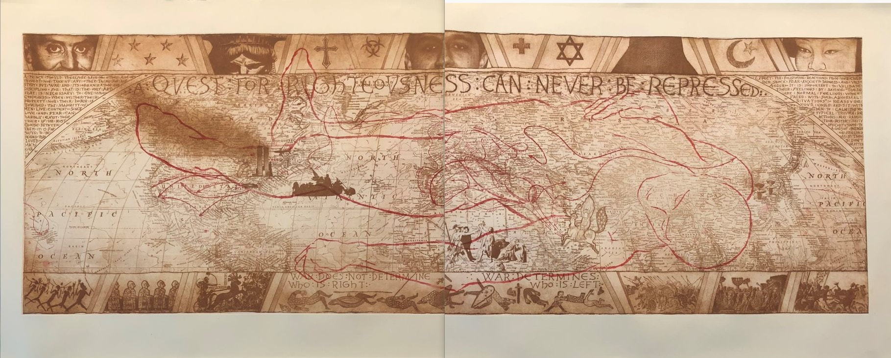
Ann ShaferYou all know about my friend Tru Ludwig. He is one of the rare art historians who is also an artist. That combination is special because those people can not only tell you about the background history of the artist and the subject matter, but also how it was done with such a depth of knowledge it is breathtaking. There were moments in the frantic shuffling of prints and interleaving during History of Prints at the BMA that I would purposefully stop to listen to Tru talk about Rembrandt's Three Crosses, Max Klinger’s Die Handschuh, Kathe Kollwitz’s Battlefield, and Leonard Baskin’s Hydrogen Man. Every time, Tru's oration would get me with goosebumps or tears welling; he is beautifully clear about how art is central to our existence. His magnificence in the classroom is why I asked him to make Platemark's History of Prints series. While we've been making Platemark however, I've been apprenticing at Tru’s print studio, The Purple Crayon Press. Last year we spent two days pulling his magnificent etching called TapHistory (Repeated), 2005, which consists of two large sheets that are joined in the center. Each half is two plates: one in brown and one in red. Learning how to print has been extraordinary. TapHistory is a play on the format of the Bayeux Tapestry, an important embroidered length of fabric that tells the tale of the lead-up to and the Battle of Hastings in 1066, when William, Duke of Normandy defeated the British upstart Harold, Earl of Wessex, following the death of King Edward the Confessor. It is thought that the outcome changed England, its language, architecture, and way of life for the future in massive ways. The tapestry was created only a handful of years after the battle and offers vignettes that tell us about military strategy, armor, cooking conventions, fashion, and all sorts of stuff. It is some 230 feet long and 20 inches tall. The main action takes place along the center, while a top and bottom border carries other figures and stories, which sometimes are fables or cautionary snippets that forecast the future. Tru’s print mimics that format. There is central action and a top and bottom border carrying other supporting information. In the central section is a map of the world, the kind you might find in an old National Geographic. Noted in tiny red stitches (mimicking the tapestry) arrows create paths of conquest by various peoples across time: Goths, Visigoths, Vikings, Mongols, etc. It is also includes art historical quotations. That is Jacques-Louis David’s Oath of the Horatii in the lower center, which depicts three sons and their father issuing an oath that will result in only one son surviving an upcoming land-dispute battle. In the left center is Emmanuel Leutze’s Washington Crossing the Delaware (in reverse). Over in Japan, two mushroom clouds rise above Hiroshima and Nagasaki. And just above Washington are the Twin Towers—one is streaming smoke and the other is about to be hit by an airplane. Tru made this shortly after 9/11, no surprise. To the right of the Oath of the Horatii is Muhammad Borne Aloft by the Buraq, from the Turkish version of The Progress of the Prophet, from the 16th century. The text running across the top of the central panel is “a quest for righteousness can never be repressed,” which is a quotation from Nelson Mandela in 2001. In the triangular space at the left edge are quotations from Niccolò Machiavelli’s The Prince, 1532. Opposite, in the righthand triangular space are excerpts from Baltimore County Public Schools letter sent to families following September 11, 2001 (Tru’s son was in a Baltimore County school at that point). Overlaying the brown map in the central panel is the red outline (a chalk outline, if you will) of the dead toreador figure from Edouard Manet’s painting at the National Gallery of Art. Across the top are partial faces of note: from left to right: Brian Sweeney, one of the pilots who died on Flight 175, which crashed into the south tower on 9/11; the angry eyes of the Statue of Liberty; Mohammed Atta, the alleged pilot of Flight 11, which crashed into the north tower on 9/11; Sharbat Gula in a full burka—she was the young woman with starkly green eyes who was photographed by Stephen McCurry in 1984 and was on the cover of National Geographic the following year; and Ogedei Khan, son of Mongol warlord Genghis Khan. Along the bottom are small packs of warriors heading into battle from various periods of history, along with the Chinese proverb “War does not determine who is right. War determines who is left.” I have often suggested to artists to reduce the number of elements in a work, thinking that if one thing says it well, you do not need five things. When I look at Tru’s print, I see cacophony, but also a deeply felt commitment to making the point: why are we doing this and why do we keep repeating history? The number of elements making the point is many. But then, that is the point, isn’t it? There are innumerable examples of conquest, war, and tragic deaths that have and continue to occur. It is maddening. To Tru I bow in deep respect. Tru Ludwig (American, born 1959). TapHistory (Repeated), 2005. 4-plate etching. 29 ½ x 76 ½. The Purple Crayon Press, Baltimore.
0 Comments
Ann Shafer Collecting art is a funny thing. The reasons I’m driven to acquire one thing or another can vary widely. Sometimes I acquire prints that make a statement about one issue or another, no doubt a hangover from my days at the museum. Back then my standards were pretty high because they had to be. There’s nothing more mortifying than having your colleagues roll their eyes at a proposed acquisition. Post-museum job, I find my aperture has widened considerably. Now a work’s conceptual rigor holds less importance for me. Living with a work of art is very different than collecting it for an institution.
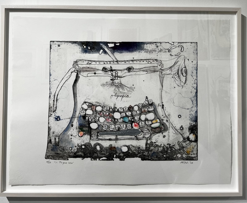
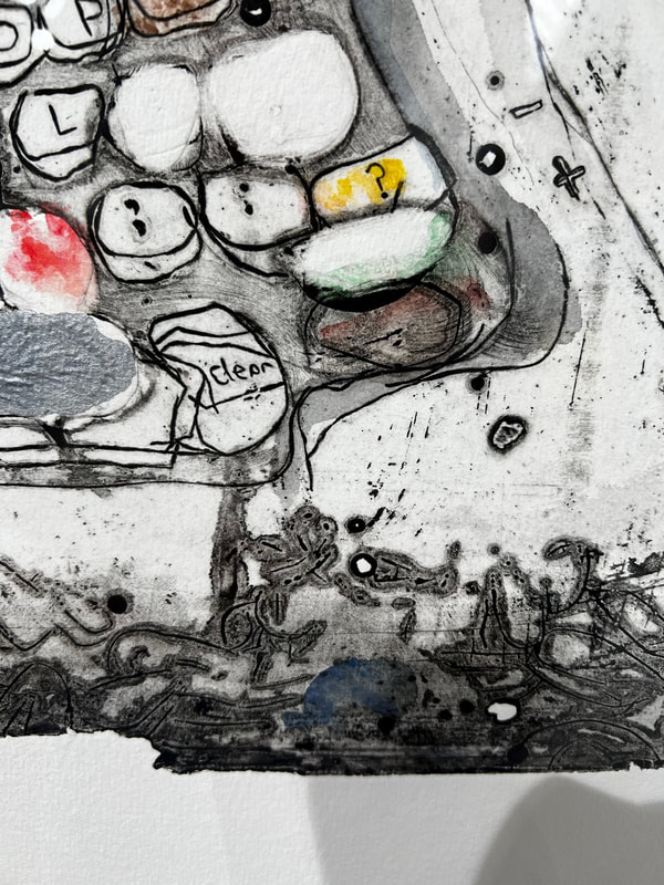
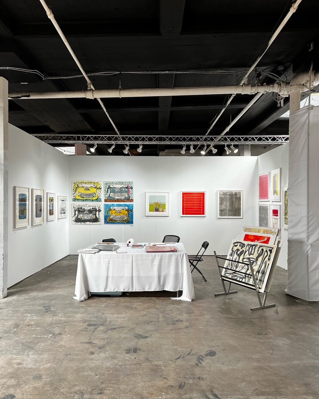
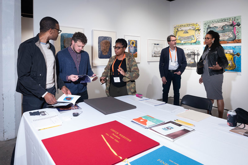
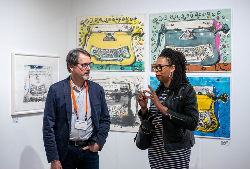
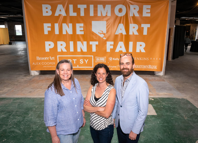
People ask me for advice a lot, and my number one response is “buy it because you love it, not because you think its value will increase.” It’s even better if you feel a deep personal connection to the work. If you’ve been following along, you know that I left a beloved job at the Baltimore Museum of Art almost five years ago. The first 2.5 years were spent trying this and that, always to find only dissatisfaction. At the start of the pandemic, in March 2020, I started writing these posts and making them available here. Like everyone, I didn’t know what might happen in those early days of COVID— whether I would get sick and not make it. Facing a possible end, I suddenly felt compelled to express a few things. I felt a combination of the abrupt cessation of a beloved career and a drive to create something to leave behind so my two sons would have something tangible from the mother. I think this latter notion was especially strong for me because I’d give a lot to have a letter from my mother, who died when I was a kid. Writing about art and subsequently starting the podcast, Platemark, led me to meet Brian Miller, who owns Full Circle Fine Art and Catalyst Contemporary. Along with Brian’s partner Julie Funderburk, last weekend the three of us pulled off an incredible feat: the inaugural Baltimore Fine Art Print Fair. Twenty-four exhibitors from across the country joined us in Baltimore to sell contemporary prints. Everyone, from exhibitors to fair-goers seemed thrilled to be together celebrating prints. The print ecosystem just got a shot in the arm. While this new fair is its own thing, it is a descendant of the Baltimore Contemporary Print Fair, which was operated by the Baltimore Museum of Art from 1990 to 2017. This new iteration is not related to the BMA, except that I directed the last three of the BMA’s fair. I’ve been longing to recreate the fair since 2017, so you can imagine how pleased I am that we managed to do it. All weekend I ran around the fair greeting old and new friends, former colleagues, and museum members who all seemed thrilled to be at the new fair. Not only was it exhilarating and exhausting, but also it made doing a thorough job of exploring each booth nearly impossible. You may have heard me say that some of the best stuff is under a vendor’s table: unframed prints, portfolios, artists books, and multiples. I missed all of that this year. No time! By Sunday afternoon, I wasn’t sure I would find the one, the print that would come home with me. There were certainly prints that would be lovely to bring home, but I also had a budget in mind, if you know what I mean. Suddenly it all clicked. I wandered into the booth of Jungle Press, a shop out of Brooklyn run by Andrew Mockler. In one corner of the booth were four mixed-technique, hand-colored typewriters by the painter Sam Messer. They were fun and cool, but they didn’t ring my bell. Next to them, however, was a smaller etching by Messer of the same Olympia typewriter, In the Year 2020, that is often the subject of his work. The plate has been deeply corroded in acid, the edges are irregular, and there are literal holes in the plate. The typewriter itself looks well loved, tired, but ready to produce the next story or essay. All of a sudden, the typewriter became a symbol of my post-BMA years when I finally found my voice in both writing and in speech and culminating in the print fair. I fell in love and had to have it. So home it came and is now hanging above my desk/recording studio. It will forever be a reminder of the pandemic, the new fair in its first year, and of my metaphorical rise from the ashes. Ann ShaferPutting on my print evangelist hat for a moment to tell you about a remarkable set of six state proofs and the final engraving by the incomparable James Siena, which I acquired for the museum back in 2012 during the Baltimore Contemporary Print Fair. The print fair was run by the print department and directed by one of its curators going back to 1990 (with deep support from the friends group, the Print, Drawing, and Photograph Society). It was held annually until 2000. When I took it on in 2012, it took place biennially and I ran it in 2012, 2015, and 2017 (that curious break between 2012 and 2015 was due to renovations in the museum’s galleries). The 2017 fair turned out to be the museum’s last for a variety of reasons. But please mark you calendars for a new print fair coming to Baltimore April 29-May, 2022. Yes, I am involved. Yes, it is a great joy to be doing it again. Yes, I’m over the moon. More details soon. For now, details are at www.baltimoreprintfair.com.
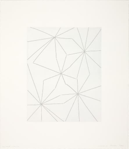
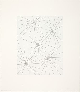
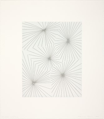
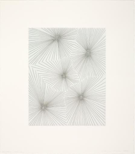
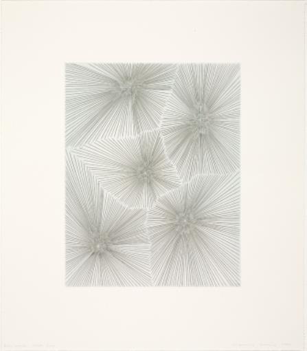
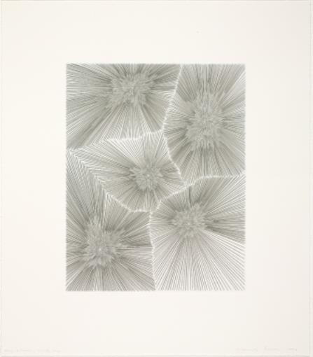
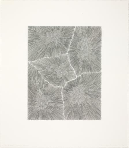
At the BMA’s fair, it was normal practice for the museum to acquire at least one print for the collection (the proceeds from the fair went directly into an acquisition fund). While there were fairs where nothing was acquired, in 2012, a set of seven engravings by James Siena caught the eye of the whole curatorial team. Printed by master prints Felix Harlan and Carol Weaver, all seven prints are of the same composition, but six of them are state proofs leading to the final print. It was a no-brainer. Who could resist these beauties all framed up and on the wall together? Not I. The opportunity to bring into the collection a progressive set of impressions was too delicious. State proofs are impressions taken from a plate in progress. When an artist begins to make marks, at a certain point—it’s random, usually when the artist feels compelled to see how the image is coming along—they will stop working on the plate, ink it up, and put it through the press. When they reach another good break point, they will print another impression to check progress. An artist can pull any number of progress proofs; there is no rule about how many should be printed. You can imagine that print curators love this kind of object because of its ability to show very clearly how the image was constructed. No Man’s Land was super helpful in the print room because we were always teaching visitors and classes about the ins and outs of printmaking. What better way to talk about the steps in printmaking than to show them physically? James Siena works mainly with abstraction, often with a set of parameters that are to be either followed or consciously ignored. Often the image fills the entire canvas or piece of paper, pushing all the way to the edges. Our eyes are drawn all the way to the edges where one finds a tension between the marks and that edge. It’s almost like the image wants to push outward past the confines of itself. In No Man’s Land, the five bursts of radiating lines push against the edges and each other, as well as explode inwardly. Although completely abstract, one can see what the title helps us understand. That this is an abstraction of an aerial view of a World War I battlefield. This allusion to reality is at odds with the elegance and precision of the engraved lines, their crisp coolness, their strength, and confident straightness. Zoom in and one notices that virtually none of the lines touch or cross each other. This increases the tension and the potential energy—they appear to be suspended in time, ready to collide at any moment. I love going all the way back to the first state when each burst consists of between eight and eleven lines and tracing the steps to finality. The central burst has eight lines radiating outward, and then in a clockwise pattern, they each have nine, ten, ten, and eleven lines respectively, following a sort of Fibonacci sequence in its pattern. At this point I see spiders more than anything else. In the second state, lines are doubled, and I start seeing spiders’ webs. Weird things happen when the density of the lines increases and decreases. Spiders’ webs become celestial beings along the way. And finally, the bomb blasts come into view. They are not just bursts with more and more lines. They are more complicated, and, for me, the journey is the reward. My experience of the image is so much richer having come through from state one to the final iteration. As we said often in the print room, these reward scrutiny. Ann Shafer One of the exhibitions I curated for the BMA, Alternate Realities, was a true highlight for me. This was back in the fall of 2014 when the prints, drawings, and photographs department had a small gallery in the contemporary wing for rotating exhibitions drawn from the permanent collection. It was a single room and just big enough to mount a small but meaningful show on a single topic. In this case, I was able to include nine works of art: two were multi-part portfolios, one was an artist’s book in a case, and the rest were prints framed on the wall.
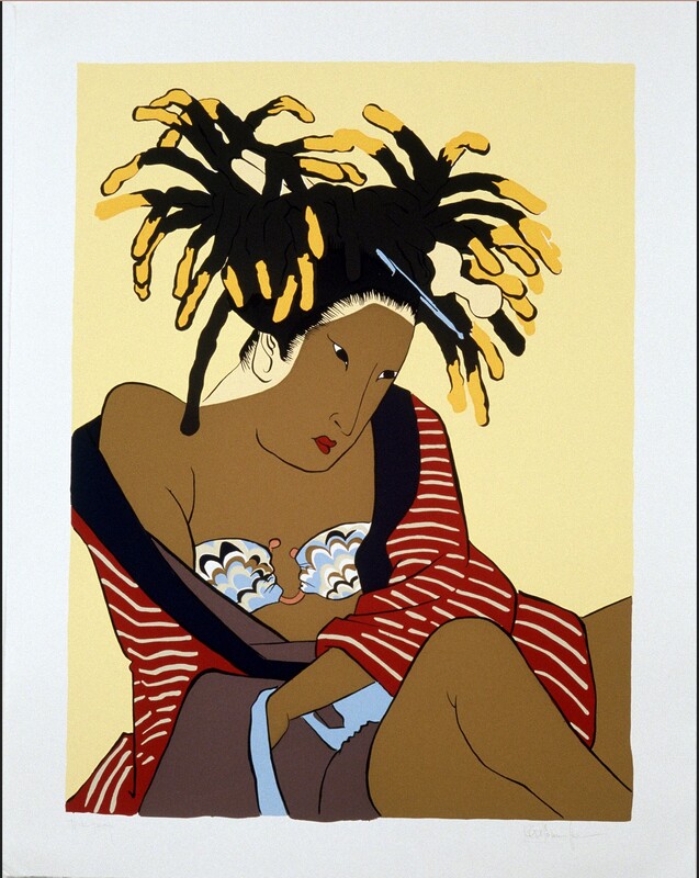
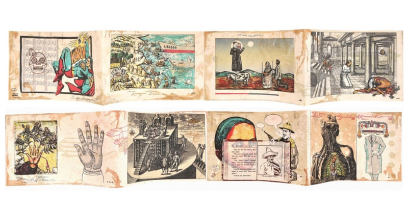
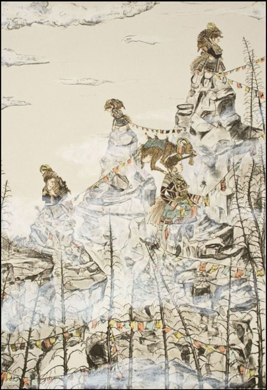
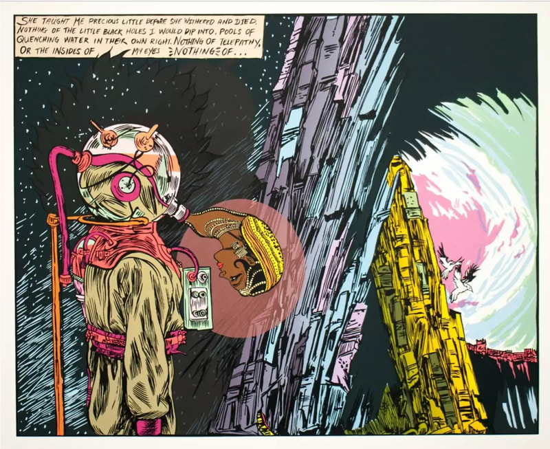
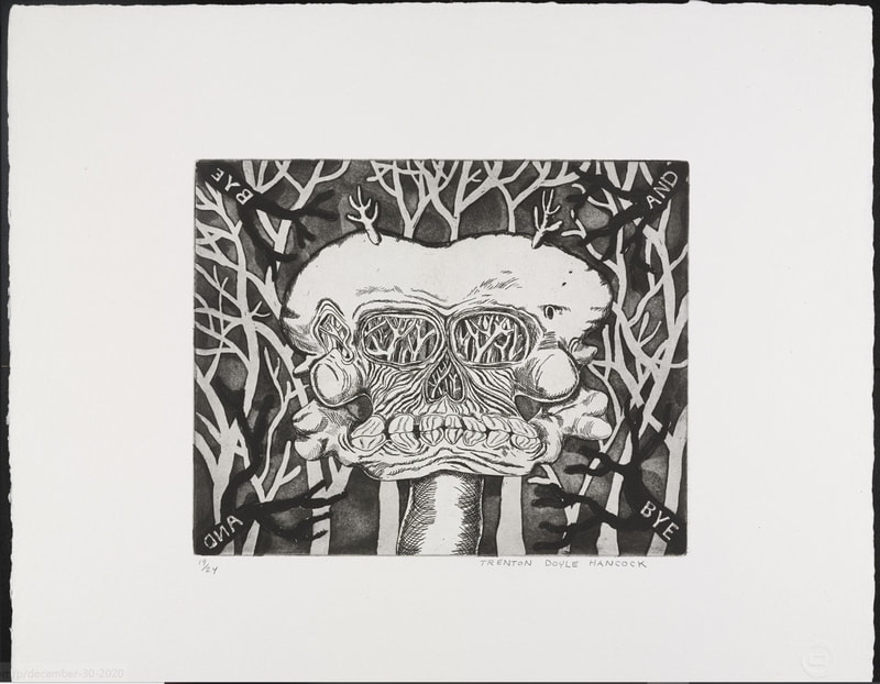
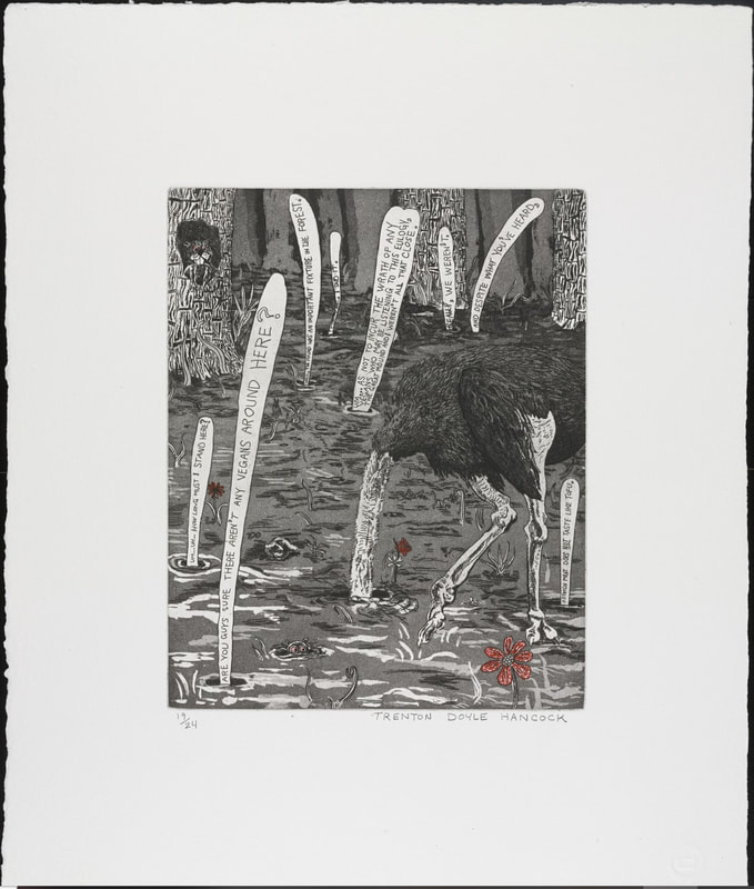
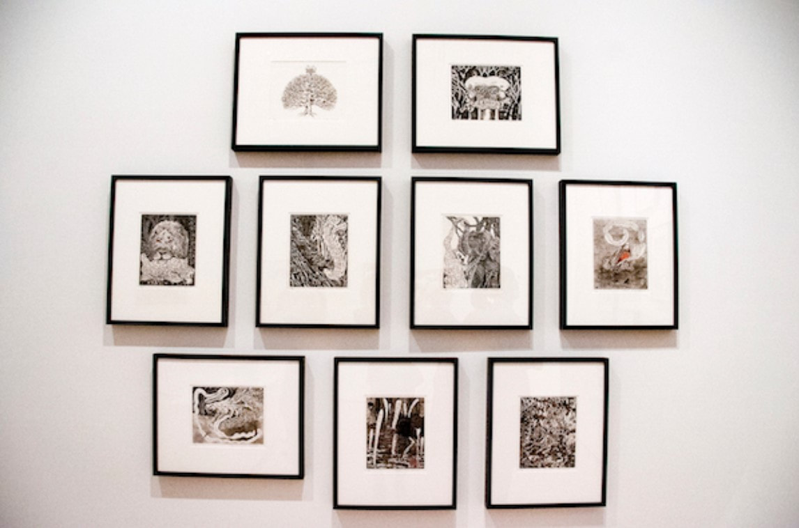
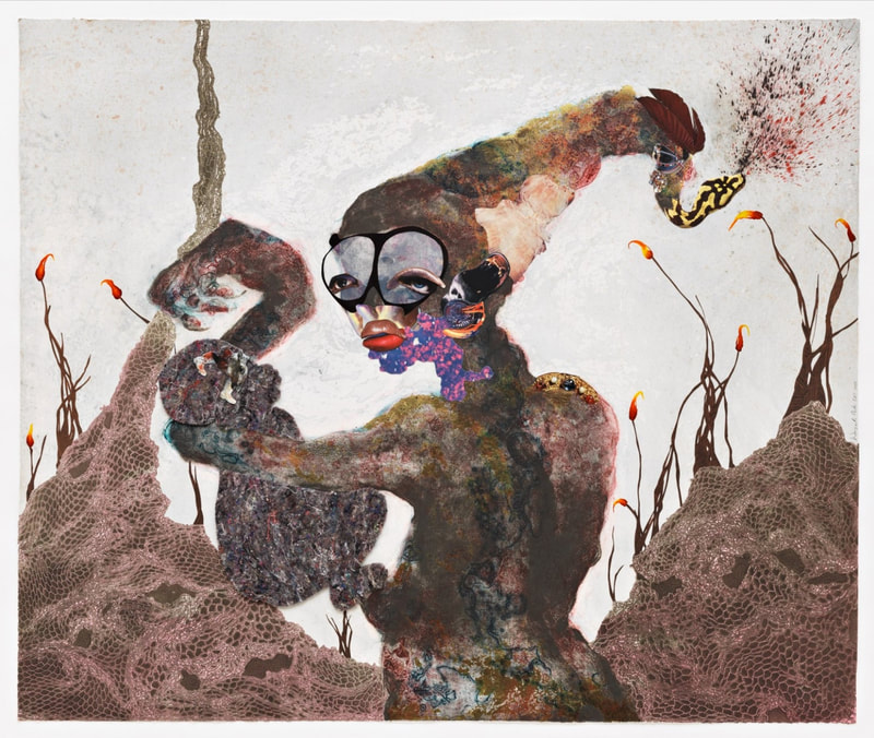
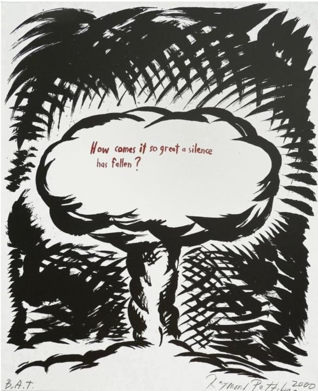
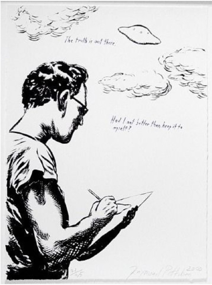
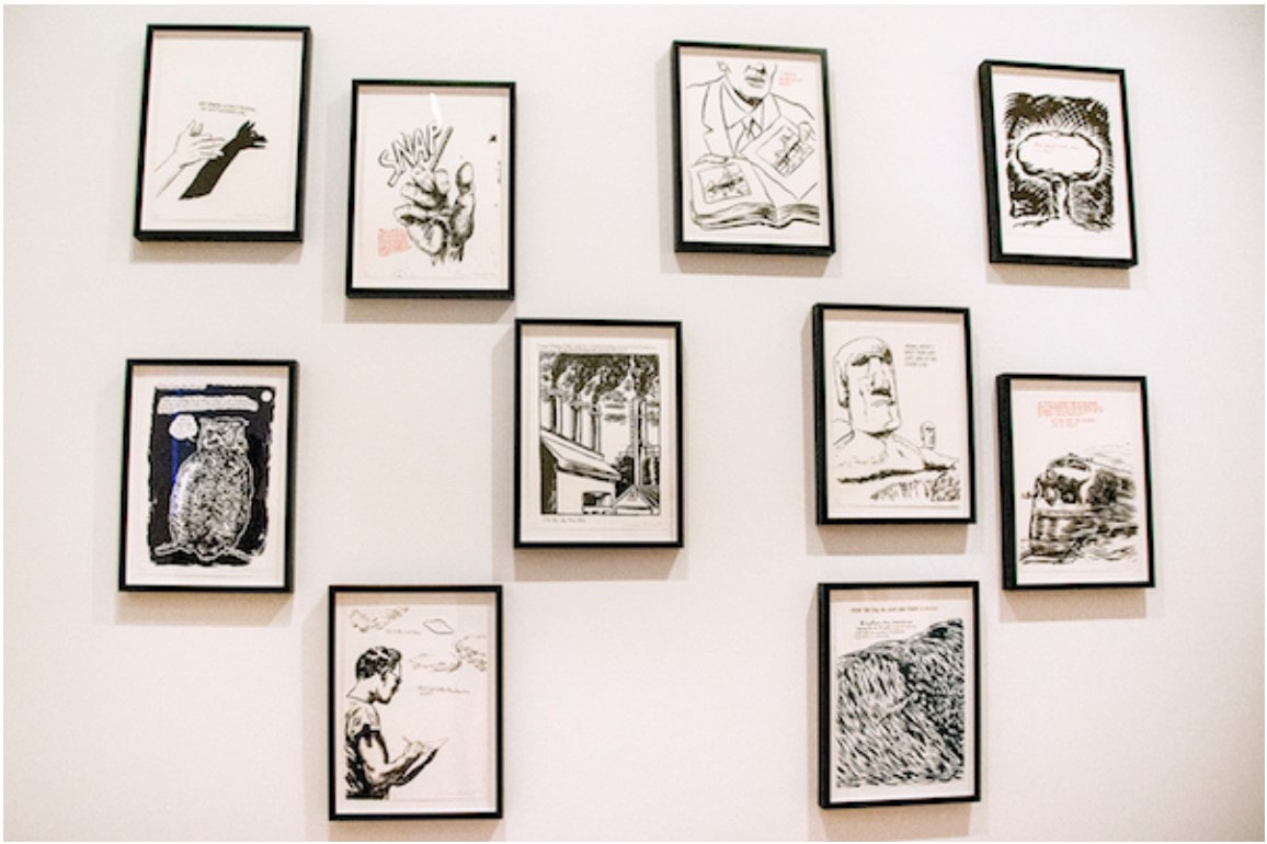
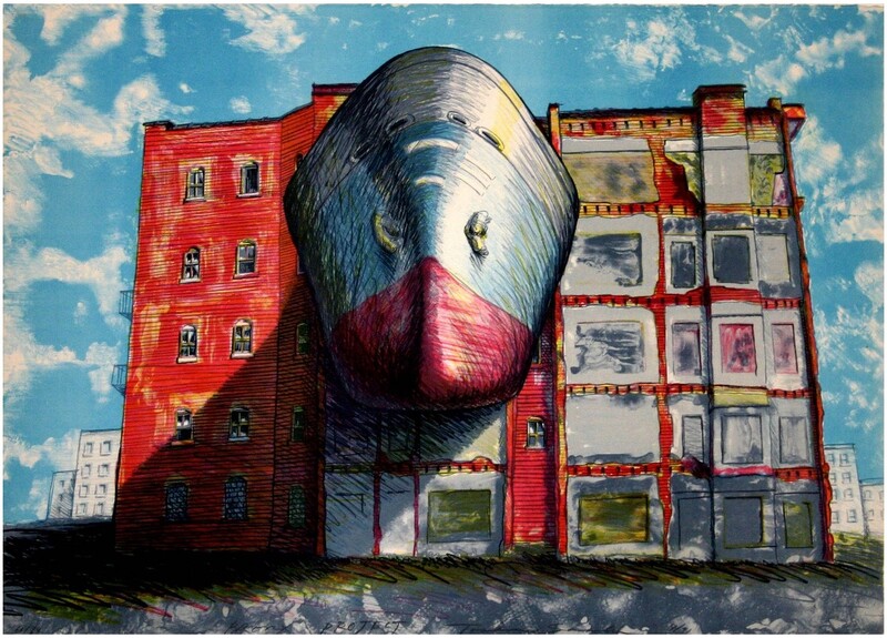
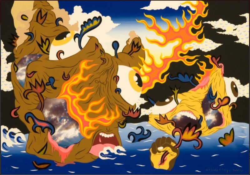
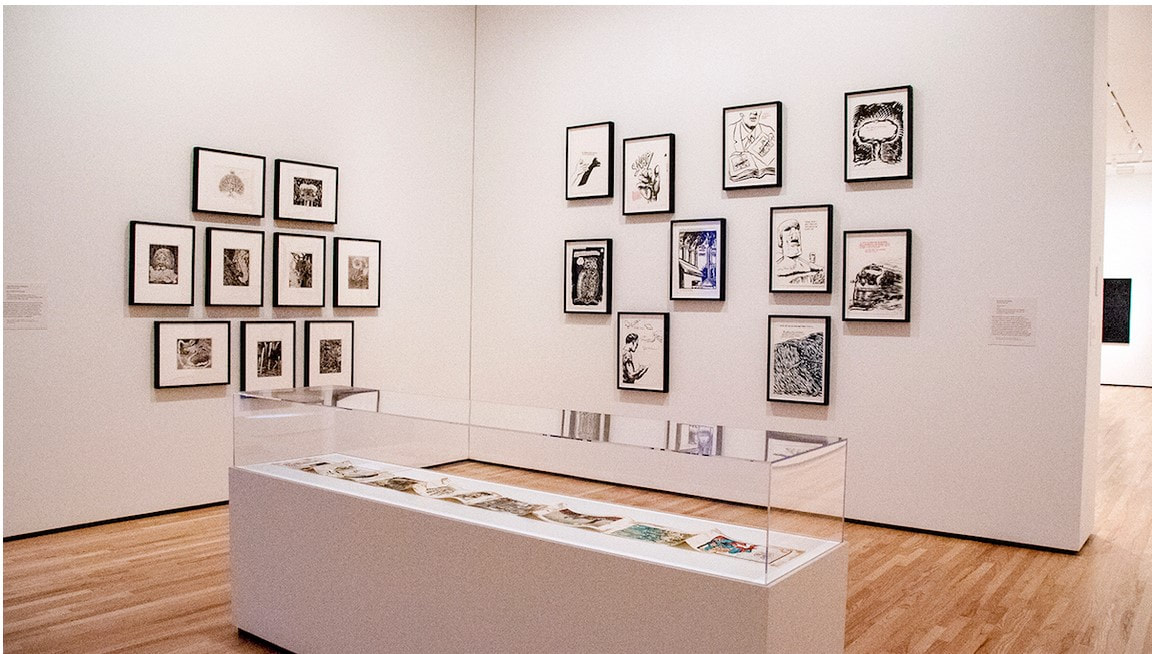
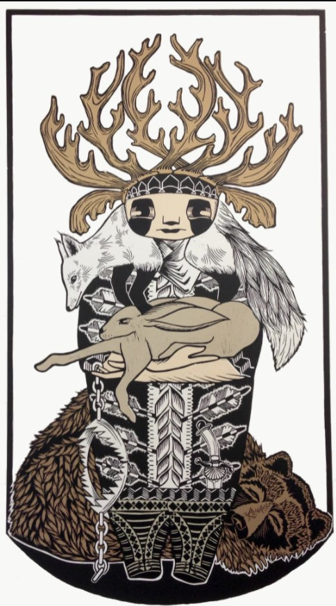
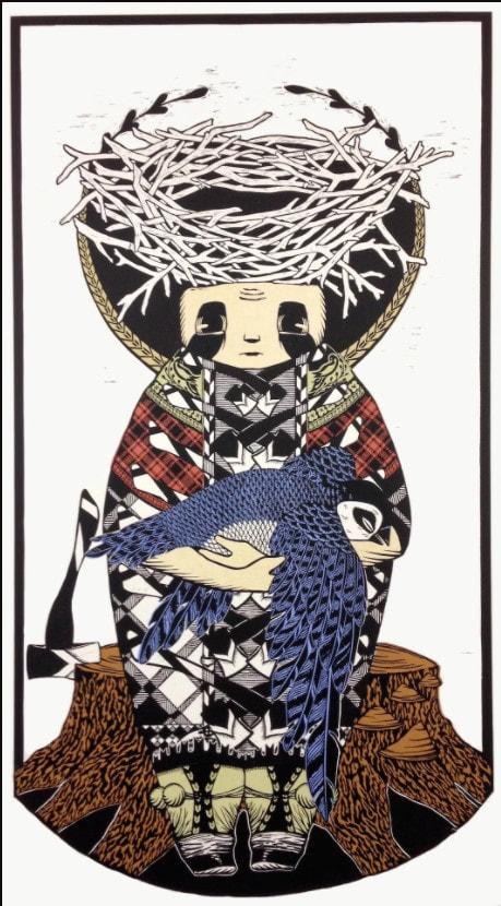
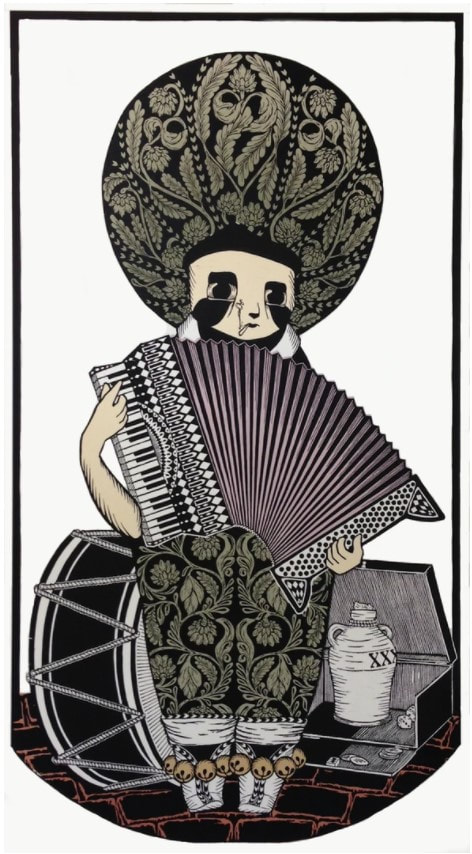
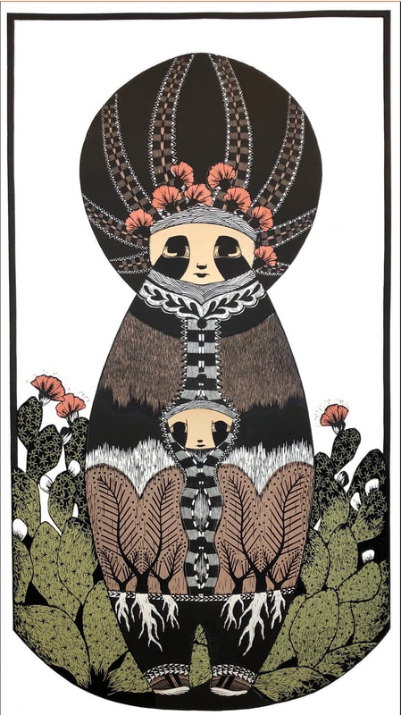
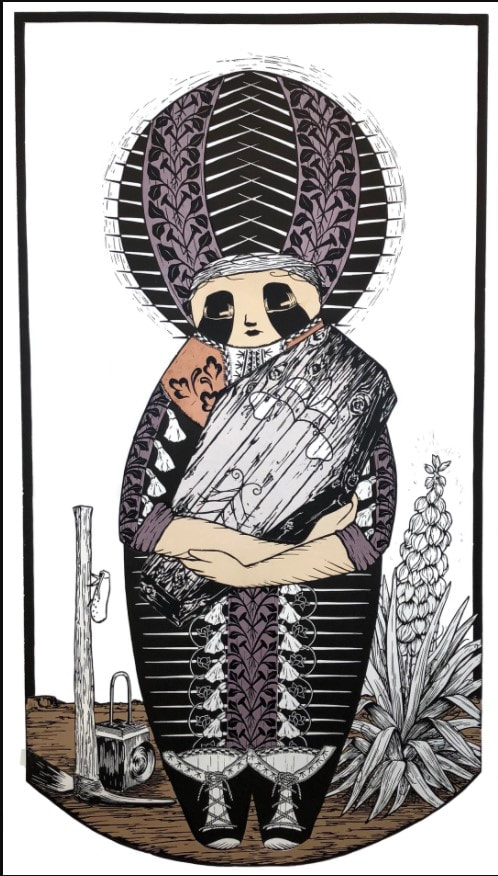
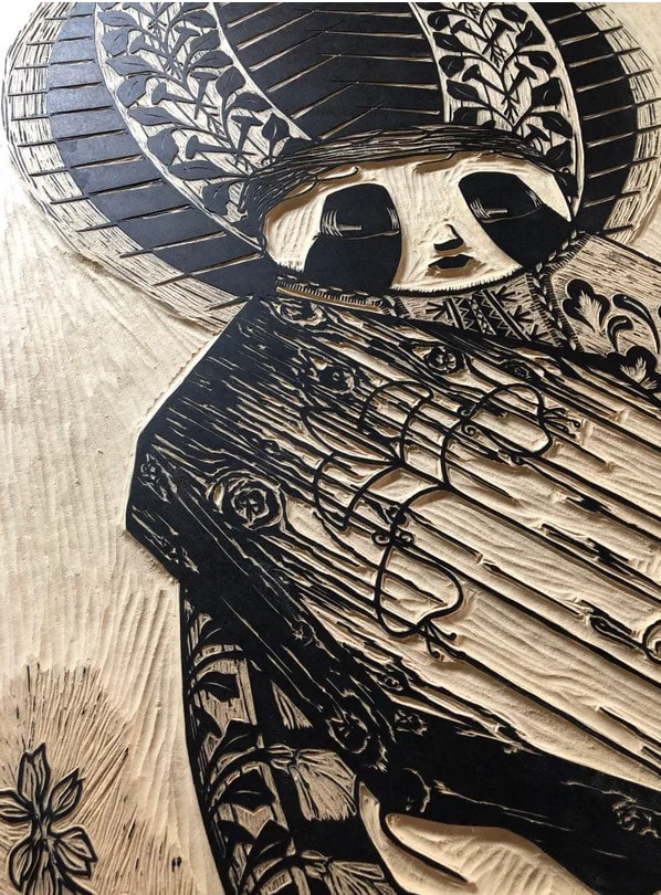
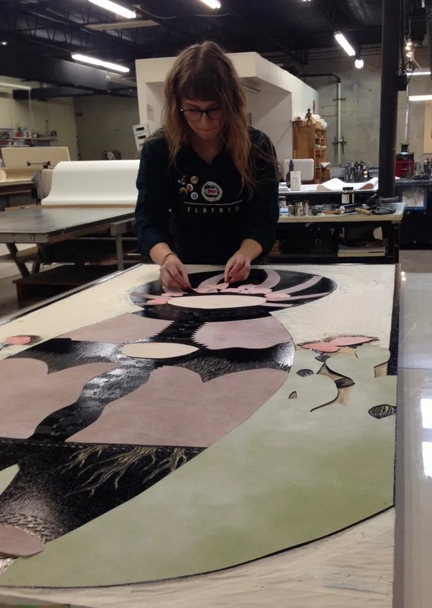
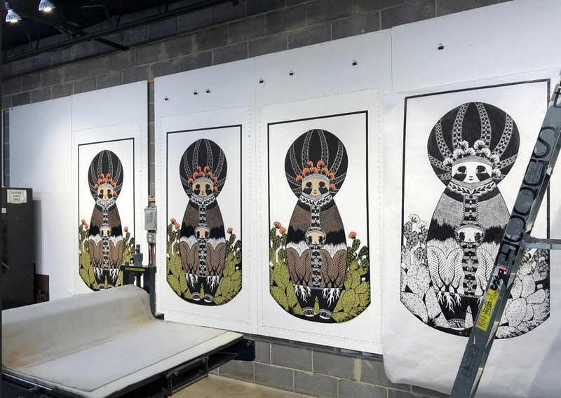
Alternate Realities included prints by iona rozeal brown, Amy Cutler, Chitra Ganesh, Wangechi Mutu, Toshio Sasaki, William Villalongo; portfolios by Trenton Doyle Hancock and Raymond Pettibon; and a book by Enrique Chagoya. The through-line of these works is that they are set in fictional (alternate) worlds and are extracted from personal narratives. The portrayed worlds are all quite different from each other, but within them these artists playfully exaggerate and reimagine the visual language of popular culture—religious stories, myths, and folk and fairy tales—as they consider larger societal issues. Through modes of picture making such as comics, street art, graffiti, and use of found images, these sometimes-humorous images rise above specific places and time to investigate issues of the human condition, cultural appropriation, gender roles, race issues, political protests, and other global issues. Most of the works were new to the collection at that point, meaning they came into the collection through purchases I made or through gifts I shepherded. I began seeking out these kinds of prints in response to requests I was getting from MICA students in the study room. They would come to see me with an assignment for their classes, which often consisted of studying one specific object for an extended period, drawing it, and then writing about it. After multiple requests to see something that reflected their interests in graffiti, zine culture, or comics, I realized we just didn’t have much to offer. The germ of an idea started with three objects already in the collection: Bye and Bye (9 sad etchings), 2002, by Trenton Doyle Hancock, Plots on Loan I, 2000, by Raymond Pettibon, and El Regreso del Caníbal Macrobiótico, 1998, by Enrique Chagoya. Slowly, over several years, I was able to acquire the remaining objects. Well, truth be told, the iona rozeal brown print was brought in by my colleague Rena Hoisington. The show came together is a magical way. I knew I wanted to be able to offer a show that would inspire those students who had asked if the museum had this kind of work. But the unanticipated consequence was that in pulling the works together, they ended up being by a rather organically diverse group of artists. By organic I mean I don’t think I could have planned it and succeeded. The other remarkable thing was the speed with which I was able to bring the show from idea to finished product on the wall. It’s super unusual to get new acquisitions out on view with any speed. Museums move like molasses in winter. Feedback on the show was very positive from the MICA students. I think they felt they were being heard, for once. And I was happy to oblige them. For all the times I emphasized how important it is to know who came before you—as Tru would say, upon whose shoulders you stand—I think it legitimized this mode of image-making for all those young artists. And for that I am truly pleased. Here is the label copy (with a few edits) that appeared on the walls of the exhibition. iona rozeal brown (American, born 1966) Untitled (Female), 2003 Published by Mueller Studios, New York Color screenprint BMA 2014.7 iona rozeal brown’s Untitled (Female) is a portrait of a geisha, a popular type of image found in woodblock prints from nineteenth-century Japan (see below); however, something is definitely different here. First, we notice the extra-large scale and brighter color palette of the twenty-first-century print. Even stranger is the dark brown tonality of the geisha’s skin, her peroxide-tipped dreadlocks, and her trendy Missoni-designed bikini top. This contemporary figure represents a sub-culture of Japanese teenagers known as Ganguro (which translates to “blackface”), who emulate African-American hip- hop style through dress, hair, and darkened skin. This sampling and remixing of cultural markers is in line with the artist’s own side-line as a hip-hop DJ. Enrique Chagoya (American, born Mexico, 1953) El Regreso del Caníbal Macrobiótico (The Return of the Macrobiotic Cannibal), 1998 Published by Shark’s Ink., Lyons, Colorado BMA 1999.113 Enrique Chagoya’s work addresses the complexity of cross-cultural identity and calls attention to the power relationships that exist when one culture is overcome or vanquished by another. This volume takes the form of a codex, a book form drawn from ancient Central American cultures. (Few examples of these Mayan and Aztec books remain since most were destroyed by Spanish conquistadors.) In The Return of the Macrobiotic Cannibal, Chagoya questions the structure of power and muses about how things would be different if the tables had been turned—that is, if Mesoamerica had been the dominant culture and had “cannibalized” the European culture and used it for its own purposes. Utilizing symbols pulled from ancient Mexican iconography, American popular culture, Christianity, and art history, Chagoya lets the conquered recast history on their own terms, serving up a smorgasbord of serious cultural critique heavily laced with satire. Amy Cutler (American, born 1974) Widow’s Peak, 2011 Published by Tamarind Lithography Workshop, Albuquerque, New Mexico Color lithograph BMA 2014.30 Mixing absurdity with whimsy, Amy Cutler creates surreal scenes that turn ideas about traditional women’s work on their head. In Widow’s Peak, women in old-world costumes have become the mountain peaks all while bearing goats on their backs. The goats attempt to direct the women forward by pulling on their braids. The setting, strung with prayer flags, is both dreamlike and inviting, and despite their burden, the women carry on with self-reliance and strength. Without an obvious narrative, Cutler leaves the significance of her image intentionally open-ended. However, the artist is known to be deeply concerned about the repression and oppression of women, which neglects that they are foundational. Chitra Ganesh (American, born 1975) Away from the Watcher, 2014 From the series Architects of the Future Published by Durham Press, Durham, Pennsylvania Color screenprint and woodcut BMA 2014.29 Born and raised in Brooklyn, New York, Chitra Ganesh is known for creating mysterious narratives inspired by comics and science fiction from both Western and Eastern traditions. By combining compositional elements, color, and text, she creates an otherworldly moment plucked out of an enigmatic narrative. This image raises many questions: Is somebody inside the scuba/space suit? Why does it appear to be propped up? Is the Indian goddess being expelled or inhaled? Are we are underwater or in outer space? What do the small-winged creatures signify? What calamity has befallen the city at right? The somber melancholy of the text seems at odds with the dynamic depiction of the planet’s fissures, as well as the brilliant color and energetic comic-book style representation. These alternate moods and narratives clash and connect in a newly constructed vision of the future. Trenton Doyle Hancock (American, born 1974) Bye and Bye (9 Sad Etchings), 2002 Co-published by Dunn & Brown Contemporary, Dallas, Texas, and James Cohan Gallery, New York Portfolio of nine etchings printed in black and red BMA 2003.35.1-9 Trenton Doyle Hancock is well known for envisioning and recounting an epic-sized saga of arch enemies, the peace-loving Mounds and evil Vegans. Over his career, Hancock has presented chapters of this twisted tale of good and evil in painting, sculpture, performance, drawing, and printmaking in a style melding comics, cartoons, and psychedelia. In Bye and Bye (9 Sad Etchings), the great and wise Mound Number One has died, and a lion, squirrel, elephant, shark, alligator, and ostrich have gathered to eulogize him. Wangechi Mutu (Kenyan, born 1972) Second Born, 2013 Published by Pace Editions, Inc., New York 24 kt gold, collagraph, relief, digital printing, collage, and hand coloring BMA 2014.8 Wangechi Mutu has lived and worked in Brooklyn, New York, since the 1990s. By combining hand drawing with collage elements, she creates powerful and deeply unsettling female figures that directly challenge ideas about contemporary consumption of the female African body. Set in a fantasy world that looks equal parts scorched earth, outer space, and aquarium, this oddly alluring mother and child dominate a landscape of fire-tipped weeds. Holding her child in the crook of her elbow, the mother twists her hand, which resembles a claw, over the child’s head. A snake seems to emerge from her hair, spitting sparks of fire or dirt. As we take in the strangeness of this figure, she seems to turn back and look at us, challenging us to enter her at once dreamlike and nightmarish realm. Raymond Pettibon (American, born 1957) Plots on Loan I, 2000 Co-published by Brooke Alexander, New York, and David Zwirner Gallery, New York Portfolio of ten color brush and tusche lithographs BMA 2000.56.1-10 Raymond Pettibon’s lithographs combine the satirical bent of political cartoons and the DIY aesthetic of zines, album covers, and underground comics. Pettibon marries each drawing with a brief text—often a fragment of a quotation taken out of context from nineteenth-century writers, such as Robert Louis Stevenson and Henry James. (Some texts are drawn from the writers’ personal letters, rather than from works of published literature.) Since the authors never intended their words to be associated with Pettibon’s images, the viewer is challenged to consider how word and image might be related, or what Pettibon might have had in mind when he put them together. Toshio Sasaki (Japanese, 1946–2007) Bronx Project, 1991 Published by Brandywine Workshop, Philadelphia, Pennsylvania Color offset lithograph Promised Gift of Darnell Burfoot Toshio Sasaki was a Japanese architect, who split his time between New York and his homeland. He is best known for his design submission for the World Trade Center memorial. (The project was ultimately awarded to another architect.) Here, the print shows the prow of a ship either attached to or breaking through the outer wall of a tenement in the Bronx. Perhaps it is a comment on the way domestic and industrial interests vie for space in one of the country’s most crowded cities. The print’s cartoon quality adds a touch of humor to a serious societal issue, enabling viewers to either engage with the growing problem or at least become aware of its existence. William Villalongo (American, born 1975) Through the Fire to the Limit, 2006 Published by Lower East Side Printshop, New York Color screenprint and archival inkjet print with collage elements BMA 2014.34 Brooklyn-based artist William Villalongo uses a cartoon and graffiti aesthetic to render Hurricane Katrina as a raging monster with teeth, tongue, and four enormous eyeballs. Even as black clouds move away and the brilliant blue sky appears, bright orange flames and a hand floating in the water tell of immeasurable damage to life and property. One wonders whether Villalongo’s Saturday-morning-cartoon style makes the disturbing image easier to digest, or if the tension between subject and technique heightens the viewer’s feelings of alarm and dread. Ann Shafer You’ve heard me say that working on the BMA’s print fair was the most fun part of the job. So many wonderful people came to the museum—joined by a shared love of prints and printmaking—to sell work to an eager and well-informed audience. One of the people I have kept an eye on since I met her in 2017 when she came as part of the Flatbed Press team, is Annalise Gratovitch. Not only was she there as one of Flatbed’s printers (along with founder Katherine Brimberry and Mike Brimberry), but also, Flatbed was showing several of her monumental woodcuts from Carrying Things from Home series.
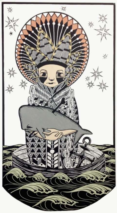
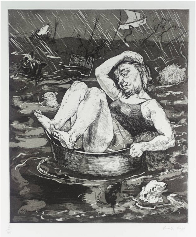
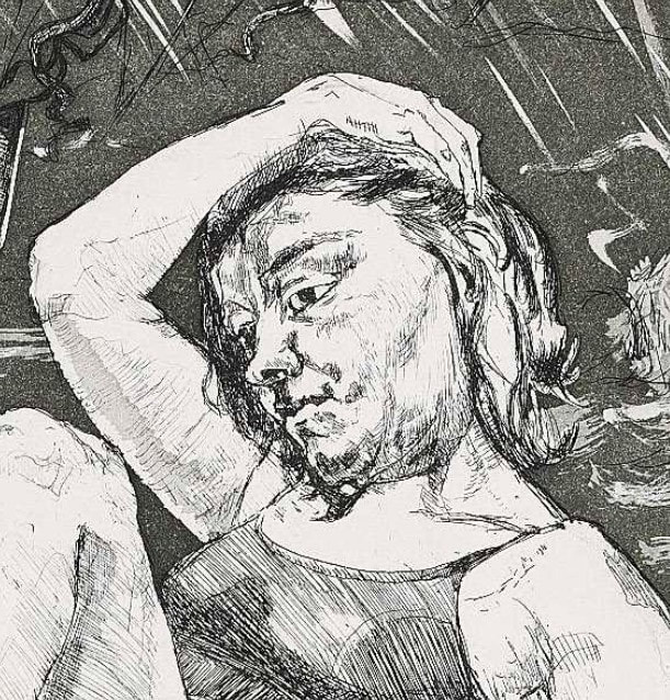
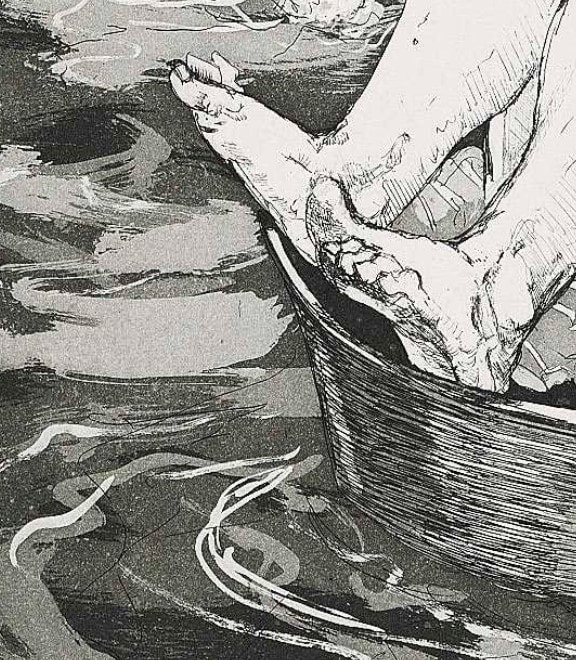
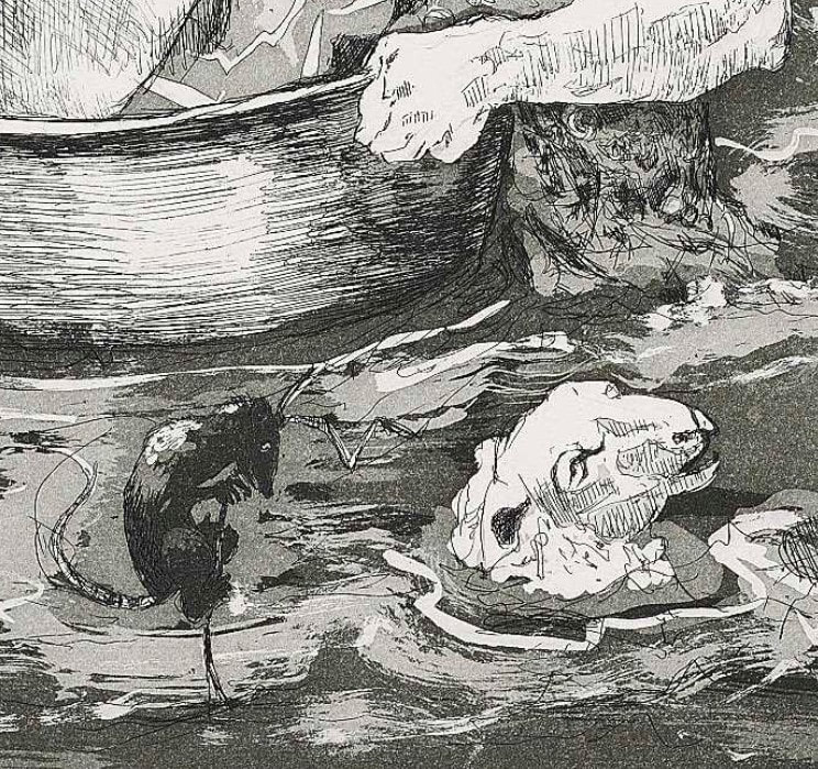
These woodcuts are nearly six feet tall and feature a single character standing fully center, like an icon on a prayer or tarot card. More accurately, they are modeled after matryoshka, those stacking/nesting Russian dolls, an effect that generalizes rather than specifies any one person. But it seems clear that Annalise’s Ukranian heritage is at play. Her grandparents were one of many families to leave their homes with only what they could carry during World War II. Annalise tells of their survival by busking with an accordion and bartering for whatever goods would help keep them fed and clothed. What makes a home? Is it a place or a feeling? How many of us have a migration story in our history? Each of the six figures holds an object and wears clothes that help us understand their role: the mariner cradles a whale, the hunter holds a hare and has a fox on their shoulders and a bear at their feet, the musician plays an accordion, the builder holds a bird (notice the headdress is a bird’s nest), the mother holds a child, and the undertaker carries a tiny, simple coffin. Any areas of color you see are pieces of hand-dyed mulberry paper that have been added by the method of chine collé, which means the colored pieces are laid on the inked block and glued down simultaneously as it goes through the press. By the way, Annalise plans for the series to consist of eight prints—only six have been completed thus far. The final two will be The Healer and The Fool. Can’t wait to see them. When you are compelled to leave your physical home behind, what do you bring with you? What is it that defines your sense of self and purpose? How do you maintain a sense of connection to home? Annalise says of her work: “My work explores themes of displacement, self and cultural identity, intention and accountability, as well as burden and regret.” For me, the two most recent prints, the mother and undertaker characters, point directly at our worldwide refugee problem. There is certainly fear and sorrow in these figures, but also a noble strength and sense of purpose. Life is complicated and family is what you decide it is. I love these prints as straightforward portrayals of strength and fortitude. Honest and direct, their stylized presentation only adds to their accessibility. The images pull you in as wonderfully graphic representations of stalwart and hardworking people, and then their circumstances and lot in life become apparent. Certainly, the scale of the works adds to their power. Sometimes more is more. I’ve been meaning to write about these woodcuts for a while, but now there is a compelling reason to bring them to your attention. Annalise, who works tirelessly on her own work and in various roles within the wider print community, needs our help. She has been battling a rather nasty and debilitating autoimmune disease for the last year and a half. All in the middle of this pandemic when hospitals are overwhelmed with those sick with Covid and turning away patients with other types of illnesses. Annalise has been able to work only intermittently, and the medical costs have been mounting. I am sure asking for help is the last thing she’s like to do, but here we are. A GoFundMe campaign has been organized by a dear friend, Hannah Neal, who reports: “Annalise’s financial burden is massive. She is largely unable to work and has run out of paid leave. Between medical expenses not covered by insurance, studio rental, and lost wages, her total to date is $37,401, and the costs continue to mount every day.” Imagine being a strong, healthy printmaker unable to do the thing you feel compelled to do. Artists must create art; it’s not negotiable. Imagine being unable to work, out of paid leave, and running out of treatment options. Annalise has things to say through her work (including the final two woodcuts from this series yet to be completed) and deserves our every effort to ensure she is back at it as soon as possible. Please consider donating in support of a fellow creative who really needs our help now more than ever. Any amount is a huge help. The GoFundMe page is here. One could also buy a print from her. Just sayin’. Ann Shafer Here’s one that got away. I always wanted to acquire a print by Paula Rego for the museum’s collection. For some reason I was always drawn to this image from the series The Pendle Witches. Something about the lone figure afloat in an precarious, upturned tub (in my mind it's an umbrella) really spoke to me. Maybe it’s the feeling of being lost in the chaos of the world as it floats by.
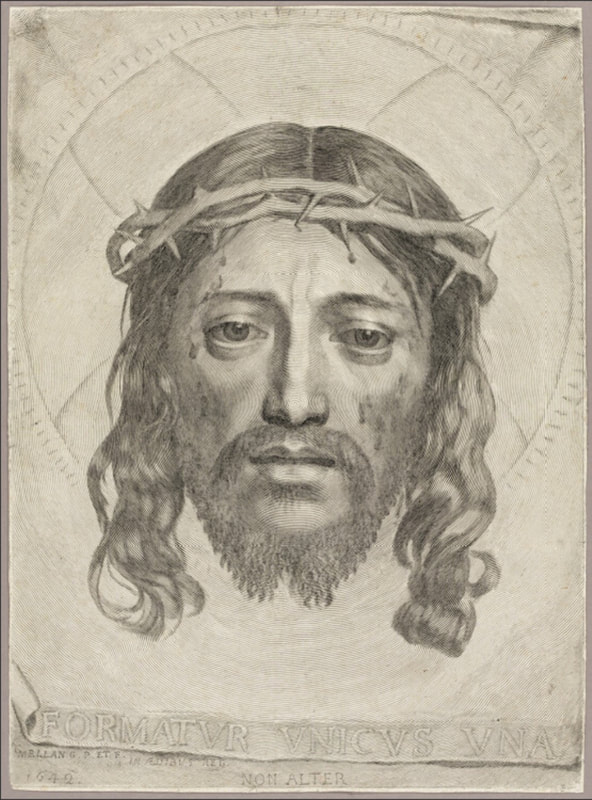
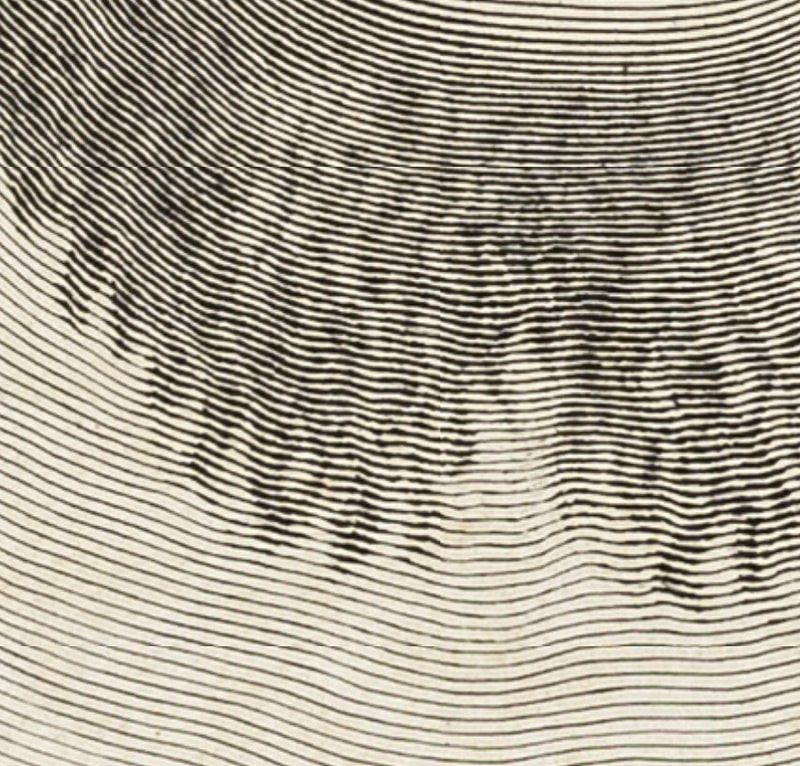
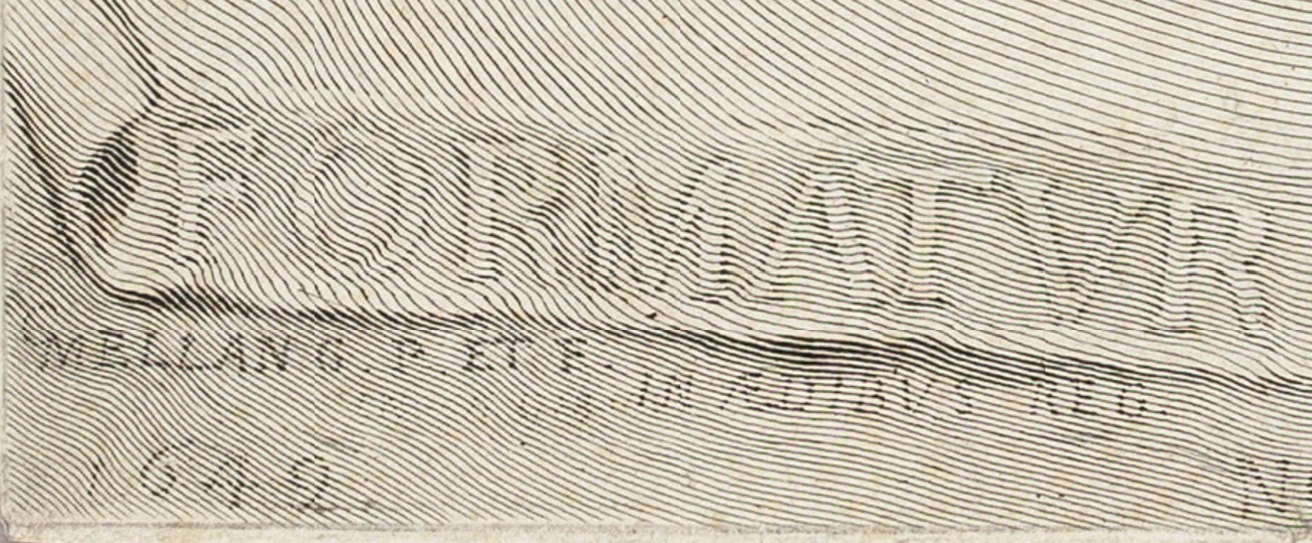
This print is from a series that accompany a group of poems by Blake Morrison, which are based on the true story of the Pendle witch trials in England in 1612 (years before the Salem trials). During the trial of multiple alleged witches, the main testimony came from a young girl who was the daughter of one of the accused. There’s more to it, obviously, but the case is held up as an example of the problems that attend depending on one so young, scared, and incapable of understanding the import of their actions. For me, the drifting figure captures the feeling perfectly. I wasn't able to acquire it for the museum, but I still love it. You may be interested in a recent podcast episode from Alan Cristea Gallery featuring Rego and others speaking about her long career and work. An excellent listen. https://cristearoberts.com/podcast/ Ann Shafer Even if engraving seems arcane to viewers, there is one print that always impresses. It is the virtuoso engraving by Claude Mellan, The Sudarium of Saint Veronica, 1649. The print shows the sudarium (Latin for sweat cloth) that Veronica used to wipe the sweat off Jesus’ face during a chance encounter (it’s also called Veronica’s veil). It became inexplicably imprinted with an image of Jesus’ face.
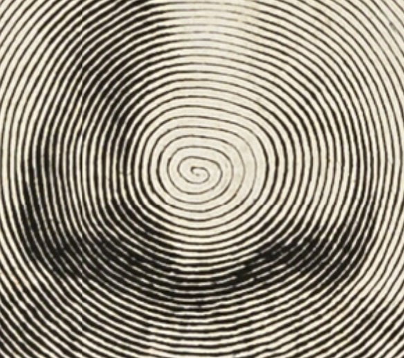
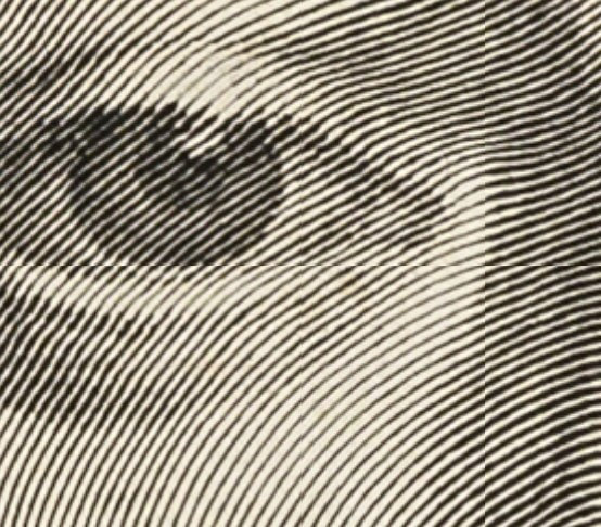
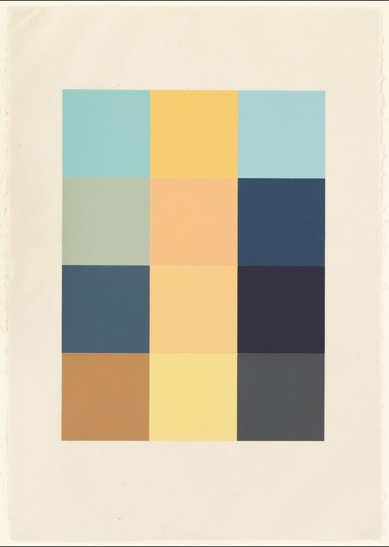
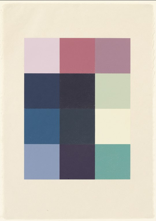
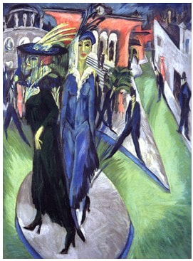
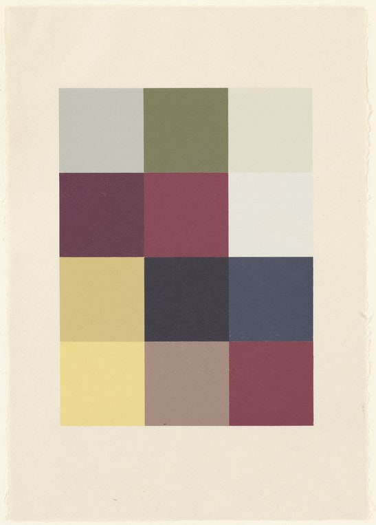
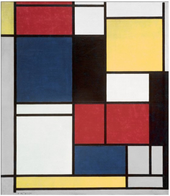
If the appearance of Christ’s face on the sudarium was a miracle, perhaps in turn, an artist’s ability to produce such a work might be seen to link their talent to a higher power. The inscription translates to "It is formed by one and no other." As if linking the artist’s talent to the divine wasn’t clear enough. This became Mellan’s calling card demonstrating his prowess with a burin, the tool used to carve the line into the copper plate. In Mellan’s composition, Jesus’ face is rather straight forward and remarkably symmetrical. Christ looks defeated and resigned with his eyes slightly downcast, and he is shown with droplets of blood from the crown of thorns that pierce his skin. The edges of the cloth are shown in a tromp l’oeil manner, meaning intended to fool the eye with their realism. It looks like the edges are curling off the sheet. This artifact foreshadows Jesus’ passion, conveyed through Veronica (the name derives from the Greek word for truth), and gives us the truth of his pain. While it may elicit a feeling of gratitude and hope for those that are spiritually Christian, for others, it may seem like a trope. But either way, I think we all can appreciate this landmark of printmaking. Here’s the part where I get to say this print “rewards scrutiny,” a phrase I used often in the museum’s studyroom. Look closer. Then zero in on Christ’s nose. Begin at Christ’s nose and follow the line outward. Keep going. Right. The image is made by increasing and decreasing the width of the single line created by carving into the copper plate. It’s really a jaw dropper, isn’t it? How in the world did he manage it? It boggles the mind. It always leaves an impression on me. Pictured is the impression of Mellan's print from the Art Institute of Chicago, chosen because one can zoom in pretty tightly to marvel at the line work. You can find it here: https://www.artic.edu/.../the-sudarium-of-saint-veronica Ann Shafer Ben and I talk about why prints are awesome all the time (especially in episodes 7 and 8 of our podcast Platemark, which will be released later this summer). One key factor: the layers of translation from one step to another in the process. It takes planning and lots of decision-making to think through all the steps, which slows the artist down and makes them consider every aspect of the proposed work. Sherrie Levine’s portfolio Meltdown, 1989, is a perfect example of multiple transitions/translations in the making of the physical object in concert with multiple layers of conceptual ideas.
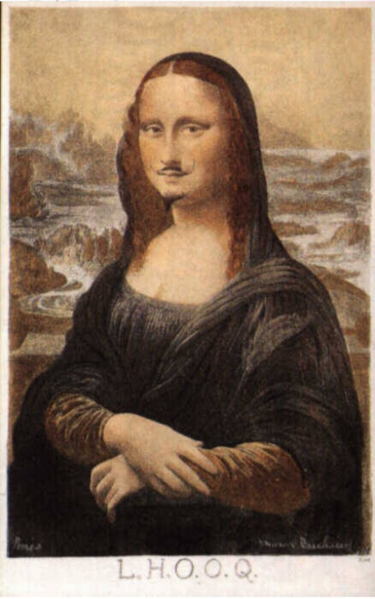
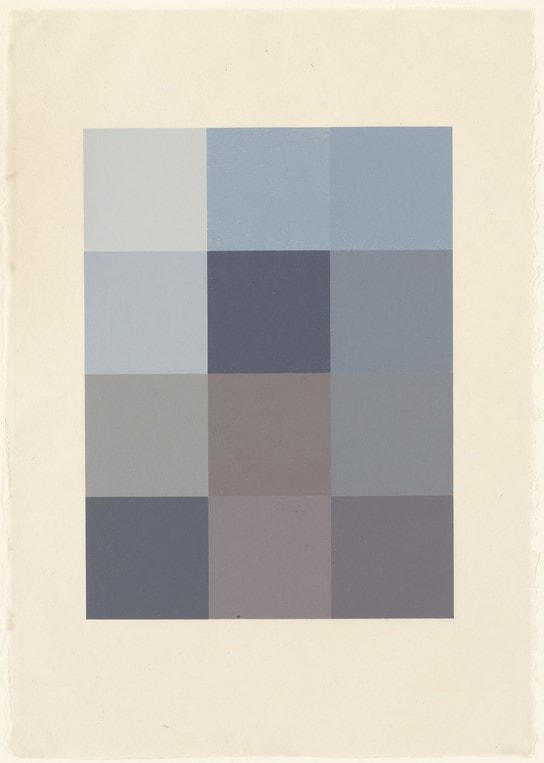
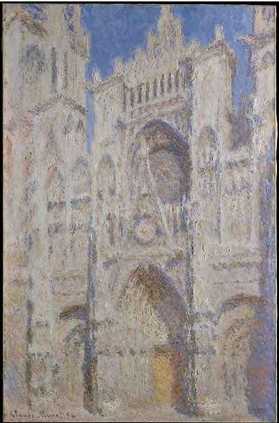
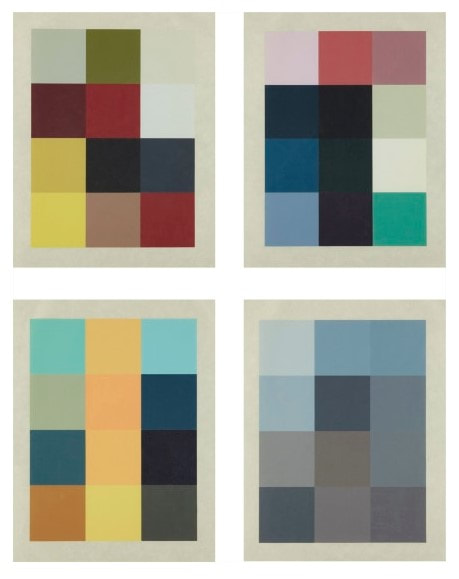
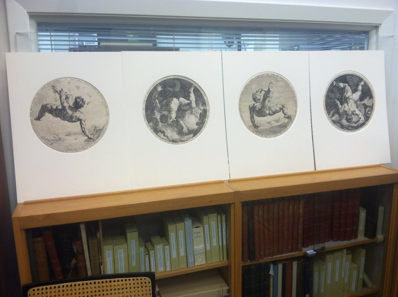
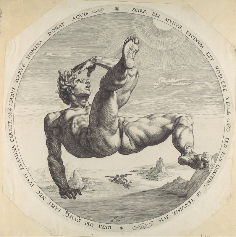
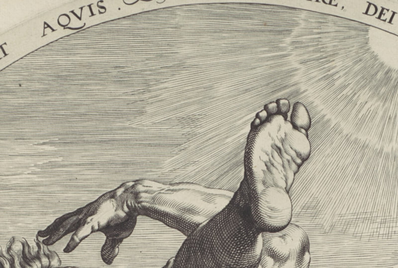
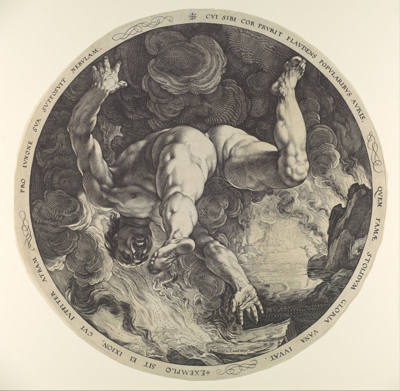
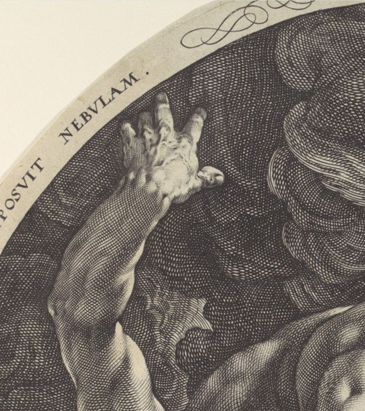
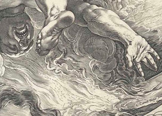
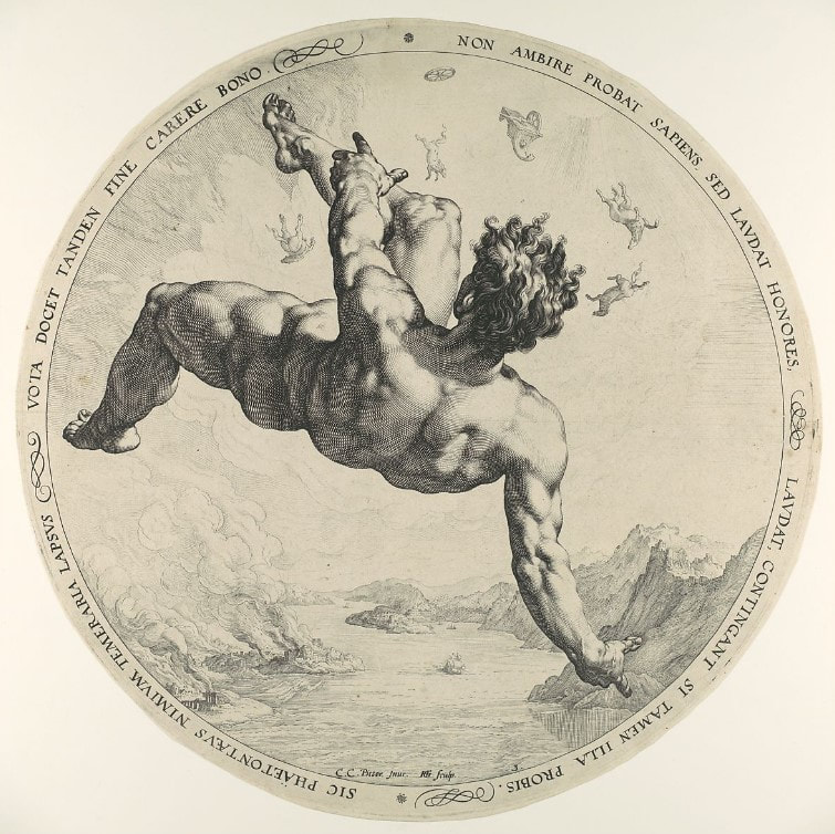
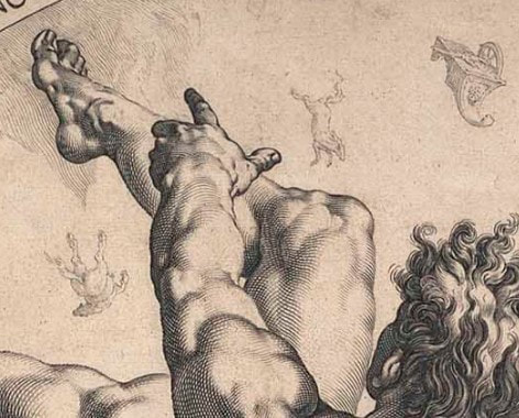
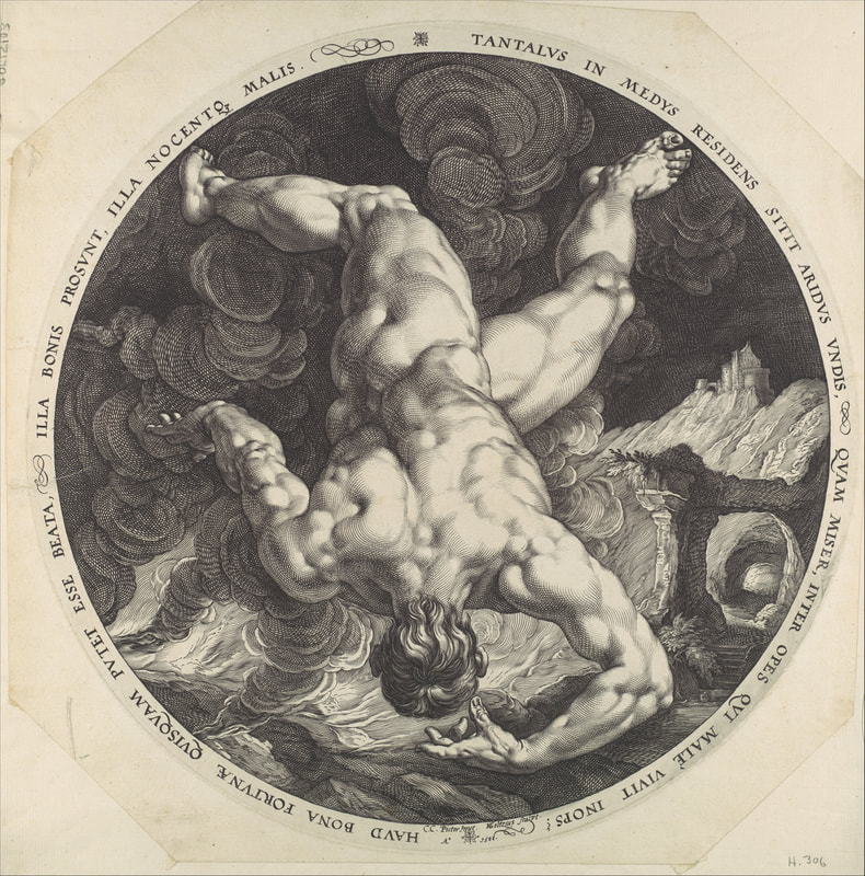
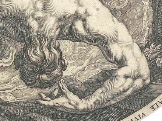
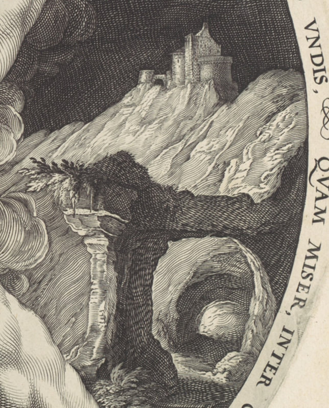
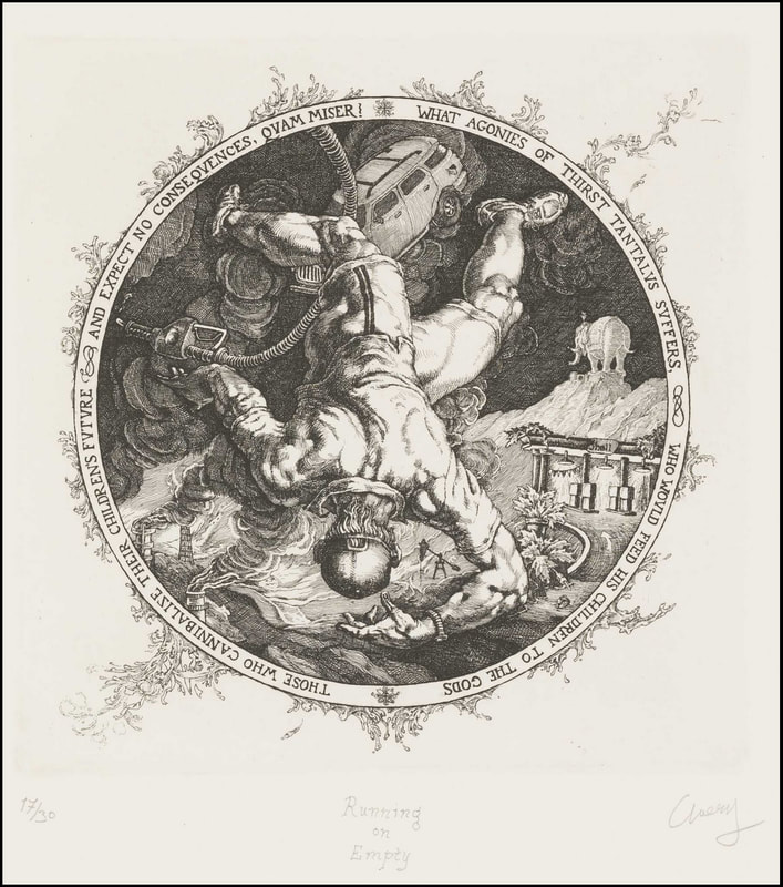
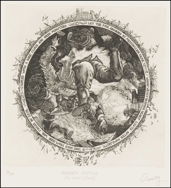
Meltdown is a portfolio of four woodcuts by Levine who is best known for challenging ideas of authenticity and originality. She often uses appropriation, either specifically or generally, as well as art history as a central element. Meltdown combines many of these concerns. The four woodcuts were printed by Maurice Shanchez at Derrière L’Etoile Studios, and the portfolio was published by Peter Blum Editions. Each print consists of twelve squares of color. They are, in my mind, purely beautiful, but they also offer up serious layers and conceptual rigor. In the project’s first step, reproductions of four works of art—paintings by Ernst Ludwig Kirchner, Piet Mondrian, and Claude Monet, plus Marcel Duchamp’s altered postcard of the Mona Lisa—were scanned from art history textbooks and a computer algorithm averaged the colors in each image into twelve pixels. Those twelve colors were approximated (expertly) into various inks and rolled onto square blocks of wood that were jigged together and then printed. So, we have the original artwork, the photograph taken of said artwork, the image as it was reproduced in an art history textbook (or other source), which was scanned to produce yet another derivation of the image. Only then does the human hand and eye of Maurice Sanchez step in to mix the inks. Then, to top it all off, the images that have been pushed through these multiple steps end up as woodcuts, the oldest, least techno form of printmaking. Plus, think about how many actors are in this play. There is the artist of the original painting (Kirchner, Monet, Mondrian—Duchamp is a special case, more on that in a sec, plus Leonardo), the photographer of the original work of art, the person and technology that created the halftone version of the photograph that would appear in a textbook, Levine who scanned the images, the computer program that averaged the colors, Sanchez who approximated those colors, and us, the viewers who bring our own perception to viewing the prints. With the after-Duchamp woodcut, there’s a whole other level of remove from Duchamp’s starting point back to the Mona Lisa. Those are a lot of layers. And let’s not forget that you are seeing a reproduction on your screen that is several steps beyond the original woodcuts. Levine is commenting on the varying nature of reproduction and appropriation of others’ images. How true is any translation of an image in one mode to another? At every stage of the trajectory the colors could have shifted to something else, either wildly or with great subtlety. It all feels extremely random and intentional all at the same time. And the bonus: in the end the prints are just so dang beautiful. Maybe you CAN have it all. Ann Shafer While teaching young artists about prints, it’s easy to think they won’t respond to works made before 1960, but they can and do. There is a quartet of engravings from 1588 called The Disgracers that were always a highlight in Tru Ludwig’s History of Prints class. They are by Hendrick Goltzius and portray four male nude figures falling. Each engraving offers a muscular male in different views of nearly the identical pose. The four men are Icarus, Ixion, Phaethon, and Tantalus. Each of them had tried to enter the realm of the gods and were sentenced to eternal torture for their hubris. Kinda like the ancient Greek version of the fall of man.
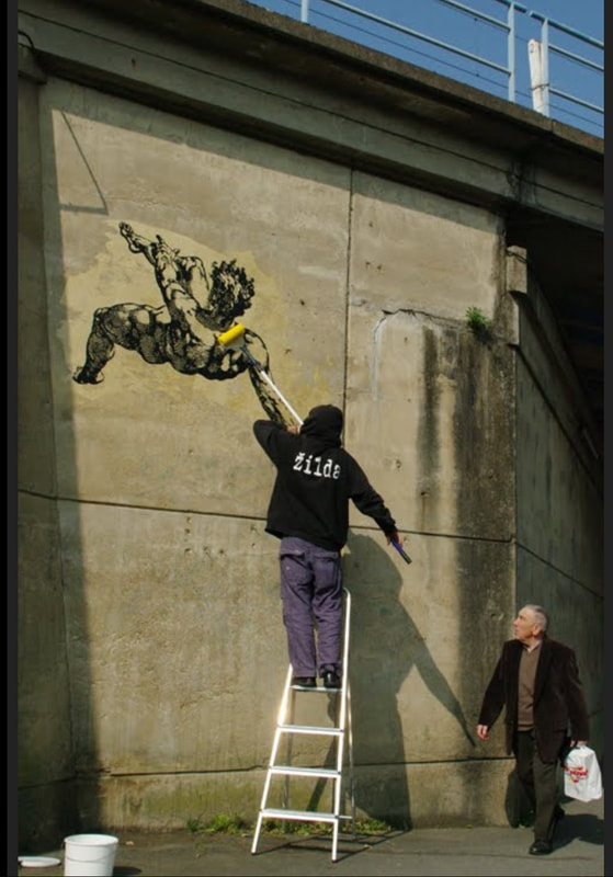
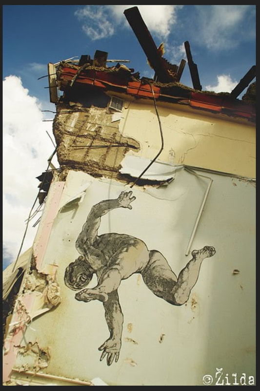
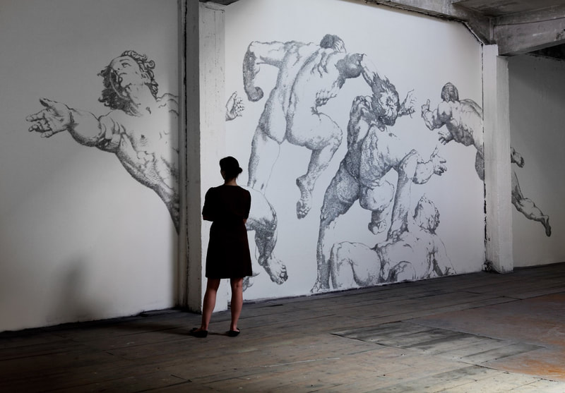
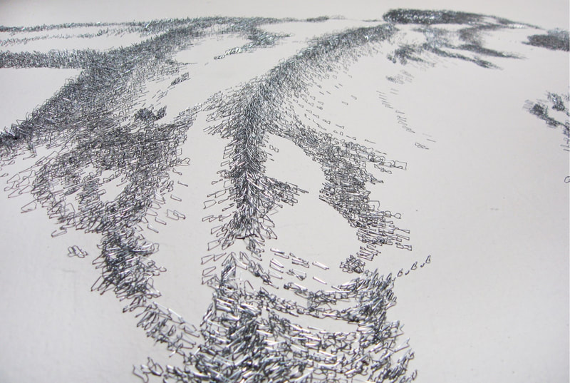
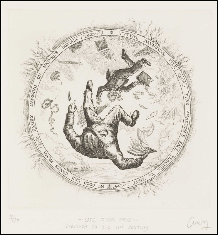
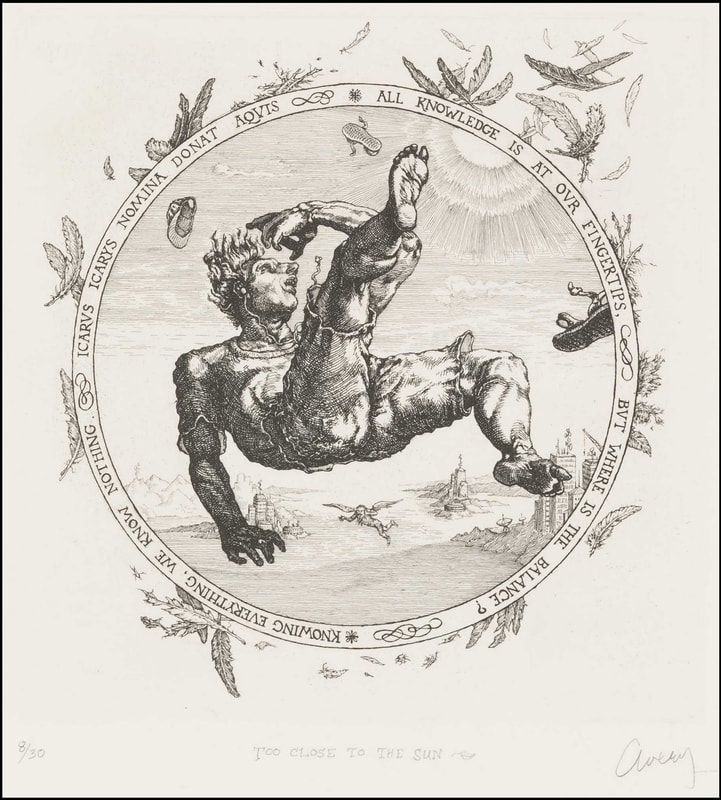
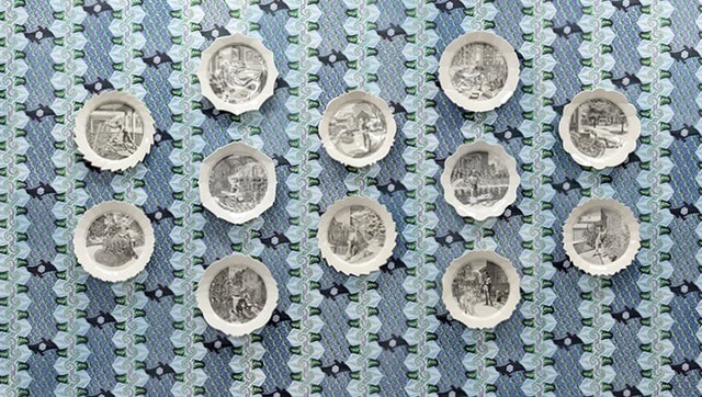
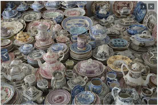
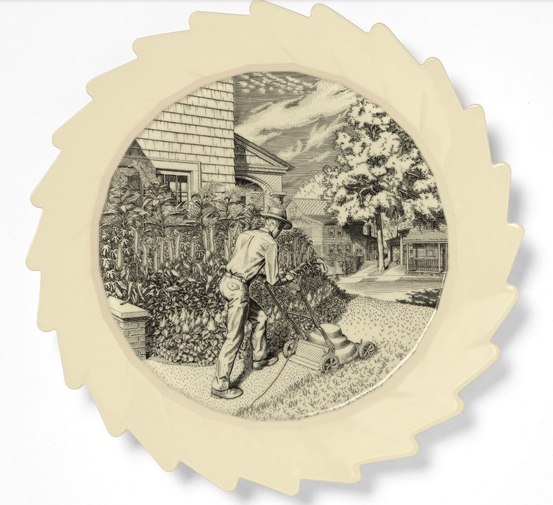
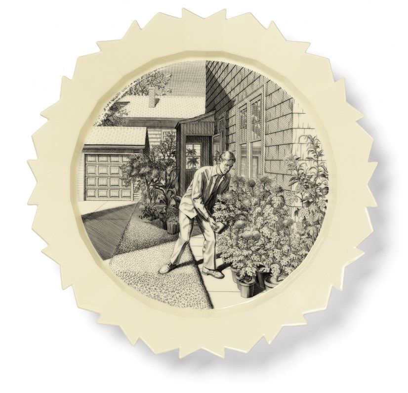
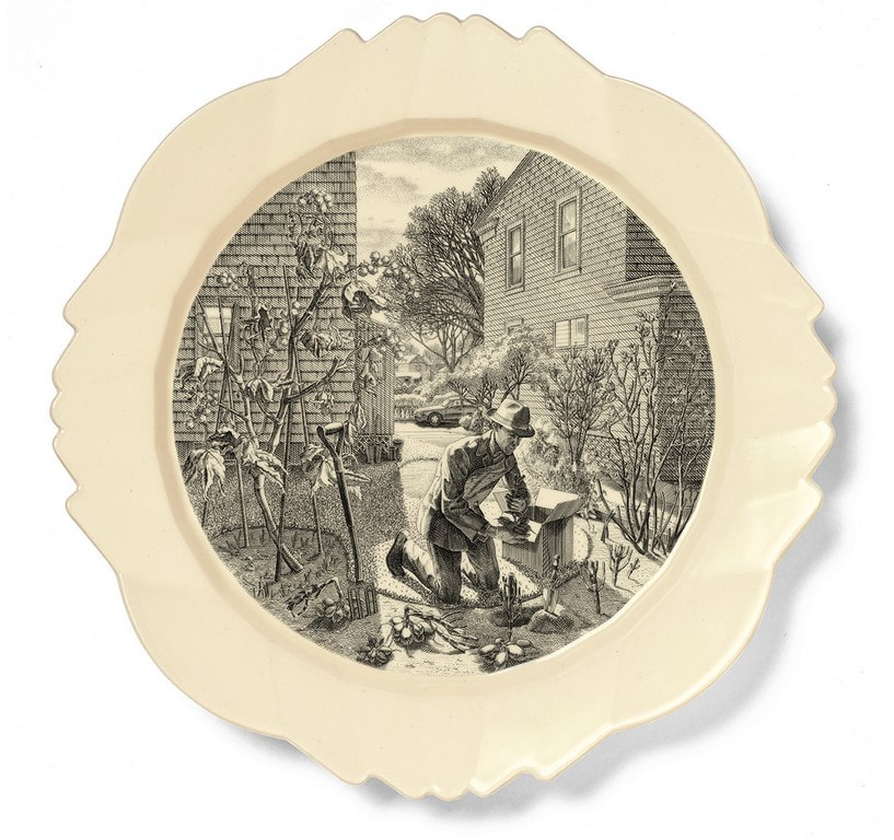
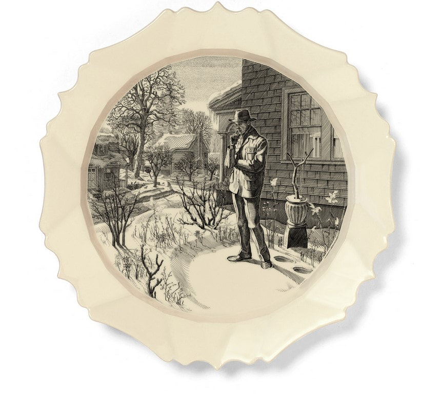
I’m guessing the students reacted to the same things I do in the prints: the artist’s audacity in portraying figures with such weird and difficult foreshortening; describing textures and patterns with surprisingly regimented engraved marks; giving a convincing sense of falling; portraying gentlemen-bits, as it were. (I can’t recall another example of such views of male nudes. Let me know if you can.) I also respond to them as a captured moment that tells the whole story of each flawed character without much context or narrative. I love the tondo shape (why aren’t they referred to simply as round?), and the text that runs around the circumference. It’s almost like we are looking through a telescope at them falling through the sky. The perspective and compositions are so startling after looking at standing figure after standing figure, they always elicited oohs and ahhs from the students. One might think the set of four would come to the museum together, having been originally collected as a group. But when I arrived at the museum there were only three of the four already in the collection and they all were, oddly, from different gifts. The missing print was Phaethon. I’m sure I wasn’t the only curator ever to work in the collection who kept an eye out to acquire the fourth print, but it took seven years to find one. It was like finding the long-lost last piece of the puzzle, and it still makes me expel a long sigh to think of them all together. There is just something wonderful about being able to show all four to students and visitors in the study room. The Disgracers are so well known to scholars of Western printmaking, you don’t even need to mention the artist’s name. Subsequent artists have been inspired by their compositions and messages and have borrowed from them to create their own take on them. For instance, there is a street artist in France named Žilda whose 2010 Liber Casus features wheat-pasted paintings of falling figures installed on buildings and bridges in Paris, Rennes, and Belgrade. And there is another artist, Baptiste Debombourg, who in 2012 created a mural based on Phaethon from The Disgracers using many thousands of staples. Yes, staples. Lawrence Goedde sums up their use of the falling figure well: “For both, the artifice of Goltzius’s series clearly provokes, intrigues, and challenges as they adapt his imagery to new purposes. Žilda sees the falling figures pasted high above passersby in urban settings as destabilizing the familiar world of the streets, provoking reflection on falling as a metaphor for the necessity of risk-taking amid the general indifference and banality of ordinary life. Debombourg finds in the heroic scale of Mannerist male nudes a metaphor for societal, and especially male, violence as seen in popular super-heroes, an aggression and familiarity that he sees as echoed in the way staples are driven into board and their utter ubiquity.” (https://apps.carleton.edu/kettering/goedde/) While Žilda and Debombourg’s Goltzius-inspired works are not prints, a third artist, David Avery, created a set of four etchings that stays closer to Goltzius’ scale and compositions in their inclusion of the text around the circumference of each. But Avery has changed the characters in order to comment about issues facing us today. Safe, Clean, Cheap: Phaeton in the 21st Century, 2011, highlights issues of the environment and its imminent destruction at our hands. Too Close to the Sun, 2013, points at human’s problematic fascination with phones and screens. Running on Empty, 2016, critiques America’s dependence on big oil. And the last in the set, Mendacia Ridicula, 2018 (Latin for ridiculous lying), satirizes politicians and the divisiveness that has come from all that lying. I appreciate it when artists look to historical examples. It reinforces the idea that they know upon whose shoulders they stand. Wouldn’t it be cool to pull together a group of contemporary works with Goltzius’ engravings for an exhibition about inspiration and artistic heroes? I’m sure there are more examples of artists looking at The Disgracers. Let me know who comes to mind. There is deep richness to be found in the history of prints. Lucky for us, there are plenty of places to see prints like these and many curators and scholars who are happy to talk about them. Ann Shafer Prints pop up everywhere. But did you ever expect to eat on them? Engravings of bucolic scenes, flora, and fauna have been transferred to ceramics since the technique was developed in England in the 1750s. Highly decorated dinnerware was previously hand painted, costly, and meant for the aristocracy. As a way of getting decorative serving sets to the growing middle classes, the transfer process was developed and has been used ever since. You probably have some in your cupboard even now.
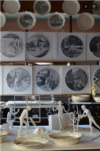
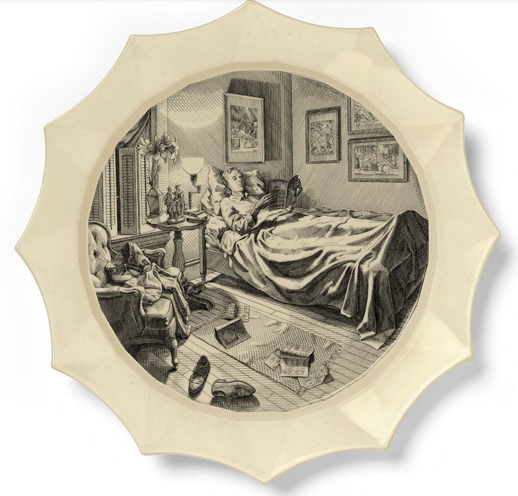
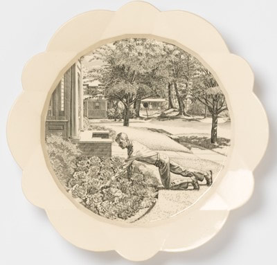
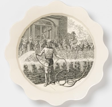
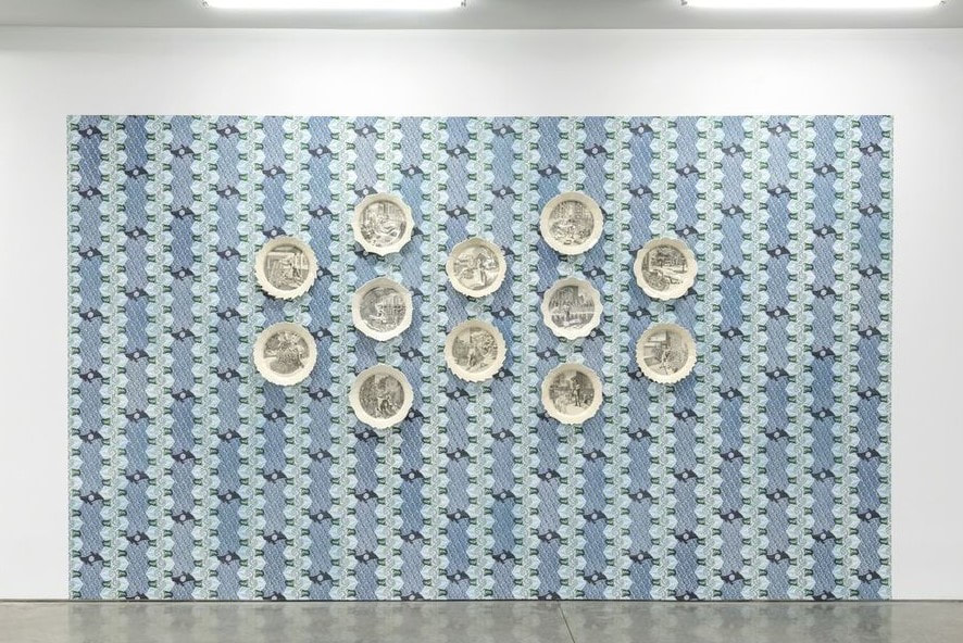
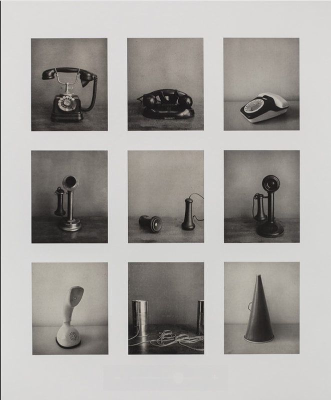
Andrew Raftery, one of very few contemporary engravers, has collected transferware for a long time as he contemplated creating a set of dinner plates of his own design. Eight years in the making, Autobiography of a Garden on Twelve Engraved Plates was finally released in 2016 (the set was published by Mary Ryan Gallery). The set of twelve plates represent the twelve months of the year, each showing Raftery engaged in thinking about, planning, and working in his garden. Raftery’s process is extensive. Scale models of each scene were made, studies and grisaille drawings were executed, and each plate’s shape was designed by the artist (each shape is unique). And that’s before he began engraving the copper plates, a laborious process in itself. No wonder it took eight years to complete the project. Oh, and he designed wallpaper that the plates may be hung upon. It’s quite an accomplishment. The set was among the final objects I acquired for the museum. Glad to have accomplished that last purchase. Ann Shafer Lately, Carrie Mae Weems’ Untitled (Listening Devices), a photogravure I acquired for the museum in 2015, has been rolling through my mind. It consists of a grid of images of devices that are posed as if having their portraits taken. The image at lower right is a simple megaphone, while next to it is the classic two cans connected by a string. Other squares are occupied by old fashioned telephones. Missing, of course, are references to smart phones of any kind. Might this be a nod to a simpler time? Or is it a nod to that old game of Telephone in which a sentence is whispered person to person resulting in a statement that bears no resemblance to the original. Does it point to ideas about failures to communicate? For me, it reflects both a plea for the simple act of listening and of being tired of talking.
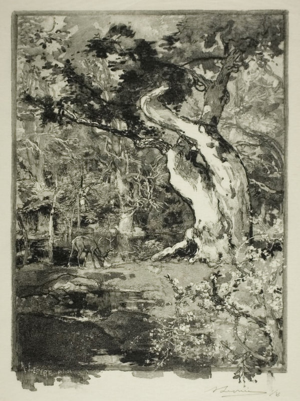
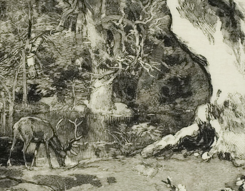
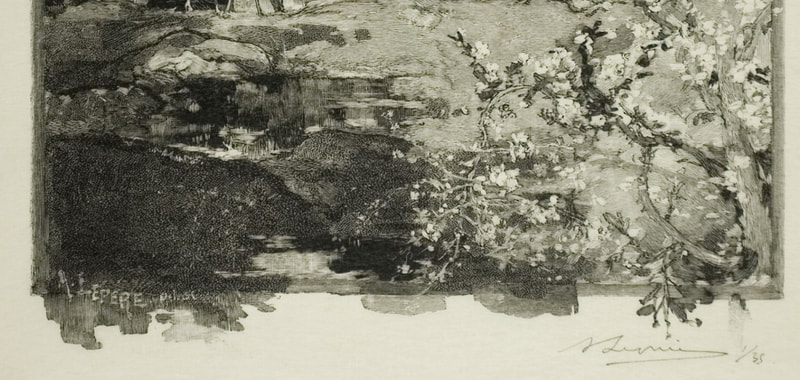
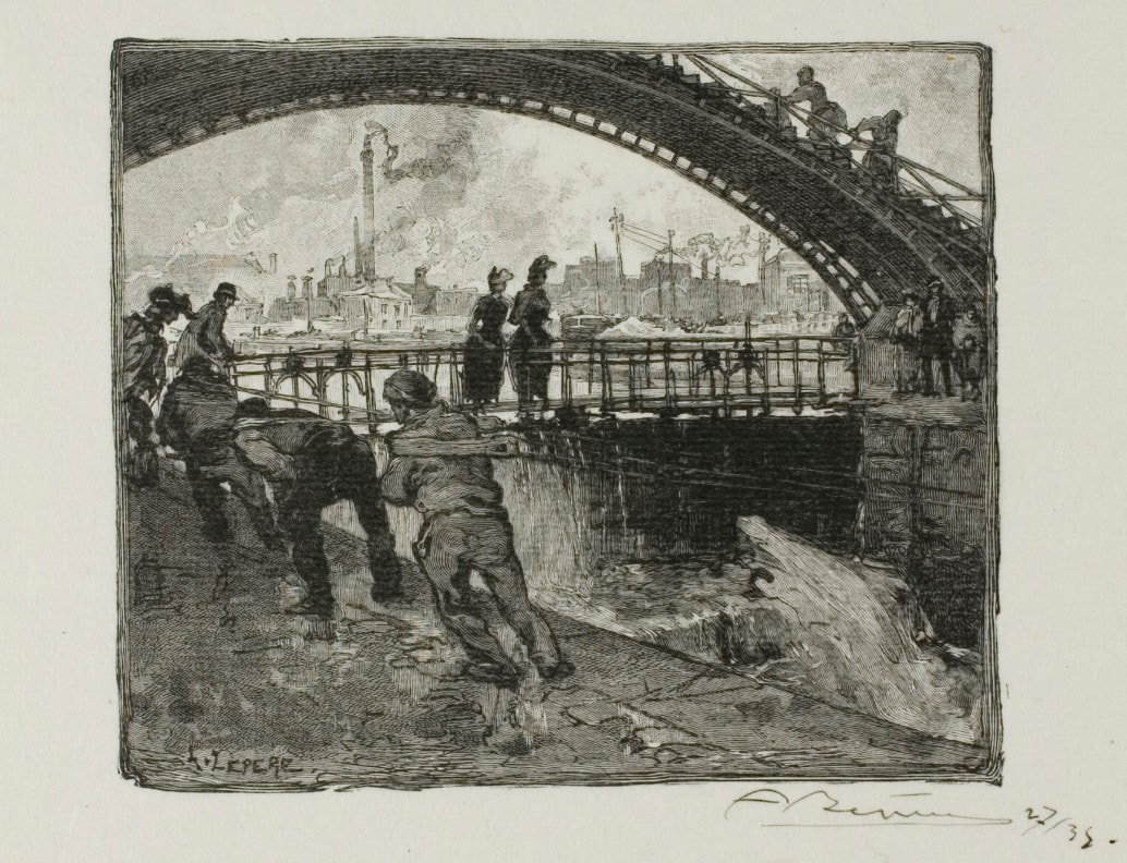
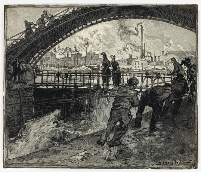
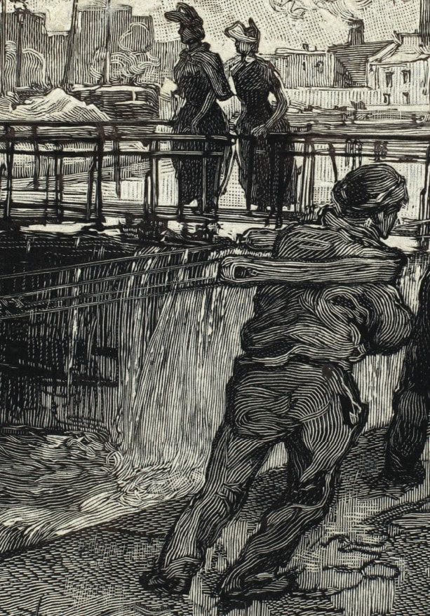
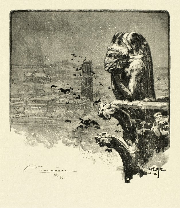
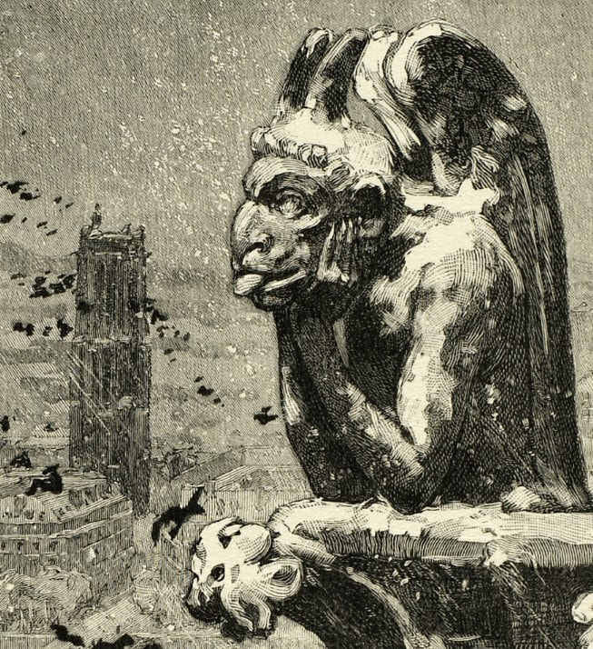
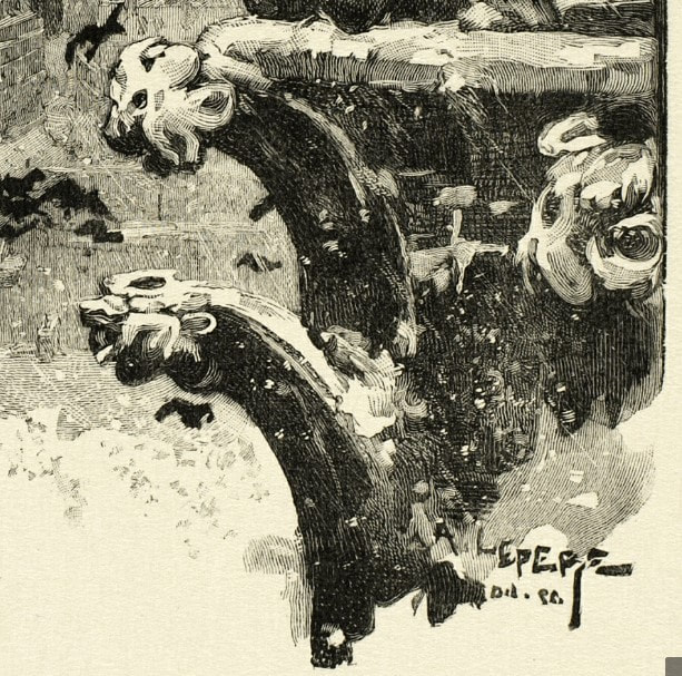
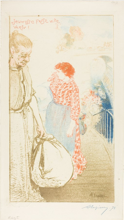
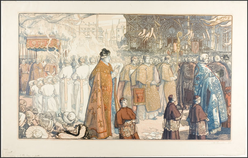
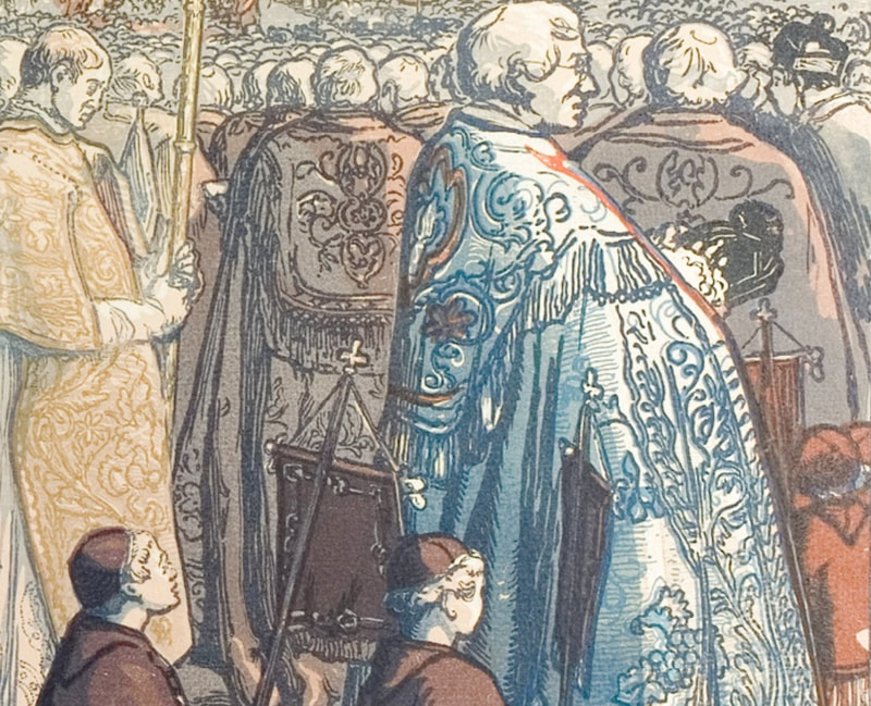
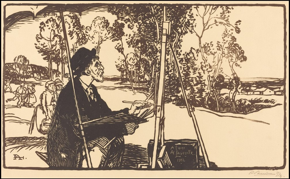
Last summer I listened to the podcast from Serial, Nice White Parents, and was mortified to think of my own patterns of behavior, unintentional or not. It was an important eye opener about my own position of privilege. And recently (thanks to Ben Levy for the recommendation), I listened to a talk by Dr. Meranda Roberts, who spoke about the significance of land acknowledgments in colonial spaces like museums. Learning how to de-center oneself is difficult. It all feels overwhelming, but it is crucial. The reason Weems’ photogravure keeps popping into my brain relates to this distinction noted by Roberts: • White savior: thinks it’s her job to give black women a voice. • White ally: knows it’s her responsibility to listen to the black voices that are already speaking. It’s not up to others to educate us, but it is on us to actively listen when they speak. It is we who need to do our own work. When I pitched this photogravure to my colleagues, I think they thought it wasn’t as representative of Weems’ work as they might want. But I persisted in my conviction that its universal message of listening with intention was equally powerful. I don’t think the museum has had a chance to exhibit the work yet—although I don’t know since I have only returned to the building once since I left. There is so much learning and unlearning that must be done personally and collectively in the art world and museums regarding racism, sexism, pay equity, decolonization, land acknowledgements, and so many other things. And I need to start with me and recognize that it is not about me at all. Carrie Mae Weems (American, born 1953) Untitled (Listening Devices), 2014 Printer/Publisher: Segura Arts Studio Photogravure Sheet: 1308 x 1079 mm. (51 1/2 x 42 1/2 in.) Baltimore Museum of Art: Print, Drawing & Photograph Society Fund, with proceeds derived from the 2015 Contemporary Print Fair, 2015.161 Ann Shafer We’ve looked at many fin-de-siècle artists who made their livings making commercial work for magazines and journals and some who made a living selling fine art prints. But how many artists have we looked at who considered themselves painters who begrudgingly made prints to support themselves? Auguste Lepère was all three.
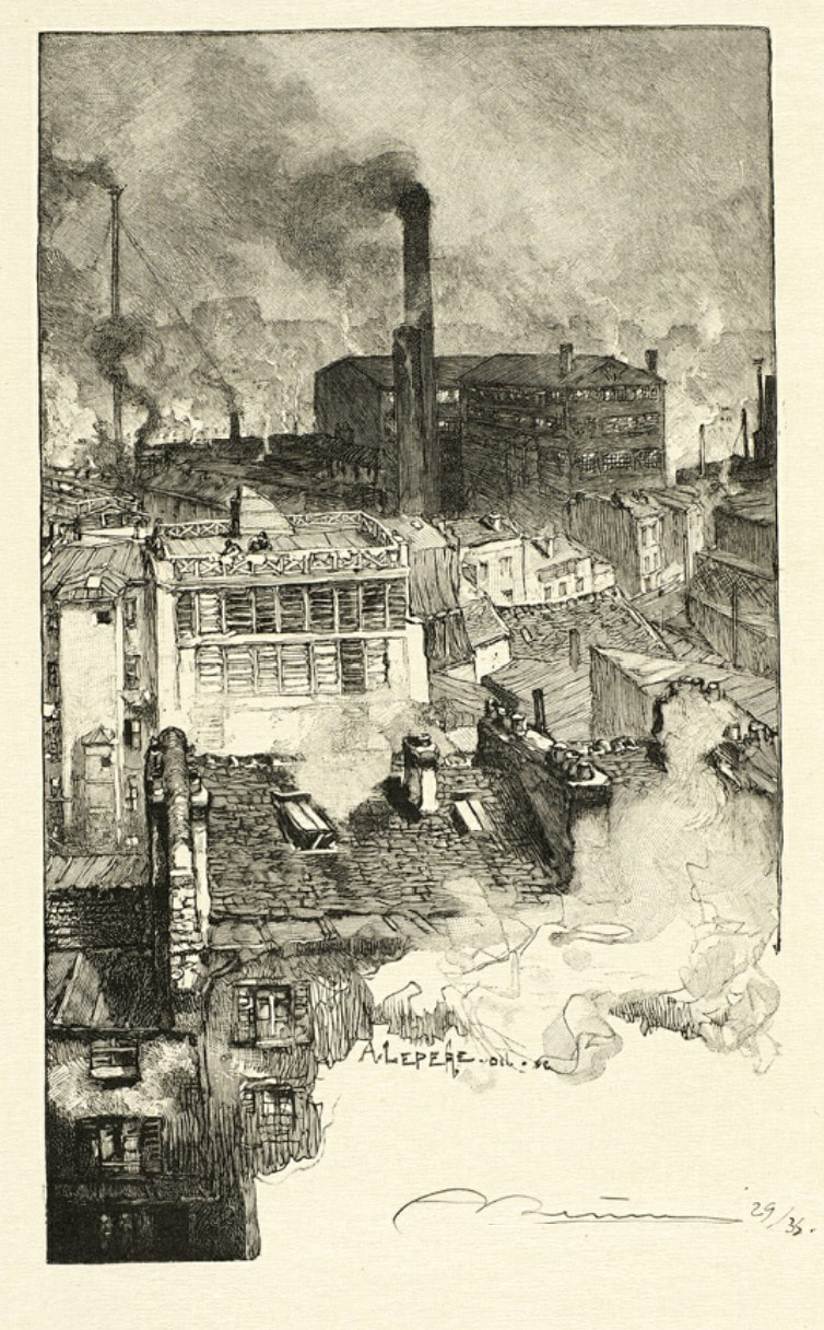
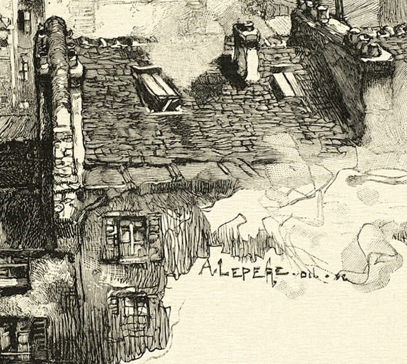
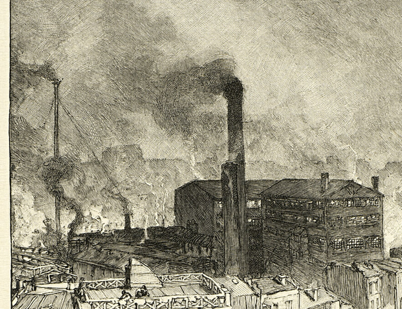
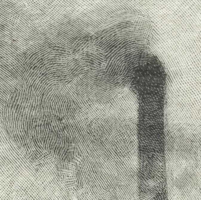
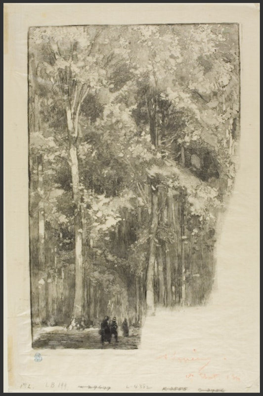
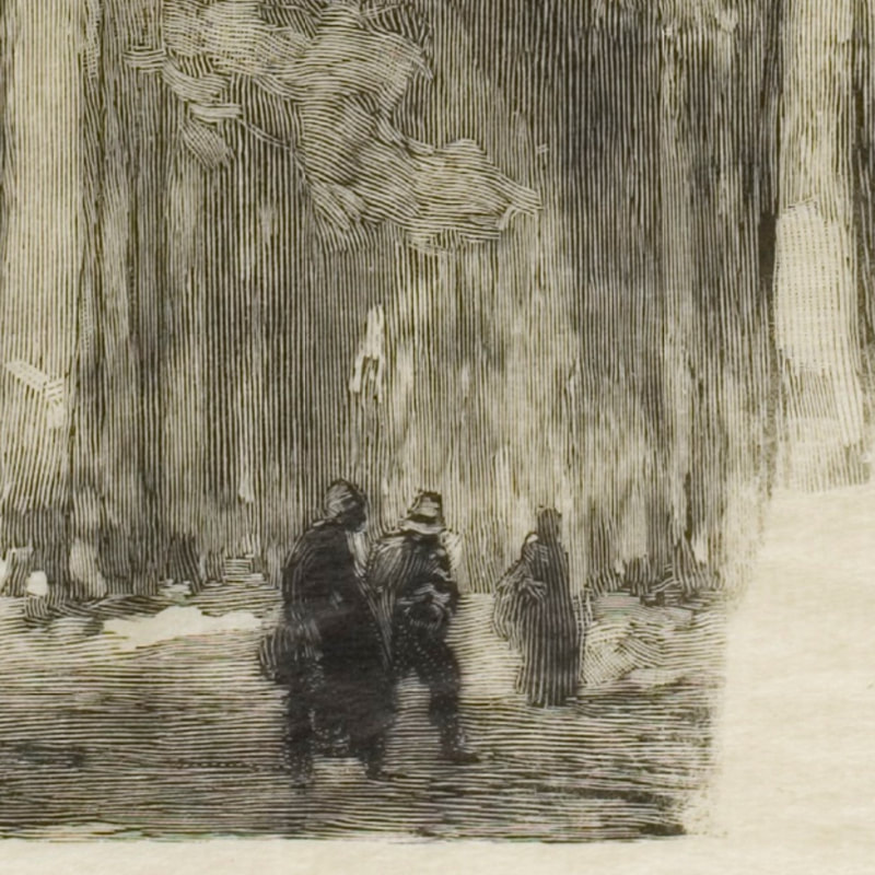
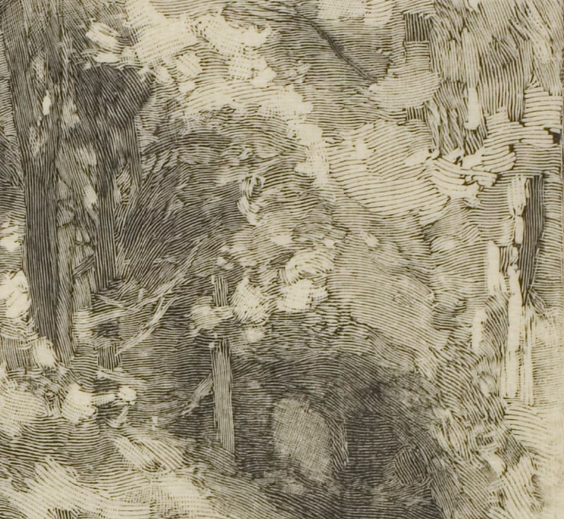
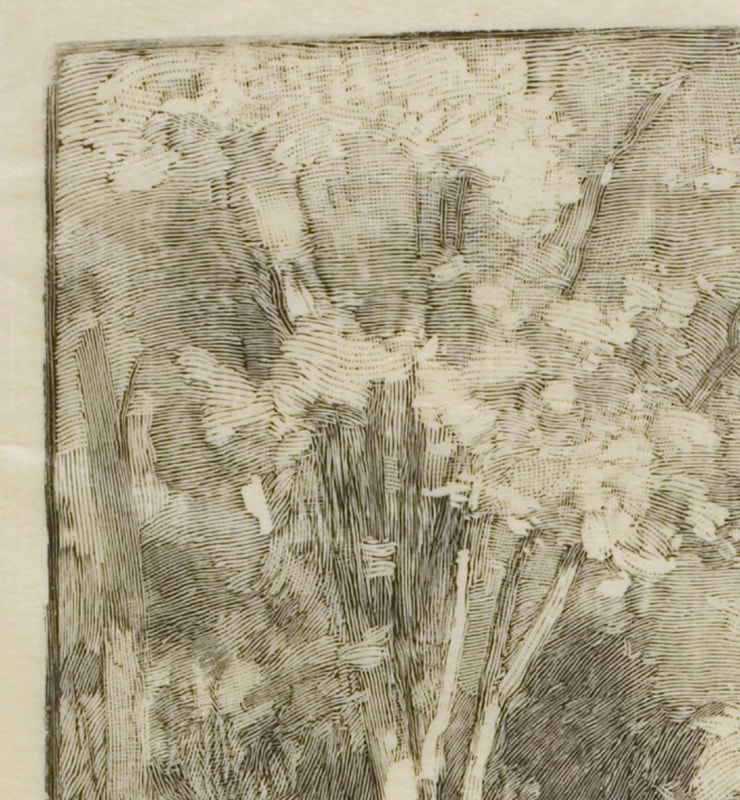
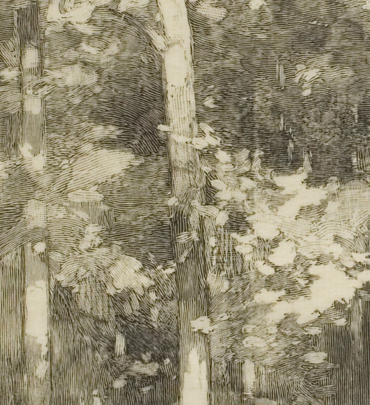
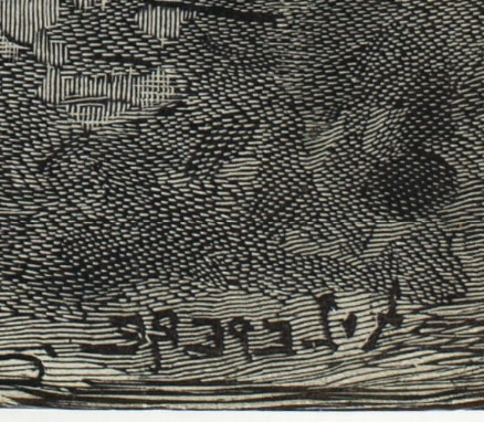
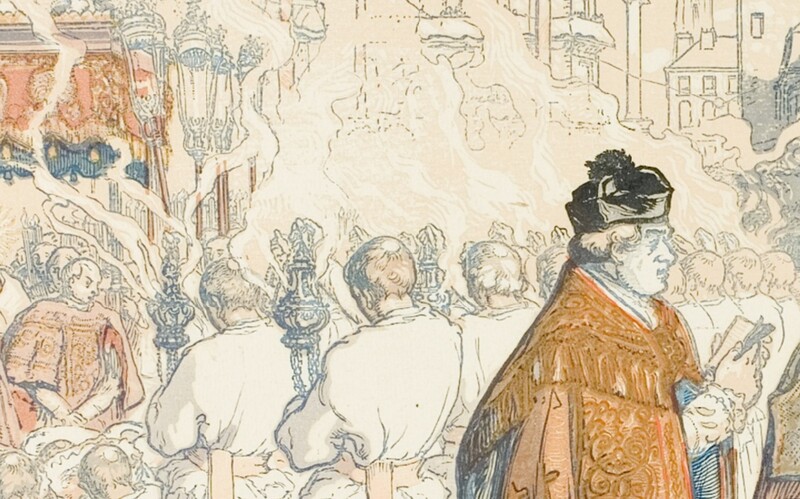
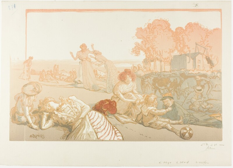
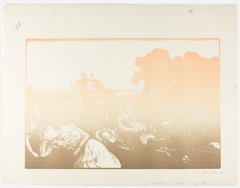
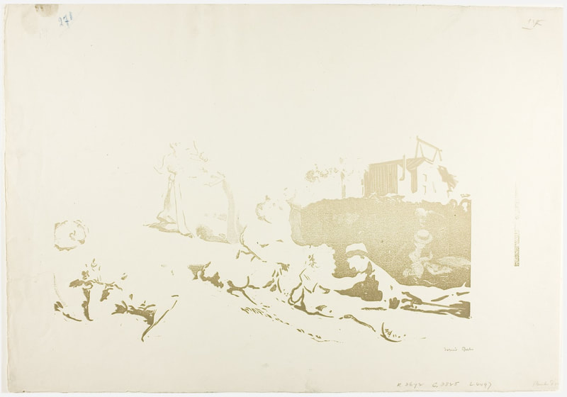
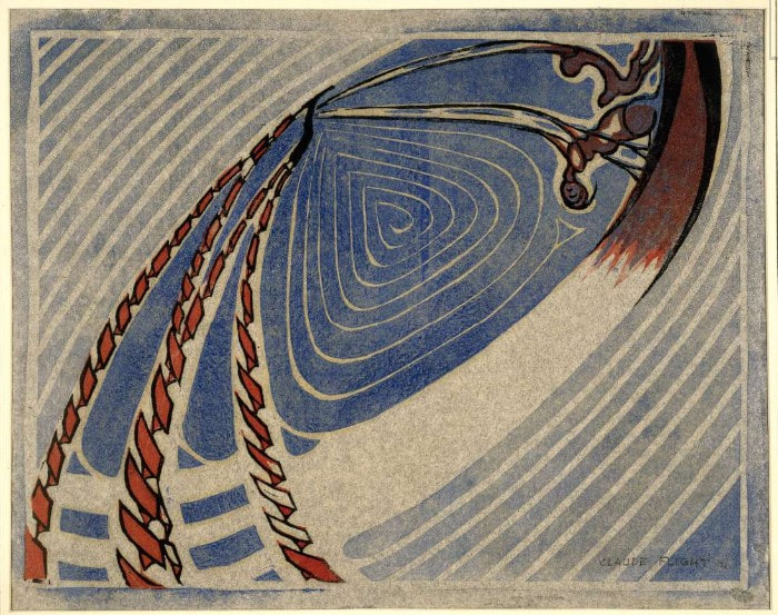
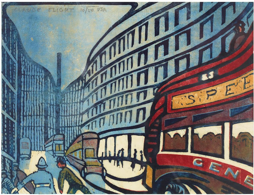
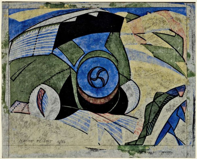
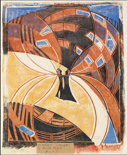
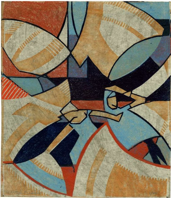
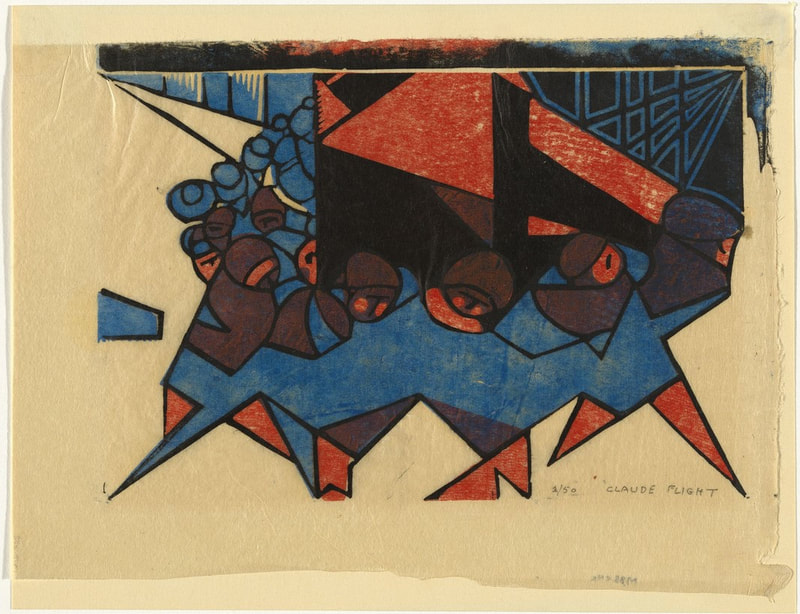
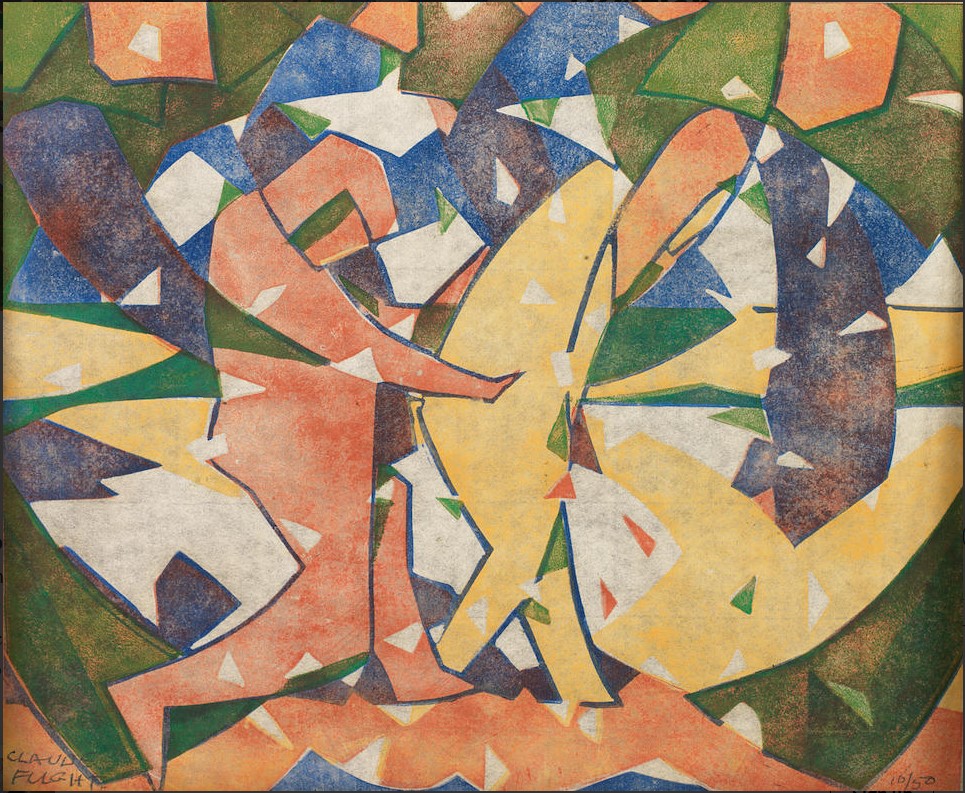
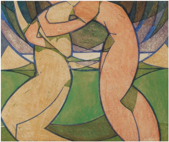
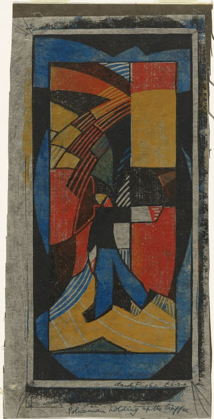
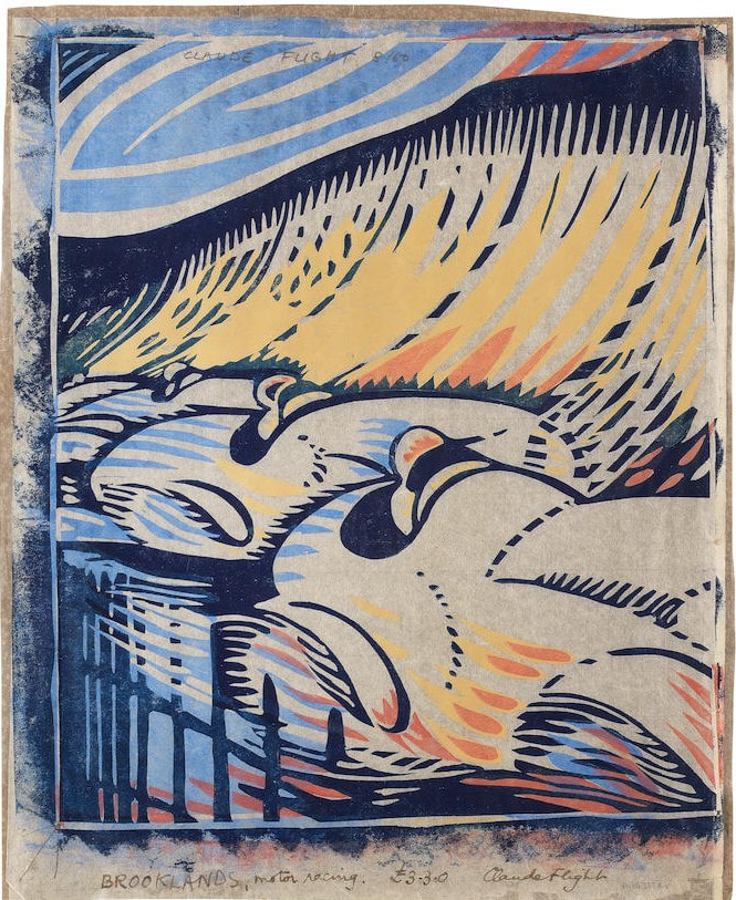
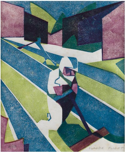
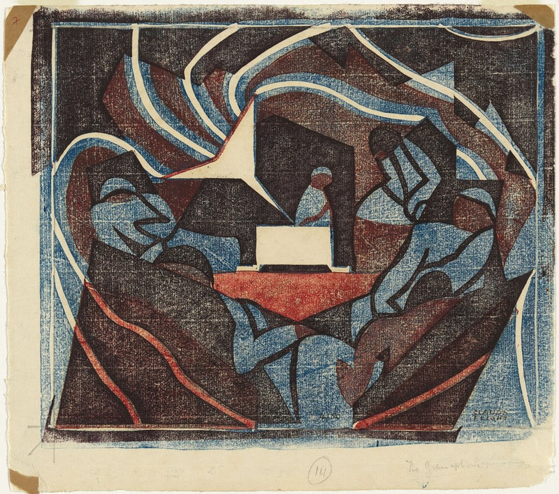
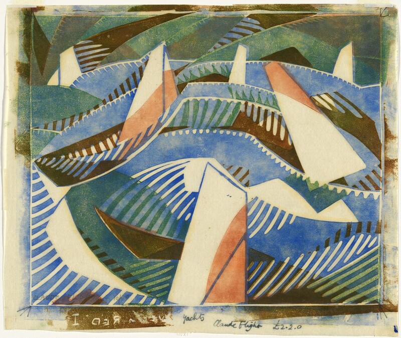
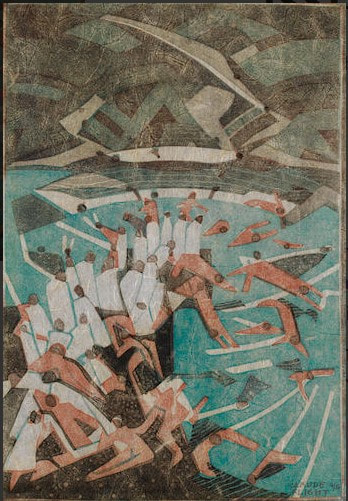
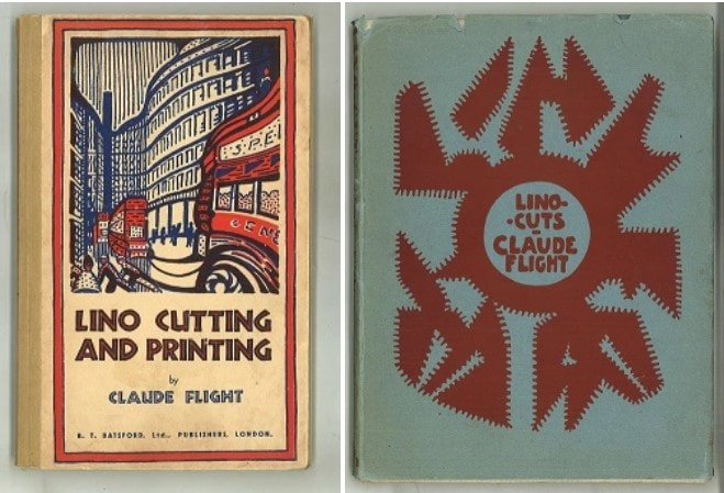
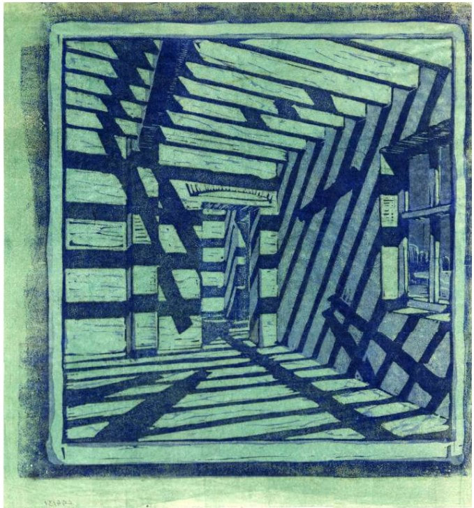
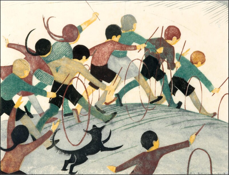
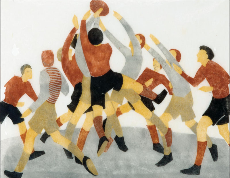
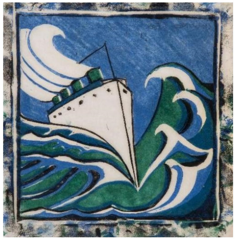
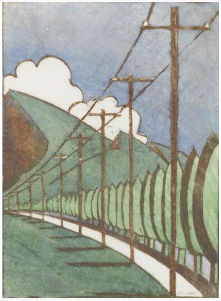
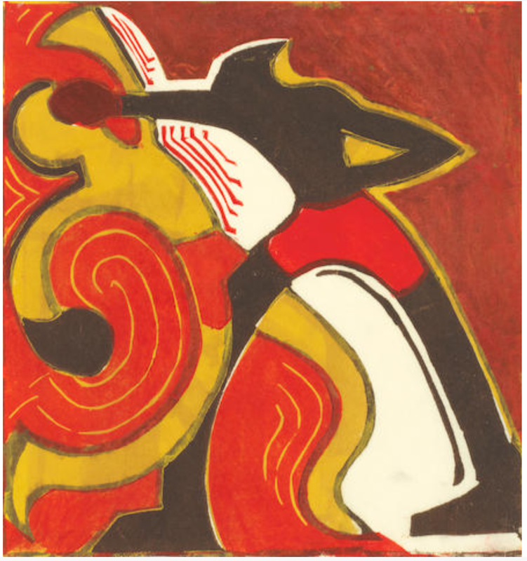
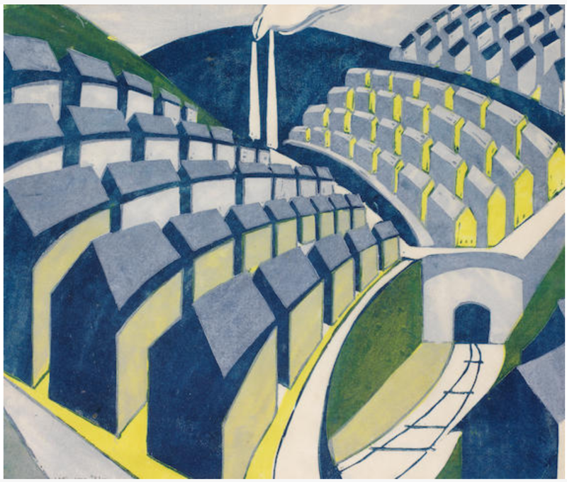
A contemporary critic wrote of his frustration: “To the world, and especially the foreign world, the name of Lepère is chiefly familiar from his engravings and notably his woodcuts. The artist himself, however, considered these merely as auxiliary to his oils. ‘I am, above all, a painter’, he would say remindfully if a suggestion were made to attribute preeminence to his plates and blocks. For originally he had taken up engraving as a breadwinning makeshift, and it was much against his wish that the popularity they won robbed him of the time he would for choice have spent at the easel.” Well, you can’t control what the viewer thinks or likes, can you? Lucky for us, Lepère was an amazing printmaker. He did it all: wood engraving, woodcut, etching, lithograph. Mostly the subjects are everyday life in and around Paris. They range from laundresses and dock workers to a new middle class enjoying a day off in the park. Today, as we are just emerging from a year in lockdown, these Parisian scenes are a balm to my soul. I can’t wait to get on a plane and go enjoy a croissant with my cafe au lait. I happen to love Lepère’s wood engravings, especially those printed on an almost translucent Japanese tissue paper. So delicate. They always stunned students in the study room. I’d hand them a loop and tell them to look at, say, the smoke emanating from a smokestack and their jaws would drop. I included details here, grabbed as best as I could from the web. Take a look at some of them. And there’s a wood block, too. Amazing mark making. Don't miss the Cleveland Museum's sets of studies and the final woodcut toward the end. These all date to 1914 and appropriately reflect the turmoil of World War I. Bucolic escapes are no more. Lepère died toward the end of the war. Ann Shafer Here’s the final Grosvenor School post (for now, anyway), featuring the man who started it all, Claude Flight. I find it fascinating that his work kinda gets at the aesthetic we have come to expect from the group, but many of his prints are wholly different. I would love to have been a fly on the wall in the studio, to see who developed what first, who picked it up, and who pushed who, etc. Imagine being surrounded by so much color and motion.
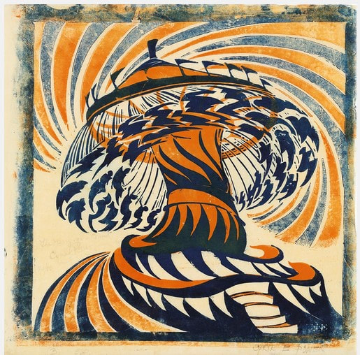
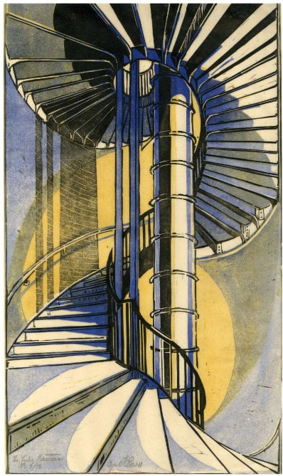
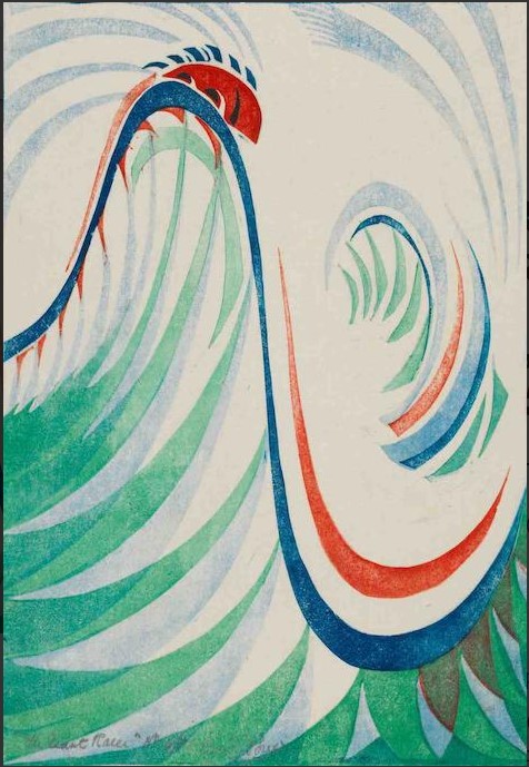
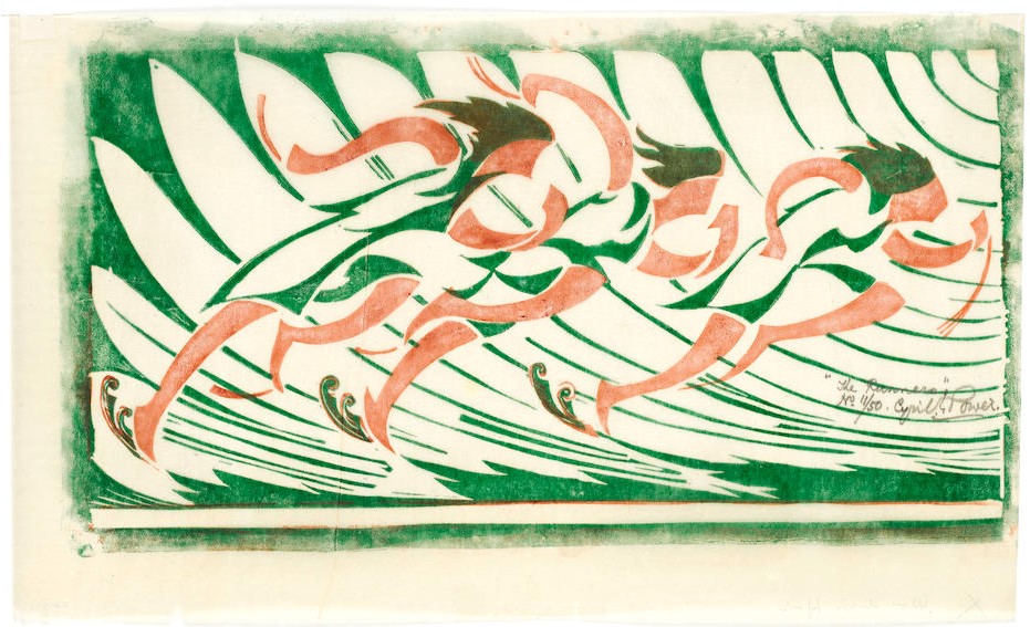
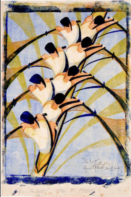
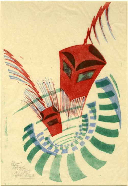
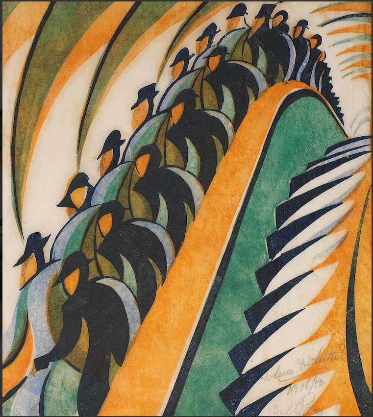
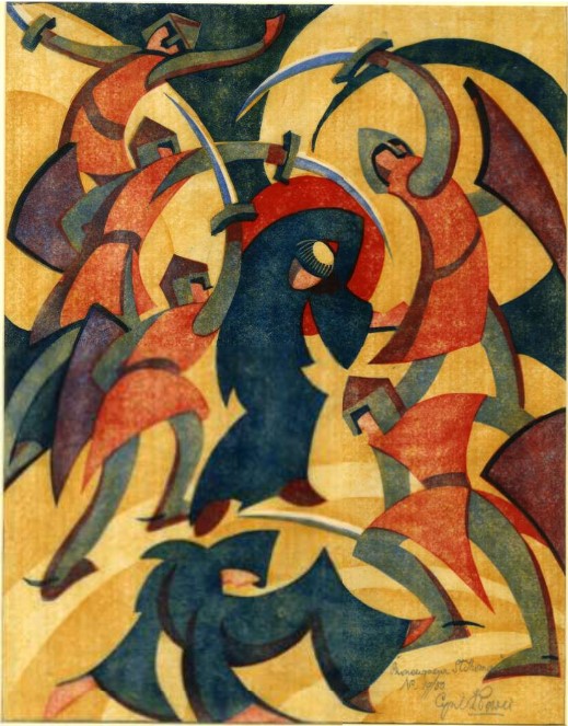
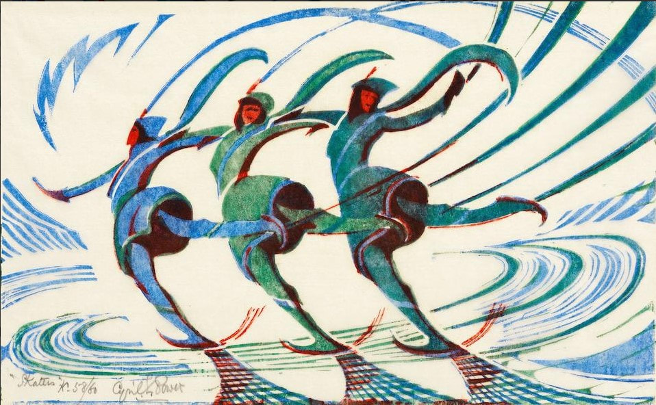
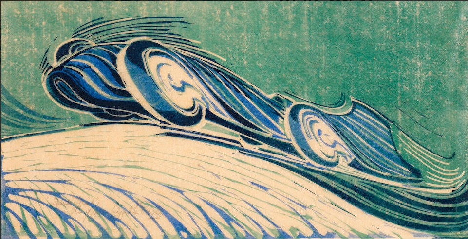
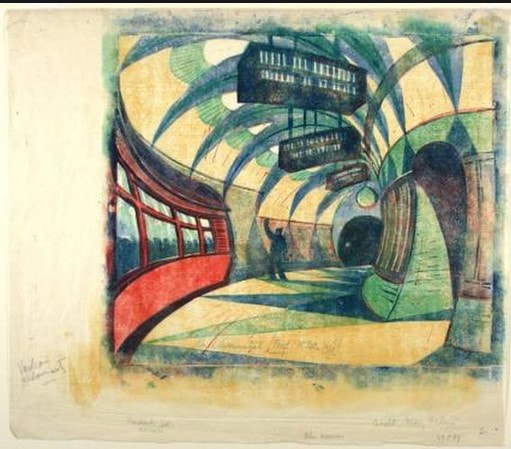
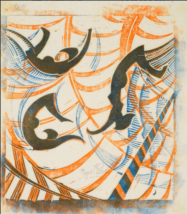
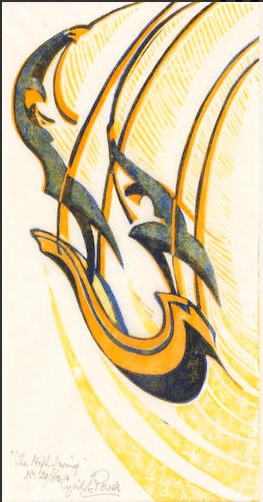
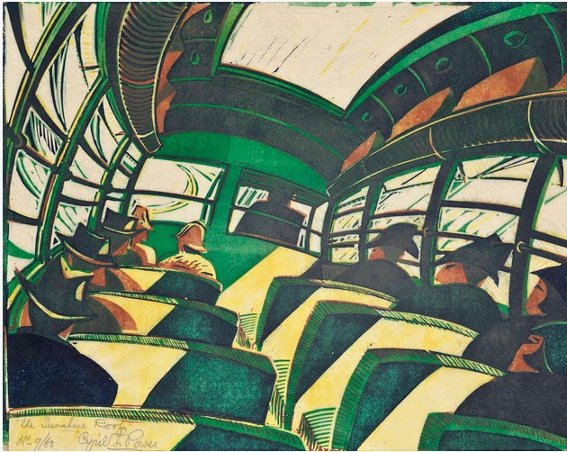
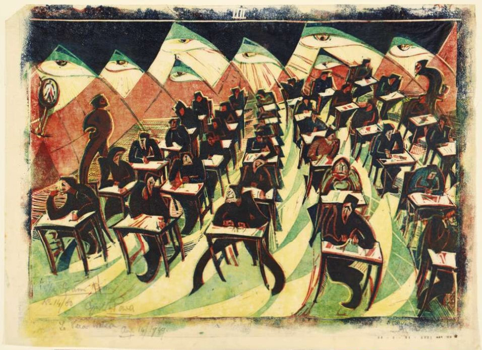
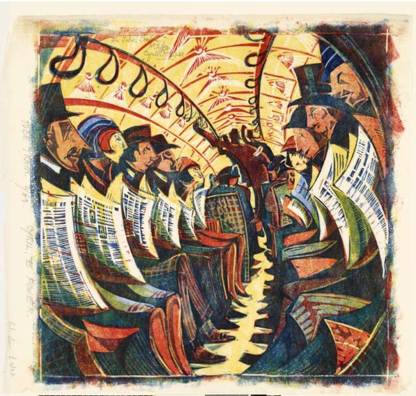
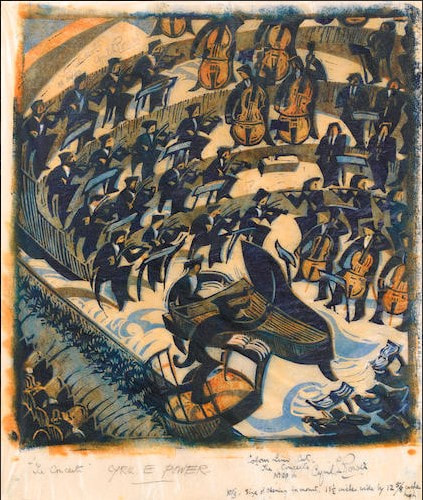
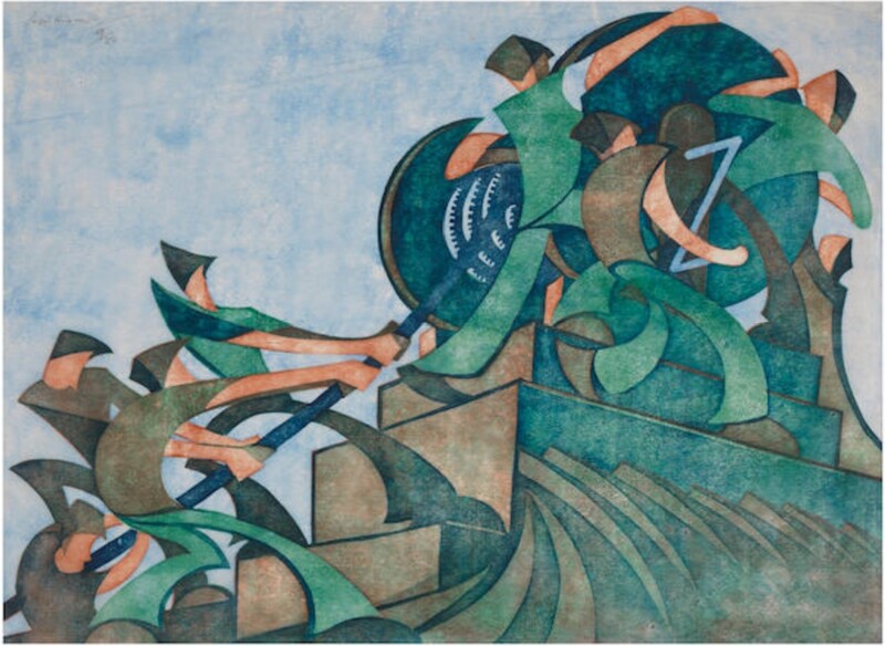
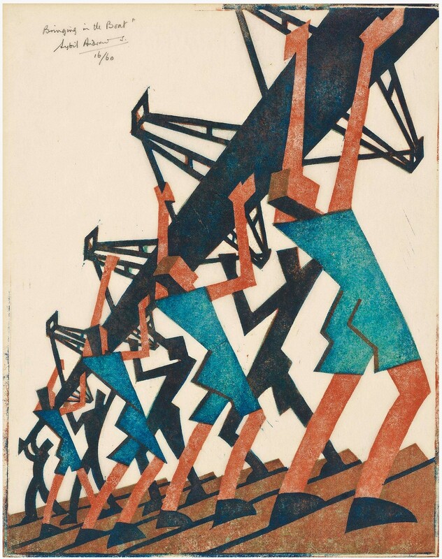
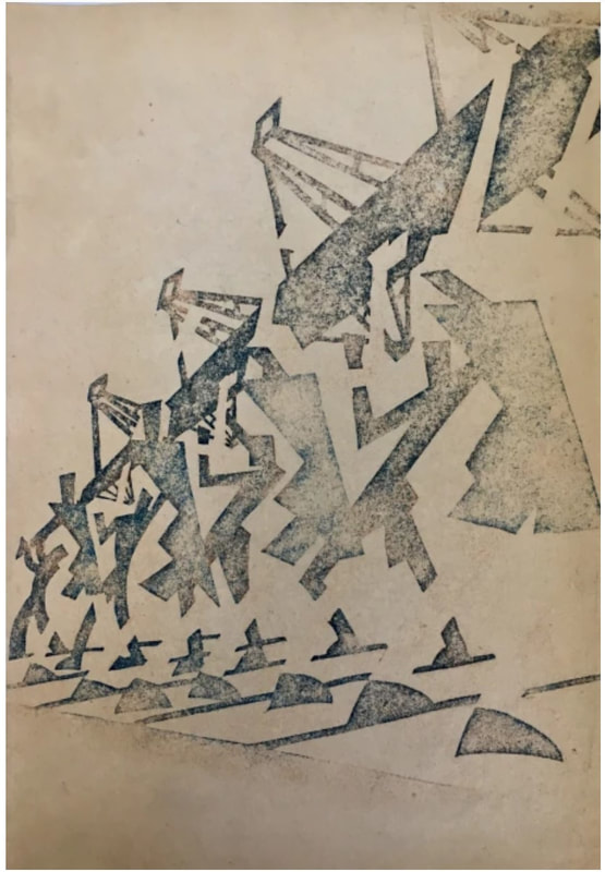
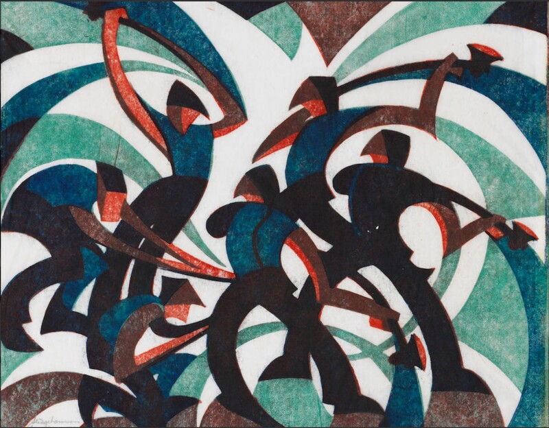
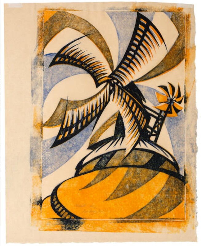
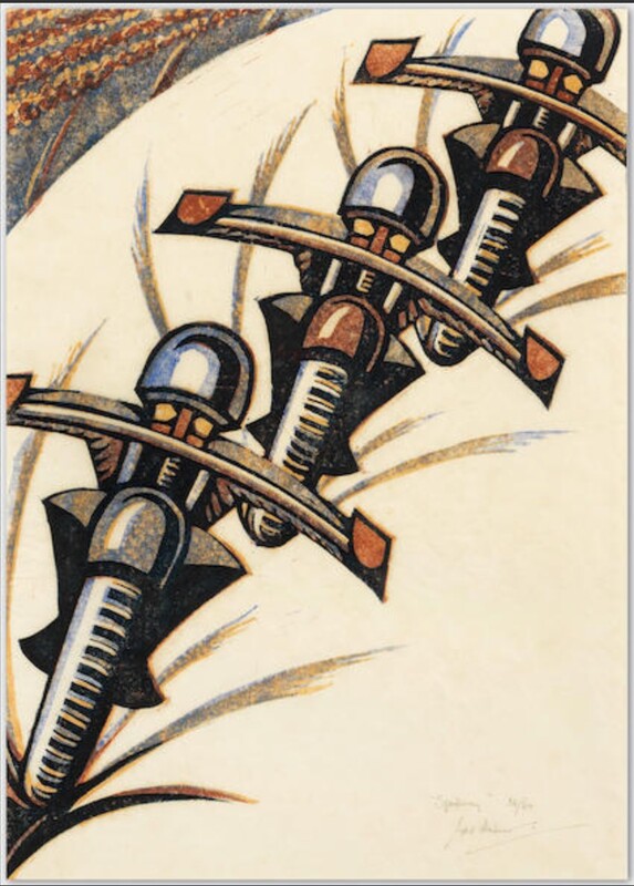
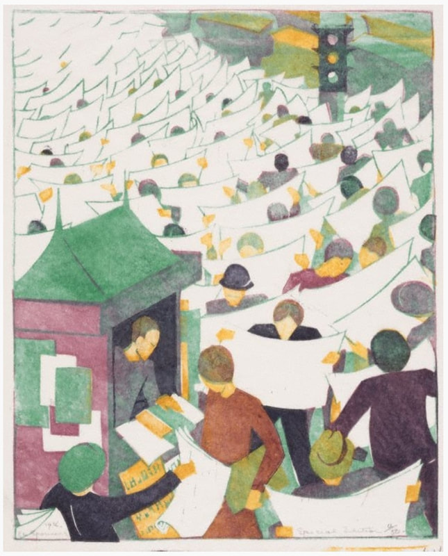
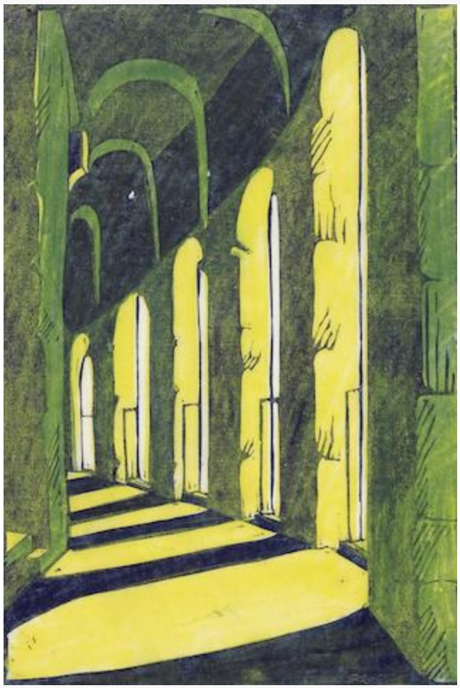
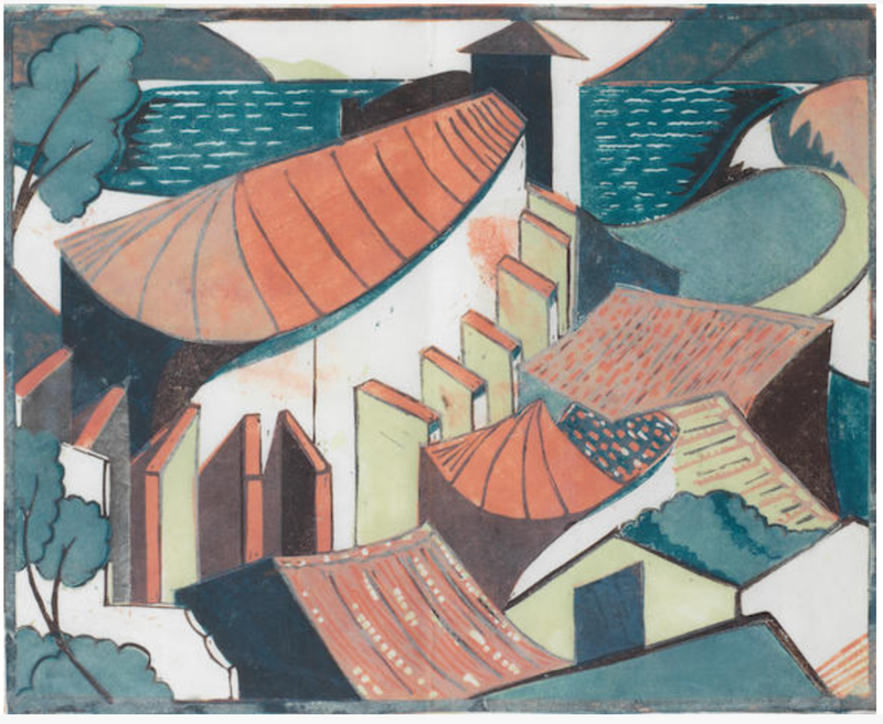
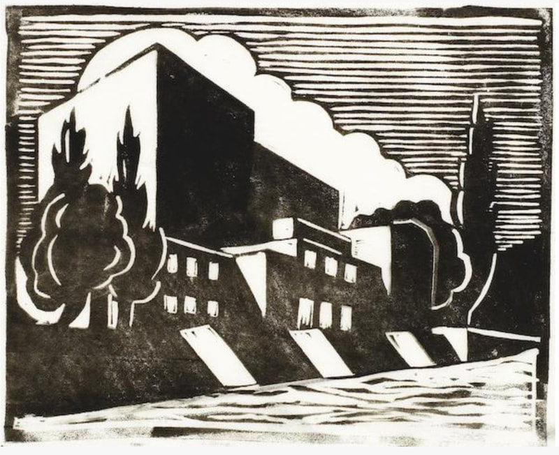
This is what I love about printmaking. Because of the need for shared equipment and supplies, artists work together, side-by-side with like-minded artists. All this togetherness might lead to friendly competition or alignment of sentiment, and the results might lead to unplanned and exciting discoveries. Flight took up linoleum cutting as early as 1919 and fell in love with it. It was easy to procure and not so costly, plus its ease of cutting seemed perfect as a route to making it possible for the masses to be exposed to art. More, cheaper, faster. He saw in it the potentiality of a truly democratic art form. Sounds a little like previous movements that attempted to bring art into every home, like William Morris' arts and crafts movement, doesn't it? Just in an updated, modern way. Here's Claude Flight. Ann Shafer Recently I shared a post about Sybil Andrews, which seemed to strike a chord if the number of likes and shares is any indication. Her multi-color, multi-block linoleum cuts, like those of her compatriot Grosvenor School artists, celebrated modern life in 1930s England. Today we’re looking at linoleum cuts by Andrews’ close friend and studio mate Cyril Power, who focused mostly on modes transportation, particularly the London Underground.
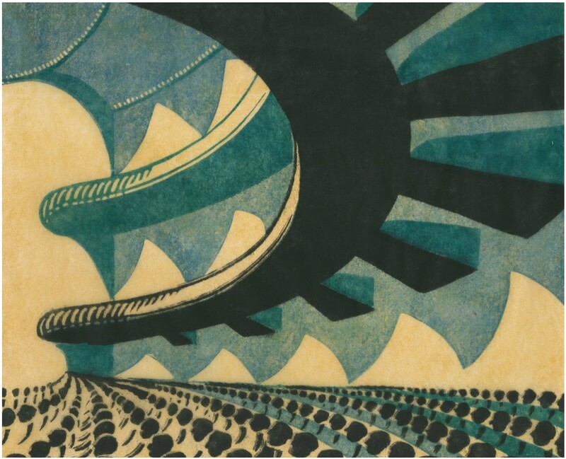
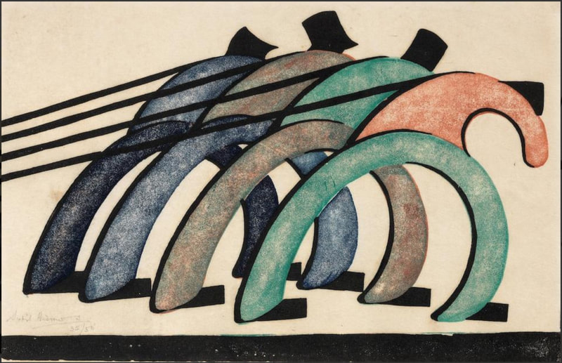
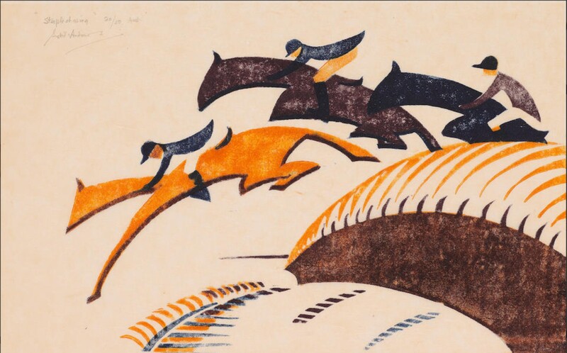
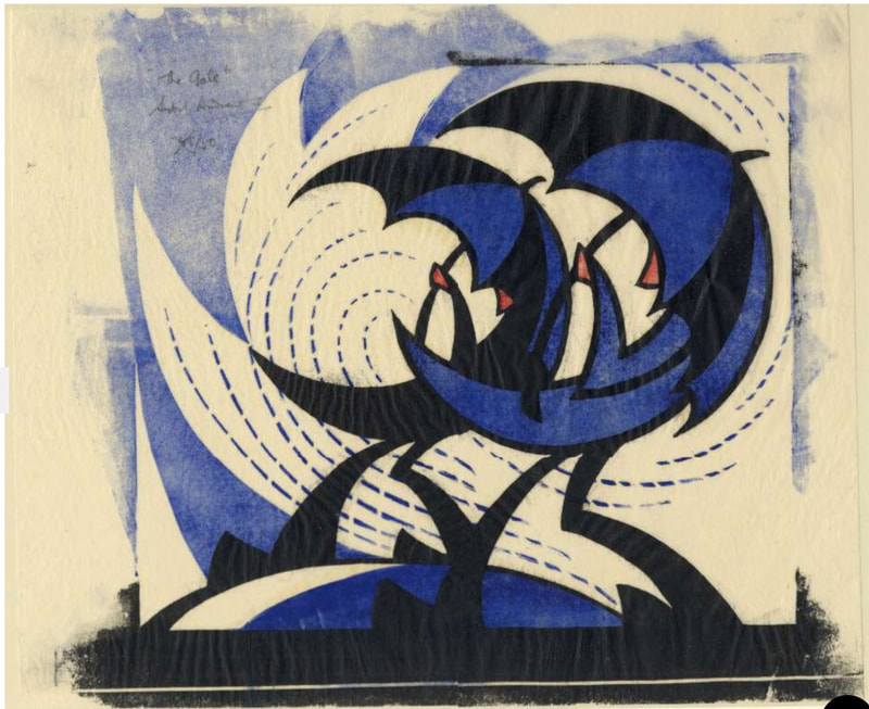
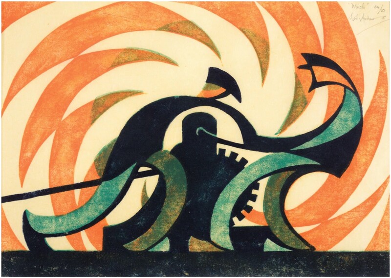
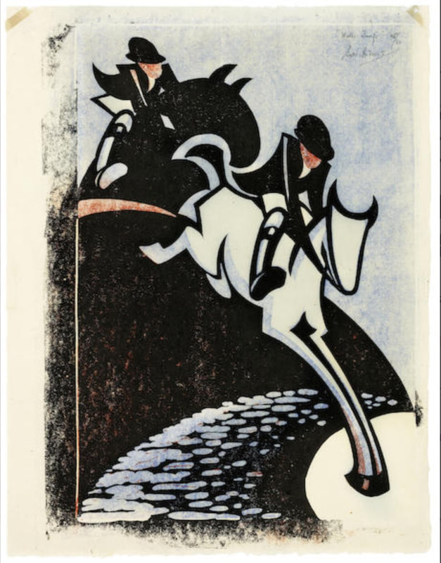
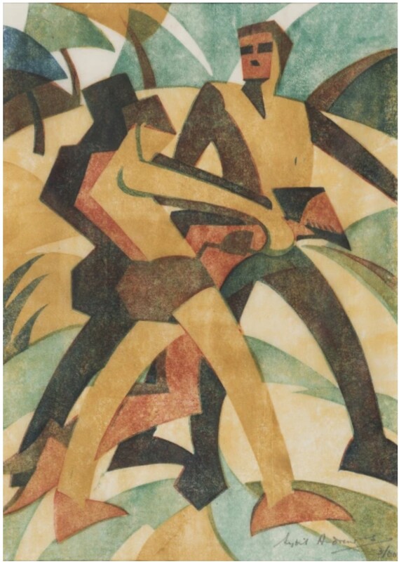
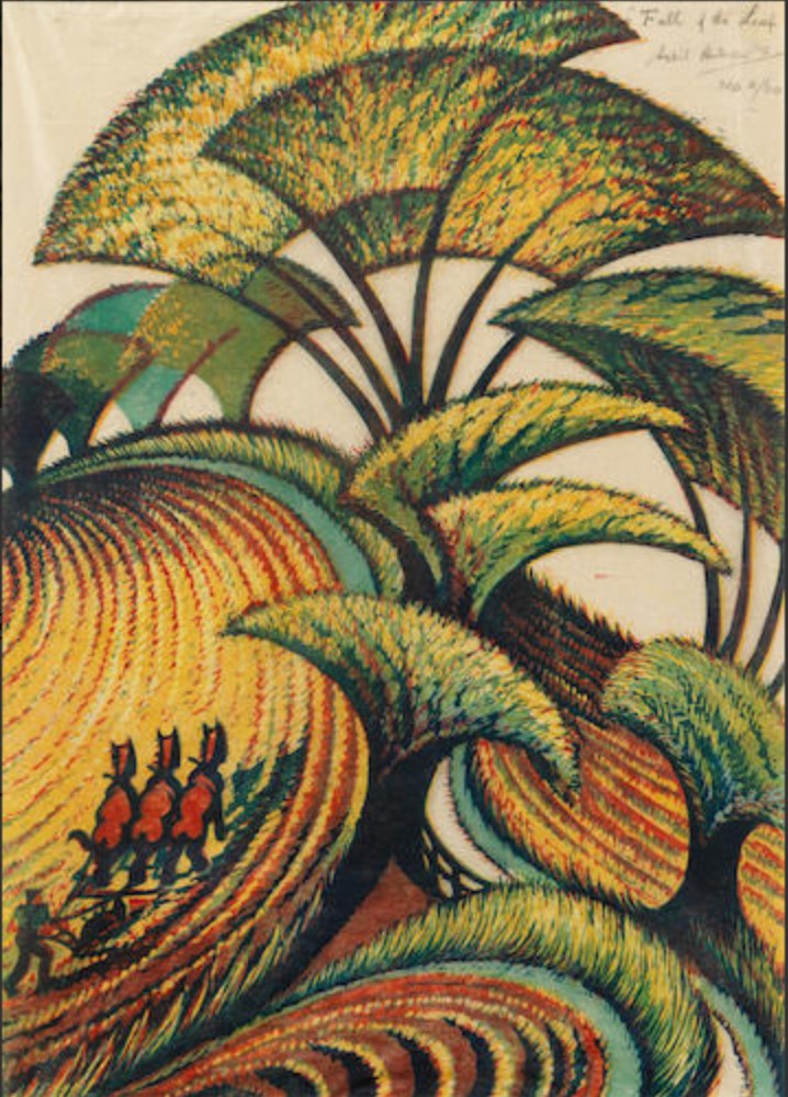
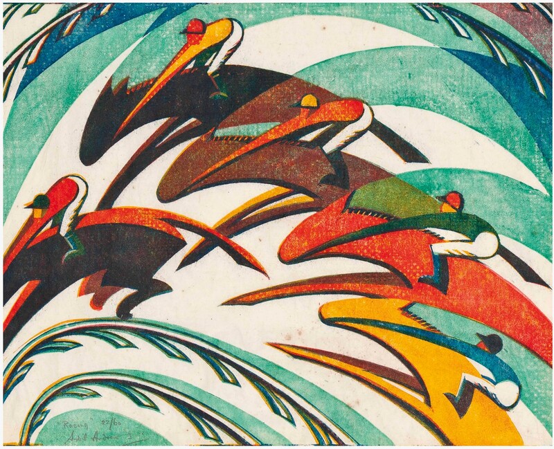
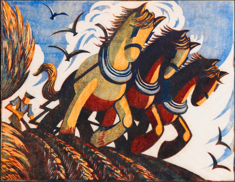
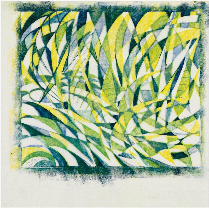
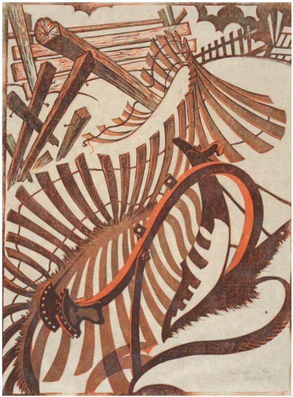
Like Andrews, Power was on the staff at the Grosvenor School when it was founded by Iain Macnab and Claude Flight in 1925. The latter was responsible for the growing interest in multi-color, multi-block linoleum cuts celebrating the speed of modernity. Power himself was a lecturer at the school. He was also a noted scholar of architecture and penned the three-volume A History of English Mediaeval Architecture, which included 424 of his own illustrations and designs. But he’s best known for the linoleum cuts he made alongside Andrews and Flight. Andrews and Power shared a studio for twenty years, giving it up in 1938 (they were both married to other people). Power served at home during the war as a surveyor for a Heavy Rescue Squad (he had also served in World War I), and after the war turned primarily to painting in oils. He died at 78 in 1951. Even when Power’s images are of static, stable things, they feel as if they are in motion. I might even say that he captures motion and potential energy better than Andrews. There’s a reason their compositions are among the best known coming out of the Grosvenor School. They were two of the best. See if you agree. Ann Shafer I love Sybil Andrews’ sensibility. Like Ursula Fookes and Ethel Spowers, who we met recently, Andrews, no surprise, was a part of the Grosvenor School of artists focused on multi-block color linoleum cuts exploring the speed of urban contemporary life primarily during the 1930s in England. I love that she explores speed literally through images of raceways and steeplechases. But she also does something surprising by focusing on rural life and agriculture in that same modernist mode. A bit antithetical. She also created a series of the stations of the cross (I’ll let you look those up on your own).
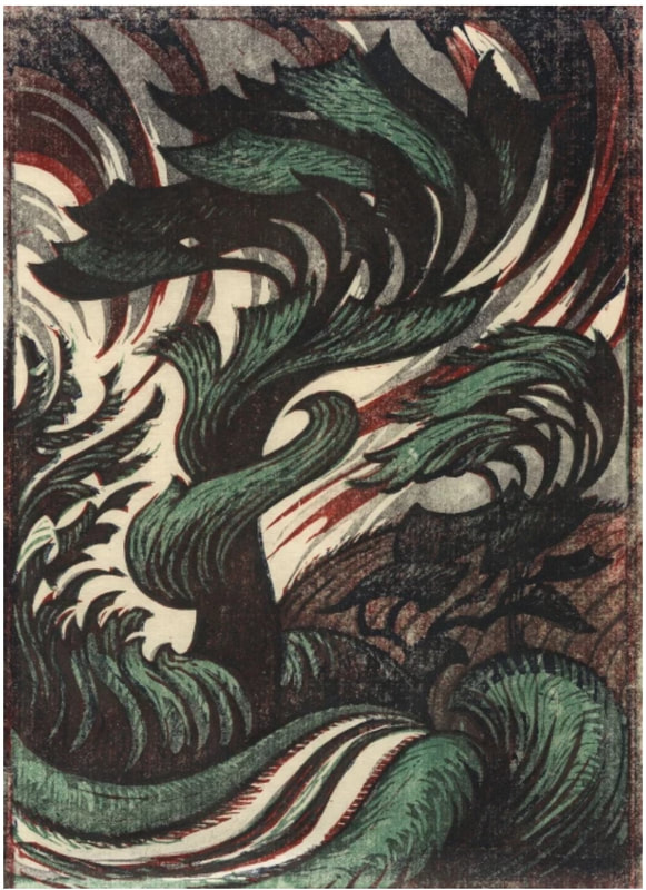
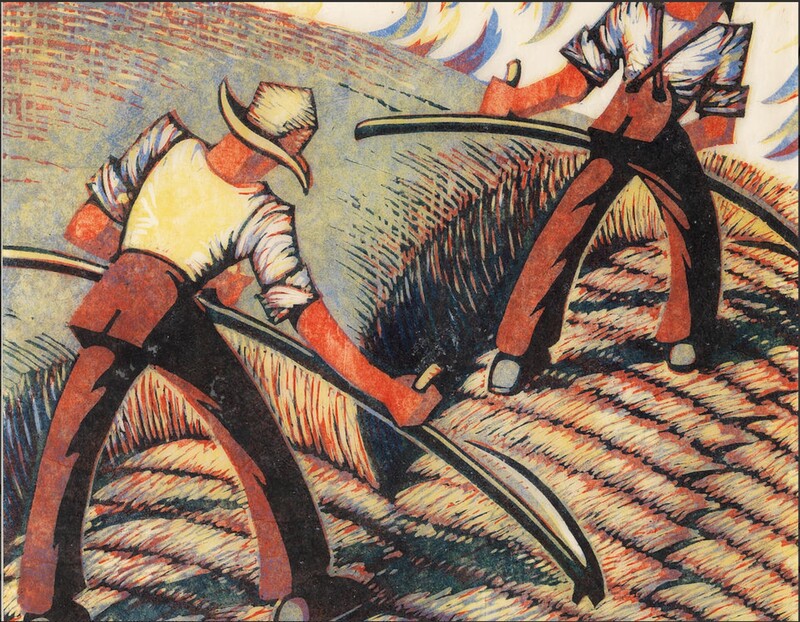
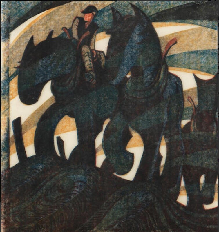
Andrews worked as a secretary at the Grosvenor School beginning in 1925 and soon began making linoleum cuts under the school’s leader, Claude Flight. She became close friends with Cyril Power (I promise, I will cover both Flight and Power soon), sharing a studio until 1938, as well as collaborating under the pseudonym Andrew-Power. During World War II, while working as a welder in a factory, she met her husband Walter Morgan. The couple emigrated to Canada and settled on Vancouver Island in 1947. She continued making color linoleum cuts well into the 1970s. I love that Andrews has such a strong point of view. I love the palette and the colors’ vibrancy. I love the high-design sense and reductiveness of the objects. I love the range of subjects. Well, there is not much about her work I don’t love. Please meet Sybil Andrews. Ann Shafer What happens if you live in Melbourne in the early part of the twentieth century in an era of pretty conservative art making? How do you learn about what is going on in Europe and other places that are so far away? There is no television, no internet.
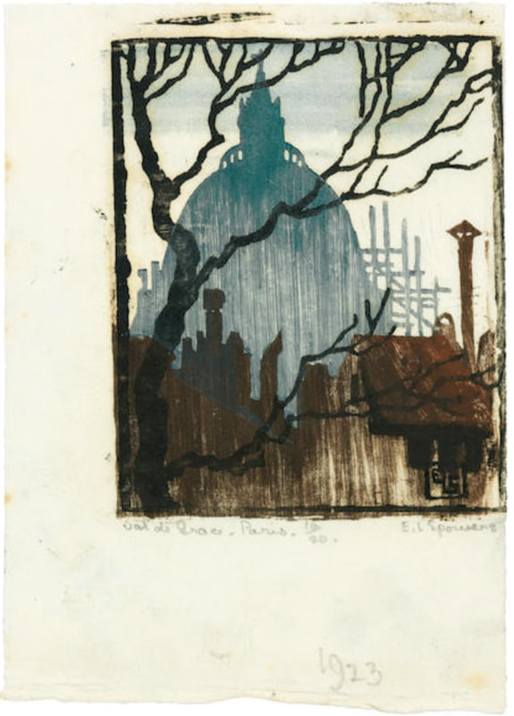
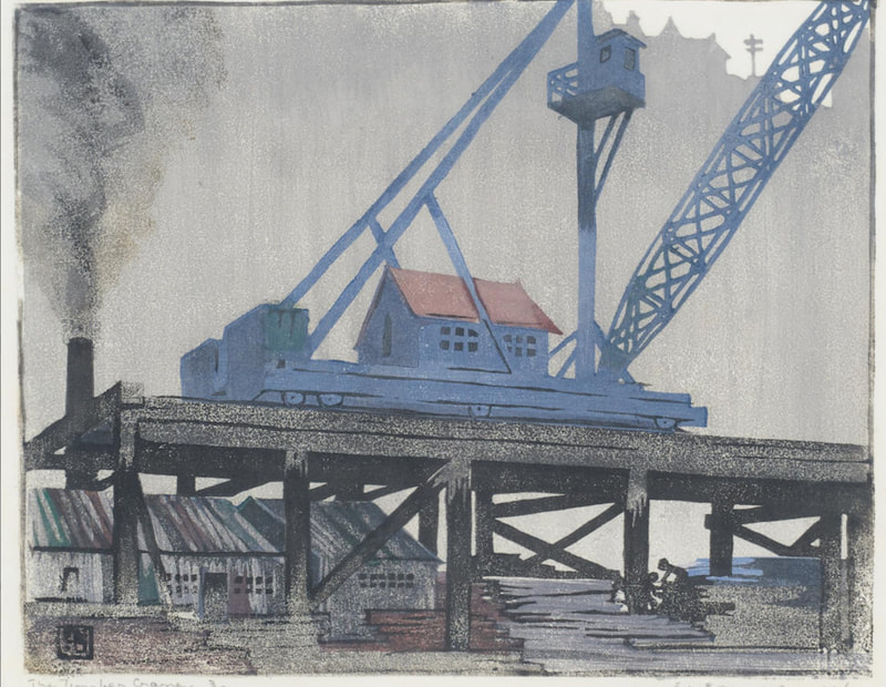
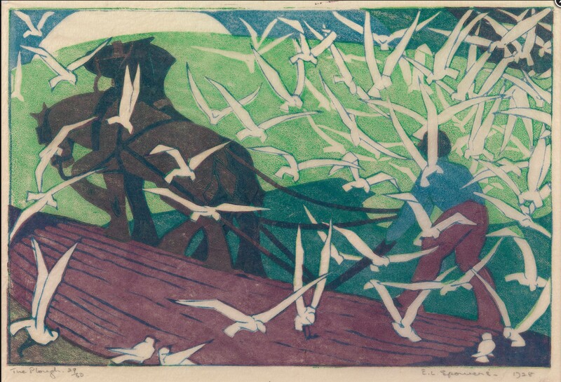
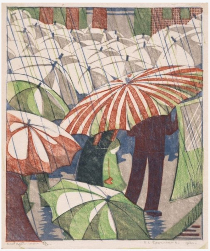
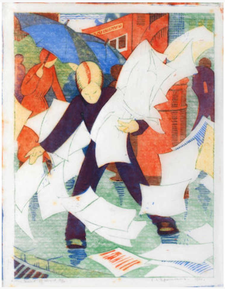
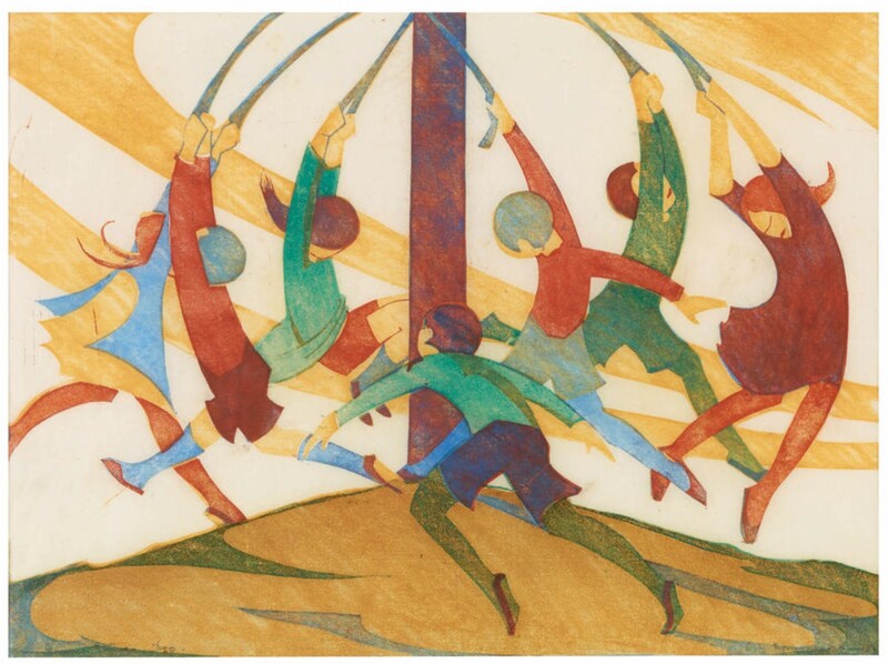
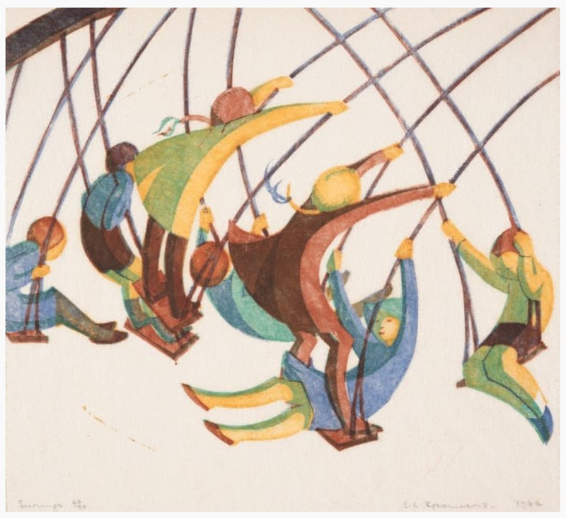
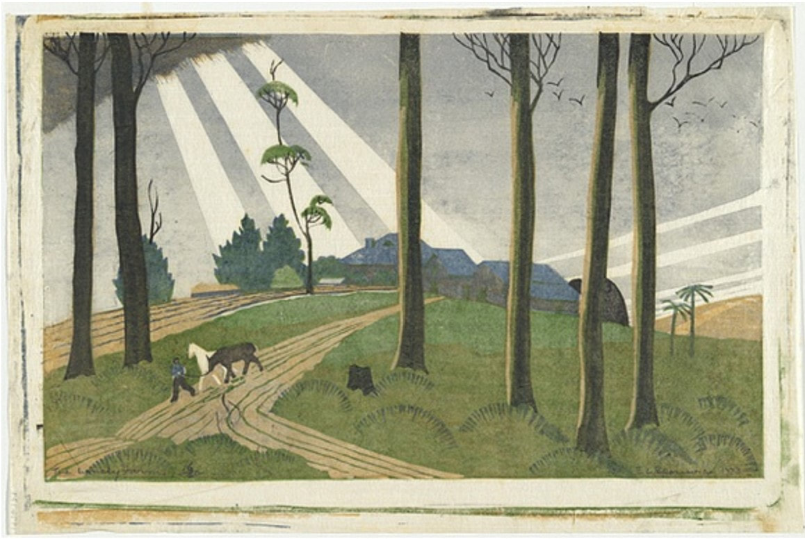
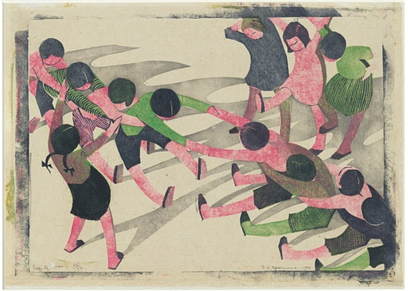
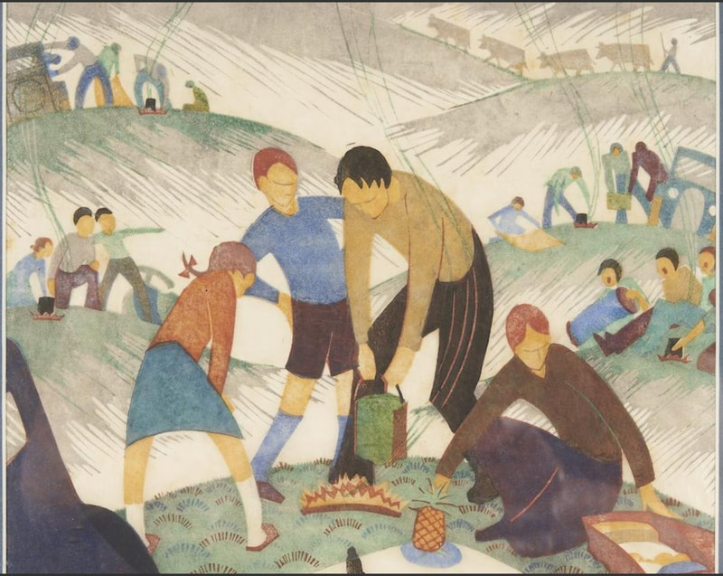
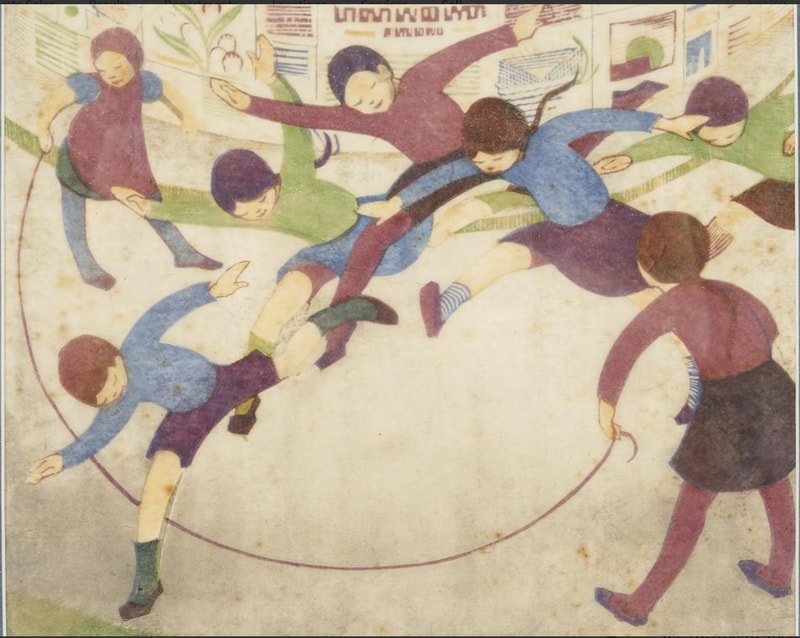
Why, one goes to libraries and book stores to find publications that might expand one’s horizons. One such oasis of cosmopolitan culture in Melbourne was found at the Depot Bookshop run by the Arts and Crafts Society of Victoria. It was there in 1928 that a young artist named Eveline Syme came across a small booklet called Lino-Cuts, written by Claude Flight. Claude Flight was the well-known teacher at the Grosvenor School of Modern Art in London who was the defacto leader of a group of printmakers named for the school. (We recently met Lill Tschudi and Ursula Fookes who both studied there.) Syme and another young artist, Ethel Spowers, would have seen the school advertised in The Studio, the leading British art-periodical also available at the Depot Bookshop. Both women were so taken by the illustrations in Flight's booklet that they traveled to London and enrolled—Spowers arrived in late 1928, and Syme came a few months later, in 1929. Located in London's Warwick Square, the Grosvenor School was an informal place that offered up random courses. It had a growing reputation due mainly to Flight who was one of its charismatic teachers. He inspired many artists to work in linoleum cuts in multiple colors (one block for each color) and to adopt Flight’s method of using both printing ink and oil paint to achieve particular color effects. Flight promoted the idea of the democratic virtue of linoleum cuts as a cheap commodity in an overpriced art market. (The Grosvenor School closed its doors in 1940.) Syme wrote about Flight and his style: “Sometimes in his classes it is hard to remember that he is teaching, so complete is the camaraderie between him and his students. He treats them as fellow-artists rather than pupils, discusses with them and suggests to them, never dictates or enforces. At the same time he is so full of enthusiasm for his subject, and his ideas are so clear and reasoned that it is impossible for his students not to be influenced by them." Today’s artist, Spowers, studied with Flight from 1928 to 1930, went home for a bit, and returned to London in 1931 for a spell. During her time back home in 1930, she mounted a show, Exhibition of Linocuts, at the Everyman Lending Library in Melbourne that featured her prints as well as those by Syme and fellow Aussie Dorrit Black. In turn, the three women all found an outlet at the Modern Art Center established in Sydney by Black in 1931. Spowers also acted as an informal agent for Flight, promoting his work down under. Spowers, sadly, died of cancer at the young age of 56 in 1947. Meanwhile, in England, influential touring exhibitions, arranged in conjunction with the Redfern Gallery, traveled around promoting the linoleum cuts of the Grosvenor School, and included the work of the Australian women. Linoleum cut prints by the artists of the Grosvenor School were popular until they seemed too colorful and optimistic in the face of the War. They fell off the radar and it wasn’t until the 1970s that there was really any market for them. Now, of course, their prices are sky high. Ann Shafer There are artists associated with the Grosvenor School that are well known (Sybil Andrews, Lill Tschudi, Claude Flight, and Cyril Power), and then there are others who are less well known. Meet Ursula Fookes, about whom very little is available online. She studied with Claude Flight at the Grosvenor School in 1929–31, which is where the color linoleum cut celebrating speed and modern life was a central subject.
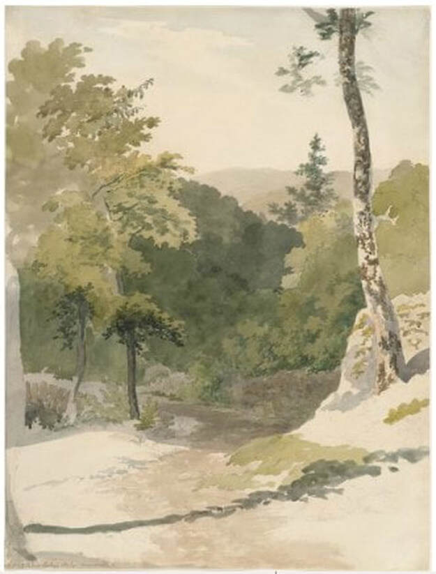
Following her studies, not much is known except that she spent the last months of the war on the Continent running a mobile canteen, which was a war-era version of a food truck. (She kept a rather compelling diary of that time, which is preserved at the Imperial War Museum.) After the war she seems to have moved to the country and ceased showing her art (or possibly stopped making any). Details are a bit fuzzy. Hopefully some industrious PhD student will take her on and flush out Fookes' herstory. Fookes’ sensibility is different than that of other artists we’ve looked at (see recent post on Lill Tschudi). It’s a bit less frenetic, perhaps a bit more staid. But I love discovering lesser-known artists within a movement. What makes their work less desirable than others who become the face of said movement? Is it just a matter of exposure? Is it that Fookes didn't create much art after this initial push and fell off the proverbial radar? Did the other artists do something different? Did they have different relationships with galleries, dealers, curators? Curious. Ann Shafer A year ago, today, a few weeks into the first lock down in March 2020, I found my voice. It had been 2.5 years since I left my position as a museum curator and 2.5 years of mourning said career. I’ve said it before: I never wanted anything else but to be a curator. Certainly it is a career choice that has its flaws, not the least of which is the dismal remuneration. I can’t think of a more highly educated and underpaid group of people than those working in the museum sector. It’s appalling, really. So, after 2.5 years of depression, it took a world-wide pandemic to get me off my ass. The truth is, I was terrified that if I were taken out by Covid-19, which in those early days seemed entirely possible (recognizing my privilege here in my ability to work from home), there were a few things I wanted to have said out loud. I wanted to leave some trace of my legacy in the field, some record that my kids could refer to later and say, hey, my mom did a thing. The plan was to share stories about the many objects I acquired for the museum’s collection, which, by the way, are the things I miss the most. They all feel personal to me: I found them, researched them, prepared a convincing pitch, and got them through the system. I even got some of them hung on the museum’s walls—no easy feat. I miss being able to look at them at will and I miss sharing them with visitors. But, in truth, these posts are sort of equivalent to sharing objects in the studyroom. Nothing will ever replace seeing a work in person, of course, but this is something I can do to share my passions with you. Back in March 2020, I started with a short entry on Jim Dine’s Raven on Lebanese Border, 2000. Second, I dropped way back to 1807 to talk about a British watercolor by Robert Hills. In these first two selections you can sense how all over the place I am. And that is what I love about working with prints, drawings, and photographs. You can be deep in Rembrandt one day, pop up to Elizabeth Catlett the next day, divert to Edouard Manet for a bit, skate by Robert Blackburn, and end up at Ann Hamilton. Perfect for a curious person with a mild case of ADD. I intended to write about every acquisition I made for the museum, one per day, and keep them short and pithy, but I couldn’t keep up that pace. Besides, there are many other objects and topics about which I want to write. Since I started a year ago, I’ve written eighty-plus entries. To tell you the truth, the writing is the easy part. Gathering the images and all the tombstone information takes the most time. But the enterprise gives me great satisfaction. I am always excited to share a cool print or beautiful drawing with people I know will appreciate it. I hope you keep reading, learning, and enjoying these posts. 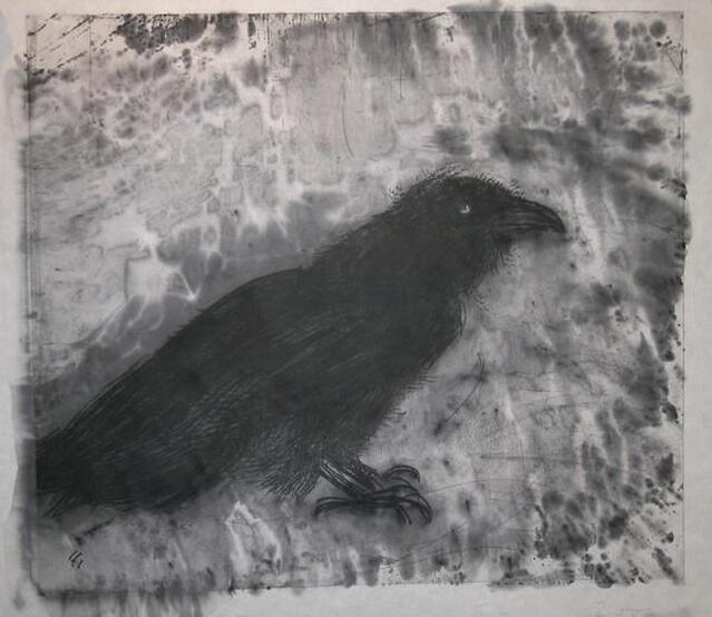 Jim Dine (American, born 1935). Published by Pace Editions, Inc., New York; printed by Julia D'Amario. Raven on Lebanese Border, 2000. Sheet: 781 × 864 mm. (30 3/4 × 34 in.); plate: 676 × 768 mm. (26 5/8 × 30 1/4 in.). Soft ground etching and woodcut with white paint (hand coloring). Baltimore Museum of Art: Purchased as the gift of the Print, Drawing & Photograph Society, BMA 2007.224. Ann Shafer Let’s talk about monoprints, selective wiping, and variable etching. With printing intaglio plates (intaglio is Italian for incising a design into a plate, usually copper or zinc, and is the umbrella term under which we find engraving, etching, drypoint, etc.), the default is to ink the plate so that the incised lines carry ink that will transfer to damp paper as it is put through a press under immense pressure. If that basic image is wiped tight (meaning virtually no ink left on the surface), you’ll get the image and nothing extra. Not a bad proposition, necessarily. But, over the centuries, artists have experimented with leaving some ink on the surface of the plate to add some tonality and atmosphere. Add even more ink to the surface and something entirely new is created. Read on about a great example of this kind of additive inking.
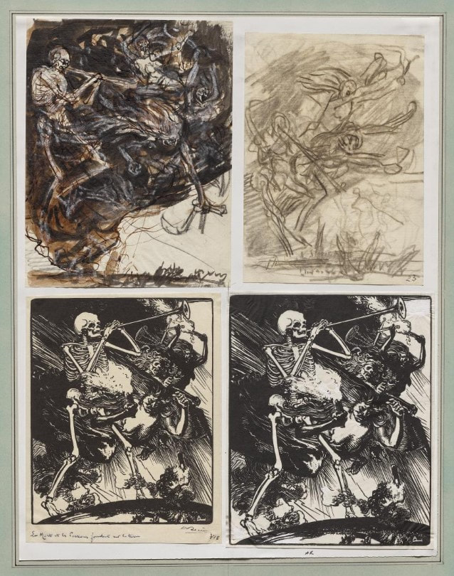
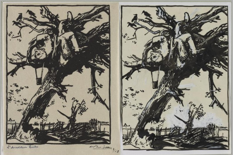
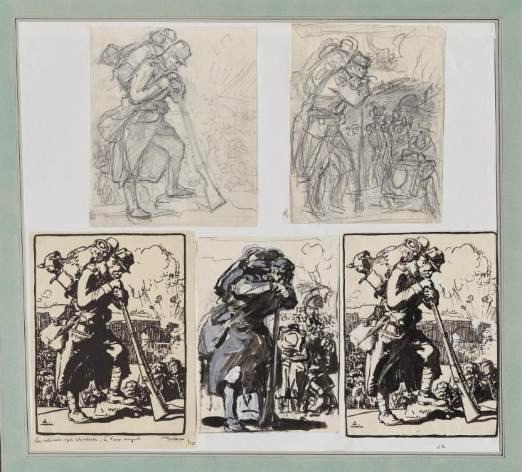
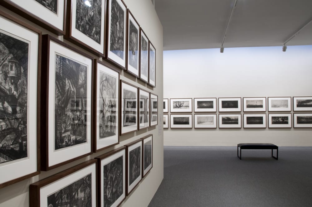
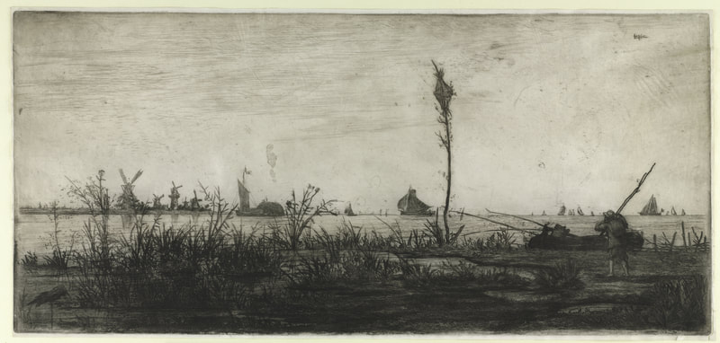
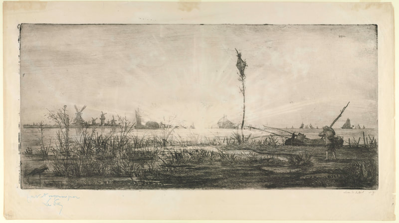
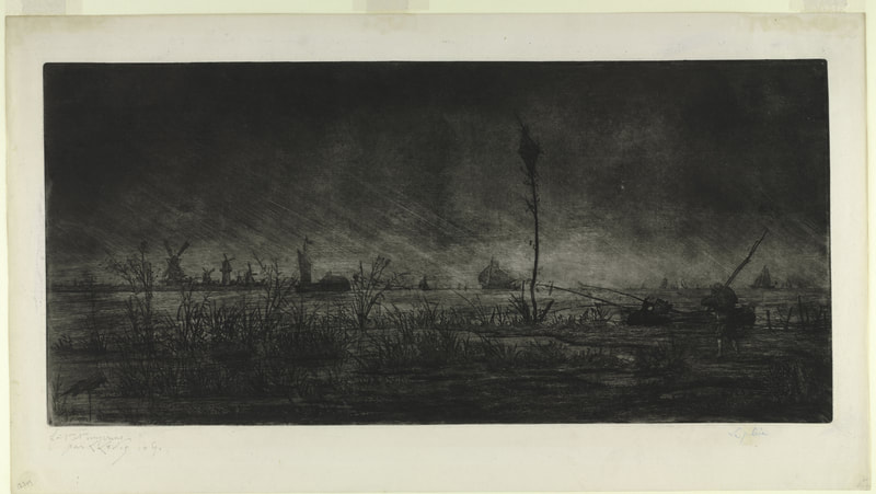
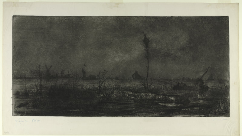
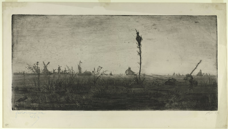
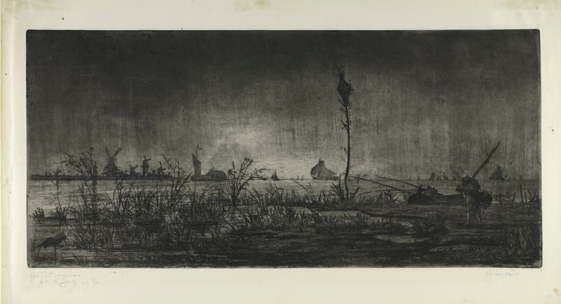
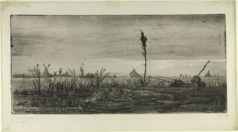
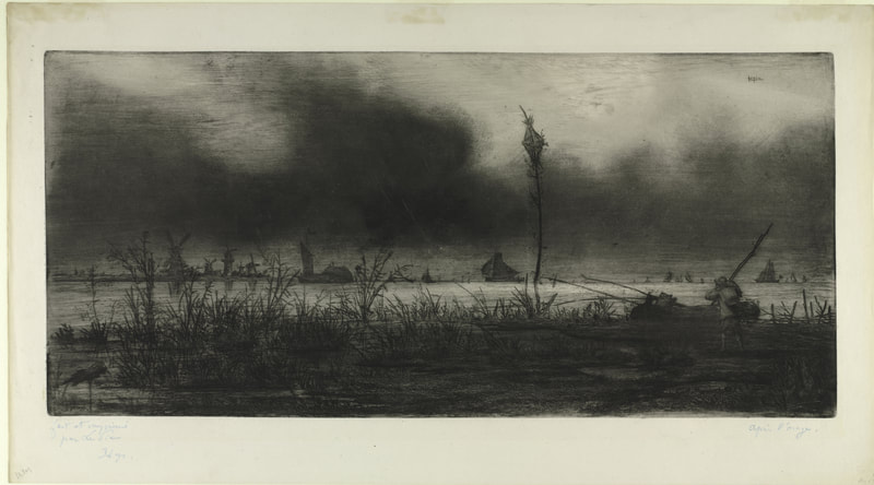
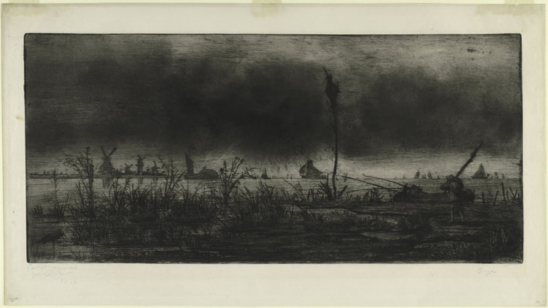
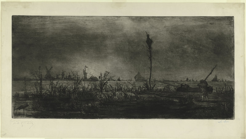
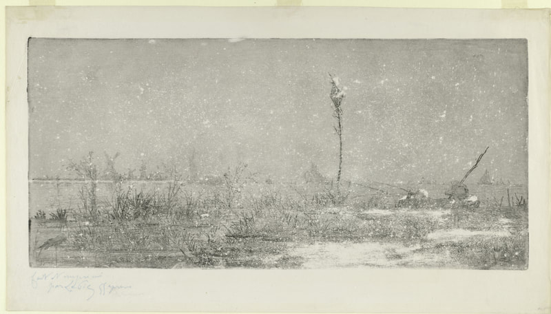
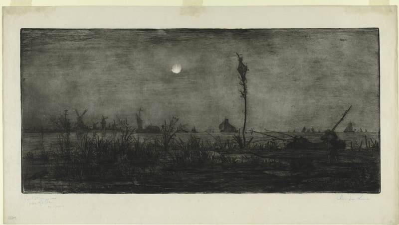
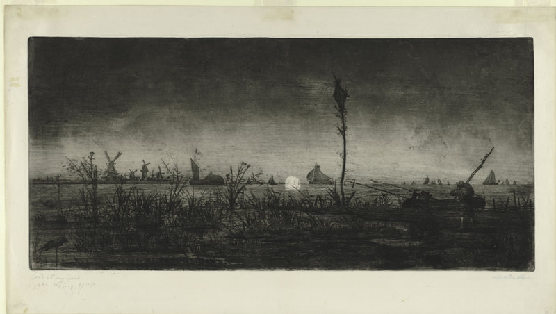
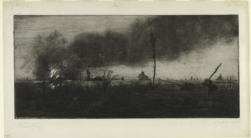
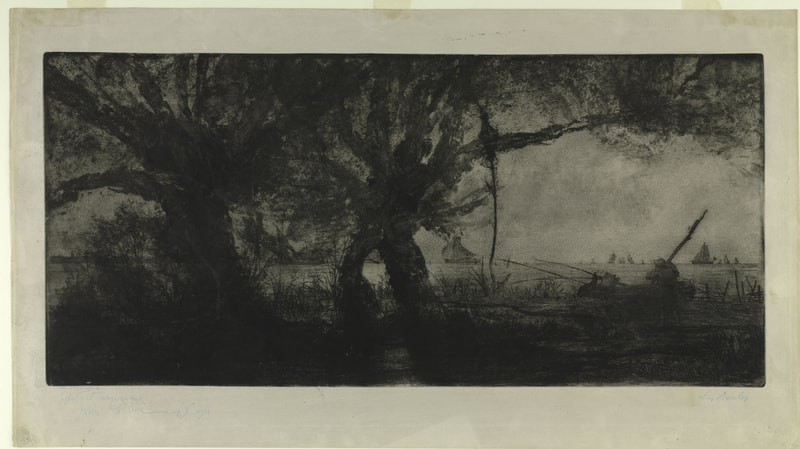
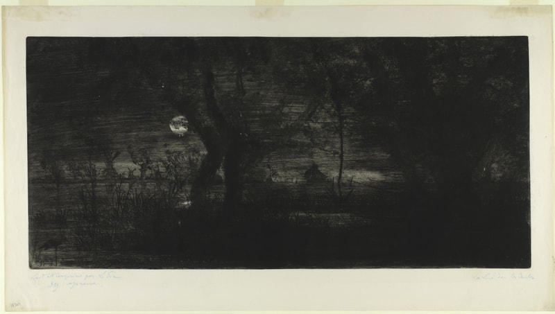
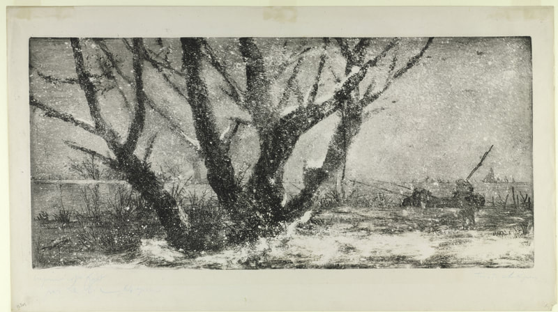
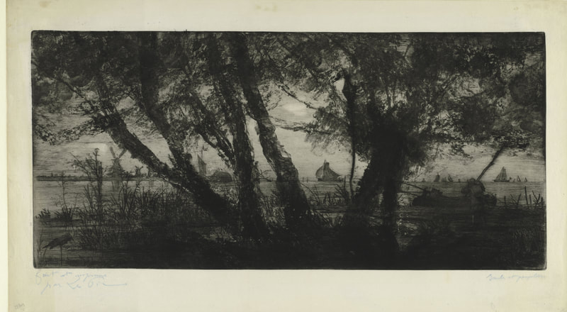
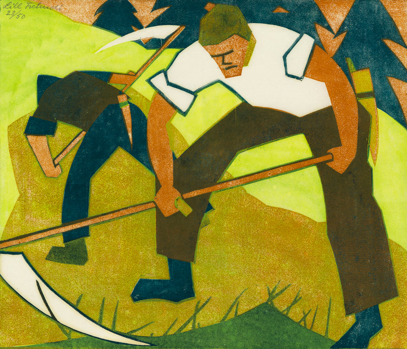
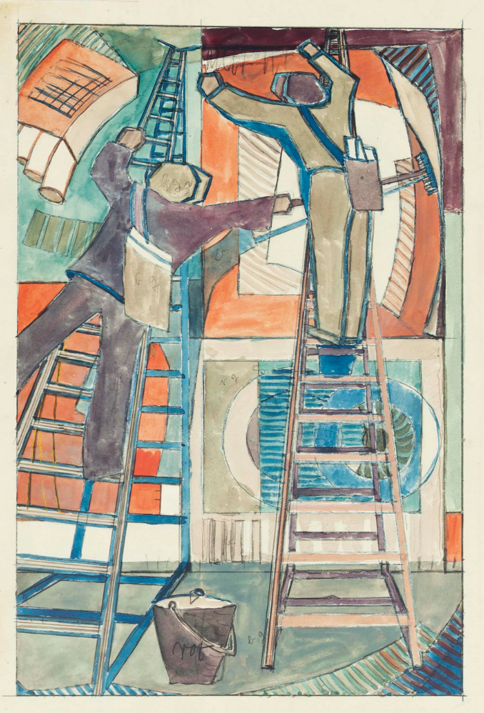
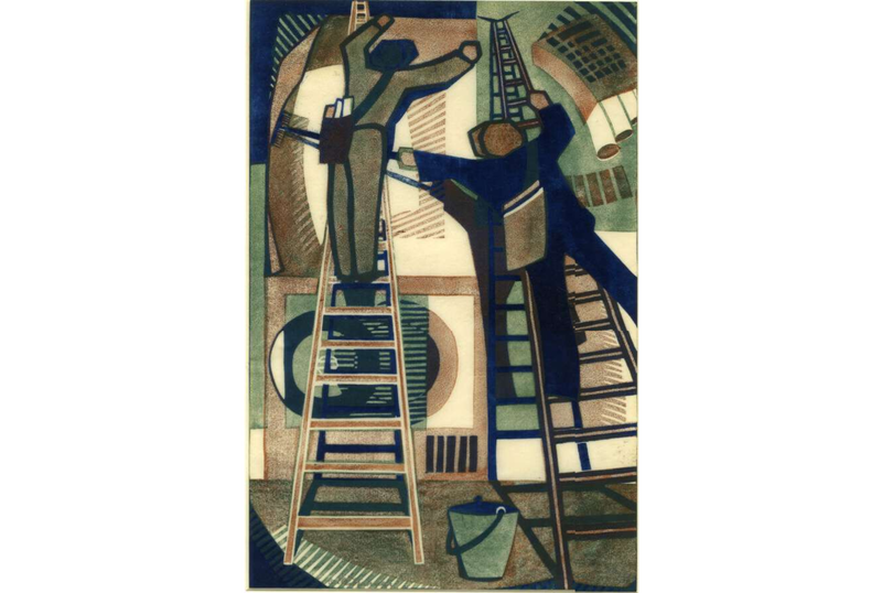
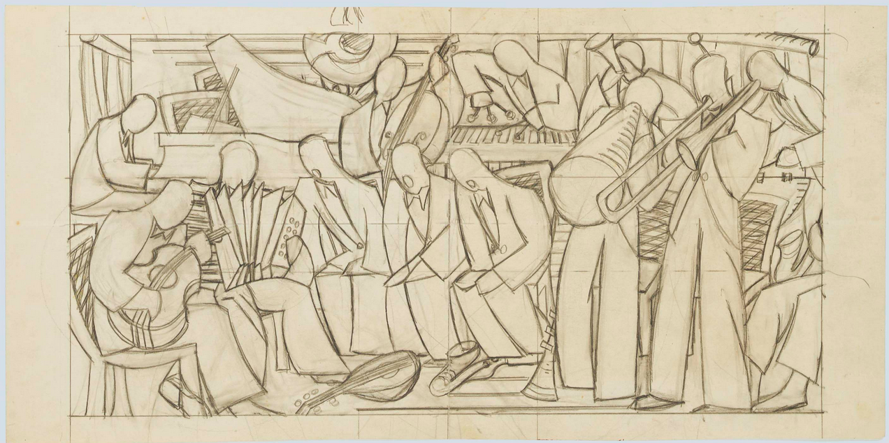
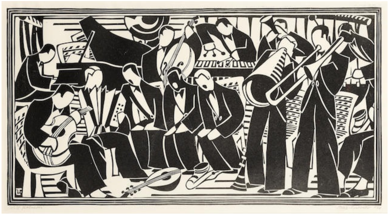
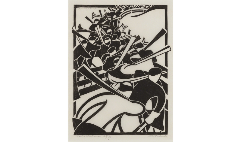
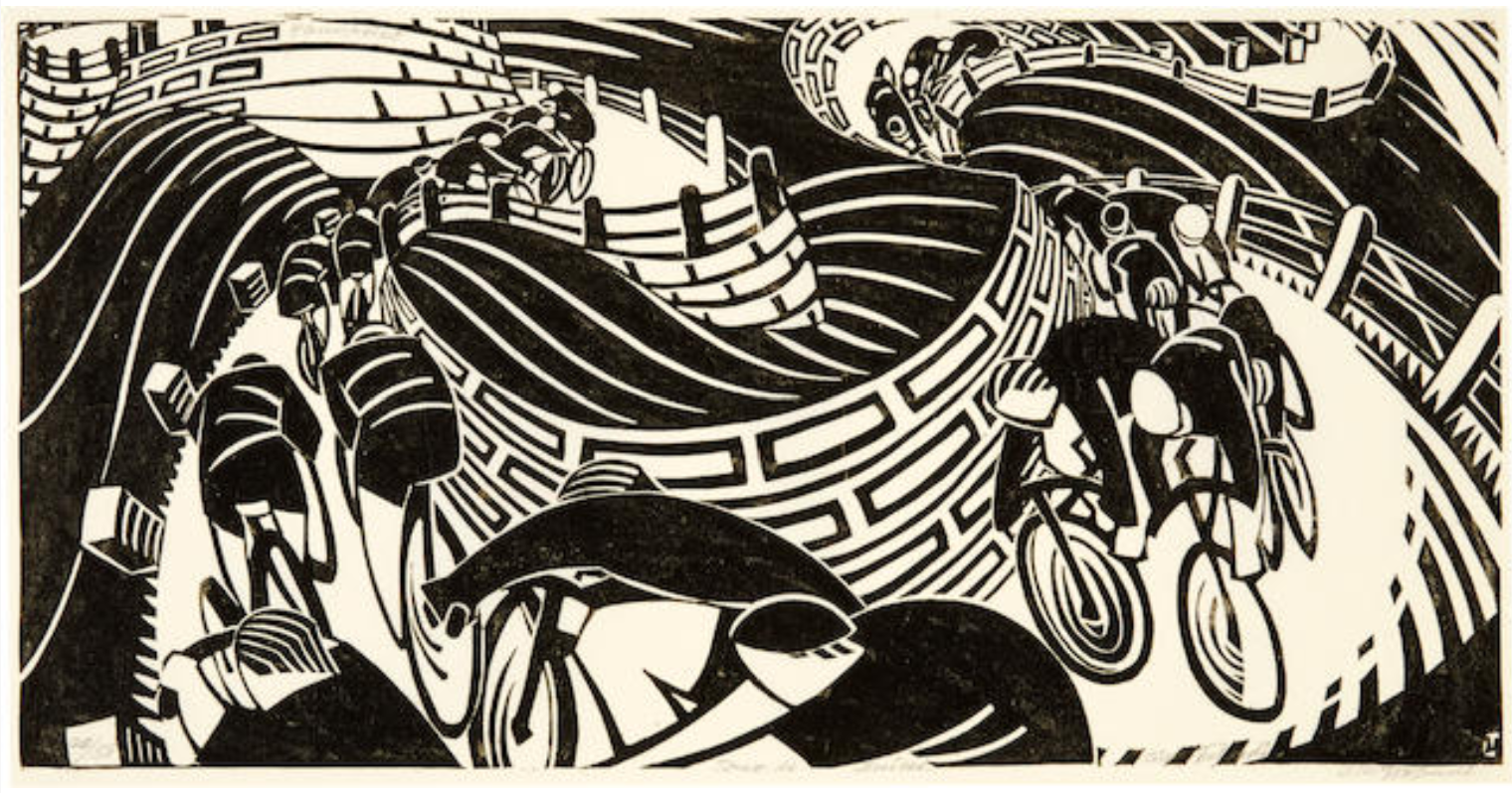
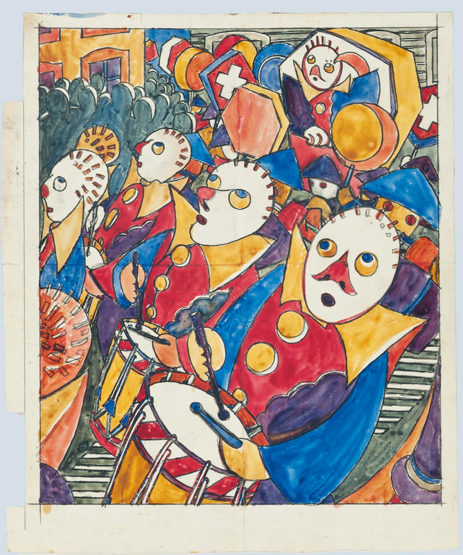
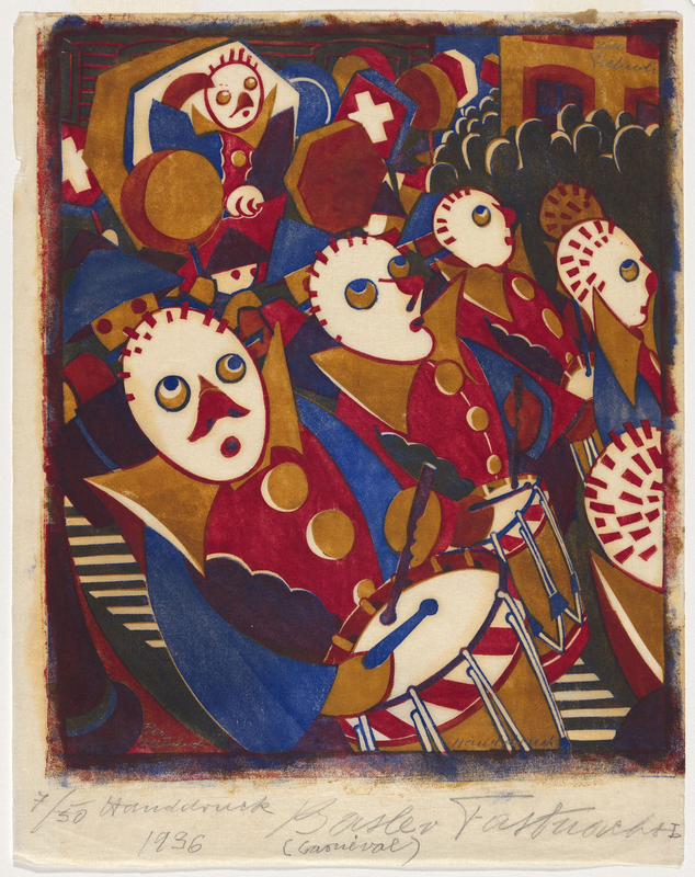
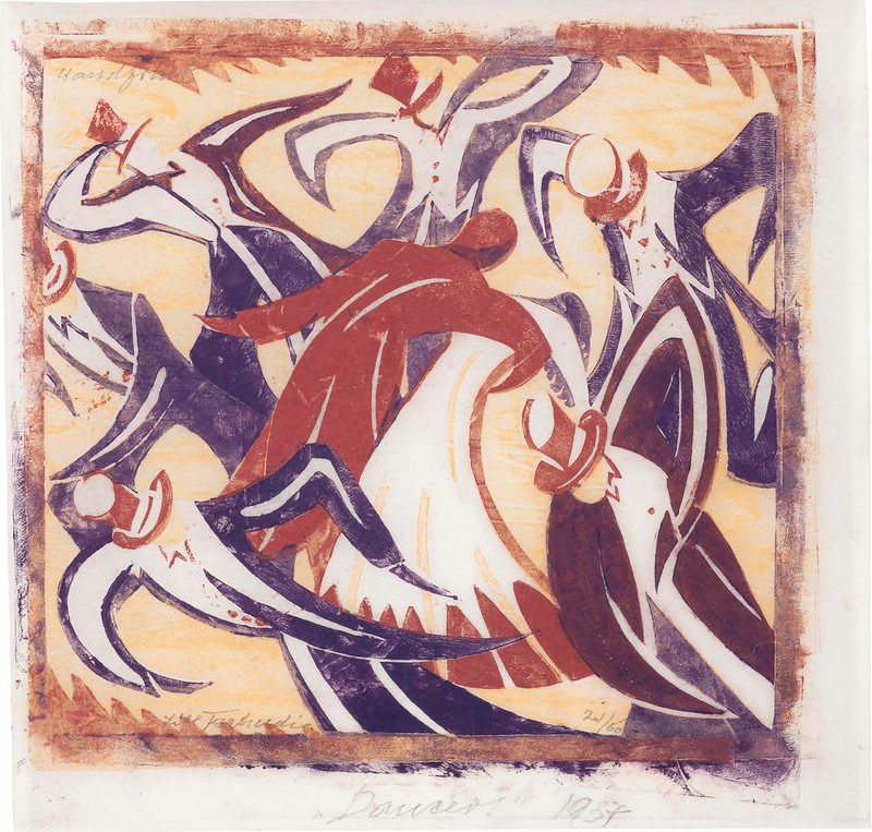
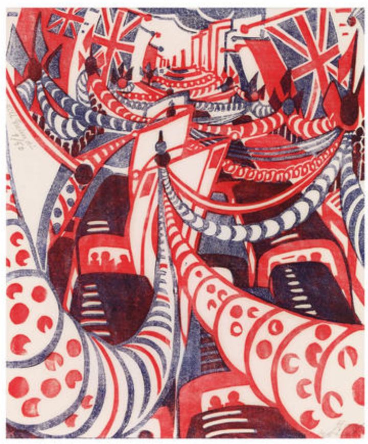
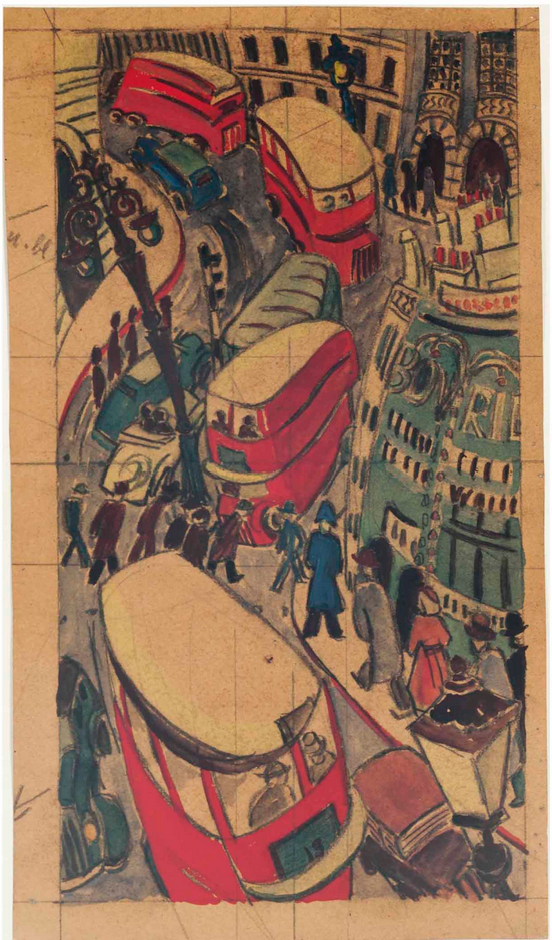
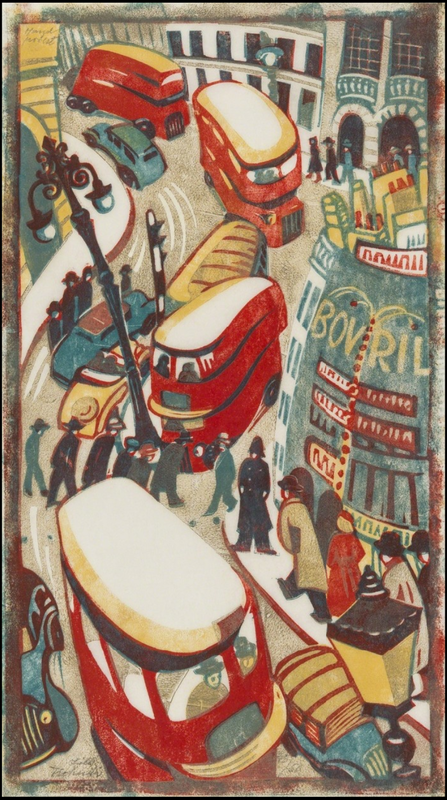
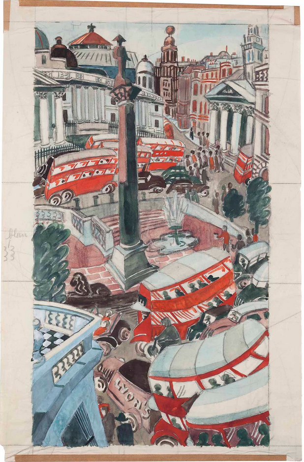
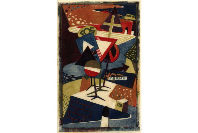
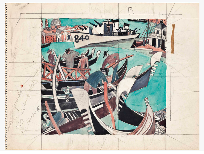
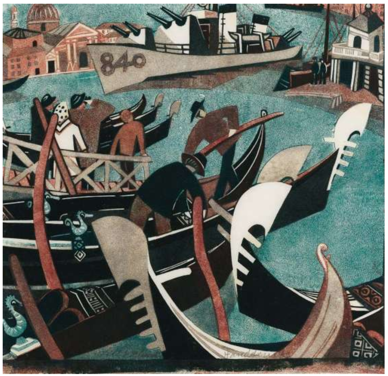
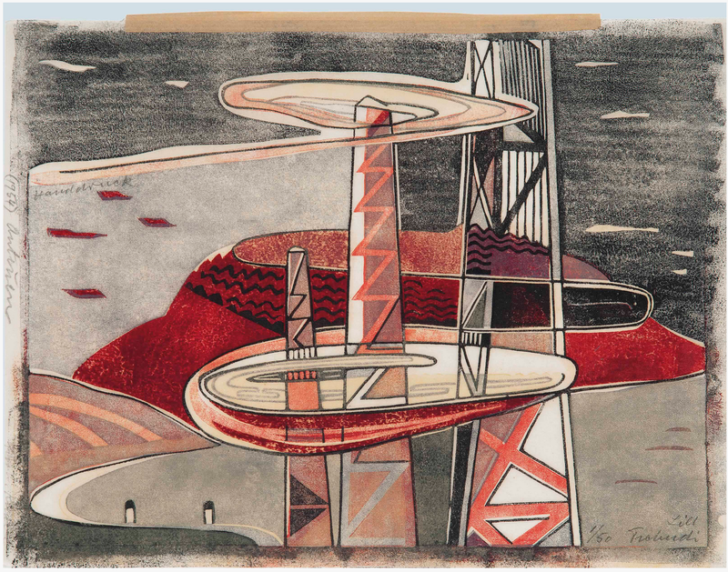
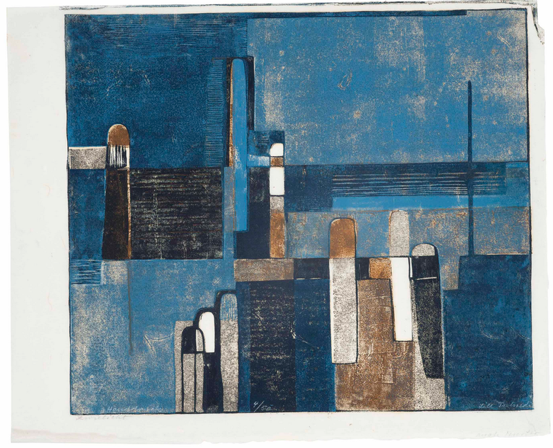
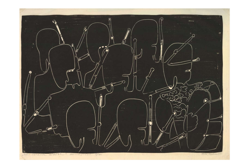
Back in 2011, the museum mounted an exhibition called Print by Print: Series from Dürer to Lichtenstein. It included twenty-nine series of prints—each in its entirety—and looked at seriality and the many reasons artists work this way. You hardly ever get the chance to see complete series of prints framed and on the wall, and the show included series that are heavy hitters in the history of prints. Some of the highlights included Durer’s Apocalypse and Piranesi’s Carceri, Jacques Callot’s Miseries of War, Ed Ruscha’s News, Mews, Pews, Brews, Stews, and Dues, Sherrie Levine’s Meltdown, and Andrew Raftery’s Real Estate Open House. The exhibition really was a feast for the eyes. But the most remarkable was a group of etchings by Vicomte Ludovic Lepic (French, 1839–1889). I’m gonna guess you’re thinking, who? Lepic was one of the artists who pushed variable wiping to its fullest. These are what we now call monoprints (it’s easy to get confused by the difference between monoprints and monotypes—monoprints start with some image already in the matrix; monotypes are created on a surface that carries no image so each is entirely unique). Twenty impressions of Lepic’s plate were grouped together on the longest wall in the show, each with a different look. They are among the gems of the BMA’s print collection. To be honest, the set of twenty variably wiped etchings doesn’t really qualify as a series. They were not intended to be published as a complete unit. Rather they are a substantial group of prints that are aligned because they use the same matrix in their creation. (Notice my use of the word set to describe them, rather than series. This is bringing out the cataloguer in me.) In fact, I believe Lepic made more versions of this etching, which the BMA does not own. That they don’t strictly fit into the defining principle of the exhibition is not a huge deal, really, especially when they are so instructive, mind-bogglingly beautiful, and can hold any wall anytime anywhere. The etching is a scene on the Scheldt river, which flows northward from France through Belgium and into Holland. First up is an impression wiped tight, meaning no extra ink was left on the surface of the plate. After that follow plates in which ink has been added to the surface to create wholly other compositions: weather effects, different times of day, and the addition of entire trees. They are wonderful examples of how variable wiping can completely alter an image in the best ways. Ludovic Lepic was a French aristocrat who is best known as an etcher and as the subject of several paintings by his good friend, Edgar Degas. Lepic was a painter and sculptor, a costume designer, an amateur archeologist (he founded an archeological museum), a breeder of dogs, an avid sailor, and an equestrian. But for us, his variable etching technique (he called it eau-forte mobile) had a huge impact on modern printmaking. Lepic learned etching from Charles Verlat (1824–1890) and created his first significant etching in 1860. He rapidly became a skilled etcher and in 1862 was invited to join the Société des Aqua-fortistes (The Society of Etchers), formed by art dealer Alfred Cadart (1828-1875) and others to publish original etchings. His etchings were exhibited in annual Salons from 1863 until 1886. Lepic was also involved with the Impressionists. Degas invited him to join with fifteen other artists to form an association to sponsor independent exhibitions, which lead to the first Impressionist exhibition in 1874. Lepic helped plan this seminal exhibition and showed seven works, watercolors, and etchings. He also showed forty-two works at the 1876 Impressionist exhibition. In the ensuing years he continued to paint, make etchings, create costumes for the Paris opera, and work on his sailboat. He died in 1889. Please meet Ludovic Lepic. Ann Shafer While I object to designating a single month to paying attention to women--why four weeks per year and why is this really necessary--here we are. I recently (not during the designated month--horrors!) wrote about some early female printmakers: Diana Scultori, Elisabetta Sirani, and Geertruydt Roghman. But, if you’ve been following along, you know my heart is in the twentieth century. So, please meet Lill Tschudi (1911–2004), a Swiss artist best known for her multi-color linoleum cuts of 1930s London.
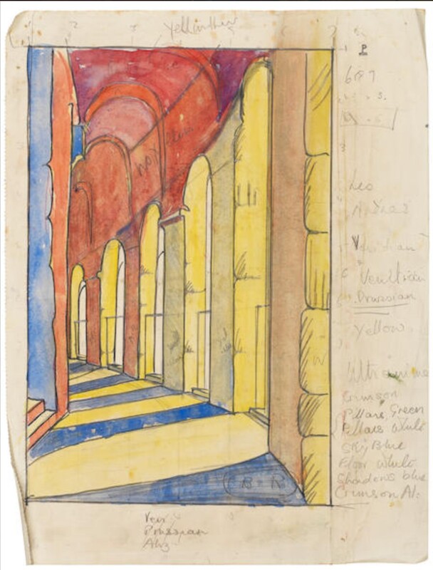
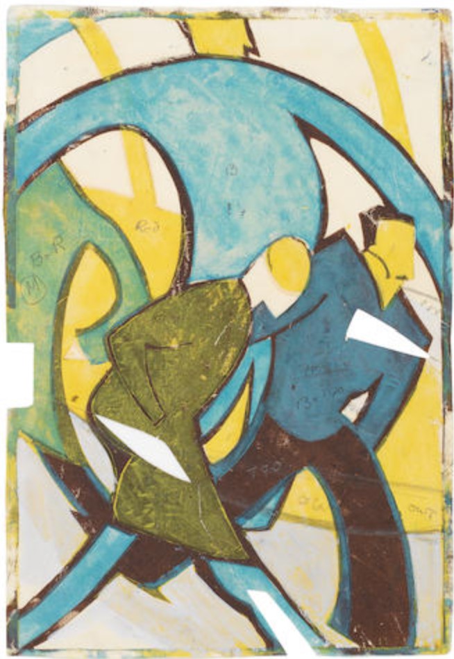
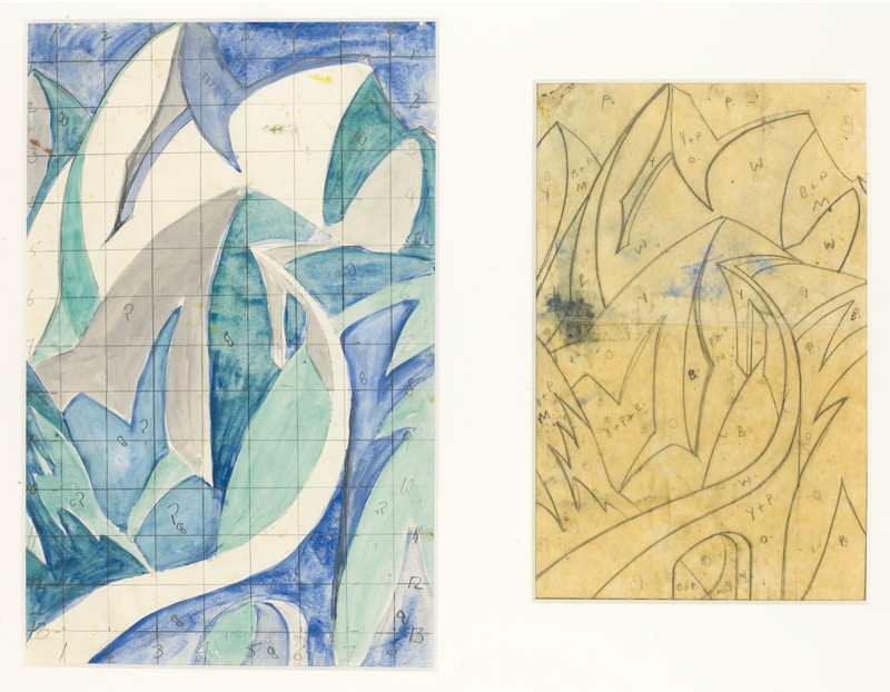
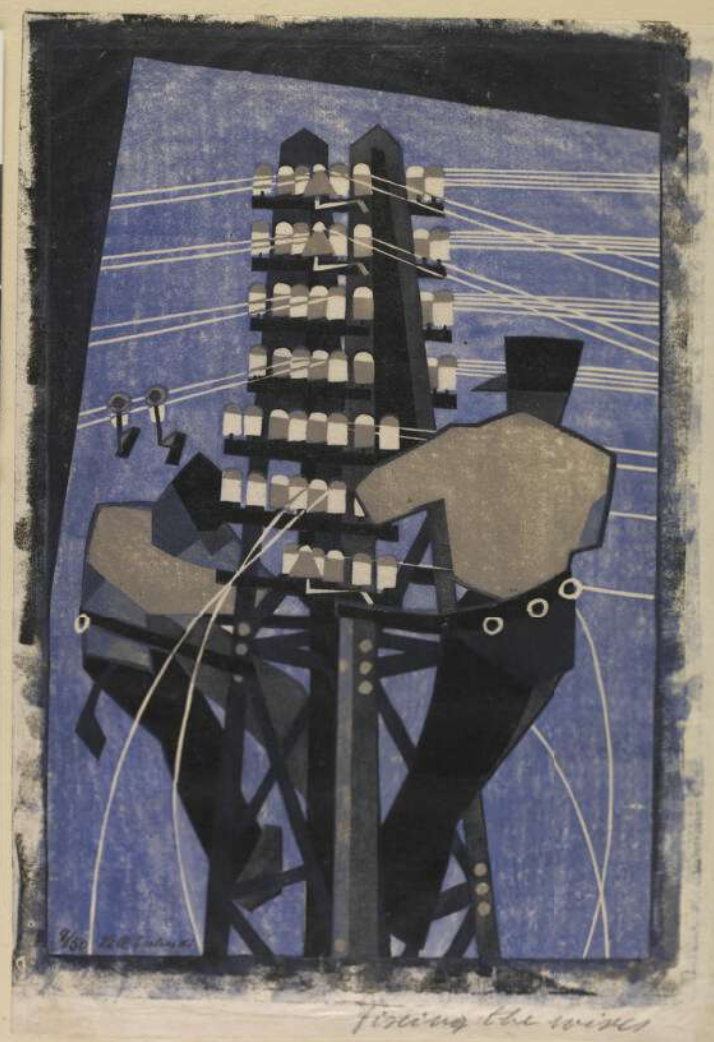
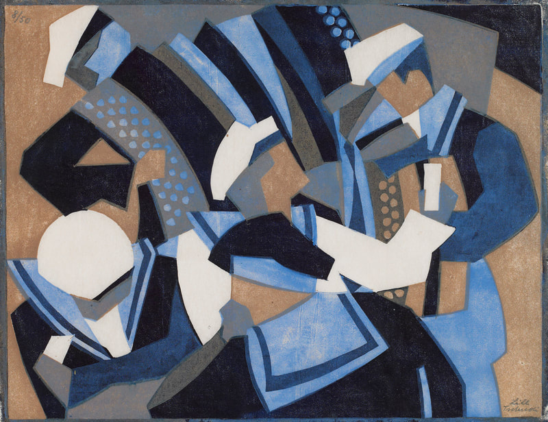
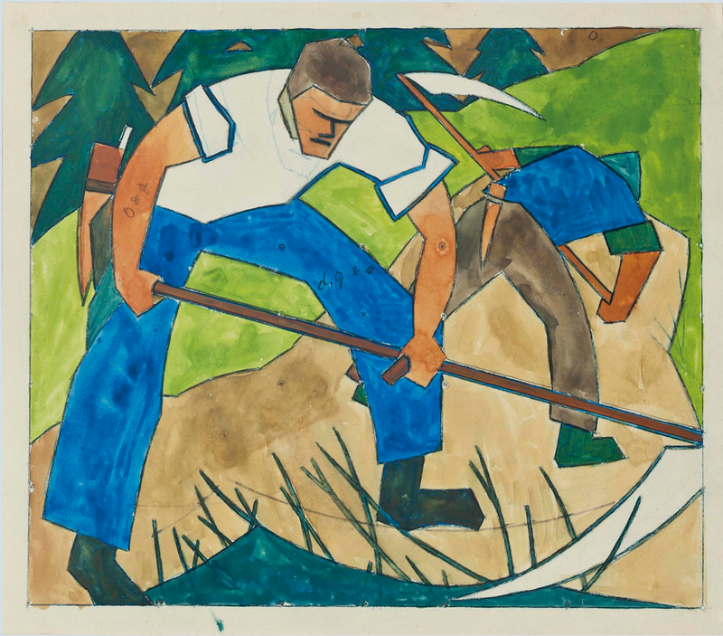
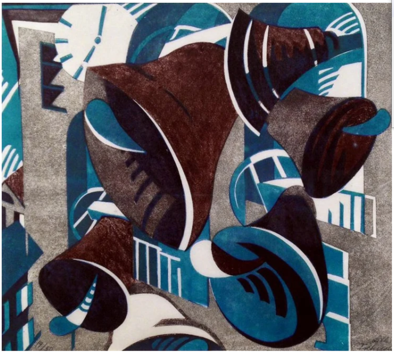
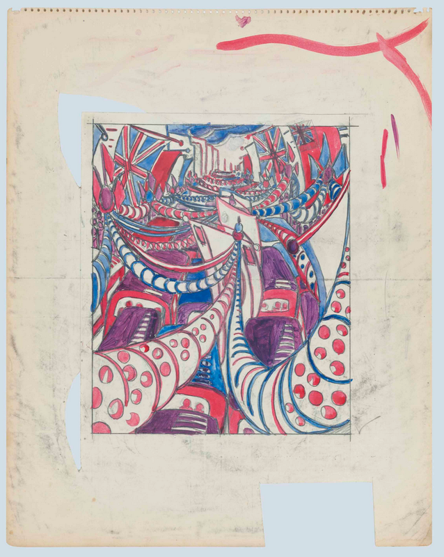
As a teenager Tschudi had already decided she wanted to be a printmaker after seeing an exhibition of prints by Austrian artist Norbertine Bresslern-Roth (she's worth a look). Determined to pursue printmaking, Tschudi spent two years (1929–30) in London beginning at age eighteen, studying with Claude Flight, a key member of the Grosvenor School, a group of printmakers making color linoleum cuts. Other members include Sybil Andrews, Cyril Power, Dorrit Black, and William Greengrass. The artists of the Grosvenor School used multiple blocks of linoleum—one for each color—to create images that celebrate modernity and the machine age in a signature style that exploits rhythmically dynamic patterns. Subjects range from the London underground’s labyrinthine stations and escalators, and horse, car, and bike races, to farmers and other manual laborers, and musicians and other performers. (Linoleum was a fairly new material used in the arts. It had been invented as floor covering in England in 1860 and later was adapted to printmaking.) After two years studying with Flight, Tschudi spent several years in Paris before returning to her native Switzerland. In Paris she studied with cubist artist André Lhote, futurist artist Gino Severini at the Academie Ronson, and Fernand Léger at the Académie Moderne. By 1935 she was back at home in Schwanden, a village in a mountainous region in eastern Switzerland known for its textile industry. In the ensuing years she made more than three hundred linoleum cuts and maintained a business relationship with Flight, who acted as her dealer in England where most of her works sold. So why am I attracted to her prints--well, all of the Grosvenor School, really? I’ve always loved bold graphic images. I love a stripe, a circle, a square, anything geometric; I am much less attracted to paisley or anything fussy. I have often wondered if it goes back to the mid-century modern décor I grew up with in the late sixties and seventies (love me some Marimekko). Cuz, you know, it’s all what you grow up with. I also love it when forms are reduced to their essential elements. And how cool is it that she got motion out of those reductive forms? I just love them. Lucky for us, a large collection of works by Tschudi sold at Christie's in 2012, including a number of preparatory drawings for prints. You'll find some here along with their prints. |
Ann's art blogA small corner of the interwebs to share thoughts on objects I acquired for the Baltimore Museum of Art's collection, research I've done on Stanley William Hayter and Atelier 17, experiments in intaglio printmaking, and the Baltimore Contemporary Print Fair. Archives
February 2023
Categories
All
|

 RSS Feed