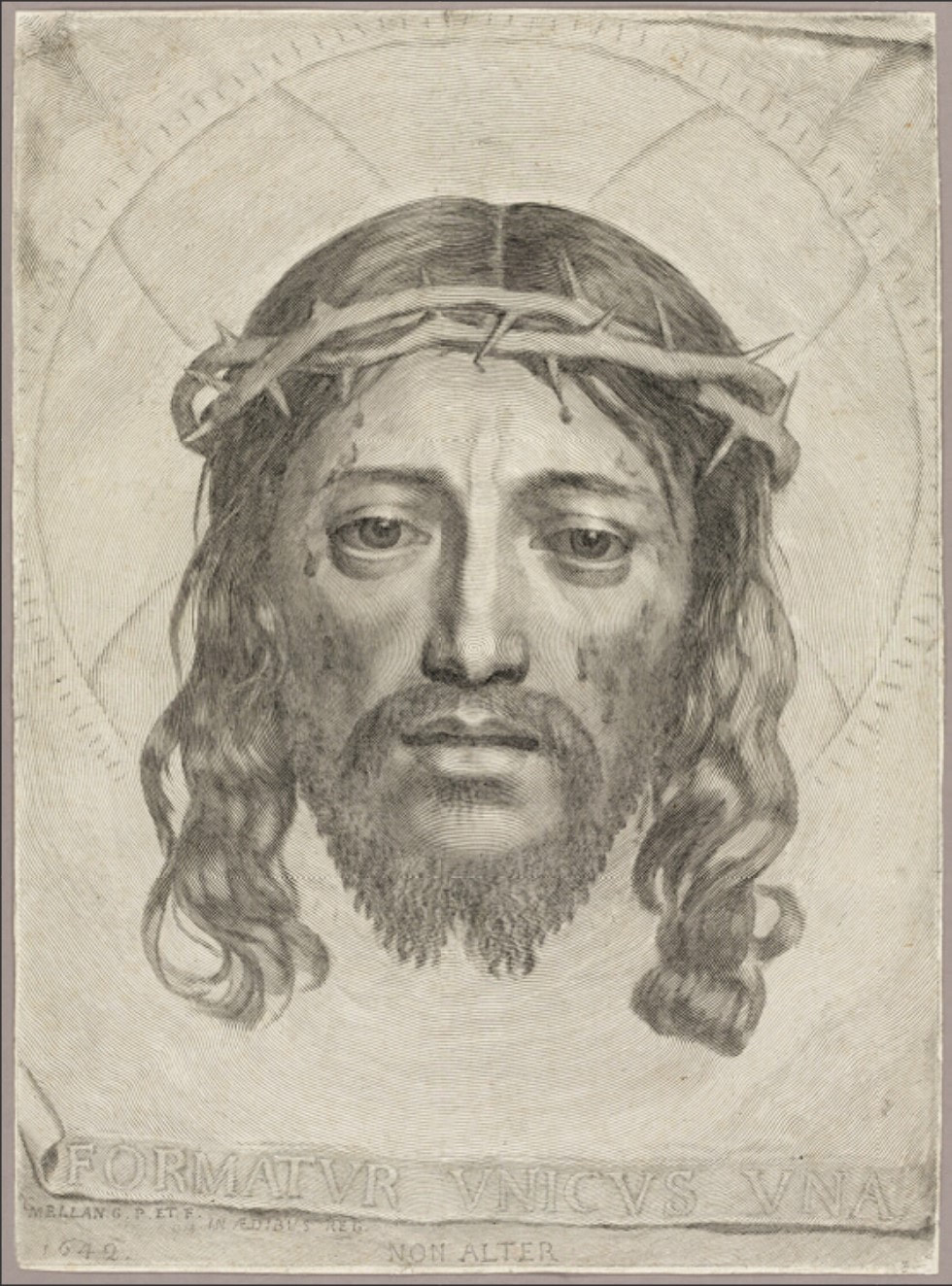
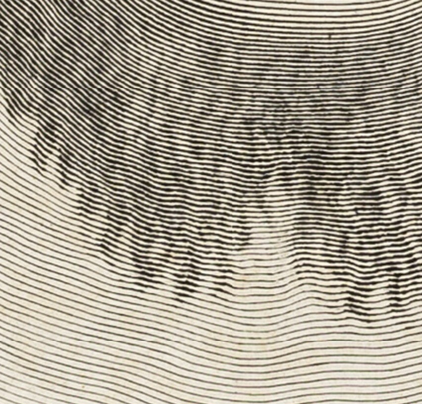
Ann Shafer Even if engraving seems arcane to viewers, there is one print that always impresses. It is the virtuoso engraving by Claude Mellan, The Sudarium of Saint Veronica, 1649. The print shows the sudarium (Latin for sweat cloth) that Veronica used to wipe the sweat off Jesus’ face during a chance encounter (it’s also called Veronica’s veil). It became inexplicably imprinted with an image of Jesus’ face. If the appearance of Christ’s face on the sudarium was a miracle, perhaps in turn, an artist’s ability to produce such a work might be seen to link their talent to a higher power. The inscription translates to "It is formed by one and no other." As if linking the artist’s talent to the divine wasn’t clear enough. This became Mellan’s calling card demonstrating his prowess with a burin, the tool used to carve the line into the copper plate. In Mellan’s composition, Jesus’ face is rather straight forward and remarkably symmetrical. Christ looks defeated and resigned with his eyes slightly downcast, and he is shown with droplets of blood from the crown of thorns that pierce his skin. The edges of the cloth are shown in a tromp l’oeil manner, meaning intended to fool the eye with their realism. It looks like the edges are curling off the sheet. This artifact foreshadows Jesus’ passion, conveyed through Veronica (the name derives from the Greek word for truth), and gives us the truth of his pain. While it may elicit a feeling of gratitude and hope for those that are spiritually Christian, for others, it may seem like a trope. But either way, I think we all can appreciate this landmark of printmaking. Here’s the part where I get to say this print “rewards scrutiny,” a phrase I used often in the museum’s studyroom. Look closer. Then zero in on Christ’s nose. Begin at Christ’s nose and follow the line outward. Keep going. Right. The image is made by increasing and decreasing the width of the single line created by carving into the copper plate. It’s really a jaw dropper, isn’t it? How in the world did he manage it? It boggles the mind. It always leaves an impression on me. Pictured is the impression of Mellan's print from the Art Institute of Chicago, chosen because one can zoom in pretty tightly to marvel at the line work. You can find it here: https://www.artic.edu/.../the-sudarium-of-saint-veronica
0 Comments
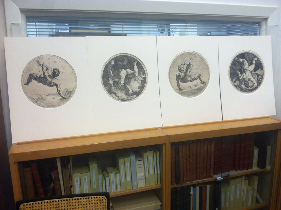
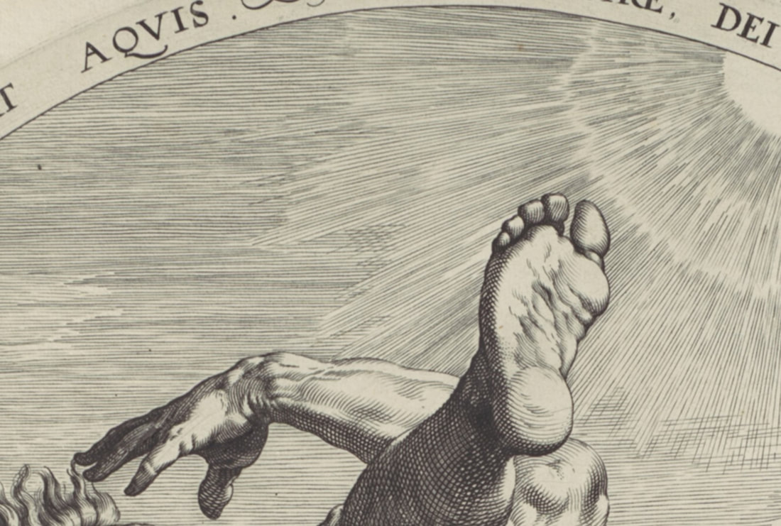
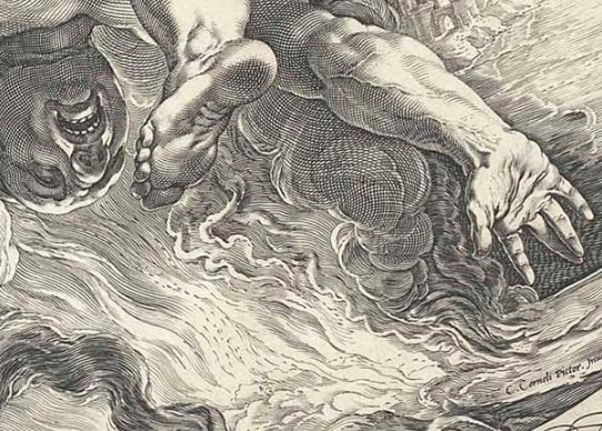
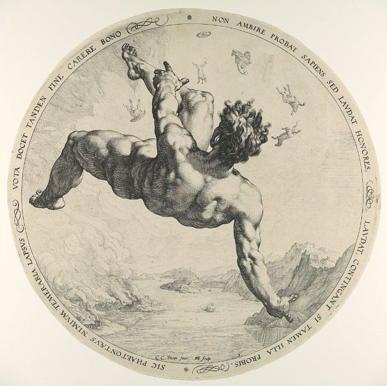
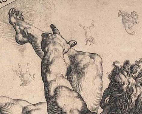
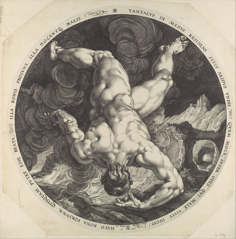
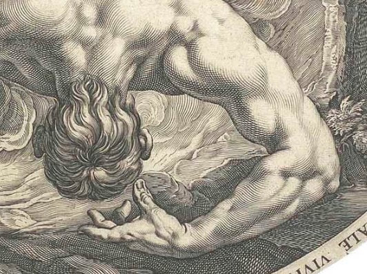
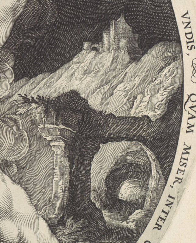
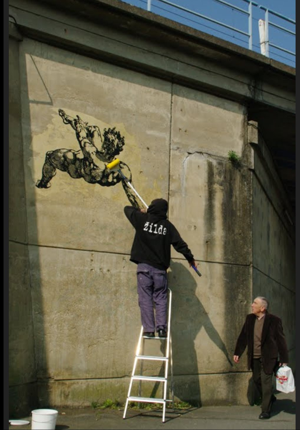
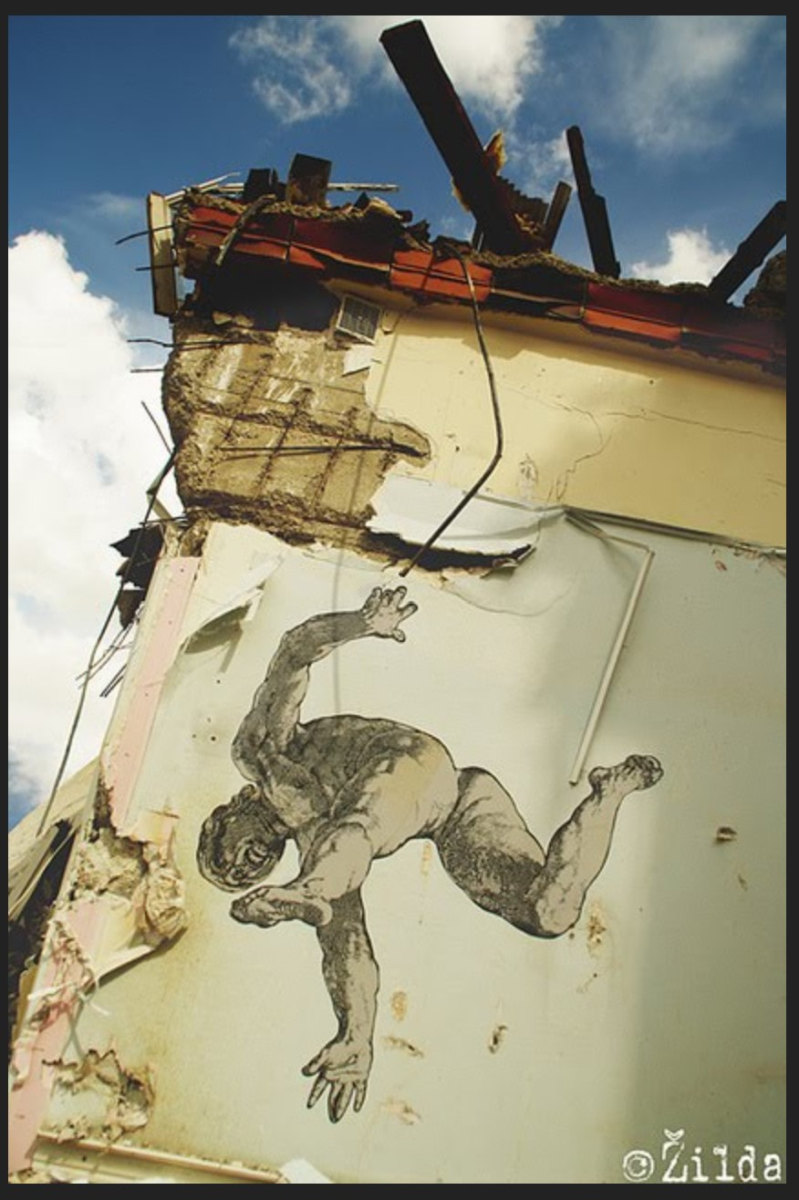
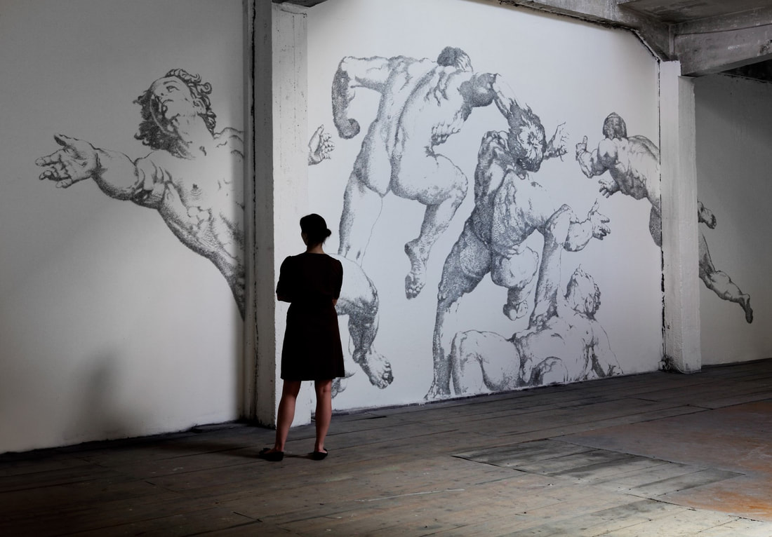
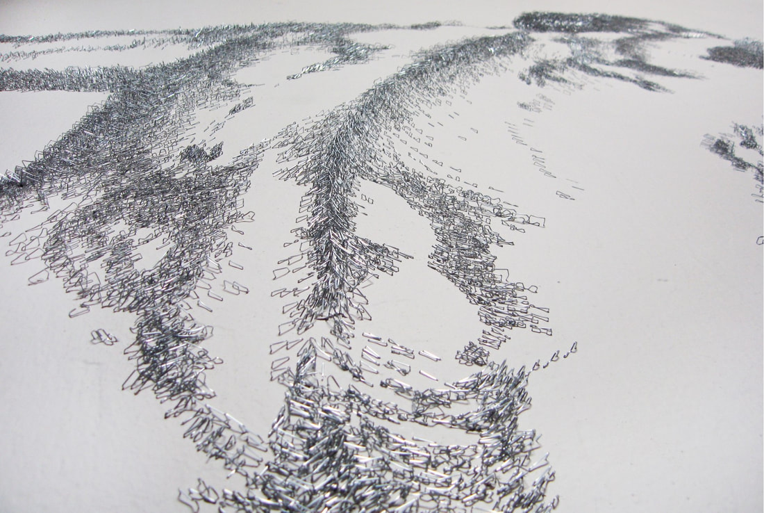
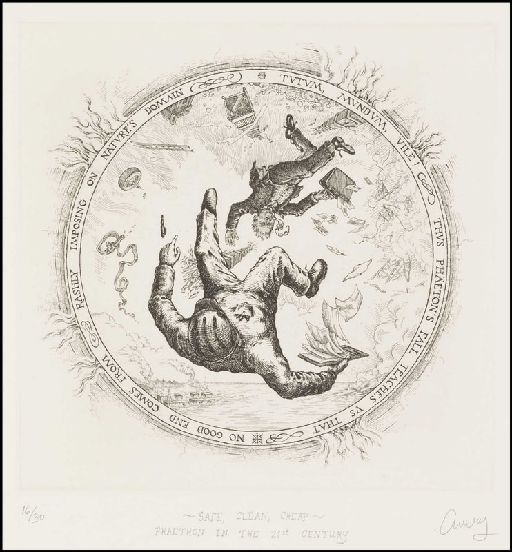
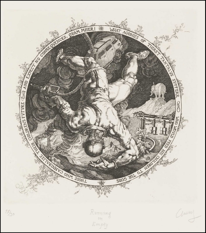
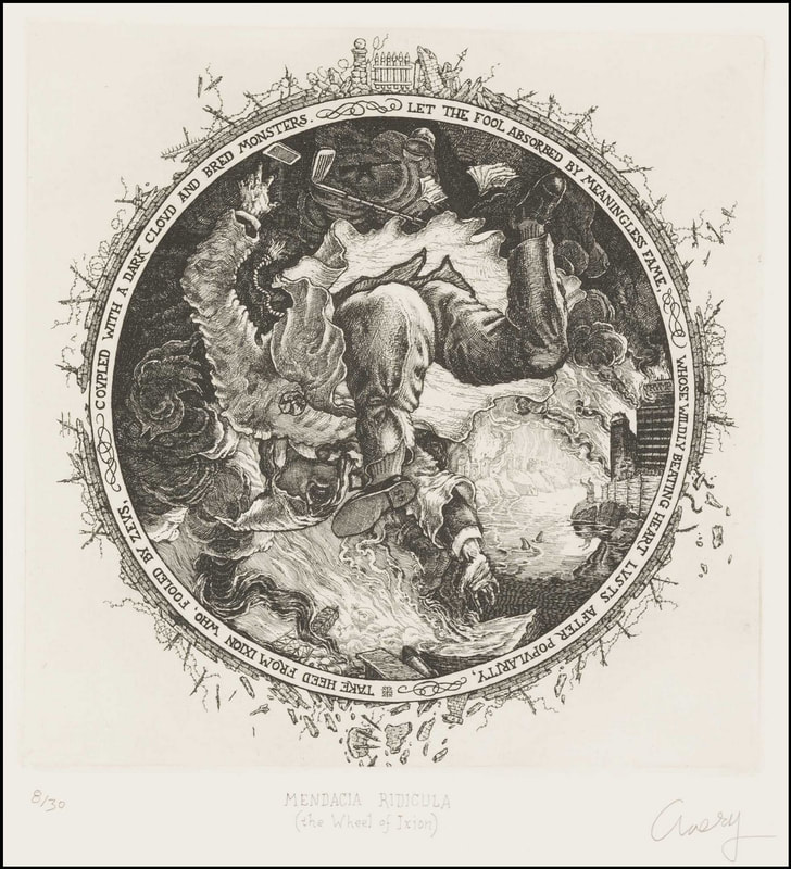
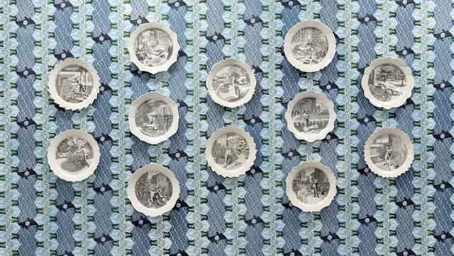
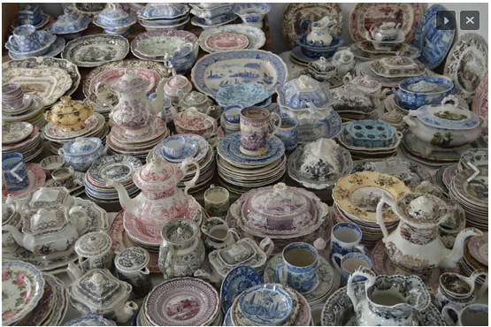
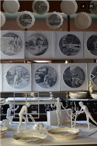
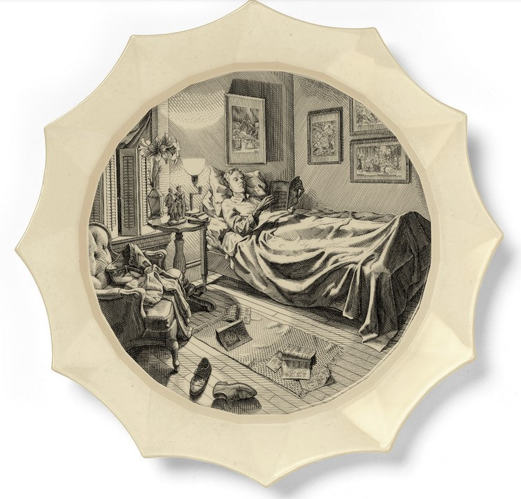
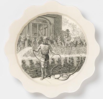
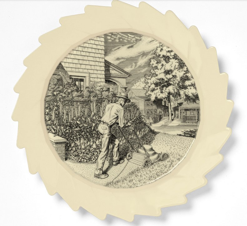
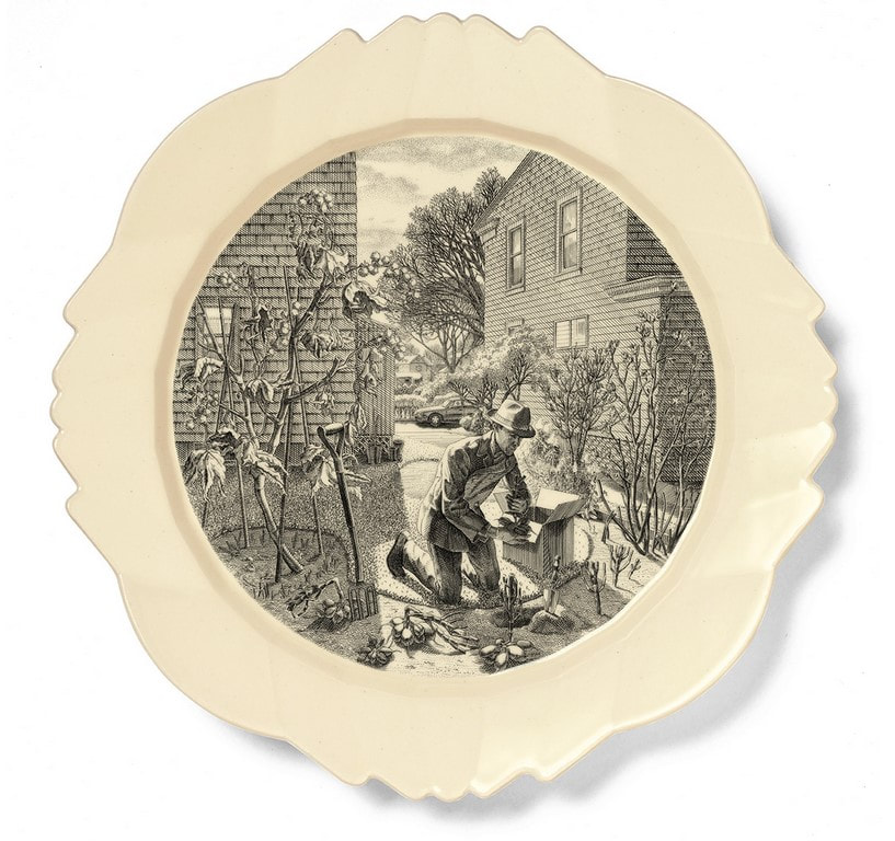
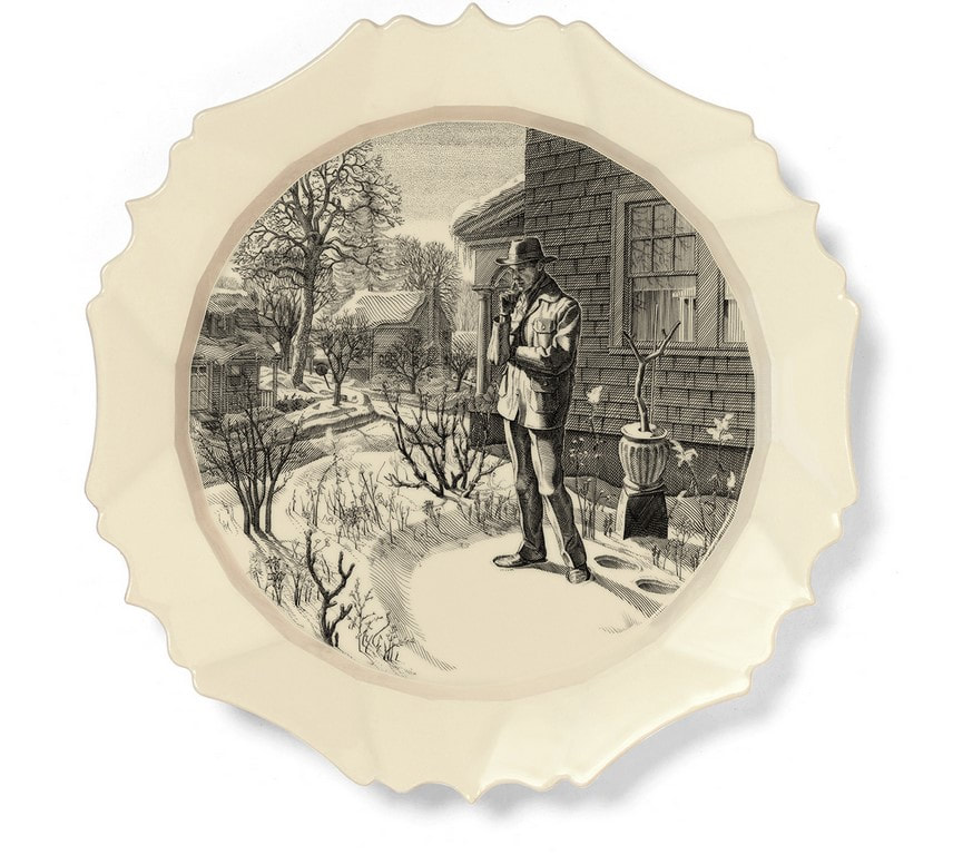
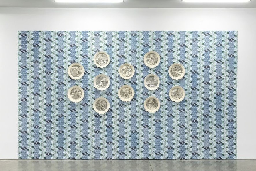
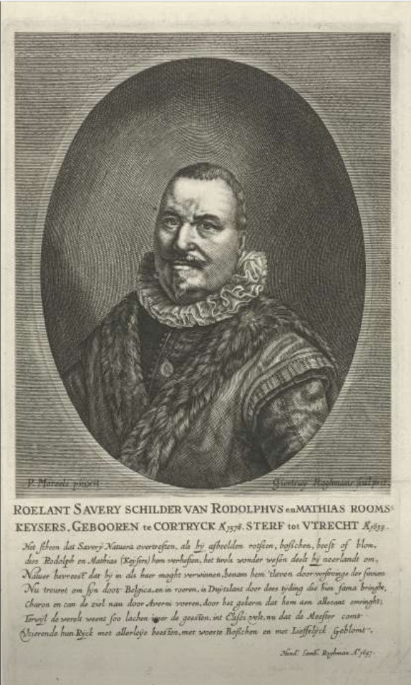
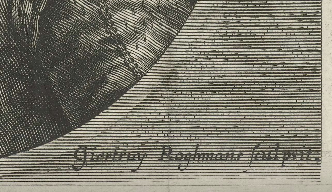
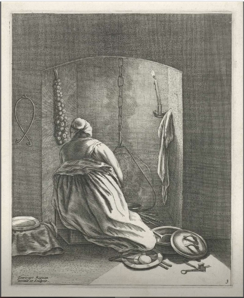
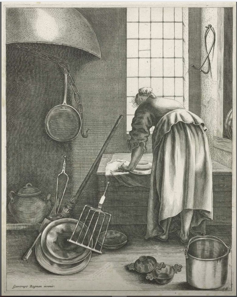
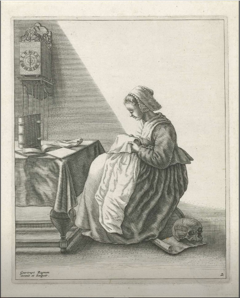
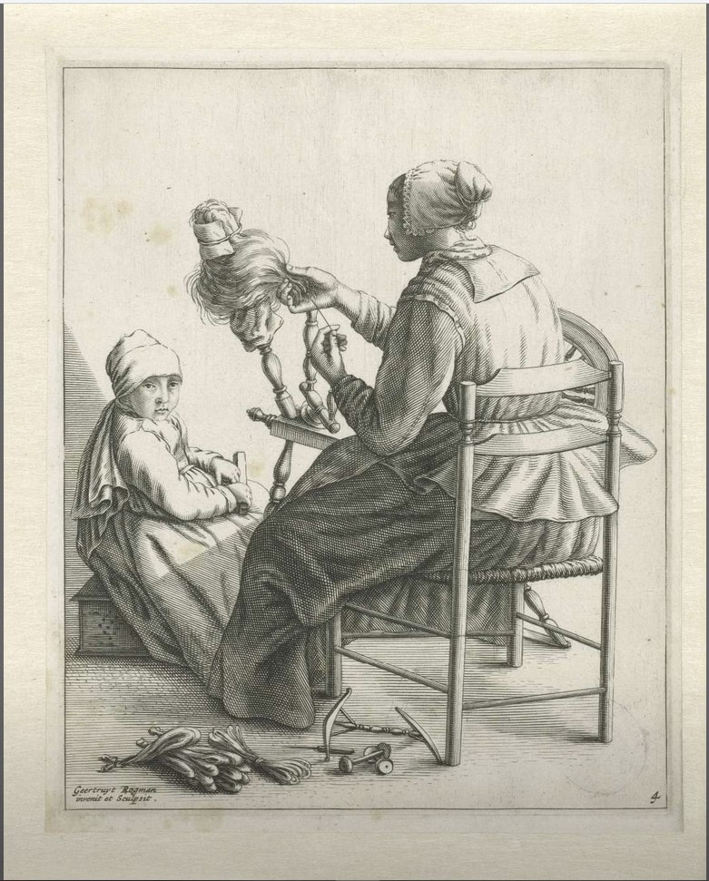
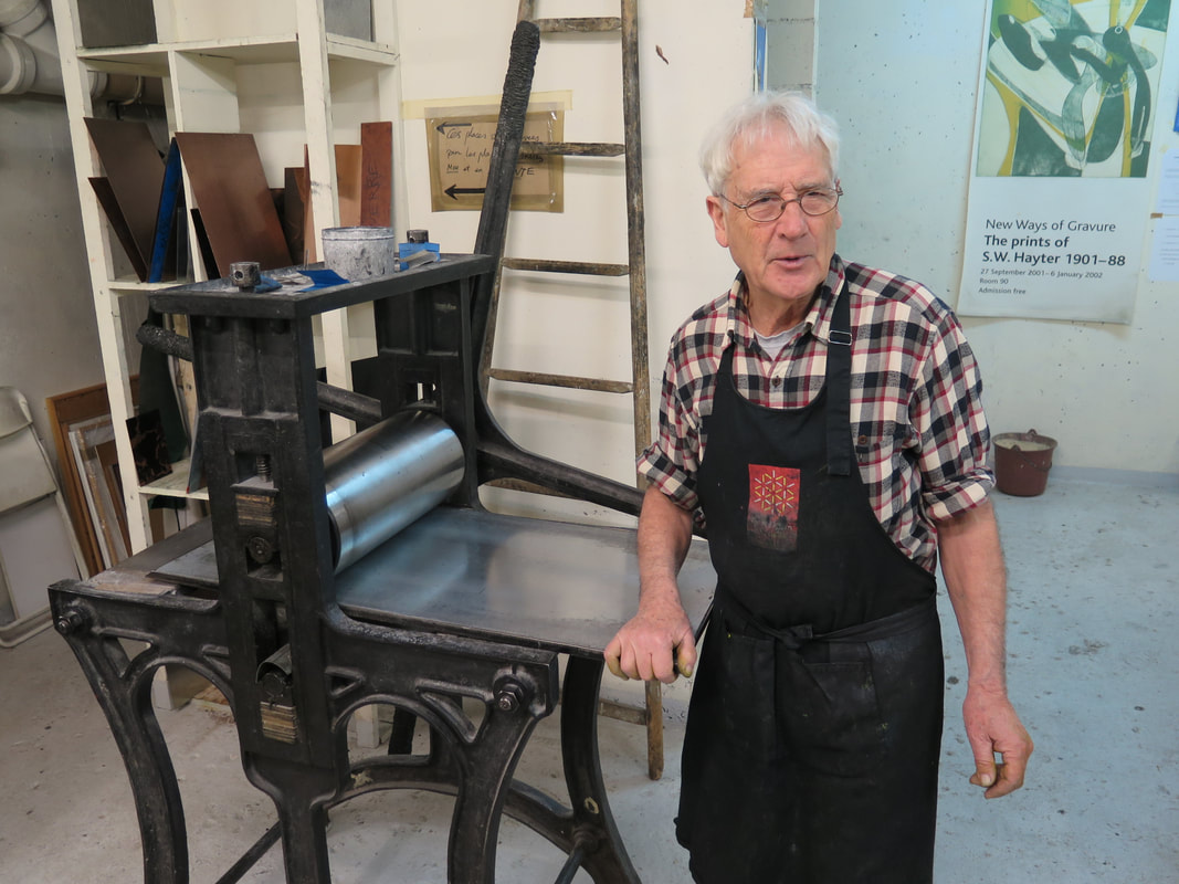
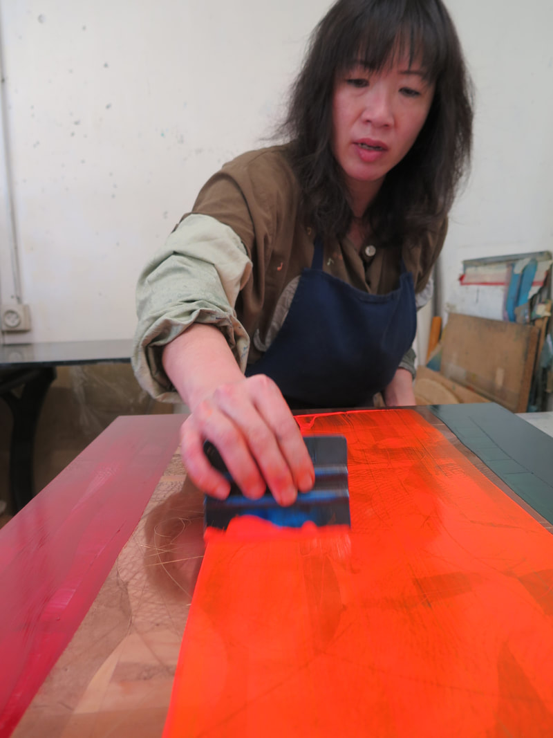
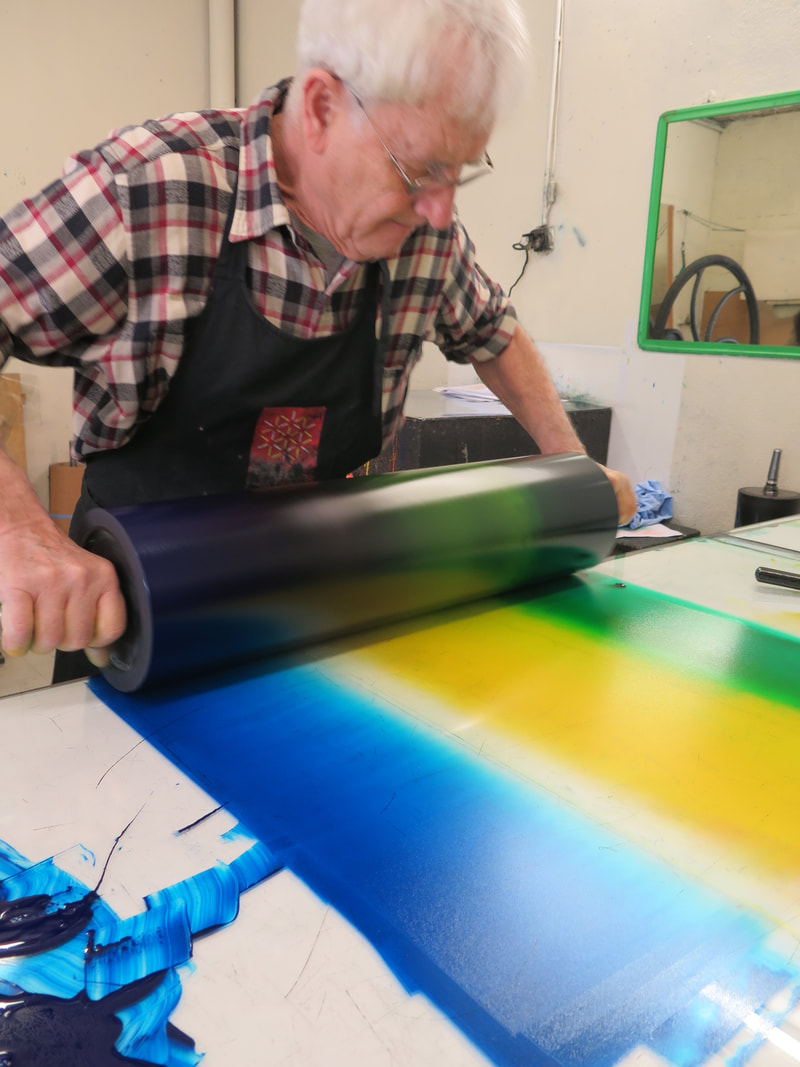
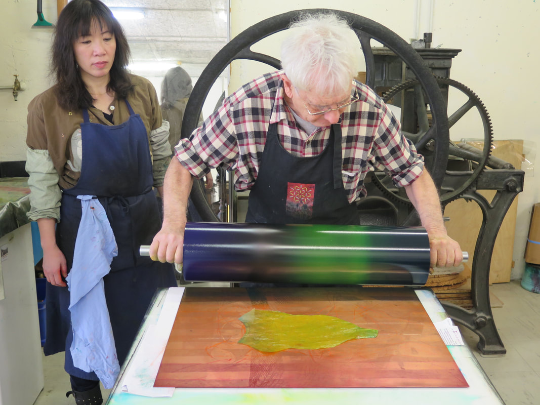
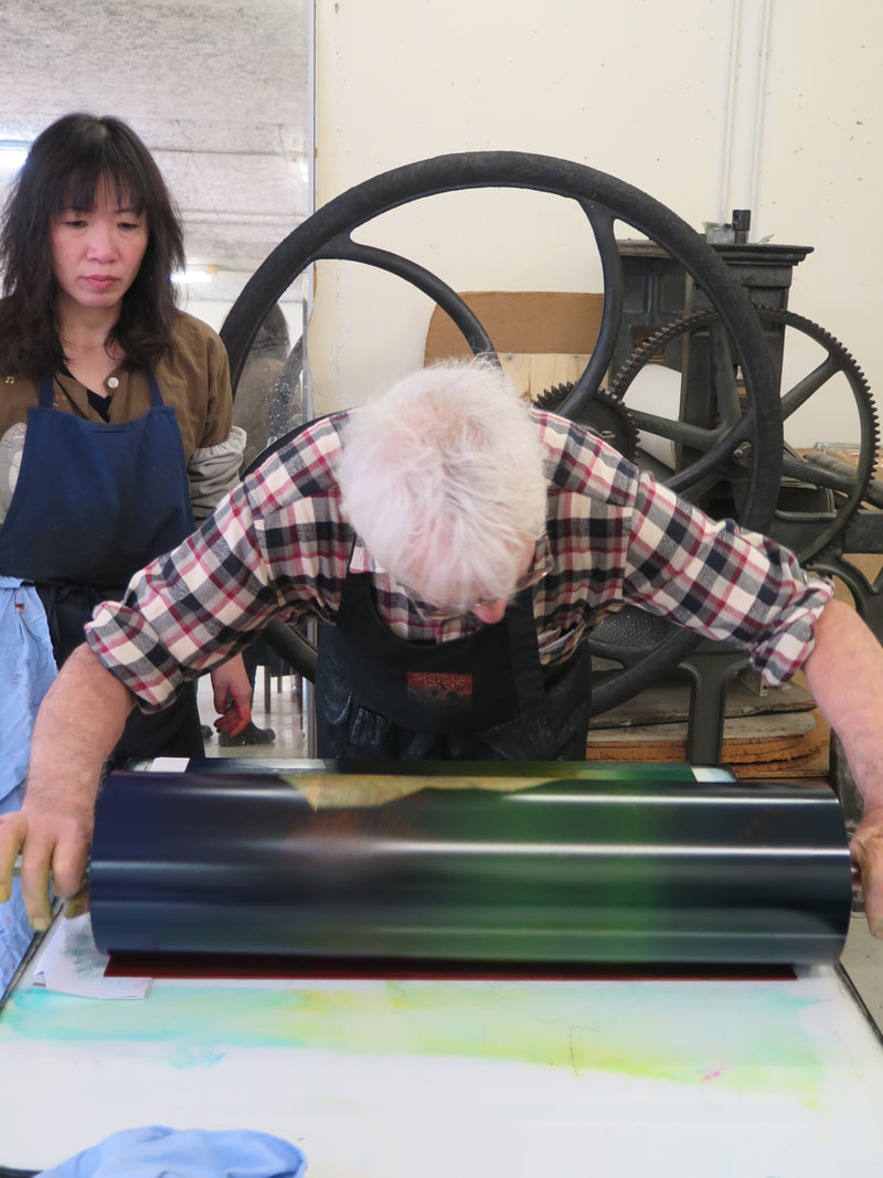
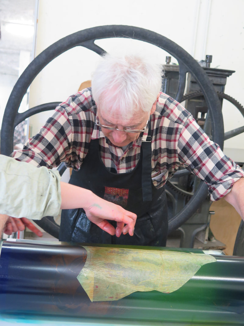
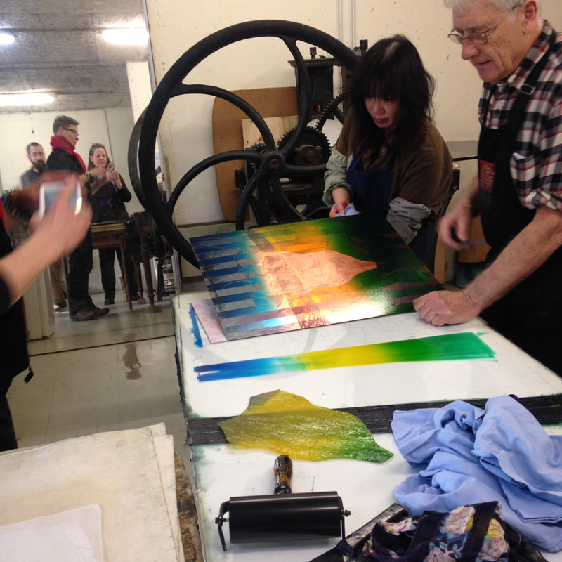
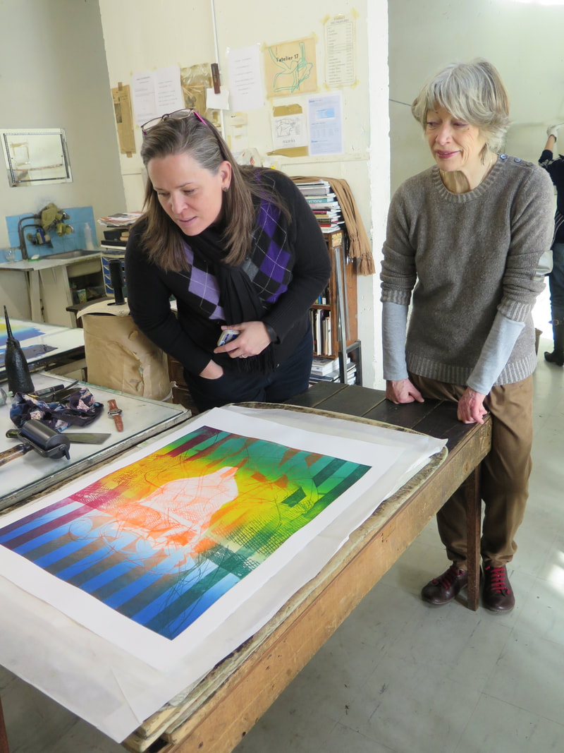
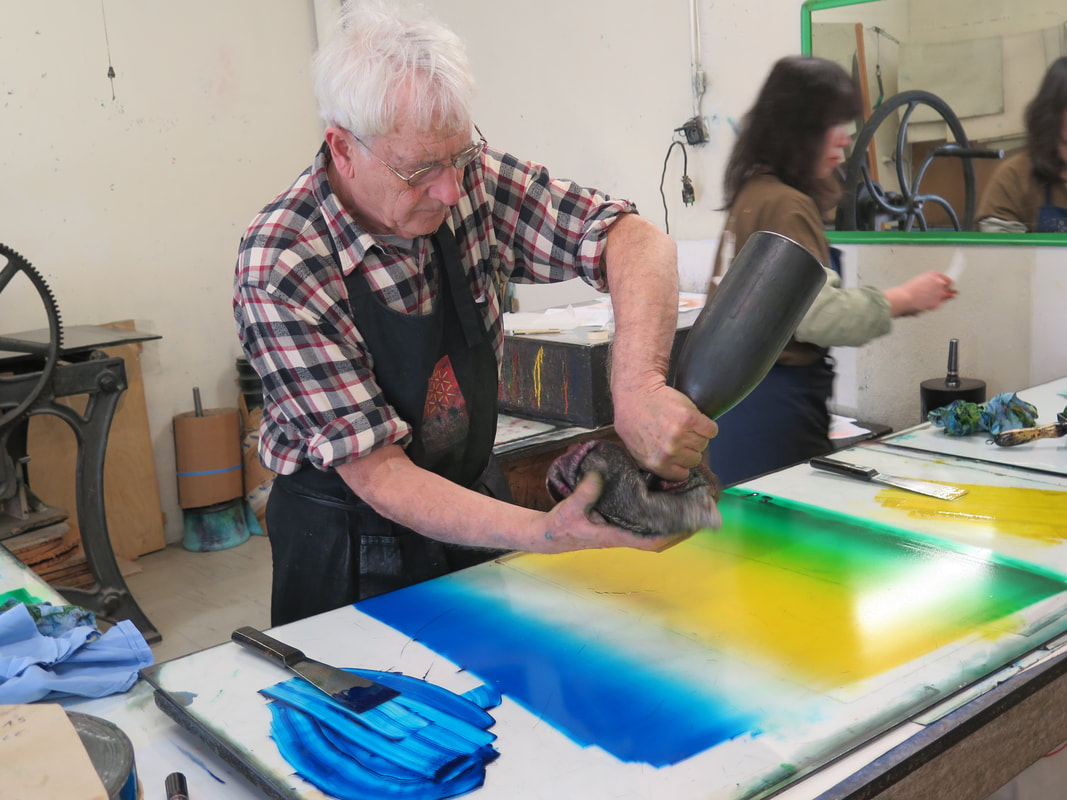
Ann Shafer While teaching young artists about prints, it’s easy to think they won’t respond to works made before 1960, but they can and do. There is a quartet of engravings from 1588 called The Disgracers that were always a highlight in Tru Ludwig’s History of Prints class. They are by Hendrick Goltzius and portray four male nude figures falling. Each engraving offers a muscular male in different views of nearly the identical pose. The four men are Icarus, Ixion, Phaethon, and Tantalus. Each of them had tried to enter the realm of the gods and were sentenced to eternal torture for their hubris. Kinda like the ancient Greek version of the fall of man. I’m guessing the students reacted to the same things I do in the prints: the artist’s audacity in portraying figures with such weird and difficult foreshortening; describing textures and patterns with surprisingly regimented engraved marks; giving a convincing sense of falling; portraying gentlemen-bits, as it were. (I can’t recall another example of such views of male nudes. Let me know if you can.) I also respond to them as a captured moment that tells the whole story of each flawed character without much context or narrative. I love the tondo shape (why aren’t they referred to simply as round?), and the text that runs around the circumference. It’s almost like we are looking through a telescope at them falling through the sky. The perspective and compositions are so startling after looking at standing figure after standing figure, they always elicited oohs and ahhs from the students. One might think the set of four would come to the museum together, having been originally collected as a group. But when I arrived at the museum there were only three of the four already in the collection and they all were, oddly, from different gifts. The missing print was Phaethon. I’m sure I wasn’t the only curator ever to work in the collection who kept an eye out to acquire the fourth print, but it took seven years to find one. It was like finding the long-lost last piece of the puzzle, and it still makes me expel a long sigh to think of them all together. There is just something wonderful about being able to show all four to students and visitors in the study room. The Disgracers are so well known to scholars of Western printmaking, you don’t even need to mention the artist’s name. Subsequent artists have been inspired by their compositions and messages and have borrowed from them to create their own take on them. For instance, there is a street artist in France named Žilda whose 2010 Liber Casus features wheat-pasted paintings of falling figures installed on buildings and bridges in Paris, Rennes, and Belgrade. And there is another artist, Baptiste Debombourg, who in 2012 created a mural based on Phaethon from The Disgracers using many thousands of staples. Yes, staples. Lawrence Goedde sums up their use of the falling figure well: “For both, the artifice of Goltzius’s series clearly provokes, intrigues, and challenges as they adapt his imagery to new purposes. Žilda sees the falling figures pasted high above passersby in urban settings as destabilizing the familiar world of the streets, provoking reflection on falling as a metaphor for the necessity of risk-taking amid the general indifference and banality of ordinary life. Debombourg finds in the heroic scale of Mannerist male nudes a metaphor for societal, and especially male, violence as seen in popular super-heroes, an aggression and familiarity that he sees as echoed in the way staples are driven into board and their utter ubiquity.” (https://apps.carleton.edu/kettering/goedde/) While Žilda and Debombourg’s Goltzius-inspired works are not prints, a third artist, David Avery, created a set of four etchings that stays closer to Goltzius’ scale and compositions in their inclusion of the text around the circumference of each. But Avery has changed the characters in order to comment about issues facing us today. Safe, Clean, Cheap: Phaeton in the 21st Century, 2011, highlights issues of the environment and its imminent destruction at our hands. Too Close to the Sun, 2013, points at human’s problematic fascination with phones and screens. Running on Empty, 2016, critiques America’s dependence on big oil. And the last in the set, Mendacia Ridicula, 2018 (Latin for ridiculous lying), satirizes politicians and the divisiveness that has come from all that lying. I appreciate it when artists look to historical examples. It reinforces the idea that they know upon whose shoulders they stand. Wouldn’t it be cool to pull together a group of contemporary works with Goltzius’ engravings for an exhibition about inspiration and artistic heroes? I’m sure there are more examples of artists looking at The Disgracers. Let me know who comes to mind. There is deep richness to be found in the history of prints. Lucky for us, there are plenty of places to see prints like these and many curators and scholars who are happy to talk about them. Ann Shafer Prints pop up everywhere. But did you ever expect to eat on them? Engravings of bucolic scenes, flora, and fauna have been transferred to ceramics since the technique was developed in England in the 1750s. Highly decorated dinnerware was previously hand painted, costly, and meant for the aristocracy. As a way of getting decorative serving sets to the growing middle classes, the transfer process was developed and has been used ever since. You probably have some in your cupboard even now. Andrew Raftery, one of very few contemporary engravers, has collected transferware for a long time as he contemplated creating a set of dinner plates of his own design. Eight years in the making, Autobiography of a Garden on Twelve Engraved Plates was finally released in 2016 (the set was published by Mary Ryan Gallery). The set of twelve plates represent the twelve months of the year, each showing Raftery engaged in thinking about, planning, and working in his garden. Raftery’s process is extensive. Scale models of each scene were made, studies and grisaille drawings were executed, and each plate’s shape was designed by the artist (each shape is unique). And that’s before he began engraving the copper plates, a laborious process in itself. No wonder it took eight years to complete the project. Oh, and he designed wallpaper that the plates may be hung upon. It’s quite an accomplishment. The set was among the final objects I acquired for the museum. Glad to have accomplished that last purchase. Ann Shafer During History of Prints class, it’s impossible to show everything. After each class, Tru Ludwig and I would reassess our lists and see where we could make cuts in the early periods to make room for the contemporary works at the end that the museum had recently acquired. For a while we had early Italian female printmaker Diana Scultori as the first woman to appear on the chronological list, but she got bumped off at some point (sorry Diana). If I recall correctly, the BMA’s prints by her were not great representations of her work. So, the first woman on the list became Geertruydt Roghman (Dutch, 1625–1657), an artist from an extensive artist family in Amsterdam. Geertruydt’s father, Hendrik Lambertsz. Roghman (1602–before 1657), was an engraver. Her mother Maritje’s father was Jacob Savery II (1593–c. 1627), a painter and etcher. Her great uncle was the Flemish painter and printmaker Roelant Savery (1576–1639), whose patron was Rudolf II, the Holy Roman Emperor (1552–1612). Geertruydt’s brother Roelant (1627–1692) and sister Magdalena (1637–after 1669) were also artists and the three siblings worked with their father. As we’ve seen in our discussions of Diana Scultori and Elisabetta Sirani (see recent posts), women printmakers were frequently members of a larger artist family. Otherwise, it must have been difficult to access the world of print publishing. Roghman mostly made reproductive prints—meaning prints reproducing the compositions of other works, which can be paintings or even other prints. Her earliest known work is a portrait engraving of her great uncle Roelant, after a painting by Paulus Moreelse (1571–1638). With her brother Roelant, she made fourteen landscape etchings after his drawings. They were in their early twenties when they made these. But, Roghman is best known and celebrated for a set of five prints that are her own designs (not after some other artist’s paintings or prints) that show women engaged in daily household tasks. They are remarkable in their originality and banality. In four of them an anonymous woman is going about her day: ruffling some fabric, spinning yarn, cooking, cleaning cookware. In the fifth print, two women are sewing. Interestingly, in two of the prints, lone figures have their backs turned to the viewer. So why images of daily life rather than moralizing or religious lessons, you ask? The simple answer is that in Northern Europe (Germany, Holland, Flanders), an anti-Catholic movement was born in the sixteenth century. The Protestant movement (protest—get it?) prescribed that people did not need the Church as intercessor but they should instead form a more direct and personal relationship with God. This meant no images in churches, no religious paintings, no religious prints. (It’s more complicated than that, but you get the picture.) This anti-religious-imagery trend marked the rise of other subjects in art: portraits, still lifes, landscapes, scenes of daily life. With Roghman’s series of women doing daily tasks, we get even more of a sense of the reality of women’s daily lives. She was one of the few seventeenth-century Dutch artists to focus on ordinary women. As the Metropolitan Museum’s web site points out: “In comparing Roghman's images of household servants with those of [Gerrit] Dou and [Johannes] Vermeer, it is tempting to distinguish male and female points of view (as some critics have rather emphatically). Whatever the interpretation, it is important to bear in mind that Roghman's prints were intended for a broad art market, whereas Dou's famously expensive paintings (as opposed to the later prints after them) and The Milkmaid by Vermeer were made with individual collectors in mind.” Roghman’s prints were an abrupt departure from the religious imagery we had been covering in class up to that point. The figures are so ordinary that their meaning and importance was lost on the students. Only with context did they come to life. Of course, Tru was there to guide us every step of the way. Ann Shafer In recognition of the one hundredth anniversary of the ratification of the nineteenth amendment granting women the right to vote, the BMA has just concluded its year of the woman during which it exhibited and acquired only work by female artists. I applaud the effort and am happy to see they have shown some terrific artists during 2020. It is pretty easy in contemporary art to find excellent female artists. Despite the fact that women still account for less than 50% of exhibitions across US museums, the problem is at least recognized. It is much harder to find huge numbers of women working in the early centuries of Western art—say, fourteenth through eighteenth centuries. In the early history of prints, when women artists are noted, most are members of a print and publishing family or are amateur artists. Remember, women were barred from art schools and institutions and there was a serious barrier to entry on multiple fronts. More research is emerging about these should-be-better-known artists. But it takes time and a lot of work. In the next few posts I want to introduce you to a few early female printmakers. Today, please meet Diana Scultori (Italian, 1536–1588). Part of the reason we know about Scultori’s work at all is that she signed her prints, which she did from her earliest known composition, The Continence of Scipio, 1542, to her last. The existence of this first dated print has thrown into question her birth date, which is usually noted as 1536. A birth date in the late 1520s is more likely given the math--most of us would agree that accomplishing an engraving at age six is unlikely, no matter how good she was. Scultori was one of four children of Giovanni Battista Scultori, who lived and operated a print workshop in Mantua. She learned printmaking in her father’s studio and executed a number of prints reproducing the compositions of several artists including Giulio Romano, who was a friend and neighbor. Romano was a pupil of Raphael and was the official artist of Duke Federico Gonzaga of Mantua. Scultori's prints helped spread Romano's renown far and wide. Scultori received her first public recognition as an engraver in Giorgio Vasari's second edition of Le vite de' più eccellenti pittori, scultori, e architettori (The Lives of the Most Excellent Painters, Sculptors, and Architects) in 1568, an early codification of Italian art history. In it Vasari talks about meeting the artist and her father on a trip to Mantua: "To Giovanbattista Mantovano, an engraver of prints and an excellent sculptor, whom we have spoken of, in the Vita of Giulio Romano and that of Marcantonio Bolognese, two sons were born, who engrave prints on copper divinely; and what is more wondrous, a daughter named Diana, who also engraves very well, which is a wondrous thing: and I who saw her, a very young and gracious young girl, and her works which are very beautiful, was astounded." This is a huge deal. Scultori engraved some sixty-two prints (that we know of), mainly of religious and mythological subjects. With her architect husband, Francesco Capriani da Volterra, she moved to Rome in 1575, where she received a Papal Privilege to make and market her own work. From the middle of the sixteenth century print publishers applied for privileges for specific prints or for all of their publications, which gave a legal base for prosecution in case of breach of the privilege. It must have been remarkable for the Pope to give Scultori the privilege on all her prints, which she signed “Diana” or “Diana Mantuana” (indicating she hailed from Mantua). Later, she married another architect, Giulio Pelosi, after her first husband died in 1594. She herself died in 1612. I imagine we would know absolutely nothing about her if she had not insisted on signing her works. Did she understand that any unsigned work would be assumed to be by a man? I am guessing she did, and that that confidence was encouraged by her father and brothers in the family printshop. I would love to have been a fly on the wall in that workshop. Don’t miss how she articulate those clouds in the last detail: stylized and hilarious, in the best way. 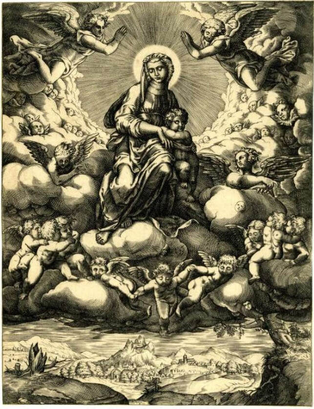 Diana Scultori (Italian, 1536–1588). The Virgin and Child accompanied by many angels seated on a bank of clouds, 1547–1612. Engraving. Sheet (trimmed to platemark): 330 x 416 mm. British Museum: Purchase, 1873,0510.232. 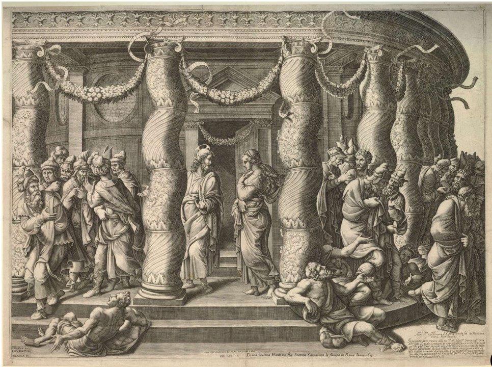 Diana Scultori (Italian, 1536–1588), after Giulio Romano (Italian, c. 1499–1546). Christ and the Woman taken in adultery, standing between two Salomonic columns of a temple, 1575. Engraving. Sheet (trimmed to platemark): 420 x 577 mm. British Museum: Purchase, 1874,0808.319. 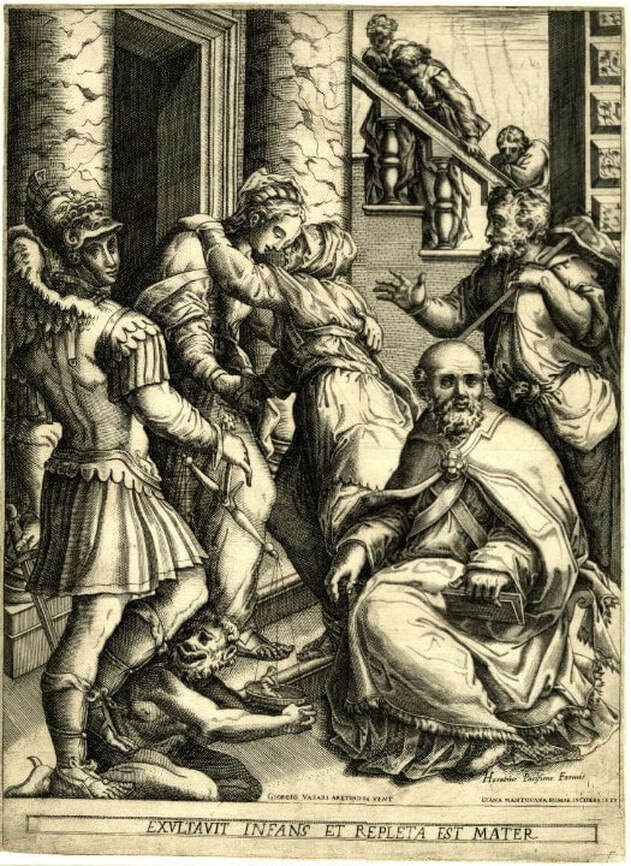 Diana Scultori (Italian, 1536–1588), after Giorgio Vasari (Italian, 1511–1574). The Visitation, 1588 Engraving. Sheet (trimmed to platemark): 390 x 284 mm. British Museum: Bequest of Clayton Mordaunt Cracherode, 1799, V,1.133. 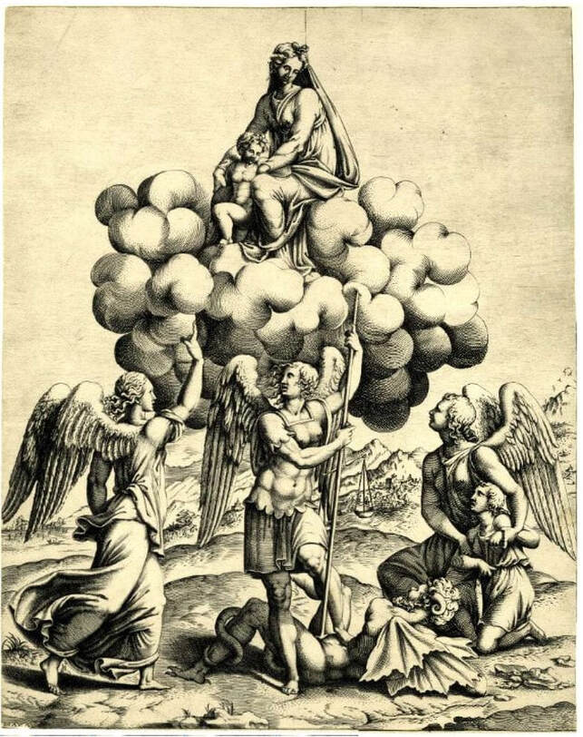 Diana Scultori (Italian, 1536–1588), after Giulio Romano (Italian, c. 1499–1546). The archangels Michael, Gabriel and Raphael adoring the Virgin and Child who occur above seated on a cloud, 1547–1612. Engraving. Sheet (trimmed to platemark): 340 x 270 mm. British Museum: Bequest of Sir Hans Sloane, 1799, V,8.12. 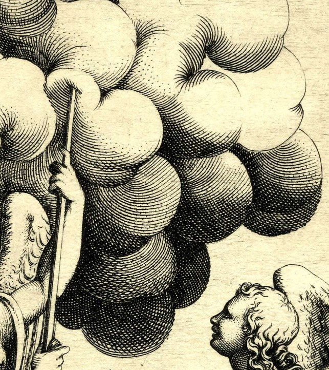 [DETAIL] Diana Scultori (Italian, 1536–1588), after Giulio Romano (Italian, c. 1499–1546). The archangels Michael, Gabriel and Raphael adoring the Virgin and Child who occur above seated on a cloud, 1547–1612. Engraving. Sheet (trimmed to platemark): 340 x 270 mm. British Museum: Bequest of Sir Hans Sloane, 1799, V,8.12. Ann ShaferRecently I saw a t-shirt that said “Don’t make me repeat myself. –History" There is a lot going on these days. Between the pandemic, politics, and confronting America’s legacy of slavery and systemic racism, I am, as I’m sure you are, anxious. On top of that, as I write this, I’m riding out a hurricane in a cottage overlooking the very turbulent waters of Vineyard Sound. We all know this period is not unique. Humans have made it through more dire times than these. But still, we seem doomed to repeat our mistakes. As I’ve written before, I really appreciate an artist who digs in and expresses the fears and worries of their time in a way that helps viewers process and think. Especially if the images read just as well in our time as in theirs. Gabor Peterdi was a Hungarian artist who worked at Atelier 17 in Paris in the 1930s during the Spanish Civil War and leading up the second World War. Like so many of his compatriots, he created prints that address issues of social justice and crimes against humanity, sometimes using the bull and bull fights or mythical horses and man-animal creatures as stand-ins for humankind. One rarely finds any self-portraits among the prints made at Hayter’s workshop, but Peterdi is notable for a 1938 series of self-portraits in which he holds his head in his hands in despair. It’s hard to get the emotion just right in these kind of images, and I think Peterdi hits the nail on the head. Like so many others, Peterdi made his way to America at the beginning of the war (remember, Europe was in turmoil for years leading up to the official declaration of war in September 1939). He enlisted in the U.S. Army and fought for his new country. No surprise, that experience finds its way into his work. Peterdi went on to have a long career both making prints and teaching printmaking. In addition to establishing the printmaking program at the Brooklyn Museum School, Peterdi taught at Hunter College from 1952–1960, and then at Yale University from 1960–1987. (Among his many students at Yale were Peter Milton and Chuck Close.) In a previous post I wrote about artists making prints reacting to World War II in the years after its conclusion as a demonstration of that conflict’s lasting effect. I also wrote about artists writing about their own work and how I wish more artists would take the time to do the same. Peterdi’s The Vision of Fear, 1953, fits both categories. About the print Peterdi wrote: “My basic idea was to create an oppressive, enervating image haunted by fearful symbols of destruction. I tried to express a composite feeling of flying with deadly birds and watching them from below.” This print is interesting also because of the four additional plates he laid on top of the large plate as it passed through the press. The deep emboss accentuates their addition as does the red ink he used, making the crosses seem to fall from the sky. I’ve included images here that I don’t mention because I think Peterdi deserves more attention and I love his sensibility. But I will note that Still Life in Germany is one that got away. I had been keeping my eye on it for years, waiting for the right time to pitch it. In the end, I ran out of time. By the way, if any of you studied with Peterdi, I’d love to hear your stories. Gabor Peterdi (American, born Hungary, 1915–2001) Despair I, 1938 Etching and engraving Plate: 266 x 197 mm. (10 1/2 × 7 ¾ in.) Sheet: 448 x 315 mm. (17 5/8 × 12 3/8 in.) Museum of Modern Art: Purchase, 146.1944 Gabor Peterdi (American, born Hungary, 1915–2001) Despair II, 1938 Etching and engraving Plate: 245 × 206 mm. (9 5/8 × 8 1/8 in.) Sheet: 304 × 269 mm. (11 15/16 × 10 9/16 in.) Yale University Art Gallery: Gift of James N. Heald II, B.S. 1949, 2011.148.8 Gabor Peterdi (American, born Hungary, 1915–2001) Despair III, 1938 Etching and engraving Plate: 315 x 248 mm. (12 3/8 × 9 ¾ in.) Sheet: 452 x 340 mm. (17 13/16 × 13 3/8 in.) Museum of Modern Art: Gift of the Artist, 103.1955 Gabor Peterdi (American, born Hungary, 1915–2001) Despair IV, 1938 Etching, engraving, and drypoint Plate: 241 × 203 mm. (9 1/2 × 8 in.) Sheet: 453 × 329 mm. (17 13/16 × 12 15/16 in.) Yale University Art Gallery: Gift of James N. Heald II, B.S. 1949, 2011.148.9 Gabor Peterdi (American, born Hungary, 1915–2001) Despair V, 1938 Etching Plate: 247 × 209 mm. (9 3/4 × 8 1/4 in.) Sheet: 453 × 329 mm. (17 13/16 × 12 15/16 in.) Yale University Art Gallery: Gift of James N. Heald II, B.S. 1949, 2011.148.10 Gabor Peterdi (American, born Hungary, 1915–2001) The Vision of Fear, 1953 Etching and engraving Plate: 651 × 933 mm. (25 5/8 × 36 3/4 in.) Sheet: 749 × 105 mm. (29 1/2 × 41 1/4 in.) Mutual Art Gabor Peterdi (American, born Hungary, 1915–2001) Still Life in Germany, 1946 Engraving Plate: 302 x 227 mm. (11 7/8 x 8 15/16 in.) Conrad Graeber Fine Art Gabor Peterdi (American, born Hungary, 1915–2001) Hunter Hunted, 1947 Engraving Plate: 394 x 368 mm. (15 1/2 x 14 ½ in.) Annex Galleries Gabor Peterdi (American, born Hungary, 1915–2001) The Price of Glory, 1947 Engraving Plate: 276 x 454 mm. (10 7/8 x 17 7/8 in.) Sheet: 336 x 514 mm. (13 1/4 x 20 ¼ in.) Dolan/Maxwell 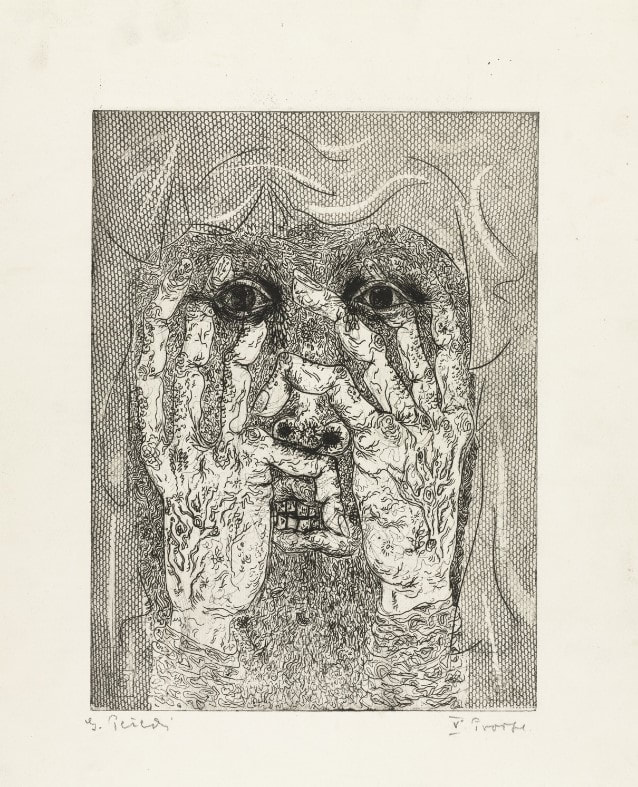 Gabor Peterdi (American, born Hungary, 1915–2001). Despair I, 1938. Etching and engraving. Plate: 266 x 197 mm. (10 1/2 × 7 ¾ in.); sheet: 448 x 315 mm. (17 5/8 × 12 3/8 in.). Museum of Modern Art: Purchase, 146.1944.  Gabor Peterdi (American, born Hungary, 1915–2001). Despair II, 1938. Etching and engraving. Plate: 245 × 206 mm. (9 5/8 × 8 1/8 in.); sheet: 304 × 269 mm. (11 15/16 × 10 9/16 in.). Yale University Art Gallery: Gift of James N. Heald II, B.S. 1949, 2011.148.8. 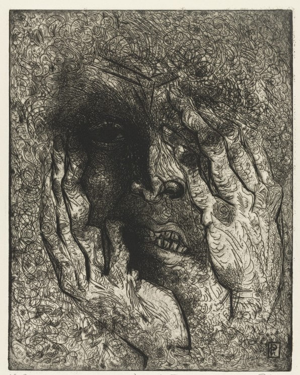 Gabor Peterdi (American, born Hungary, 1915–2001). Despair III, 1938. Etching and engraving. Plate: 315 x 248 mm. (12 3/8 × 9 ¾ in.); sheet: 452 x 340 mm. (17 13/16 × 13 3/8 in.). Museum of Modern Art: Gift of the Artist, 103.1955. 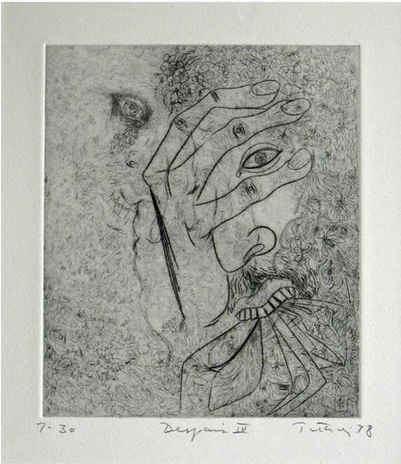 Gabor Peterdi (American, born Hungary, 1915–2001). Despair IV, 1938. Etching, engraving, and drypoint. Plate: 241 × 203 mm. (9 1/2 × 8 in.); sheet: 453 × 329 mm. (17 13/16 × 12 15/16 in.). Yale University Art Gallery: Gift of James N. Heald II, B.S. 1949, 2011.148.9. 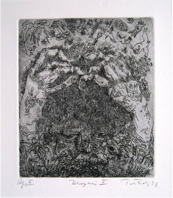 Gabor Peterdi (American, born Hungary, 1915–2001). Despair V, 1938. Etching. Plate: 247 × 209 mm. (9 3/4 × 8 1/4 in.); sheet: 453 × 329 mm. (17 13/16 × 12 15/16 in.). Yale University Art Gallery: Gift of James N. Heald II, B.S. 1949, 2011.148.10. 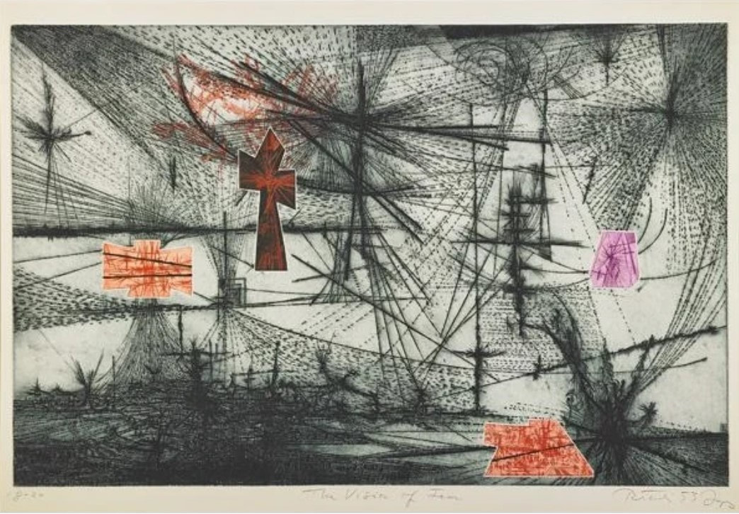 Gabor Peterdi (American, born Hungary, 1915–2001). The Vision of Fear, 1953. Etching and engraving. Plate: 651 × 933 mm. (25 5/8 × 36 3/4 in.); sheet: 749 × 105 mm. (29 1/2 × 41 1/4 in.). Mutual Art. 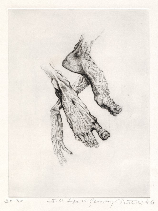 Gabor Peterdi (American, born Hungary, 1915–2001). Still Life in Germany, 1946. Engraving. Plate: 302 x 227 mm. (11 7/8 x 8 15/16 in.). Conrad Graeber Fine Art. 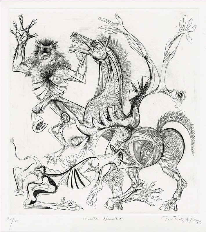 Gabor Peterdi (American, born Hungary, 1915–2001). Hunter Hunted, 1947. Engraving. Plate: 394 x 368 mm. (15 1/2 x 14 ½ in.). Annex Galleries. 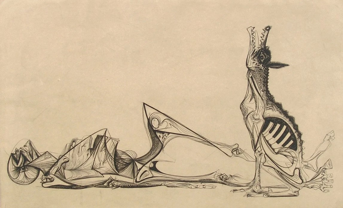 Gabor Peterdi (American, born Hungary, 1915–2001). The Price of Glory, 1947. Engraving. Plate: 276 x 454 mm. (10 7/8 x 17 7/8 in.); sheet: 336 x 514 mm. (13 1/4 x 20 ¼ in.). Dolan/Maxwell. Ann ShaferLast week I posted a few images of praying mantes in prints. Fascinating creatures. By the terribly scientific polling apparatus available to me—number of likes, natch—I decided to post more images by the person whose praying mantis print was most admired, Roderick Mead (American, 1900–1971). Mead grew up in New Jersey and attended Yale University, graduating in 1925. Following art school, he moved to New York where he studied at the Art Students’ League under George Luks (and later with him privately) for several years. He also studied watercolor painting with George Pearse Ennis at the Grand Central School of Art. In 1931, Mead moved to Majorca. Three years later he moved his studio to Paris and began studying printmaking at guess where? The experimental studio run by Stanley William Hayter known as Atelier 17. Actually, in 1931, the atelier was only a few years old and had yet to take up the name it would become known by. It wasn’t until 1933 that the studio moved to 17, rue Campagne Première, from which the 17 in its name derives. But you can be sure that Mead absorbed as much as he could there and as a result, the effect on his style is clear. At the Atelier on any given day one might be working at a table next to Joan Miró, Pablo Picasso, Alberto Giacometti, Max Ernst, Yves Tanguy, Jean Hélion, or Wassily Kandinsky. Like most of the artists there, Mead experimented with abstraction and surrealism, and one finds shared ideas, forms, and styles among the prints made there. Like most everyone else, Mead and his wife left Paris in 1939 ahead of the start of World War II and by 1941 was living in Carlsbad, New Mexico. There he was able to devote himself to creating art full time; he continued to paint and make prints until his death in 1971. For me, Mead would have been one in a long list of artists working with Hayter about whom I know not a great deal was it not for my friend Gregg Most, who grew up down the street from the Meads. Gregg and I worked together at the National Gallery in the 1990s, and he has researched and collected Mead for a long time. It is Gregg’s passion for Mead that caused me to pay closer attention. I love Mead’s prints because they are carefully crafted, readable yet totally surreal, and have a high sense of crispness and design that really attracts me. See if you agree. Roderick Mead (American, 1900–1971) The Wrecked Ship, 1936 Engraving Plate: 197 x 251 mm. (7 ¾ x 9 7/8 in.) Smithsonian American Art Museum, Gift of Mrs. Roderick Mead, 1974.122.1 Roderick Mead (American, 1900–1971) Untitled (Matador and Bull), c. 1936 Engraving and softground etching with aquatint Plate: 203 x 203 mm. (8 × 8 in.) Dolan/Maxwell Roderick Mead (American, 1900–1971) Rope Figures, c. 1935–45 Engraving Plate: 160 x 82 mm. (6 1⁄2 x 3 1⁄4 in.) Smithsonian American Art Museum, Gift of Mrs. Roderick Mead, 1976.99.5 Roderick Mead (American, 1900–1971) St. Michael and the Dragon, 1939 Color wood engraving Image: 232 x 203 mm. (9 1/8 x 8 in.) Smithsonian American Art Museum, Gift of Mrs. Roderick Mead, 1974.122.6 Roderick Mead (American, 1900–1971) Creation of Eve, c. 1942 Engraving and softground etching Plate: 200 x 199 mm. (7 7/8 x 7 13/16 in.) Smithsonian American Art Museum, Gift of Mrs. Roderick Mead, 1976.99.1 Roderick Mead (American, 1900–1971) Trojan Horse, c. 1945–50s Color engraving, aquatint, and softground etching Plate: 235 x 298 mm. (9 ¼ x 11 ¾ in.) Smithsonian American Art Museum, Gift of Mrs. Roderick Mead, 1974.122.2 Roderick Mead (American, 1900–1971) Combat #1 (Incident), c. 1942–45 Engraving and softground etching 264 x 186 mm. (10 3/8 x 7 3/8 in.) Smithsonian American Art Museum, Gift of Mrs. Roderick Mead, 1974.122.3 Roderick Mead, (American, 1900–1971) Tauromachia I, 1946 Engraving and aquatint Plate: 114 x 182 mm (4 ½ x 31/4 in.) Fine Arts Museums of San Francisco, Achenbach Foundation, California State Library loan, L543.1966 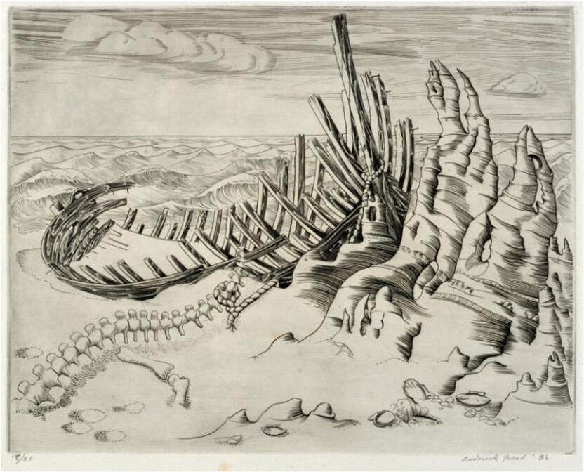 Roderick Mead (American, 1900–1971). The Wrecked Ship,1936. Engraving and aquatint. Plate: 197 x 251 mm. (7 ¾ x 9 7/8 in.). Smithsonian American Art Museum, Gift of Mrs. Roderick Mead, 1974.122.1.  Roderick Mead (American, 1900–1971). Untitled (Matador and Bull), c. 1936. Engraving and softground etching with aquatint. Plate: 203 x 203 mm. (8 × 8 in.). Dolan/Maxwell. 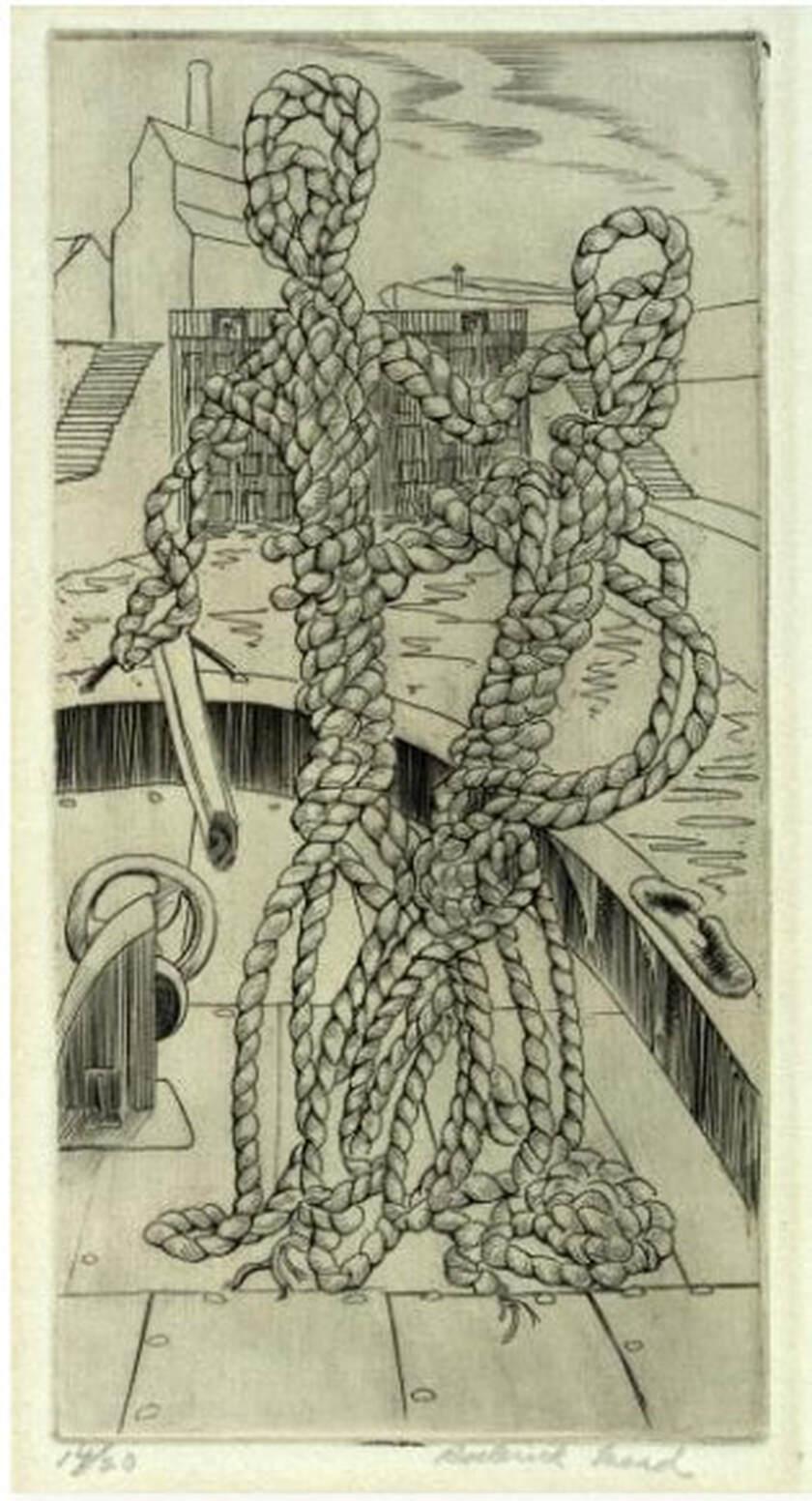 Roderick Mead (American, 1900–1971). Rope Figures, c. 1935–45. Engraving. Plate: 160 x 82 mm. (6 1⁄2 x 3 1⁄4 in.). Smithsonian American Art Museum, Gift of Mrs. Roderick Mead, 1976.99.5. 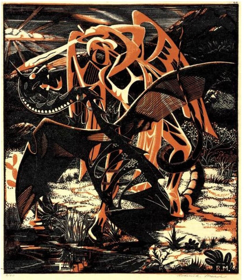 Roderick Mead (American, 1900–1971). St. Michael and the Dragon, 1939. Color wood engraving. Image: 232 x 203 mm. (9 1/8 x 8 in.). Smithsonian American Art Museum, Gift of Mrs. Roderick Mead, 1974.122.6. 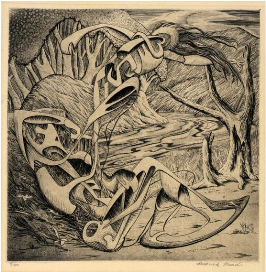 Roderick Mead (American, 1900–1971). Creation of Eve, c. 1942. Engraving and softground etching. Plate: 200 x 199 mm. (7 7/8 x 7 13/16 in.). Smithsonian American Art Museum, Gift of Mrs. Roderick Mead, 1976.99.1. 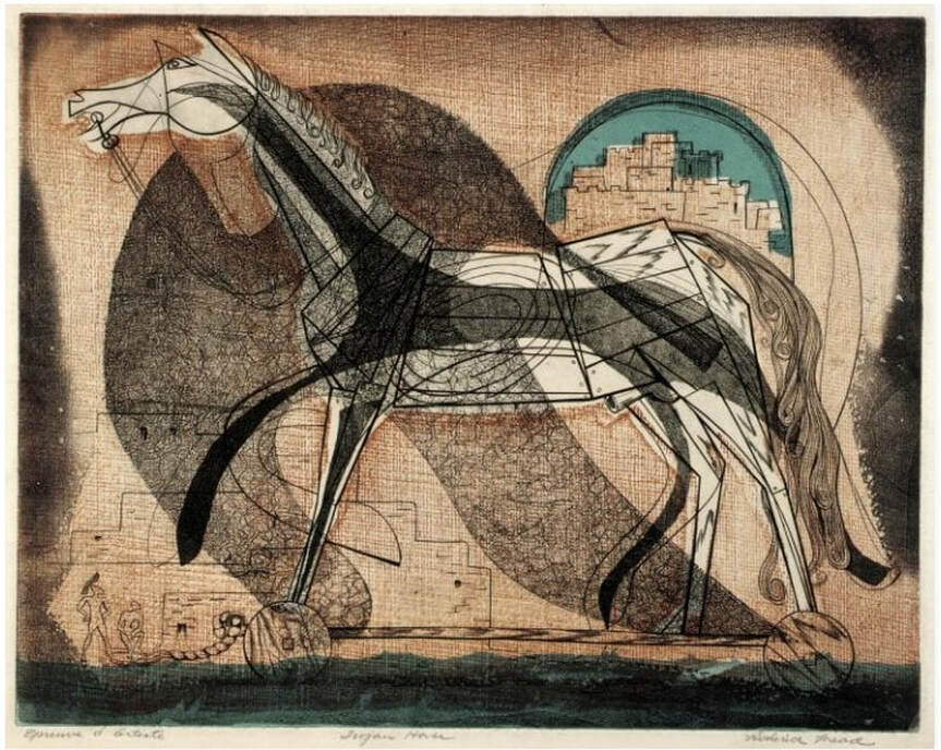 Roderick Mead (American, 1900–1971). Trojan Horse, c. 1945–50s. Color engraving, aquatint, and softground etching. Plate: 235 x 298 mm. (9 ¼ x 11 ¾ in.). Smithsonian American Art Museum, Gift of Mrs. Roderick Mead, 1974.122.2. 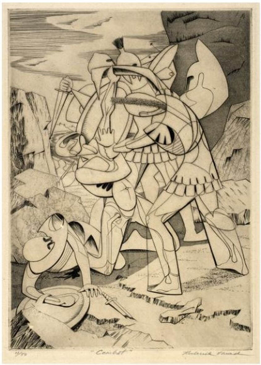 Roderick Mead (American, 1900–1971). Combat #1 (Incident), c. 1942–45. Engraving and softground etching. Plate: 264 x 186 mm. (10 3/8 x 7 3/8 in.). Smithsonian American Art Museum, Gift of Mrs. Roderick Mead, 1974.122.3. 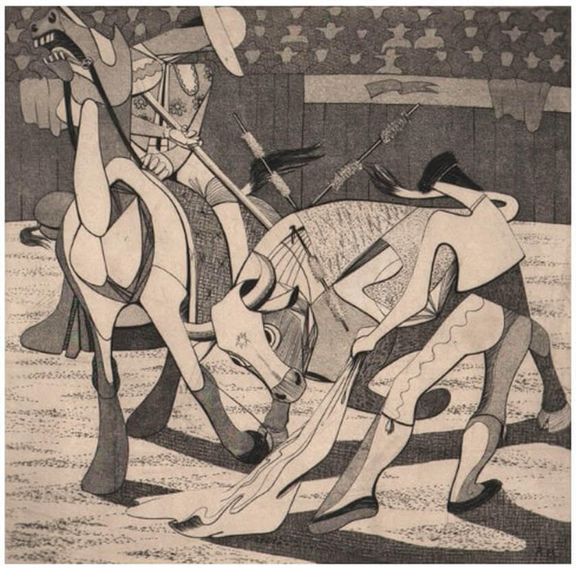 Roderick Mead, (American, 1900–1971). Tauromachia I, 1946. Engraving and aquatint. Plate: 114 x 182 mm (4 ½ x 31/4 in.). Fine Arts Museums of San Francisco, Achenbach Foundation, California State Library loan, L543.1966. Ann ShaferOne of the reasons I love Stanley William Hayter so much is that I adore the quality of line he gets with engraving. In this method the artist uses a burin, a handheld tool with a diamond-shaped tip, to cut into the copper; they push the tool forward to incise a line in the copper into which the ink will lay. It takes a lot of strength and control, but it rewards the hard work. I love the swell and taper, the strength, the crispness. Hayter used engraving in a totally new way beginning in the 1930s. Prior to that the technique was used to reproduce the compositions of other artists. This type of print is known as a reproductive print. By these prints, the artist of the original composition could spread his designs far and wide, and the engraver could make a living. They were created by very talented engravers who devised a series of patterns of marks meant to mimic brushstrokes, fabric, hair, feathers, all the while in black and white. You can imagine that the advent of photography in the late 1830s killed this entire industry and engraving along with it. One hundred years later, Hayter revitalized the technique, but in a wholly new way. Reproductive prints are the bastard stepchild of the already bastard stepchild of prints, making them the bottom of the barrel. They don't get a lot of respect, but there has been a growing interest in them in the last few decades. Maybe they will soon have their day in the spotlight. I used to skim past these kinds of prints when going through solander boxes in the storeroom. They tended to be portrait after portrait of persons I didn't recognize or care about. They seemed trite, fussy, controlled, old fashioned, and are markedly different from the modernist prints of Hayter and the associated artists at Atelier 17. But as happens with prints, the more you slow down your looking, the more you see. As we used to say in the print room: "these reward scrutiny." I had a chance today to paw through Tru Ludwig's copy of Anthony Griffith's monumental book, The Print Before Photography (EDIT: not Prints and Printmaking: An Introduction to the History and Techniques, as first reported). The book is impressive, and the images are drawn solely from the collection of the British Museum. Its endpapers are a detail of a reproductive engraving by Antoine Masson of a portrait of Henri de Lorraine, Count of Harcourt, by Nicolas Mignard from 1667. In the first few pages are more details plus the entire image. As you look through these details, check out how many different patterns are used and what they describe. This is when reproductive engravings get interesting for me: imagining an artist looking at a painting, or, more likely, a drawing of the painting, and attempting to render the flesh of the sitter's hand with black lines and dashes. Or the curling hair of his mustache. Or the shine of his satin sleeves. The list goes on. It truly boggles the mind. Antoine Masson (French, 1636–1700), after Nicolas Mignard (French, 1606–1668) Henri de Lorraine, Count of Harcourt, 1667 Engraving Plate (trimmed within platemark) 544 x 390 (20 1/2 x 16 in.) British Museum: Bequest of Clayton Mordaunt Cracherode, R,6.209 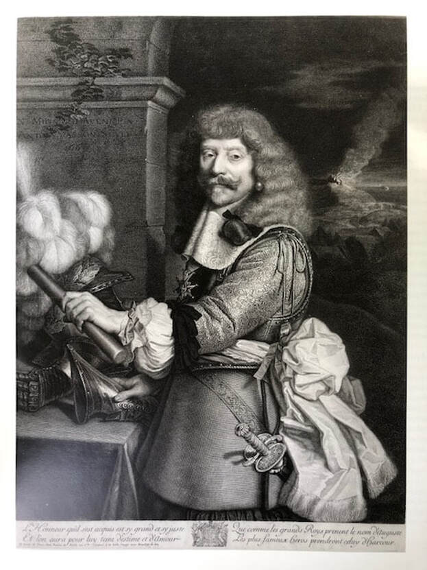 Antoine Masson (French, 1636–1700), after Nicolas Mignard (French, 1606–1668). Henri de Lorraine, Count of Harcourt, 1667. Engraving, plate (trimmed within platemark) 544 x 390 (20 1/2 x 16 in.). British Museum: Bequest of Clayton Mordaunt Cracherode, R,6.209 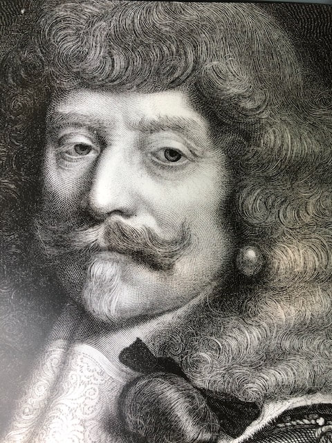 DETAIL: Antoine Masson (French, 1636–1700), after Nicolas Mignard (French, 1606–1668) Henri de Lorraine, Count of Harcourt, 1667 Engraving Plate (trimmed within platemark) 544 x 390 (20 1/2 x 16 in.) British Museum: Bequest of Clayton Mordaunt Cracherode, R,6.209 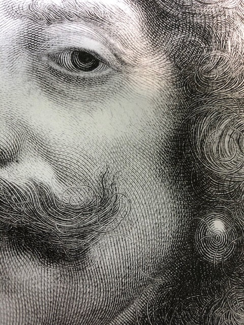 DETAIL: Antoine Masson (French, 1636–1700), after Nicolas Mignard (French, 1606–1668) Henri de Lorraine, Count of Harcourt, 1667 Engraving Plate (trimmed within platemark) 544 x 390 (20 1/2 x 16 in.) British Museum: Bequest of Clayton Mordaunt Cracherode, R,6.209 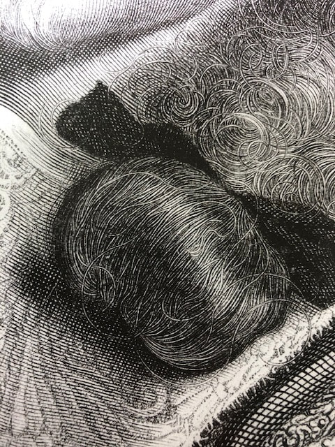 DETAIL: Antoine Masson (French, 1636–1700), after Nicolas Mignard (French, 1606–1668) Henri de Lorraine, Count of Harcourt, 1667 Engraving Plate (trimmed within platemark) 544 x 390 (20 1/2 x 16 in.) British Museum: Bequest of Clayton Mordaunt Cracherode, R,6.209 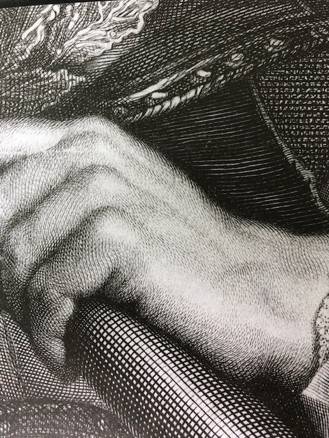 DETAIL: Antoine Masson (French, 1636–1700), after Nicolas Mignard (French, 1606–1668) Henri de Lorraine, Count of Harcourt, 1667 Engraving Plate (trimmed within platemark) 544 x 390 (20 1/2 x 16 in.) British Museum: Bequest of Clayton Mordaunt Cracherode, R,6.209 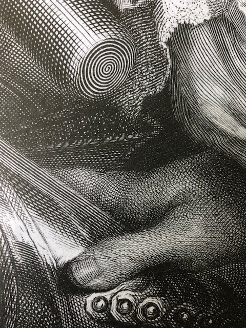 DETAIL: Antoine Masson (French, 1636–1700), after Nicolas Mignard (French, 1606–1668) Henri de Lorraine, Count of Harcourt, 1667 Engraving Plate (trimmed within platemark) 544 x 390 (20 1/2 x 16 in.) British Museum: Bequest of Clayton Mordaunt Cracherode, R,6.209 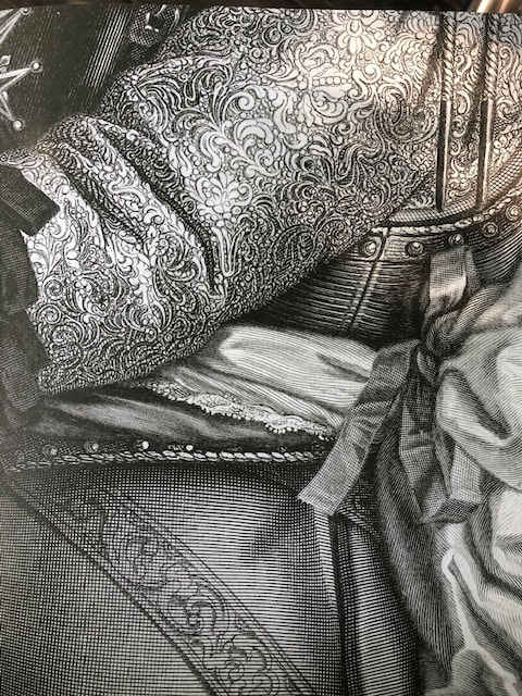 DETAIL: Antoine Masson (French, 1636–1700), after Nicolas Mignard (French, 1606–1668) Henri de Lorraine, Count of Harcourt, 1667 Engraving Plate (trimmed within platemark) 544 x 390 (20 1/2 x 16 in.) British Museum: Bequest of Clayton Mordaunt Cracherode, R,6.209 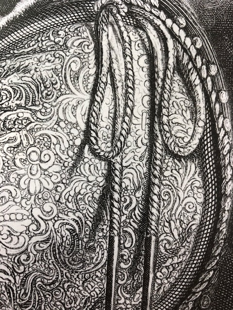 DETAIL: Antoine Masson (French, 1636–1700), after Nicolas Mignard (French, 1606–1668) Henri de Lorraine, Count of Harcourt, 1667 Engraving Plate (trimmed within platemark) 544 x 390 (20 1/2 x 16 in.) British Museum: Bequest of Clayton Mordaunt Cracherode, R,6.209 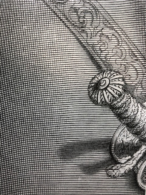 DETAIL: Antoine Masson (French, 1636–1700), after Nicolas Mignard (French, 1606–1668) Henri de Lorraine, Count of Harcourt, 1667 Engraving Plate (trimmed within platemark) 544 x 390 (20 1/2 x 16 in.) British Museum: Bequest of Clayton Mordaunt Cracherode, R,6.209 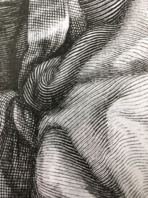 DETAIL: Antoine Masson (French, 1636–1700), after Nicolas Mignard (French, 1606–1668) Henri de Lorraine, Count of Harcourt, 1667 Engraving Plate (trimmed within platemark) 544 x 390 (20 1/2 x 16 in.) British Museum: Bequest of Clayton Mordaunt Cracherode, R,6.209 Ann ShaferEngraving was Hayter’s first love. He wanted to reintroduce it as a tool for what he called “original expression,” which basically means for one’s own work and not for reproducing another artists’ design. There aren’t many artists utilizing engraving today, but Evan Lindquist is one of them. No surprise he has ties to Hayter through his graduate studies at the University of Iowa, where Mauricio Lasansky had founded the printmaking department in the late 1940s (Lasansky worked with Hayter at the New York Atelier 17 in the early 1940s). In recent years, Lindquist has created a series of elegantly engraved portraits of art history’s well-known engravers like Martin Schongauer, Albrecht Dürer, Hendrik Goltzius, William Blake, Hayter, and others. (See his website here: https://evanlindquist.com/seeprints/gallery2.html.) In his engraving, SW Hayter Engraves War, Lindquist portrays Hayter as an intense, powerful figure out of whose burin (his engraving tool) come motifs referring to the Spanish Civil War. That Lindquist portrays this titan of printmaking creating a print in support of victims of a crazy war, and not as a teacher, is telling. Hayter and a group of artists created two portfolios, Solidarité (1938) and Fraternity (1939), that were fundraisers for the child victims of the Spanish Civil War. Hayter’s plate for Fraternity, which also contains prints by John Buckland Wright, Dalla Husband, Josef Hecht, Wassily Kandinsky, Roderick Mead, Joan Miró, Dolf Reiser, and Luis Vargas, shows a nude male standing in a doorway while an airplane flies overhead. One can’t help but think of Guernica, the small Spanish village that was bombed in April 1937, killing vast numbers of civilian men, women, and children. Occurrences like Guernica motivated many artists to create work in protest, mostly famously Picasso, and Hayter was no different. He was a passionate humanist who used art to express his profound discomfort with the darkness that befell humanity during the first half of the twentieth century. That the symbols and marks of the war are spitting out vigorously from Hayter’s burin in Lindquist’s portrait is a perfect homage. Stanley William Hayter (English, 1901-1988) Untitled, from the portfolio Fraternity, 1936 Engraving Sheet: 211 x 161 mm. (8 5/16 x 6 5/16 in.) Plate: 124 x 73 mm. (4 7/8 x 2 7/8 in.) Baltimore Museum of Art: Gift of Sidney Hollander, Baltimore, BMA 1996.8.3 Evan Lindquist (American, born 1936) SW Hayter Engraves War, 2015 Engraving Sheet: 388 x 310 mm. (15 1/4 x 12 3/16 in.) Plate: 278 x 207 mm. (10 15/16 x 8 1/8 in.) Baltimore Museum of Art: Purchased as the gift of an Anonymous Donor, BMA 2015.173  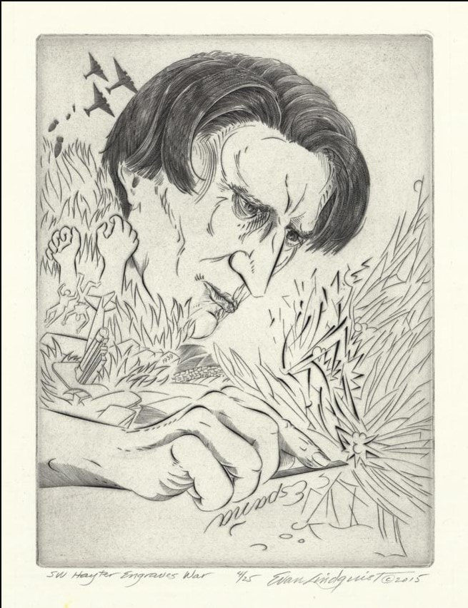 Ann ShaferFile this post under nothing lasts forever, even on the interwebs. For the BMA's 100th birthday, staff produced 100 blog entries on favorite collection objects. Some were videotaped pieces featuring curators, conservators, and other staff speaking on camera; other entries were written posts. I went to look for my written pieces on artbma.org and couldn't find them anywhere (thankfully, the videos are still on YouTube). Thanks to Laura Albans, I have recovered the text for my entry on Dürer's Knight Death and the Devil, portions of which I share here. The best part of working in a large collection of prints, drawings, and photographs is the range of material. I used to always say that you could come up with almost any theme and find an entire exhibition on it drawn out of the solander boxes. Since my interests tend toward the 20th and 21st centuries, it may surprise some of you, then, that Albrecht Dürer’s Knight, Death and the Devil is one of my favorite prints of all time. Not only is it a glorious example of engraving, but also it carries a universal message to stand by the courage of your convictions. Albrecht Dürer was a German printmaker, draftsman, painter, observer of nature, and humanist. In 1513 and 1514 he created a trio of engravings that have come to be called his master prints. In addition to Knight, Death and the Devil, the trio includes St. Jerome in His Study and Melencolia I. Most scholars agree that the former represents the active life, while the two others represent the intellectual life and the contemplative life respectively. While the three prints together are spectacular, I’m most drawn to Knight, Death and the Devil. The image is a visual feast. It features a righteous German knight resplendent in armor, a horse straight out of Renaissance Italy, a wonderful and faithful companion Fido the dog, and gnarly creatures representing Death and the Devil, all set in a naturalistic landscape. Contemporaries of Dürer would have understood the symbolism of every aspect of this print. But our own unfamiliarity with those symbols doesn’t lessen the impact of the work. Clearly this stalwart fellow is making his way through the forest of temptation and vanitas. He is able to keep to his path, ignoring all that is going on around him and stands by the courage of his convictions. Even if we strip the image of its religious associations of pre-reformation Catholicism, the message of perseverance is clear. Stick to your guns, well, lance, and you can get through anything with grace and dignity. A message as important today as ever. Albrecht Dürer (German, 1471-1528) Knight, Death and the Devil, 1513 Engraving Sheet (trimmed within platemark): 244 x 187 mm. (9 5/8 x 7 3/8 in.) Baltimore Museum of Art: Gift of Alfred R. and Henry G. Riggs, in Memory of General Lawrason Riggs, BMA 1943.32.188 This image is less than stellar, serving as an excellent reminder that it's always better to see works like this in person. 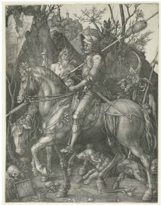 Ann ShaferYou might be surprised to learn that Hayter's workshop is still operating in Paris at 10, rue Didot. After his death in 1988, the workshop changed its name to Atelier Contrepoint and is run by Hector Saunier, who printed many of Hayter’s late compositions. I was fortunate to be able to visit the Atelier twice, in 2014 and 2015. The first time was to meet Hector and see what the operation looked like. The second time Hayter's widow, Désirée, agreed to bring over one of his plates so Hector could ink and print it for us (there is no one better suited for this particular task). The plan was to create an online feature for the exhibition’s web site, which never happened because the show was cancelled. As usual, Ben Levy and Tru Ludwig were with me, and between the three of us, we shot a lot of video and photographed Hector and Shu-lin Chen printing Hayter’s Torso, 1986. Désirée couldn’t find the plate she was originally thinking of, so she randomly selected Torso, which turned out to be serendipitous because Torso conceptually circles back around to the fist clenching the void discussed in an earlier post. In Torso, Hayter used stripes with inverted color variants, inking the central intaglio composition in green, red, and fluorescent orange, and with a horizontally rolled gradient of blue/yellow/green. The shape of the torso is defined by a mask that was laid down on the inked plate, blocking the rollers from depositing the blue, yellow, and green ink on the paper, producing an area of white across the center. The positive shape of the torso, described by an absence, echoes the conundrum of the untitled plate six from The Apocalypse, in which the negative space of a clenched fist is described by a positive volume. In this late print, the cognitive inquiries and accumulated techniques of four decades have come together. With the copper plate under her arm, we met Désirée on the appointed day at Atelier Contrepoint. After consulting the catalogue raisonné, they got right to work. Shu-lin set about inking the plate (intaglio) in red, fluorescent orange, and dark green in vertical stripes. Hector prepared the rainbow roll of blue, yellow, and green on a glass palette. The mask was still wrapped with the plate, so it was used as well. When Shu-lin was satisfied with her wiping job, the plate was ready for the mask’s placement and the rainbow roll. Hector completed his part and the plate was placed on the bed of the press that had been used for thousands of prints by hundreds of artists over the majority of the twentieth century. After a few unsatisfactory pulls, they printed four impressions, one of which eventually entered the Baltimore Museum of Art’s collection. I remain amazed that I got to experience the printing of one of Hayter’s plates and so appreciative of Désirée, Hector, and Shu-lin’s generosity that day. Even better, Ben Levy and Tru Ludwig were with me to witness the magic. Ann ShaferIn the previous post I shared a video about Stanley William Hayter (known as Bill to his friends), an artist that has interested me for many years. I also shared a link to a PDF catalogue for an exhibition that took place last year in São Paolo, Brazil. I was lucky enough to participate in a conference there in conjunction with that exhibition, Atelier 17 and Modern Printmaking in the Americas. I’m sharing a summary of the conference I wrote for another publication that I hope you find interesting. And, if you or any of your students need a dissertation topic, read through to the end. The conference was held at the Museu de Arte Contemporãnea, which is part of the University of São Paolo and is known as MAC USP. Both the exhibition and conference focused on printmaking and artistic exchange between the United States and South American countries in the mid-twentieth century. The exhibition, catalogue, and conference were born out of the research of USP graduate student Carolina Rossetti de Toledo, who, under the supervision of professor and chief curator Ana Gonçalves Magalhães, focused on several gifts to São Paolo’s new Museum of Modern Art (MAM) in the 1950s of prints from Nelson Rockefeller, Henry Ford, and Lessing Rosenwald (the majority of MAM’s permanent collection was transferred to MAC USP upon its founding in 1963). Nelson Rockefeller made two gifts, one in 1946 of paintings and sculpture and another in 1951 of twenty-five modern prints, to assist in the establishment of a museum of modern art in São Paolo. (He also donated a group of paintings to a museum in Rio de Janeiro in 1952.) Rockefeller’s interest in Brazil began when he travelled there as the director of the Office of the Coordinator of Inter-American Affairs, the purpose of which was to strengthen relations with Latin America during World War II, both politically and culturally. The initial selection of prints for the Rockefeller donation was made by MoMA curator William Lieberman, who chose prints that represented cutting-edge modernism. The majority reflect American printmaking of the time, meaning works by artists associated with Stanley William Hayter’s Atelier 17. Why Rockefeller focused on MAM in São Paolo specifically remains unclear. Whatever the real reason, it was noted as a “gesture of goodwill.” A selection of prints from the 1951 gift were exhibited that year in São Paolo but have rarely been shown in the intervening years. Following Rockefeller’s gesture, Henry Ford donated one print in 1953, and Lessing Rosenwald made a gift of nine modern prints in 1956, which were meant to augment the collection in the area of international modernism. The connection between the three donors and what motivated the Ford and Rosenwald gifts is unclear. But among the prints in these later gifts were yet more examples of international modernism in the form of works by artists associated with Atelier 17. For Brazilian artists, there were three possible points of contact with Atelier 17. The first was through trips abroad. The second was through the publication and circulation of books by Hayter and his associates. The third was through exhibitions such as MoMA’s 1944 Atelier 17 exhibition, which traveled not only around the United States but also throughout Latin America, and through the exhibitions of works by Atelier 17 artists in the São Paolo Biennials and other venues. Hayter had an exhibition in Rio de Janeiro in 1957, which also traveled to Buenos Aires, and his work was included in the British pavilion in the 1959 São Paolo Biennial (MAM purchased several prints from this show). Interestingly, Atelier 17 artist Minna Citron had an extensive one-person show at MAM in São Paolo in 1952, which was by far the biggest exposure of an Atelier 17 artist in Brazil up to that point. Citron was fairly proficient in Portuguese (and many other languages), which may account for how she secured and coordinated this show. Several of the prints in the Rockefeller gift to MAM had been shown in other impressions in the 1944 MoMA exhibition and yet other prints in the gift were seen in Una Johnson’s seminal National Print Annual exhibitions at the Brooklyn Museum. In other words, the gift was of cutting-edge contemporary prints. There are still gaps in the story, however. In her essay for the exhibition catalogue, Rossetti de Toledo notes, rightly, that the connections between modern American and European printmaking and its Latin American counterparts are not well understood or properly documented. The Rockefeller gift is one piece of the puzzle. Rossetti de Toledo’s research into the Rockefeller gift developed into the MAC USP exhibition and bilingual catalogue, both majorly supported by the Terra Foundation. In addition to prints from MAC USP’s collection, the exhibition featured loans from the Terra Foundation’s extensive collection of American prints and works from the Brooklyn Museum and Art Institute of Chicago. The conference began with introductory remarks from Magalhães and Terra Foundation curator Peter John (PJ) Brownlee. Rossetti de Toledo spoke about her research on the Rockefeller gift. I introduced Hayter and the Atelier 17, setting the stage for the discussion. Other speakers included Luiz Claudio Mubarac, who gave an overview of Brazilian printmaking in the twentieth century; Silvia Dolinko, who gave an overview of printmaking in her home country of Argentina; Heloisa Espada, who focused on Brazilian artist Geraldo de Barros (he worked at Atelier 17 in Paris in 1951); and Priscila Sacchettin, who spoke about Livio Abramo (he worked at Atelier 17 in 1951–52 and his work appears in Hayter’s book, About Prints). Christina Weyl closed out the conference with her talk on women at Atelier 17, which was an excellent preview of her important, recently published book. Over the course of two days, it became clear that South American printmaking runs in sometimes intersecting but separate tracks from European and American art. While artists cross pollinated through travel, books, and exhibitions, for those of us who study prints, there’s a whole other world of printmakers to be discovered in South America. It is also clear that research on these printmakers is wide open. Brazil lacks the central repository of artists’ papers and archives like our Archives of American Art. Many of the artists’ families remain in possession of the works and papers of their creative relatives. These artists’ estates have not been formalized or catalogued, nor are they easily accessible. Hardly any estates’ papers have found their way into libraries or universities, meaning there is a lot of room for intrepid scholars to uncover the careers of any number of artists. How’s your Portuguese? Need a dissertation topic? As I noted yesterday, the exhibition catalogue was printed in a small run but a pdf of the book is available here: bit.ly/Atelier17MACUSP. I also include a list of Brazilian and Argentine artists who were mentioned repeatedly. Brazilian artist-printmakers of note: Edith Behring (1916–1996) Maria Bonomi (born 1935, she was married to Abramo) Ibêre Carmargo (1941–1994) Oswaldo Goeldi (1895–1961) Marcelo Grassmann (1925–2013) Evandro Carlos Jardim (born 1935) Renina Katz (born 1925) Anna Letycia (born 1929) Maria Martins (1894–1993) Fayga Ostrower (1920–2001) Carlos Oswald (1882–1971) Mário Pedrosa (1900–1981) Gilvan Samico (1928–2013) Lasar Segall (1891–1957) Regina Silveira (born 1939) Argentine artists-printmakers: Hilda Ainscough (born 1900) Mauricio Lasansky (1914–2012) Julio LeParc (born 1928) Fernando López Anaya (1903–1987) Ana Maria Moncalvo (1921–2009) 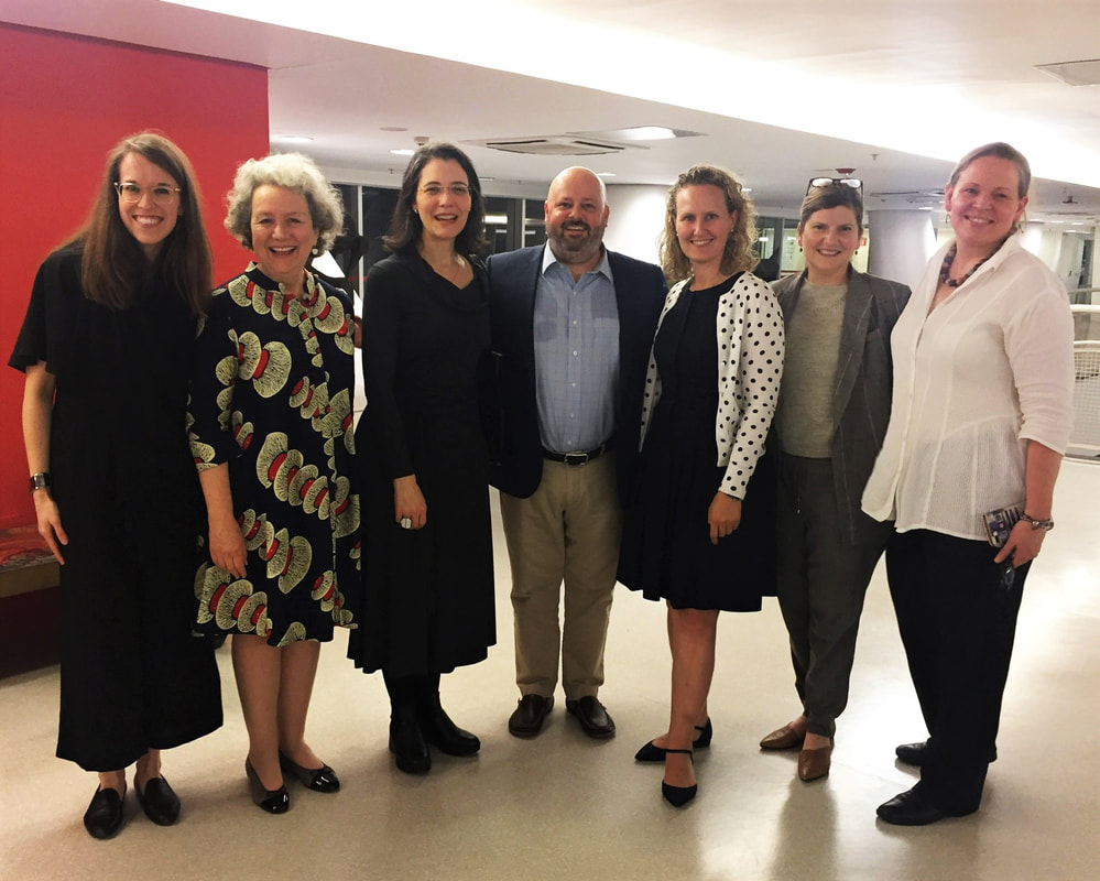 At the exhibition reception: (L-R) Taylor Poulin, Elizabeth Glassman, Ana Gonçalves Magalhães, Peter (PJ) Brownlee, Christina Weyl, Amy Zinck, and Ann Shafer. Photo by MAC USP staff.
Ann ShaferIf you know me at all, you know I spent a very long time working on a project focused on Stanley William Hayter and Atelier 17. I always talked about him as a lightning rod around whom bazillions of artists swirled. I believe his and the atelier's story is the fastest route to inserting printmaking firmly into the now-ever-changing canon. My attempt to do that in a grand fashion was not to be through circumstances out of my control, but a few smaller projects resulted. Some of the research is published in a catalogue for an exhibition at MAC USP (University of Sao Paolo). The print run was quite small, but the catalogue PDF is available here: bit.ly/Atelier17MACUSP. In addition, I was filmed talking about one of my favorite Hayter prints for the BMA, which is available here: https://www.youtube.com/watch?v=mJ6Z-8Yq9cs. I love this print. I feel like it sums up so much of Hayter's thinking and is among my top candidates for most important print of the 20th century. Stanley William Hayter (English, 1901-1988) Untitled (no. 6 from The Apocalypse), 1931 Engraving and drypoint; printed in black (intaglio) Sheet: 526 x 399 mm. (20 11/16 x 15 11/16 in.) Plate: 324 x 228 mm. (12 3/4 x 9 in.) Baltimore Museum of Art: Gift of Mr. and Mrs. Robert Paul Mann, Towson, Maryland, BMA 1979.377.6 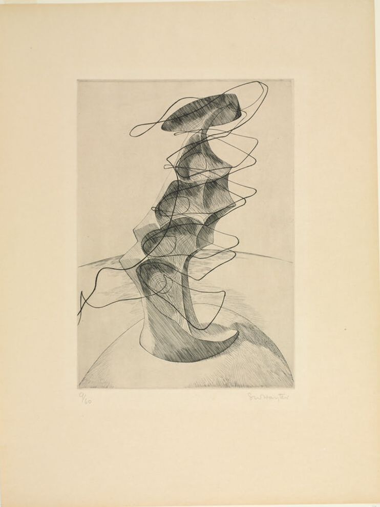 |
Ann's art blogA small corner of the interwebs to share thoughts on objects I acquired for the Baltimore Museum of Art's collection, research I've done on Stanley William Hayter and Atelier 17, experiments in intaglio printmaking, and the Baltimore Contemporary Print Fair. Archives
February 2023
Categories
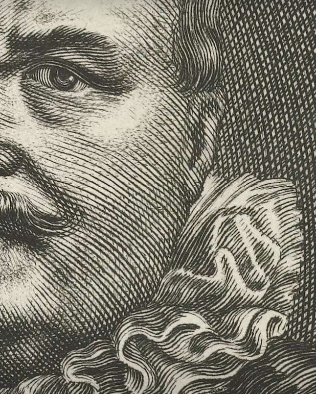
All
|


 RSS Feed