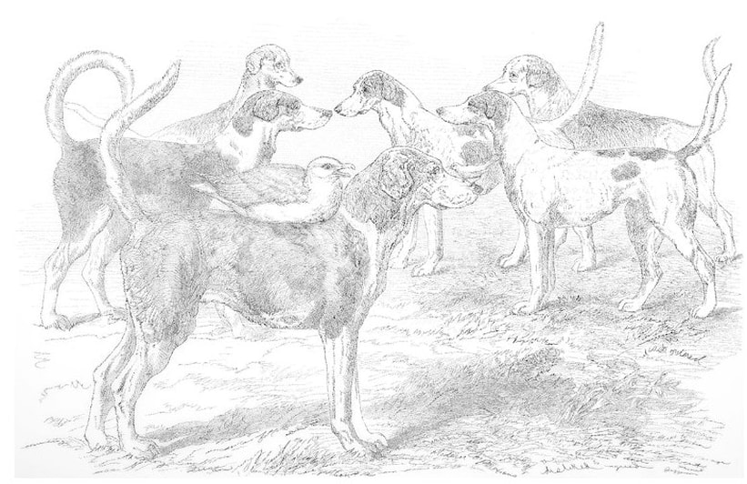
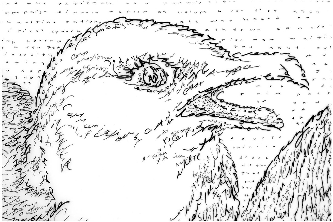
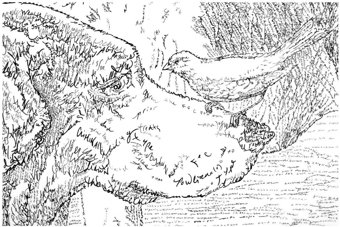
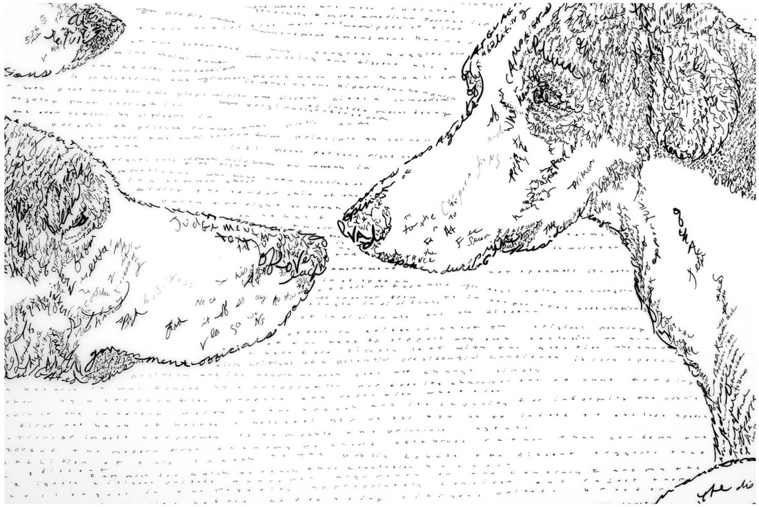
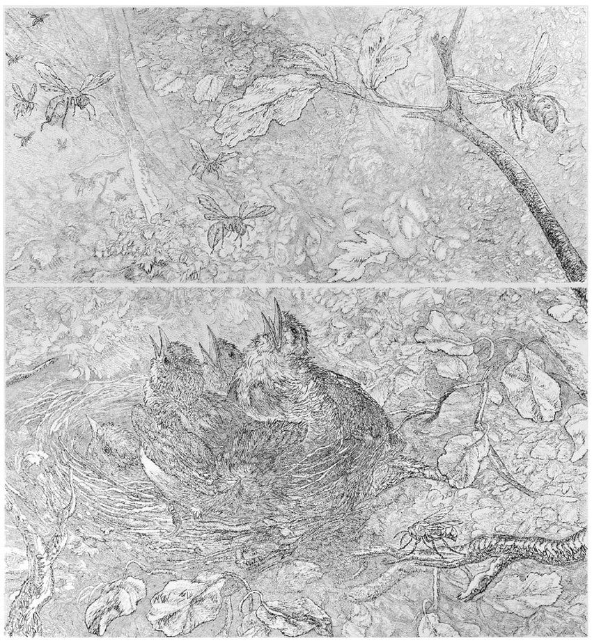
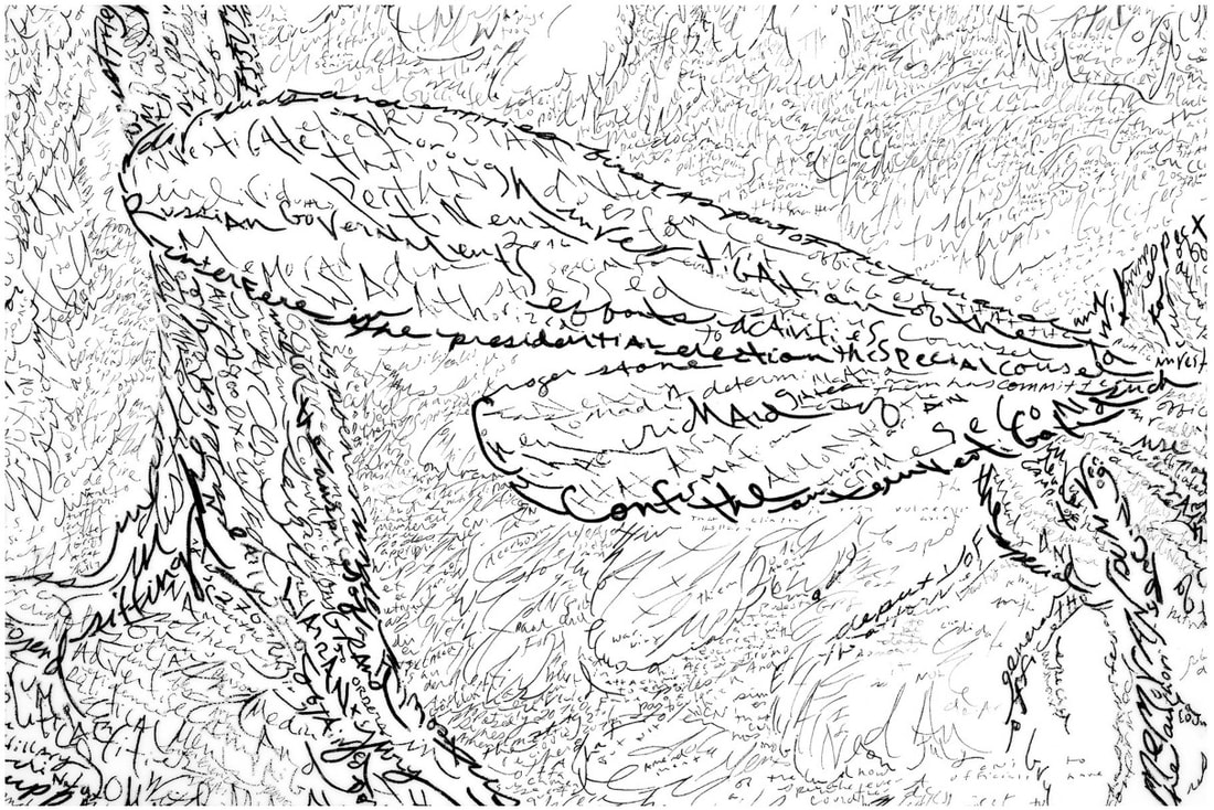
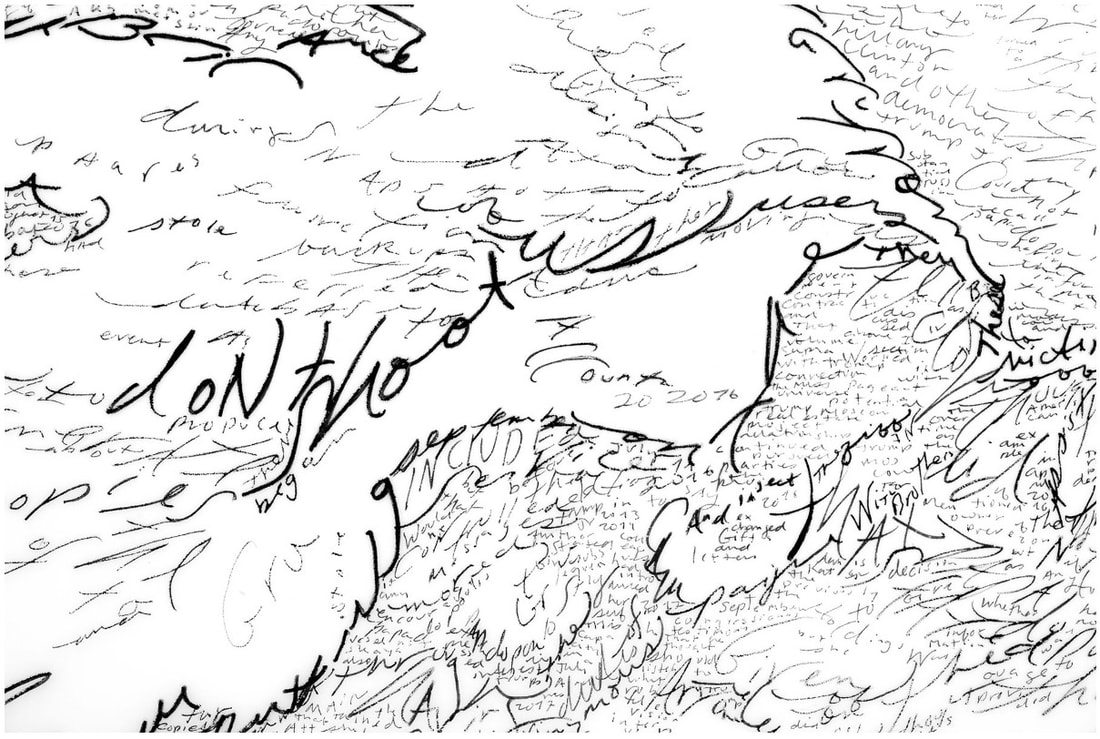
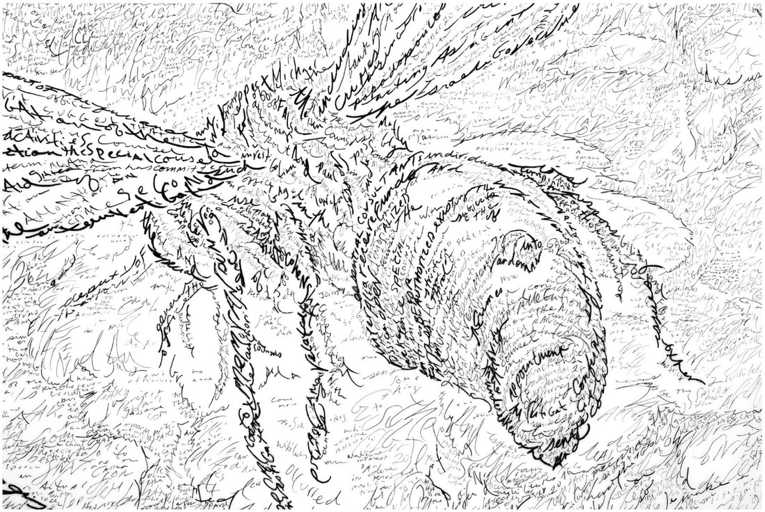
Ann ShaferFor the very first time since I left the museum three years ago (today is the anniversary), I am glad I’m not there anymore. The museum sector is going through some real come-to-Jesus moments. I am having a hard time watching from the sidelines and I can only imagine how frustrated I would be as a museum employee with little to no power to address the issues. Museums, by definition, are collections of things. Categorizing and defining objects and identifying the cultures from whence they came, as well as the notion of them as specimens for our study, has me feeling queasy. The whole enterprise has been rightly identified as a colonializing one. This idea isn’t new—I certainly didn’t come up with it—but at this moment, all these factors are colliding, and I am not sure I see a way for museums to come through it. What do you do when they are entirely based on the idea of studying the “other.” Is it possible to change courses to what necessarily has to be a wholly different model? Just what is the blueprint for this shift? I loved working in museums. I did it for nearly thirty years. I’m an object person. I believe art can help us think through difficult concepts as well as give us pleasure. I never wanted to do anything else besides create ways to tell interesting stories through great art. I love works that sit at the intersection of new and old, of abstract representation and representational abstraction, of beauty and toughness. Filed in the ones-that-got-away column is the work of Mike Waugh whose large-scale drawings demand attention. On the surface one sees an image that harkens back to traditional tropes of Americana: eagles, ducks, hounds, horses. One could write them off as illustrative and backward facing; but stay with it. Zoom in and notice each drawn line is really text. (This technique has a name: micrography.) These lines are not just random words selected because their shapes fit the bill, but words that together make up important political manifestos and bureaucratic documents. In a drawing from earlier this year, Citizens United v. Federal Election Commission, Waugh has written out the text of the 2010 Supreme Court ruling. Hugely controversial, it reversed campaign finance restrictions and enabled corporations and other groups to spend unlimited funds on elections. Reversing the one-hundred-year-old law allows wealthy donors, corporations, and special interest groups to have dramatically expanded influence on campaigns with negative repercussions for American democracy and the fight against political corruption. In Waugh’s image, a pack of hunting dogs are waiting for guidance—the blind leading the blind—while a seagull seated on one hound’s back seems to be anticipating the other shoe dropping. For Redacted, 2019, Waugh copied over 350 pages of The Mueller Report. It took months of meditative labor to accomplish the work (which is huge for a drawing at some 6 x 6 feet). A nest of baby birds with mouths agape are innocently stuck in the nest until they gain maturity. For the moment they are just waiting to be fed and hoping for the best. Wasps swarm above them menacingly. While the Mueller Report laid out definitive evidence of corruption and criminal activity within the 2016 Trump election campaign, the populace is unable to take really meaningful action (until November 3, that is). Politically charged content and “traditional” imagery intersect here. The beauty and intricacy of the drawings engages us. Understanding what the text says and represents gives us pause. Artists are always interested in getting people to linger longer over their work, and Waugh’s delicate, massive, impactful drawings richly reward scrutiny. Michael Waugh (American, born 1967) Citizens United, 2020 Pen and black ink on Mylar 45 x 69 inches (114.3 x 175.3 cm) Courtesy Von Lintel Gallery Michael Waugh (American, born 1967) Redacted (The Mueller Report, volume I & II), 2019 Diptych, pen and black ink on Mylar Overall: 81 x 76 inches (206 x 193 cm.) Courtesy Von Lintel Gallery
0 Comments
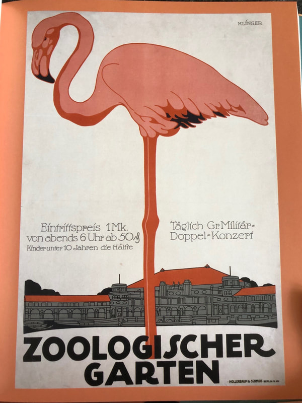
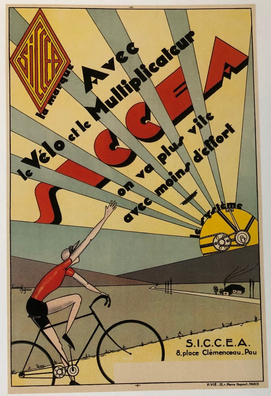
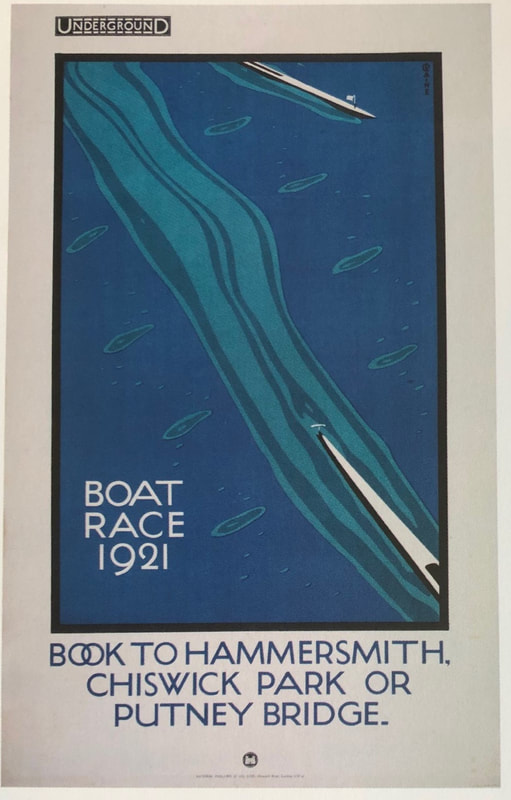
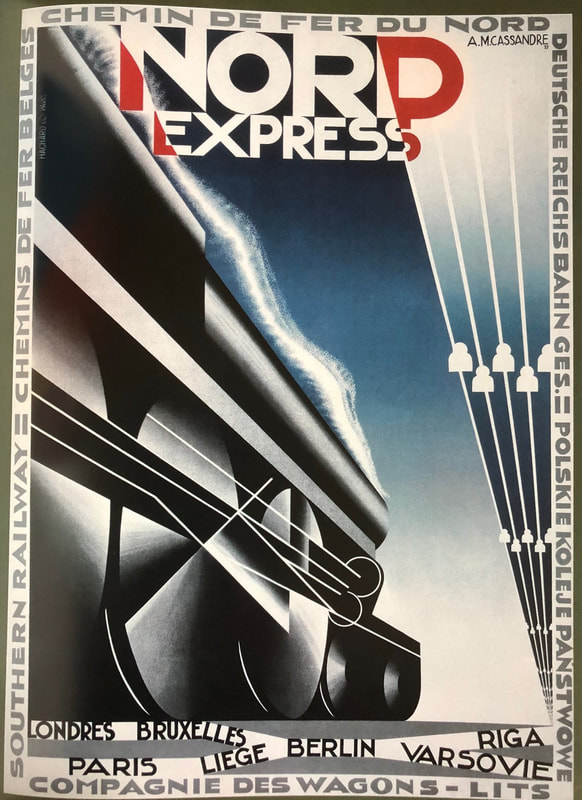
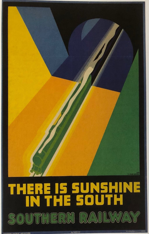
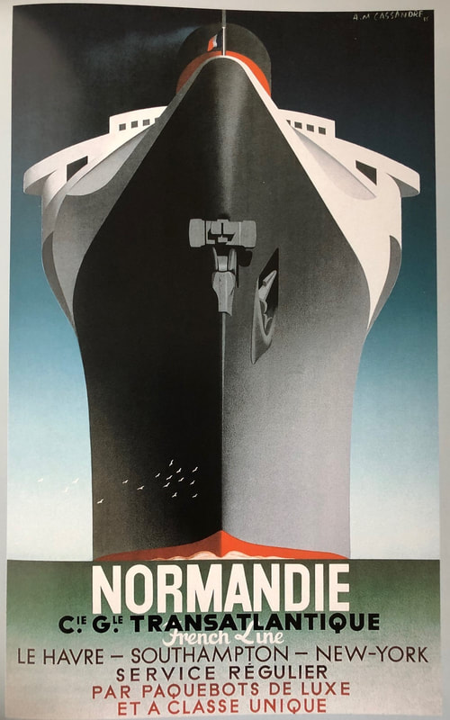
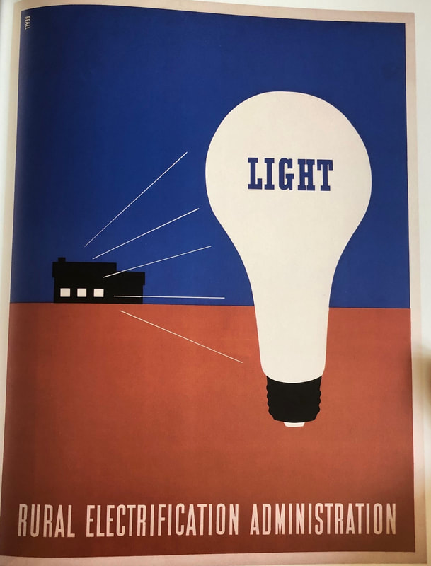
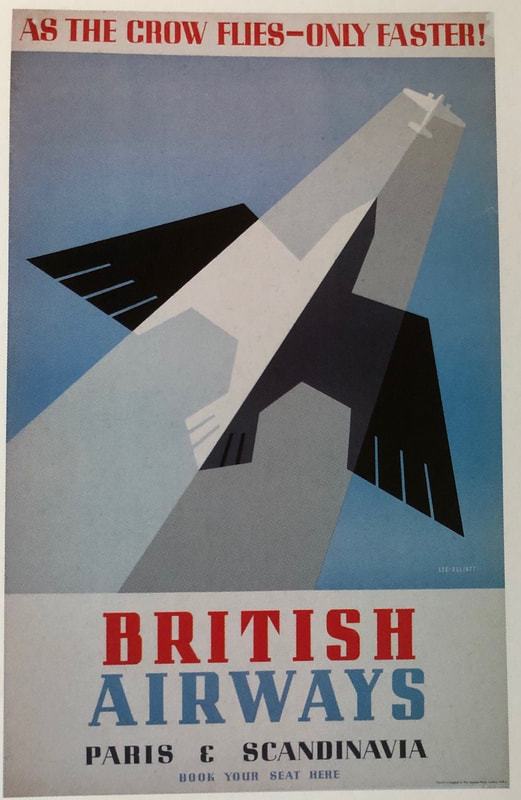
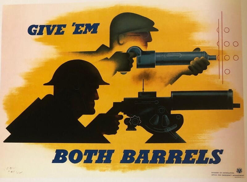
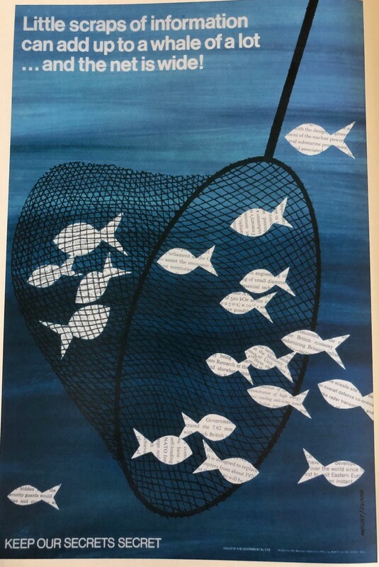
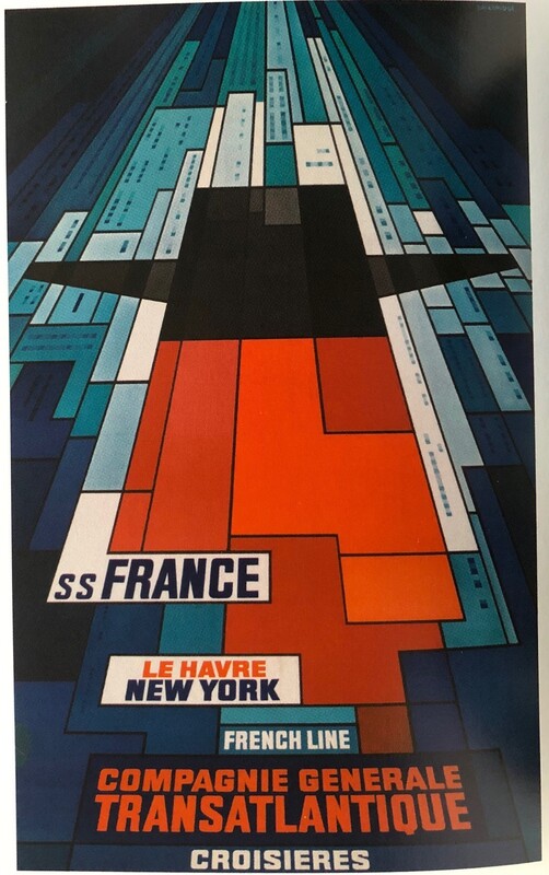
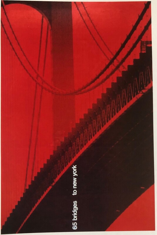
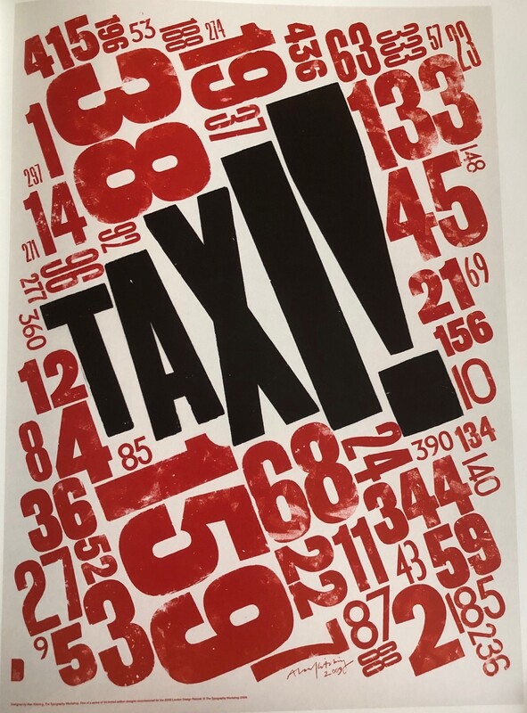
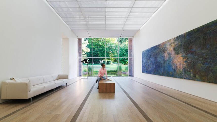
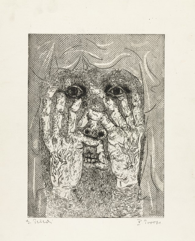
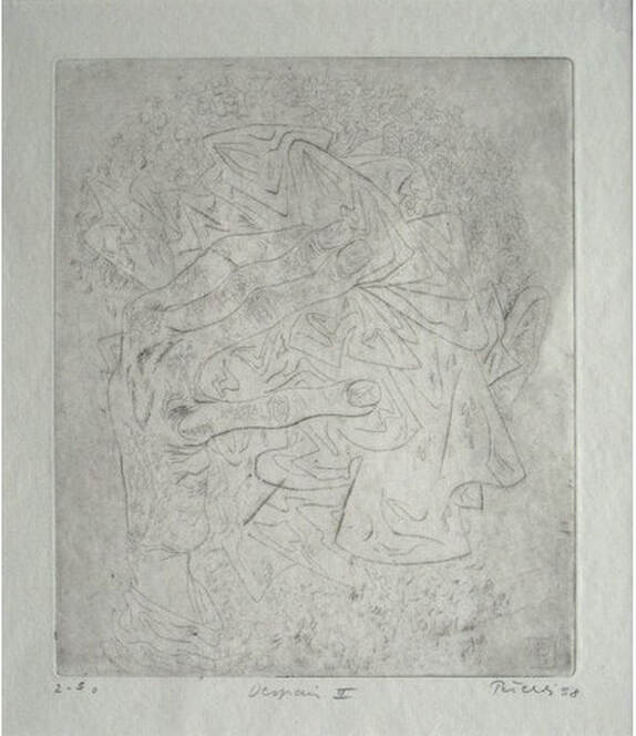
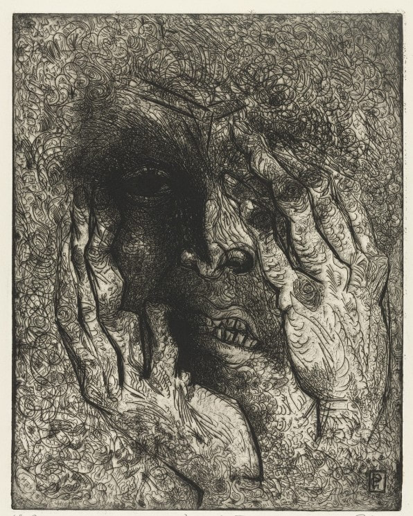
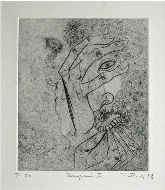
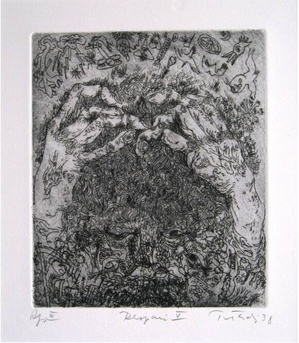
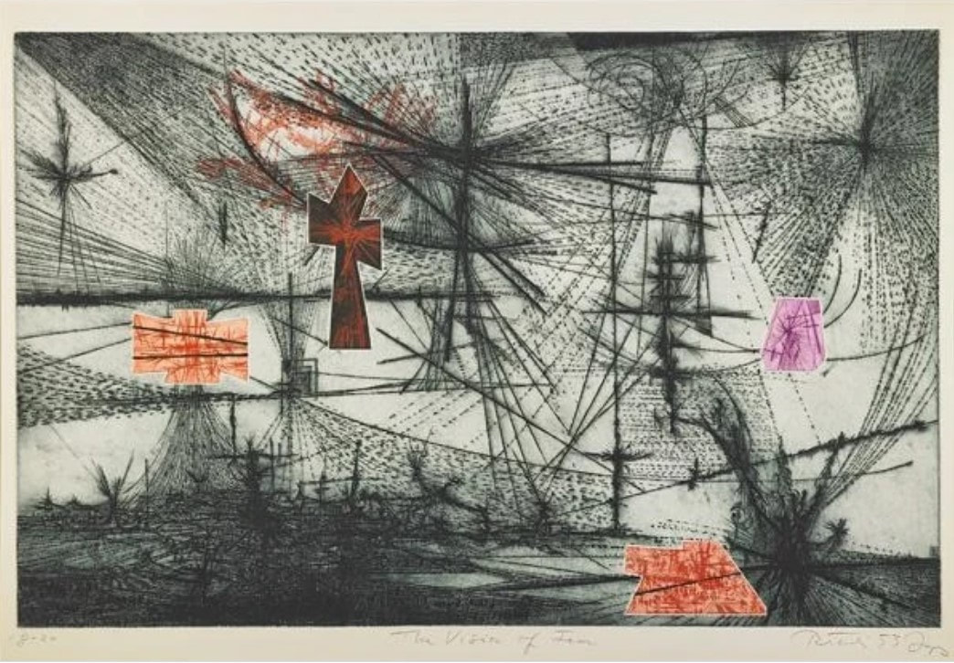
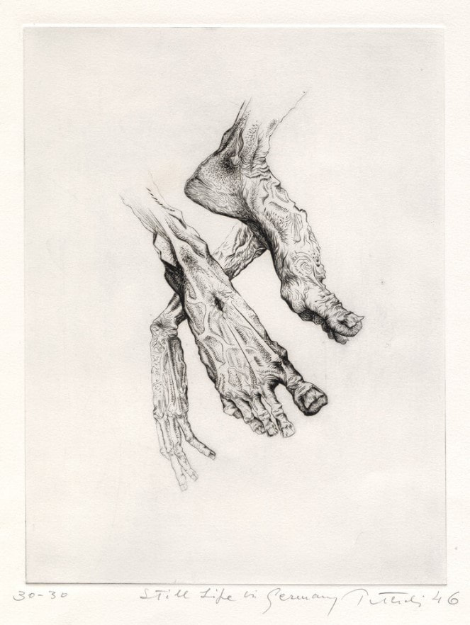
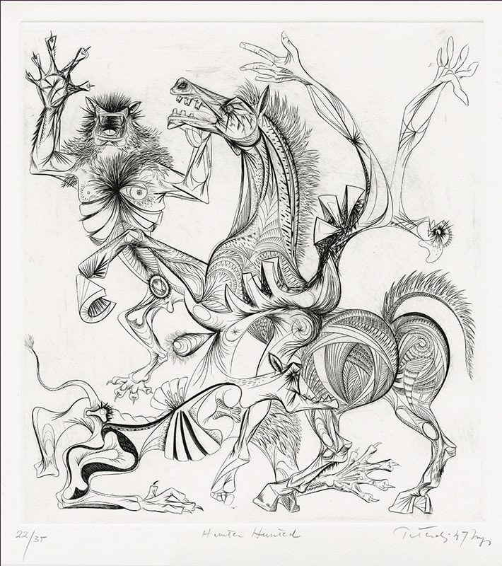
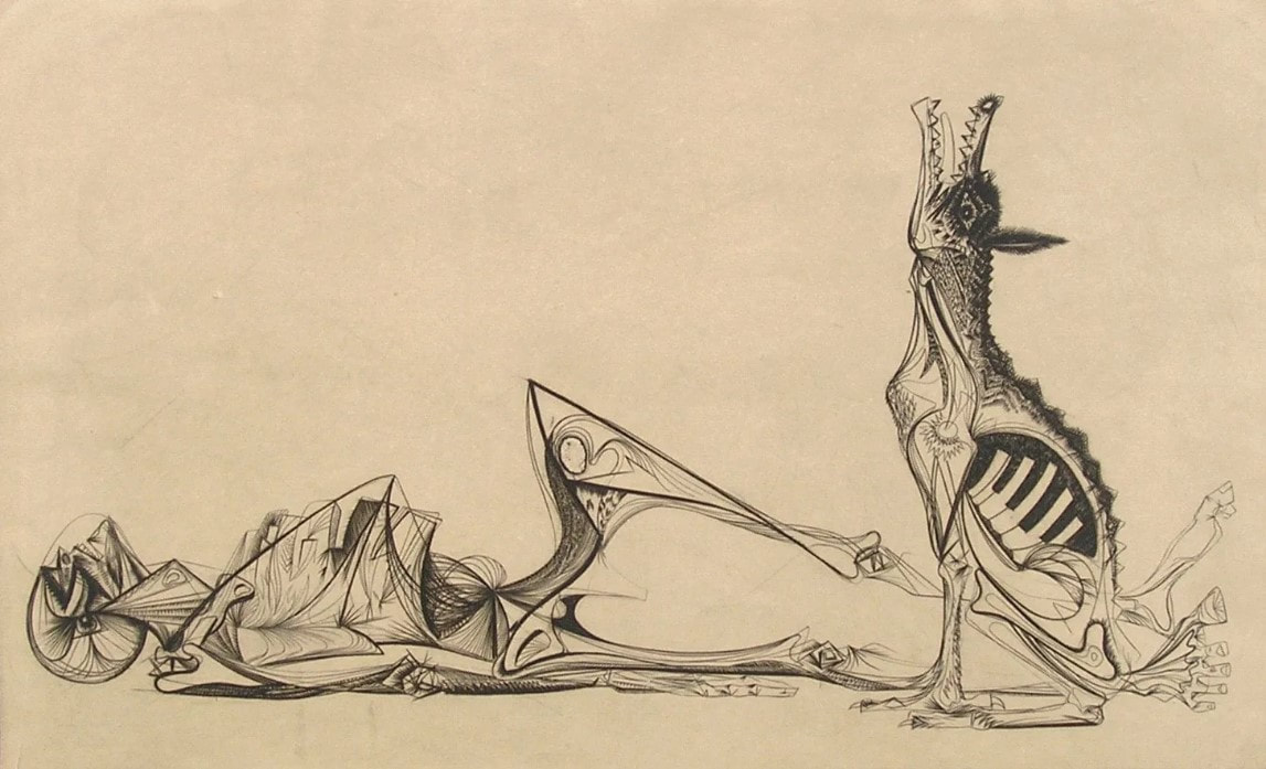
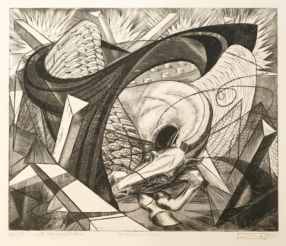
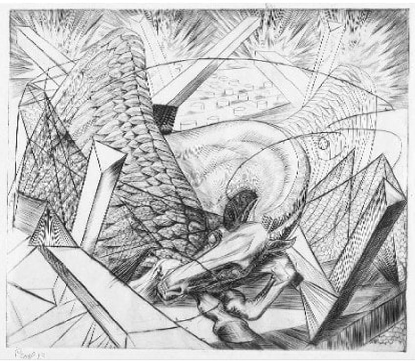
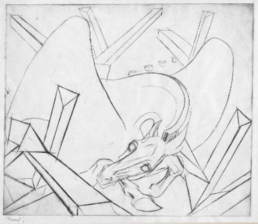
Ann ShaferPosters. According to Charles Anderson, an American graphic designer, posters are “art with a purpose, to communicate, announce, promote, or inform.” This is the opening line of a book on posters from the Victoria and Albert Museum collection just published. It lays out a compelling social history and is worth reading (Gil Saunders and Margaret Timmers, The Poster: A Visual History. London: V&A/Thames & Hudson, 2020). It is chock-a-block full of great images from across the spectrum: British, French, American, Russian, war, leisure, entertainment, products, travel. You may not know that I am also a graphic designer. What can I say, it’s one of my creative outlets. Yes, I’ve gotten paid for my work, but mostly I do it for friends and family. I really love the graphic sensibility of a great poster. Out of more than one hundred images in the V&A’s book, I selected several to share that resonate with my sense of design. You’ll notice that I’m drawn to highly reductive imagery. Forms are simplified and reduced to essentials, colors are bold, and there are few words. Swiss designer Armin Hofmann summed up a poster’s strength as based on: “size, clarity, simplicity.” I have always felt that less is more in advertising and I find myself constantly critiquing logos on trucks and billboards as I drive around town. Since you have to catch someone’s attention really quickly, too much visual information overwhelms and becomes illegible. See if you agree with my choices. Posters fell under my responsibility at the museum; they are stored with the rest of the print collection. Like the BMA, some museums collect and keep posters in the same manner as other works on paper. Some museums have them set apart from the regular stuff in a sort of “study collection.” And some museums don’t collect them at all believing they aren’t art. Why? Their commercial function as advertisements creates a divide between them and fine art. But they are designed by artists (aka graphic designers). They are printed on presses like fine art prints. So what gives? It’s a strange bias that has always fascinated me. The BMA has some great posters, particularly by Toulouse-Lautrec and other nineteenth-century artists. They are difficult to handle. Often large and fragile, they are usually printed on crappy paper—they were meant to be temporary after all. But they carry such great impact and are instructive for historians and artists alike. And I do love them. Julius Klinger (Austrian, 1876–1942) Zoologischer Garten, c. 1910 Color lithograph Victoria and Albert Museum, E.614–1915 Edward McKnight Kauffer (British, 1890–1954) Soaring to Success! Daily Herald—The Early Bird, 1919 Color lithograph Victoria and Albert Museum, E.35–1973 Henry Sajous (French) S.I.C.C.E.A. Bicycles, 1920s Color lithograph Victoria and Albert Museum, E.320–2018 Charles Paine (British, 1895–1967) Boat Race, 1921 Color lithograph Victoria and Albert Museum, E.261–1981 Cassandre (Adolphe Jean-Marie-Mouron, French, 1901–1968) Nord Express, 1927 Color lithograph Victoria and Albert Museum, E.223–1935 Peter Irwin Brown (British, 1903–1988) There is Sunshine in the South, 1930 Color lithograph Victoria and Albert Museum, E.340–1932 Cassandre (Adolphe Jean-Marie-Mouron, French, 1901–1968) Normandie, 1935 Color lithograph Victoria and Albert Museum, E.648–2017 Lester Beall (British, 1903–1969) Light, 1937 Color screenprint Victoria and Albert Museum, E.265–2005 Theyre Lee-Elliott (British, 1903–1988) British Airways. Paris & Scandinavia. As the Crow Flies—Only Faster!, c. 1937–38 Color lithograph Victoria and Albert Museum, E.1372–1979 Jean Carlu (American, born France, 1900–1997) Give ‘Em Both Barrels, 1941 Color lithograph Victoria and Albert Museum, E.2916–1980 Abram Games (British, 1914–1996) Men who mean business read The Financial Times every day, c. 1951 Color lithograph Victoria and Albert Museum, E.156–1980 Reginald Mount (British, 1906–1979) and Eileen Evans (British, born 1921) Little scraps of information can add up to a whale of a lot…and the net is wide! Keep our secrets secret, 1960 Color lithograph Victoria and Albert Museum, E.450–1995 Tomoko Miho (American, 1931–2012) 65 bridges to new york, 1968 Color offset lithograph and screenprint Victoria and Albert Museum, E.420–1973 John Bainbridge (British, 1918–1978) SS France Campagnie Générale Transatlantique: Le Havre New York, c. 1968 Color offset lithograph Victoria and Albert Museum, E.250–1981 Alan Kitching (British, born 1940) Taxi! For the London Poster Project, 2009 Color screenprint Victoria and Albert Museum, E.397–2011 Ann ShaferI have written before that I’ve had jaw-dropping art history moments in my life. There have been three, although I’ve only written about the first two: Manet’s still life of lilacs during an undergraduate slide lecture, discovering the church steeple looming over the garden behind Charles Demuth’s childhood home in Lancaster, PA, and seeing Velasquez’s Las Meninas at the Prado in Madrid (I’ll write about this last one eventually). There have also been the occasional goosebumpy experiences mostly derived from entering amazing architectural spaces like St. Peter’s in Rome, Notre Dame in Paris, or Frank Lloyd Wright’s Falling Water. Better yet is when the goosebumps are the result of the intersection of architecture and art. One of the super cool things about my job as a curator was escorting art to random places around the world to which I would not travel otherwise. Back in 2006, I escorted the BMA’s masterwork, Matisse’s Pink Nude, to the Fondation Beyeler in Basel, Switzerland. I had heard from colleagues to not miss a trip to see the Beyeler, an intimate museum set in green, open fields on the outskirts of Basel. The museum normally devotes several galleries to single artists enabling an in-depth view into a few, like Pablo Picasso and Paul Klee. It’s an interesting model, although it helps, of course, if you like the art of whoever is being featured. One of the sections focuses on Claude Monet, whose work is easy to like. I confess I appreciate his early work more than the late, large canvases of flowers from his garden at Giverny, but the Beyeler has on view a large canvas of waterlilies that comes to life because of the space it occupies. The gallery houses only that one painting. It is a long rectangular room at the short end of which is a glass wall looking out onto the landscape. Abutting the window on the outside is a pool of water (with waterlilies, of course) at the same level as the floor of the room. Light bouncing off the moving water flutters across the walls of the gallery in constant motion. The painting is hung on one of the long walls and along the opposite wall is a long, white couch. The whole scene is built for quiet contemplation. When I found the gallery, it was empty and I was blissfully alone. I sat down on the couch and took in the light flickering across the walls and floor. This was impressive enough, but suddenly music started playing. It was something lovely, classical. Chopin, I think. That’s when the goosebumps started. I really loved the totality of the experience. The awareness of the outdoors mirroring the effects of Monet’s conception, the ability to settle into a comfortable couch and linger, and the addition of lovely music. It was an assault on the senses in the best way. Put the Beyeler on your list of post-pandemic places to visit. It’s totally worth the effort. Ann ShaferRecently I saw a t-shirt that said “Don’t make me repeat myself. –History" There is a lot going on these days. Between the pandemic, politics, and confronting America’s legacy of slavery and systemic racism, I am, as I’m sure you are, anxious. On top of that, as I write this, I’m riding out a hurricane in a cottage overlooking the very turbulent waters of Vineyard Sound. We all know this period is not unique. Humans have made it through more dire times than these. But still, we seem doomed to repeat our mistakes. As I’ve written before, I really appreciate an artist who digs in and expresses the fears and worries of their time in a way that helps viewers process and think. Especially if the images read just as well in our time as in theirs. Gabor Peterdi was a Hungarian artist who worked at Atelier 17 in Paris in the 1930s during the Spanish Civil War and leading up the second World War. Like so many of his compatriots, he created prints that address issues of social justice and crimes against humanity, sometimes using the bull and bull fights or mythical horses and man-animal creatures as stand-ins for humankind. One rarely finds any self-portraits among the prints made at Hayter’s workshop, but Peterdi is notable for a 1938 series of self-portraits in which he holds his head in his hands in despair. It’s hard to get the emotion just right in these kind of images, and I think Peterdi hits the nail on the head. Like so many others, Peterdi made his way to America at the beginning of the war (remember, Europe was in turmoil for years leading up to the official declaration of war in September 1939). He enlisted in the U.S. Army and fought for his new country. No surprise, that experience finds its way into his work. Peterdi went on to have a long career both making prints and teaching printmaking. In addition to establishing the printmaking program at the Brooklyn Museum School, Peterdi taught at Hunter College from 1952–1960, and then at Yale University from 1960–1987. (Among his many students at Yale were Peter Milton and Chuck Close.) In a previous post I wrote about artists making prints reacting to World War II in the years after its conclusion as a demonstration of that conflict’s lasting effect. I also wrote about artists writing about their own work and how I wish more artists would take the time to do the same. Peterdi’s The Vision of Fear, 1953, fits both categories. About the print Peterdi wrote: “My basic idea was to create an oppressive, enervating image haunted by fearful symbols of destruction. I tried to express a composite feeling of flying with deadly birds and watching them from below.” This print is interesting also because of the four additional plates he laid on top of the large plate as it passed through the press. The deep emboss accentuates their addition as does the red ink he used, making the crosses seem to fall from the sky. I’ve included images here that I don’t mention because I think Peterdi deserves more attention and I love his sensibility. But I will note that Still Life in Germany is one that got away. I had been keeping my eye on it for years, waiting for the right time to pitch it. In the end, I ran out of time. By the way, if any of you studied with Peterdi, I’d love to hear your stories. Gabor Peterdi (American, born Hungary, 1915–2001) Despair I, 1938 Etching and engraving Plate: 266 x 197 mm. (10 1/2 × 7 ¾ in.) Sheet: 448 x 315 mm. (17 5/8 × 12 3/8 in.) Museum of Modern Art: Purchase, 146.1944 Gabor Peterdi (American, born Hungary, 1915–2001) Despair II, 1938 Etching and engraving Plate: 245 × 206 mm. (9 5/8 × 8 1/8 in.) Sheet: 304 × 269 mm. (11 15/16 × 10 9/16 in.) Yale University Art Gallery: Gift of James N. Heald II, B.S. 1949, 2011.148.8 Gabor Peterdi (American, born Hungary, 1915–2001) Despair III, 1938 Etching and engraving Plate: 315 x 248 mm. (12 3/8 × 9 ¾ in.) Sheet: 452 x 340 mm. (17 13/16 × 13 3/8 in.) Museum of Modern Art: Gift of the Artist, 103.1955 Gabor Peterdi (American, born Hungary, 1915–2001) Despair IV, 1938 Etching, engraving, and drypoint Plate: 241 × 203 mm. (9 1/2 × 8 in.) Sheet: 453 × 329 mm. (17 13/16 × 12 15/16 in.) Yale University Art Gallery: Gift of James N. Heald II, B.S. 1949, 2011.148.9 Gabor Peterdi (American, born Hungary, 1915–2001) Despair V, 1938 Etching Plate: 247 × 209 mm. (9 3/4 × 8 1/4 in.) Sheet: 453 × 329 mm. (17 13/16 × 12 15/16 in.) Yale University Art Gallery: Gift of James N. Heald II, B.S. 1949, 2011.148.10 Gabor Peterdi (American, born Hungary, 1915–2001) The Vision of Fear, 1953 Etching and engraving Plate: 651 × 933 mm. (25 5/8 × 36 3/4 in.) Sheet: 749 × 105 mm. (29 1/2 × 41 1/4 in.) Mutual Art Gabor Peterdi (American, born Hungary, 1915–2001) Still Life in Germany, 1946 Engraving Plate: 302 x 227 mm. (11 7/8 x 8 15/16 in.) Conrad Graeber Fine Art Gabor Peterdi (American, born Hungary, 1915–2001) Hunter Hunted, 1947 Engraving Plate: 394 x 368 mm. (15 1/2 x 14 ½ in.) Annex Galleries Gabor Peterdi (American, born Hungary, 1915–2001) The Price of Glory, 1947 Engraving Plate: 276 x 454 mm. (10 7/8 x 17 7/8 in.) Sheet: 336 x 514 mm. (13 1/4 x 20 ¼ in.) Dolan/Maxwell Ann ShaferWhen I taught young artists in the BMA’s printroom, I always suggested a few things to keep in mind when creating art. First, that they pay attention to materials—the work might turn out well, and you’ll be sorry it’s on crappy paper. Second, that they sign everything—I can’t tell you how many works on paper by unknown artists are in the collection. Third, that they date everything—you always think you’ll remember when you created a work, but unless you have a remarkable mind, you won’t remember. On the latter point, some museums are okay with n.d. as a date (meaning no date), but I was trained to at least assign a range of possible dates, which would help viewers identify a period or century. Sometimes this means a huge range from birth plus twenty to death. For example, if the artist were born in 1900 and died in 1975, and the object had no date, we would write c. 1920–1975. Crazy, right? No one wants that. For me, however, it would be even better if the artist wrote something about their intentions with a work. But my sage friend and artist Ben Levy would say: “I’m an artist and I say things visually. Now you want me to write about it, too? I say it visually because I can’t say it in writing.” And I get it. Artists are a special breed with special brains. They think differently. But it would be lovely to be able to read an artist’s words about a given work anyway. I thank all you artists in advance. It is rare to come across an artist who is eloquent about their own work. While working on my Hayter project, I became intrigued by the hundreds if not thousands of artists who worked at Atelier 17. I was thrilled to find one artist who wrote about his prints, which his granddaughter made available online. Leo Katz was an established printmaker and painter by the time Hayter set up the workshop at the New School for Social Research in New York in 1940. The New York branch remained operational until 1955 under the direction of several people, including Katz. In 2015, his granddaughter, Lisa Katz Wadge, established a useful web site devoted to her grandfather's career that includes one of his essays along with notes on individual prints. For me, Katz’s print Pegasus, 1945, is his most important. It is a direct reaction to World War II. I’m fascinated by prints made during and just following the war, and how artists digested the experience, the fallout, the H bomb, the Holocaust. All these revelations in the late 1940s must have been overwhelming. I’m also interested in how long after the end of the war artists made work reflecting on it. I can think of works done well into the 1950s. Trauma lasts. But to the artist’s own words. Katz writes about Pegasus: "This composition tried to express symbolically, the condition of the creative spirit at the end of World War II. Pegasus the winged horse, the dream symbol of man's creative imagination, tries to get out from under the remains of barbed wires and nets among the concrete tank traps. He makes a feeble attempt to rise on his forelegs. In the distance there are still explosions. The dark mesh, which arches over the horse, has a suggestion of a pelvic form which would indicate that awakening is more like birth. I had a feeling at that time (1945) that the great question of our era is whether this birth, or rebirth, of Pegasus will be a living, lasting success or not. It is not enough to have rockets and bombers flying high in the air while man's creative soul with its dreams is permanently grounded.” If you can, write about your work’s intentions. Or, at the very least, sign and date it. Thank you from future art historians and curators. Leo Katz (American, born Czechoslovakia, 1887–1982) Pegasus (three states), 1945 Engraving and softground etching; printed in black (intaglio) Plate: 251 × 304 mm. (9 7/8 × 11 15/16 in.) Leo Katz Foundation |
Ann's art blogA small corner of the interwebs to share thoughts on objects I acquired for the Baltimore Museum of Art's collection, research I've done on Stanley William Hayter and Atelier 17, experiments in intaglio printmaking, and the Baltimore Contemporary Print Fair. Archives
February 2023
Categories
All
|


 RSS Feed