Ann ShaferYou all know about my friend Tru Ludwig. He is one of the rare art historians who is also an artist. That combination is special because those people can not only tell you about the background history of the artist and the subject matter, but also how it was done with such a depth of knowledge it is breathtaking. There were moments in the frantic shuffling of prints and interleaving during History of Prints at the BMA that I would purposefully stop to listen to Tru talk about Rembrandt's Three Crosses, Max Klinger’s Die Handschuh, Kathe Kollwitz’s Battlefield, and Leonard Baskin’s Hydrogen Man. Every time, Tru's oration would get me with goosebumps or tears welling; he is beautifully clear about how art is central to our existence. His magnificence in the classroom is why I asked him to make Platemark's History of Prints series. While we've been making Platemark however, I've been apprenticing at Tru’s print studio, The Purple Crayon Press. Last year we spent two days pulling his magnificent etching called TapHistory (Repeated), 2005, which consists of two large sheets that are joined in the center. Each half is two plates: one in brown and one in red. Learning how to print has been extraordinary. TapHistory is a play on the format of the Bayeux Tapestry, an important embroidered length of fabric that tells the tale of the lead-up to and the Battle of Hastings in 1066, when William, Duke of Normandy defeated the British upstart Harold, Earl of Wessex, following the death of King Edward the Confessor. It is thought that the outcome changed England, its language, architecture, and way of life for the future in massive ways. The tapestry was created only a handful of years after the battle and offers vignettes that tell us about military strategy, armor, cooking conventions, fashion, and all sorts of stuff. It is some 230 feet long and 20 inches tall. The main action takes place along the center, while a top and bottom border carries other figures and stories, which sometimes are fables or cautionary snippets that forecast the future. Tru’s print mimics that format. There is central action and a top and bottom border carrying other supporting information. In the central section is a map of the world, the kind you might find in an old National Geographic. Noted in tiny red stitches (mimicking the tapestry) arrows create paths of conquest by various peoples across time: Goths, Visigoths, Vikings, Mongols, etc. It is also includes art historical quotations. That is Jacques-Louis David’s Oath of the Horatii in the lower center, which depicts three sons and their father issuing an oath that will result in only one son surviving an upcoming land-dispute battle. In the left center is Emmanuel Leutze’s Washington Crossing the Delaware (in reverse). Over in Japan, two mushroom clouds rise above Hiroshima and Nagasaki. And just above Washington are the Twin Towers—one is streaming smoke and the other is about to be hit by an airplane. Tru made this shortly after 9/11, no surprise. To the right of the Oath of the Horatii is Muhammad Borne Aloft by the Buraq, from the Turkish version of The Progress of the Prophet, from the 16th century. The text running across the top of the central panel is “a quest for righteousness can never be repressed,” which is a quotation from Nelson Mandela in 2001. In the triangular space at the left edge are quotations from Niccolò Machiavelli’s The Prince, 1532. Opposite, in the righthand triangular space are excerpts from Baltimore County Public Schools letter sent to families following September 11, 2001 (Tru’s son was in a Baltimore County school at that point). Overlaying the brown map in the central panel is the red outline (a chalk outline, if you will) of the dead toreador figure from Edouard Manet’s painting at the National Gallery of Art. Across the top are partial faces of note: from left to right: Brian Sweeney, one of the pilots who died on Flight 175, which crashed into the south tower on 9/11; the angry eyes of the Statue of Liberty; Mohammed Atta, the alleged pilot of Flight 11, which crashed into the north tower on 9/11; Sharbat Gula in a full burka—she was the young woman with starkly green eyes who was photographed by Stephen McCurry in 1984 and was on the cover of National Geographic the following year; and Ogedei Khan, son of Mongol warlord Genghis Khan. Along the bottom are small packs of warriors heading into battle from various periods of history, along with the Chinese proverb “War does not determine who is right. War determines who is left.” I have often suggested to artists to reduce the number of elements in a work, thinking that if one thing says it well, you do not need five things. When I look at Tru’s print, I see cacophony, but also a deeply felt commitment to making the point: why are we doing this and why do we keep repeating history? The number of elements making the point is many. But then, that is the point, isn’t it? There are innumerable examples of conquest, war, and tragic deaths that have and continue to occur. It is maddening. To Tru I bow in deep respect. 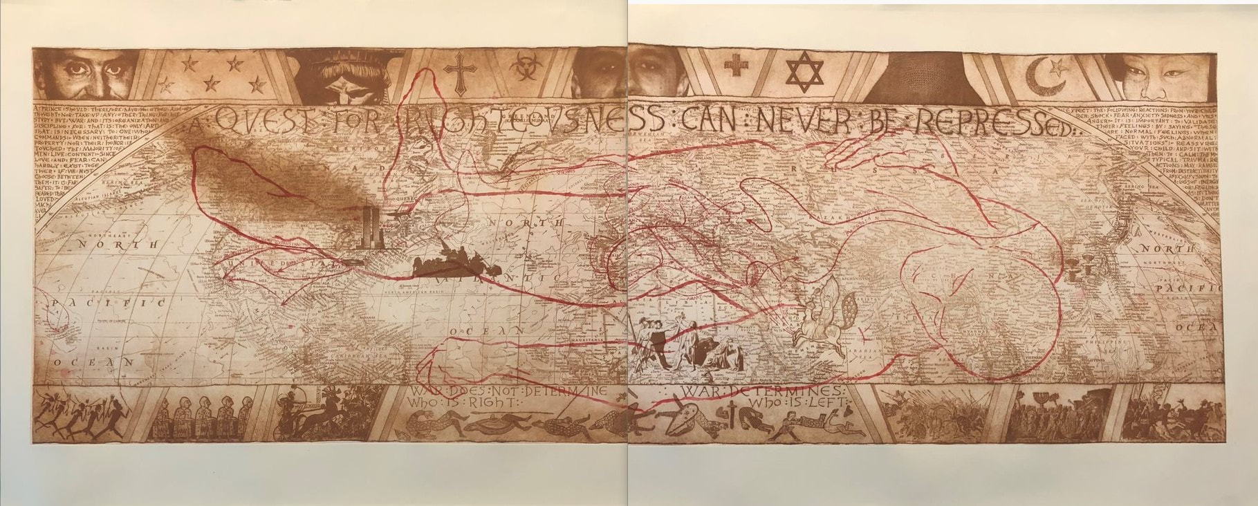 Tru Ludwig (American, born 1959). TapHistory (Repeated), 2005. 4-plate etching. 29 ½ x 76 ½. The Purple Crayon Press, Baltimore.
0 Comments
Ann Shafer Here’s one that got away. I always wanted to acquire a print by Paula Rego for the museum’s collection. For some reason I was always drawn to this image from the series The Pendle Witches. Something about the lone figure afloat in an precarious, upturned tub (in my mind it's an umbrella) really spoke to me. Maybe it’s the feeling of being lost in the chaos of the world as it floats by. This print is from a series that accompany a group of poems by Blake Morrison, which are based on the true story of the Pendle witch trials in England in 1612 (years before the Salem trials). During the trial of multiple alleged witches, the main testimony came from a young girl who was the daughter of one of the accused. There’s more to it, obviously, but the case is held up as an example of the problems that attend depending on one so young, scared, and incapable of understanding the import of their actions. For me, the drifting figure captures the feeling perfectly. I wasn't able to acquire it for the museum, but I still love it. You may be interested in a recent podcast episode from Alan Cristea Gallery featuring Rego and others speaking about her long career and work. An excellent listen. https://cristearoberts.com/podcast/ Ann Shafer Let’s talk about monoprints, selective wiping, and variable etching. With printing intaglio plates (intaglio is Italian for incising a design into a plate, usually copper or zinc, and is the umbrella term under which we find engraving, etching, drypoint, etc.), the default is to ink the plate so that the incised lines carry ink that will transfer to damp paper as it is put through a press under immense pressure. If that basic image is wiped tight (meaning virtually no ink left on the surface), you’ll get the image and nothing extra. Not a bad proposition, necessarily. But, over the centuries, artists have experimented with leaving some ink on the surface of the plate to add some tonality and atmosphere. Add even more ink to the surface and something entirely new is created. Read on about a great example of this kind of additive inking. Back in 2011, the museum mounted an exhibition called Print by Print: Series from Dürer to Lichtenstein. It included twenty-nine series of prints—each in its entirety—and looked at seriality and the many reasons artists work this way. You hardly ever get the chance to see complete series of prints framed and on the wall, and the show included series that are heavy hitters in the history of prints. Some of the highlights included Durer’s Apocalypse and Piranesi’s Carceri, Jacques Callot’s Miseries of War, Ed Ruscha’s News, Mews, Pews, Brews, Stews, and Dues, Sherrie Levine’s Meltdown, and Andrew Raftery’s Real Estate Open House. The exhibition really was a feast for the eyes. But the most remarkable was a group of etchings by Vicomte Ludovic Lepic (French, 1839–1889). I’m gonna guess you’re thinking, who? Lepic was one of the artists who pushed variable wiping to its fullest. These are what we now call monoprints (it’s easy to get confused by the difference between monoprints and monotypes—monoprints start with some image already in the matrix; monotypes are created on a surface that carries no image so each is entirely unique). Twenty impressions of Lepic’s plate were grouped together on the longest wall in the show, each with a different look. They are among the gems of the BMA’s print collection. To be honest, the set of twenty variably wiped etchings doesn’t really qualify as a series. They were not intended to be published as a complete unit. Rather they are a substantial group of prints that are aligned because they use the same matrix in their creation. (Notice my use of the word set to describe them, rather than series. This is bringing out the cataloguer in me.) In fact, I believe Lepic made more versions of this etching, which the BMA does not own. That they don’t strictly fit into the defining principle of the exhibition is not a huge deal, really, especially when they are so instructive, mind-bogglingly beautiful, and can hold any wall anytime anywhere. The etching is a scene on the Scheldt river, which flows northward from France through Belgium and into Holland. First up is an impression wiped tight, meaning no extra ink was left on the surface of the plate. After that follow plates in which ink has been added to the surface to create wholly other compositions: weather effects, different times of day, and the addition of entire trees. They are wonderful examples of how variable wiping can completely alter an image in the best ways. Ludovic Lepic was a French aristocrat who is best known as an etcher and as the subject of several paintings by his good friend, Edgar Degas. Lepic was a painter and sculptor, a costume designer, an amateur archeologist (he founded an archeological museum), a breeder of dogs, an avid sailor, and an equestrian. But for us, his variable etching technique (he called it eau-forte mobile) had a huge impact on modern printmaking. Lepic learned etching from Charles Verlat (1824–1890) and created his first significant etching in 1860. He rapidly became a skilled etcher and in 1862 was invited to join the Société des Aqua-fortistes (The Society of Etchers), formed by art dealer Alfred Cadart (1828-1875) and others to publish original etchings. His etchings were exhibited in annual Salons from 1863 until 1886. Lepic was also involved with the Impressionists. Degas invited him to join with fifteen other artists to form an association to sponsor independent exhibitions, which lead to the first Impressionist exhibition in 1874. Lepic helped plan this seminal exhibition and showed seven works, watercolors, and etchings. He also showed forty-two works at the 1876 Impressionist exhibition. In the ensuing years he continued to paint, make etchings, create costumes for the Paris opera, and work on his sailboat. He died in 1889. Please meet Ludovic Lepic. Ann Shafer The Big Bang. How do you express the formation of the planet and its inhabitants, and what kind of craziness had to come together to create the elements that, put together, make humans capable of thought, creativity, love? It’s really all dumb luck, isn’t it? I recently helped Tru Ludwig print a rather large etching tackling this concept, Dumb Luck, 2009. The composition is a ring of periodic table elements swirling around a human brain set against a galaxy of stars. That brain is a zinc plate cut to fit into the center of the copper plate. The image is printed in blue-black (on the copper plate) and deep red (on the zinc plate). Scribing the element symbols took Tru three months to complete. I believe it. They are intricate, delicate discs floating on an aquatinted galaxy of stars and planets. Three bright white, far-off stars are drilled holes in the plate that carry no ink. They are a small yet vital part of the composition. Then there is a set of blessing hands at lower left. So, in addition to pondering the dumb luck that enables our existence, it raises questions about whether a higher power had a hand in our design. I love this print. I’ve always loved looking at pictures of the stars and galaxies and I’ve always been amazed by the Big Bang theory. How could it be that all this was created without some sort of intentionality? I’m not a particularly religious person, but it does make one wonder. That Tru figured out a way to convey this mystery astounds me. You may recall that Tru and I printed another of his prints, Ask Not…, last weekend, during which I was sort of helpful. I think I graduated to really helpful printing Dumb Luck. By the end of the session, I was wiping that little brain without supervision. I was wiping those element discs. I even came up with a method of quickly removing the first layer of ink—I’m pretty proud of that. We fell into the print-shop ballet that will be familiar to anyone who prints. I loved being in the studio and it reignited my long-held desire to open a print shop and publish prints. If only I would win the lottery in order to be able to do so. <sigh> Ann Shafer There’s one part of being a curator that may shock you. There is no requirement that a curator has ever made a work of art in the manner of those objects they study and work with on the job. I mean, they have to know the basics and be able to describe them, but they don’t have to have done it themselves. I’ve watched lots of demos, made a linoleum cut in grade school (still have the scar to prove it), and I’ve been on hand during the printing process, but have always been the extra pair of hands. I’ve never inked, daubed, wiped, and printed a plate. Until recently, that is. If you’ve been following along, you know that Tru Ludwig and I have been friends and colleagues for a good long time. Tru is the MICA professor with whom I taught history of prints for over a decade. I have also told you that Tru and I have traveled together to take in exhibitions and art fairs: New York, Philadelphia, Washington, London, Paris. We’ve shared a lot of hotel rooms, meals, and more than our share of vodka martinis (dirty and really dirty, respectively). But you probably don’t know that Tru is a kickass printmaker. I’ve always admired his woodcuts—there is one in the Baltimore Museum’s collection and I used it frequently for classes in the studyroom. And I’ve seen just about all of his other works. But one had always eluded me, Ask Not...—I’d only seen it in a pretty bad, discolored reproduction. But I knew it was special and that I would give a lot to have an impression. Lucky for me, the plate for Ask Not..., with Jackie and JFK as Pietà, is in fine shape, even after sitting in storage for twenty plus years. After a bit of Weenol, it was ready for its closeup. We managed to pull three impressions on Saturday. Jeepers, it’s a big plate. I was surprised by the amount of ink needed to cover the plate, both less and more than I thought. I was surprised how long it took to wipe the plate. I was surprised by how many variations of wiping went into the enterprise. And it confirmed for me that wiping and printing are just as critical as the making of the plate. It really was an education. And of course, there’s no better teacher than Tru. So, the print, Ask Not.... It’s a mash up of a critical piece of American history portrayed in the manner of an important Renaissance artwork by none other than Michelangelo (love a nod to art history), and turns the focus to not the main character (JFK), but a supporting one (the first lady). Tru’s etching gives us Jackie Kennedy holding the limp, dead body of President Kennedy on her lap in the same way the Virgin Mary holds the dead Christ in Michelangelo’s glorious marble sculpture. (If you’ve never seen the Pietà in St. Peter’s at the Vatican, don’t miss it if you get to Rome. Seriously.) It’s a simple gesture, but so full of meaning, emotion, power. (Remember, less is sometimes more.) Sometimes an image socks you in the gut. Like the Virgin in the Pietà, the image of Jackie holding JFK reminds us of her grace under extraordinary circumstances. Here she is still wearing the pink suit that had been splattered and soaked with the blood of her husband. It is well known that the first lady kept that suit on throughout the long day following the death of the president. She understood the power of images and was heard to say: “let them see what they've done." JFK is being cradled by an American flag, which seems to puddle along with our hope for the future. Tru’s draftsmanship is spot-on. And there’s something about the action of the corrosive acid used to etch the copper plate that lends itself to the subject. It feels like the copper is fighting to be turned into something, in the same way that we are fighting to be seen and heard and acknowledged. That the country’s sorrow should not be in vain. That at this point in our history, we should take a moment to remember what we have all fought for, and what so many have died for. There’s something at once delicate and harsh about the technique and about the subject. A pure confluence of content and method. It all feels more timely than ever. Ann ShaferSelf-taught. Self. Taught. One of the most remarkable etchers of the first half of the twentieth century taught himself how to etch after his wife gave him an “etching kit” for Christmas. What the hell. John Taylor Arms (American, 1887–1953) made stunning etchings of architecture in New York, Europe, and Japan, and Mexico. No doubt his experience as an architect gave him a leg up. In those days, there were no computers with CAD programs to assist with rendering buildings. Back then, architects hand drew every drawing for a project. With that bit of information, Arms’ etchings make more sense. They are, after all, seriously accurate images of architecture. But still. Interestingly, rather than portraying contemporary buildings, Arms more often portrayed Gothic architecture, which he considered “the most significant expression of man’s aspirations.” His early etchings focus on New York’s skyscrapers, but he soon decided “I can admire the skyscrapers of New York, that unbelievable city which is a very gold mine for the architectural etcher, but I do not love them and I cannot etch what I do not love.” Once New York lost its appeal as a subject, Arms traveled extensively making detailed drawings of towns and churches across Europe and Mexico that would be the basis of etchings once he was back home. He made some five hundred etchings during his fifty-year career and was quite successful over the course of his lifetime. Why do I love his etchings? After all, they are hyper-realistic, full of fine details, and are highly representational. They don’t exactly fall into my tight-conceptual-circle model. What gives? Maybe it’s because they take me away to whatever place is represented. And maybe those day-dreamy trips have an extra hold on me during these long winter, quarantine days. Wouldn’t it be nice to be riding a vaporetto along the Grand Canal passing the Ca’ d’Oro? I can almost smell the sea air and every other scent that comes with wandering around Venice. Also, I can’t wrap my head around how he portrays the crumbling stone texture of the gargoyles, the intricacies of Venetian facades, the church porticos, not to mention the reflections, light, and shadows. He apparently used sewing needles and magnifying glasses to make such fine marks. But the image that I really want for myself is Wasp, the image of two planes dive-bombing some target or other, printed in blue ink. I love the flatness of the image, the pattern made by the searchlights, the potential energy of the planes. It sits at the intersection of abstraction and representation and it hits so many notes. Love. It. Ann Shafer “Why are there no great women artists?” was the main question tackled by Linda Nochlin in a 1971 essay that changed art history forever. In it, Nochlin didn’t dive into the lives of specific women, rather, she critiqued the systems, schools, and other institutions that were designed to discriminate against women. It was the beginning of a conversation that endures. Yes, there are few female printmakers recorded in the early history of Western printmaking. But does it follow that there aren’t any or is it that we just don’t know who they are? Today, please meet Elisabetta Sirani (Italian, 1638–1665), who produced an astonishing two hundred paintings and fifteen etchings before she died at the young age of twenty-seven. Born in Bologna, Sirani was the daughter of Giovanni Andrea Sirani, who was principal assistant to the painter Guido Reni. When her father became ill, Sirani ran the print publishing business supporting the whole family. Luckily for future historians, she was mentored by one Carlo Malvasia, who became her biographer. She was painting professionally by the age of seventeen and she completed commissions for private patrons (usually small-scale devotional paintings) as well as for aristocratic patrons like Grand Duke Cosimo III de' Medici (these were large-scale religious and historical works). Sirani’s reputation for rapidly painting beautiful canvases drew skepticism as patrons believed her father must be helping her with production. Sirani countered these rumors by opening her studio to visitors to show that she alone was completing the paintings. (One can imagine a society’s shock that such a young artist could be so prolific, especially a female one. And yet, I’m rolling my eyes at their disbelief.) Apparently, Sirani taught more than a dozen young women who went on to become professional artists themselves (aside from her two sisters, I haven’t found a comprehensive list so far). All before age twenty-seven—impressive, indeed. Her touch reminds me of the prints of father and son Giovanni Battista Tiepolo and Giovanni Domenico Tiepolo. Interestingly, G.B. was born in 1696, thirty years after Sirani died. Wonder if he knew her work somehow? All these prints are in the British Museum, which has an astonishingly deep collection of prints and drawings. (Check out each print’s accession number and note the year of acquisition, 1799. American collections were not even a spark in a collector’s eye). These works were acquired as part of the bequest of Clayton Mordaunt Cracherode (British, 1730–1799), a collector of books, drawings, prints, shells, and minerals (a classic eighteenth-century student of the Enlightenment). He was a trustee of the British Museum beginning in 1784, and upon his death in April 1799, his holdings entered the museum’s collection. The Cracherode bequest included forty-five hundred books, many of which are important examples of early printing, and the portfolios of prints included magnificent engravings by Dürer and etchings by Rembrandt and form the basis of the museum’s print collection. By the way, the British Museum’s works on paper collection includes 50,000 drawings and more than two million prints. And I thought 65,000 pieces of paper was a lot to wrangle.  Elisabetta Sirani (Italian, 1638–1665). The Holy Family with the Virgin clasping the arm of the infant John the Baptist, 1659. Etching. Sheet (cut to oval): 163 x 138 mm. British Museum: Bequest of Clayton Mordaunt Cracherode, 1799, U,3.71.  Elisabetta Sirani (Italian, 1638–1665). The Rest on the Flight into Egypt, with the Virgin leaning against a tree, 1655–65. Etching. Sheet (cut to oval): 165 x 180 mm. British Museum: Bequest of Clayton Mordaunt Cracherode, 1799, U,3.75.  After Elisabetta Sirani (Italian, 1638–1665). Saint Eustace kneeling before Christ crucified fixed to the antlers of a stag, 1655. Etching. Sheet (trimmed within platemark): 260 x 183 mm. British Museum: Bequest of Clayton Mordaunt Cracherode, 1799, U,3.173. 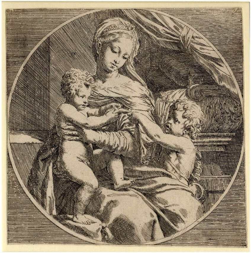 Elisabetta Sirani (Italian, 1638–1665), after Raphael (Italian, 1483–1520). The Virgin and Child who holds a scroll, with the infant John the Baptist, 1655–65. Etching. Sheet (trimmed within platemark): 212 x 212 mm. British Museum: Bequest of Clayton Mordaunt Cracherode, 1799, U,3.97. Ann Shafer When I started in the print department in fall 2005, I got a request to host a Maryland Institute College of Art History of Prints (HoP) class for multiple visits. The professor had taught the class before and had an already established lists of objects. Even being new to the task, I was surprised to realize the breadth of the plan. For each of six visits we pulled out between eighty and one hundred prints starting with Master ES and ending with yesterday. While those classes were a lot of work, they were so rewarding. The immense impact of HoP on hundreds of young artists is due solely to professor Tru Ludwig who is not only a gifted art historian, but also is a practicing printmaker with some badass technical chops. We clicked from the start and taught HoP together fifteen times between 2005 and 2017. In my time in the print room, no other teachers made as powerful a use of the collection. I had never taken a history of prints class (exactly how many colleges offer one?), and with Tru, I had a front row seat to the best teaching I’d ever seen. What does it take to engage twenty-five art students, some of whom think they don’t need to learn anything? It takes a person whose passion is contagious and whose performance is energetic, full of prime historical and technical information, and who encourages students to get up close and personal with the prints themselves. Print nerds know that looking at prints out of their frames is really the only way to get close enough to see what is going on in line quality, tiny details, and textures. The combination of excellent teaching and in-person contact with actual objects is just the best. Tru shines when he starts talking about a time period, movement, or particular artist and gets on a roll. Every semester there was at least one spiel that gave me goosebumps or got me teary-eyed, and more than one that made everyone laugh. After Dürer, Rembrandt, Goya, and everyone in between, and having seen hundreds of prints, we’d finally get to the late-nineteenth century. Most of the material from this period is focused on France, but a sudden detour to Germany introduced Max Klinger and his 1881 portfolio, A Glove (Ein Handschuh), to the class. Klinger (1857–1920) was a bit of an outsider. He created visions from his mind’s eye that presaged twentieth-century thinking about the subconscious and dreams before it was a thing. His work influenced surrealist artists like Salvador Dalí and Giorgio de Chirico, as well as Käthe Kollwitz and Edvard Munch. Of the thirteen portfolios Klinger published during his lifetime, his first is a favorite. It is based on a set of drawings, Fantasies on a Found Glove (Phantasien über einen gefundenen Handschuh), which was exhibited in 1878 at the Berlin Royal Academy of the Arts' annual exhibition. (He was twenty-one years old.) Encouraged by art dealer and engraver Hermann Sagert, Klinger published the set of etchings as a portfolio two years later in 1881. A Glove, Opus VI (Ein Handschuh, Opus VI) features ten etchings and a title page that follows a dream/nightmare sequence of a lost ladies’ glove. First picked up at a skating rink, it becomes an obsession for the central character (Klinger himself) and haunts his waking and sleeping moments. The sexual connotations of such an object are obvious, and Tru’s description had all of us tittering with laughter. The portfolio was always a hit with the class. MoMA’s Heather Hess sums up the portfolio’s narrative nicely: “Klinger meticulously depicts the real and the imaginary with hallucinatory clarity, casting himself as protagonist. At a skating rink in Berlin, Klinger is seen eyeing a beautiful young woman; he swoops down to retrieve her dropped glove. This intimate and potently sexualized object triggers a series of elaborate visions of longing and loss, conveyed through dreamlike distortions of scale and jarring juxtapositions. As desire threatens to engulf Klinger, the fetishized glove takes on a life of its own. It assumes the attributes of Venus, born of sea foam and driving a shell chariot. An outsize version torments him in his sleep, recalling Francisco de Goya's prints. Klinger's grasp on the glove remains elusive, and a fantastic creature finally spirits the object away.” (https://www.moma.org/s/ge/collection_ge/object/object_objid-64063.html) The portfolio’s popularity is clear; after the first publication, it was issued in several subsequent editions, including one posthumously (meaning after Klinger’s death). This is the publication sequence: the first edition was published in 1881 in an edition of twenty-five; a second edition was published a year later as Paraphrase über den Fund eines Handschuhs in an unknown quantity; both a third (1883) and fourth (1892) edition were published in an unknown quantity; the fifth edition was posthumously published in 1924, as Paraphrase über den Fund eines Handschuhs by Verlag von Gertrud Hartmann-Klinger in an edition of approximately one hundred. Knowing all this becomes important when it comes to value and marketability. Obviously, it is preferable to have the earliest set. But would I buy a posthumous set for myself if I came across one? Hell yes. It's such an odd, fantastical sequence, and is all the more remarkable because it dates to the early 1880s, comes out of Germany, and is executed by a twenty-something artist. It makes me wonder about the exact nature of creativity and imagination. I mean, from whence do these kinds of visions come? And who is bold enough to make them into a multiple, collectible set of gorgeous etchings? Tru’s presentation of Ein Handschuh was a highlight every semester. I’d wager that former students (we call them HoPsters) would agree that it was indeed memorable. Any HoPster alums want to chime in? Ann Shafer The museum is fortunate to have two impressions of Félix Bracquemond’s gorgeous portrait of Edmond de Goncourt (one first state and one eighth/final state), and the pair was a permanent fixture on lists for classes studying prints or drawings. Why did I pull the two out constantly? For one thing, it is a kitchen sink etching full of a variety of mark making. Two, having an early state means you can see how and where he started and compare it to the final state. Three, it is a remarkably beautiful and sensitive portrayal of the artist's friend. For me, however, the easy sell is the smoke emanating from the cigarette Goncourt holds. I mean, have you ever? In fact it was the smoke in this print that made me start a subject list of all sorts of images. Whenever I was box surfing, I would note works that featured any number of objects or themes: clouds, eyeglasses, monkeys, night scenes, games, sports, city, country, four seasons, seven deadly sins, you get the picture. Trying to draw smoke seems to me to be almost as difficult as portraying water in a vase (see my earlier post about Manet’s Lilacs in a Vase). Bracquemond’s elegant spiral of smoke wafts up from the butt with such elegance. (Please don’t mistake this for an advertisement for smoking—it isn’t.) Bracquemond enjoyed notoriety and success as a printmaker by the time he started work on the etched portrait of Edmond de Goncourt. He had had prints in multiple Salon exhibitions in Paris and his work was included in the first Impressionist show in 1874. He also created designs for dinnerware, was fascinated by Japonisme, and taught etching to many artists including Jean-Baptiste-Camille Corot, Gustave Courbet, Théodore Rousseau, Edgar Degas, and Henri Fantin-Latour. Bracquemond was a key figure in the etching revival of the 1850s and 1860s in France. Along with the publisher Alfred Cadart and the printer Auguste Delâtre, he founded La Société des Aquafortistes in 1862. The Société published a monthly portfolio of prints over its five-year existence, including work by the most progressive artists of the time: Edouard Manet, Fantin-Latour, Charles Meryon, James McNeil Whistler, and Bracquemond himself. To say he was in the mix would be an understatement. He made over 900 prints during his lifetime, two favorites of which are worth looking up: Le haut d’un battant de porte (Birds Nailed to a Barn Door), 1852; and The Large Rabbit, 1891. But for me, his Portrait of Edmond de Goncourt, 1881–82, is the pinnacle of his oeuvre. In the portrait, Goncourt is shown surrounded by objects that tell us about him. The most meaningful, perhaps, is the portfolio of prints by his younger brother, Jules de Goncourt, seen at lower right. Jules was an amateur printmaker, but more importantly, together the brothers produced a literary journal that is revered today. It is at once a chronicle of an era, an intimate glimpse into their lives, and the purest expression of a burgeoning modern sensibility preoccupied with sex, art, celebrity, and self-exposure. The Goncourts were known to visit everything from slums and brothels to balls and imperial receptions; they argued about art and politics and were merciless gossips discussing news with and about writers Victor Hugo, Charles Baudelaire, and Emile Zola, as well as artists Edgar Degas, Auguste Rodin, and many others. When Jules (who was ten years younger) suffered a painful and slow death at age thirty-nine from syphilis in 1871, Edmond was at his side. The portfolio in the portrait is a nod to Jules as a beloved brother and close collaborator. Other objects include, at upper left, a relief by the French sculptor Clodion of a frolicking nymph and satyr (mythical woodland creatures) recalling eighteenth-century French art, about which Goncourt was passionate. Below the relief is a bronze ornament with a bird and tassels, which represents Goncourt’s collection of fifteen hundred Japanese objects. On the right is a large vase reflected in a mirror. Apparently, Goncourt’s writing about art often evoked physical sensations such as touch and smell, which Bracquemond suggests with objects, rich fabrics, and that burning cigarette. Bracquemond and Goncourt were friends, which I believe is apparent in the portrait’s attention to detail. It is also one of the largest plates Bracquemond ever worked on, adding to its significance. As an artist paying attention to the new conception of the limited edition, with special proofs, papers, etc., Bracquemond took full advantage. As far as we know, there are probably twenty impressions of state I, six impressions of states II–VII, and 175 impressions of state VIII (twenty-five on vellum and 150 on Japan paper). The images below are of several different impressions of the print, including details of a first state impression from the collection of the Metropolitan Museum, a final state impression from the Minneapolis Institute of Arts, along with the drawing of the same subject in the collection of the Louvre. Other details come from a variety of collections. Please know these choices are based on the resolution of the online images. (The online images of the Baltimore Museum of Art's impressions are not high enough resolution to reproduce here.) As always, collections are noted in the captions. Ann Shafer As a curator and self-described print evangelist, I’ve always found printmaking is a tough sell to non-print people. It requires such a steep learning curve in knowledge, but once people are over the peak, usually they are in. At the museum, I spent a lot of time explaining techniques, like the differences between how etched and engraved lines appear. I didn’t mind repeating my spiel (hence the print-evangelist moniker), but the truth is, it just takes a lot of looking. Easy to do when you can box surf in the vault, not so easy if you only look at prints occasionally. To help our audience really learn how to feel confident looking at prints, I always thought we should offer a printmaking 101 course—but such a thing would be impossible given time and resources. In my mind the solution was to mount exhibitions featuring each technique’s greatest hits as well as works by unsung heroes. Since I have a serious soft spot for intaglio techniques (etching, engraving, softground, aquatint, etc), I would start the exhibition series there. (Perhaps starting with relief makes more sense historically, but hey, these are my fantasy shows.) Stars of the intaglio exhibition would be Rembrandt, Callot, Goya, Canaletto, Piranesi, Whistler, Meryon, Braquemond, Cassatt, Arms, Picasso, Kollwitz, Milton, and today’s subject, Félix-Hilaire Buhot, who made incredible etchings from 1873 to 1892. Buhot (pronounced in French as Boo-oh; in English sometimes as Boo-Ho) was born in Normandy and was, sadly, orphaned at age seven. Somehow, he made his way to Paris and made a living as a commercial artist. He began making prints in 1873, and only a year later was singled out by Philippe Burty, a prominent critic who admired Buhot’s belles épreuves (beautiful proofs). The etching revival of the 1860s was already underway when Burty put forward the idea of special proofs to denote rare, superbly inked impressions printed by the artist himself. Burty created a market for prints by promoting the idea of the limited edition (in which an artist sets a certain number of prints to be editioned, and no more), special proofs on colored papers, special stamps, and marginalia. Not coincidentally, central to the etching revival was the concept of the peintre-graveur (painter-etcher), as etching provided a means for a more autographic mark and an involvement with inking and printing, as opposed to the commercial lithography and reproductive engraving trades popular at the time. Buhot distinguished himself from other artists with his use of marges symphoniques (symphonic margins), also called marginalia or remarques. Margins outside of the main image area are filled with quirky doodles, sort of like notes in a sketchbook, which often offer a different take on the main subject. Buhot also experimented with inking and papers—some of my favorites include his use of an amazing blue ink. In fact, his experimentation meant that almost no etchings of the same image are like any of the other impressions. Hence the term painter-etcher. Buhot portrayed both ends of the daily life spectrum, from celebrations of national holidays in National Holiday on the Boulevard de Clichy, 1879, to the disastrous effects of winter later that same year in Winter in Paris. The beauty of the latter belies the action. In December 1879, Paris was in a deep freeze and suffering greatly. In his print, it takes us a minute to notice the dogs fighting over scraps in the foreground of the main image, as well as the frozen bodies of horses found along the left side. Buhot enjoyed popularity in his lifetime in France and in America. His prints were collected by two major American print collectors: Samuel P. Avery, whose collection is at the New York Public Library, and George A. Lucas, whose collection is at the Baltimore Museum of Art. In subsequent years, the National Gallery of Art has also assembled a substantial collection, including many drawings. I love Buhot’s compositions, use of aquatint, spontaneous-looking doodles in the margins, and painterly application of inks that enhance the portrayal of various weather effects. In the study room we would have called them scrumpy. No surprise, his prints were favorites with visiting students. I’m in. Are you? Ann Shafer I’ve loved Martin Lewis’ etchings and drypoints of urban and rural scenes from the 1920s and 1930s since I tripped over an impression of Shadow Dance in a solander box at the museum. That print’s light, the shadows, the translucency of the dresses, and the composition are soooo good. And that’s a self-portrait—the man on the left is Lewis himself. His prints would feature prominently in my imagined exhibition City/Country. Maybe I’m drawn to Lewis’ work because of my time in New York as a young professional. I mean, I never walked to the Whitney in heels and a flapper dress with a cloche hat, but I did hoof it across town in a suit and white sneakers, work shoes tucked in my oversized purse. Of course, I was blasting some good eighties ballads on my Walkman—Paul Young, anyone? I was young and had recently discovered that I wanted nothing else than to be a curator. I was full of hope for my future and was thrilled to be living in the Big Apple. Living in New York, with its water towers, brownstones, skyscrapers, parks, yellow cabs, and subways made me appreciate the urbanism popularized by Alfred Stieglitz and his stable of early-twentieth-century artists. The Whitney’s permanent collection cemented my love for them. There were gorgeous paintings hanging on the third floor of the Whitney’s Breuer building including canvases by Georgia O’Keeffe, Joseph Stella, Charles Sheeler, and my two first loves, Charles Demuth and Edward Hopper. Demuth’s My Egypt and Hopper’s Early Sunday Morning were pilgrimage stops for me when I wandered the galleries before opening. Lewis may not be as well-known as other artists working in New York in the first half of the century, but his prints are worth a look. Plus, he is credited for introducing Hopper to printmaking—the two remained lifelong friends. Both these artists’ print prices are sky high now, and it always makes me laugh when these prints have original prices scrawled on them: $25 or even $15 (see Derricks at Night--$25 is marked at lower right). Wouldn’t it have been nice to reward the artists with today’s prices during their lifetimes? Lewis was born in 1881 in Victoria, Australia. As a youth, Lewis worked on cattle ranches in the Australian Outback, in logging and mining camps, and as a sailor. In 1898, he moved to Sydney and studied art for two years (his only formal training). It is unclear if he learned printmaking in Sydney, although we do know a local radical paper, The Bulletin, published two of his drawings. In 1900, Lewis arrived in San Francisco and made his way to New York shortly thereafter. Like many other artists, Lewis made his living as a commercial artist. He produced his first etching in 1915 and soon taught Hopper how to make them. In 1920, Lewis used his entire savings to travel to Japan to study and make art. After two years there, he returned New York and resumed his commercial art career, while also making his own paintings and prints. From 1944–1952 Lewis taught a graphics course at the Art Students League. Over thirty years, Lewis made some 145 drypoints and etchings. His prints, like Shadow Dance and Stoops in Snow, were admired during the 1930s for their realistic portrayal of daily life. (Remember there was still a divide between artists who worked in an “American style” versus European Modernism.) Call me a fan. I love Lewis’ compositions, the range of lights and darks, the transparencies, the “alone in a crowd”-ness of them. If only we could afford them. See what you think. Ann Shafer Sometimes an artist you really want to hang on the museum’s walls is only represented in the collection by minor works (in both visual impact and size). Don’t get me wrong, I love a small work—I had a running list of tiny prints that I thought would make a great show—but when it comes to contemporary works on paper, they need to be able to “hold the wall” because of the size of the galleries and the scale of the non-paper works they may hang near. My wish list included several artists in this category, most notably John Baldessari, Kara Walker, William Kentridge, and Kerry James Marshall. The museum’s collection has works on paper by these artists, but few with substantial wall power. I chased Baldessari’s print, Roller Coaster, 1989, three times. The first time I saw it on the wall at the IFPDA Print Fair in the booth of the work’s publisher, Brooke Alexander. On opening night, the work was already on hold for a collector. The second time, it came up at auction. I got permission to bid on it and lost out to another bidder. The third time was at the print fair again, and again, I was too late. Baldessari is a tough nut to crack. Irreverent is the best word I can think of to describe his work. But there is just something about Roller Coaster: the shaped print, the way the arc of the roller coaster moves from one end of the sheet to the other, the wall power, its size. It is so easy to like. I also chased William Kentridge’s powerful Casspirs Full of Love, ironically also from 1989, multiple times. Two different dealers offered it to us multiple times over the years, but the price was just high enough to be out of reach. If only I could have said yes. Whereas the Baldessari is clever and fun, the Kentridge is shocking. Severed heads appear to be stacked in a cabinet of some sort. MoMA’s web site helps us parse it out: “The title of this work refers to a message sent from mothers to sons on a popular radio program for South African troops: ‘this message comes from your mother, with Casspirs full of love.’ Casspirs are armored military vehicles; their name is an anagram for CSIR (Council for Scientific and Industrial Research) and SAP (South African Police), the organization that developed them. These vehicles, designed for international military operations, were deployed against black township communities in South Africa during states of emergency imposed by the apartheid government.” I think you can agree that both have wall power for different reasons. I could think of an exhibition with each as its centerpiece. Obviously not the same show. Well, unless one was looking at the year 1989. John Baldessari (American, 1931–2020) Rollercoaster, 1989 Aquatint, photogravure printed in black, green, and red Sheet: 39 × 67 1/2 in. (99 × 171.5 cm.) Published by Brooke Alexander William Kentridge (South African, born 1955) Casspirs Full of Love, 1989 Drypoint and engraving with roulette Sheet: 65 3/8 x 38.7/16 in. (166 x 97.6 cm.) Plate: 58 9/16 x 32 in. (148.8 x 318 cm.) Published by the artist and David Krut 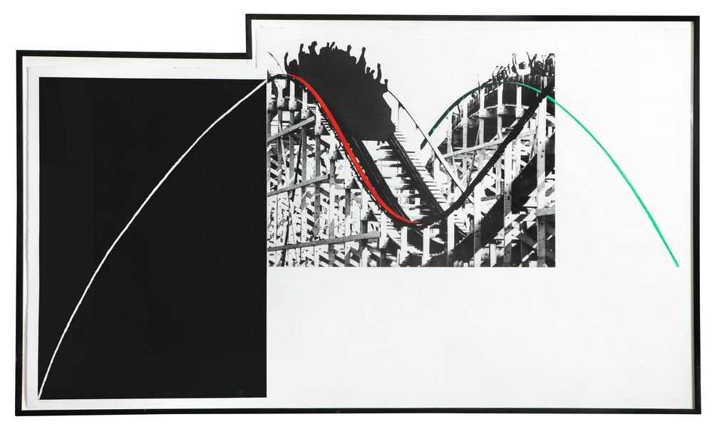 John Baldessari (American, 1931–2020). Rollercoaster, 1989. Aquatint, photogravure printed in black, green, and red. Sheet: 39 × 67 1/2 in. (99 × 171.5 cm.). Published by Brooke Alexander. 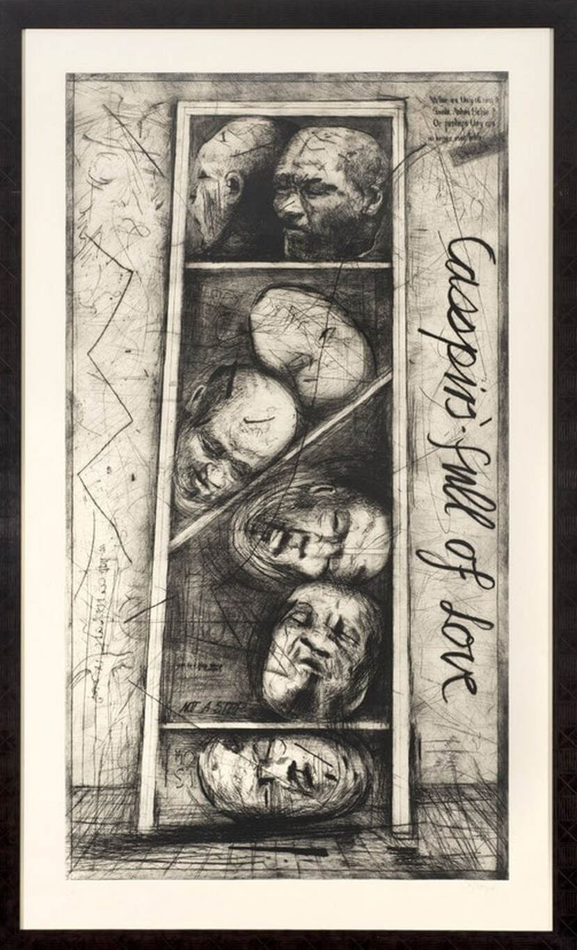 William Kentridge (South African, born 1955). Casspirs Full of Love, 1989. Drypoint and engraving with roulette. Sheet: 65 3/8 x 38.7/16 in. (166 x 97.6 cm.); plate: 58 9/16 x 32 in. (148.8 x 318 cm.). Published by the artist and David Krut. Ann ShaferLet's talk about editions, the idea of creating a limited number of a particular work of art—generally used in prints and multiples. The practice of limiting the number means that multiple collectors can possess the same image, that as the number dwindles an artificial rarity may create demand, and that artists control dissemination. (Know that the idea of a limited edition is a relatively new one, dating to the late-nineteenth century.) People often ask about editions and how it is that if there are more than one print, why are they considered original works of art and not copies. Basically, it has to do with the artist’s intention. (I can point you to the definition established by the Print Council of America here: https://printcouncil.org/defining-a-print/.) Printmakers naturally take advantage of the medium’s implicit multiplicity, but can the edition itself be the subject of an edition? How meta can it get? I like an artist who is aware of the structure of the enterprise. But is meta too clever, too cheeky? Is it possible to be funny, smart, aesthetically pleasing, and collectible? Check out this etching by Bill Thompson, which was printed by Jim Stroud at Center Street Studio. The print, Edition, 2015, is a minimalist composition featuring a simple grid. Inside of each square is a fraction running from 1/45 to 45/45—these reflect the numbers in the edition. There are also squares for one BAT (bon à tirer—meaning “good to print,” the proof an artist approves to proceed with printing), 1AP to 5AP (artist’s proofs), and 1PP to 5PP (printer’s proofs). These last few are outside the official edition of 45, but they often find their way into the market eventually. It may seem like they are special in some way, but this is artificial. For the most part, master printers will produce nearly identical impressions to such a degree that a print from the numbered edition will be no different from any of the proofs. Since all the possible impressions are represented within Thompson’s print itself, instead of the number getting handwritten below the image as is usual, in this case the artist circled each number in succession. So, the hand addition of the colored pencil circles indicates the number in sequence and also becomes the focal point of the image. It’s a visually elegant work, and its meta-ness is cheeky. (Impressions of Thompson’s prints are available here: http://www.centerstreetstudio.com/pur…/bill-thompson-edition). A second meta work is Fiona Banner’s Book 1/1, 2009, published by the now defunct The Multiple Store. The work is more print than book for it is simply bold black letters on a single piece of mirror-finish card. The type spells out the ISBN number of the books—each individual book, that is. Each ISBN (International Standard Book Number) number is registered—it’s an official publication full of nothing, containing only its registration information. Because books are usually reproduced in great numbers, that each of Banner’s books is unique plays against the norm. In addition, the mirror finish performs an important role. Because the viewer necessarily sees him/herself in the reflection, they are automatically the subject of the image/book. In addition, because of the reflective surface, the books are also impossible to photograph and reproduce well; their uniqueness is even more firmly established. Any image of said book will necessarily be different depending on the reflections caught in the process. Banner’s work is a published and registered book, without contents, unreproducible, unique, and reflects the viewer. Talk about meta! Bill Thompson (American, born 1957) Printed and published by Center Street Studio Edition (BAT), 2015 Etching with chine collé Sheet: 546 x 565 mm. (21 ½ x 22 ¼ in.) Plate: 318 x 368 mm. (12 ½ x 14 ½ in.) Fiona Banner (British, born 1966) Published by The Vanity Press and The Multiple Store Book 1/1, 2009 Block print on mirror card 685 x 492 mm. (27 x 19 ½ in.) 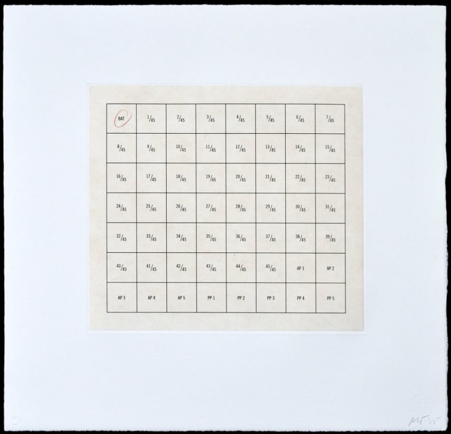 Bill Thompson (American, born 1957). Printed and published by Center Street Studio. Edition (BAT), 2015. Etching with chine collé. Sheet: 546 x 565 mm. (21 ½ x 22 ¼ in.); plate: 318 x 368 mm. (12 ½ x 14 ½ in.).  Fiona Banner (British, born 1966). Published by The Vanity Press and The Multiple Store. Book 1/1, 2009. Block print on mirror card. Sheet: 685 x 492 mm. (27 x 19 ½ in.). Ann ShaferIn the BMA’s study room, I welcomed classes from area colleges and high schools and enjoyed the groups from MICA the most. I loved showing young artists works that made their brain synapses fire. You could see them igniting. Sometimes it was fun to play the “how was it made” game. Usually these works were conceptual in that there is a set of rules governing the making, and also indexical in which the image is of its own making. One such drawing by Baltimore artist Denise Tassin always made the cut. The BMA’s online database doesn’t include the drawing so I can’t show you the actual work, but it is similar to the version I posted below (know that the paper is bright white, not pink). The abstract image is on a large sheet and is made of only red ink. Sometimes the students would guess correctly: Tassin used earthworms and red pigment to create the image. In some of the marks one can discern the ribbed rings of the worms’ two ends, which were usually the giveaway. It’s a beautiful drawing and enables a discussion about conceptual works of art in which a set of rules are established and followed. In this case the rules are simple: the worms are allowed to wriggle around for X time, no other intrusions interrupt the process. Next, I would pull out another critter-based work: the portfolio Wandering Position by Japanese artist Yukinori Yanagi. Coincidentally also in red ink, the five untitled sheets in this portfolio are etchings and the featured insect is an ant. On a plate coated with a hard ground, the artist followed the ant with an etching needle, tracing its path in the confined shape. Looking closely reveals the ant’s repeated attempts to get out; there is a marked build-up of lines in the corners and against the boundary. I suspect the rules included a time limit in which to follow the creature. And here is another indexical image. Yanagi didn’t draw an image of an ant traversing a space, rather, the ant’s recorded path is the image. The students seemed to love the portfolio; they always reacted with a hearty “ooh!” It’s such a simple concept really, following a bug with an etching needle. But there’s more to it. There’s a weird power struggle here, a both/and situation. The tiny and vulnerable ant is in charge of the artist’s labor and yet is confined to a prescribed space. On the other hand, the artist is at the whim of the bug and is also in control of the situation. In this and in other works Yanagi looks at issues of control in society, drawing a through-line from borders, nationality, and migration to incarceration. (The artist created an installation piece at Alcatraz in 1996.) I always strove to show works that expanded what was possible as well as different modes of art making. Yanagi’s portfolio is an intriguing set of prints that always resonated with young artists. Denise Tassin (American, born 1966) Drawing by Worms Red ink Denisetassin.com Yukinori Yanagi (Japanese, born 1959) Wandering Position, 1997 Printed by Harlan & Weaver Published by Peter Blum Editions Sheet (each): 615 x 510 mm. (24 3/16 x 20 1/16 in.) Portfolio of five etchings printed in red Baltimore Museum of Art: Women's Committee Acquisitions Endowment for Contemporary Prints and Photographs, BMA 2001.352.1–5  Denise Tassin (American, born 1966). Drawing by Worms. Red ink.  Yukinori Yanagi (Japanese, born 1959). Untitled, from the portfolio Wandering Position, 1997. Printed by Harlan & Weaver; published by Peter Blum Editions. Sheet: 615 x 510 mm. (24 3/16 x 20 1/16 in.). Etching printed in red. Baltimore Museum of Art: Women's Committee Acquisitions Endowment for Contemporary Prints and Photographs, BMA 2001.352.1–5.  [DETAIL] Yukinori Yanagi (Japanese, born 1959). Untitled, from the portfolio Wandering Position, 1997. Printed by Harlan & Weaver; published by Peter Blum Editions. Sheet: 615 x 510 mm. (24 3/16 x 20 1/16 in.). Etching printed in red. Baltimore Museum of Art: Women's Committee Acquisitions Endowment for Contemporary Prints and Photographs, BMA 2001.352.1–5.  Yukinori Yanagi (Japanese, born 1959). Untitled, from the portfolio Wandering Position, 1997. Printed by Harlan & Weaver; published by Peter Blum Editions. Sheet: 615 x 510 mm. (24 3/16 x 20 1/16 in.). Etching printed in red. Baltimore Museum of Art: Women's Committee Acquisitions Endowment for Contemporary Prints and Photographs, BMA 2001.352.1–5.  Yukinori Yanagi (Japanese, born 1959). Untitled, from the portfolio Wandering Position, 1997. Printed by Harlan & Weaver; published by Peter Blum Editions. Sheet: 615 x 510 mm. (24 3/16 x 20 1/16 in.). Etching printed in red. Baltimore Museum of Art: Women's Committee Acquisitions Endowment for Contemporary Prints and Photographs, BMA 2001.352.1–5.  Yukinori Yanagi (Japanese, born 1959). Untitled, from the portfolio Wandering Position, 1997. Printed by Harlan & Weaver; published by Peter Blum Editions. Sheet: 615 x 510 mm. (24 3/16 x 20 1/16 in.). Etching printed in red. Baltimore Museum of Art: Women's Committee Acquisitions Endowment for Contemporary Prints and Photographs, BMA 2001.352.1–5.  Yukinori Yanagi (Japanese, born 1959). Untitled, from the portfolio Wandering Position, 1997. Printed by Harlan & Weaver; published by Peter Blum Editions. Sheet: 615 x 510 mm. (24 3/16 x 20 1/16 in.). Etching printed in red. Baltimore Museum of Art: Women's Committee Acquisitions Endowment for Contemporary Prints and Photographs, BMA 2001.352.1–5. Ann ShaferRecently I saw a t-shirt that said “Don’t make me repeat myself. –History" There is a lot going on these days. Between the pandemic, politics, and confronting America’s legacy of slavery and systemic racism, I am, as I’m sure you are, anxious. On top of that, as I write this, I’m riding out a hurricane in a cottage overlooking the very turbulent waters of Vineyard Sound. We all know this period is not unique. Humans have made it through more dire times than these. But still, we seem doomed to repeat our mistakes. As I’ve written before, I really appreciate an artist who digs in and expresses the fears and worries of their time in a way that helps viewers process and think. Especially if the images read just as well in our time as in theirs. Gabor Peterdi was a Hungarian artist who worked at Atelier 17 in Paris in the 1930s during the Spanish Civil War and leading up the second World War. Like so many of his compatriots, he created prints that address issues of social justice and crimes against humanity, sometimes using the bull and bull fights or mythical horses and man-animal creatures as stand-ins for humankind. One rarely finds any self-portraits among the prints made at Hayter’s workshop, but Peterdi is notable for a 1938 series of self-portraits in which he holds his head in his hands in despair. It’s hard to get the emotion just right in these kind of images, and I think Peterdi hits the nail on the head. Like so many others, Peterdi made his way to America at the beginning of the war (remember, Europe was in turmoil for years leading up to the official declaration of war in September 1939). He enlisted in the U.S. Army and fought for his new country. No surprise, that experience finds its way into his work. Peterdi went on to have a long career both making prints and teaching printmaking. In addition to establishing the printmaking program at the Brooklyn Museum School, Peterdi taught at Hunter College from 1952–1960, and then at Yale University from 1960–1987. (Among his many students at Yale were Peter Milton and Chuck Close.) In a previous post I wrote about artists making prints reacting to World War II in the years after its conclusion as a demonstration of that conflict’s lasting effect. I also wrote about artists writing about their own work and how I wish more artists would take the time to do the same. Peterdi’s The Vision of Fear, 1953, fits both categories. About the print Peterdi wrote: “My basic idea was to create an oppressive, enervating image haunted by fearful symbols of destruction. I tried to express a composite feeling of flying with deadly birds and watching them from below.” This print is interesting also because of the four additional plates he laid on top of the large plate as it passed through the press. The deep emboss accentuates their addition as does the red ink he used, making the crosses seem to fall from the sky. I’ve included images here that I don’t mention because I think Peterdi deserves more attention and I love his sensibility. But I will note that Still Life in Germany is one that got away. I had been keeping my eye on it for years, waiting for the right time to pitch it. In the end, I ran out of time. By the way, if any of you studied with Peterdi, I’d love to hear your stories. Gabor Peterdi (American, born Hungary, 1915–2001) Despair I, 1938 Etching and engraving Plate: 266 x 197 mm. (10 1/2 × 7 ¾ in.) Sheet: 448 x 315 mm. (17 5/8 × 12 3/8 in.) Museum of Modern Art: Purchase, 146.1944 Gabor Peterdi (American, born Hungary, 1915–2001) Despair II, 1938 Etching and engraving Plate: 245 × 206 mm. (9 5/8 × 8 1/8 in.) Sheet: 304 × 269 mm. (11 15/16 × 10 9/16 in.) Yale University Art Gallery: Gift of James N. Heald II, B.S. 1949, 2011.148.8 Gabor Peterdi (American, born Hungary, 1915–2001) Despair III, 1938 Etching and engraving Plate: 315 x 248 mm. (12 3/8 × 9 ¾ in.) Sheet: 452 x 340 mm. (17 13/16 × 13 3/8 in.) Museum of Modern Art: Gift of the Artist, 103.1955 Gabor Peterdi (American, born Hungary, 1915–2001) Despair IV, 1938 Etching, engraving, and drypoint Plate: 241 × 203 mm. (9 1/2 × 8 in.) Sheet: 453 × 329 mm. (17 13/16 × 12 15/16 in.) Yale University Art Gallery: Gift of James N. Heald II, B.S. 1949, 2011.148.9 Gabor Peterdi (American, born Hungary, 1915–2001) Despair V, 1938 Etching Plate: 247 × 209 mm. (9 3/4 × 8 1/4 in.) Sheet: 453 × 329 mm. (17 13/16 × 12 15/16 in.) Yale University Art Gallery: Gift of James N. Heald II, B.S. 1949, 2011.148.10 Gabor Peterdi (American, born Hungary, 1915–2001) The Vision of Fear, 1953 Etching and engraving Plate: 651 × 933 mm. (25 5/8 × 36 3/4 in.) Sheet: 749 × 105 mm. (29 1/2 × 41 1/4 in.) Mutual Art Gabor Peterdi (American, born Hungary, 1915–2001) Still Life in Germany, 1946 Engraving Plate: 302 x 227 mm. (11 7/8 x 8 15/16 in.) Conrad Graeber Fine Art Gabor Peterdi (American, born Hungary, 1915–2001) Hunter Hunted, 1947 Engraving Plate: 394 x 368 mm. (15 1/2 x 14 ½ in.) Annex Galleries Gabor Peterdi (American, born Hungary, 1915–2001) The Price of Glory, 1947 Engraving Plate: 276 x 454 mm. (10 7/8 x 17 7/8 in.) Sheet: 336 x 514 mm. (13 1/4 x 20 ¼ in.) Dolan/Maxwell 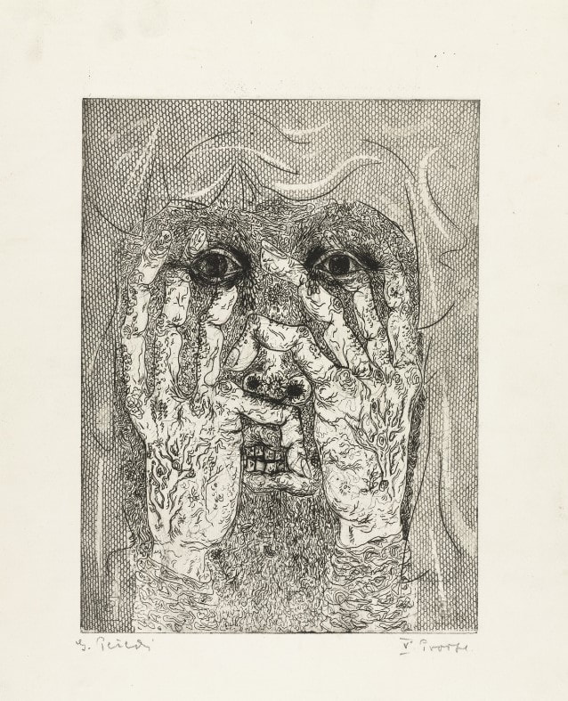 Gabor Peterdi (American, born Hungary, 1915–2001). Despair I, 1938. Etching and engraving. Plate: 266 x 197 mm. (10 1/2 × 7 ¾ in.); sheet: 448 x 315 mm. (17 5/8 × 12 3/8 in.). Museum of Modern Art: Purchase, 146.1944. 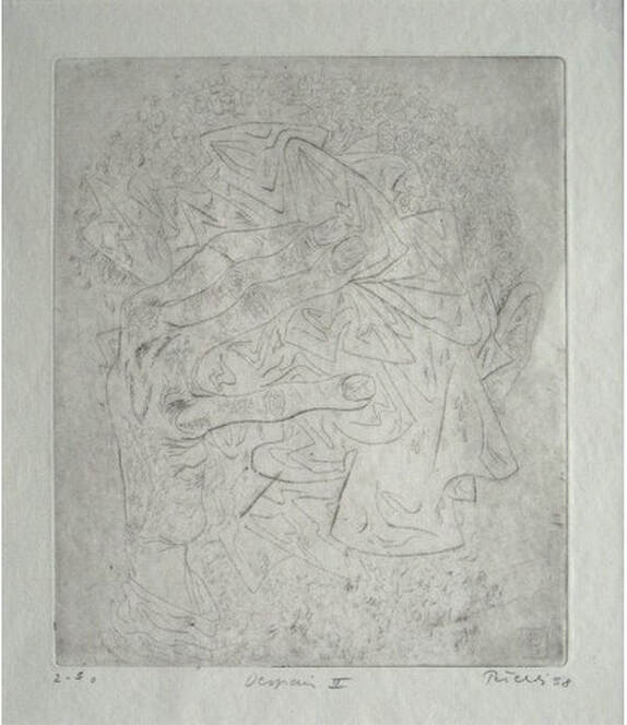 Gabor Peterdi (American, born Hungary, 1915–2001). Despair II, 1938. Etching and engraving. Plate: 245 × 206 mm. (9 5/8 × 8 1/8 in.); sheet: 304 × 269 mm. (11 15/16 × 10 9/16 in.). Yale University Art Gallery: Gift of James N. Heald II, B.S. 1949, 2011.148.8. 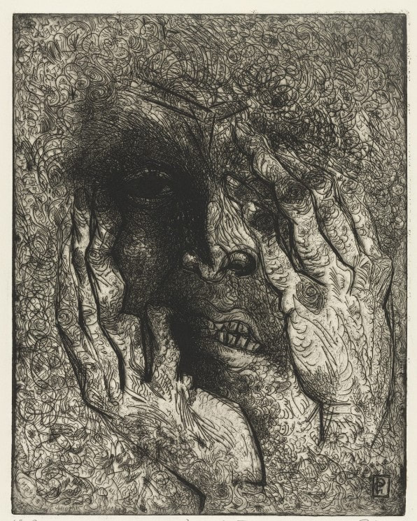 Gabor Peterdi (American, born Hungary, 1915–2001). Despair III, 1938. Etching and engraving. Plate: 315 x 248 mm. (12 3/8 × 9 ¾ in.); sheet: 452 x 340 mm. (17 13/16 × 13 3/8 in.). Museum of Modern Art: Gift of the Artist, 103.1955. 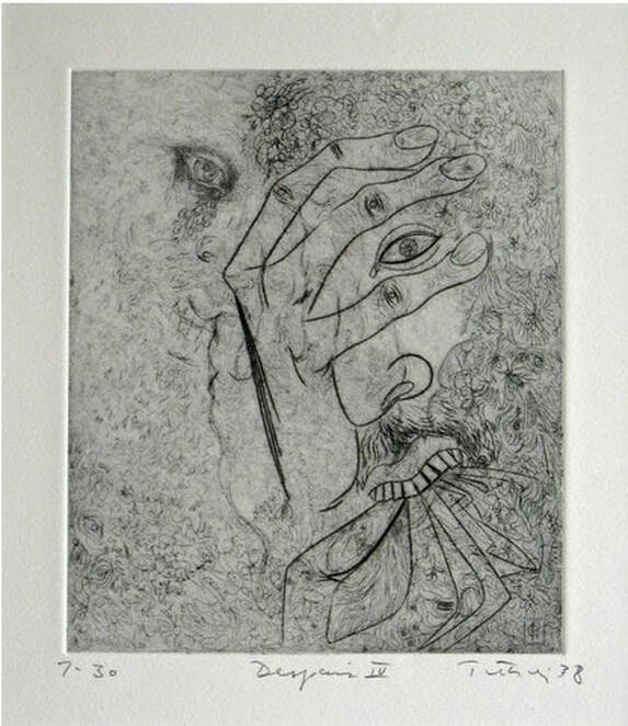 Gabor Peterdi (American, born Hungary, 1915–2001). Despair IV, 1938. Etching, engraving, and drypoint. Plate: 241 × 203 mm. (9 1/2 × 8 in.); sheet: 453 × 329 mm. (17 13/16 × 12 15/16 in.). Yale University Art Gallery: Gift of James N. Heald II, B.S. 1949, 2011.148.9. 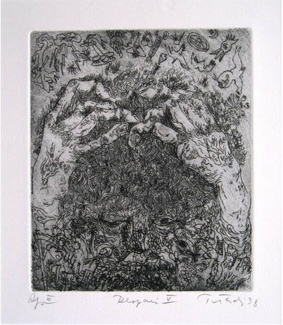 Gabor Peterdi (American, born Hungary, 1915–2001). Despair V, 1938. Etching. Plate: 247 × 209 mm. (9 3/4 × 8 1/4 in.); sheet: 453 × 329 mm. (17 13/16 × 12 15/16 in.). Yale University Art Gallery: Gift of James N. Heald II, B.S. 1949, 2011.148.10. 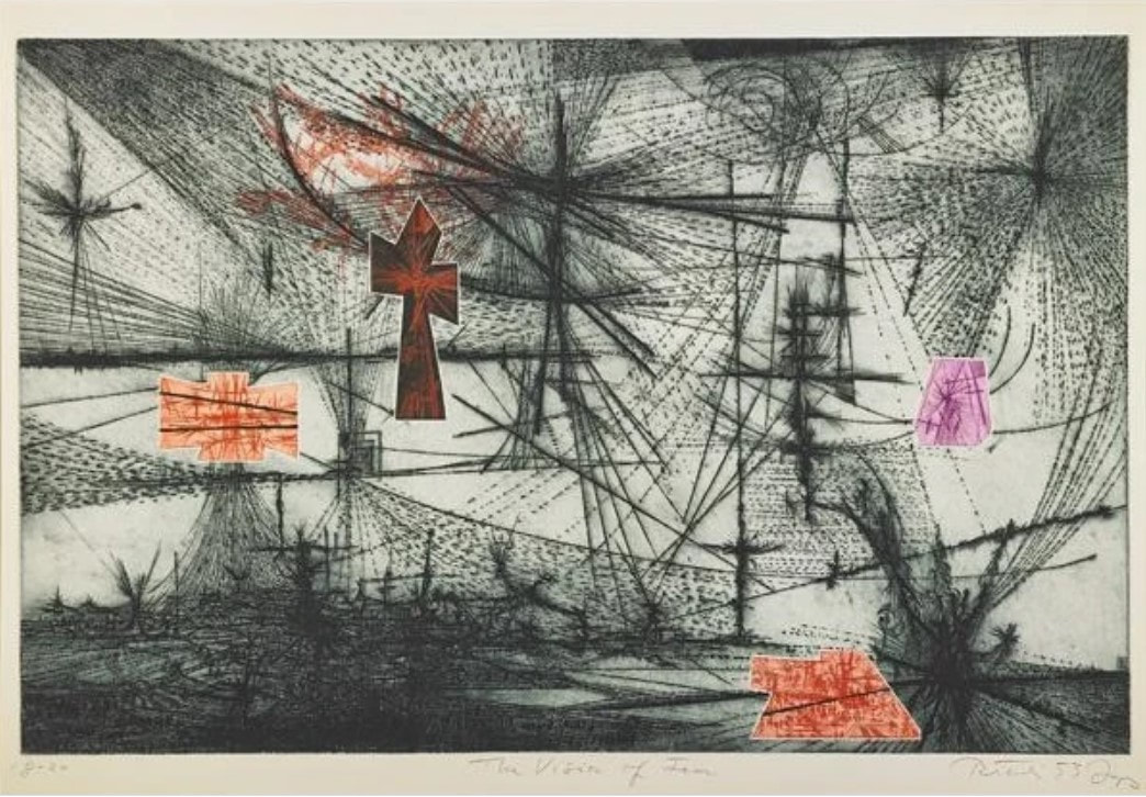 Gabor Peterdi (American, born Hungary, 1915–2001). The Vision of Fear, 1953. Etching and engraving. Plate: 651 × 933 mm. (25 5/8 × 36 3/4 in.); sheet: 749 × 105 mm. (29 1/2 × 41 1/4 in.). Mutual Art.  Gabor Peterdi (American, born Hungary, 1915–2001). Still Life in Germany, 1946. Engraving. Plate: 302 x 227 mm. (11 7/8 x 8 15/16 in.). Conrad Graeber Fine Art.  Gabor Peterdi (American, born Hungary, 1915–2001). Hunter Hunted, 1947. Engraving. Plate: 394 x 368 mm. (15 1/2 x 14 ½ in.). Annex Galleries. 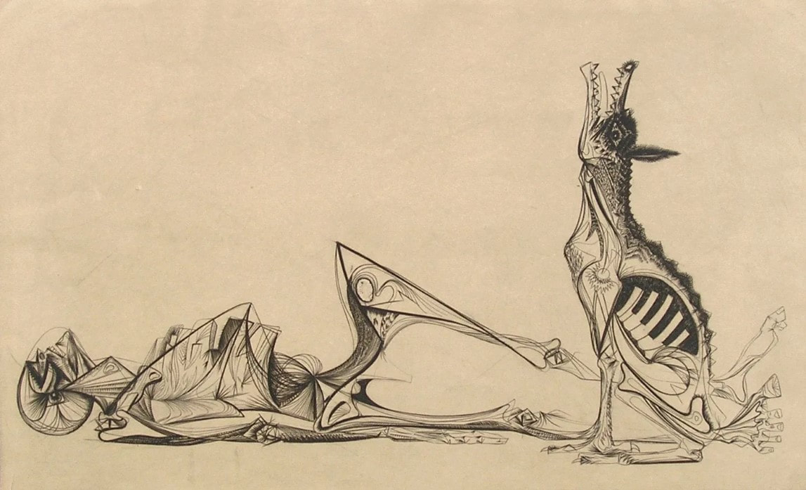 Gabor Peterdi (American, born Hungary, 1915–2001). The Price of Glory, 1947. Engraving. Plate: 276 x 454 mm. (10 7/8 x 17 7/8 in.); sheet: 336 x 514 mm. (13 1/4 x 20 ¼ in.). Dolan/Maxwell. Ann ShaferWhen I taught young artists in the BMA’s printroom, I always suggested a few things to keep in mind when creating art. First, that they pay attention to materials—the work might turn out well, and you’ll be sorry it’s on crappy paper. Second, that they sign everything—I can’t tell you how many works on paper by unknown artists are in the collection. Third, that they date everything—you always think you’ll remember when you created a work, but unless you have a remarkable mind, you won’t remember. On the latter point, some museums are okay with n.d. as a date (meaning no date), but I was trained to at least assign a range of possible dates, which would help viewers identify a period or century. Sometimes this means a huge range from birth plus twenty to death. For example, if the artist were born in 1900 and died in 1975, and the object had no date, we would write c. 1920–1975. Crazy, right? No one wants that. For me, however, it would be even better if the artist wrote something about their intentions with a work. But my sage friend and artist Ben Levy would say: “I’m an artist and I say things visually. Now you want me to write about it, too? I say it visually because I can’t say it in writing.” And I get it. Artists are a special breed with special brains. They think differently. But it would be lovely to be able to read an artist’s words about a given work anyway. I thank all you artists in advance. It is rare to come across an artist who is eloquent about their own work. While working on my Hayter project, I became intrigued by the hundreds if not thousands of artists who worked at Atelier 17. I was thrilled to find one artist who wrote about his prints, which his granddaughter made available online. Leo Katz was an established printmaker and painter by the time Hayter set up the workshop at the New School for Social Research in New York in 1940. The New York branch remained operational until 1955 under the direction of several people, including Katz. In 2015, his granddaughter, Lisa Katz Wadge, established a useful web site devoted to her grandfather's career that includes one of his essays along with notes on individual prints. For me, Katz’s print Pegasus, 1945, is his most important. It is a direct reaction to World War II. I’m fascinated by prints made during and just following the war, and how artists digested the experience, the fallout, the H bomb, the Holocaust. All these revelations in the late 1940s must have been overwhelming. I’m also interested in how long after the end of the war artists made work reflecting on it. I can think of works done well into the 1950s. Trauma lasts. But to the artist’s own words. Katz writes about Pegasus: "This composition tried to express symbolically, the condition of the creative spirit at the end of World War II. Pegasus the winged horse, the dream symbol of man's creative imagination, tries to get out from under the remains of barbed wires and nets among the concrete tank traps. He makes a feeble attempt to rise on his forelegs. In the distance there are still explosions. The dark mesh, which arches over the horse, has a suggestion of a pelvic form which would indicate that awakening is more like birth. I had a feeling at that time (1945) that the great question of our era is whether this birth, or rebirth, of Pegasus will be a living, lasting success or not. It is not enough to have rockets and bombers flying high in the air while man's creative soul with its dreams is permanently grounded.” If you can, write about your work’s intentions. Or, at the very least, sign and date it. Thank you from future art historians and curators. Leo Katz (American, born Czechoslovakia, 1887–1982) Pegasus (three states), 1945 Engraving and softground etching; printed in black (intaglio) Plate: 251 × 304 mm. (9 7/8 × 11 15/16 in.) Leo Katz Foundation 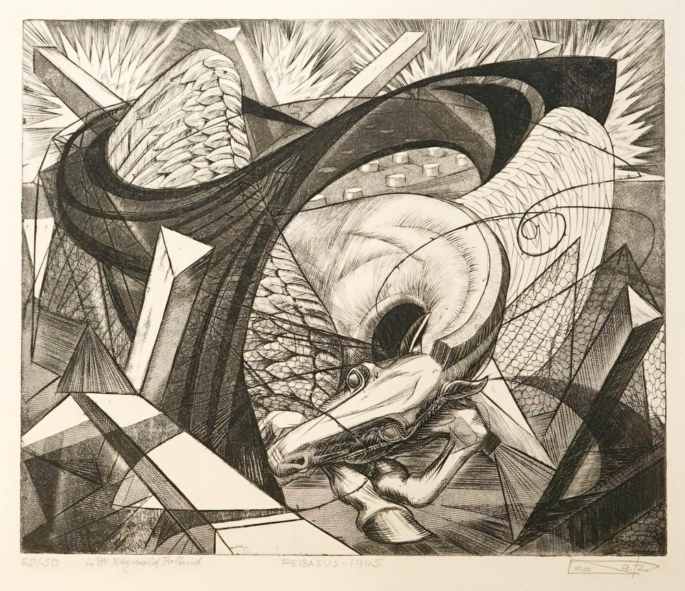 Leo Katz (American, born Czechoslovakia, 1887–1982). Pegasus (final state), 1945. Engraving and softground etching. Plate: 251 × 304 mm. (9 7/8 × 11 15/16 in.). Leo Katz Foundation. 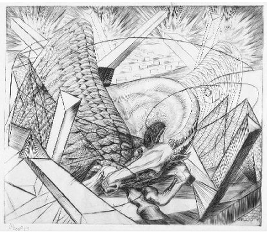 Leo Katz (American, born Czechoslovakia, 1887–1982). Pegasus (second state), 1945. Engraving and softground etching. Plate: 251 × 304 mm. (9 7/8 × 11 15/16 in.). Leo Katz Foundation. 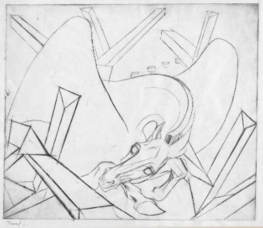 Leo Katz (American, born Czechoslovakia, 1887–1982). Pegasus (first state), 1945. Engraving and softground etching. Plate: 251 × 304 mm. (9 7/8 × 11 15/16 in.). Leo Katz Foundation. Ann ShaferLast week I posted a few images of praying mantes in prints. Fascinating creatures. By the terribly scientific polling apparatus available to me—number of likes, natch—I decided to post more images by the person whose praying mantis print was most admired, Roderick Mead (American, 1900–1971). Mead grew up in New Jersey and attended Yale University, graduating in 1925. Following art school, he moved to New York where he studied at the Art Students’ League under George Luks (and later with him privately) for several years. He also studied watercolor painting with George Pearse Ennis at the Grand Central School of Art. In 1931, Mead moved to Majorca. Three years later he moved his studio to Paris and began studying printmaking at guess where? The experimental studio run by Stanley William Hayter known as Atelier 17. Actually, in 1931, the atelier was only a few years old and had yet to take up the name it would become known by. It wasn’t until 1933 that the studio moved to 17, rue Campagne Première, from which the 17 in its name derives. But you can be sure that Mead absorbed as much as he could there and as a result, the effect on his style is clear. At the Atelier on any given day one might be working at a table next to Joan Miró, Pablo Picasso, Alberto Giacometti, Max Ernst, Yves Tanguy, Jean Hélion, or Wassily Kandinsky. Like most of the artists there, Mead experimented with abstraction and surrealism, and one finds shared ideas, forms, and styles among the prints made there. Like most everyone else, Mead and his wife left Paris in 1939 ahead of the start of World War II and by 1941 was living in Carlsbad, New Mexico. There he was able to devote himself to creating art full time; he continued to paint and make prints until his death in 1971. For me, Mead would have been one in a long list of artists working with Hayter about whom I know not a great deal was it not for my friend Gregg Most, who grew up down the street from the Meads. Gregg and I worked together at the National Gallery in the 1990s, and he has researched and collected Mead for a long time. It is Gregg’s passion for Mead that caused me to pay closer attention. I love Mead’s prints because they are carefully crafted, readable yet totally surreal, and have a high sense of crispness and design that really attracts me. See if you agree. Roderick Mead (American, 1900–1971) The Wrecked Ship, 1936 Engraving Plate: 197 x 251 mm. (7 ¾ x 9 7/8 in.) Smithsonian American Art Museum, Gift of Mrs. Roderick Mead, 1974.122.1 Roderick Mead (American, 1900–1971) Untitled (Matador and Bull), c. 1936 Engraving and softground etching with aquatint Plate: 203 x 203 mm. (8 × 8 in.) Dolan/Maxwell Roderick Mead (American, 1900–1971) Rope Figures, c. 1935–45 Engraving Plate: 160 x 82 mm. (6 1⁄2 x 3 1⁄4 in.) Smithsonian American Art Museum, Gift of Mrs. Roderick Mead, 1976.99.5 Roderick Mead (American, 1900–1971) St. Michael and the Dragon, 1939 Color wood engraving Image: 232 x 203 mm. (9 1/8 x 8 in.) Smithsonian American Art Museum, Gift of Mrs. Roderick Mead, 1974.122.6 Roderick Mead (American, 1900–1971) Creation of Eve, c. 1942 Engraving and softground etching Plate: 200 x 199 mm. (7 7/8 x 7 13/16 in.) Smithsonian American Art Museum, Gift of Mrs. Roderick Mead, 1976.99.1 Roderick Mead (American, 1900–1971) Trojan Horse, c. 1945–50s Color engraving, aquatint, and softground etching Plate: 235 x 298 mm. (9 ¼ x 11 ¾ in.) Smithsonian American Art Museum, Gift of Mrs. Roderick Mead, 1974.122.2 Roderick Mead (American, 1900–1971) Combat #1 (Incident), c. 1942–45 Engraving and softground etching 264 x 186 mm. (10 3/8 x 7 3/8 in.) Smithsonian American Art Museum, Gift of Mrs. Roderick Mead, 1974.122.3 Roderick Mead, (American, 1900–1971) Tauromachia I, 1946 Engraving and aquatint Plate: 114 x 182 mm (4 ½ x 31/4 in.) Fine Arts Museums of San Francisco, Achenbach Foundation, California State Library loan, L543.1966  Roderick Mead (American, 1900–1971). The Wrecked Ship,1936. Engraving and aquatint. Plate: 197 x 251 mm. (7 ¾ x 9 7/8 in.). Smithsonian American Art Museum, Gift of Mrs. Roderick Mead, 1974.122.1.  Roderick Mead (American, 1900–1971). Untitled (Matador and Bull), c. 1936. Engraving and softground etching with aquatint. Plate: 203 x 203 mm. (8 × 8 in.). Dolan/Maxwell.  Roderick Mead (American, 1900–1971). Rope Figures, c. 1935–45. Engraving. Plate: 160 x 82 mm. (6 1⁄2 x 3 1⁄4 in.). Smithsonian American Art Museum, Gift of Mrs. Roderick Mead, 1976.99.5.  Roderick Mead (American, 1900–1971). St. Michael and the Dragon, 1939. Color wood engraving. Image: 232 x 203 mm. (9 1/8 x 8 in.). Smithsonian American Art Museum, Gift of Mrs. Roderick Mead, 1974.122.6.  Roderick Mead (American, 1900–1971). Creation of Eve, c. 1942. Engraving and softground etching. Plate: 200 x 199 mm. (7 7/8 x 7 13/16 in.). Smithsonian American Art Museum, Gift of Mrs. Roderick Mead, 1976.99.1. 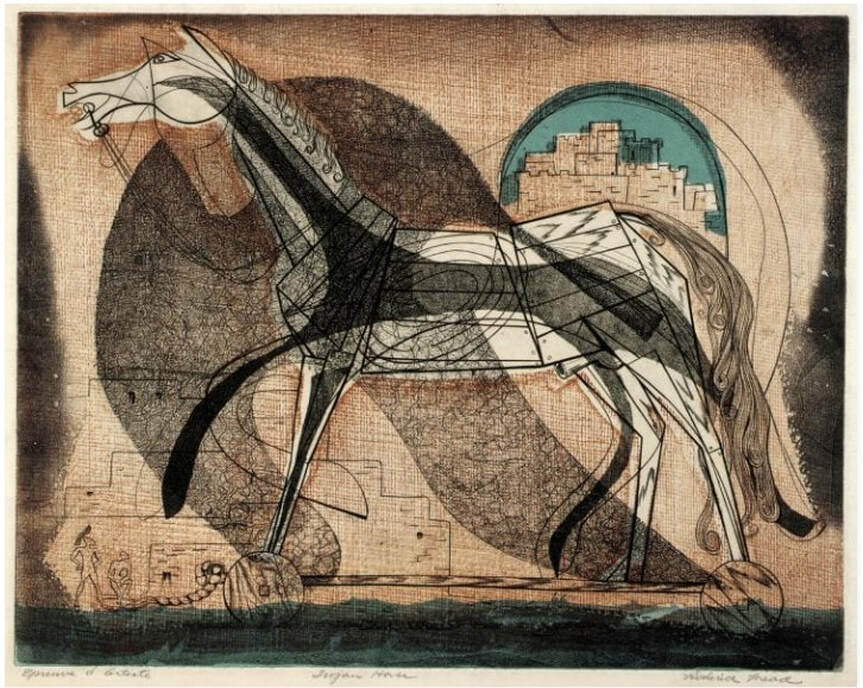 Roderick Mead (American, 1900–1971). Trojan Horse, c. 1945–50s. Color engraving, aquatint, and softground etching. Plate: 235 x 298 mm. (9 ¼ x 11 ¾ in.). Smithsonian American Art Museum, Gift of Mrs. Roderick Mead, 1974.122.2. 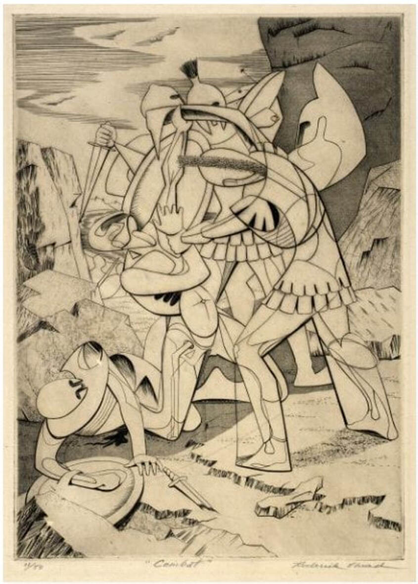 Roderick Mead (American, 1900–1971). Combat #1 (Incident), c. 1942–45. Engraving and softground etching. Plate: 264 x 186 mm. (10 3/8 x 7 3/8 in.). Smithsonian American Art Museum, Gift of Mrs. Roderick Mead, 1974.122.3. 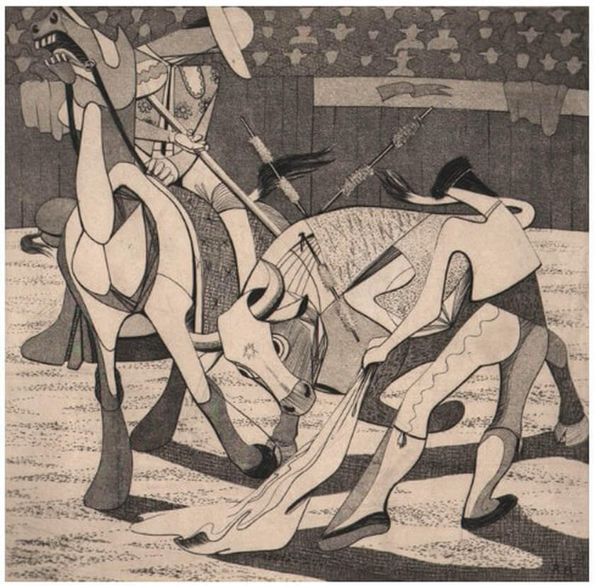 Roderick Mead, (American, 1900–1971). Tauromachia I, 1946. Engraving and aquatint. Plate: 114 x 182 mm (4 ½ x 31/4 in.). Fine Arts Museums of San Francisco, Achenbach Foundation, California State Library loan, L543.1966. Ann ShaferI always wanted to do an exhibition about the audience. Portraying not the main attraction—the action on stage—but the people who are watching seems ripe for capturing a slice of life. The lookers being looked at flips convention. Voyeurism is a funny thing, alternately creepy and, what’s the opposite of creepy? Oh, pleasant. There are some great prints from the late nineteenth and early twentieth centuries that would fit in this proposed exhibition nicely like Mary Cassatt’s In the Opera Box, 1879, Reginald Marsh’s Box at the Metropolitan, 1934, Joseph Hirsch’s Hecklers, 1943. Of course, there are plenty of paintings portraying audiences, too. My favorite is Tissot’s Women of Paris: The Circus Lover, 1885. Though these images may seem quirky and quaint now, it is possible for an image of this type to cross over into social justice and to capture the zeitgeist. For me, one of the most searing group of images of an audience is Paul Fusco’s series taken in 1968 from the train carrying the body of Robert F. Kennedy from New York to Washington, D.C., for burial at Arlington National Cemetery. The photographs capture an emotionally naked populace witnessing the end of optimism in the country. RFK’s assassination followed that of his brother, President Kennedy on November 22, 1963; Malcolm X on February 21, 1965; and Martin Luther King, Jr., on April 4, 1968. RFK was shot just two months after Dr. King’s death, on June 5, 1968. By then, the country had seen more than its share of sorrow and senseless killing. The photographer, Paul Fusco, died last week, and it reminded me of how powerful the images are still. I marvel at how much emotion is conveyed across decades; they give me chills to this day. It may not surprise you to know that one of the photographs, a shot up North Broadway, just before the train dips underground on its approach into Penn Station in Baltimore, is one that got away. I pitched this photograph some years ago and got enough pushback to return it to the dealer. Part of the issue was that my colleagues weren’t convinced it was Baltimore in the photograph (of course it is), and the other had to do with vintage prints versus later reprints. Many curators seek and prefer to collect vintage prints, meaning the photographs were printed at the time they were shot. The photograph in question was a later printing, and thus was less desirable. I am certain Fusco wasn’t thinking in terms of museum collections in 1968. In fact, as a member of Magnum Photos, an international cooperative agency, he was on assignment for Look magazine, which published two of the photographs in black and white. The series was unknown until Aperture published it in 2008. Hence the later printings. In an earlier post I said I have never forgotten those that got away, and it’s true. To this day, when I see one of these works on the wall in some exhibition, I think “yes, I was right.” A few years after my failed pitch, I saw an exhibition of Fusco’s RFK train pictures at SFMoMA, and there was the North Broadway shot, front and center. Vindication. Paul Fusco (American, 1930–2020) Untitled (North Broadway, Baltimore), from the series RFK Funeral Train, 1968, printed later Danziger Gallery Paul Fusco (American, 1930–2020) Untitled (Family), from the series RFK Funeral Train, 1968, printed later Danziger Gallery Paul Fusco (American, 1930–2020) Untitled (Western Maryland Railroad), from the series RFK Funeral Train, 1968, printed later Danziger Gallery Mary Cassatt (American, 1844–1926) In the Opera Box (No. 3), c. 1880 Etching, softground etching, and aquatint Sheet: 357 x 269 mm. (14 1/16 x 10 9/16 in.) Plate: 197 x 178 mm. (7 3/4 x 7 in.) Metropolitan Museum of Art: Gift of Mrs. Imrie de Vegh, 1949, 49.127.1 Reginald Marsh American (1898–1954) Box at the Metropolitan, 1934 Etching and engraving Sheet: 250 x 202 mm. (9 13/16 x 7 15/16 in.) Plate 322 x 252 mm. (12 11/16 x 9 15/16 in.) Metropolitan Museum of Art: Gift of The Honorable William Benton, 1959, 59.609.15 Joseph Hirsch (American, 1910–1981) The Hecklers, 1943–1944, published 1948 Lithograph Sheet 312 421 mm. (12 5/16 x 16 9/16 in.) Image: 251 x 388 mm. (9 7/8 x 15 ¼ in.) National Gallery of Art: Reba and Dave Williams Collection, Gift of Reba and Dave Williams, 2008.115.2503 James Tissot (1836–1902) Women of Paris: The Circus Lover, 1885 Oil on canvas 147.3 x 101.6 cm. (58 x 40 in.) Museum of Fine Arts, Boston: Juliana Cheney Edwards Collection, 58.45 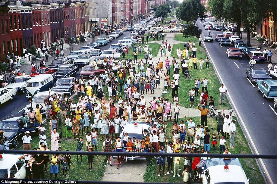 Paul Fusco (American, 1930–2020). Untitled (North Broadway, Baltimore), from the series RFK Funeral Train, 1968, printed later. Danziger Gallery.  Google Maps shot of the median on North Broadway, Baltimore, from under the train tracks.  Paul Fusco (American, 1930–2020). Untitled (Family), from the series RFK Funeral Train, 1968, printed later. Danziger Gallery.  Paul Fusco (American, 1930–2020). Untitled (Western Maryland Railroad), from the series RFK Funeral Train, 1968, printed later. Danziger Gallery.  Mary Cassatt (American, 1844–1926). In the Opera Box (No. 3), c. 1880. Etching, softground etching, and aquatint. Sheet: 357 x 269 mm. (14 1/16 x 10 9/16 in.); plate: 197 x 178 mm. (7 3/4 x 7 in.). Metropolitan Museum of Art: Gift of Mrs. Imrie de Vegh, 1949, 49.127.1.  Reginald Marsh American (1898–1954). Box at the Metropolitan, 1934. Etching and engraving. Sheet: 250 x 202 mm. (9 13/16 x 7 15/16 in.); plate 322 x 252 mm. (12 11/16 x 9 15/16 in.). Metropolitan Museum of Art: Gift of The Honorable William Benton, 1959, 59.609.15.  Joseph Hirsch (American, 1910–1981). The Hecklers, 1943–1944, published 1948. Lithograph. Sheet 312 421 mm. (12 5/16 x 16 9/16 in.); image: 251 x 388 mm. (9 7/8 x 15 ¼ in.). National Gallery of Art: Reba and Dave Williams Collection, Gift of Reba and Dave Williams, 2008.115.2503.  James Tissot (1836–1902). Women of Paris: The Circus Lover, 1885. Oil on canvas. 147.3 x 101.6 cm. (58 x 40 in.). Museum of Fine Arts, Boston: Juliana Cheney Edwards Collection, 58.45. Ann ShaferHere’s a doozy for my simultaneous color printing friends. No surprise, Letterio Calapai worked with our man Hayter at Atelier 17 in New York in the 1940s. While Earthquake is from 1958, it is a glorious summation of techniques he learned among the many inventive artists frequenting Atelier 17. The print is really two prints that form a diptych. I've seen images of the two sides abutting each other, but the BMA would likely present these in a single frame, but with two windows in the mat with a center strip covering the seam. Letterio Calapai followed the path of many other American artists who worked at Hayter’s Atelier 17. After growing up in Boston, he moved to New York in 1928 and supported himself by working in a lithographic shop. He worked for the WPA early on painting a mural in the 101st Signal Battalion at 801 Dean Street in Brooklyn among other projects (see image). By the time Hayter moved Atelier 17 to New York from Paris in 1940 (fleeing German occupation), Calapai was continuing his artistic studies. It wasn’t until 1946 that Calapai worked at Atelier 17; he continued making prints there until 1949. His shift from 1930s realism to 1940s abstraction can be specifically linked to his time there. Like so many other artists who worked at the New York Atelier 17, Calapai went on to found a university printmaking program, in his case, the Graphic Arts Department at the Albright Art School in Buffalo (1949–55). He returned to New York to teach at the New School for Social Research from 1955–65. During his tenure at the New School, he established the Intaglio Workshop for Advanced Printmaking in 1962 (it ran until 1965). In 1965 he moved to Chicago and taught at, and retired from, the University of Illinois at Chicago. So, to the printing. Recently we’ve been pulling apart simultaneous color prints by Hayter. You can assume if Hayter did it, others did too, including Calapai. Earthquake is printed from two plates, which together are some 32 inches wide (big!). Both plates are inked in black (intaglio), where the ink is pushed into the lines and grooves of the plate. Rolled onto the surface (relief) are several colored inks added through screens (similar to a stencil): blue-green gradient, red, and green on the left, and green and red-yellow gradient on the right. The left plate also includes a yellow wood offset rolled through a stencil (similar to Hayter’s Sun Dancer, discussed in another post). For clarity, the description is broken down into bullet points to more easily list each component. Just remember, all of these colored inks are rolled onto each of these plates and are put through the press once. Letterio Calapai (American, 1902–1993) Earthquake, 1958 Diptych of etching, softground etching, open bite etching, and engraving
Sheet (right): 562 x 458 mm. (22 1/8 x 18 1/16 in.; plate (right): 504 x 404 mm. (19 13/16 x 15 7/8 in.) Baltimore Museum of Art: The John Dorsey and Robert W. Armacost Acquisitions Endowment, BMA 2014.13a-b  Letterio Calapai (American, 1902–1993), Earthquake, 1958. Diptych of etching, softground etching, open bite etching, and engraving; left plate printed in black (intaglio), blue-green gradient (screen, relief) , red (screen, relief), green (screen, relief), yellow (wood offset, stencil, relief); right plate printed in black (intaglio), green (screen, relief), red-yellow gradient (screen, relief). Sheet (left): 562 x 432 mm. (22 1/8 x 17 in.); plate (left): 505 x 404 mm. (19 7/8 x 15 7/8 in.); sheet (right): 562 x 458 mm. (22 1/8 x 18 1/16 in.); plate (right): 504 x 404 mm. (19 13/16 x 15 7/8 in.). Baltimore Museum of Art: The John Dorsey and Robert W. Armacost Acquisitions Endowment, BMA 2014.13a-b 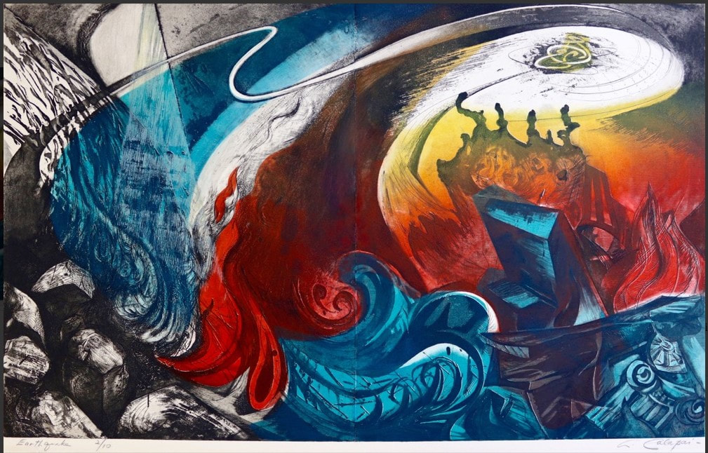 Impression of Calapai's Earthquake from Aaron Galleries. 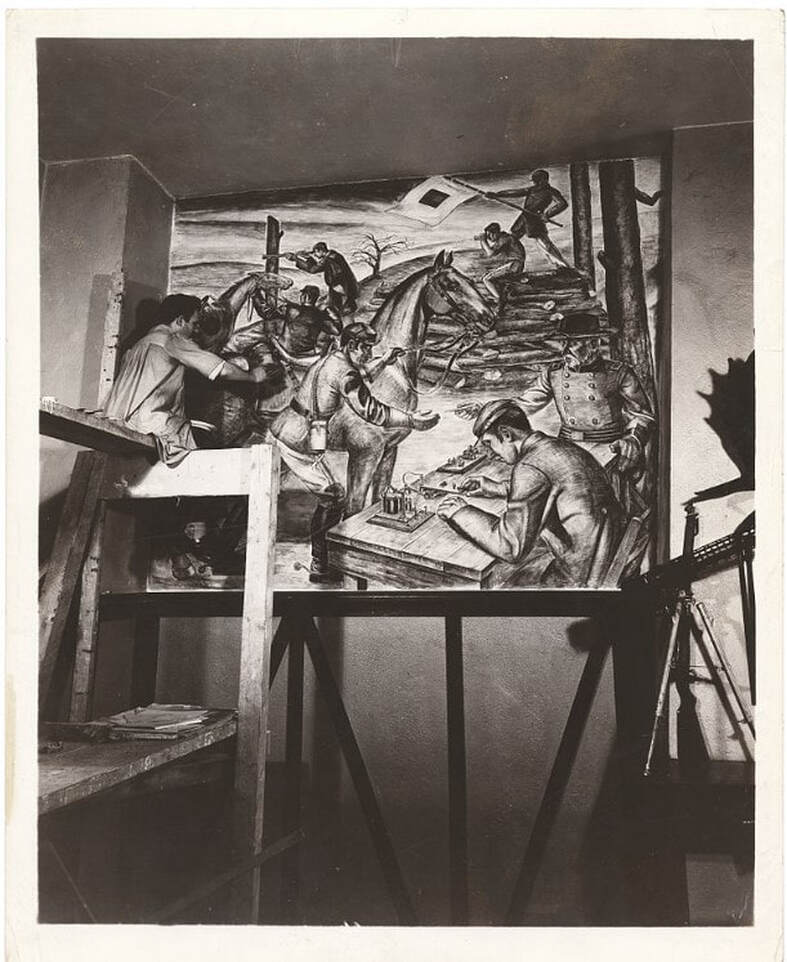 Letterio Calapai painting a WPA mural in the 101st Signal Battalion at 801 Dean Street in Brooklyn. (Photo from Wikipedia.) Ann ShaferIn a previous post, we looked at the new system Ben Levy came up with to describe Hayter’s simultaneous color prints. We adopted a two-tiered method: the first line describes what is in the plate (the grooves and textures that carry the image); the subsequent lines describe each layer of inking, which are combined on the single plate and run through the press once. In our discussion we gave a few examples, and one included a wood-offset-stencil-relief roll. Sounds complicated, I know. I’m going to pull it apart for you. Hayter used the wood offset dealio in his 1951 print Danse de soleil (Sun Dancer). Published by Guilde Internationale de la Gravure, there were 200 in the edition (aside from any proofs or early states). Hayter had been experimenting with relief rolling colors of different viscosities onto the plate either through a silkscreen or a stencil for several years—his 1946 print Cinq personnages is considered his most important early use of this new-fangled printing method. By 1951, he’s on a roll (get it?). For Danse du soleil, Hayter used an offset pattern from a plank of wood. To get the texture and pattern of the wood to show up in a gradient of red-orange, he first rolled out the gradient on a glass palette, red on one end and orange on the other. (After a period of rolling, the inks merge in the middle and create a smooth mix of the colors.) Taking the roller with the red-orange ink, Hayter rolled the gradient onto a piece of wood that had just the pattern and texture he wanted. Then he took another, clean roller, one large enough that its circumference was equal to the height of the copper plate carrying the image, and rolled it across the inked-up wood once, picking up the exact image of the wood texture in the red-orange gradient. That roller was rolled across the surface of the already intaglio-inked copper plate once, depositing the image of the red-orange wood on the surface. He did this through a cut paper stencil so that the gradient only appears in certain areas. See the image where I added the purple marks indicating where the stencil allowed the gradient through. He also rolled on a yellow ink through a different stencil, as well as a blue-green gradient through another stencil. Neither of these two stenciled additions used an offset from another texture. Rather, the inks were rolled on a palette and directly rolled onto the plate through stencils. So, our description should now make sense: Engraving, softground etching, and scorper Printed in black (intaglio); red-orange gradient (wood offset, stencil, relief); yellow (stencil, relief); blue-green gradient (stencil, relief) Stanley William Hayter (English, 1901–1988) Danse du soleil (Sun Dancer) [state 1], 1951 Engraving; printed in black (intaglio) Sheet: 503 x 317 mm. (19 13/16 x 12 1/2 in.) Plate: 397 x 233 mm. (15 5/8 x 9 3/16 in.) Baltimore Museum of Art: Gift of Mr. and Mrs. Robert Paul Mann, Towson, Maryland, BMA 1979.362 Stanley William Hayter (English, 1901–1988) Danse du soleil (Sun Dancer), 1951 Engraving, softground etching, and scorper; printed in black (intaglio); red-orange gradient (wood offset, stencil, relief); yellow (stencil, relief); blue-green gradient (stencil, relief) Sheet: 566 x 379 mm. (22 5/16 x 14 15/16 in.) Plate: 394 x 238 mm. (15 1/2 x 9 3/8 in.) Baltimore Museum of Art: Blanche Adler Memorial Fund, BMA 1953.56 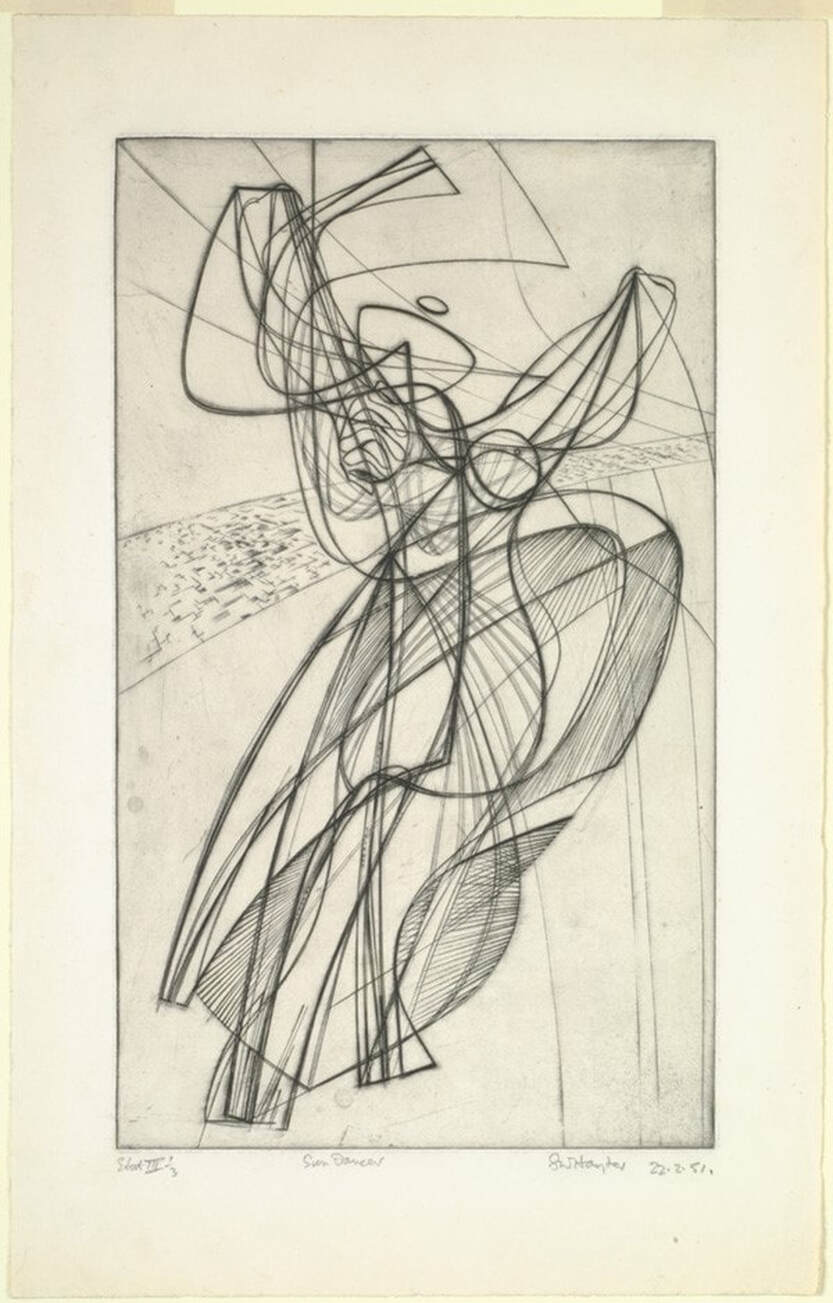 Stanley William Hayter (English, 1901–1988), Danse du soleil (Sun Dancer) [state 1], 1951. Engraving; printed in black (intaglio), sheet: 503 x 317 mm. (19 13/16 x 12 1/2 in.); plate: 397 x 233 mm. (15 5/8 x 9 3/16 in.). Baltimore Museum of Art: Gift of Mr. and Mrs. Robert Paul Mann, Towson, Maryland, BMA 1979.362. 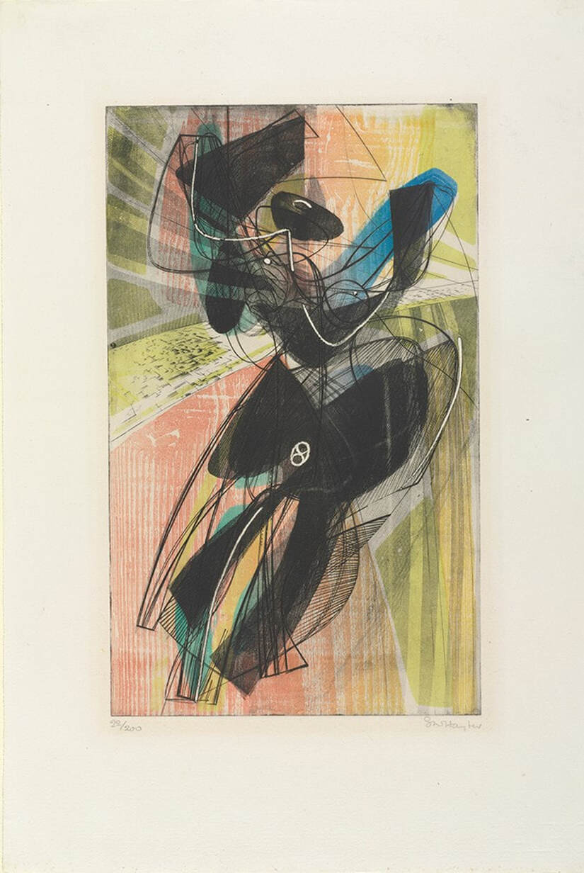 Stanley William Hayter (English, 1901–1988), Danse du soleil (Sun Dancer), 1951. Engraving, softground etching, and scorper; printed in black (intaglio); red-orange gradient (wood offset, stencil, relief); yellow (stencil, relief); blue-green gradient (stencil, relief), sheet: 566 x 379 mm. (22 5/16 x 14 15/16 in.); plate: 394 x 238 mm. (15 1/2 x 9 3/8 in.). Baltimore Museum of Art: Blanche Adler Memorial Fund, BMA 1953.56.  Purple marks where the stencil lets the ink pass through. Stanley William Hayter (English, 1901–1988), Danse du soleil (Sun Dancer), 1951. Engraving, softground etching, and scorper; printed in black (intaglio); red-orange gradient (wood offset, stencil); yellow (stencil); blue-green gradient (stencil), sheet: 566 x 379 mm. (22 5/16 x 14 15/16 in.); plate: 394 x 238 mm. (15 1/2 x 9 3/8 in.). Baltimore Museum of Art: Blanche Adler Memorial Fund, BMA 1953.56. |
Ann's art blogA small corner of the interwebs to share thoughts on objects I acquired for the Baltimore Museum of Art's collection, research I've done on Stanley William Hayter and Atelier 17, experiments in intaglio printmaking, and the Baltimore Contemporary Print Fair. Archives
February 2023
Categories
All
|
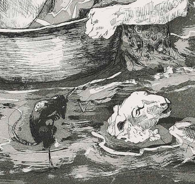
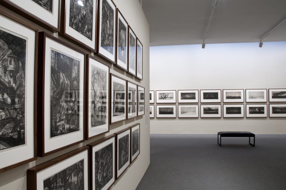
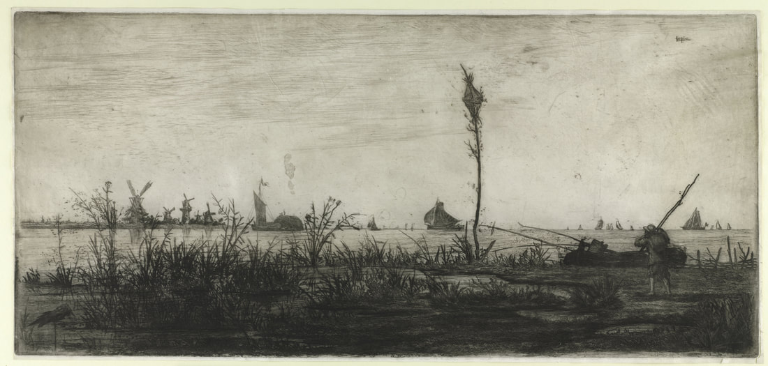
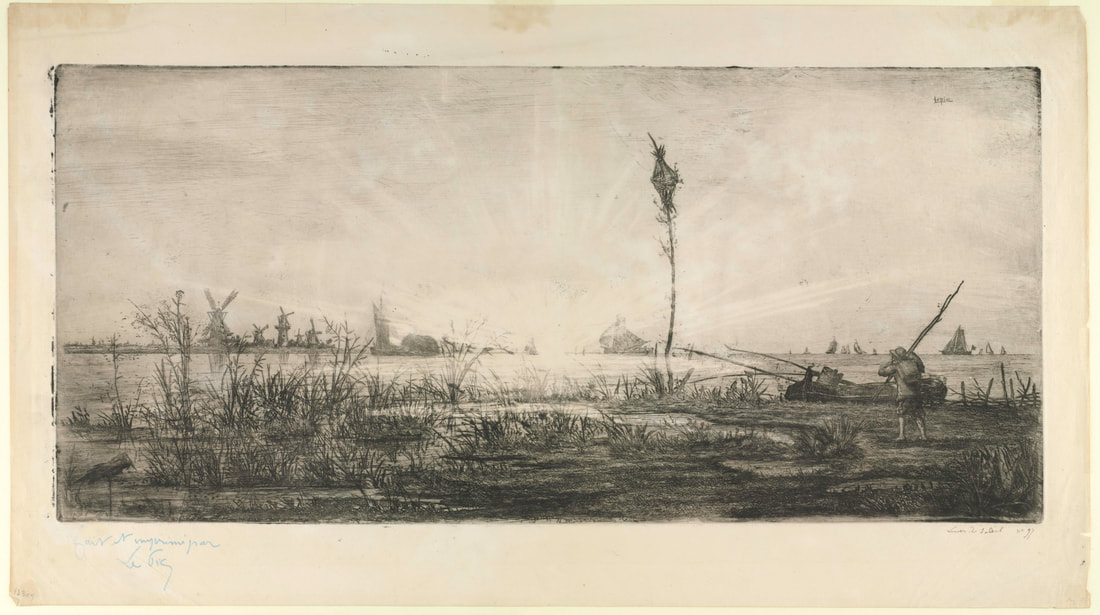
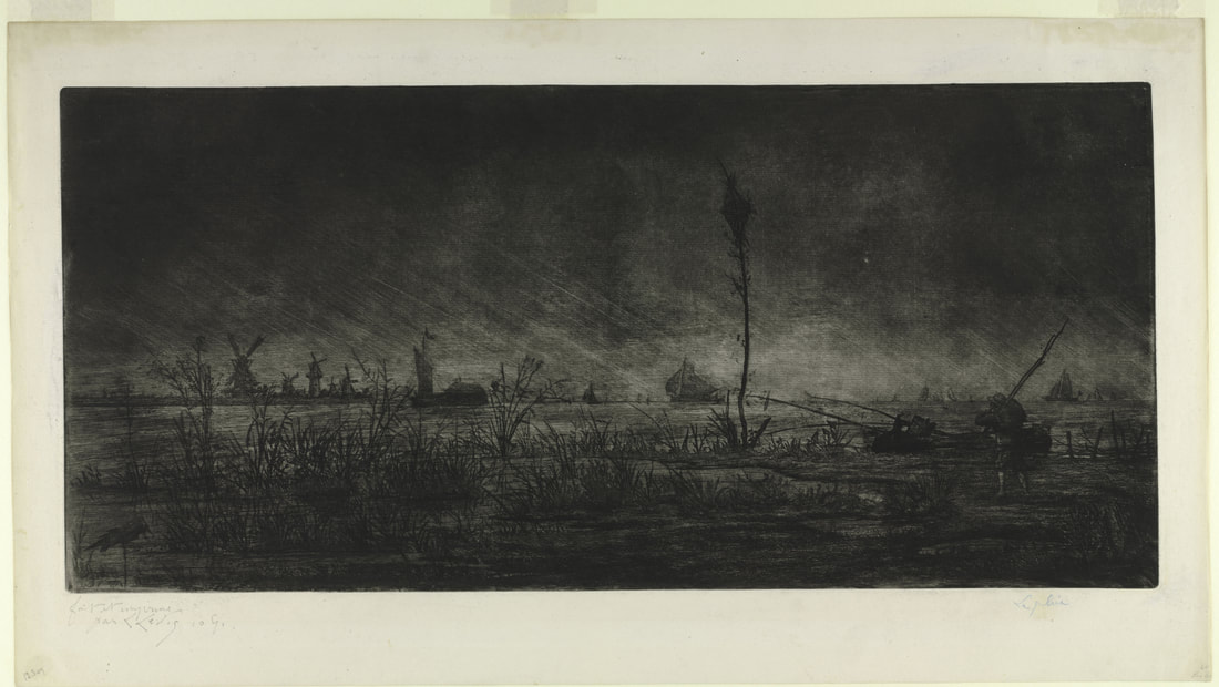
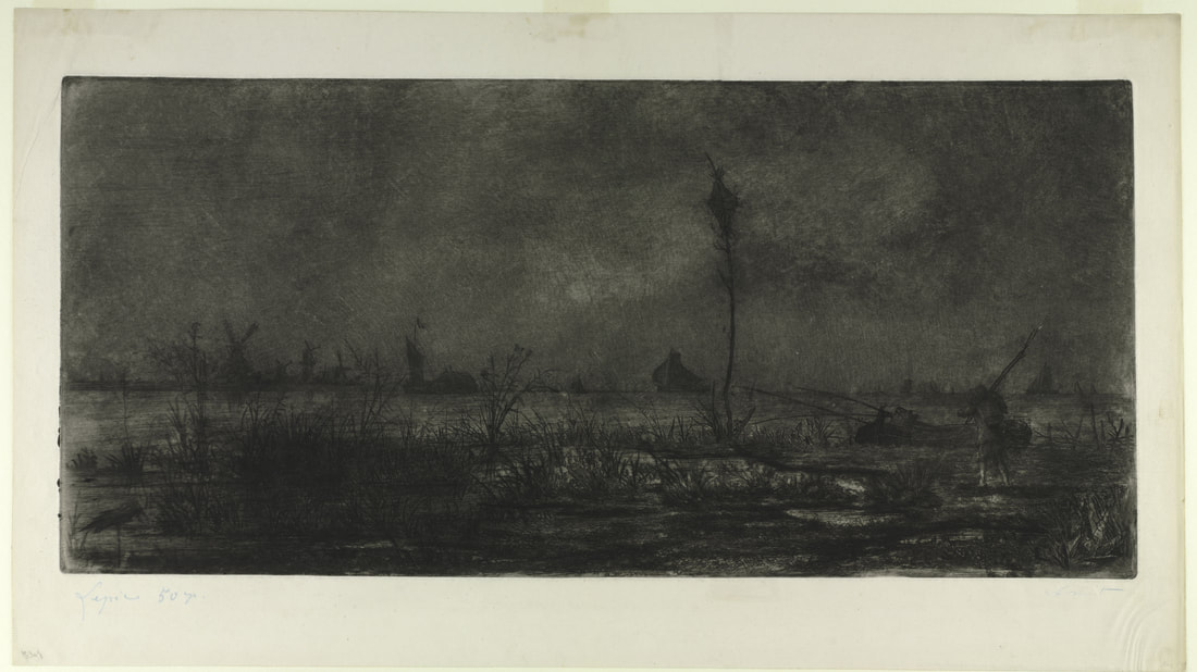
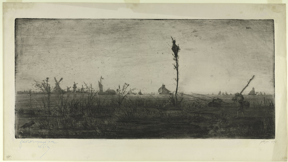
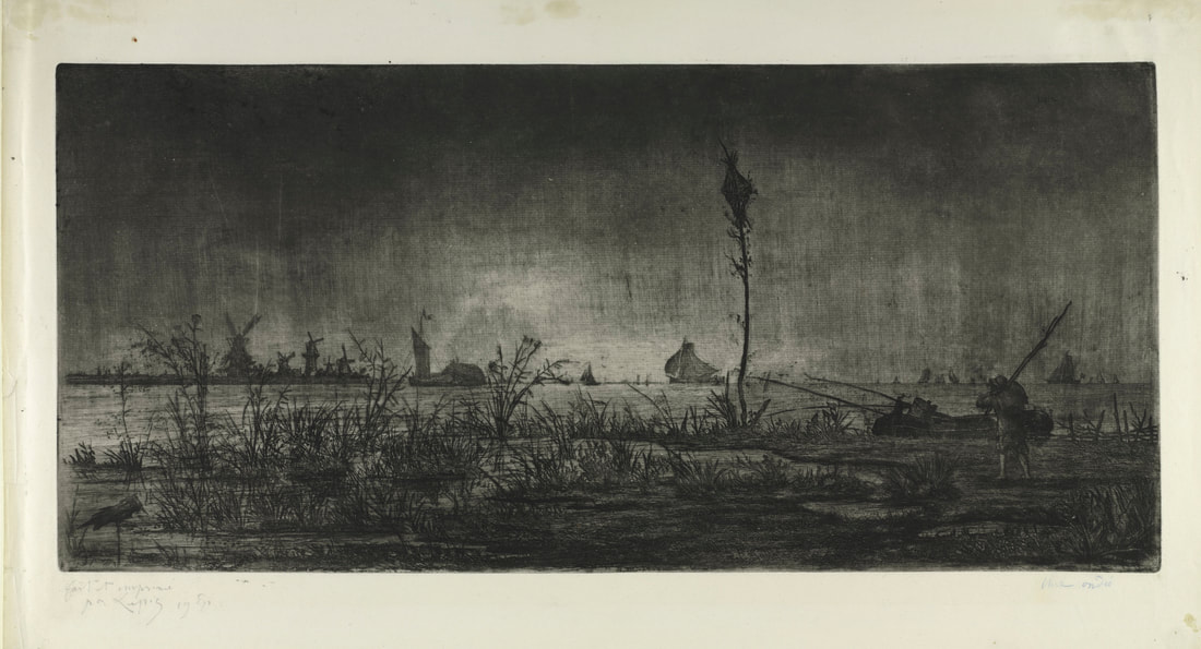
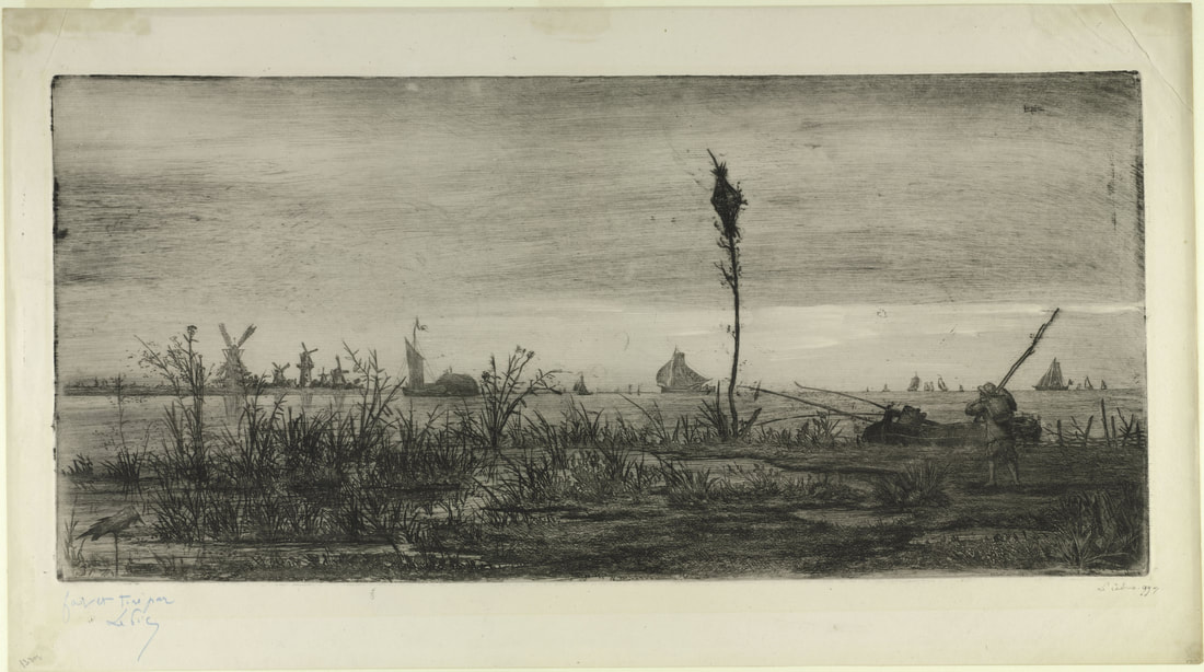
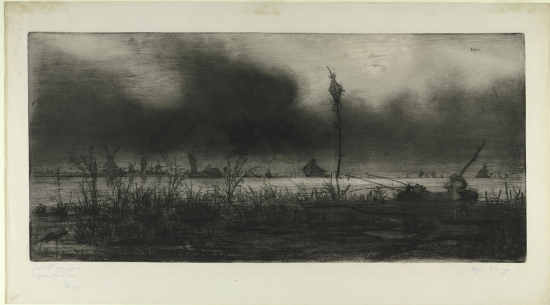
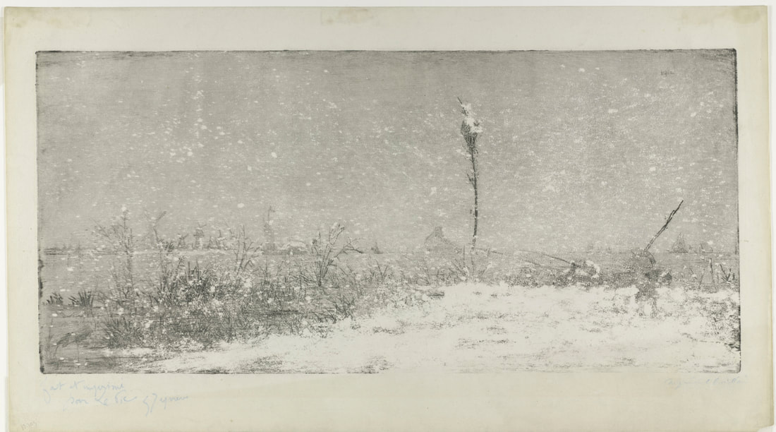
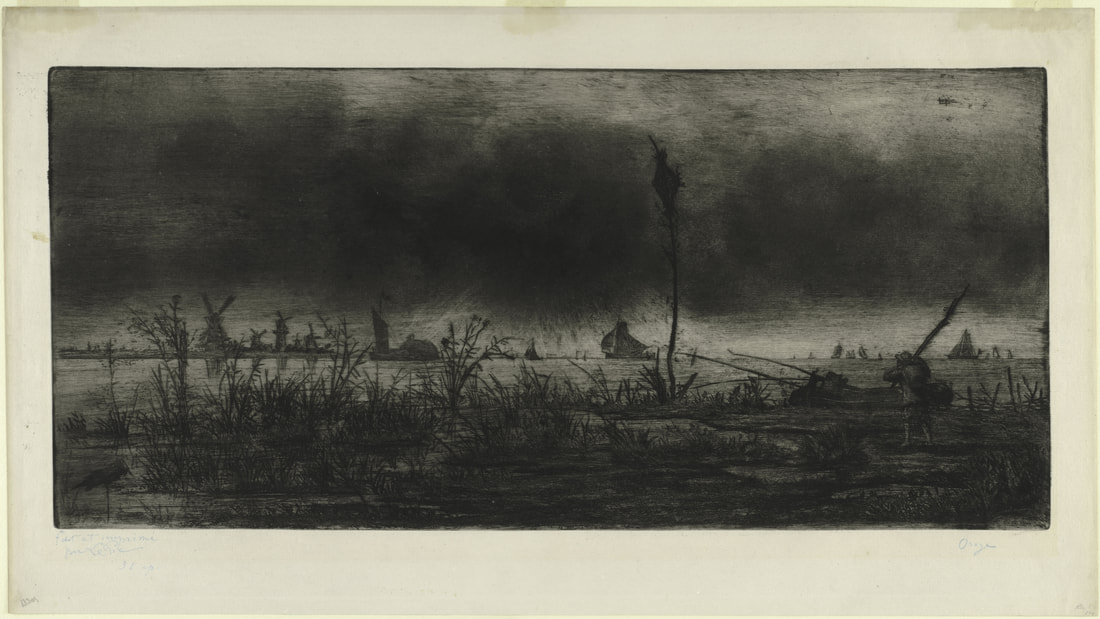
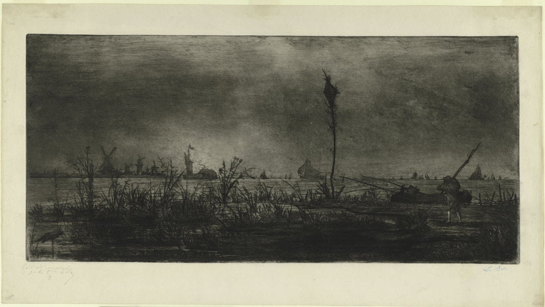
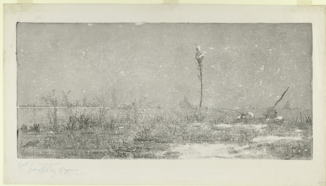

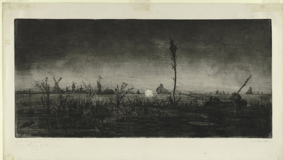
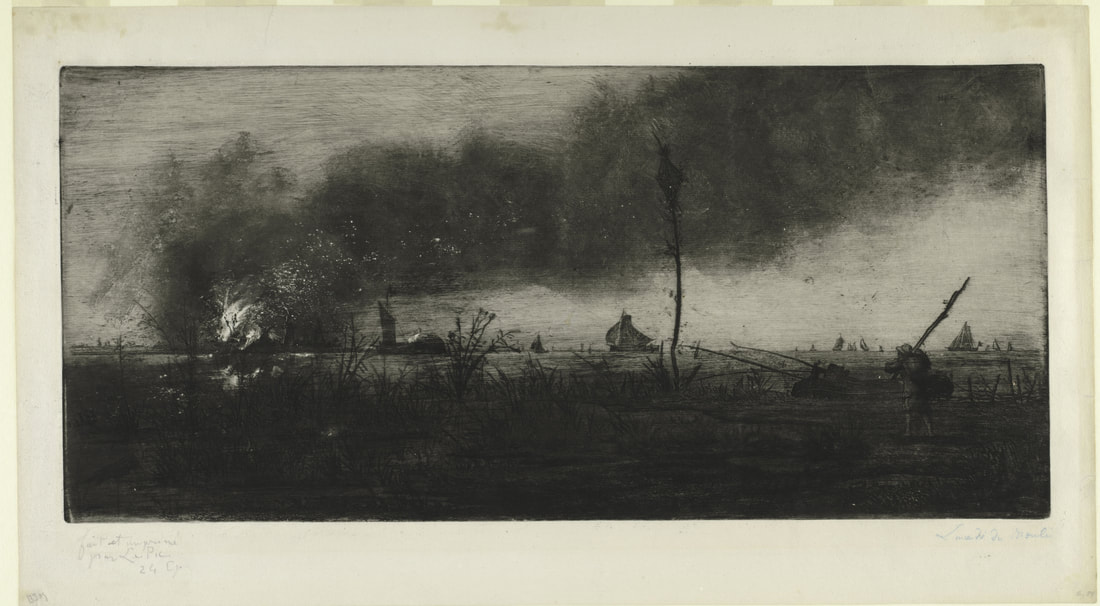
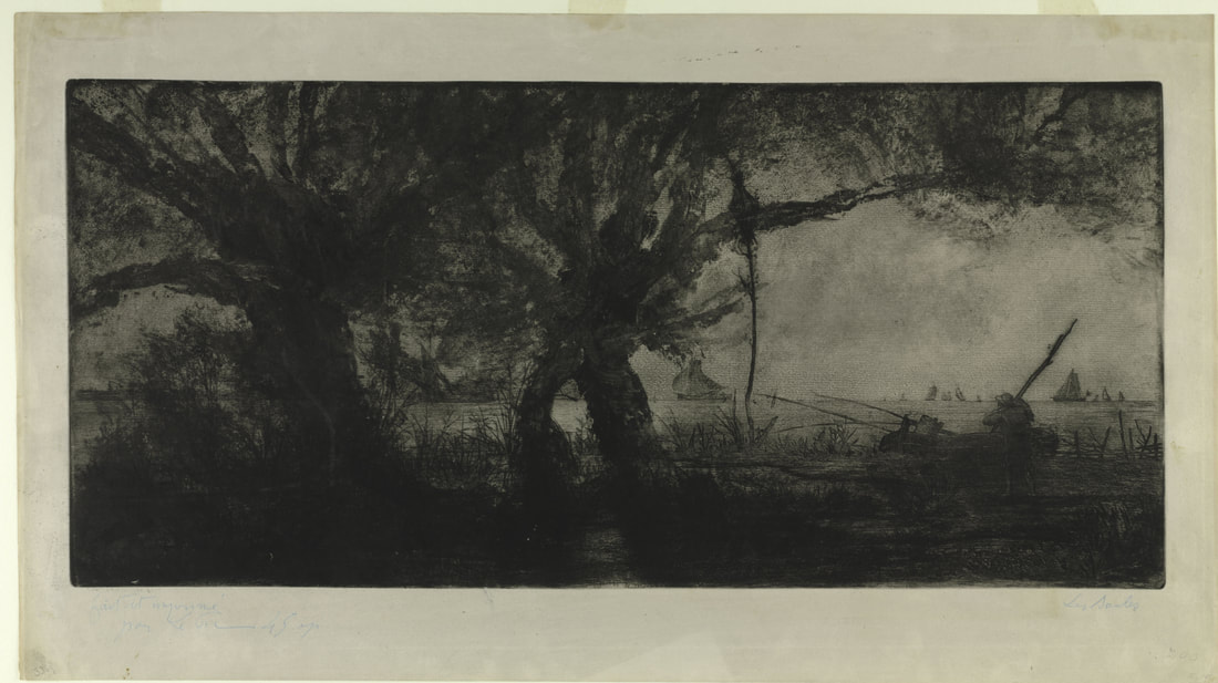

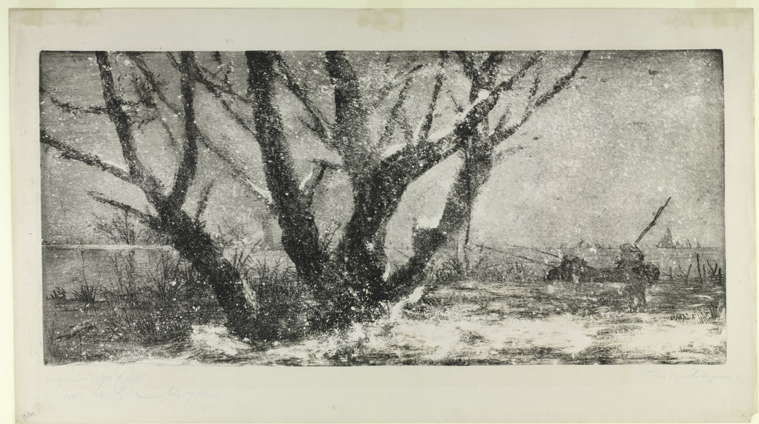
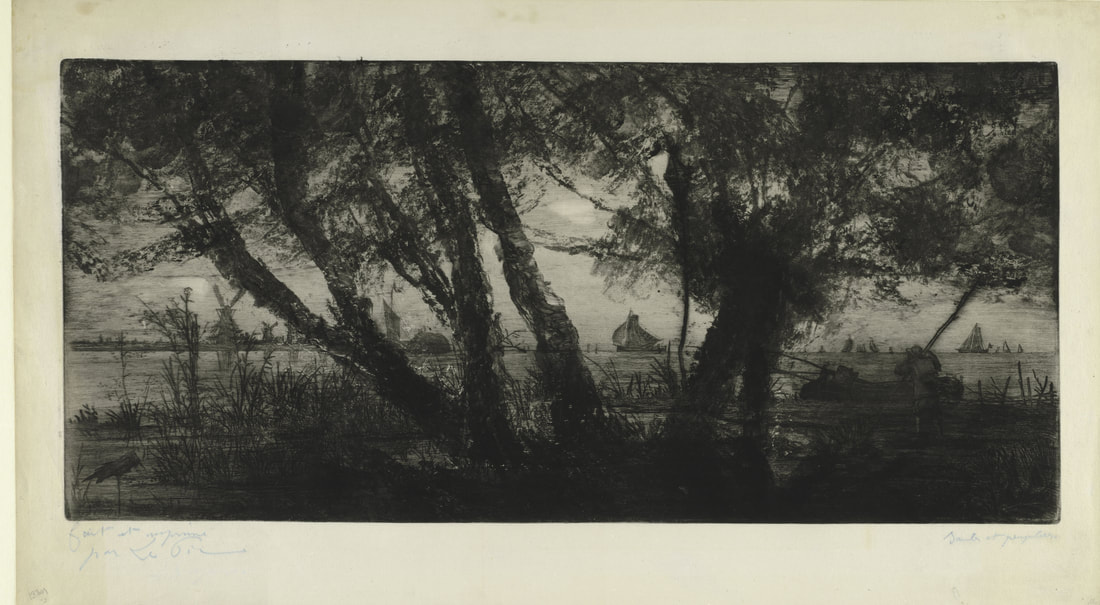
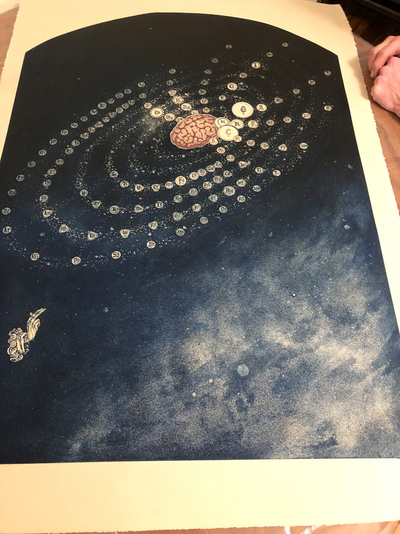
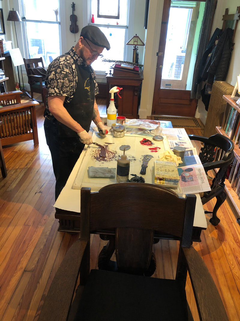
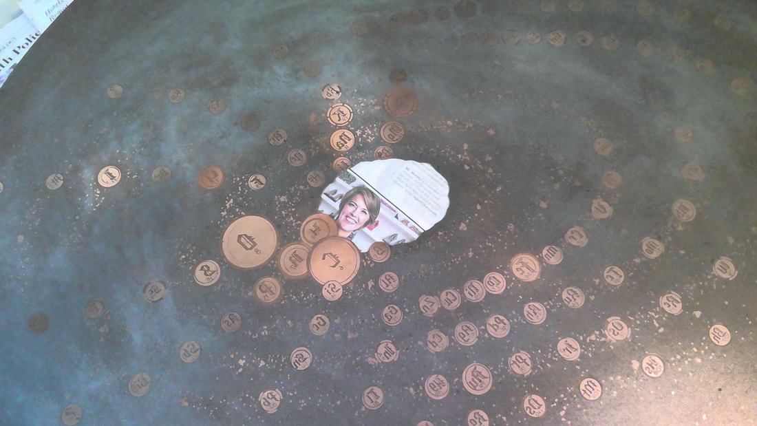
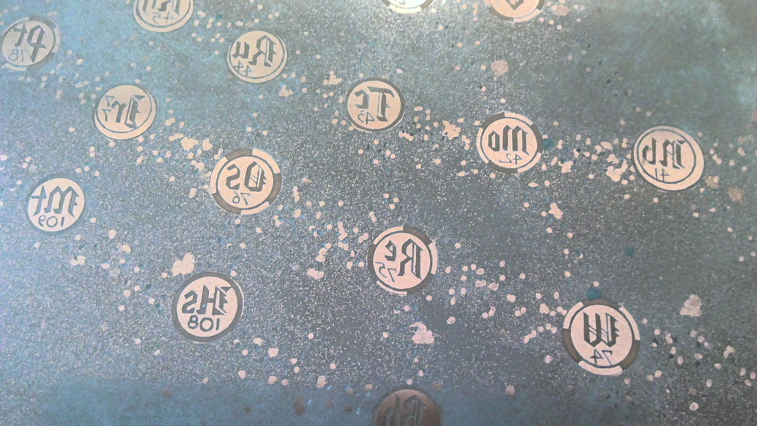
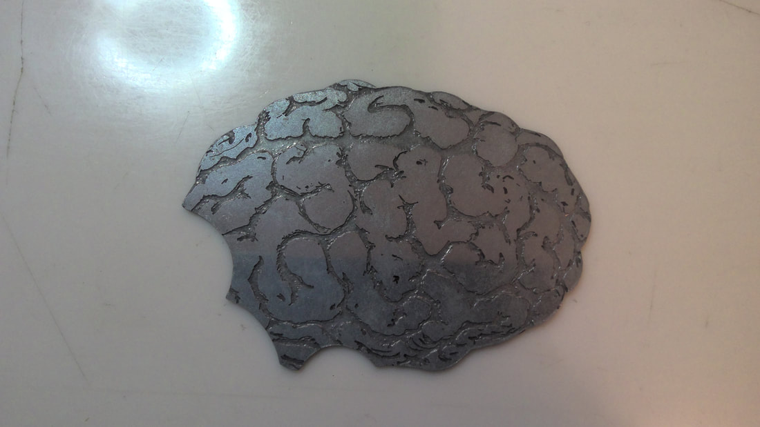
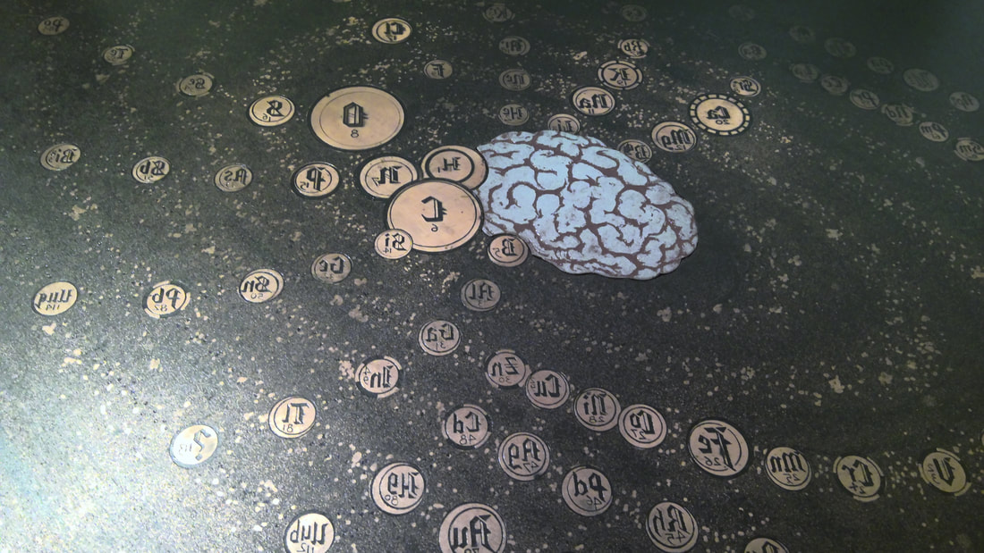
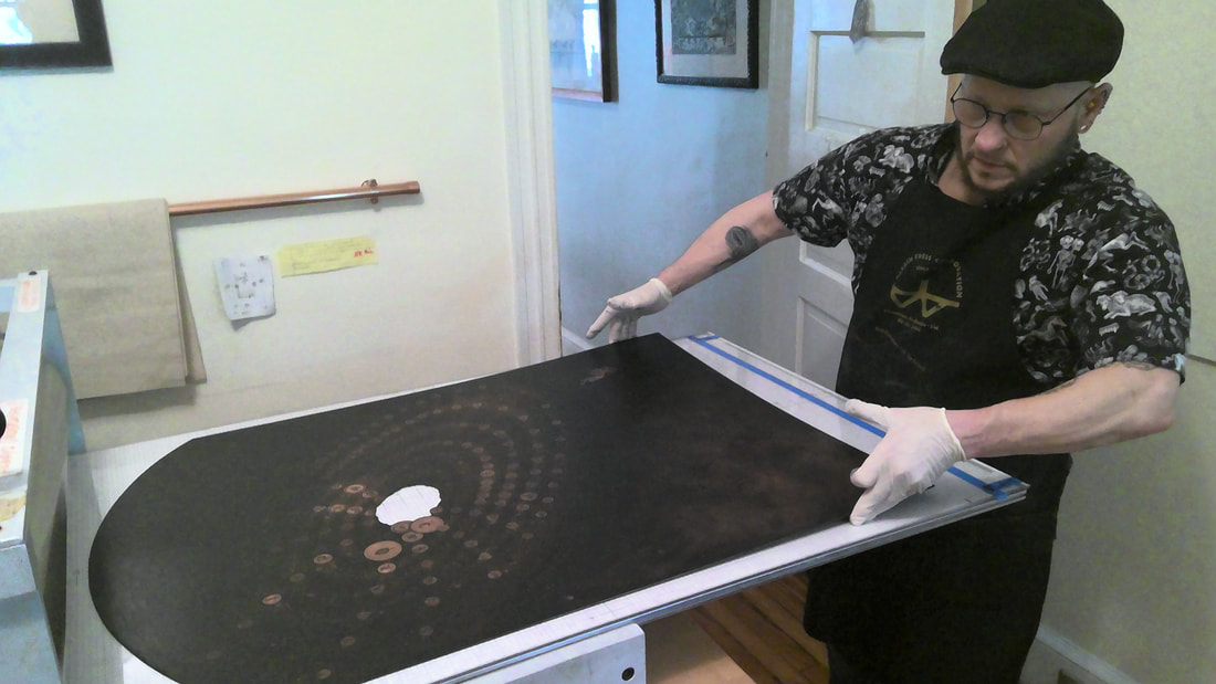
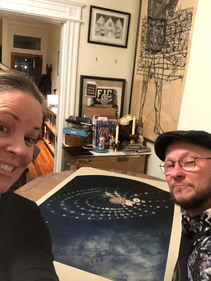
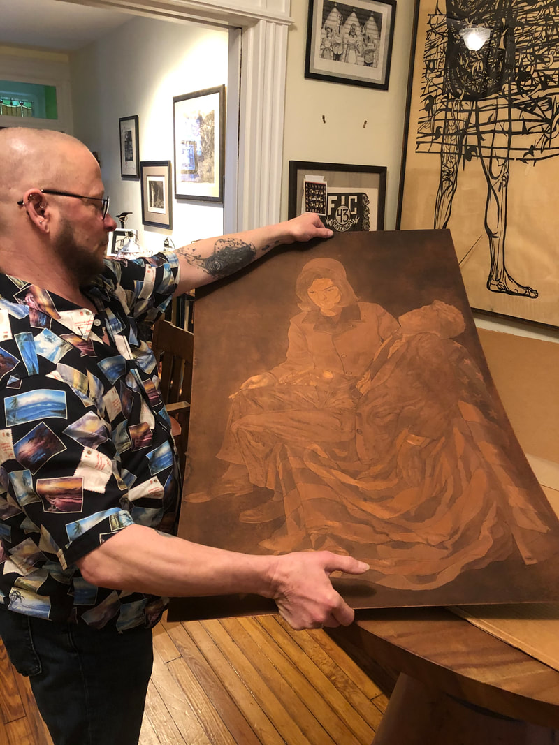
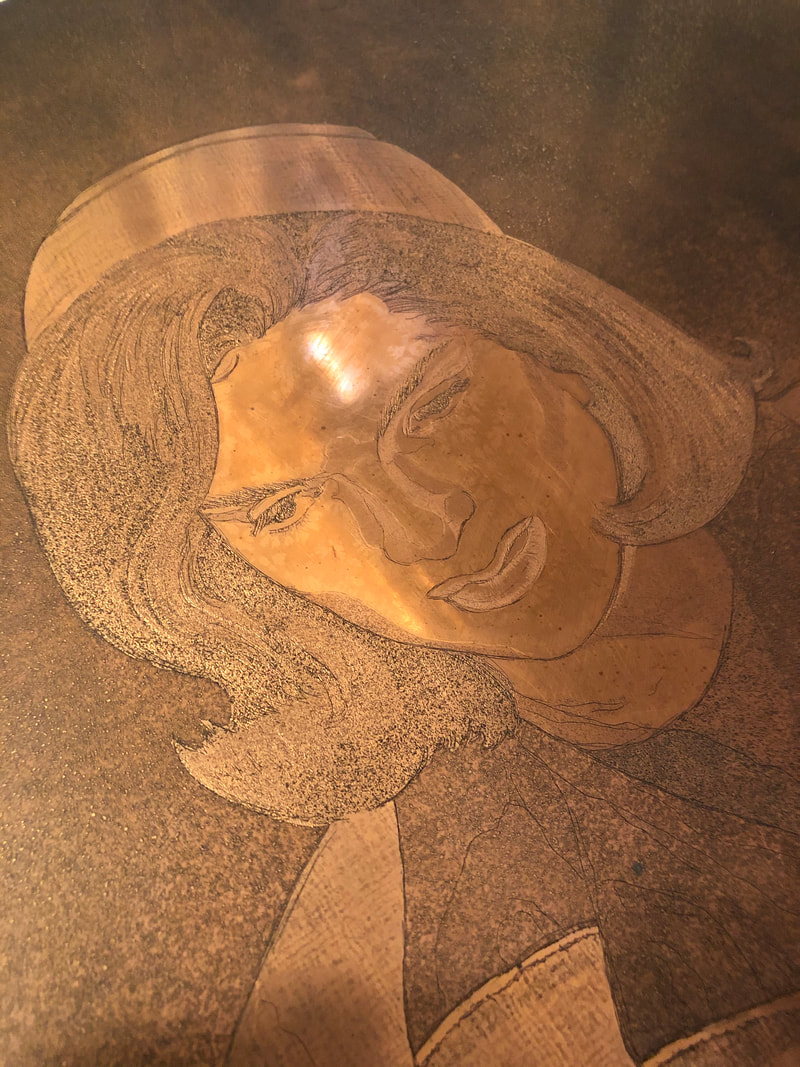
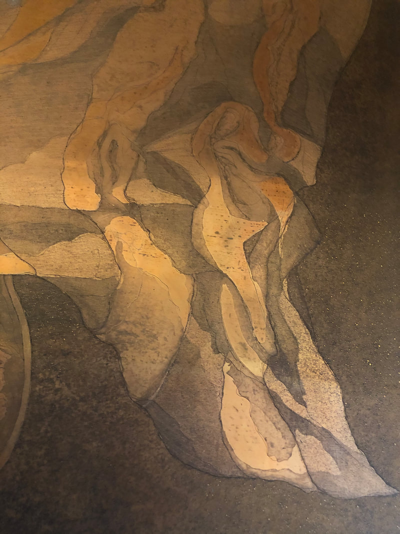
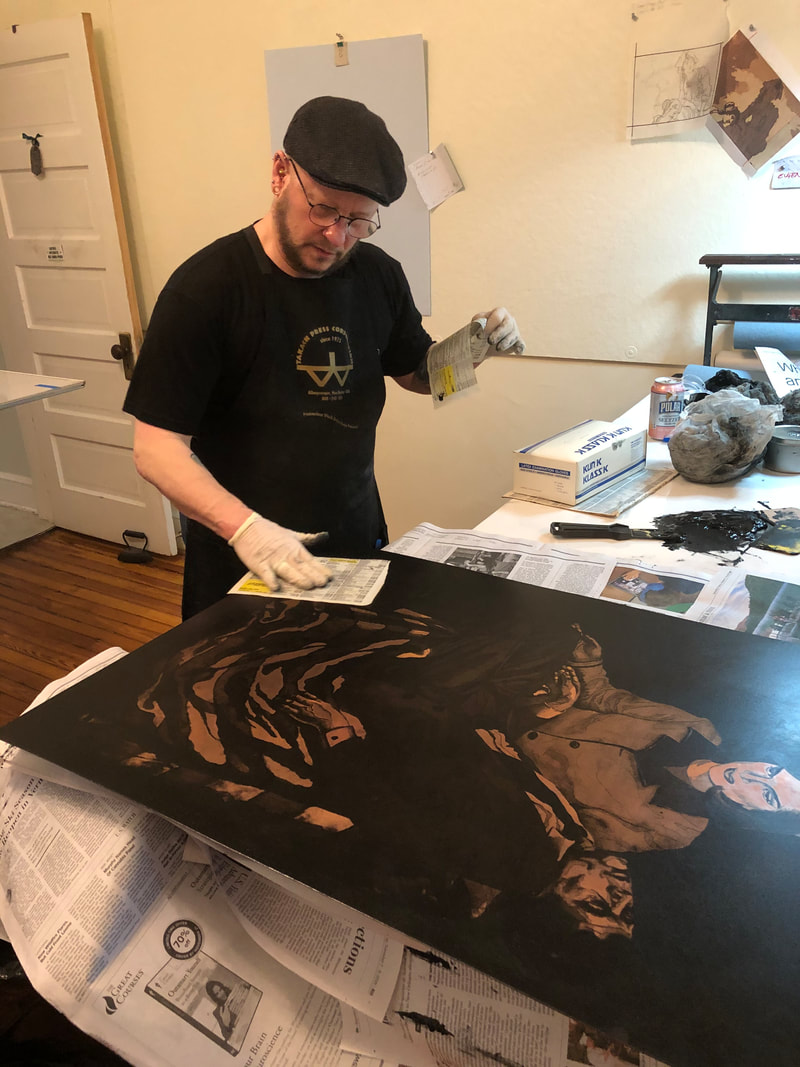
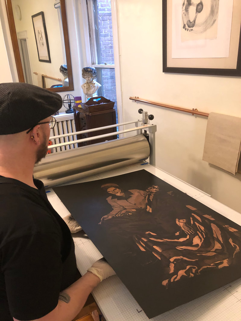
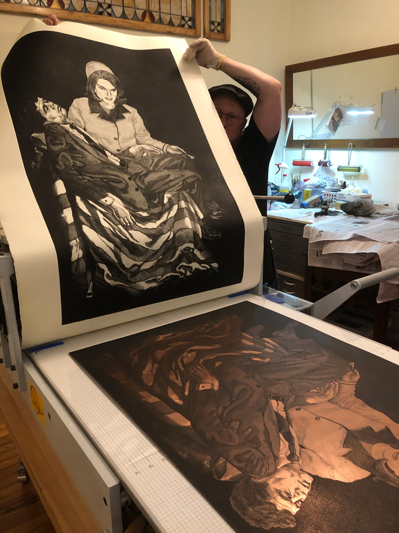
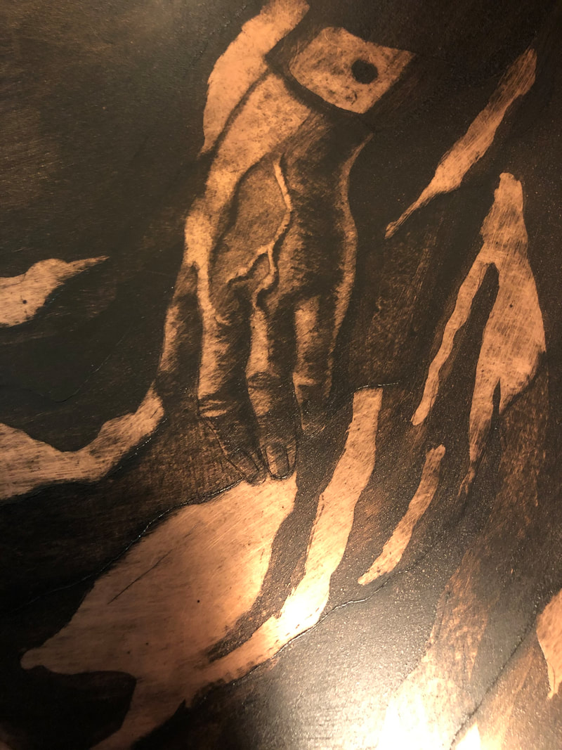
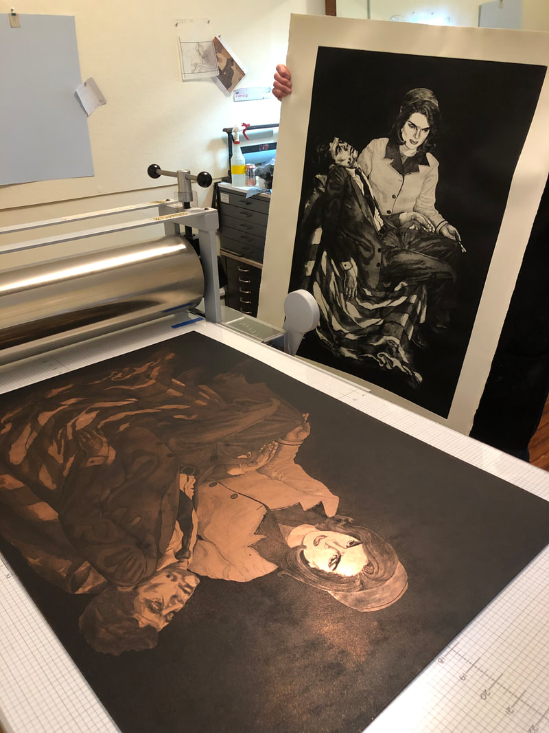
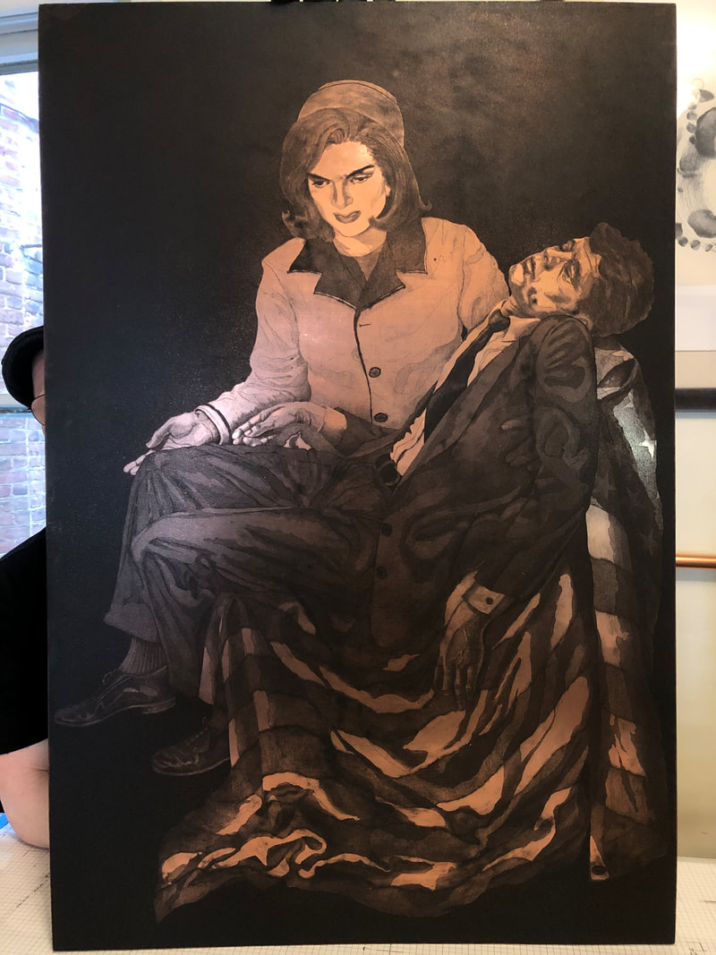
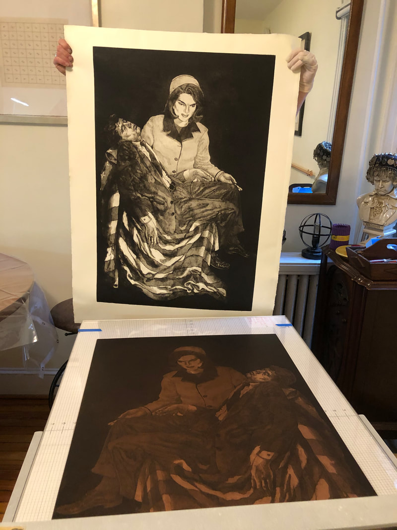
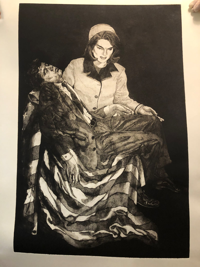
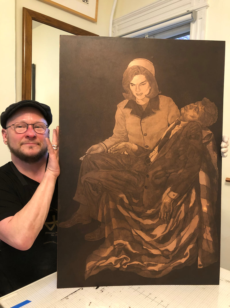
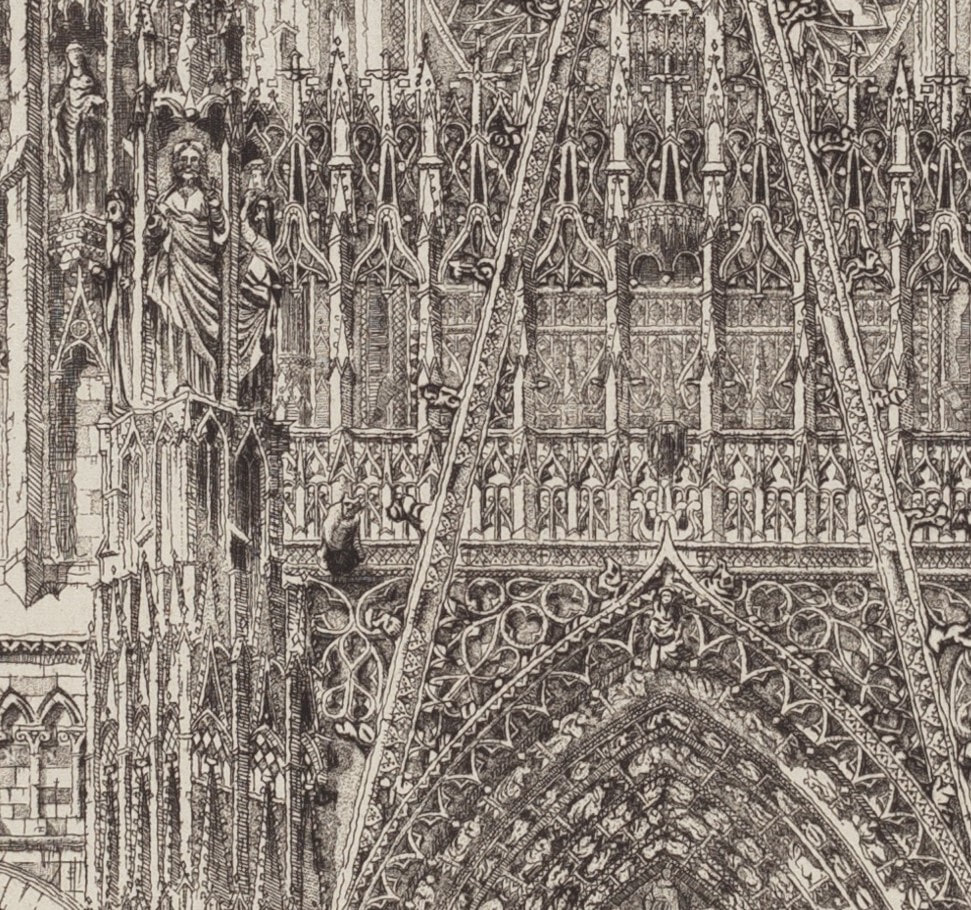
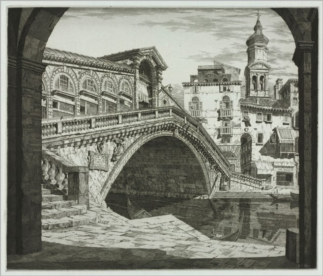
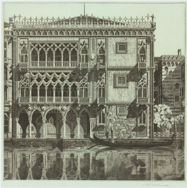
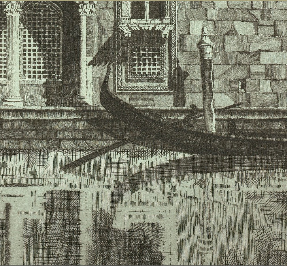
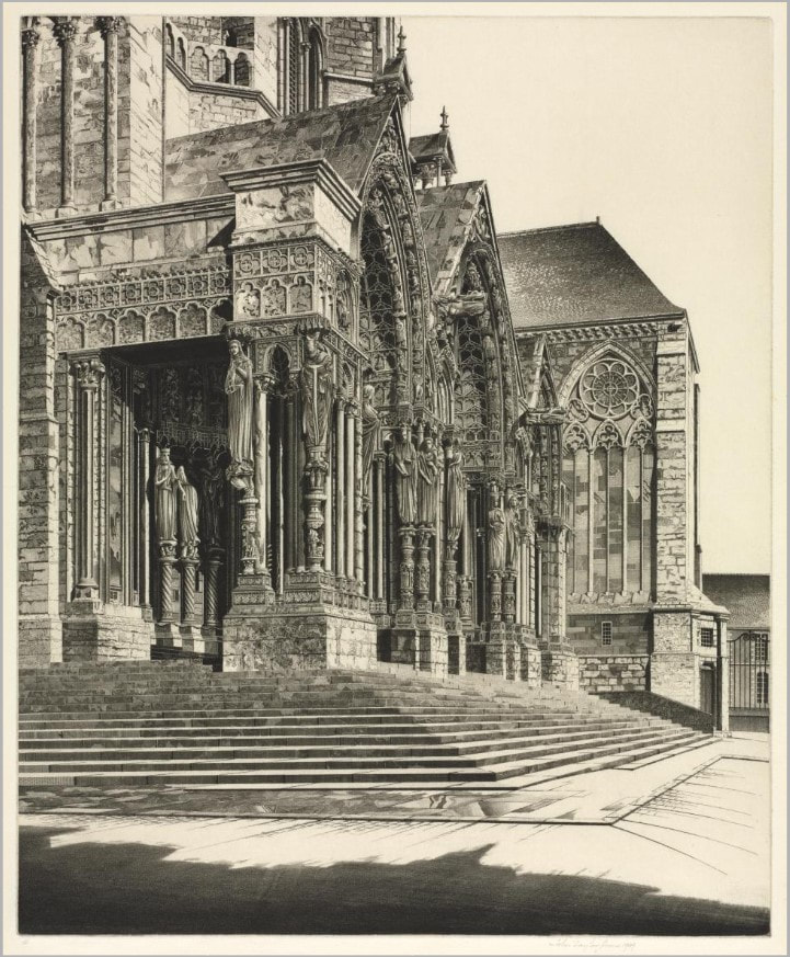
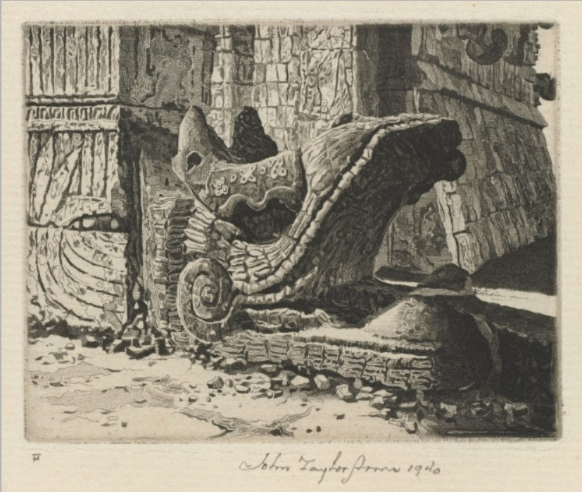
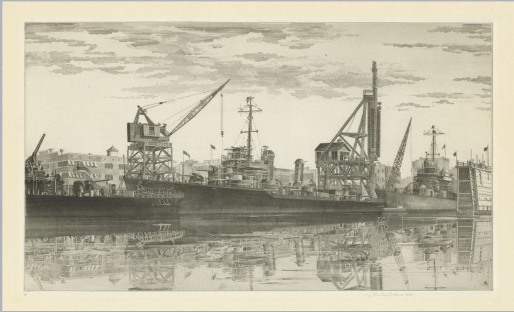

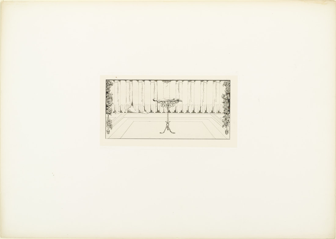
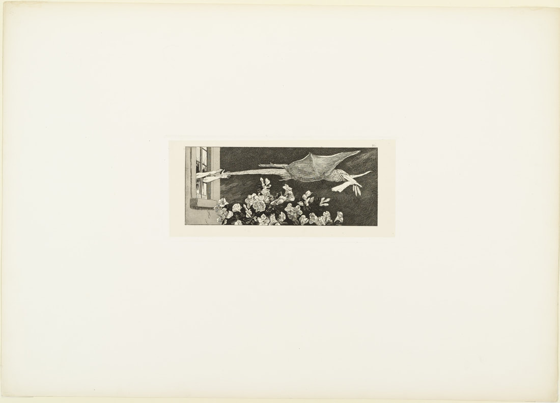
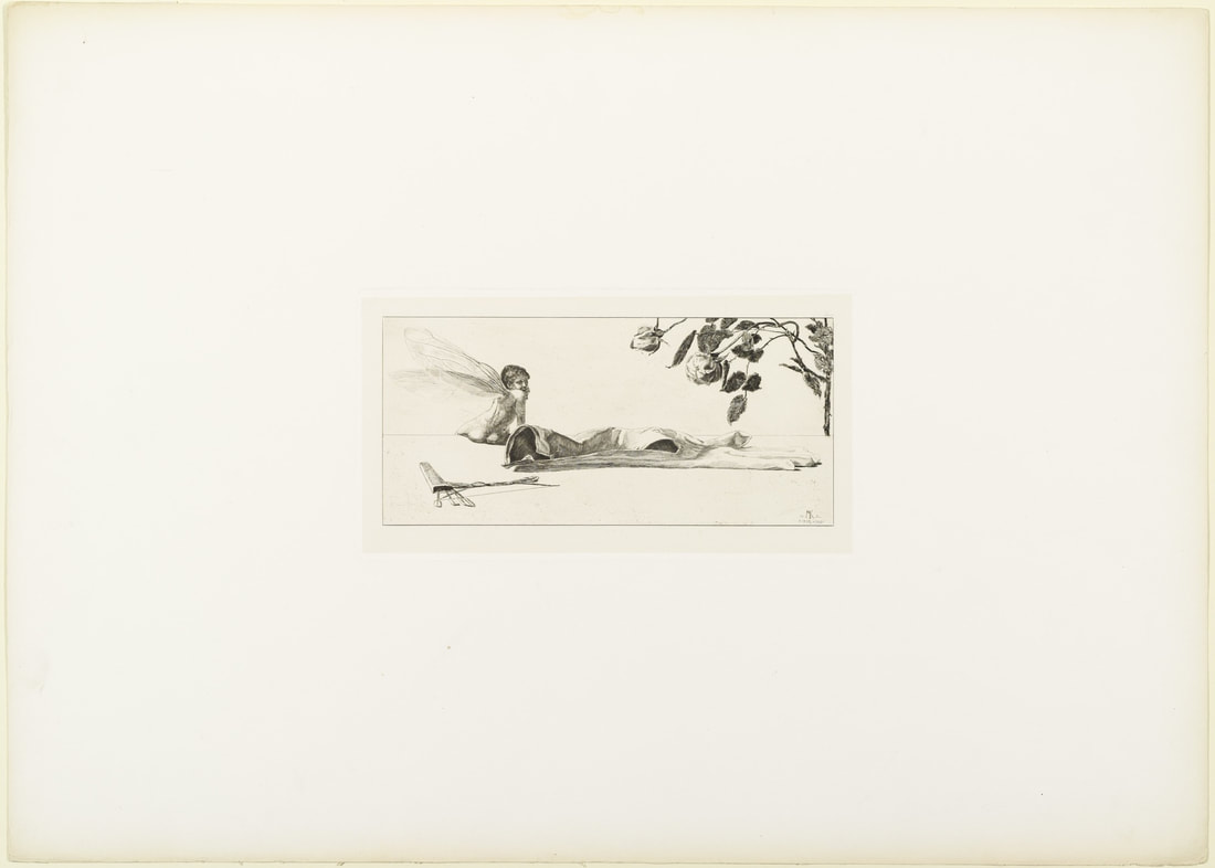
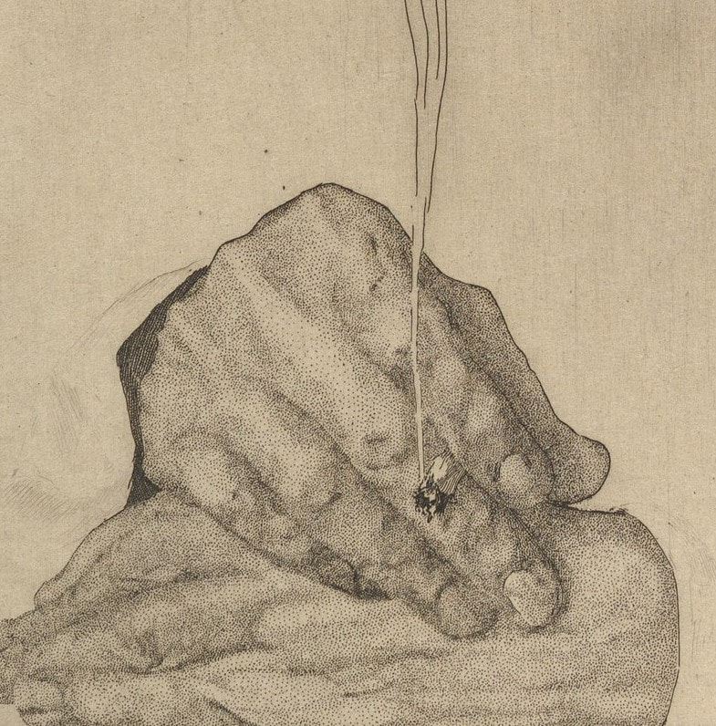
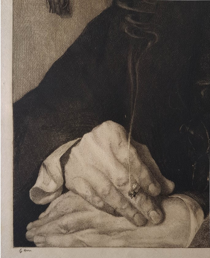
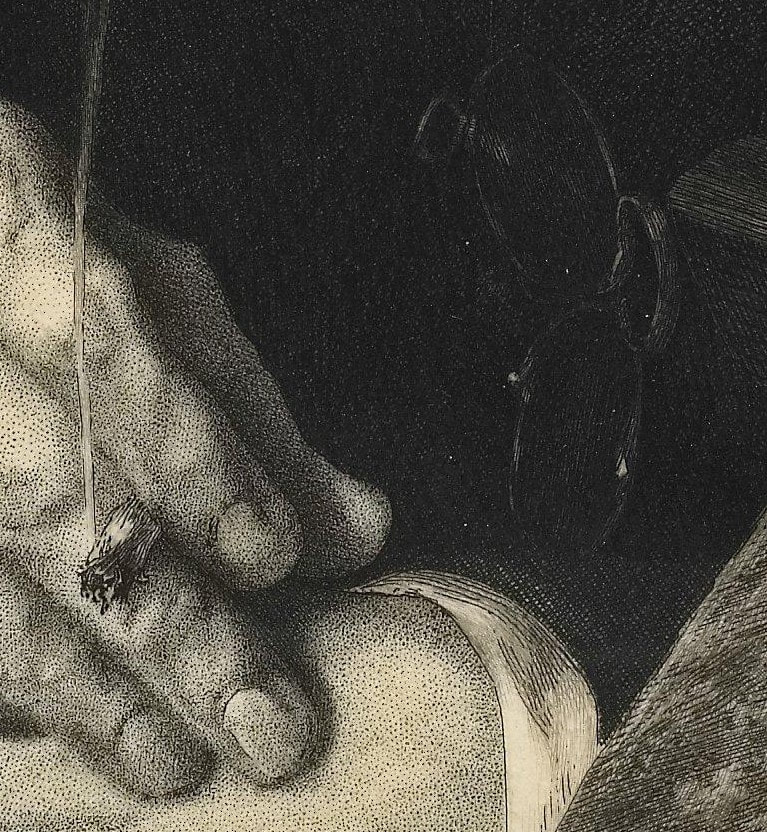
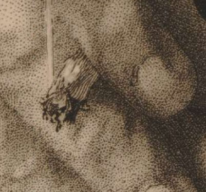
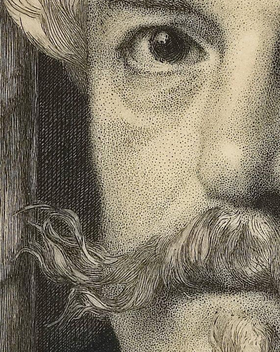


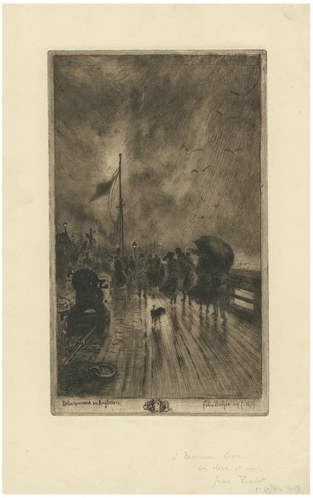
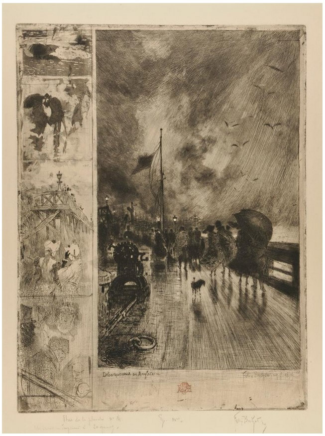
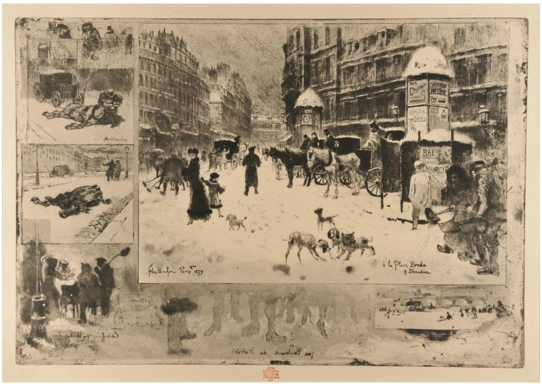
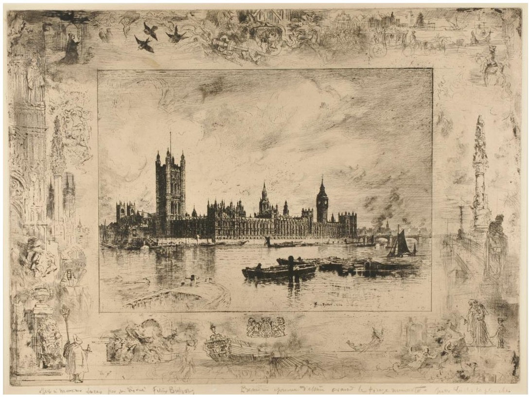

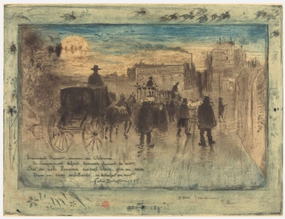
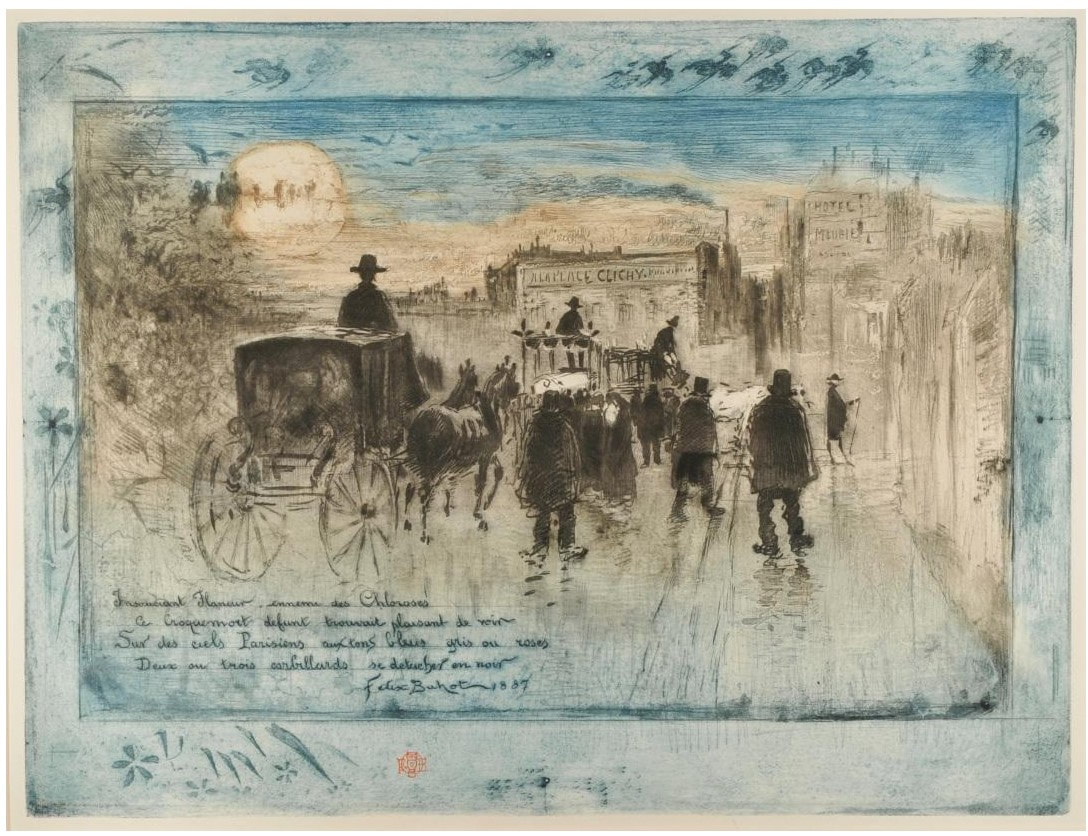

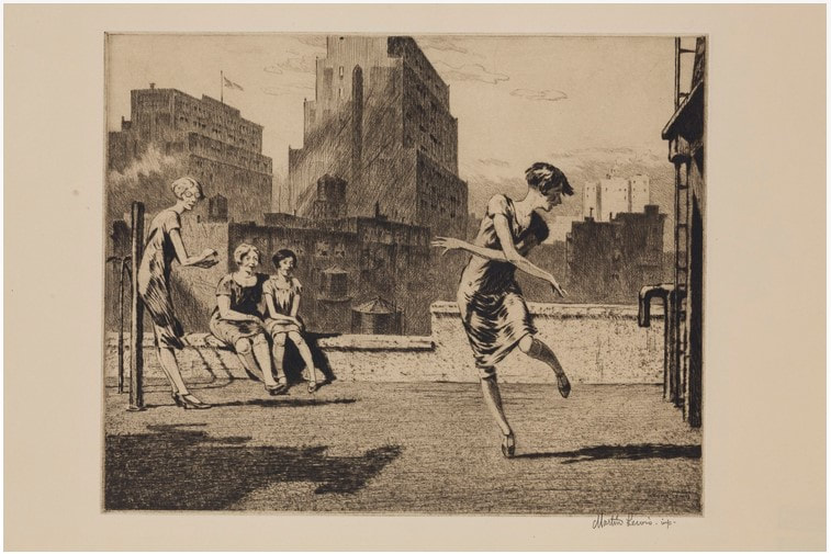
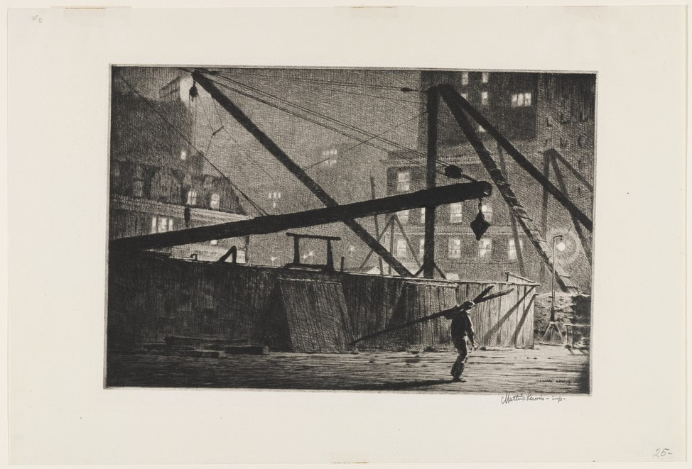
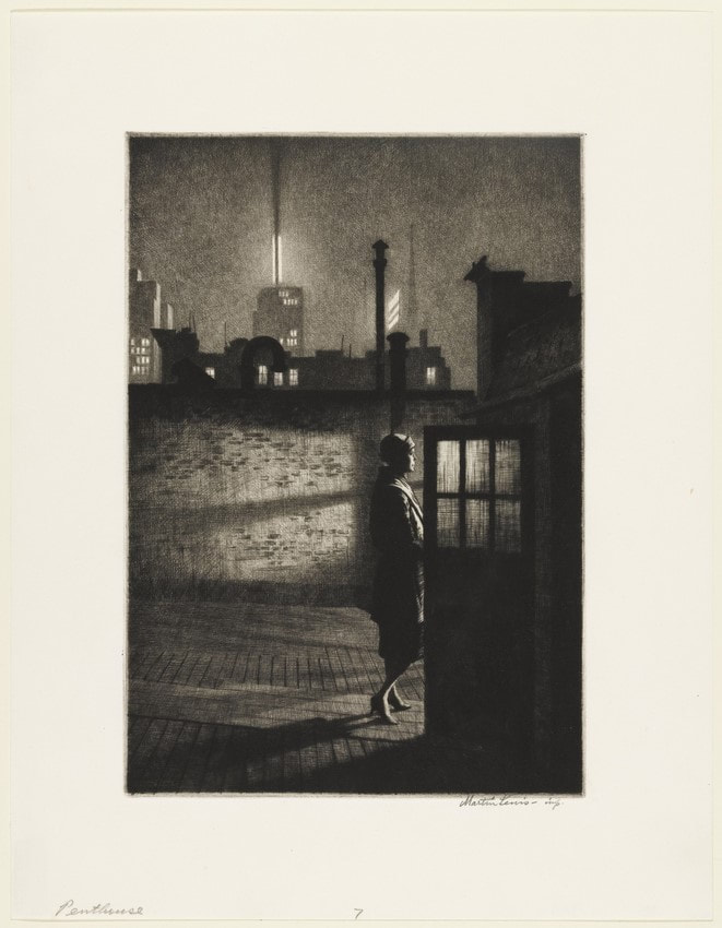
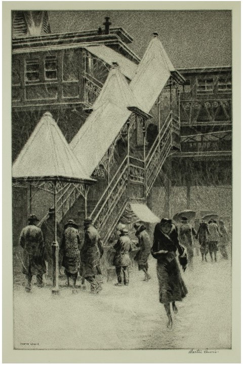
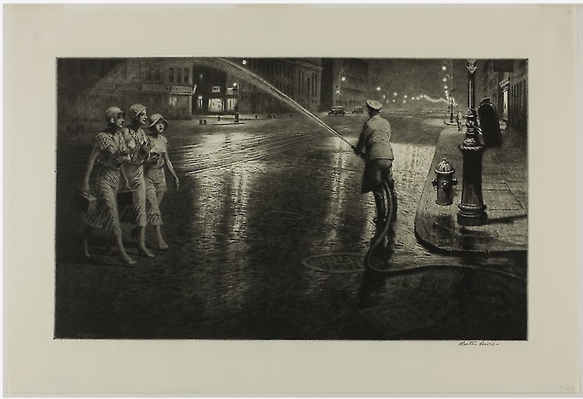
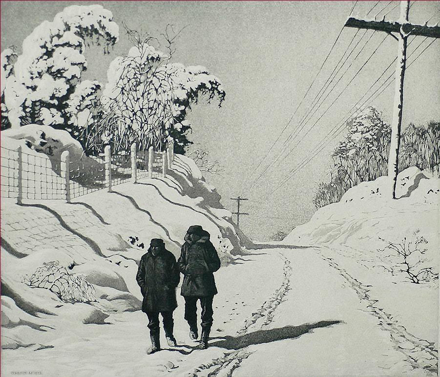
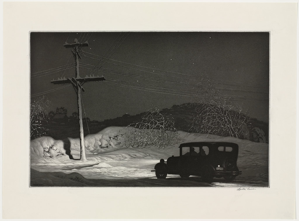
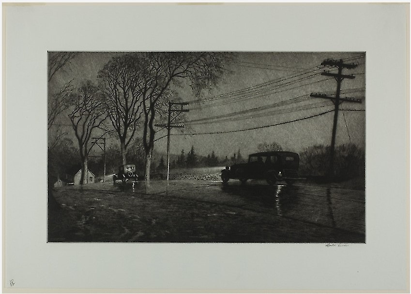
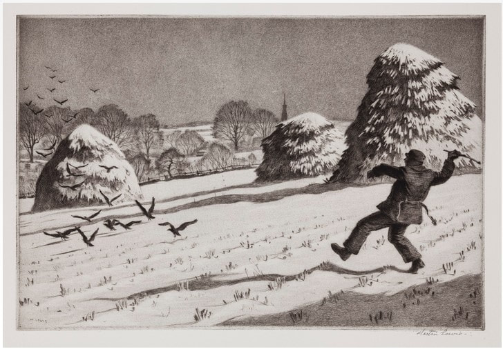
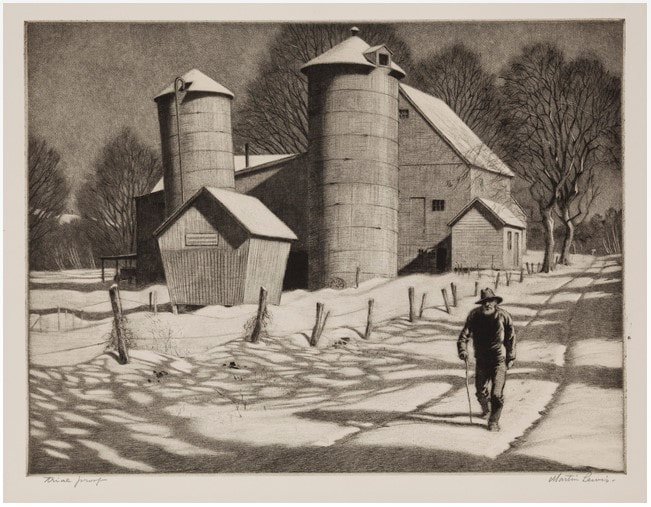
 RSS Feed