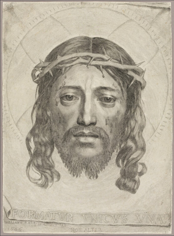
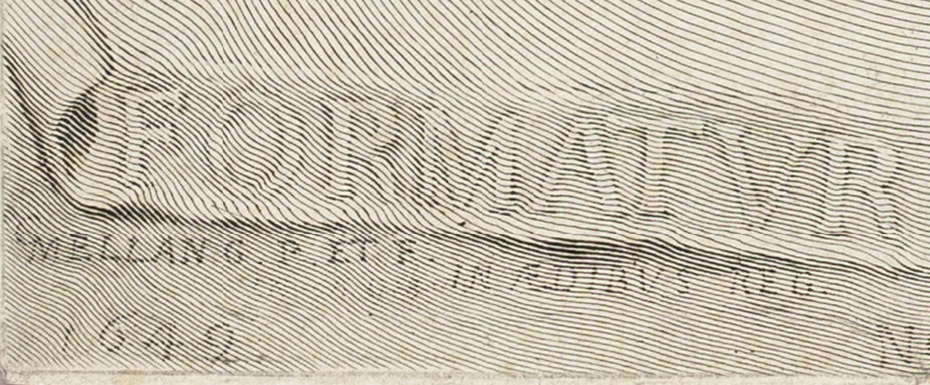
Ann Shafer Even if engraving seems arcane to viewers, there is one print that always impresses. It is the virtuoso engraving by Claude Mellan, The Sudarium of Saint Veronica, 1649. The print shows the sudarium (Latin for sweat cloth) that Veronica used to wipe the sweat off Jesus’ face during a chance encounter (it’s also called Veronica’s veil). It became inexplicably imprinted with an image of Jesus’ face.
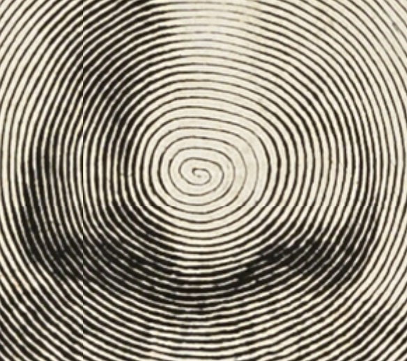
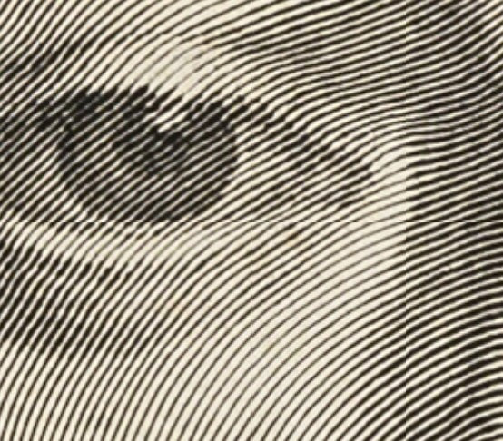
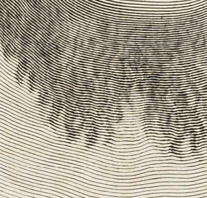
If the appearance of Christ’s face on the sudarium was a miracle, perhaps in turn, an artist’s ability to produce such a work might be seen to link their talent to a higher power. The inscription translates to "It is formed by one and no other." As if linking the artist’s talent to the divine wasn’t clear enough. This became Mellan’s calling card demonstrating his prowess with a burin, the tool used to carve the line into the copper plate. In Mellan’s composition, Jesus’ face is rather straight forward and remarkably symmetrical. Christ looks defeated and resigned with his eyes slightly downcast, and he is shown with droplets of blood from the crown of thorns that pierce his skin. The edges of the cloth are shown in a tromp l’oeil manner, meaning intended to fool the eye with their realism. It looks like the edges are curling off the sheet. This artifact foreshadows Jesus’ passion, conveyed through Veronica (the name derives from the Greek word for truth), and gives us the truth of his pain. While it may elicit a feeling of gratitude and hope for those that are spiritually Christian, for others, it may seem like a trope. But either way, I think we all can appreciate this landmark of printmaking. Here’s the part where I get to say this print “rewards scrutiny,” a phrase I used often in the museum’s studyroom. Look closer. Then zero in on Christ’s nose. Begin at Christ’s nose and follow the line outward. Keep going. Right. The image is made by increasing and decreasing the width of the single line created by carving into the copper plate. It’s really a jaw dropper, isn’t it? How in the world did he manage it? It boggles the mind. It always leaves an impression on me. Pictured is the impression of Mellan's print from the Art Institute of Chicago, chosen because one can zoom in pretty tightly to marvel at the line work. You can find it here: https://www.artic.edu/.../the-sudarium-of-saint-veronica
0 Comments
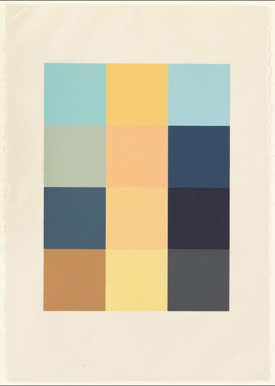
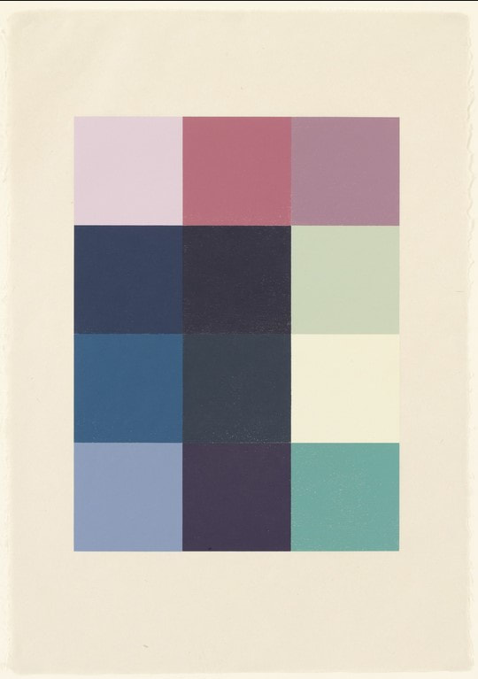
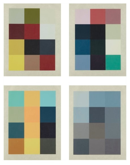
Ann Shafer Ben and I talk about why prints are awesome all the time (especially in episodes 7 and 8 of our podcast Platemark, which will be released later this summer). One key factor: the layers of translation from one step to another in the process. It takes planning and lots of decision-making to think through all the steps, which slows the artist down and makes them consider every aspect of the proposed work. Sherrie Levine’s portfolio Meltdown, 1989, is a perfect example of multiple transitions/translations in the making of the physical object in concert with multiple layers of conceptual ideas.
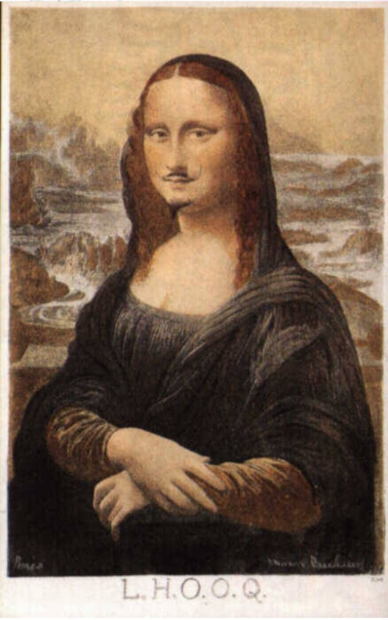
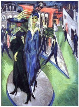
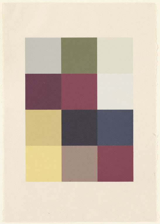
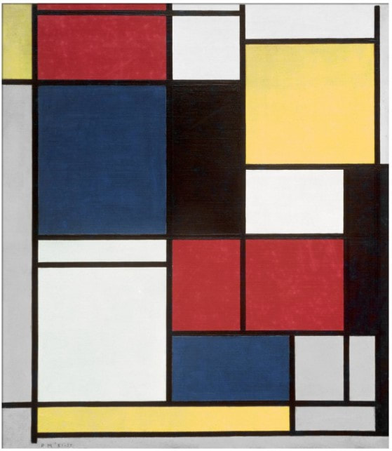
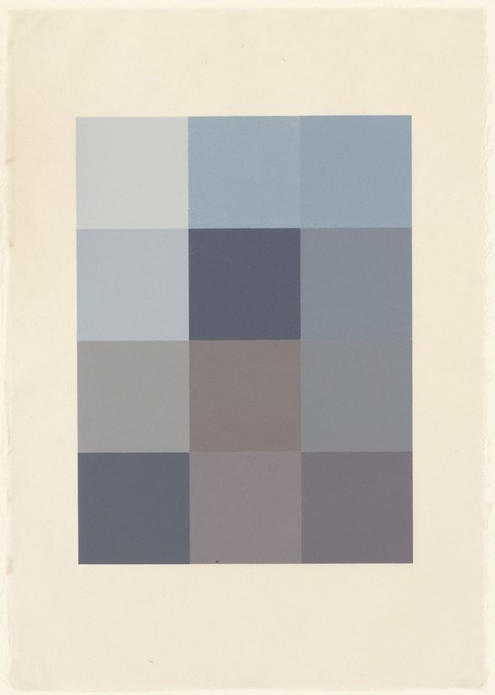
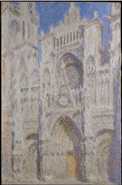
Meltdown is a portfolio of four woodcuts by Levine who is best known for challenging ideas of authenticity and originality. She often uses appropriation, either specifically or generally, as well as art history as a central element. Meltdown combines many of these concerns. The four woodcuts were printed by Maurice Shanchez at Derrière L’Etoile Studios, and the portfolio was published by Peter Blum Editions. Each print consists of twelve squares of color. They are, in my mind, purely beautiful, but they also offer up serious layers and conceptual rigor. In the project’s first step, reproductions of four works of art—paintings by Ernst Ludwig Kirchner, Piet Mondrian, and Claude Monet, plus Marcel Duchamp’s altered postcard of the Mona Lisa—were scanned from art history textbooks and a computer algorithm averaged the colors in each image into twelve pixels. Those twelve colors were approximated (expertly) into various inks and rolled onto square blocks of wood that were jigged together and then printed. So, we have the original artwork, the photograph taken of said artwork, the image as it was reproduced in an art history textbook (or other source), which was scanned to produce yet another derivation of the image. Only then does the human hand and eye of Maurice Sanchez step in to mix the inks. Then, to top it all off, the images that have been pushed through these multiple steps end up as woodcuts, the oldest, least techno form of printmaking. Plus, think about how many actors are in this play. There is the artist of the original painting (Kirchner, Monet, Mondrian—Duchamp is a special case, more on that in a sec, plus Leonardo), the photographer of the original work of art, the person and technology that created the halftone version of the photograph that would appear in a textbook, Levine who scanned the images, the computer program that averaged the colors, Sanchez who approximated those colors, and us, the viewers who bring our own perception to viewing the prints. With the after-Duchamp woodcut, there’s a whole other level of remove from Duchamp’s starting point back to the Mona Lisa. Those are a lot of layers. And let’s not forget that you are seeing a reproduction on your screen that is several steps beyond the original woodcuts. Levine is commenting on the varying nature of reproduction and appropriation of others’ images. How true is any translation of an image in one mode to another? At every stage of the trajectory the colors could have shifted to something else, either wildly or with great subtlety. It all feels extremely random and intentional all at the same time. And the bonus: in the end the prints are just so dang beautiful. Maybe you CAN have it all. |
Ann's art blogA small corner of the interwebs to share thoughts on objects I acquired for the Baltimore Museum of Art's collection, research I've done on Stanley William Hayter and Atelier 17, experiments in intaglio printmaking, and the Baltimore Contemporary Print Fair. Archives
February 2023
Categories
All
|
 RSS Feed