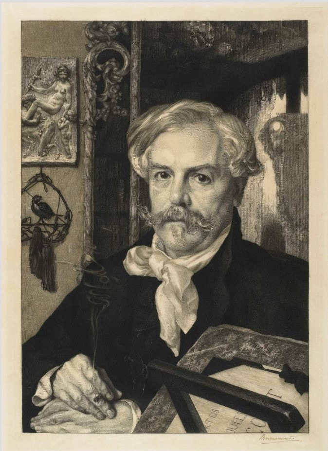
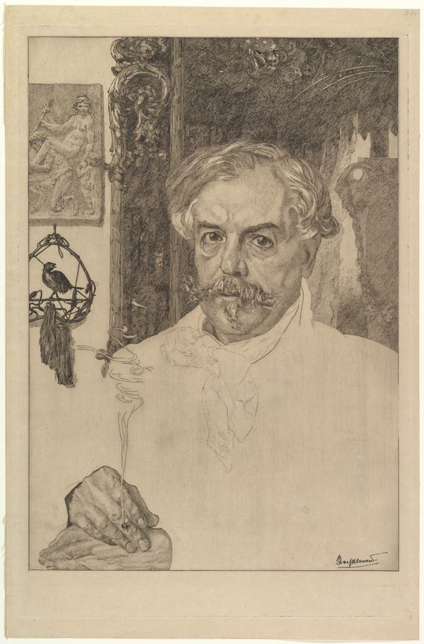
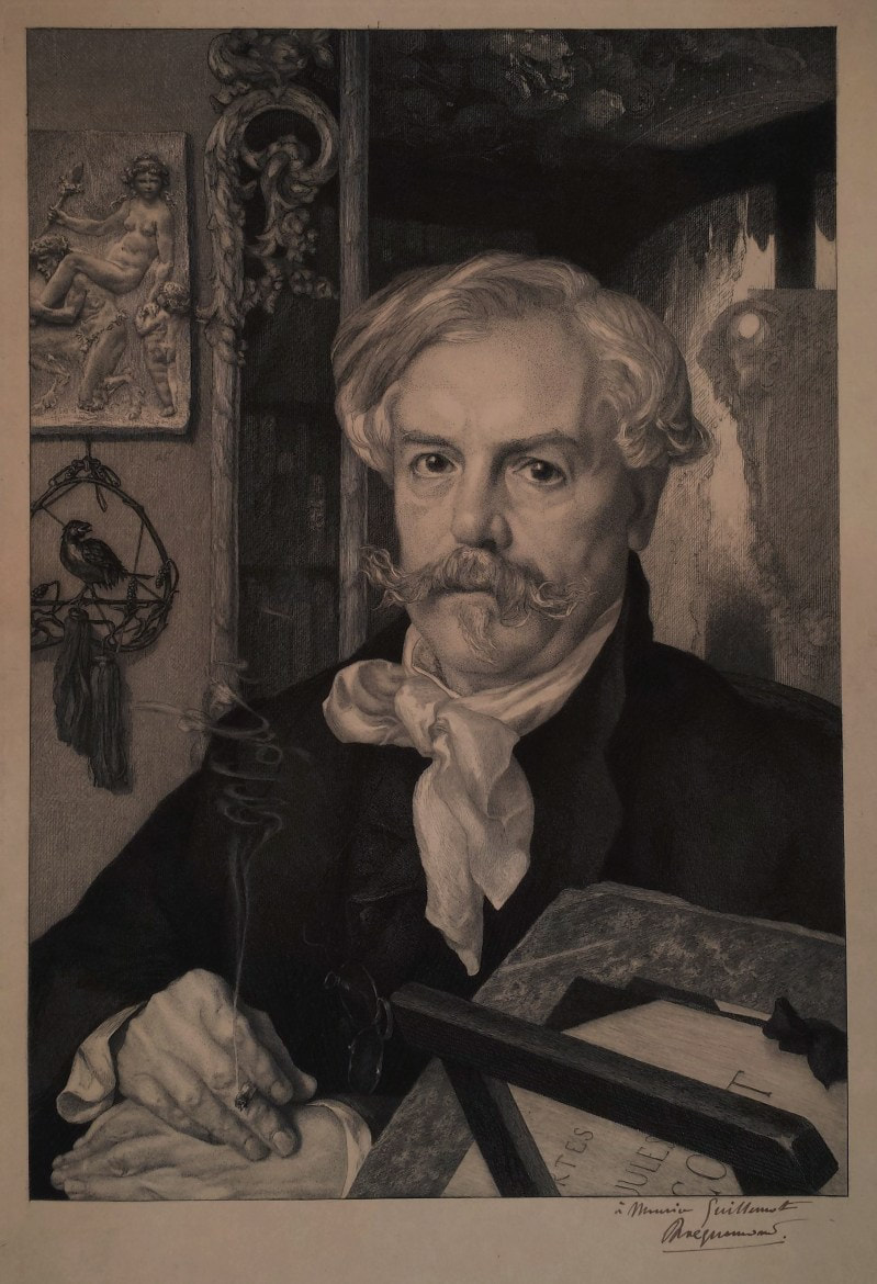
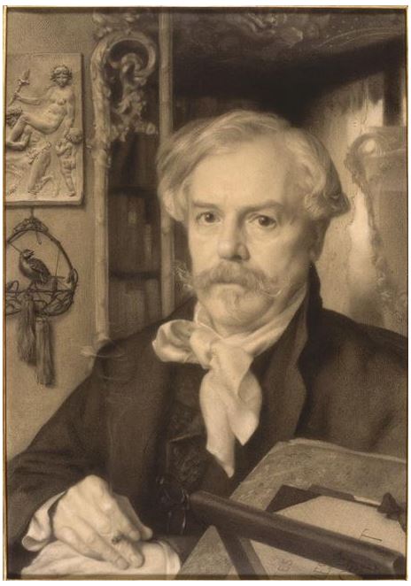
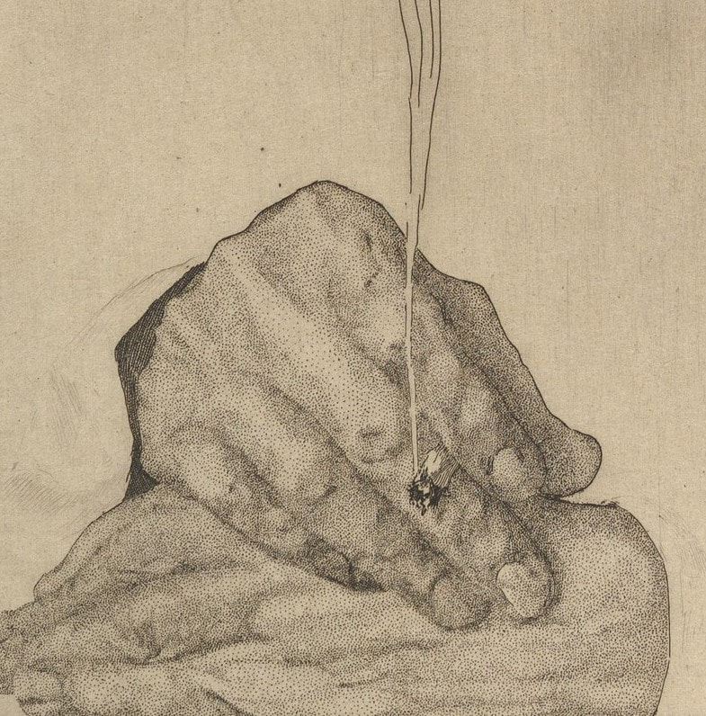
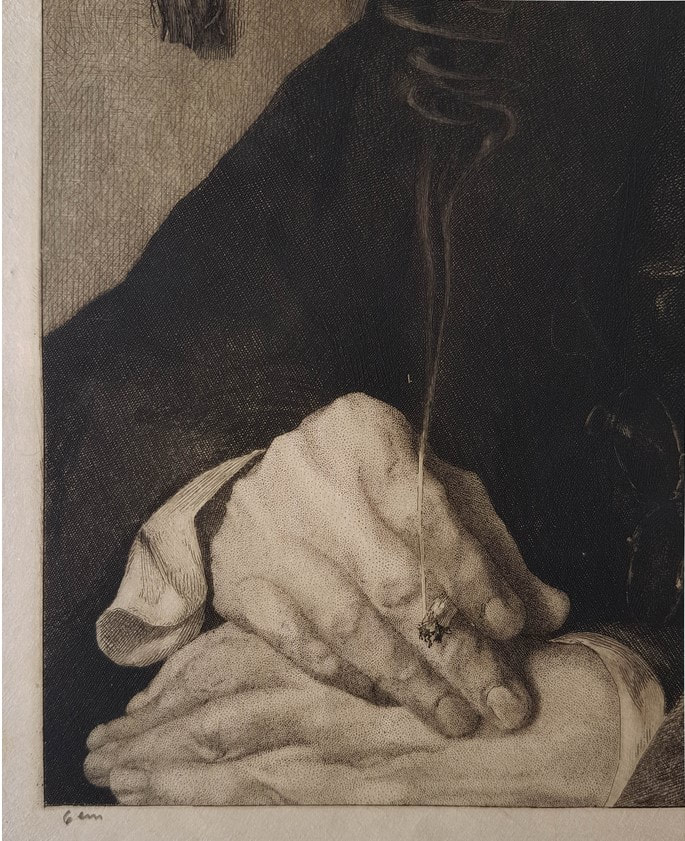
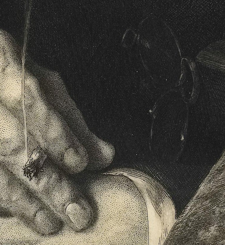
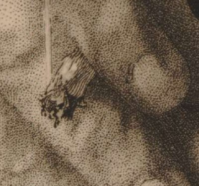
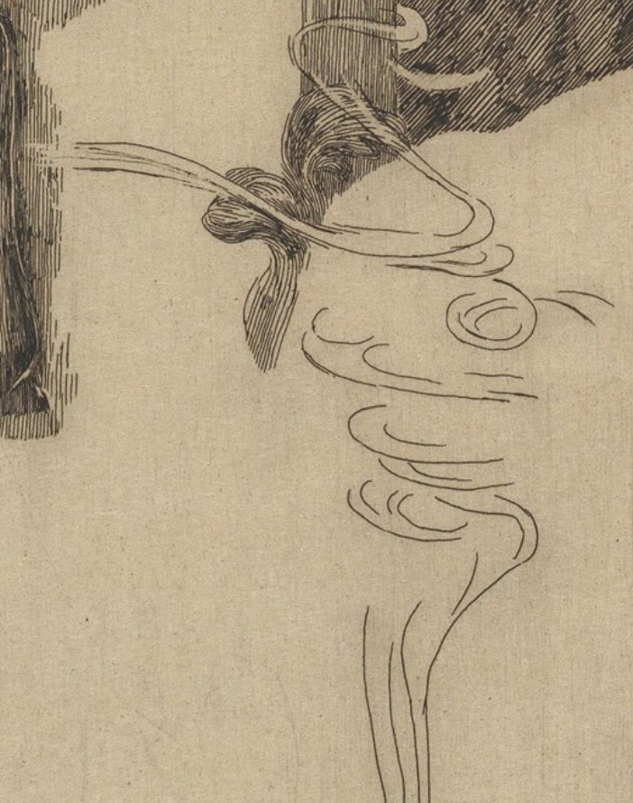
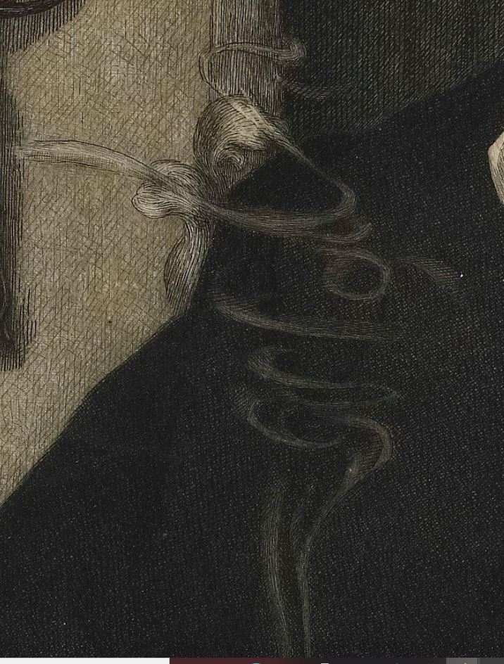
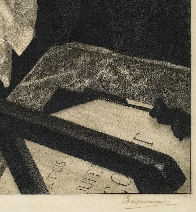
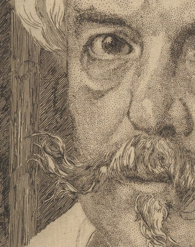
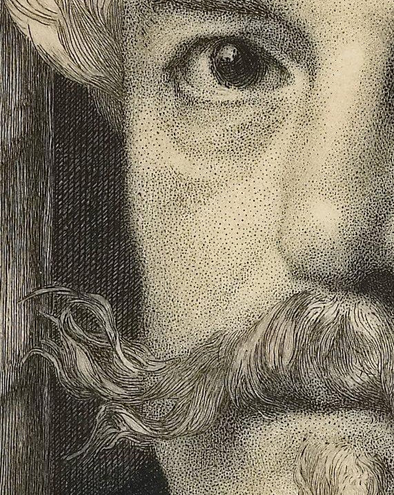
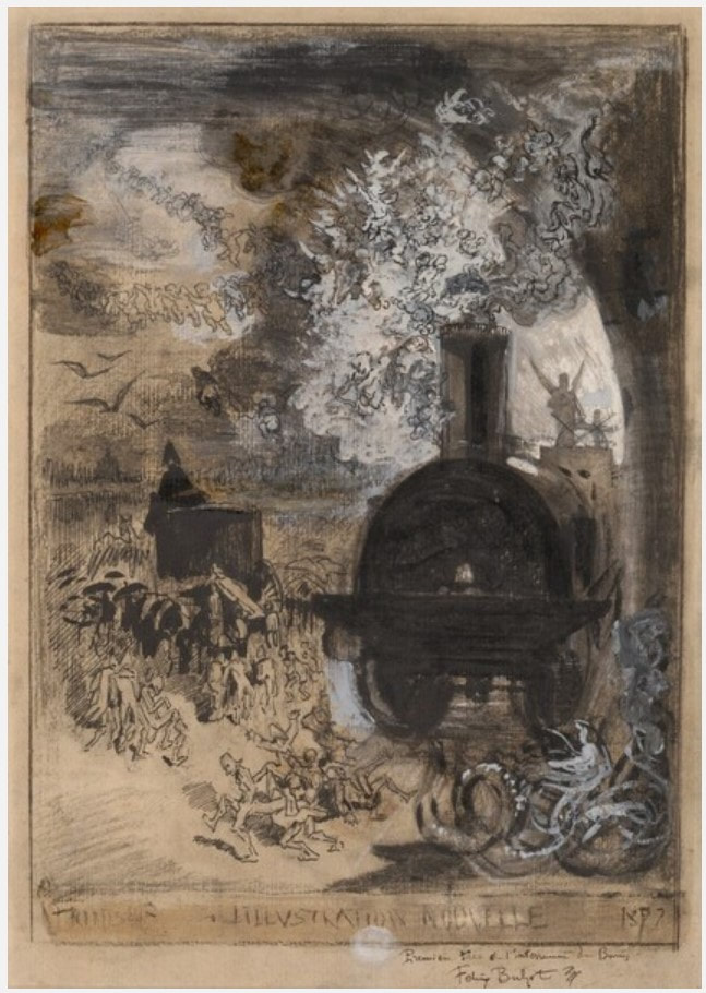
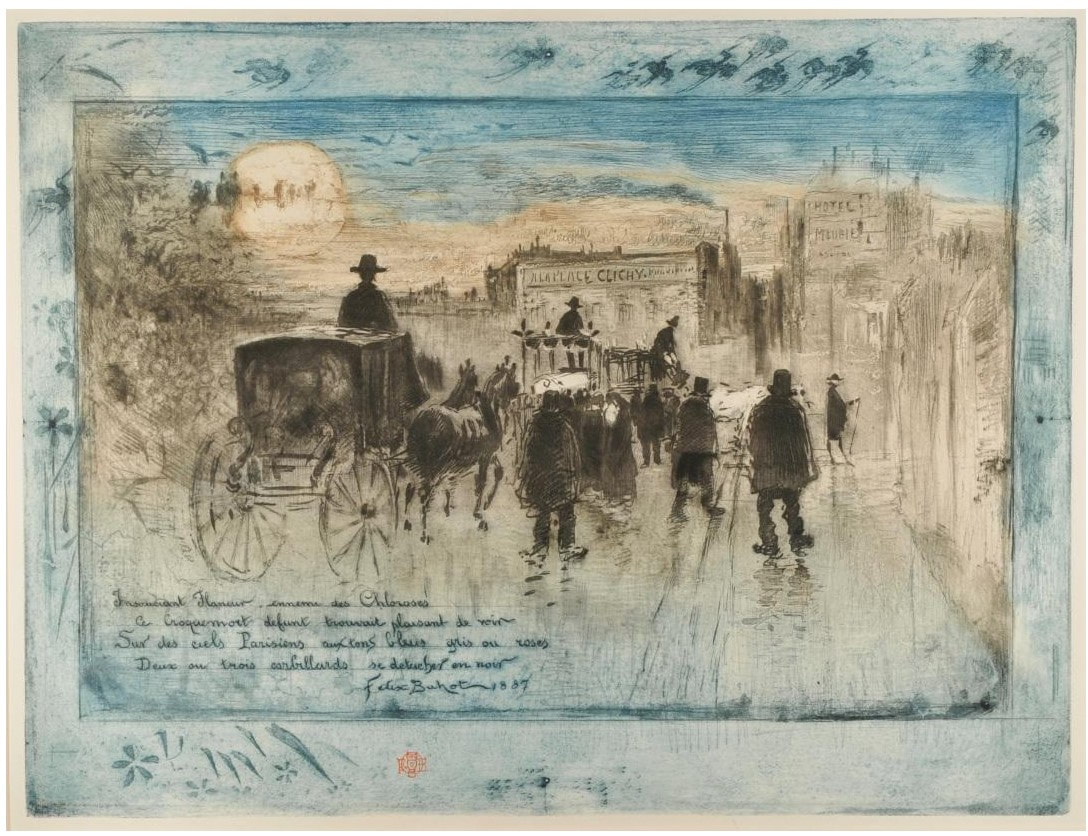
Ann Shafer The museum is fortunate to have two impressions of Félix Bracquemond’s gorgeous portrait of Edmond de Goncourt (one first state and one eighth/final state), and the pair was a permanent fixture on lists for classes studying prints or drawings. Why did I pull the two out constantly? For one thing, it is a kitchen sink etching full of a variety of mark making. Two, having an early state means you can see how and where he started and compare it to the final state. Three, it is a remarkably beautiful and sensitive portrayal of the artist's friend. For me, however, the easy sell is the smoke emanating from the cigarette Goncourt holds. I mean, have you ever? In fact it was the smoke in this print that made me start a subject list of all sorts of images. Whenever I was box surfing, I would note works that featured any number of objects or themes: clouds, eyeglasses, monkeys, night scenes, games, sports, city, country, four seasons, seven deadly sins, you get the picture. Trying to draw smoke seems to me to be almost as difficult as portraying water in a vase (see my earlier post about Manet’s Lilacs in a Vase). Bracquemond’s elegant spiral of smoke wafts up from the butt with such elegance. (Please don’t mistake this for an advertisement for smoking—it isn’t.) Bracquemond enjoyed notoriety and success as a printmaker by the time he started work on the etched portrait of Edmond de Goncourt. He had had prints in multiple Salon exhibitions in Paris and his work was included in the first Impressionist show in 1874. He also created designs for dinnerware, was fascinated by Japonisme, and taught etching to many artists including Jean-Baptiste-Camille Corot, Gustave Courbet, Théodore Rousseau, Edgar Degas, and Henri Fantin-Latour. Bracquemond was a key figure in the etching revival of the 1850s and 1860s in France. Along with the publisher Alfred Cadart and the printer Auguste Delâtre, he founded La Société des Aquafortistes in 1862. The Société published a monthly portfolio of prints over its five-year existence, including work by the most progressive artists of the time: Edouard Manet, Fantin-Latour, Charles Meryon, James McNeil Whistler, and Bracquemond himself. To say he was in the mix would be an understatement. He made over 900 prints during his lifetime, two favorites of which are worth looking up: Le haut d’un battant de porte (Birds Nailed to a Barn Door), 1852; and The Large Rabbit, 1891. But for me, his Portrait of Edmond de Goncourt, 1881–82, is the pinnacle of his oeuvre. In the portrait, Goncourt is shown surrounded by objects that tell us about him. The most meaningful, perhaps, is the portfolio of prints by his younger brother, Jules de Goncourt, seen at lower right. Jules was an amateur printmaker, but more importantly, together the brothers produced a literary journal that is revered today. It is at once a chronicle of an era, an intimate glimpse into their lives, and the purest expression of a burgeoning modern sensibility preoccupied with sex, art, celebrity, and self-exposure. The Goncourts were known to visit everything from slums and brothels to balls and imperial receptions; they argued about art and politics and were merciless gossips discussing news with and about writers Victor Hugo, Charles Baudelaire, and Emile Zola, as well as artists Edgar Degas, Auguste Rodin, and many others. When Jules (who was ten years younger) suffered a painful and slow death at age thirty-nine from syphilis in 1871, Edmond was at his side. The portfolio in the portrait is a nod to Jules as a beloved brother and close collaborator. Other objects include, at upper left, a relief by the French sculptor Clodion of a frolicking nymph and satyr (mythical woodland creatures) recalling eighteenth-century French art, about which Goncourt was passionate. Below the relief is a bronze ornament with a bird and tassels, which represents Goncourt’s collection of fifteen hundred Japanese objects. On the right is a large vase reflected in a mirror. Apparently, Goncourt’s writing about art often evoked physical sensations such as touch and smell, which Bracquemond suggests with objects, rich fabrics, and that burning cigarette. Bracquemond and Goncourt were friends, which I believe is apparent in the portrait’s attention to detail. It is also one of the largest plates Bracquemond ever worked on, adding to its significance. As an artist paying attention to the new conception of the limited edition, with special proofs, papers, etc., Bracquemond took full advantage. As far as we know, there are probably twenty impressions of state I, six impressions of states II–VII, and 175 impressions of state VIII (twenty-five on vellum and 150 on Japan paper). The images below are of several different impressions of the print, including details of a first state impression from the collection of the Metropolitan Museum, a final state impression from the Minneapolis Institute of Arts, along with the drawing of the same subject in the collection of the Louvre. Other details come from a variety of collections. Please know these choices are based on the resolution of the online images. (The online images of the Baltimore Museum of Art's impressions are not high enough resolution to reproduce here.) As always, collections are noted in the captions.
1 Comment
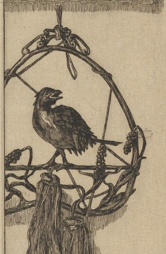
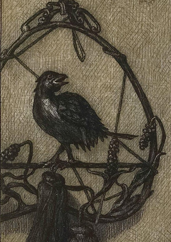
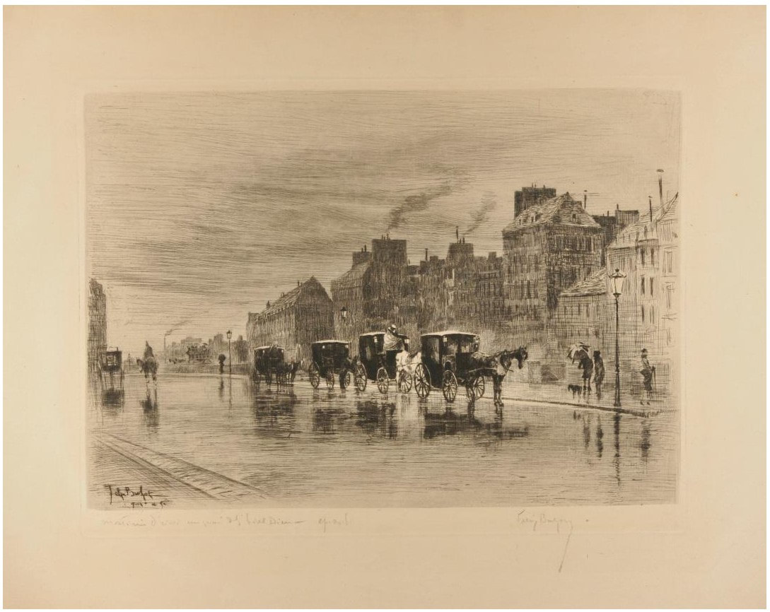
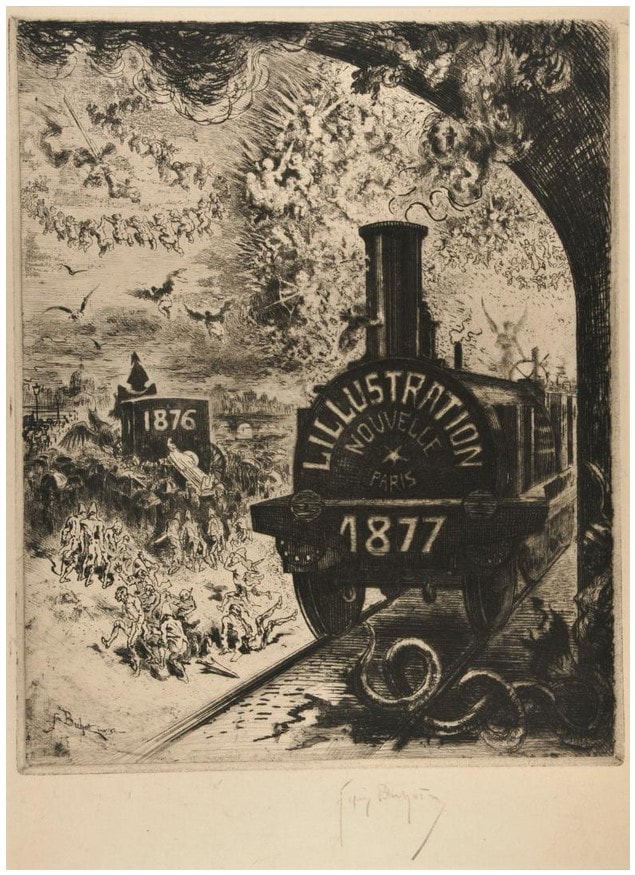
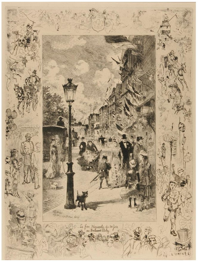
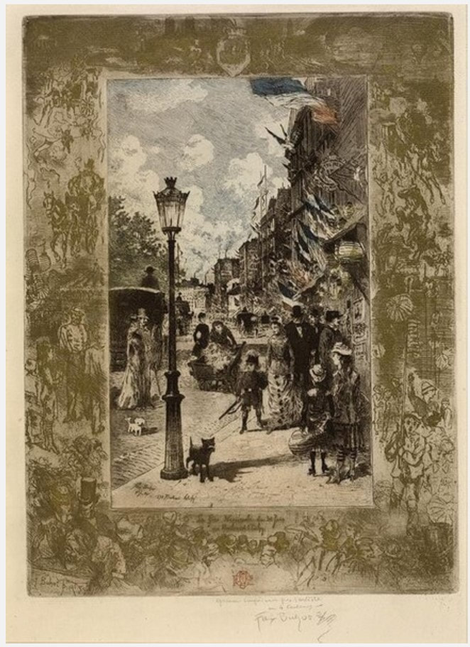
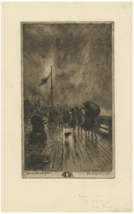
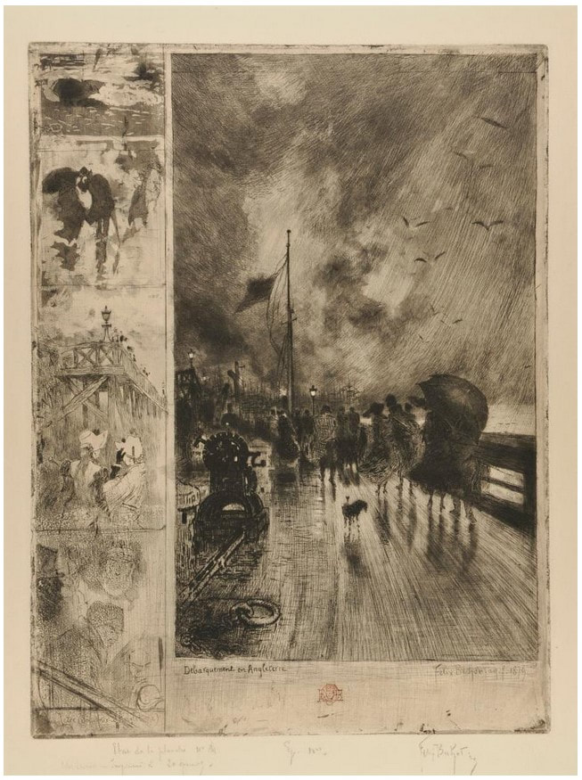
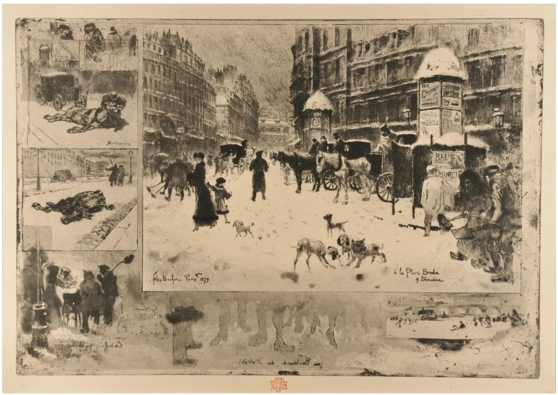
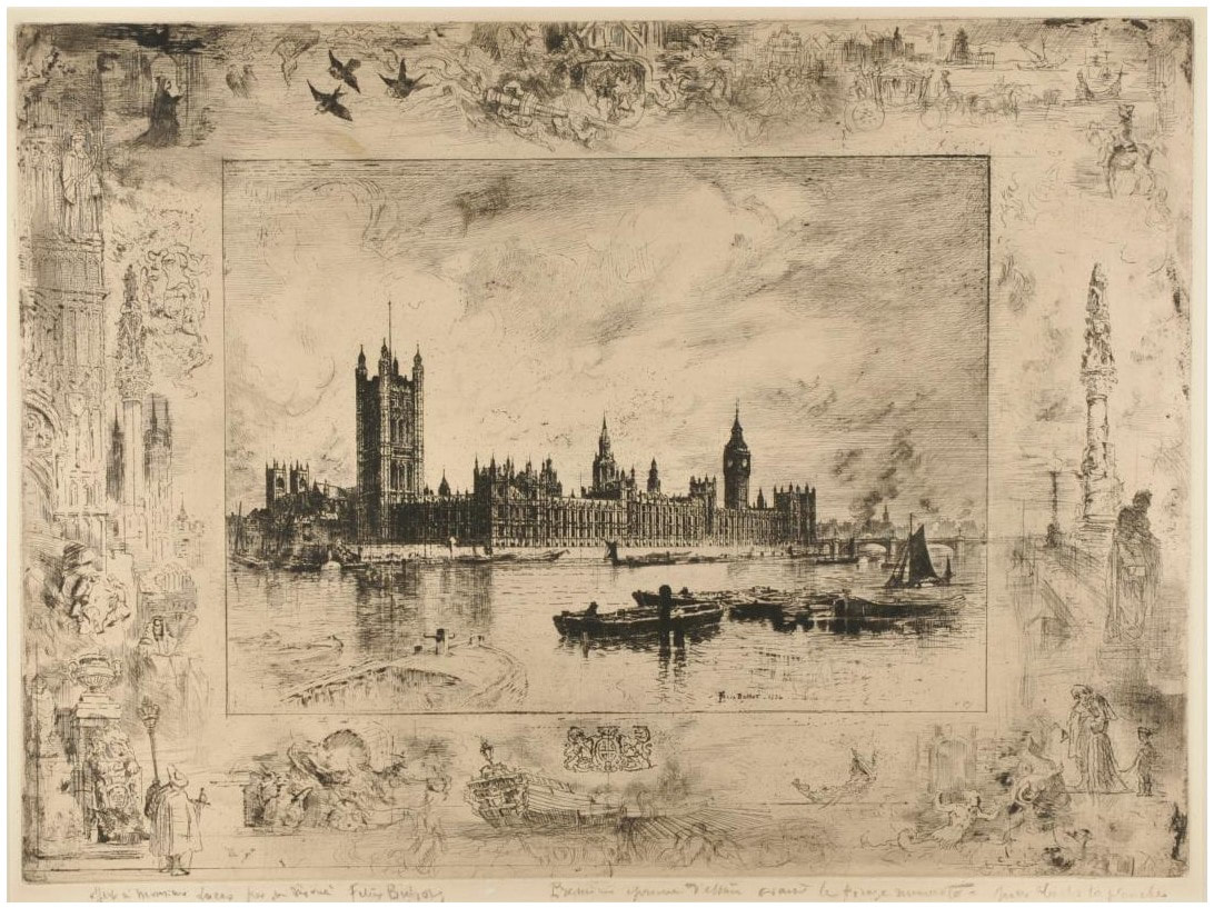
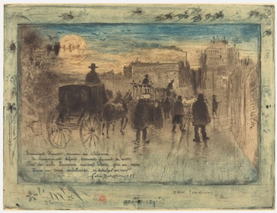
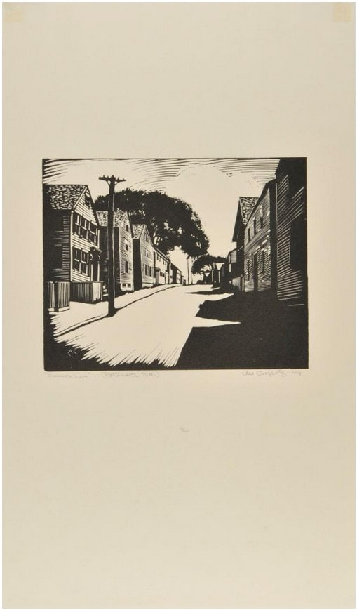
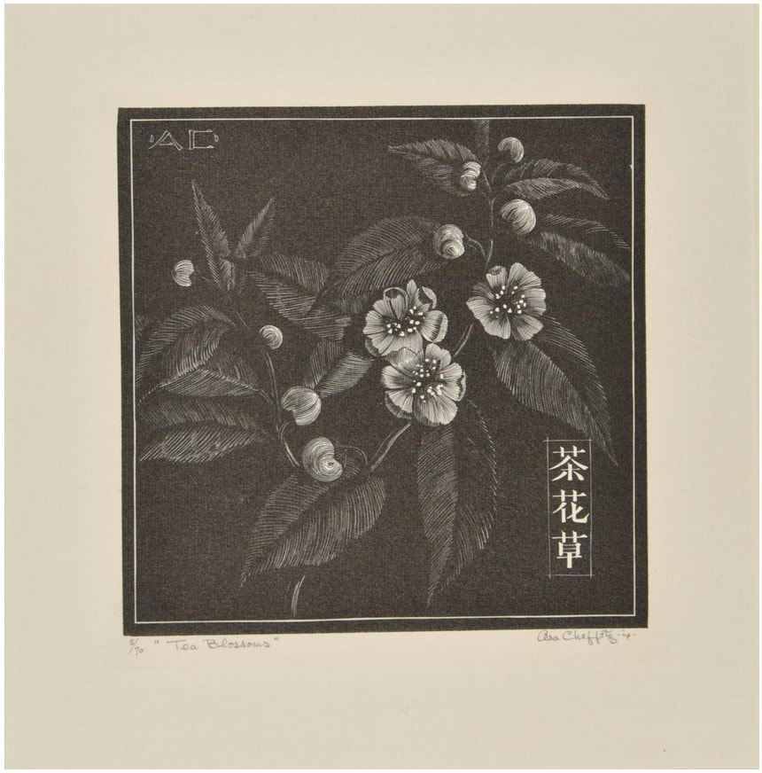
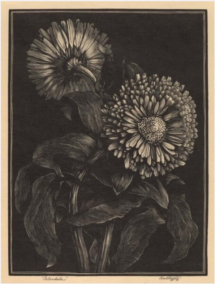
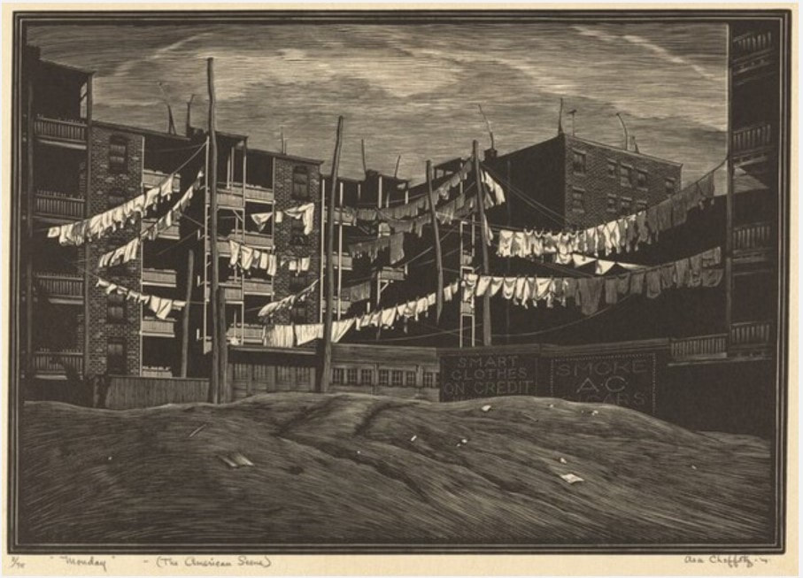
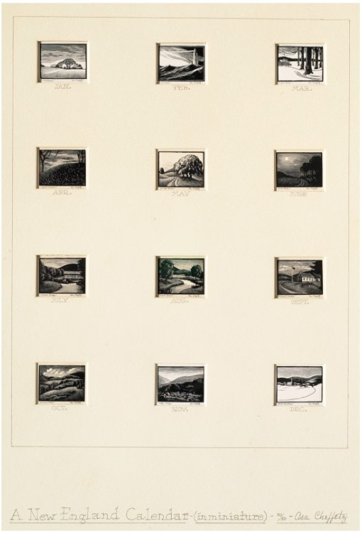
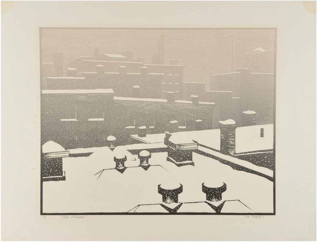
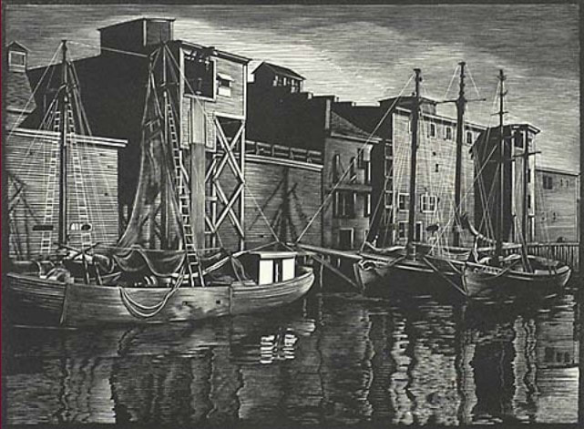
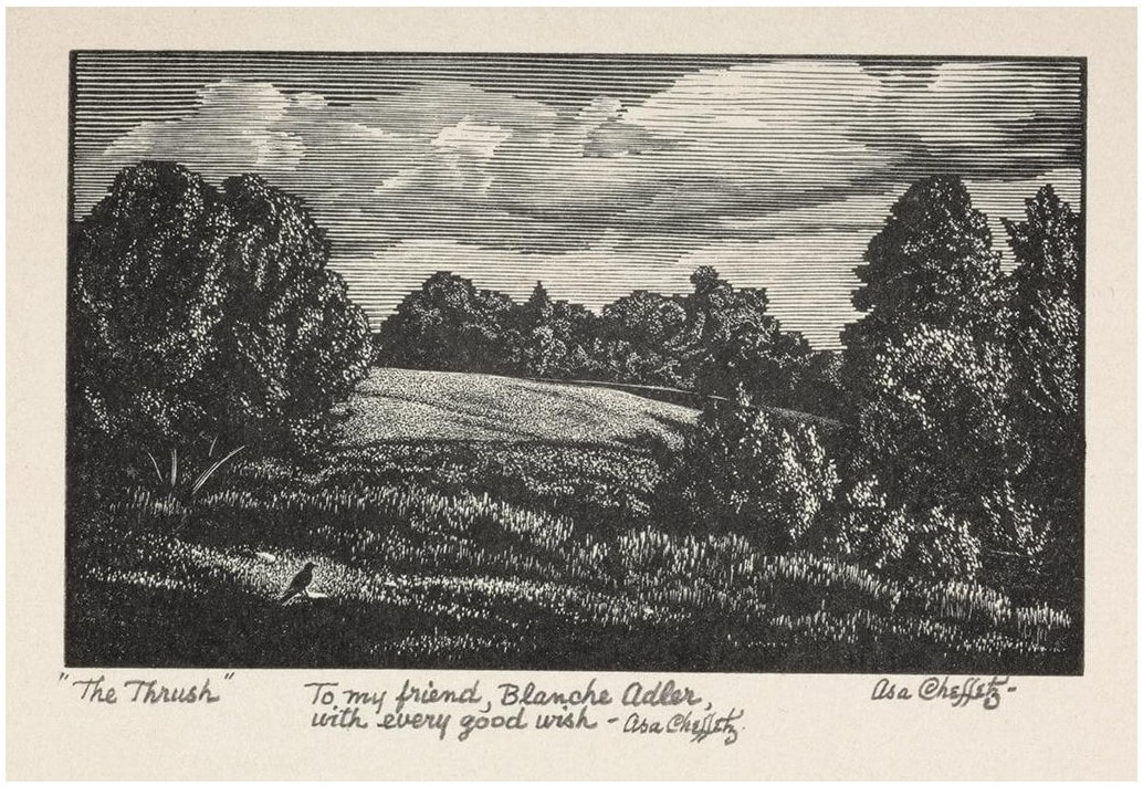
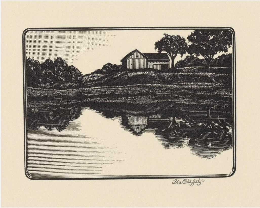
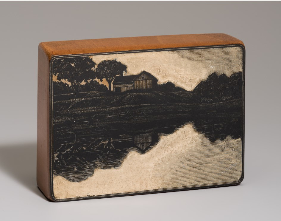
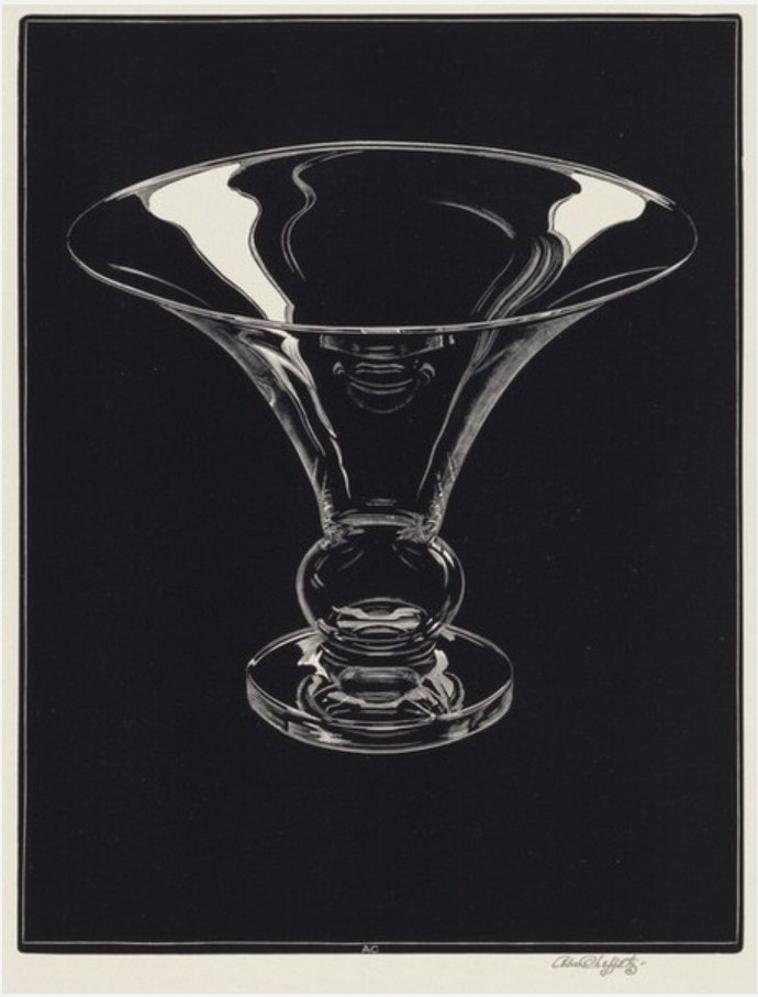
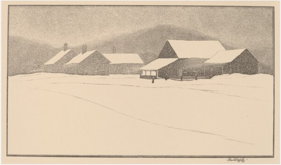
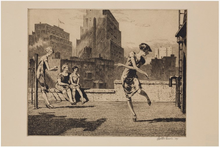
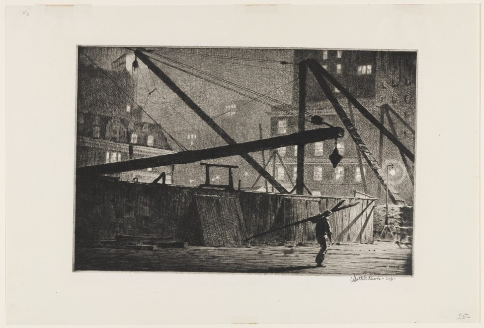
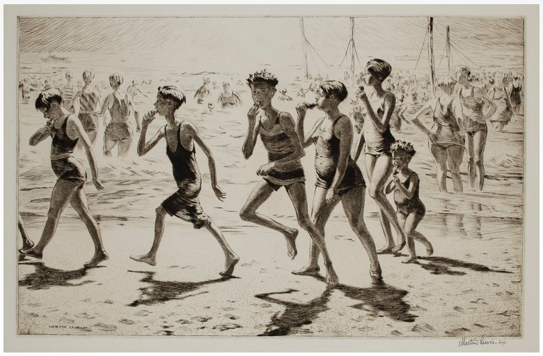
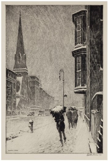
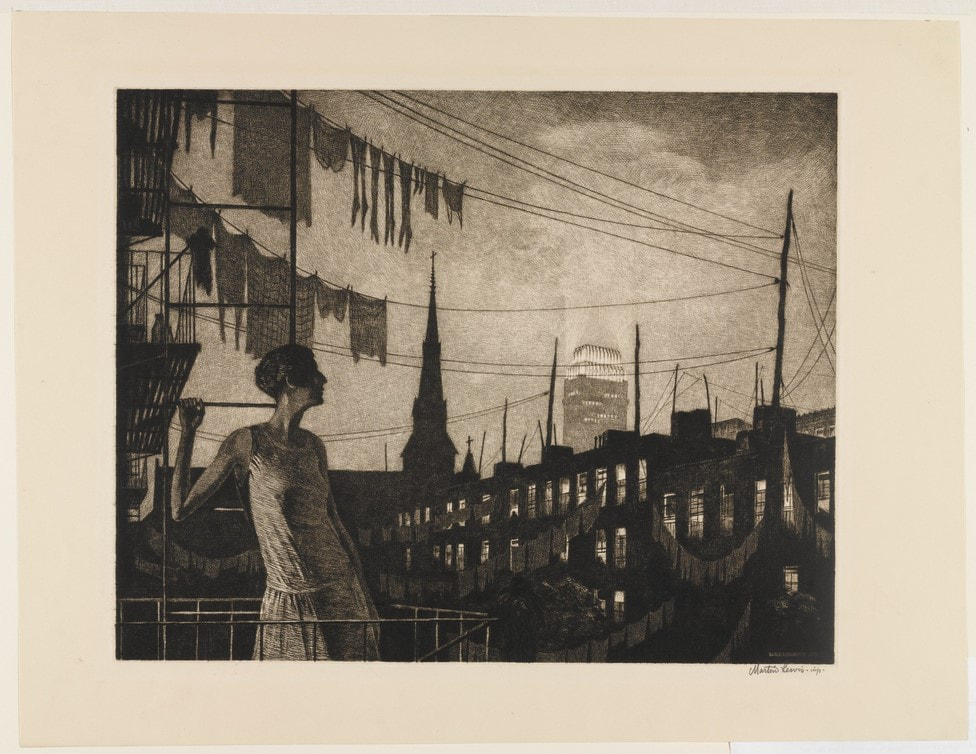
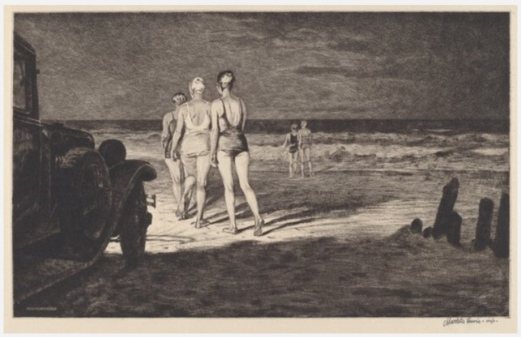
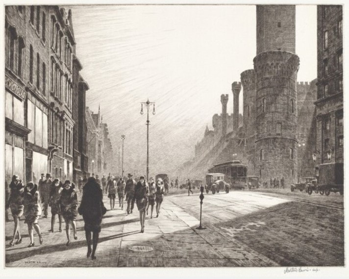
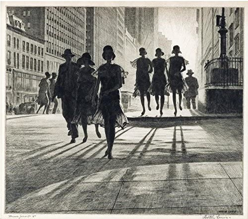
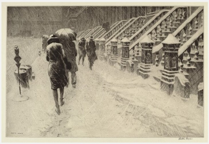
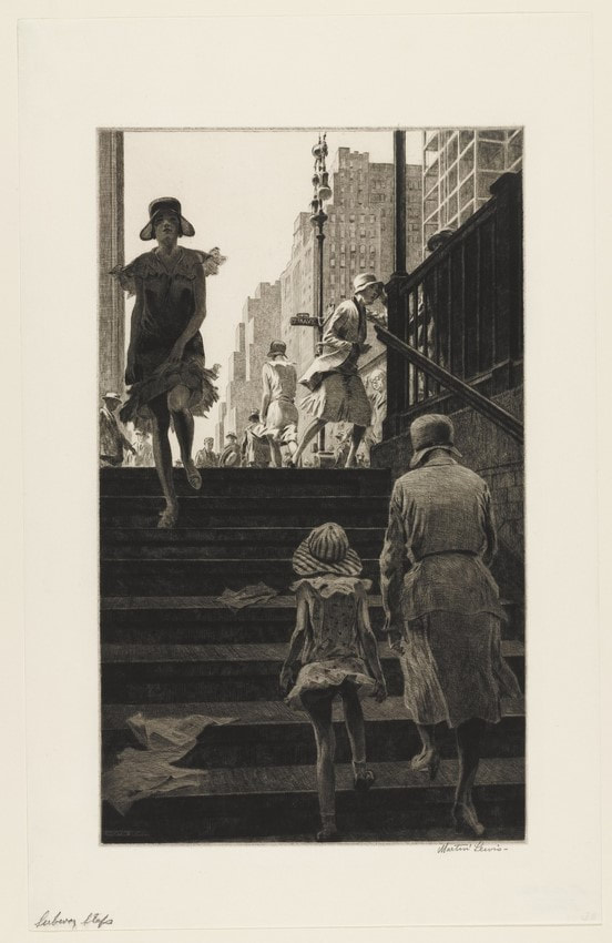
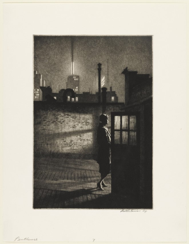
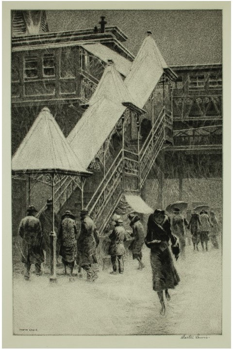
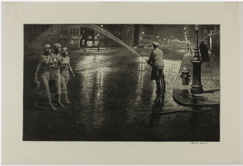
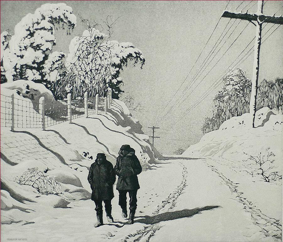
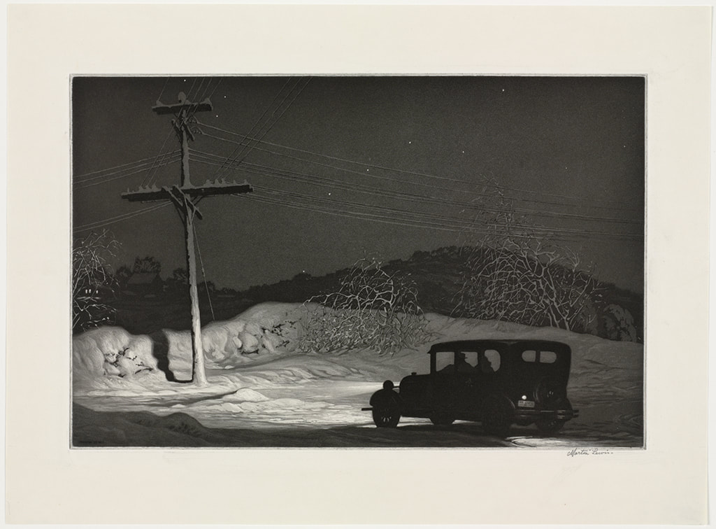
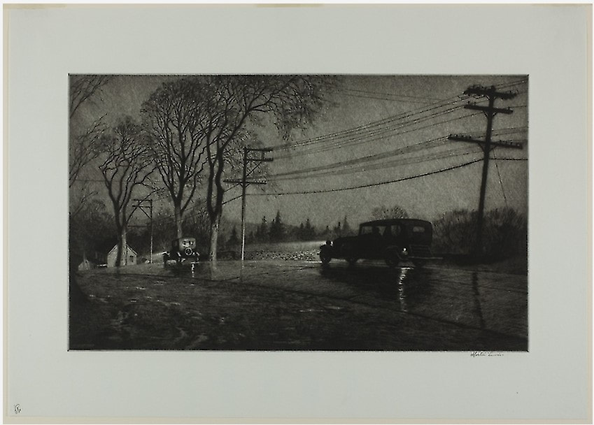
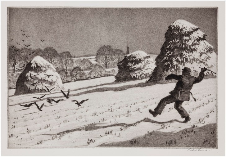
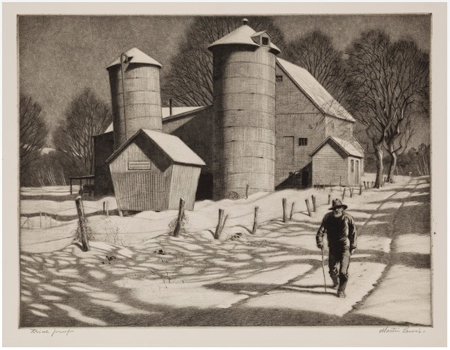
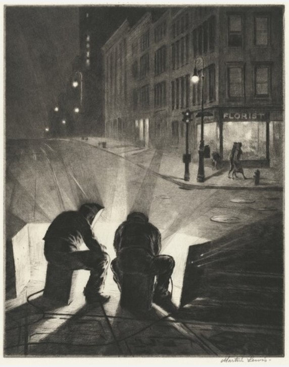
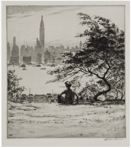
Ann Shafer As a curator and self-described print evangelist, I’ve always found printmaking is a tough sell to non-print people. It requires such a steep learning curve in knowledge, but once people are over the peak, usually they are in. At the museum, I spent a lot of time explaining techniques, like the differences between how etched and engraved lines appear. I didn’t mind repeating my spiel (hence the print-evangelist moniker), but the truth is, it just takes a lot of looking. Easy to do when you can box surf in the vault, not so easy if you only look at prints occasionally. To help our audience really learn how to feel confident looking at prints, I always thought we should offer a printmaking 101 course—but such a thing would be impossible given time and resources. In my mind the solution was to mount exhibitions featuring each technique’s greatest hits as well as works by unsung heroes. Since I have a serious soft spot for intaglio techniques (etching, engraving, softground, aquatint, etc), I would start the exhibition series there. (Perhaps starting with relief makes more sense historically, but hey, these are my fantasy shows.) Stars of the intaglio exhibition would be Rembrandt, Callot, Goya, Canaletto, Piranesi, Whistler, Meryon, Braquemond, Cassatt, Arms, Picasso, Kollwitz, Milton, and today’s subject, Félix-Hilaire Buhot, who made incredible etchings from 1873 to 1892. Buhot (pronounced in French as Boo-oh; in English sometimes as Boo-Ho) was born in Normandy and was, sadly, orphaned at age seven. Somehow, he made his way to Paris and made a living as a commercial artist. He began making prints in 1873, and only a year later was singled out by Philippe Burty, a prominent critic who admired Buhot’s belles épreuves (beautiful proofs). The etching revival of the 1860s was already underway when Burty put forward the idea of special proofs to denote rare, superbly inked impressions printed by the artist himself. Burty created a market for prints by promoting the idea of the limited edition (in which an artist sets a certain number of prints to be editioned, and no more), special proofs on colored papers, special stamps, and marginalia. Not coincidentally, central to the etching revival was the concept of the peintre-graveur (painter-etcher), as etching provided a means for a more autographic mark and an involvement with inking and printing, as opposed to the commercial lithography and reproductive engraving trades popular at the time. Buhot distinguished himself from other artists with his use of marges symphoniques (symphonic margins), also called marginalia or remarques. Margins outside of the main image area are filled with quirky doodles, sort of like notes in a sketchbook, which often offer a different take on the main subject. Buhot also experimented with inking and papers—some of my favorites include his use of an amazing blue ink. In fact, his experimentation meant that almost no etchings of the same image are like any of the other impressions. Hence the term painter-etcher. Buhot portrayed both ends of the daily life spectrum, from celebrations of national holidays in National Holiday on the Boulevard de Clichy, 1879, to the disastrous effects of winter later that same year in Winter in Paris. The beauty of the latter belies the action. In December 1879, Paris was in a deep freeze and suffering greatly. In his print, it takes us a minute to notice the dogs fighting over scraps in the foreground of the main image, as well as the frozen bodies of horses found along the left side. Buhot enjoyed popularity in his lifetime in France and in America. His prints were collected by two major American print collectors: Samuel P. Avery, whose collection is at the New York Public Library, and George A. Lucas, whose collection is at the Baltimore Museum of Art. In subsequent years, the National Gallery of Art has also assembled a substantial collection, including many drawings. I love Buhot’s compositions, use of aquatint, spontaneous-looking doodles in the margins, and painterly application of inks that enhance the portrayal of various weather effects. In the study room we would have called them scrumpy. No surprise, his prints were favorites with visiting students. I’m in. Are you? Ann Shafer One of the best parts about working with a large print collection is solander-box surfing. Once the print originally sought is found, the rest of the prints in the box are there to peruse. Many a wonderful discovery is made this way. Solander-box surfing at the National Gallery is how I first discovered Asa Cheffetz (I worked there in the 1990s). I tripped over his beautiful wood engraving, Reflections in Crystal, 1946, which was created as a publication for the Woodcut Society. In fact, it was still in its Woodcut Society folder when I came across it. The folder included extensive statements by John Taylor Arms, who wrote, “Cheffetz’s prints evince a happy union of technical skill with poetry and nobility of feeling,” and Cheffetz himself. I was fascinated by how the artist captured the reflections in crystal in black and white. Struck by its graphic quality and beauty, I looked to see what other examples of Cheffetz’s wood engravings were in the box. The Woodcut Society was one of a startling number of print-related publishers, associations, societies, and clubs formed in the 1930s. Their history is a whole other topic; for now, know the Woodcut Society published two of Cheffetz’s wood engravings. [The Woodcut Society is fascinating. Cori Sherman North describes it thusly: “Stemming from an interest in collecting hand-printed bookplates, in 1932 Kansas City grain merchant Alfred Fowler (1889–1959) established the Woodcut Society with the sole aim of increasing ‘interest in fine woodcuts as a medium of artistic expression.’ He planned to commission and publish two new woodcut prints each year, proposing a subscription-based organization limited to 200 members who, for $10 in dues per year, would receive the woodcuts mounted in a presentation folder printed by the Torch Press of Cedar Rapids. As the Woodcut Society was primarily geared toward print collectors, and ‘intended to be savored in the intimate setting of one’s private library,’ the folders each opened to the print facing a page essay by a noted print authority or penned by the artist.”] In addition to Reflections in Crystal, Cheffetz’s subjects range from bucolic New England landscapes of barns in snow and in the heat of summer to working fishing vessels tied to piers. He also created two favorite urban images, one of rooftops in snow and the other of laundry lines behind city tenements. The American scene was precious to him. He wrote: “I love this fertile land, and the simple way of life of its rugged people. I love the very temperament of the land in all its moods.” His wood engravings were always popular with students in the BMA’s study room. They are simple yet so effective and fine. As you scroll through the images, don’t miss the calendar from c. 1934. Twelve prints are mounted in a folder, which is hand notated by Cheffetz. When opened it always surprises students that they are all separate, tiny prints, and not twelve prints on one sheet. Each month is represented by a separate print, each of them is ¾ x 1 inch. Yes, you read that right, less than one inch square. The calendar always sets mouths agape. I always feel I should include some information on the artist, so here you go. Cheffetz was born in Buffalo, NY, and ended up living in Springfield, Massachusetts, for most of his adult life. He studied at the School of the Museum of Fine Arts Boston, and subsequently at the National Academy of Design in New York. Following serving in the Navy during World War I, he worked in what he called the “routine of business” (read, not art) until he could devote himself to art full time after 1927. New England’s landscapes continually featured in his work. He wrote: “The passion for the New England scene remains undiminished to this day. I have since continued to cut wood, and continue to be fascinated by the spell of my own countryside.” He is less well known than many, but I think he deserves a look. I love his sensibility, the graphic quality of his compositions, the delicacy of the cuts, the way he captured atmosphere and weather. Oh, and those reflections. See if you agree. Ann Shafer I’ve loved Martin Lewis’ etchings and drypoints of urban and rural scenes from the 1920s and 1930s since I tripped over an impression of Shadow Dance in a solander box at the museum. That print’s light, the shadows, the translucency of the dresses, and the composition are soooo good. And that’s a self-portrait—the man on the left is Lewis himself. His prints would feature prominently in my imagined exhibition City/Country. Maybe I’m drawn to Lewis’ work because of my time in New York as a young professional. I mean, I never walked to the Whitney in heels and a flapper dress with a cloche hat, but I did hoof it across town in a suit and white sneakers, work shoes tucked in my oversized purse. Of course, I was blasting some good eighties ballads on my Walkman—Paul Young, anyone? I was young and had recently discovered that I wanted nothing else than to be a curator. I was full of hope for my future and was thrilled to be living in the Big Apple. Living in New York, with its water towers, brownstones, skyscrapers, parks, yellow cabs, and subways made me appreciate the urbanism popularized by Alfred Stieglitz and his stable of early-twentieth-century artists. The Whitney’s permanent collection cemented my love for them. There were gorgeous paintings hanging on the third floor of the Whitney’s Breuer building including canvases by Georgia O’Keeffe, Joseph Stella, Charles Sheeler, and my two first loves, Charles Demuth and Edward Hopper. Demuth’s My Egypt and Hopper’s Early Sunday Morning were pilgrimage stops for me when I wandered the galleries before opening. Lewis may not be as well-known as other artists working in New York in the first half of the century, but his prints are worth a look. Plus, he is credited for introducing Hopper to printmaking—the two remained lifelong friends. Both these artists’ print prices are sky high now, and it always makes me laugh when these prints have original prices scrawled on them: $25 or even $15 (see Derricks at Night--$25 is marked at lower right). Wouldn’t it have been nice to reward the artists with today’s prices during their lifetimes? Lewis was born in 1881 in Victoria, Australia. As a youth, Lewis worked on cattle ranches in the Australian Outback, in logging and mining camps, and as a sailor. In 1898, he moved to Sydney and studied art for two years (his only formal training). It is unclear if he learned printmaking in Sydney, although we do know a local radical paper, The Bulletin, published two of his drawings. In 1900, Lewis arrived in San Francisco and made his way to New York shortly thereafter. Like many other artists, Lewis made his living as a commercial artist. He produced his first etching in 1915 and soon taught Hopper how to make them. In 1920, Lewis used his entire savings to travel to Japan to study and make art. After two years there, he returned New York and resumed his commercial art career, while also making his own paintings and prints. From 1944–1952 Lewis taught a graphics course at the Art Students League. Over thirty years, Lewis made some 145 drypoints and etchings. His prints, like Shadow Dance and Stoops in Snow, were admired during the 1930s for their realistic portrayal of daily life. (Remember there was still a divide between artists who worked in an “American style” versus European Modernism.) Call me a fan. I love Lewis’ compositions, the range of lights and darks, the transparencies, the “alone in a crowd”-ness of them. If only we could afford them. See what you think. Ann Shafer When I started working for Full Circle, I was curious to see what kinds of art was in its stable, and what I could do to bring any of it to light for you. One painting, which is hanging in Catalyst Contemporary’s “backroom” among other represented artists’ works, I just love. It’s by Damon Arhos and it’s a self-portrait. I’ve always been fascinated by self-portraits and why they are rife throughout art. Let’s look back for a minute before we get to Arhos’ painting. In Western art the first self-portrait is believed to be by Jan van Eyck in 1466. Why then; why him? Likely it has to do with the development of clear, useful mirrors. Until then, there was no way to see ourselves with any accuracy. Those first mirrors must have surprised and delighted. Consider, too, that historically there had been little distinction between individual artists and artisan-craftsmen of guilds, so no cause for taking one’s own likeness. Individualism was not a thing yet. When and who decided that an artist’s work was the product of immense and unusual talent worthy of a signature and individual notice? I’m sure there are other examples, but my printmaking mind goes directly to our old friend Albrecht Dürer (1471–1528) since he was a master of self-promotion and marketing. He drew his first self-portrait at age 13—but it is a drawing and its circulation was limited. Hell, he wasn’t even a professional artist at that age. But I’ve always been impressed that by 1500 (age 28) he had the kahunas to portray himself in the guise of Jesus Christ. I mean, honestly. Self-portraits were a way of promoting one’s talent, a calling card if you will. Plus, the model was accessible and cheap. But more than that, they are a means of introspection. Self-portraiture enables artists to look inside, figure out who and what they are, how they want to be seen. Many artists have made them, but how many have really dug in and investigated their own selves in a serial manner? Obviously for me, printmakers come to mind: Rembrandt, Käthe Kollwitz, Max Beckmann, Lovis Corinth, Jim Dine. It’s fascinating to think about what drives us to picture ourselves and to what end. I’d suggest artists use self-portraiture to reflect on what it means to be human, creative, alive. These days, are self-portraits still relevant, especially in this era of selfies, or do they seem old fashioned? What if the self-portrait was only one element in a work that explores more than the physical features of a face? The painting hanging in the backroom at Catalyst Contemporary, which I mentioned at the top of this post, is by Damon Arhos who unfolds queer culture and seeks to promote love and acceptance while investigating social and political issues of gender and sexuality across media. He uses pop culture references fused with the personal to make his work approachable to viewers, and also to be true to himself. In Agnes Moorehead & Me (No. 1/Figure Portrait), 2019, Arhos digitally combined his own face with that of actor Agnes Moorehead as the basis for the painting. The two are merged in a stylistic way with an acidy palette—I love that mustard color. It's one of a series of Moorehead paintings. But why Moorehead? She was an accomplished actor who is now best known as Endora, the mother of the main character in the 1960s television series Bewitched. Endora and her brother Uncle Arthur, played with zeal by gay actor Paul Lynde, became lightning rods for the gay community in subsequent decades due to the characters themselves, but also because of assumptions made about the actors’ personal lives. For Arhos, who would have watched Bewitched in reruns, Uncle Arthur was the first positive, if coded, gay character to come across the television screen. And Endora was full-on glamour and fabulousness. What better character to use to explore one’s identity and challenge gender normativity? In Arhos’ hands, the merged image of two faces is reductive and colorful, playful and serious, objective and subjective. He’s used the idea of a self-portrait but turned it into something that is not recognizable as such. Rather, it becomes a symbol for absorbing different identities into oneself in order to expand the possibility of a more open concept of self, one without boundaries or constraints, norms or rules. It speaks of openness, love, inclusion, everyone’s uniqueness, as well as wishes and hopes for a day when one can be whoever one wants to be. In other words, it’s a masterwork. Damon Arhos (American, born 1967) Agnes Moorehead & Me (No. 1/Figure Portrait), 2019 Acrylic on hardboard panel 40 × 30 × 2 in (101.6 × 76.2 × 5.1 cm) Catalyst Contemporary, Baltimore Jan van Eyck (Netherlandish, c. 1390–1441) Portrait of a Man (Self Portrait?), 1433 Oil on oak 26 x 19 cm (10 ¼ x 7 ½ in) National Gallery, London Albrecht Dürer (German, 1471–1528) Self-Portrait, 1484 Silverpoint 27.5 x 19.6 cm (10 5/8 x 7 5/8 in) Albertina, Vienna Albrecht Dürer (German, 1471–1528) Self-Portrait, 1500 Oil on panel 67.1 cm × 48.9 cm (26.4 in × 19.3 in) Alte Pinakothek, Munich Rembrandt van Rijn (Netherlandish, 1606–1669) Self-Portrait with Saskia, 1636 Etching Plate: 10.5 x 9.4 cm (4 1/8 x 3 11/16 in) Museum Boijmans van Beuningen, Rotterdam Max Beckmann (German, 1884–1950) Self-Portrait, 1914 Drypoint Plate: 239 × 179 mm (9 3/8 x 7 1/16 in) Art Institute of Chicago: H. Simons Fund, 1948.21 Lovis Corinth (German, 1858–1925) Death and the Artist (Tod und Künstler), from the series Dance of Death (Totentanz) 1921, published 1922 Etching, soft-ground etching, and drypoint Plate: 23.9 x 17.9 cm (9 7/16 x 7 1/16 in) Block Museum, Northwestern University, Evanston: Gift of James and Pamela Elesh, 1999.21.13 Käthe Kollwitz (German, 1867–1945) Self-Portrait, 1934 Crayon lithograph Image: 20.5 x 18.5 cm (8 1/16 x 7 3/8 in) National Gallery of Canada, Ottawa Jim Dine (American, born 1935) Berlin 1, 2013 Lithograph 140.4 x 99.2 cm (55 ¼ x 39 in) Albertina, Vienna: Gift of the Artist and Diana Michener, DG2015/68  Damon Arhos (American, born 1967). Agnes Moorehead & Me (No. 1/Figure Portrait), 2019. Acrylic on hardboard panel. 40 × 30 × 2 in (101.6 × 76.2 × 5.1 cm). Catalyst Contemporary, Baltimore. 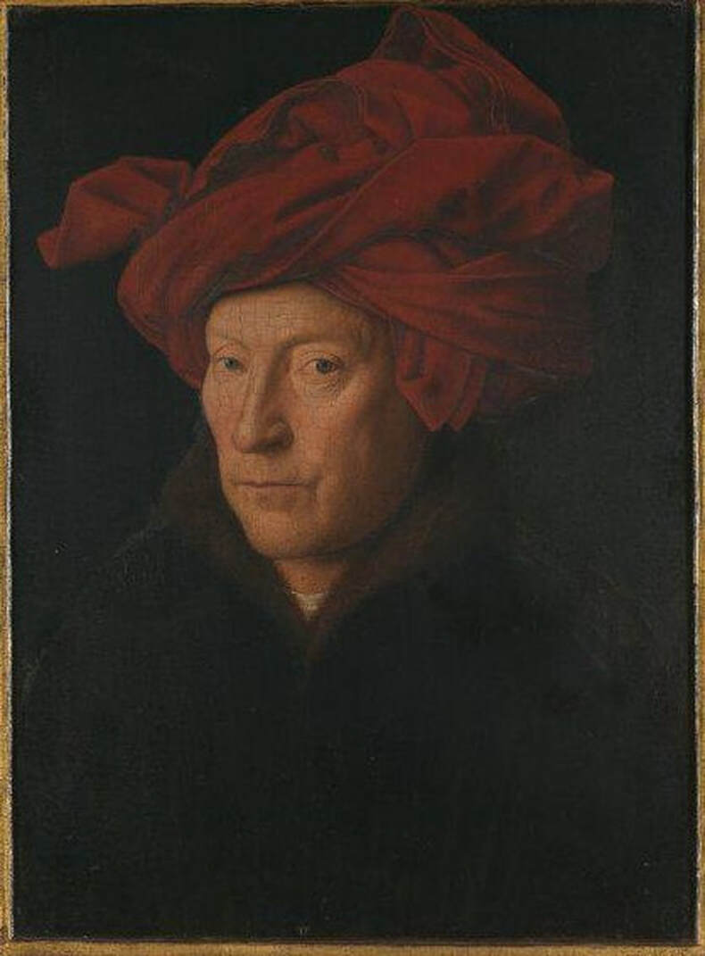 Jan van Eyck (Netherlandish, c. 1390–1441). Portrait of a Man (Self Portrait?), 1433. Oil on oak. 26 x 19 cm (10 ¼ x 7 ½ in). National Gallery, London. 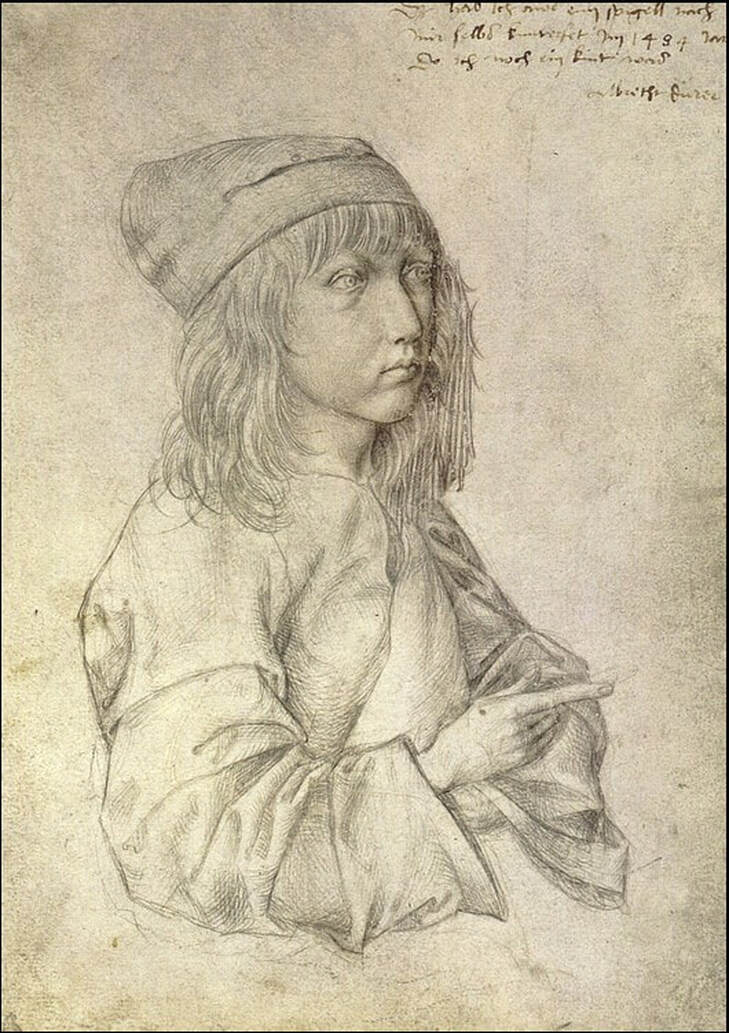 Albrecht Dürer (German, 1471–1528). Self-Portrait, 1484. Silverpoint. 27.5 x 19.6 cm (10 5/8 x 7 5/8 in). Albertina, Vienna. 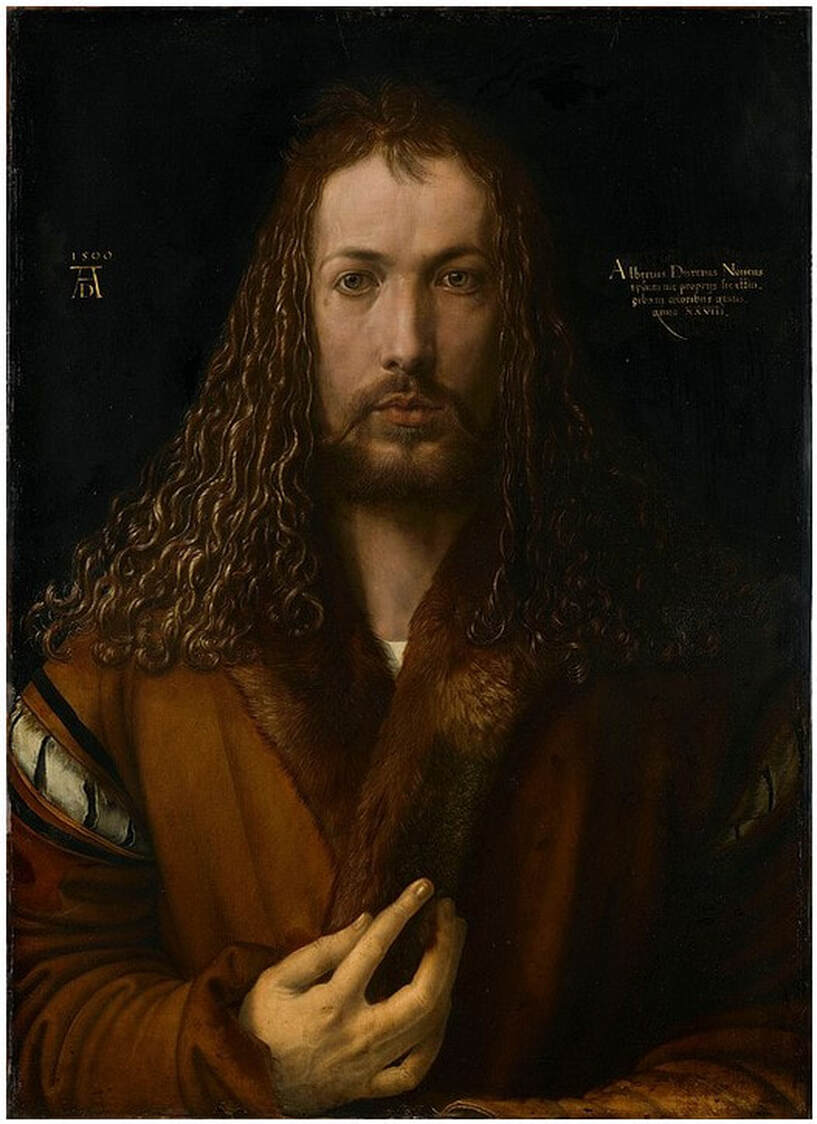 Albrecht Dürer (German, 1471–1528). Self-Portrait, 1500. Oil on panel. 67.1 cm × 48.9 cm (26.4 in × 19.3 in). Alte Pinakothek, Munich. 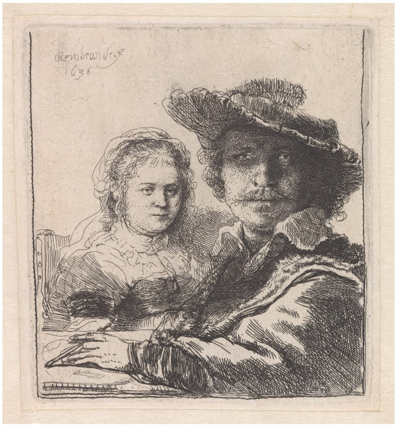 Rembrandt van Rijn. Netherlandish, 1606–1669). Self-Portrait with Saskia, 1636 Etching. Plate: 10.5 x 9.4 cm (4 1/8 x 3 11/16 in). Museum Boijmans van Beuningen, Rotterdam. 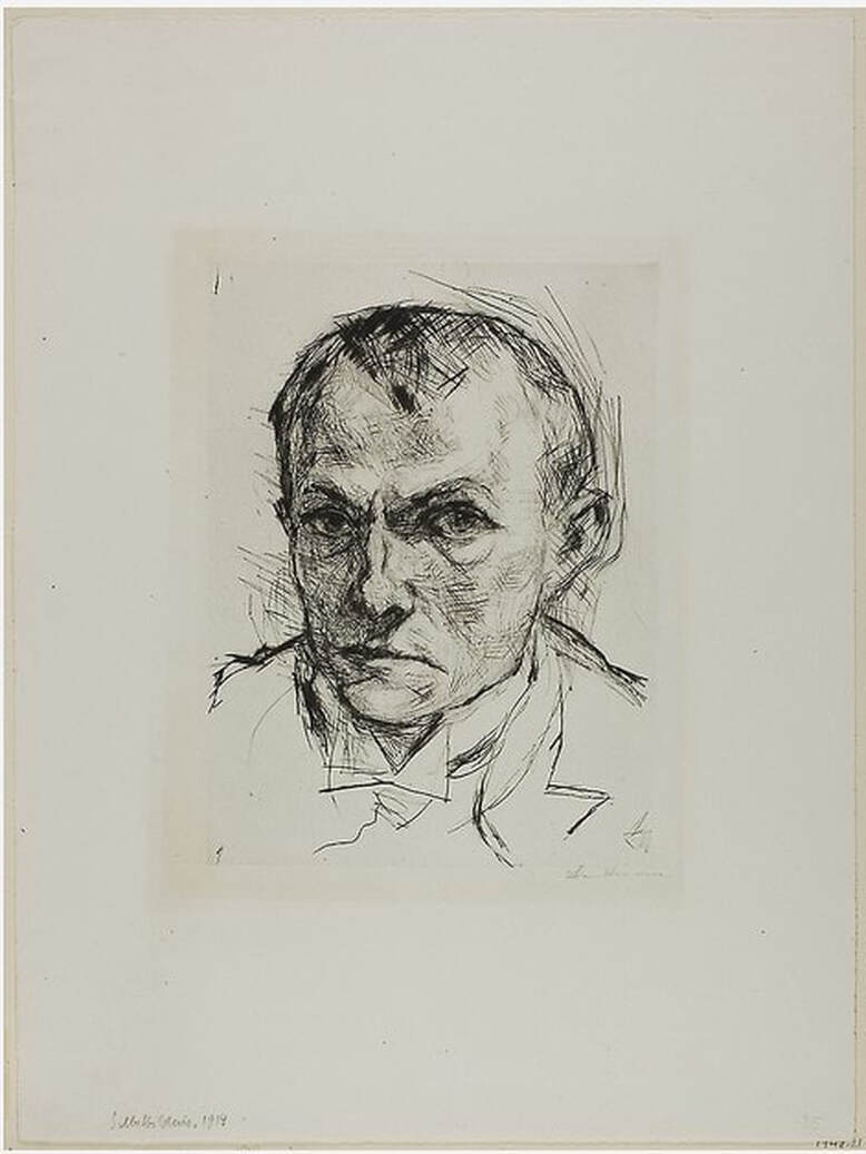 Max Beckmann (German, 1884–1950). Self-Portrait, 1914 . Drypoint. Plate: 239 × 179 mm (9 3/8 x 7 1/16 in). Art Institute of Chicago: H. Simons Fund, 1948.21. 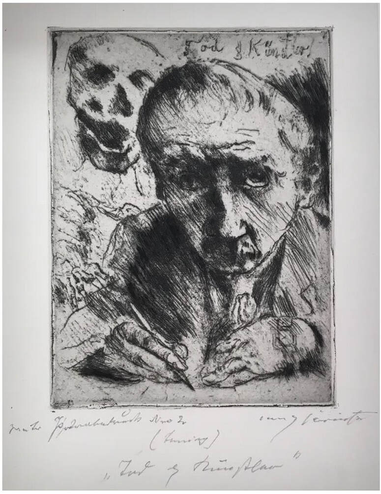 Lovis Corinth (German, 1858–1925). Death and the Artist (Tod und Künstler), from the series Dance of Death (Totentanz) 1921, published 1922. Etching, soft-ground etching, and drypoint. Plate: 23.9 x 17.9 cm (9 7/16 x 7 1/16 in). Block Museum, Northwestern University, Evanston: Gift of James and Pamela Elesh, 1999.21.13. 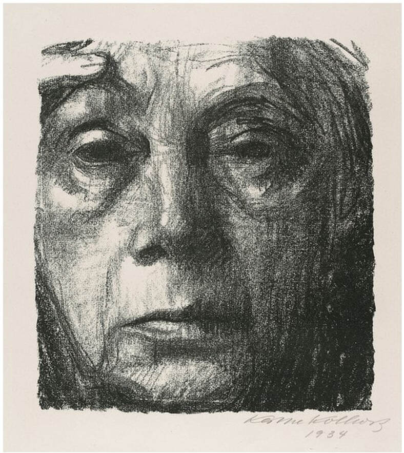 Käthe Kollwitz (German, 1867–1945). Self-Portrait, 1934. Crayon lithograph. Image: 20.5 x 18.5 cm (8 1/16 x 7 3/8 in). National Gallery of Canada, Ottawa.  Jim Dine (American, born 1935). Berlin 1, 2013. Lithograph. 140.4 x 99.2 cm (55 ¼ x 39 in). Albertina, Vienna: Gift of the Artist and Diana Michener, DG2015/68. Ann Shafer Sometimes an artist you really want to hang on the museum’s walls is only represented in the collection by minor works (in both visual impact and size). Don’t get me wrong, I love a small work—I had a running list of tiny prints that I thought would make a great show—but when it comes to contemporary works on paper, they need to be able to “hold the wall” because of the size of the galleries and the scale of the non-paper works they may hang near. My wish list included several artists in this category, most notably John Baldessari, Kara Walker, William Kentridge, and Kerry James Marshall. The museum’s collection has works on paper by these artists, but few with substantial wall power. I chased Baldessari’s print, Roller Coaster, 1989, three times. The first time I saw it on the wall at the IFPDA Print Fair in the booth of the work’s publisher, Brooke Alexander. On opening night, the work was already on hold for a collector. The second time, it came up at auction. I got permission to bid on it and lost out to another bidder. The third time was at the print fair again, and again, I was too late. Baldessari is a tough nut to crack. Irreverent is the best word I can think of to describe his work. But there is just something about Roller Coaster: the shaped print, the way the arc of the roller coaster moves from one end of the sheet to the other, the wall power, its size. It is so easy to like. I also chased William Kentridge’s powerful Casspirs Full of Love, ironically also from 1989, multiple times. Two different dealers offered it to us multiple times over the years, but the price was just high enough to be out of reach. If only I could have said yes. Whereas the Baldessari is clever and fun, the Kentridge is shocking. Severed heads appear to be stacked in a cabinet of some sort. MoMA’s web site helps us parse it out: “The title of this work refers to a message sent from mothers to sons on a popular radio program for South African troops: ‘this message comes from your mother, with Casspirs full of love.’ Casspirs are armored military vehicles; their name is an anagram for CSIR (Council for Scientific and Industrial Research) and SAP (South African Police), the organization that developed them. These vehicles, designed for international military operations, were deployed against black township communities in South Africa during states of emergency imposed by the apartheid government.” I think you can agree that both have wall power for different reasons. I could think of an exhibition with each as its centerpiece. Obviously not the same show. Well, unless one was looking at the year 1989. John Baldessari (American, 1931–2020) Rollercoaster, 1989 Aquatint, photogravure printed in black, green, and red Sheet: 39 × 67 1/2 in. (99 × 171.5 cm.) Published by Brooke Alexander William Kentridge (South African, born 1955) Casspirs Full of Love, 1989 Drypoint and engraving with roulette Sheet: 65 3/8 x 38.7/16 in. (166 x 97.6 cm.) Plate: 58 9/16 x 32 in. (148.8 x 318 cm.) Published by the artist and David Krut 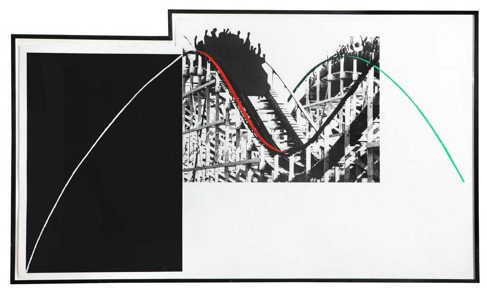 John Baldessari (American, 1931–2020). Rollercoaster, 1989. Aquatint, photogravure printed in black, green, and red. Sheet: 39 × 67 1/2 in. (99 × 171.5 cm.). Published by Brooke Alexander. 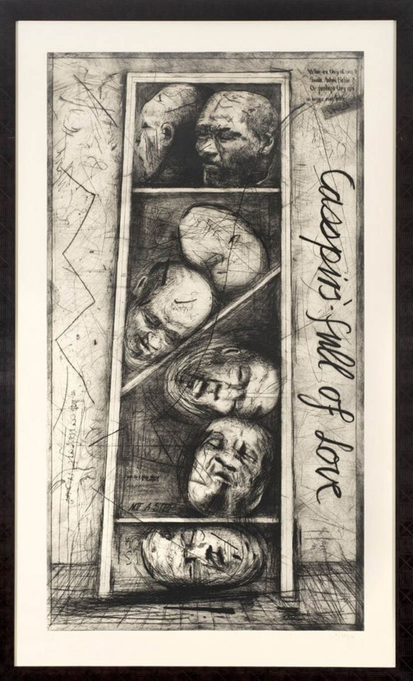 William Kentridge (South African, born 1955). Casspirs Full of Love, 1989. Drypoint and engraving with roulette. Sheet: 65 3/8 x 38.7/16 in. (166 x 97.6 cm.); plate: 58 9/16 x 32 in. (148.8 x 318 cm.). Published by the artist and David Krut. |
Ann's art blogA small corner of the interwebs to share thoughts on objects I acquired for the Baltimore Museum of Art's collection, research I've done on Stanley William Hayter and Atelier 17, experiments in intaglio printmaking, and the Baltimore Contemporary Print Fair. Archives
February 2023
Categories
All
|


 RSS Feed