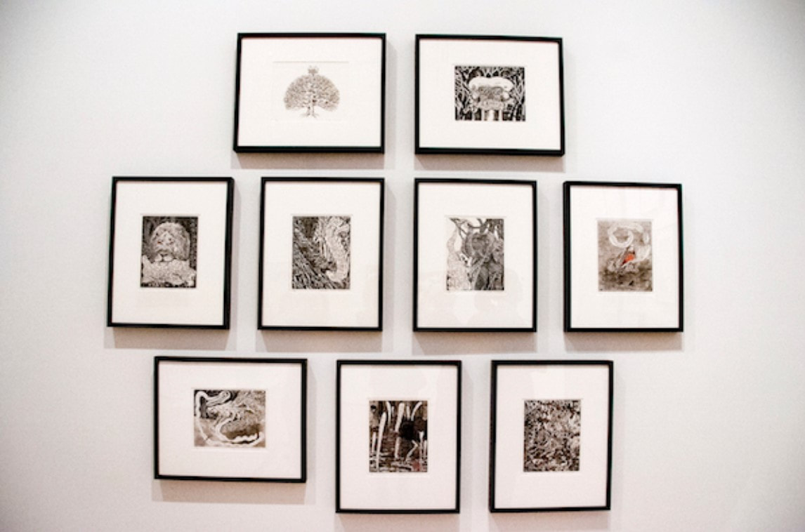
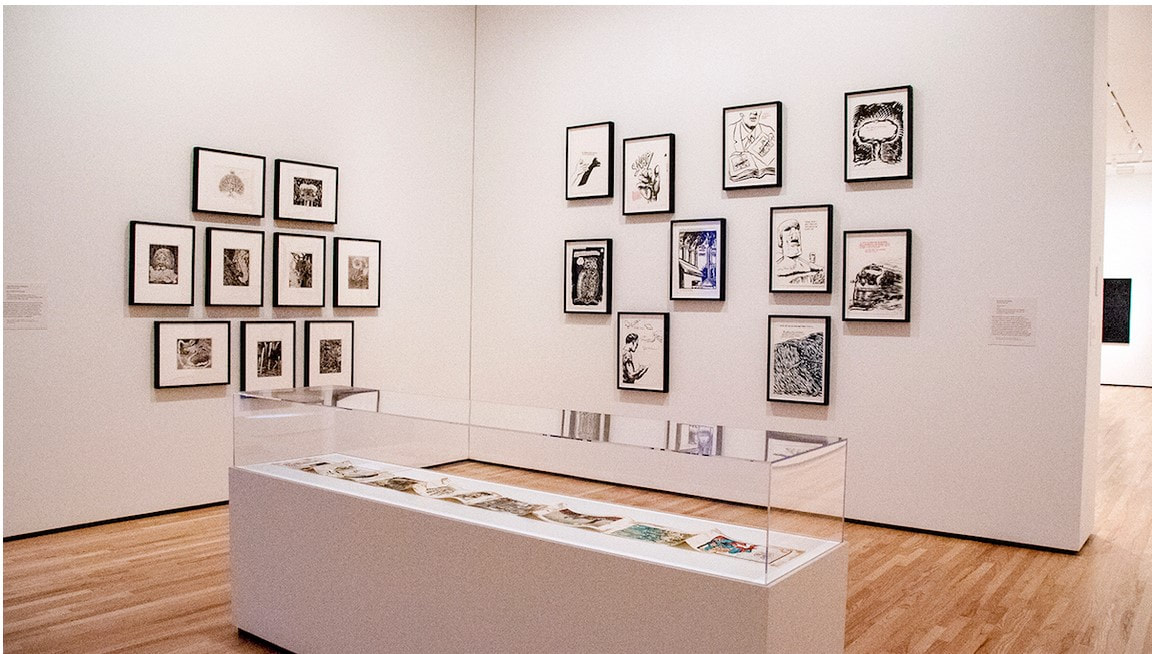
Ann Shafer One of the exhibitions I curated for the BMA, Alternate Realities, was a true highlight for me. This was back in the fall of 2014 when the prints, drawings, and photographs department had a small gallery in the contemporary wing for rotating exhibitions drawn from the permanent collection. It was a single room and just big enough to mount a small but meaningful show on a single topic. In this case, I was able to include nine works of art: two were multi-part portfolios, one was an artist’s book in a case, and the rest were prints framed on the wall.
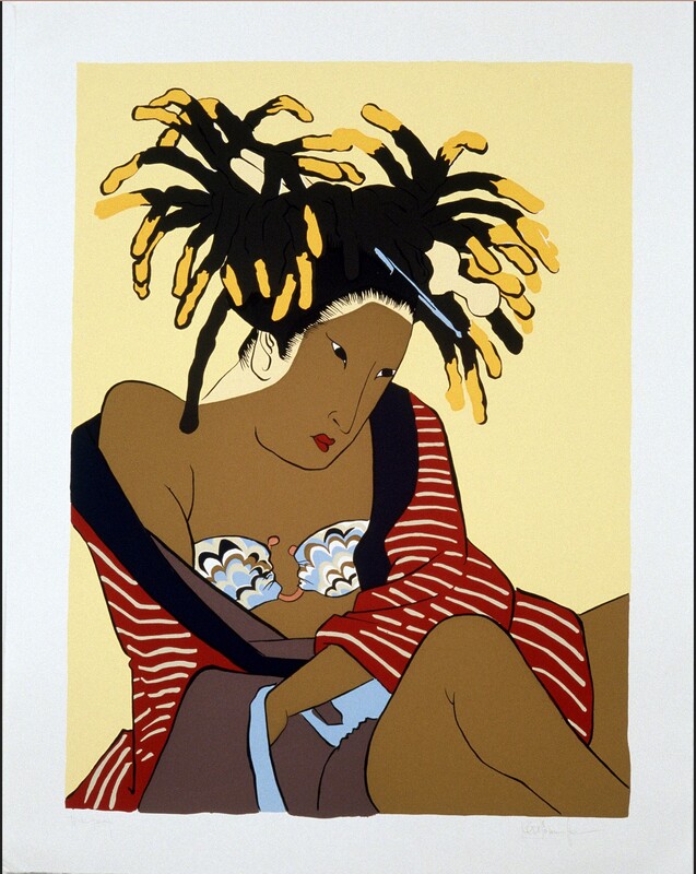
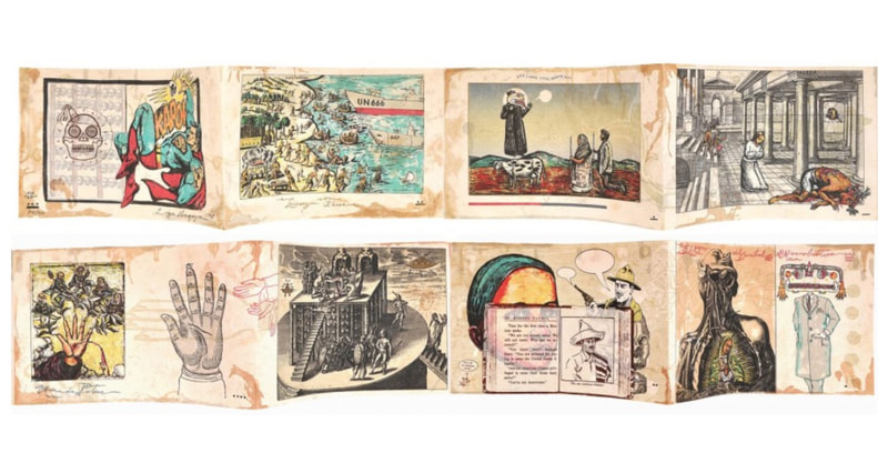
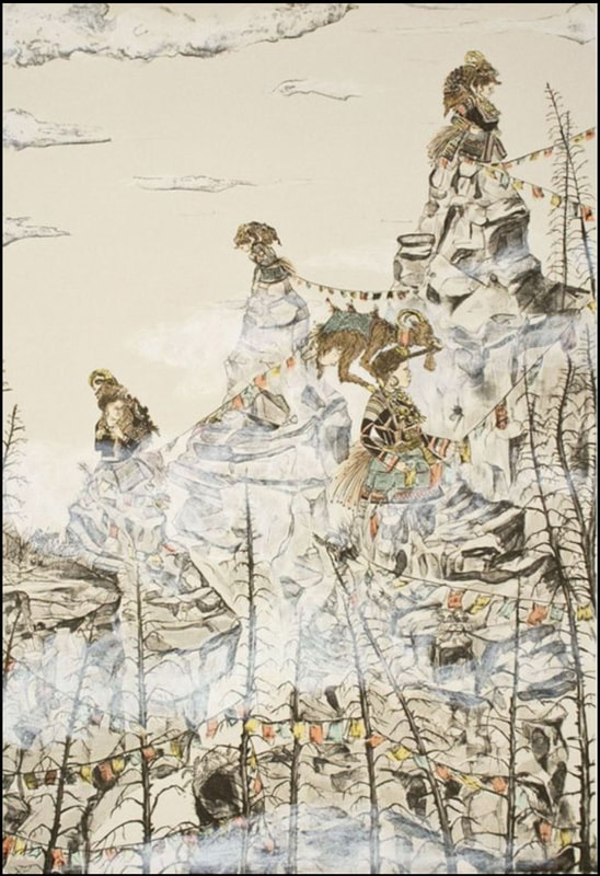
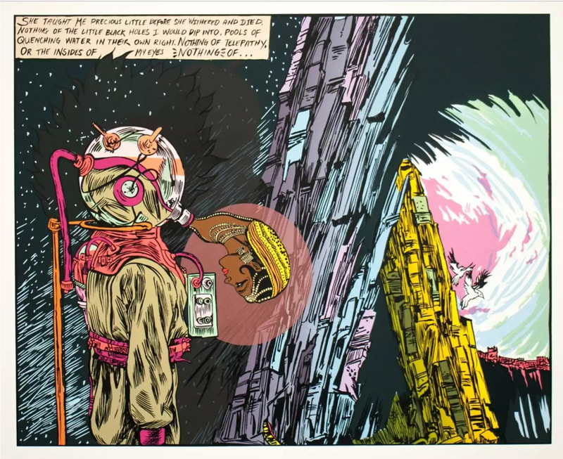
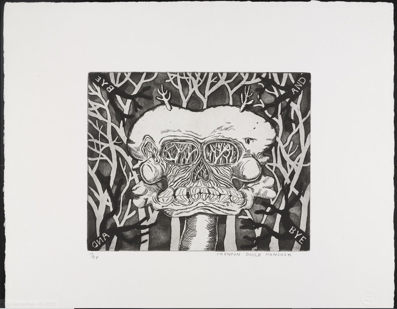
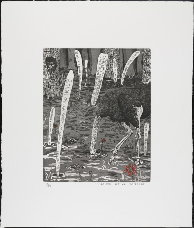
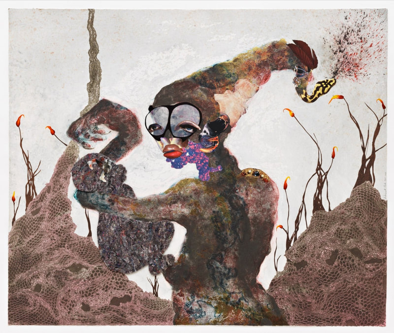
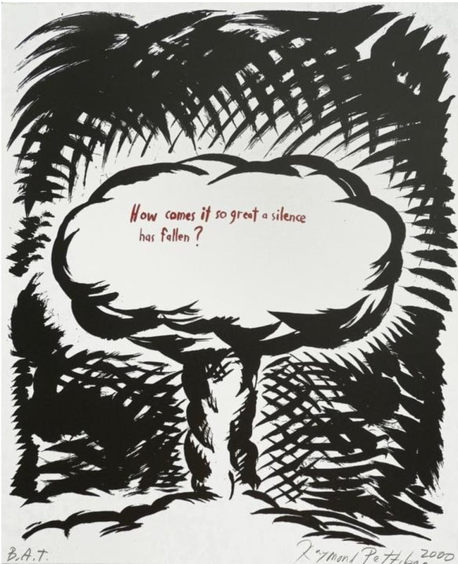
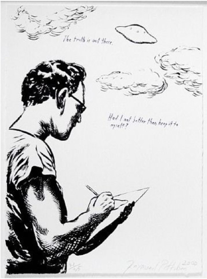
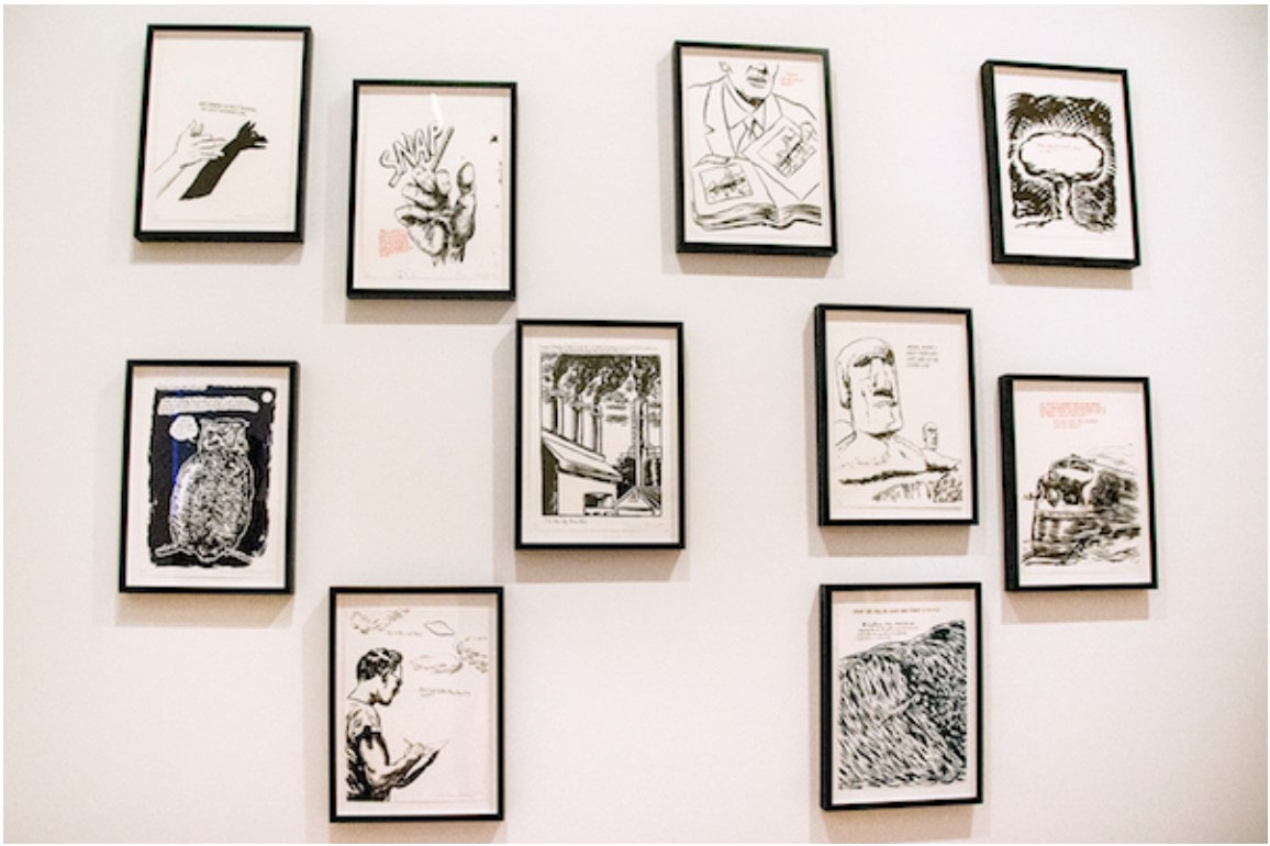
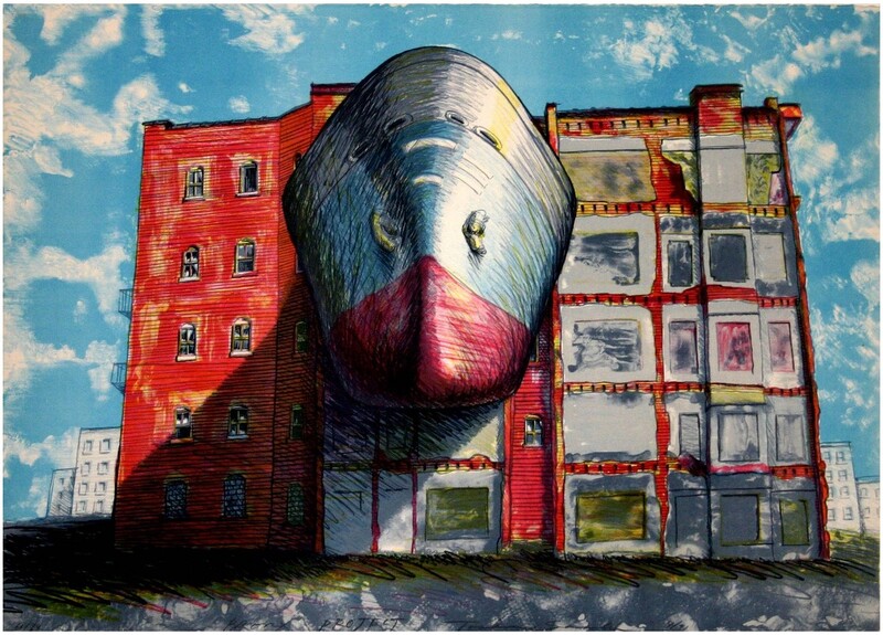
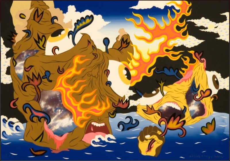
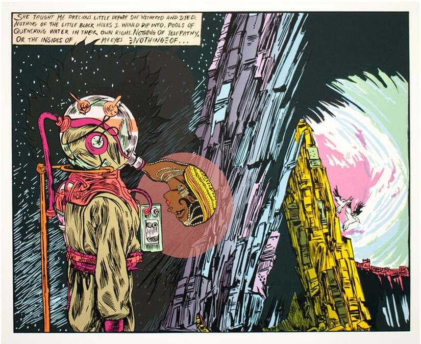
Alternate Realities included prints by iona rozeal brown, Amy Cutler, Chitra Ganesh, Wangechi Mutu, Toshio Sasaki, William Villalongo; portfolios by Trenton Doyle Hancock and Raymond Pettibon; and a book by Enrique Chagoya. The through-line of these works is that they are set in fictional (alternate) worlds and are extracted from personal narratives. The portrayed worlds are all quite different from each other, but within them these artists playfully exaggerate and reimagine the visual language of popular culture—religious stories, myths, and folk and fairy tales—as they consider larger societal issues. Through modes of picture making such as comics, street art, graffiti, and use of found images, these sometimes-humorous images rise above specific places and time to investigate issues of the human condition, cultural appropriation, gender roles, race issues, political protests, and other global issues. Most of the works were new to the collection at that point, meaning they came into the collection through purchases I made or through gifts I shepherded. I began seeking out these kinds of prints in response to requests I was getting from MICA students in the study room. They would come to see me with an assignment for their classes, which often consisted of studying one specific object for an extended period, drawing it, and then writing about it. After multiple requests to see something that reflected their interests in graffiti, zine culture, or comics, I realized we just didn’t have much to offer. The germ of an idea started with three objects already in the collection: Bye and Bye (9 sad etchings), 2002, by Trenton Doyle Hancock, Plots on Loan I, 2000, by Raymond Pettibon, and El Regreso del Caníbal Macrobiótico, 1998, by Enrique Chagoya. Slowly, over several years, I was able to acquire the remaining objects. Well, truth be told, the iona rozeal brown print was brought in by my colleague Rena Hoisington. The show came together is a magical way. I knew I wanted to be able to offer a show that would inspire those students who had asked if the museum had this kind of work. But the unanticipated consequence was that in pulling the works together, they ended up being by a rather organically diverse group of artists. By organic I mean I don’t think I could have planned it and succeeded. The other remarkable thing was the speed with which I was able to bring the show from idea to finished product on the wall. It’s super unusual to get new acquisitions out on view with any speed. Museums move like molasses in winter. Feedback on the show was very positive from the MICA students. I think they felt they were being heard, for once. And I was happy to oblige them. For all the times I emphasized how important it is to know who came before you—as Tru would say, upon whose shoulders you stand—I think it legitimized this mode of image-making for all those young artists. And for that I am truly pleased. Here is the label copy (with a few edits) that appeared on the walls of the exhibition. iona rozeal brown (American, born 1966) Untitled (Female), 2003 Published by Mueller Studios, New York Color screenprint BMA 2014.7 iona rozeal brown’s Untitled (Female) is a portrait of a geisha, a popular type of image found in woodblock prints from nineteenth-century Japan (see below); however, something is definitely different here. First, we notice the extra-large scale and brighter color palette of the twenty-first-century print. Even stranger is the dark brown tonality of the geisha’s skin, her peroxide-tipped dreadlocks, and her trendy Missoni-designed bikini top. This contemporary figure represents a sub-culture of Japanese teenagers known as Ganguro (which translates to “blackface”), who emulate African-American hip- hop style through dress, hair, and darkened skin. This sampling and remixing of cultural markers is in line with the artist’s own side-line as a hip-hop DJ. Enrique Chagoya (American, born Mexico, 1953) El Regreso del Caníbal Macrobiótico (The Return of the Macrobiotic Cannibal), 1998 Published by Shark’s Ink., Lyons, Colorado BMA 1999.113 Enrique Chagoya’s work addresses the complexity of cross-cultural identity and calls attention to the power relationships that exist when one culture is overcome or vanquished by another. This volume takes the form of a codex, a book form drawn from ancient Central American cultures. (Few examples of these Mayan and Aztec books remain since most were destroyed by Spanish conquistadors.) In The Return of the Macrobiotic Cannibal, Chagoya questions the structure of power and muses about how things would be different if the tables had been turned—that is, if Mesoamerica had been the dominant culture and had “cannibalized” the European culture and used it for its own purposes. Utilizing symbols pulled from ancient Mexican iconography, American popular culture, Christianity, and art history, Chagoya lets the conquered recast history on their own terms, serving up a smorgasbord of serious cultural critique heavily laced with satire. Amy Cutler (American, born 1974) Widow’s Peak, 2011 Published by Tamarind Lithography Workshop, Albuquerque, New Mexico Color lithograph BMA 2014.30 Mixing absurdity with whimsy, Amy Cutler creates surreal scenes that turn ideas about traditional women’s work on their head. In Widow’s Peak, women in old-world costumes have become the mountain peaks all while bearing goats on their backs. The goats attempt to direct the women forward by pulling on their braids. The setting, strung with prayer flags, is both dreamlike and inviting, and despite their burden, the women carry on with self-reliance and strength. Without an obvious narrative, Cutler leaves the significance of her image intentionally open-ended. However, the artist is known to be deeply concerned about the repression and oppression of women, which neglects that they are foundational. Chitra Ganesh (American, born 1975) Away from the Watcher, 2014 From the series Architects of the Future Published by Durham Press, Durham, Pennsylvania Color screenprint and woodcut BMA 2014.29 Born and raised in Brooklyn, New York, Chitra Ganesh is known for creating mysterious narratives inspired by comics and science fiction from both Western and Eastern traditions. By combining compositional elements, color, and text, she creates an otherworldly moment plucked out of an enigmatic narrative. This image raises many questions: Is somebody inside the scuba/space suit? Why does it appear to be propped up? Is the Indian goddess being expelled or inhaled? Are we are underwater or in outer space? What do the small-winged creatures signify? What calamity has befallen the city at right? The somber melancholy of the text seems at odds with the dynamic depiction of the planet’s fissures, as well as the brilliant color and energetic comic-book style representation. These alternate moods and narratives clash and connect in a newly constructed vision of the future. Trenton Doyle Hancock (American, born 1974) Bye and Bye (9 Sad Etchings), 2002 Co-published by Dunn & Brown Contemporary, Dallas, Texas, and James Cohan Gallery, New York Portfolio of nine etchings printed in black and red BMA 2003.35.1-9 Trenton Doyle Hancock is well known for envisioning and recounting an epic-sized saga of arch enemies, the peace-loving Mounds and evil Vegans. Over his career, Hancock has presented chapters of this twisted tale of good and evil in painting, sculpture, performance, drawing, and printmaking in a style melding comics, cartoons, and psychedelia. In Bye and Bye (9 Sad Etchings), the great and wise Mound Number One has died, and a lion, squirrel, elephant, shark, alligator, and ostrich have gathered to eulogize him. Wangechi Mutu (Kenyan, born 1972) Second Born, 2013 Published by Pace Editions, Inc., New York 24 kt gold, collagraph, relief, digital printing, collage, and hand coloring BMA 2014.8 Wangechi Mutu has lived and worked in Brooklyn, New York, since the 1990s. By combining hand drawing with collage elements, she creates powerful and deeply unsettling female figures that directly challenge ideas about contemporary consumption of the female African body. Set in a fantasy world that looks equal parts scorched earth, outer space, and aquarium, this oddly alluring mother and child dominate a landscape of fire-tipped weeds. Holding her child in the crook of her elbow, the mother twists her hand, which resembles a claw, over the child’s head. A snake seems to emerge from her hair, spitting sparks of fire or dirt. As we take in the strangeness of this figure, she seems to turn back and look at us, challenging us to enter her at once dreamlike and nightmarish realm. Raymond Pettibon (American, born 1957) Plots on Loan I, 2000 Co-published by Brooke Alexander, New York, and David Zwirner Gallery, New York Portfolio of ten color brush and tusche lithographs BMA 2000.56.1-10 Raymond Pettibon’s lithographs combine the satirical bent of political cartoons and the DIY aesthetic of zines, album covers, and underground comics. Pettibon marries each drawing with a brief text—often a fragment of a quotation taken out of context from nineteenth-century writers, such as Robert Louis Stevenson and Henry James. (Some texts are drawn from the writers’ personal letters, rather than from works of published literature.) Since the authors never intended their words to be associated with Pettibon’s images, the viewer is challenged to consider how word and image might be related, or what Pettibon might have had in mind when he put them together. Toshio Sasaki (Japanese, 1946–2007) Bronx Project, 1991 Published by Brandywine Workshop, Philadelphia, Pennsylvania Color offset lithograph Promised Gift of Darnell Burfoot Toshio Sasaki was a Japanese architect, who split his time between New York and his homeland. He is best known for his design submission for the World Trade Center memorial. (The project was ultimately awarded to another architect.) Here, the print shows the prow of a ship either attached to or breaking through the outer wall of a tenement in the Bronx. Perhaps it is a comment on the way domestic and industrial interests vie for space in one of the country’s most crowded cities. The print’s cartoon quality adds a touch of humor to a serious societal issue, enabling viewers to either engage with the growing problem or at least become aware of its existence. William Villalongo (American, born 1975) Through the Fire to the Limit, 2006 Published by Lower East Side Printshop, New York Color screenprint and archival inkjet print with collage elements BMA 2014.34 Brooklyn-based artist William Villalongo uses a cartoon and graffiti aesthetic to render Hurricane Katrina as a raging monster with teeth, tongue, and four enormous eyeballs. Even as black clouds move away and the brilliant blue sky appears, bright orange flames and a hand floating in the water tell of immeasurable damage to life and property. One wonders whether Villalongo’s Saturday-morning-cartoon style makes the disturbing image easier to digest, or if the tension between subject and technique heightens the viewer’s feelings of alarm and dread.
0 Comments
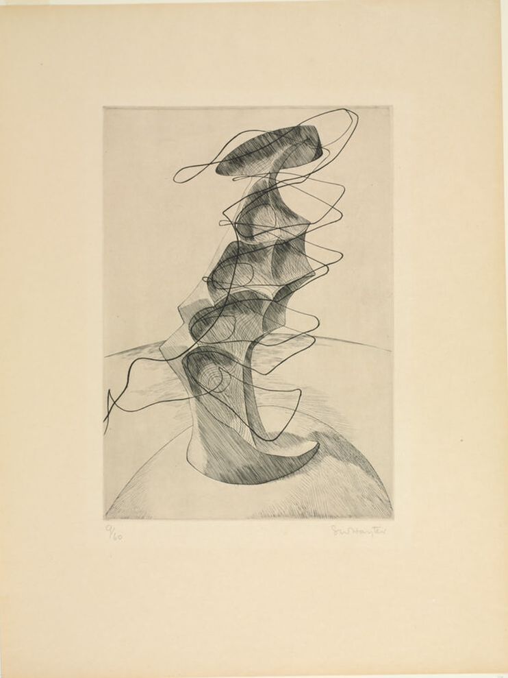
Ann ShaferOur man Hayter was the spiritual epicenter of Atelier 17, which was an important hub for collaboration and experimentation in printmaking. It was his goal that artists would work together toward new discoveries. He downplayed his role as teacher and mentor, although it is clear the workshop’s success owed a tremendous amount to his personal charisma.
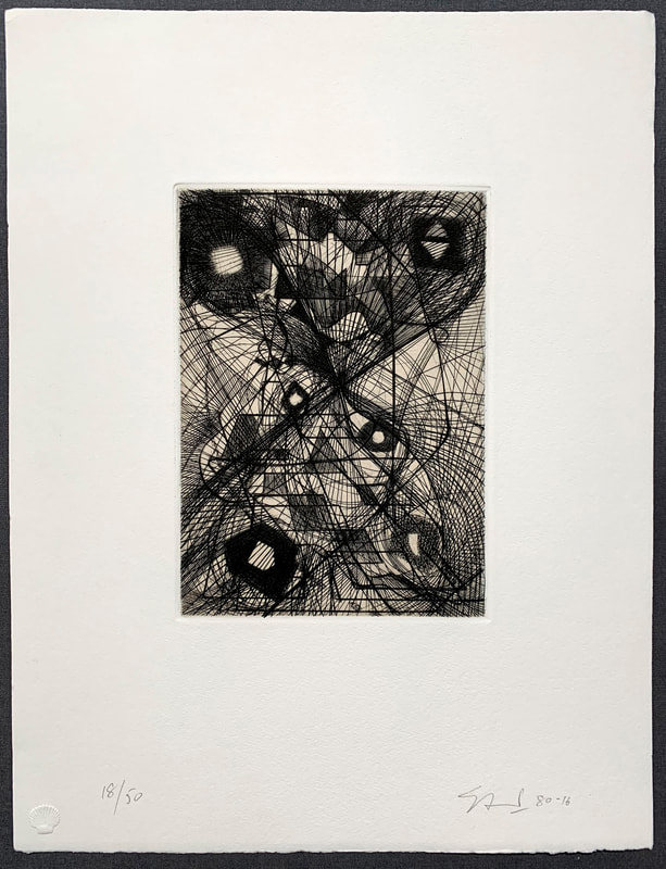
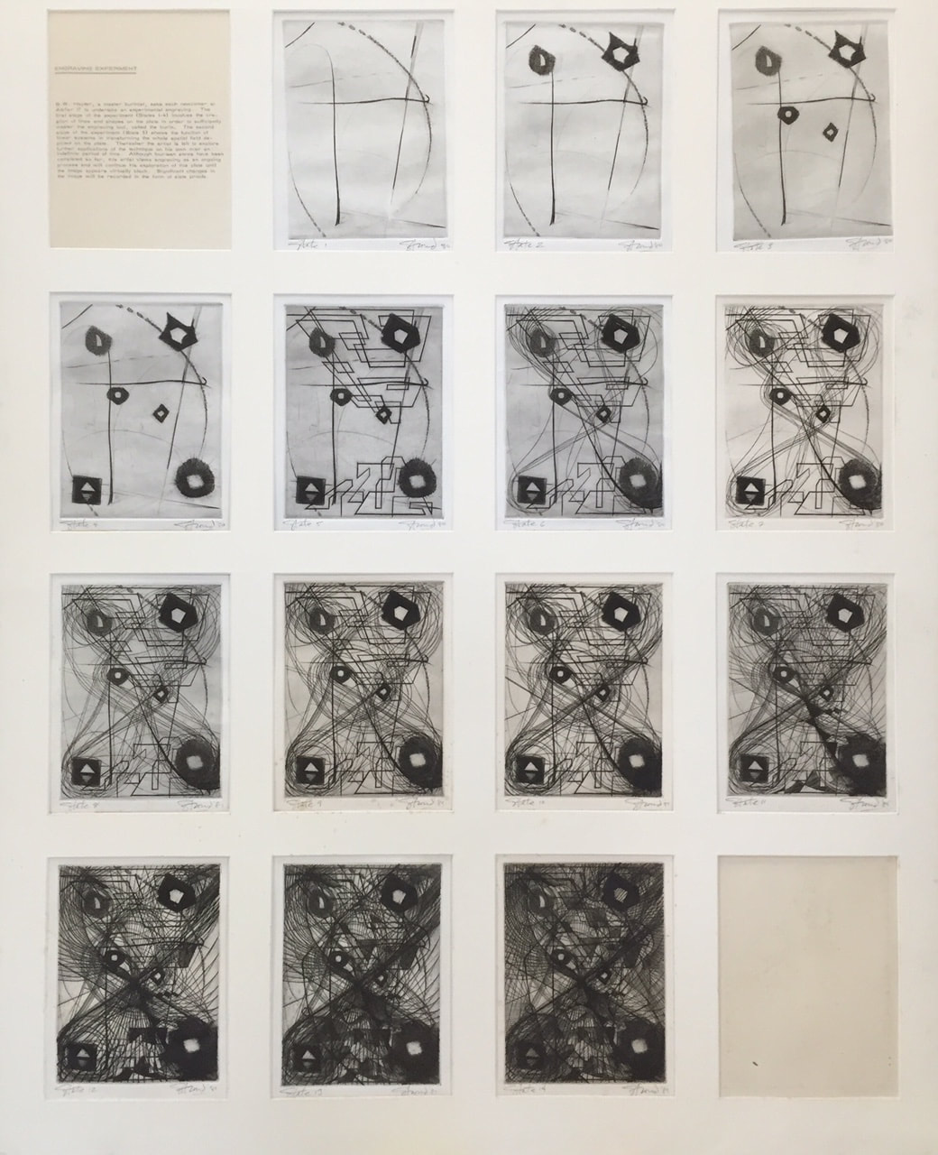
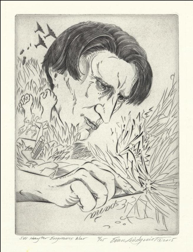
When a new artist arrived at the studio Hayter would put them through their paces before allowing them free access to the equipment. One of the first things was to accomplish a plate of burin studies. Given a copper plate, the nouveau was instructed to make marks without regard to a planned image. This was a chance to become familiar with the technique and process. Hayter encouraged students to free their minds of preconceived imagery and just let the burin go where it might until they had become fully comfortable making marks. Because engraving is a difficult means of making an image—one pushes a diamond-shaped tool through the copper or zinc to create divets that will carry ink—it is important that one is at ease with it prior to investing time and energy in a large print. Hayter, himself, engraved several of these sorts of studies over the course of his career, perhaps in order to go back to basics once in a while. These studies really were supposed to be a freeform exercise tapping into one’s subconscious. He even advocated for creating engraved lines by feel rather than by sight. These ideas can be linked to Hayter’s interest in the surrealist practice of automatic drawing, in which one’s subconscious should be accessed thus producing stronger work. Hayter was active at the Atelier until the end of his life in 1988, meaning scores of artists can claim some time with the master. One such artist is the master printer James Stroud, whose print shop, Center Street Studio, operates outside of Boston. In between his BFA and his MFA, Stroud studied with Hayter at the Atelier in Paris from 1980 to 1981. In the progressive states (he stopped and printed the plate periodically as he added more and more to the composition), the plate is filled with swirling lines that intersect over geometric forms in an orderly yet chaotic way. Stroud reported coming across the plate in his studio in 2014, many years after he engraved it. For fun, he printed a handful of impressions and liked the result. Knowing about the BMA’s planned Hayter exhibition, Stroud not only donated a 2014 impression of the final state, but also the set of earlier states he’d kept all these years. Jim is a superb printer (and artist) and his shop is worth checking out: http://www.centerstreetstudio.com/. James Stroud (American, born 1958) Burin Studies (state 1-14 and final), 1980 Engraving Sheet (each): 250 × 205 mm. (9 13/16 × 8 1/16 in.) Plate (each): 184 × 138 mm. (7 1/4 × 5 7/16 in.) Baltimore Museum of Art: Gift of the Artist, 2016.140.1–14 and 2014.100 Ann ShaferEngraving was Hayter’s first love. He wanted to reintroduce it as a tool for what he called “original expression,” which basically means for one’s own work and not for reproducing another artists’ design. There aren’t many artists utilizing engraving today, but Evan Lindquist is one of them. No surprise he has ties to Hayter through his graduate studies at the University of Iowa, where Mauricio Lasansky had founded the printmaking department in the late 1940s (Lasansky worked with Hayter at the New York Atelier 17 in the early 1940s). In recent years, Lindquist has created a series of elegantly engraved portraits of art history’s well-known engravers like Martin Schongauer, Albrecht Dürer, Hendrik Goltzius, William Blake, Hayter, and others. (See his website here: https://evanlindquist.com/seeprints/gallery2.html.) In his engraving, SW Hayter Engraves War, Lindquist portrays Hayter as an intense, powerful figure out of whose burin (his engraving tool) come motifs referring to the Spanish Civil War.
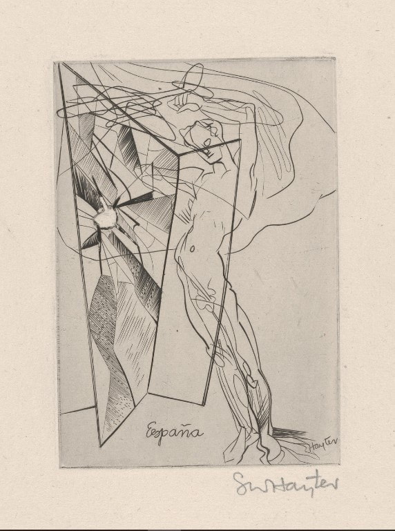
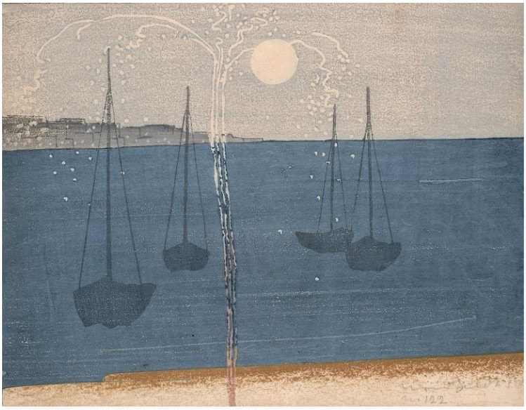
That Lindquist portrays this titan of printmaking creating a print in support of victims of a crazy war, and not as a teacher, is telling. Hayter and a group of artists created two portfolios, Solidarité (1938) and Fraternity (1939), that were fundraisers for the child victims of the Spanish Civil War. Hayter’s plate for Fraternity, which also contains prints by John Buckland Wright, Dalla Husband, Josef Hecht, Wassily Kandinsky, Roderick Mead, Joan Miró, Dolf Reiser, and Luis Vargas, shows a nude male standing in a doorway while an airplane flies overhead. One can’t help but think of Guernica, the small Spanish village that was bombed in April 1937, killing vast numbers of civilian men, women, and children. Occurrences like Guernica motivated many artists to create work in protest, mostly famously Picasso, and Hayter was no different. He was a passionate humanist who used art to express his profound discomfort with the darkness that befell humanity during the first half of the twentieth century. That the symbols and marks of the war are spitting out vigorously from Hayter’s burin in Lindquist’s portrait is a perfect homage. Stanley William Hayter (English, 1901-1988) Untitled, from the portfolio Fraternity, 1936 Engraving Sheet: 211 x 161 mm. (8 5/16 x 6 5/16 in.) Plate: 124 x 73 mm. (4 7/8 x 2 7/8 in.) Baltimore Museum of Art: Gift of Sidney Hollander, Baltimore, BMA 1996.8.3 Evan Lindquist (American, born 1936) SW Hayter Engraves War, 2015 Engraving Sheet: 388 x 310 mm. (15 1/4 x 12 3/16 in.) Plate: 278 x 207 mm. (10 15/16 x 8 1/8 in.) Baltimore Museum of Art: Purchased as the gift of an Anonymous Donor, BMA 2015.173 Ann ShaferI had the chance occasionally to acquire objects for the BMA’s collection at auction. It was always exciting, particularly when we won. The museum acquired an impression of this print, B.J.O. Nordfeldt’s The Skyrocket in this manner from Swann Auction Galleries in 2012.
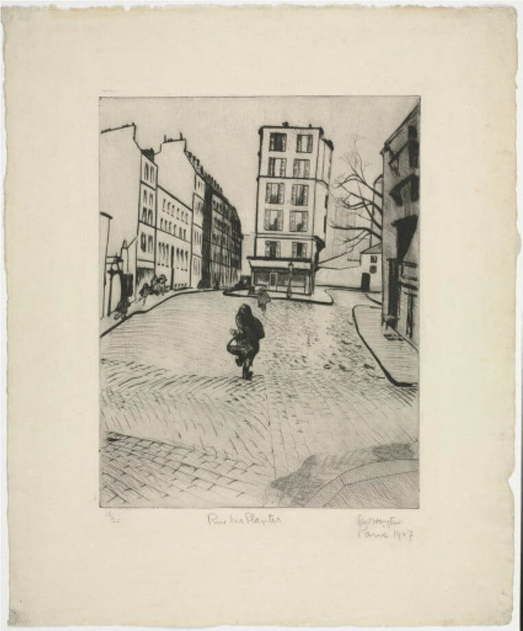
The Skyrocket is my favorite of Nordfeldt’s woodcut compositions, which have a distinctive Japan-esque quality to them. (He also made etchings, which are more reminiscent of Whistler’s Thames series.) Inspired by 19th-century Japanese Ukiyo-e woodcuts, Nordfeldt developed a new method of printing color woodblocks. Instead of carving multiple blocks to carry individual colors in the Japanese manner, Nordfeldt carved images onto a single block, and inked each section with a different color. Sometimes, to keep colors separate on the block, small grooves were carved between each segment that create distinctive white lines in printing. This white-line style became a hallmark of his and other artists’ works made in Provincetown in 1916 and onward. That doesn’t appear to be the case here, and it is a decade before those works, but the design sensibility is definitely present. You should know that the image I’m showing here is the impression from the Smithsonian American Art Museum. It’s slightly different in its printing, though the colors are similar. For instance, the BMA impression has less of that brown along the bottom. I can’t show the BMA’s impression because it is not included on the online database. Not every object is available on the website and I suspect it will be many years before the online database includes everything. More reasons to make an appointment to see the work in person after the pandemic has eased and museums reopen their doors to the public. B.J.O. Nordfeldt (American, born Sweden, 1878–1955) The Skyrocket, 1906 Color woodcut on Japan paper Image: 220 x 285 mm. (8 ¾ x 11 1/4 inches) Smithsonian American Art Museum: Gift of L. Laszlo Ecker-Racz Ann ShaferI’ve been teaching myself Adobe’s video editing software, Premiere Rush. Today is the debut of my first attempt, a very short video on Stanley William Hayter’s Rue des Plantes, 1926. For our epic research trip to Paris in 2015, Ben Levy, Tru Ludwig, and I had a lot on our to-do list related to the Hayter exhibition. First on the list was to photograph and film the printing of Hayter’s Torso, 1986, at Atelier Contrepoint, which I wrote about in another post. Second was to interview Désirée Hayter on video. Third was to find and photograph as many locations of the Atelier as possible (it moved a bunch of times). And fourth was to find, photograph, and videotape the locations that appear in Hayter’s series Paysages urbains, 1930 (more on that in another post). While doing the last, I added finding the site of Rue des Plantes to the list. Rue des Plantes is a lovely early drypoint by Hayter depicting a simple street scene in the 14th arrondissement. In it a lone figure carrying her daily market purchases walks toward a building that oddly is situated in the middle of a cobblestone street. Finding the site wasn’t too hard, but finally laying our eyes on it sparked our adrenaline. Ben set up the video equipment intent on taking some B-roll for an eventual video for the exhibition website. With the camera rolling, suddenly an older woman carrying her market purchases wandered into the frame. The three of us must have looked like lunatics gesturing to each other madly but silently so as not to be recorded on the tape. It couldn’t have been more perfect. Finally, I’ve pulled a short video together showing this golden moment, which thrills me still. Stanley William Hayter (English, 1901–1988) Rue des Plantes, 1926 Drypoint Sheet: 400 x 328 mm. (15 3/4 x 12 15/16 in.) Plate: 267 x 208 mm. (10 1/2 x 8 3/16 in.) Baltimore Museum of Art: Bequest of Ruth Cole Kainen, Chevy Chase, Maryland, BMA 2011.263 Ann ShaferWhen the museum acquired Chitra Ganesh’s work, I already had the seed of a show growing in my mind. I had been asked to come up with an exhibition drawn from the collection featuring works by artists of color. This is problematic on many levels. I have always believed that separation is sometimes useful, but that integration must be the goal. In any case, the works available for a show of that sort lacked any thematic cohesion. At the same time, I’d had many MICA students inquire about seeing works from the storeroom that reflected a graffiti or comic book sensibility. The collection did not have much to offer. It took time and several acquisitions to bring together an exhibition that focused on the theme of alternate realities—artists looking at real-world problems through visual fantasies, comics, sci-fi. Ganesh’s gorgeous print fit the bill beautifully and was installed along with prints by Trenton Doyle Hancock, Wangechi Mutu, Toshio Sasaki, Enrique Chagoya, William Villalongo, iona rozeal brown, Raymond Pettibon, and Amy Cutler. On Paper: Alternate Realities was on view September 21, 2014–April 12, 2015. It was the most organically diverse show of my career and remains one about which I feel extremely proud.
I love a print that looks cool and asks more questions than it answers. Chitra Ganesh’s Away from the Watcher is a colorful combination of screenprint and woodcut that features an enigmatic figure at left (in a scuba or space suit—you decide) who seems to be exhaling an Indian goddess figure, while watching a city on a hill possibly being destroyed. Along the top left is a comic-strip-style thought bubble that reads: “She taught me precious little before she withered and died. Nothing of the little black holes I would dip into. Nothing of telepathy, nor the insides of my eyes. Nothing of…” This image raises many questions: Is somebody inside the scuba/space suit—isn’t it propped up? Is the Indian goddess figure being expelled or inhaled? Are we underwater or in outer space? What do the small winged creatures signify? What calamity has befallen the city at right? The somber melancholy of the text seems at odds with the dynamic depiction of the planet’s fissures, as well as the brilliant color and energetic comic-book style of representation. These alternate moods and narratives clash and connect in a newly constructed vision of the future. Chitra Ganesh (American, born 1975) Printed and published by Durham Press Away from the Watcher, 2014 From the series Architects of the Future Woodblock and screenprint 629 × 797 mm. (24 3/4 × 31 3/8 in.) Baltimore Museum of Art: Purchased as the gift of an Anonymous Donor, BMA 2014.29 Ann ShaferIf ever I turned my attention to making art instead of writing about it, I would pull out my watercolors and brushes and head outdoors. It’s hard to imagine a world when that wasn’t possible—but it wasn’t so long ago that the first paints in tubes became commercially available. The first premixed watercolors were introduced to the market in England in the 1760s, but it wasn’t until the 1840s that those little tubes we know today were invented.
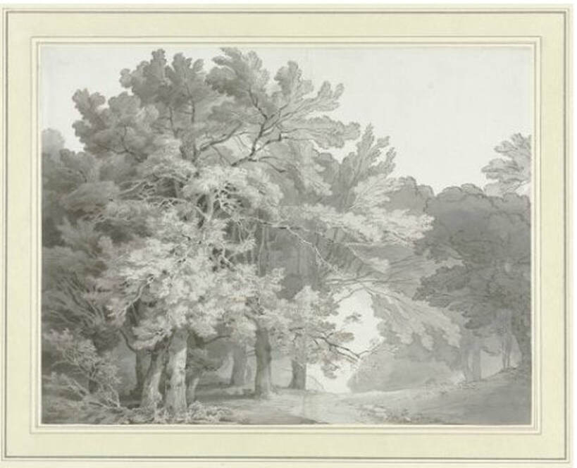
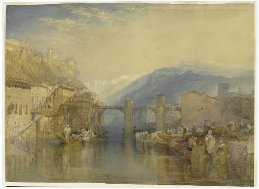
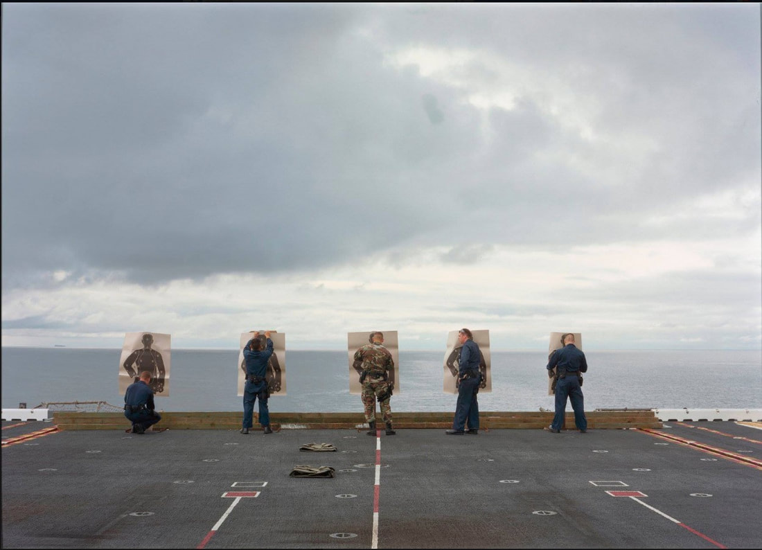
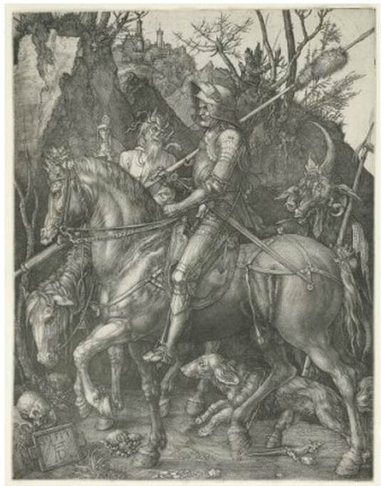
The proliferation of watercolor landscapes in England in the late-eighteenth and nineteenth centuries was due in no small part to the introduction of those premixed watercolor paints. Artists began to experiment with the medium and test the boundaries of what could be accomplished. Soon these works found their way into the annual exhibitions of the English Royal Academy, but they were so marginalized that a group of artists split from the Academy in 1804 to establish the Society of Painters in Water-Colours. The goal of this new Society was to place watercolors on an equal footing with oil paintings, and artists responded by creating large-scale, highly finished watercolors displayed in elaborate gold frames. The Baltimore Museum of Art is fortunate to have an example of one of these presentation watercolors by Britain’s favorite son, Joseph Mallord William Turner. In contrast to the highly finished exhibition watercolors, many artists created more intimate works in the same medium. Artists went outdoors with sketchbooks and paints to test their skills at portraying the landscape. One such work from a sketchbook (notice the crease down the center) is a favorite acquisition. The artist is John White Abbott, a country surgeon and apothecary from Exeter, who as an amateur artist painted for his own enjoyment (the term amateur indicates only that the artist did not earn money making art, but is no indication of a lack of talent). After inheriting an estate from his uncle, he was able to devote himself full time to painting. Abbott probably drew A Path through the Woods first in graphite pencil on the spot, and then returned to his studio to finish the work with gray washes and pen and brown ink. I continue to be amazed at the quality of light through the dappled foliage painted with just gray and brown. In fact, the execution is so masterful that I see this monochromatic scene in full color. In addition, the peacefulness of the scene always transports me to somewhere else. For me, this work is a figurative and literal breath of fresh air. John White Abbott (English, 1763‑1851) A Path through the Woods, c. 1785‑1795. Pen and brown and gray ink with brush and gray ink over graphite Sheet: 256 x 335 mm. (10 1/16 x 13 3/16 in.) Baltimore Museum of Art: Purchased as the gift of Rhoda Oakley, Baltimore, BMA 2008.9 Joseph Mallord William Turner (English, 1775‑1851) Grenoble Bridge, c. 1824. Transparent and opaque watercolor with scraping over traces of graphite Sheet: 530 x 718 mm. (20 7/8 x 28 1/4 in.) Baltimore Museum of Art: Purchased with exchange funds from Nelson and Juanita Greif Gutman Collection, BMA 1968.28 Ann ShaferFile this one under it's not always about prints and printmaking. In the fall/winter of 2013-14, the BMA showed the work of photographer An-My Lê (pronounced Ann-Mee Lay). It was an honor to work with her and, as often happens, the museum acquired one of the photographs from the show. When it came time to select objects to talk about on video for the BMA Voices initiative, this one was a no-brainer. It's got it all. Here's the link to the short video we made: https://www.youtube.com/watch?v=_fuT0JHVXmE. In the brochure for the exhibition, I concluded in this manner: In their quiet, unassuming way, Lê's sublime landscapes remind us that war is complex and contradictory. Alongside the brutality of combat, there is also the thrill of danger and adventure. Where there is enormous loss, there is also honor. Where there is heated protest, there is also heartfelt patriotism. By calling attention to the global reach of the U.S. military, Lê's photographs point out how martial power is balanced by humanitarian assistance and support of scientific research. Any discussion of the military will be polarizing, but Lê is able to find equilibrium between opposing points of view. While her photographs appeal to conservatives who see her work as pro-military, they also speak to liberals who read her work as anti-war. In drawing back the curtain to reveal the inner workings of the military as a giant facet of the global economy, Lê's photographs encourage us to think about its many complexities. An-My Lê (American, born Vietnam, 1960) Target Practice, USS Peleliu, 2005 Inkjet print, pigment-based Sheet: 1016 x 1435 mm. (40 x 56 1/2 in.) Baltimore Museum of Art: Women's Committee Acquisitions Endowment for Contemporary Prints and Photographs, BMA 2014.5 Ann ShaferFile this post under nothing lasts forever, even on the interwebs. For the BMA's 100th birthday, staff produced 100 blog entries on favorite collection objects. Some were videotaped pieces featuring curators, conservators, and other staff speaking on camera; other entries were written posts. I went to look for my written pieces on artbma.org and couldn't find them anywhere (thankfully, the videos are still on YouTube). Thanks to Laura Albans, I have recovered the text for my entry on Dürer's Knight Death and the Devil, portions of which I share here.
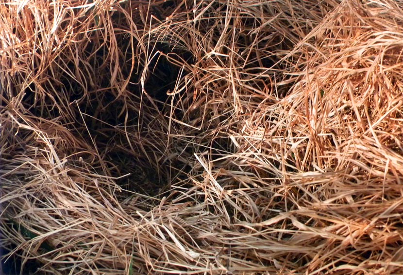
The best part of working in a large collection of prints, drawings, and photographs is the range of material. I used to always say that you could come up with almost any theme and find an entire exhibition on it drawn out of the solander boxes. Since my interests tend toward the 20th and 21st centuries, it may surprise some of you, then, that Albrecht Dürer’s Knight, Death and the Devil is one of my favorite prints of all time. Not only is it a glorious example of engraving, but also it carries a universal message to stand by the courage of your convictions. Albrecht Dürer was a German printmaker, draftsman, painter, observer of nature, and humanist. In 1513 and 1514 he created a trio of engravings that have come to be called his master prints. In addition to Knight, Death and the Devil, the trio includes St. Jerome in His Study and Melencolia I. Most scholars agree that the former represents the active life, while the two others represent the intellectual life and the contemplative life respectively. While the three prints together are spectacular, I’m most drawn to Knight, Death and the Devil. The image is a visual feast. It features a righteous German knight resplendent in armor, a horse straight out of Renaissance Italy, a wonderful and faithful companion Fido the dog, and gnarly creatures representing Death and the Devil, all set in a naturalistic landscape. Contemporaries of Dürer would have understood the symbolism of every aspect of this print. But our own unfamiliarity with those symbols doesn’t lessen the impact of the work. Clearly this stalwart fellow is making his way through the forest of temptation and vanitas. He is able to keep to his path, ignoring all that is going on around him and stands by the courage of his convictions. Even if we strip the image of its religious associations of pre-reformation Catholicism, the message of perseverance is clear. Stick to your guns, well, lance, and you can get through anything with grace and dignity. A message as important today as ever. Albrecht Dürer (German, 1471-1528) Knight, Death and the Devil, 1513 Engraving Sheet (trimmed within platemark): 244 x 187 mm. (9 5/8 x 7 3/8 in.) Baltimore Museum of Art: Gift of Alfred R. and Henry G. Riggs, in Memory of General Lawrason Riggs, BMA 1943.32.188 This image is less than stellar, serving as an excellent reminder that it's always better to see works like this in person. Ann ShaferSometimes you get lucky and come across an artist by chance whose work you love. Even better is when you become friends. I made a studio visit to an artist who happened to be married to Susan Harbage Page. Because their studios were adjacent, I was able to see both in one visit. Susan's work runs the gamut: photography, drawing, performance, fibers, writing. One project has always risen to the top for me. The Border Project is a long running exploration of immigration issues focused on the border at the Rio Grande river in Brownsville, Texas. (An exhibition catalogue about the project is available here: https://susanharbagepagedotcom.files.wordpress.com/…/1_bord….)
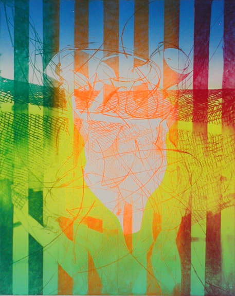
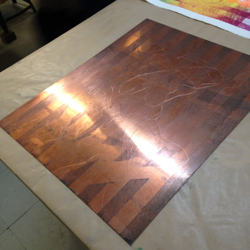
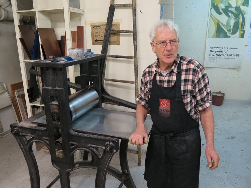
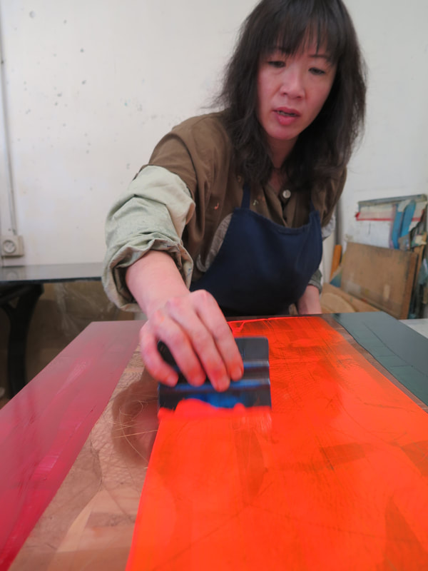
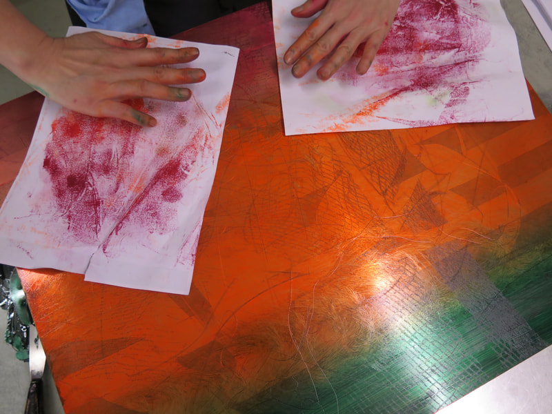
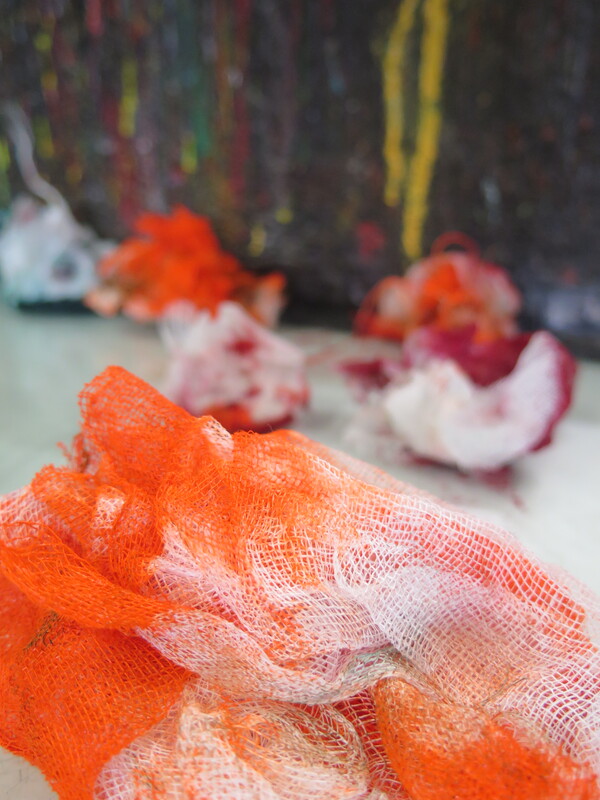
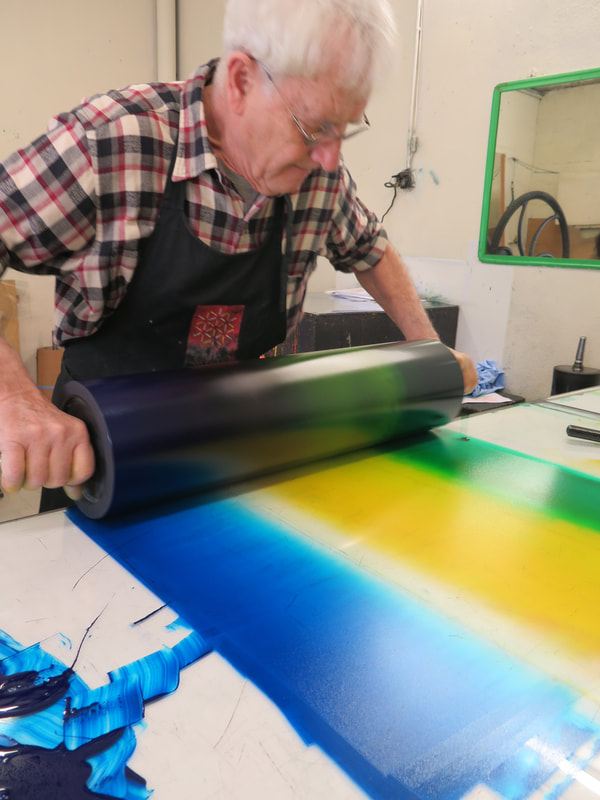
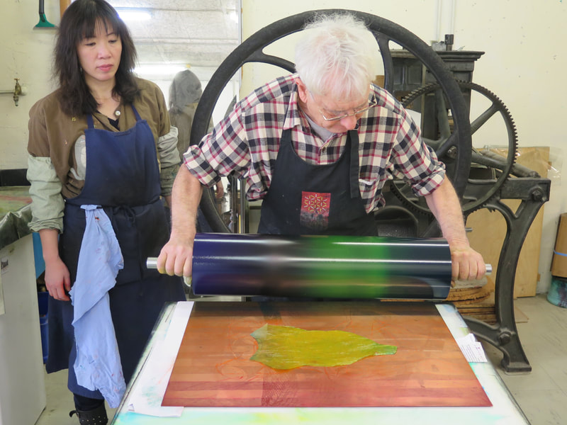
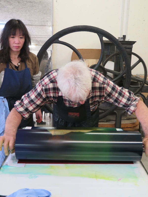
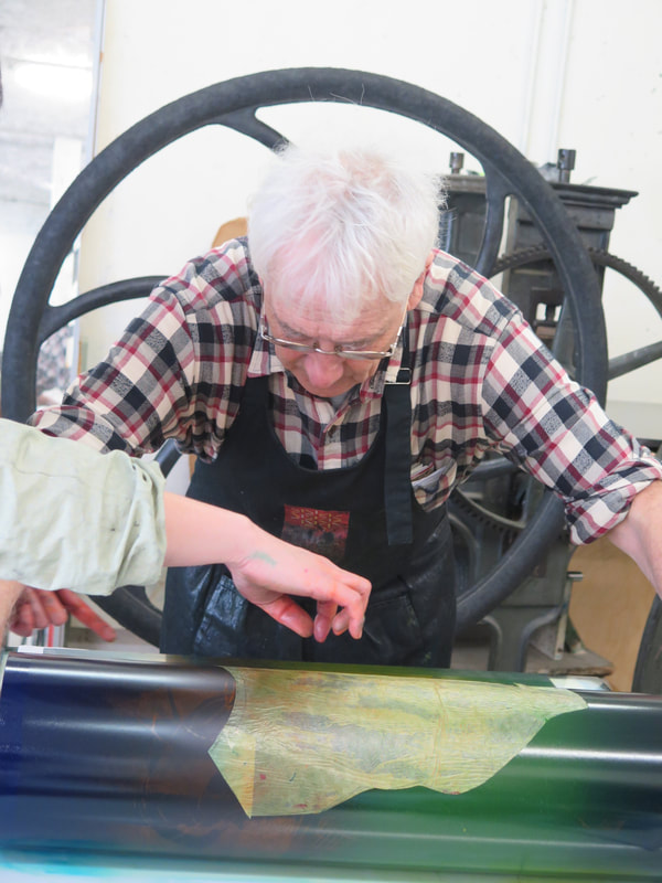
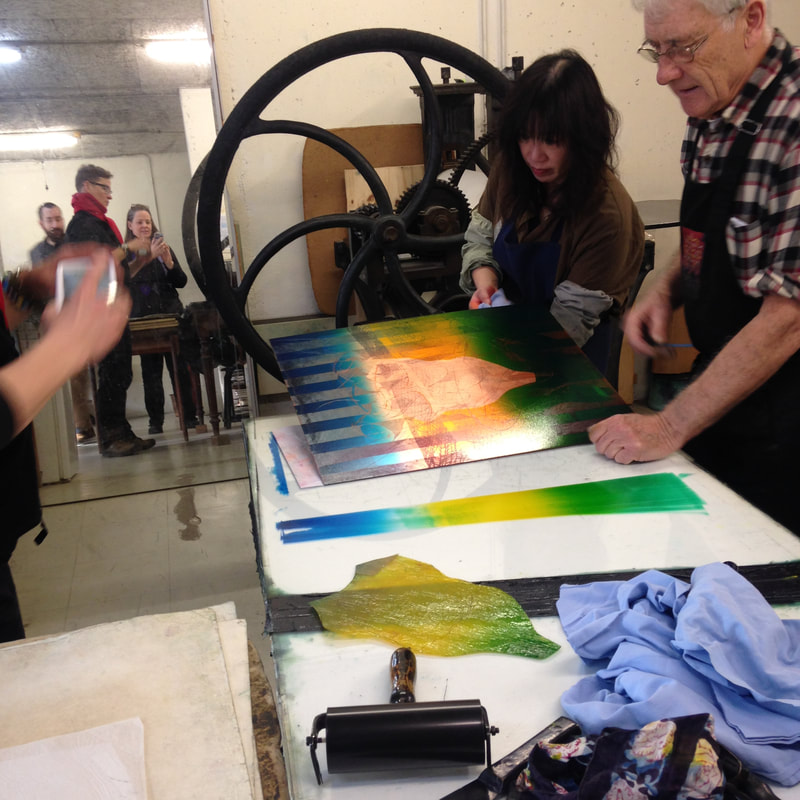
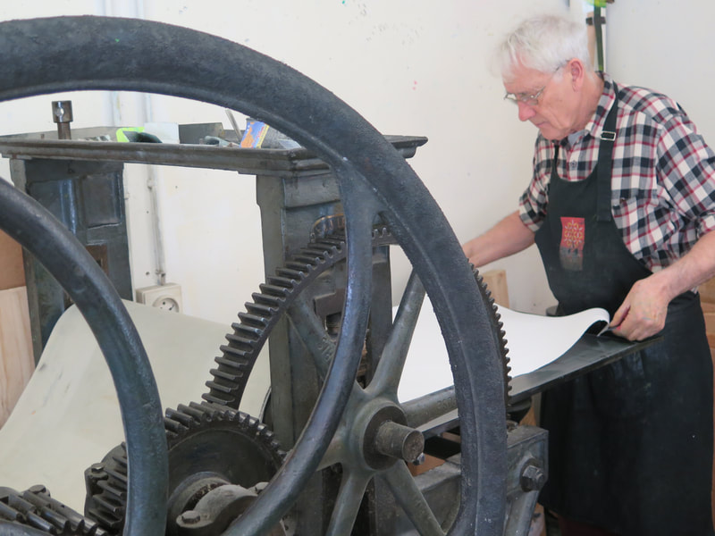
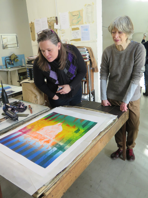
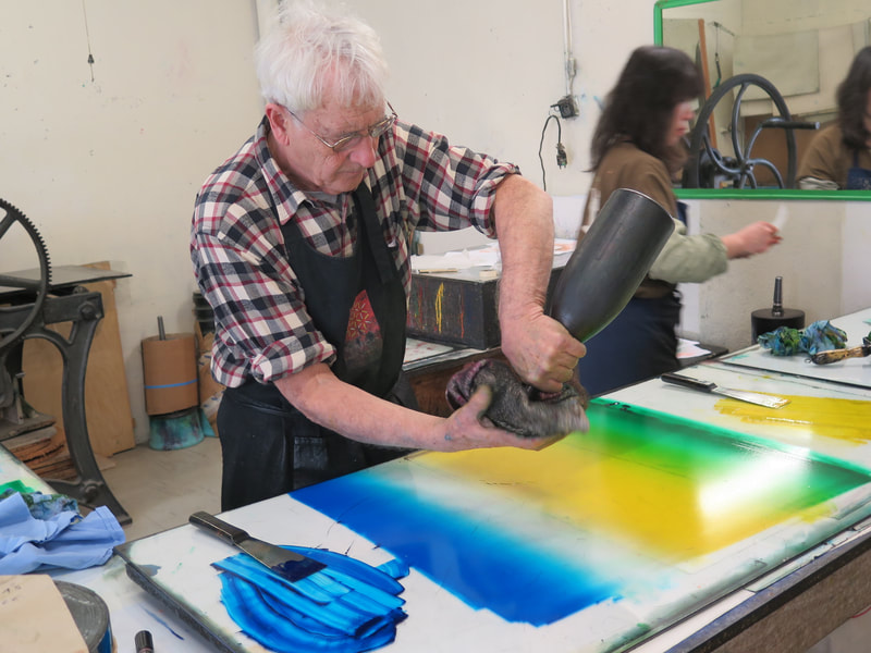
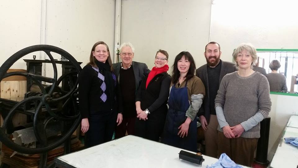
Long before children were being separated from their parents, Susan spent a lot of time photographing objects in situ and then collecting them. The objects left behind by migrants--bras, wallets, identification cards, shirts, toothbrushes--are catalogued and photographed in an anti-archive. The large-scale, color photographs of objects in the landscape hold power for me. Yet, sometimes no object is needed as evidence of a human presence. In Nest (Hiding Place), Laredo, Texas, a human-sized divot in the dry, tall grasses has been recently used as a resting or hiding place after crossing the border from Mexico. Easy to miss, once we understand how these crossings occur, we will recognize signs like this one forever. This now-empty nest is simple, stark, potent, and full of untold stories both of hope for a better life and fear of capture. Susan Harbage Page (American, born 1959) Nest (Hiding Place), Laredo, Texas, 2011, printed 2012 Inkjet print, pigment–based Sheet: 1067 × 1553 mm. (42 × 61 1/8 in.) Image: 965 × 1448 mm. (38 × 57 in.) The Baltimore Museum of Art: Gift of the Artist, BMA 2012.156 Ann ShaferYou might be surprised to learn that Hayter's workshop is still operating in Paris at 10, rue Didot. After his death in 1988, the workshop changed its name to Atelier Contrepoint and is run by Hector Saunier, who printed many of Hayter’s late compositions. I was fortunate to be able to visit the Atelier twice, in 2014 and 2015. The first time was to meet Hector and see what the operation looked like. The second time Hayter's widow, Désirée, agreed to bring over one of his plates so Hector could ink and print it for us (there is no one better suited for this particular task). The plan was to create an online feature for the exhibition’s web site, which never happened because the show was cancelled. As usual, Ben Levy and Tru Ludwig were with me, and between the three of us, we shot a lot of video and photographed Hector and Shu-lin Chen printing Hayter’s Torso, 1986.
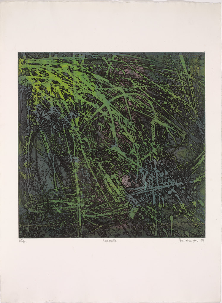
Désirée couldn’t find the plate she was originally thinking of, so she randomly selected Torso, which turned out to be serendipitous because Torso conceptually circles back around to the fist clenching the void discussed in an earlier post. In Torso, Hayter used stripes with inverted color variants, inking the central intaglio composition in green, red, and fluorescent orange, and with a horizontally rolled gradient of blue/yellow/green. The shape of the torso is defined by a mask that was laid down on the inked plate, blocking the rollers from depositing the blue, yellow, and green ink on the paper, producing an area of white across the center. The positive shape of the torso, described by an absence, echoes the conundrum of the untitled plate six from The Apocalypse, in which the negative space of a clenched fist is described by a positive volume. In this late print, the cognitive inquiries and accumulated techniques of four decades have come together. With the copper plate under her arm, we met Désirée on the appointed day at Atelier Contrepoint. After consulting the catalogue raisonné, they got right to work. Shu-lin set about inking the plate (intaglio) in red, fluorescent orange, and dark green in vertical stripes. Hector prepared the rainbow roll of blue, yellow, and green on a glass palette. The mask was still wrapped with the plate, so it was used as well. When Shu-lin was satisfied with her wiping job, the plate was ready for the mask’s placement and the rainbow roll. Hector completed his part and the plate was placed on the bed of the press that had been used for thousands of prints by hundreds of artists over the majority of the twentieth century. After a few unsatisfactory pulls, they printed four impressions, one of which eventually entered the Baltimore Museum of Art’s collection. I remain amazed that I got to experience the printing of one of Hayter’s plates and so appreciative of Désirée, Hector, and Shu-lin’s generosity that day. Even better, Ben Levy and Tru Ludwig were with me to witness the magic. Ann ShaferCascade, 1959, by Stanley William Hayter, is the print I planned to use of the cover of the catalogue. One, because it's gorgeous. Two, because by 1959, Hayter is 58 and had been at it for more than thirty years and Cascade sums up so much of Hayter's thinking. During that time, he's helped Spanish refugees during the Spanish Civil War by hiding them in the studio; he's dropped everything and fled Paris as it went to war with Germany in 1939; he's created something really special in NY during the war and following (he's in NY from 1940-1950); he's watching his 16-year-old son die in 1946; he's helped hundreds of artists find their voices and discover new ways of creating intaglio prints; he, like so many other artists, has grappled with the horrors revealed by the Holocaust and bombing of Hiroshima and Nagasaki; and he's been able to return to France and purchase a vacation home in the south of France. But Hayter was also a man who never stopped thinking, working, creating, loving, living. Three, it's a great place to start talking about one of the Atelier's most important discoveries, that of simultaneous color printing (sometimes called viscosity printing, although Hayter didn't like that term since all inks have a viscosity of some sort).
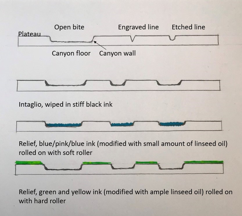
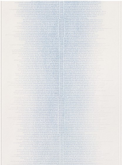
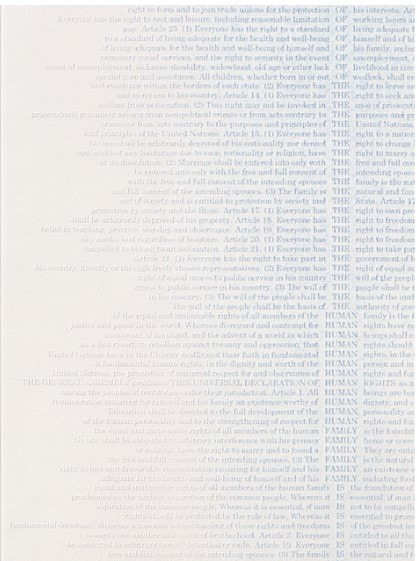
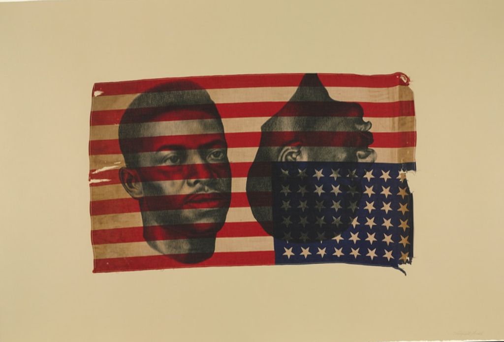
Cascade, 1959, is a colorful print with an all-over composition that appears completely abstract; seemingly random drips and gestures cover the plate. Hayter, however, never accepted pure abstraction as a meaningful subject—even when his subjects defy conventional representation, his titles anchor them in the world of places and things. Cascade is one of many works inspired by the appearance of rushing water in a river near his home in the south of France. The direct autographic drawing that had been essential to Hayter’s work since he began engraving has disappeared, replaced by a variety of devices that could be set in motion by his hand, but whose outcomes were far more open to chance: leaking cans of liquid ground suspended as pendulums, and marker pens that could dribble and spray showers of thin resist. These systems recorded, rather than depicted, the behavior of liquids in motion. Cascade is an indexical print (see prior post about Trisha Brown). Despite all of the scholarly reasons we can cite for Hayter's switch from engraving lines to depict images to indexical splashes of liquid, I've always wondered if his hands were just tired and he was dealing with an onset of arthritis. I have absolutely no proof of this--it's just a thought. What's so intriguing to me about the print is figuring out how in the world a bunch of open-bit swooshes and gestures are inked to produce the colorful image. First, we need to understand that to produce a color print, normally one would create separate copper plates for each color and they would be printed in successive layers on the paper in multiple passes through the press. Instead, Hayter layered the different colors on the same, single plate, and ran it through the press once. The trick is to vary the amount of oil in each color so that they don't run together as they are applied. (This idea was developed at the Atelier by Krishna Reddy and Kaiko Moti--an example of the collaborative nature of the workshop.) Along with the print itself, I'm including an image of the zinc plate (also in Baltimore's collection, a gift from Mrs. Hayter, BMA 2014.40), and an image that shows the cross section of the plate in the order it is inked. I hope this will make some sense; we'll dig in more tomorrow. First, the plate is wiped intaglio in black so that the ink clings to the canyon walls; second, a soft roller carrying the rainbow roll of blue/pink/blue deposits color in the canyons; third, a hard roller deposits an unblended green and yellow across the plateau. This will all be made clearer tomorrow when I share the test plates we created for the exhibition to show each step in this inking process. Because these test plates are the first and only etchings I've ever made, you can imagine I had help. I am deeply, supremely indebted to Tru Ludwig and Ben Levy, who made it all happen. Tomorrow you'll see us in action. Stanley William Hayter (English, 1901-1988) Cascade, 1959 Open bite etching; printed in black (intaglio), blue-pink-blue gradient (relief), yellow, green, and blue, unblended (relief) Sheet: 794 x 584 mm. (31 1/4 x 23 in.) Plate: 489 x 489 mm. (19 1/4 x 19 1/4 in.) The Baltimore Museum of Art: Purchased as the gift of the Print, Drawing & Photograph Society, BMA 2008.112 Ann ShaferIf you know me at all, you know I spent a very long time working on a project focused on Stanley William Hayter and Atelier 17. I always talked about him as a lightning rod around whom bazillions of artists swirled. I believe his and the atelier's story is the fastest route to inserting printmaking firmly into the now-ever-changing canon. My attempt to do that in a grand fashion was not to be through circumstances out of my control, but a few smaller projects resulted. Some of the research is published in a catalogue for an exhibition at MAC USP (University of Sao Paolo). The print run was quite small, but the catalogue PDF is available here: bit.ly/Atelier17MACUSP. In addition, I was filmed talking about one of my favorite Hayter prints for the BMA, which is available here: https://www.youtube.com/watch?v=mJ6Z-8Yq9cs. I love this print. I feel like it sums up so much of Hayter's thinking and is among my top candidates for most important print of the 20th century. Stanley William Hayter (English, 1901-1988) Untitled (no. 6 from The Apocalypse), 1931 Engraving and drypoint; printed in black (intaglio) Sheet: 526 x 399 mm. (20 11/16 x 15 11/16 in.) Plate: 324 x 228 mm. (12 3/4 x 9 in.) Baltimore Museum of Art: Gift of Mr. and Mrs. Robert Paul Mann, Towson, Maryland, BMA 1979.377.6 Ann ShaferMost of you will have heard me say that the Baltimore Contemporary Print Fair (BCPF) was the most fun we had on the job. (It is seriously depressing that it likely will not happen again under the new administration.) Not only was it a deeply satisfying if exhausting event, but also we were able to use about half the proceeds for purchasing prints for the collection. I was in charge of the biennial fair three times, in 2012, 2015, and 2017, and believe me, none of them would have happened without the hard work of Ben Levy and Morgan Dowty. I owe them everything. From the 2017 fair, the museum purchased four really great prints or sets of prints by Sascha Braunig, Andrew Raftery, Ambreen Butt, and Ann Hamilton. Sometimes it takes the whole fair to decide if a print is appropriate for the collection--there's a flurry of red dotting at the last moment--and sometimes you know immediately. Such was the case with the Ann Hamilton print, RIGHTS, published by Gemini G.E.L. This is truly a print that doesn't convey in photographs, so here's a bit of description. It's a tall narrow sheet upon which is blind embossed the text of the Universal Declaration of Human Rights (UDHR), which the United Nations adopted after WWII on December 10, 1948. The letters that line up down the central spine spell out the first sentence. Blue ink was delicately daubed onto the letters forming a ghost of a figure, an everyperson. Hamilton is subtle and not so subtle at the same time. While the message of the UDHR is clearly present, it is difficult to read. It's a push-pull of quiet insistence on the righteousness of the message and screaming about the injustices around us. Yesterday I told you I never shy away from a good, political work of art, and I'm rather pleased that my last acquisition was this startling, stark, delicate, beautiful, impactful, meaningful work of art by the glorious Ann Hamilton. Ann Hamilton (American, born 1956) Published by Gemini G.E.L. RIGHTS, 2017 Blind embossment with hand-applied ink Sheet: 2019 x 546 mm. (79 1/2 x 21 ½ in.) Baltimore Museum of Art: Print, Drawing & Photograph Society Fund, with proceeds derived from the 2017 Contemporary Print Fair, BMA 2017.66 Ann ShaferI prefer looking at art with people. It slows me down and helps me engage more fully. I am lucky to have two partners in looking: Ben Levy and Tru Ludwig. (More on each of them in a later post.) During the 2011 NY Print Week, Tru and I headed downtown to hit the galleries. We were traipsing around Chelsea catching shows both on purpose and by chance when we tripped over this glorious print by Whitfield Lovell. There's always great stuff in 535 W 22nd St., home to DC Moore Gallery, Leslie Tonkonow, and Julie Saul. DC Moore had a show up of Lovell's fabulous drawings, one of which I would have loved to acquire--they were out of range for the museum's budget. There turned out to be some treasures not on view, too. (At print fairs, the best stuff is often under the table--always ask to see it.)
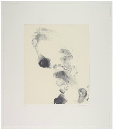
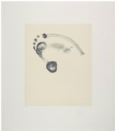
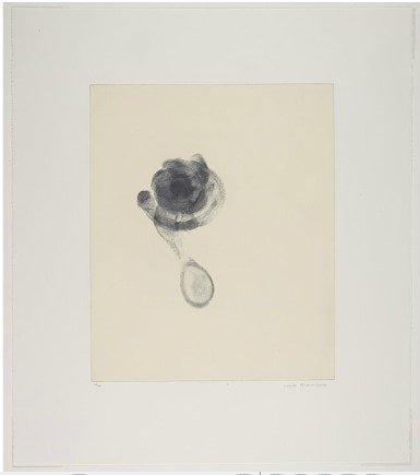
Lovell's lithograph, Deuce, was published by Smith College in an edition of 40 on Ivory Plike paper, but several experimental versions had been printed on vintage flags, which, to my mind heightens just about everything about the print. One of these special versions had the flag in a vertical position, which made the disembodied heads look like they were hanging/lynched. Now, I'm not one to shy away from a strong, political work of art, but I believe the one we acquired held more impact in its ambiguity: the red stripe across the mouth effectively silencing the man, the clarity of his eyes as he sees all of the inequities and injustices around him, the ambiguous and complicated relationship African Americans have with patriotism. There is so much to unpack here and it was frequently used in the studyroom for various classes. Someday I would love to mount a Lovell exhibition. He's worth checking out. Whitfield Lovell (American, born 1959) Published by Smith College Print Workshop Printed by Derrière L'Étoile Studios Deuce, 2011 Sheet: 768 x 1130 mm. (30 1/4 x 44 1/2 in.); Image: 413 x 705 mm. (16 1/4 x 27 3/4 in.) Crayon lithograph on American flag mounted to paper The Baltimore Museum of Art: Women's Committee Acquisitions Endowment for Contemporary Prints and Photographs, BMA 2012.154 Ann ShaferThe first time I went to the IFPDA Print Fair at the Park Avenue Armory, I didn't know anyone, wasn't traveling with anyone, and felt overwhelmed. (Art fairs can do that to a person.) At the end of a very long day, I paused in the Graphicstudio booth where soon-to-be-friend Kristin Soderqvist invited me to sit down. We were chatting about nothing in particular when I glanced over her shoulder and saw these prints by choreographer Trisha Brown. These are softground etchings with a relief roll of yellow on the surface of the plate. To create the image, Brown pirouetted on the plates that were coated with a soft, sticky ground, allowing the impression of her foot to be recorded. These are the first works that helped me understand the concept of being indexical. Simply put, instead of drawing what a foot in action looks like, the image is the product of the thing itself in action. I also love the idea of a dancer's work transferring to the wall, especially since one of Brown's famous pieces featured a person walking down the side of a building (https://trishabrowncompany.org/…/man-walking-down-the-side-…). These were the first works I acquired from a fair for the BMA's collection.
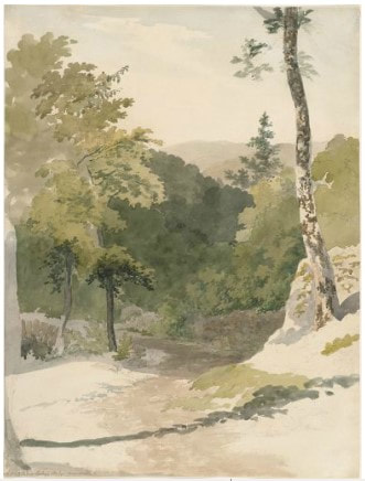
Trisha Brown (American, 1936-2017) Published by Graphicstudio; printed by Tom Pruitt (American, born 1956) Untitled Set One, No. 1–3, 2006 Sheet (each): 657 x 578 mm. (25 7/8 x 22 3/4 in.) Plate (each): 429 x 352 mm. (16 7/8 x 13 7/8 in.) Set of three softground etchings printed in black (intaglio) and yellow (relief) The Baltimore Museum of Art: Women's Committee Acquisitions Endowment for Contemporary Prints and Photographs, BMA 2007.336–338 Ann ShaferYou may not know that I have a secret passion for British watercolors of the 18th and early 19th centuries. The BMA has a glorious Turner presentation watercolor of Grenoble Bridge, but few companions. In 2008 I put together a small show featuring the Turner and was able to acquire this watercolor to augment the show and the collection. It's by Robert Hills, an artist best known as an animalier--one who specialized in painting animals. In this watercolor he captured the curve in the country road with the broken-down fence at left and singular tree at right. It's a crisp, lovely sheet--the whites are white and the colors strong--and it has all the features one wants in such a composition: a path leading the eye back in space, a framing tree and shadow, that broken down fence as a bit of nostalgia in industrializing Britain, the sense that it was painted on the spot (it likely was), and its uncontrolled picturesqueness. I think this was my first purchase for the collection. I love it still.
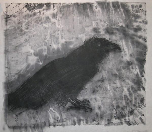
Robert Hills (English, 1769–1844) Nook End, Ambleside, c. 1807 Watercolor over graphite Sheet: 357 x 270 mm. (14 1/16 x 10 5/8 in.) The Baltimore Museum of Art: Purchase with exchange funds from Bequest of Saidie A. May, BMA 2006.93 Ann ShaferOne of my first acquisitions for the BMA was this Jim Dine print. I was working on a small show of his works from the collection and was able to purchase two of Jim's more recent prints to round out the show. The inimitable Tru Ludwig and I set off to NYC to shop at Pace Prints. I knew for sure I wanted to acquire A Side View in Florida, a massive skull derived from Grey's Anatomy, but was open about a second print. Then Raven on Lebanese Border was unveiled, and we knew instantly this was the obvious choice. It has been on view in multiple exhibitions and was my go-to in the classroom because of its Baltimore-related subject matter, experimental printing methods, and multiple techniques. It is probably the work that I got the most use out of. Jim Dine (American, born 1935) Published by Pace Editions, Inc., New York; printed by Julia D'Amario Raven on Lebanese Border, 2000 Sheet: 781 × 864 mm. (30 3/4 × 34 in.) Plate: 676 × 768 mm. (26 5/8 × 30 1/4 in.) Soft ground etching and woodcut with white paint (hand coloring) Baltimore Museum of Art: Purchased as the gift of the Print, Drawing & Photograph Society, BMA 2007.224 |
Ann's art blogA small corner of the interwebs to share thoughts on objects I acquired for the Baltimore Museum of Art's collection, research I've done on Stanley William Hayter and Atelier 17, experiments in intaglio printmaking, and the Baltimore Contemporary Print Fair. Archives
February 2023
Categories
All
|

 RSS Feed