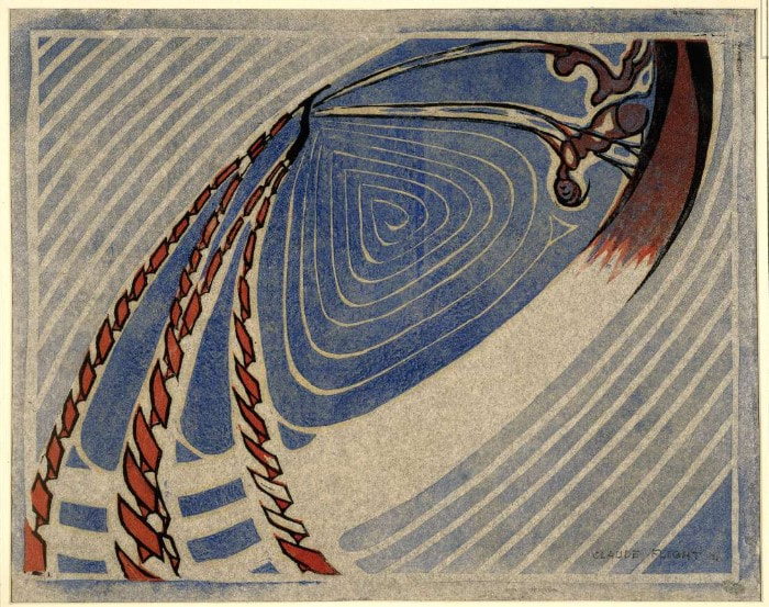
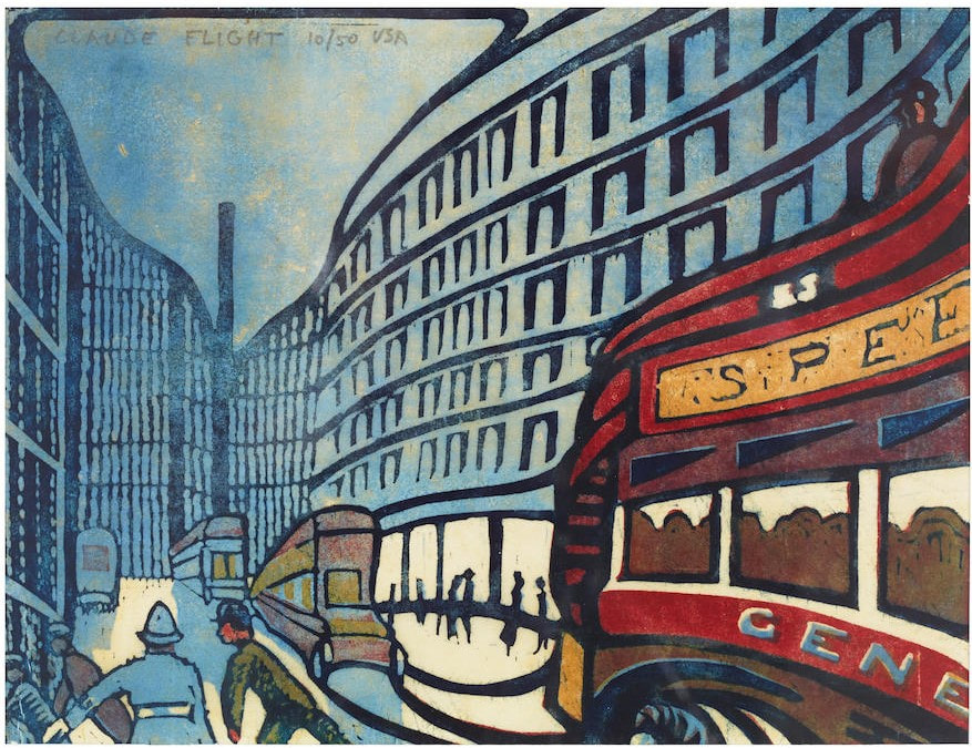
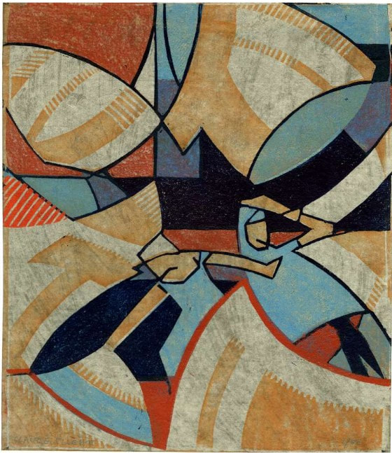
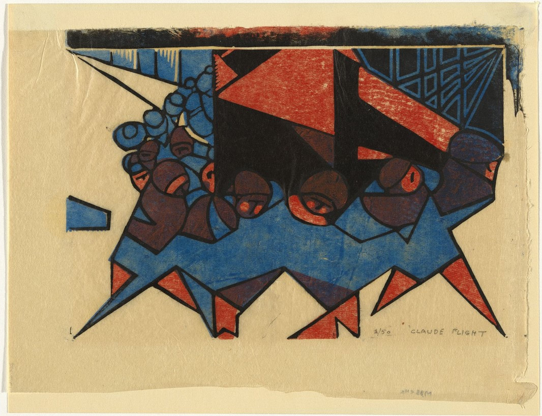
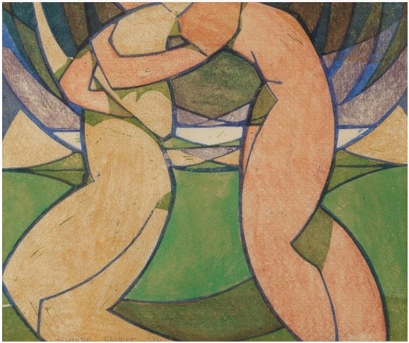
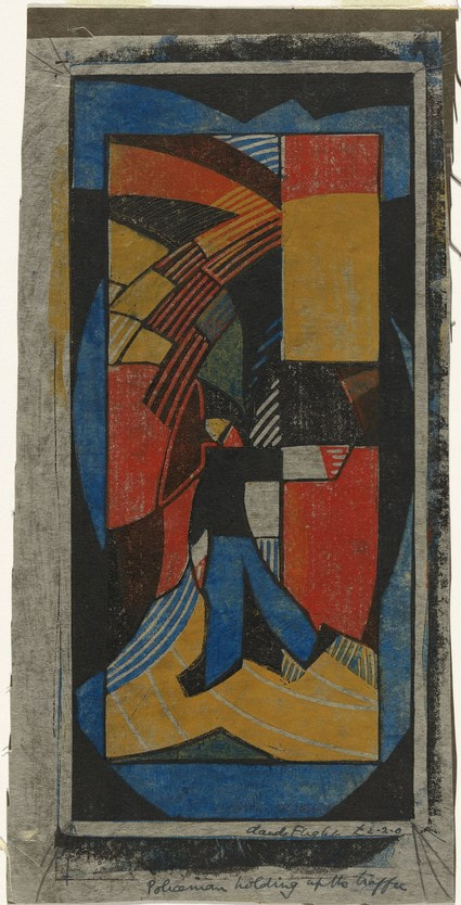
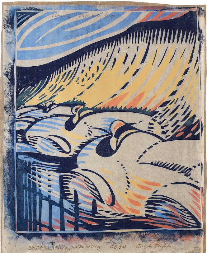
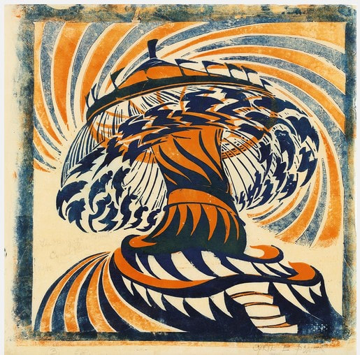
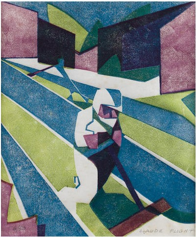
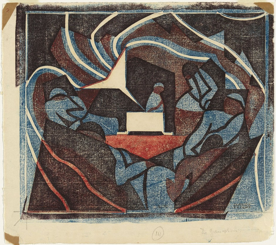
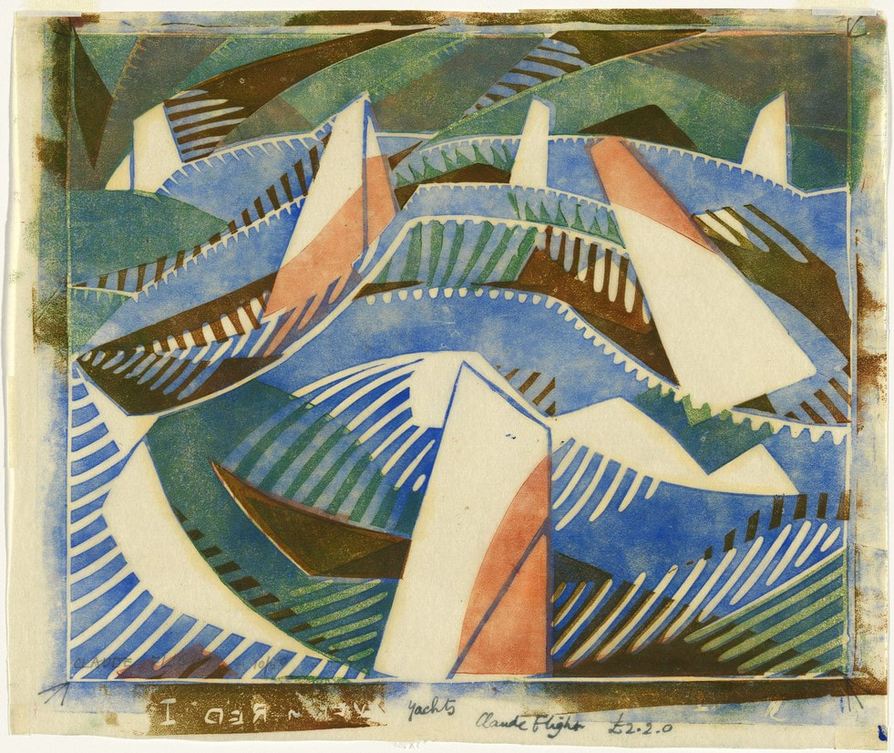
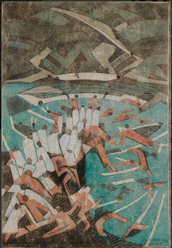
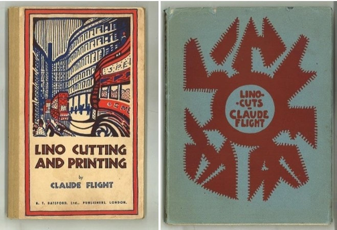
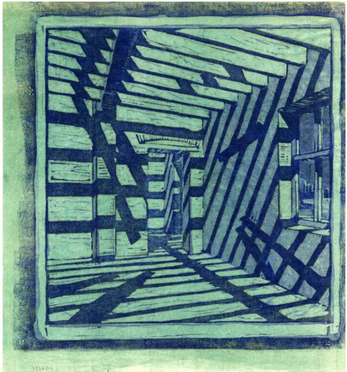
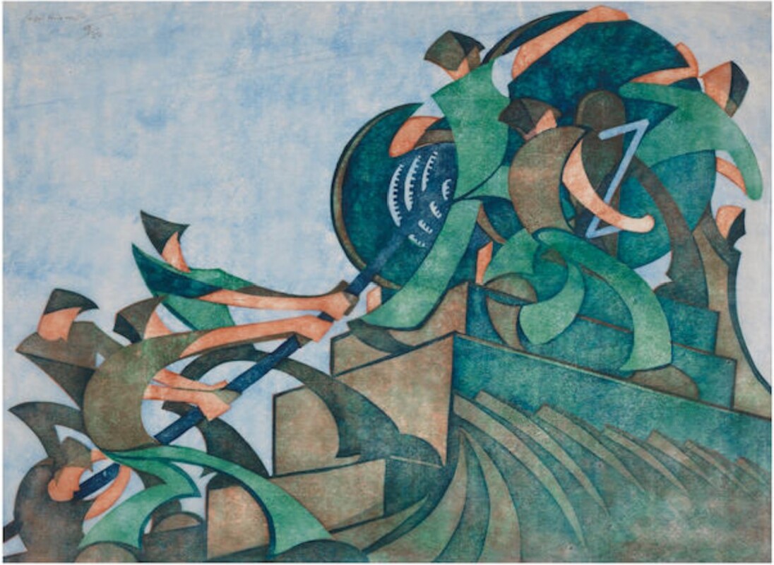
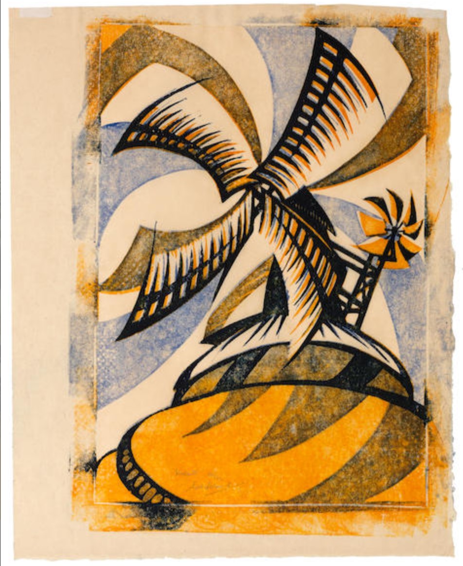
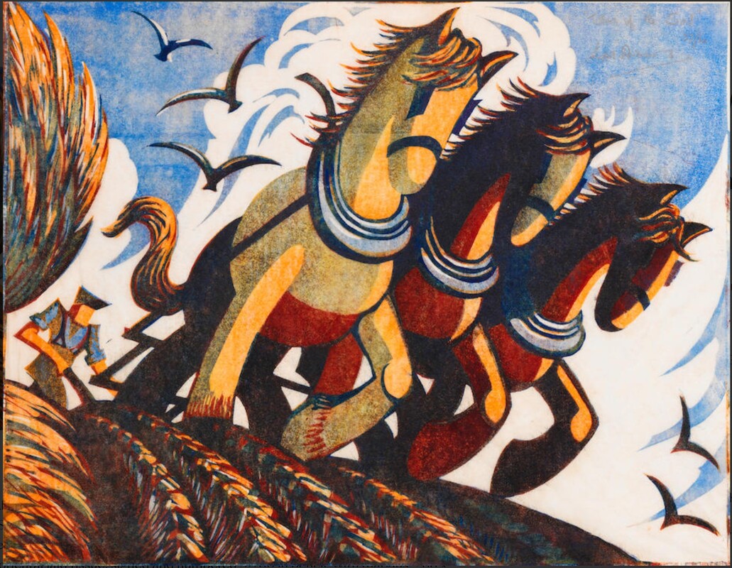
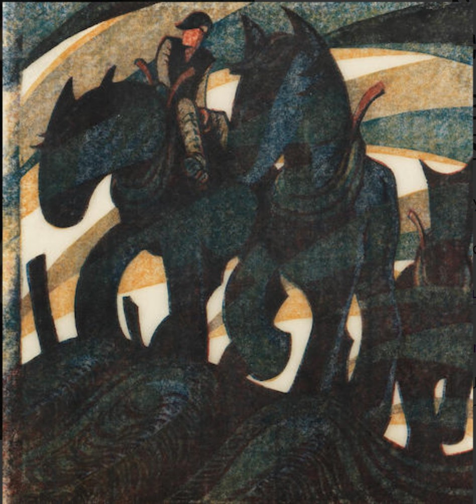
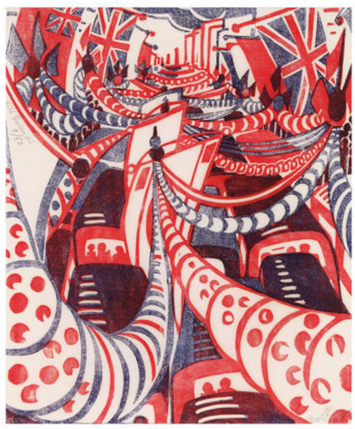
Ann Shafer Here’s the final Grosvenor School post (for now, anyway), featuring the man who started it all, Claude Flight. I find it fascinating that his work kinda gets at the aesthetic we have come to expect from the group, but many of his prints are wholly different. I would love to have been a fly on the wall in the studio, to see who developed what first, who picked it up, and who pushed who, etc. Imagine being surrounded by so much color and motion. This is what I love about printmaking. Because of the need for shared equipment and supplies, artists work together, side-by-side with like-minded artists. All this togetherness might lead to friendly competition or alignment of sentiment, and the results might lead to unplanned and exciting discoveries. Flight took up linoleum cutting as early as 1919 and fell in love with it. It was easy to procure and not so costly, plus its ease of cutting seemed perfect as a route to making it possible for the masses to be exposed to art. More, cheaper, faster. He saw in it the potentiality of a truly democratic art form. Sounds a little like previous movements that attempted to bring art into every home, like William Morris' arts and crafts movement, doesn't it? Just in an updated, modern way. Here's Claude Flight.
0 Comments
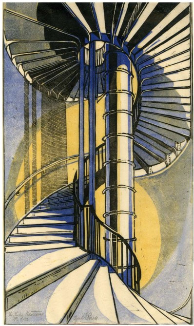
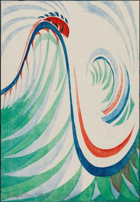
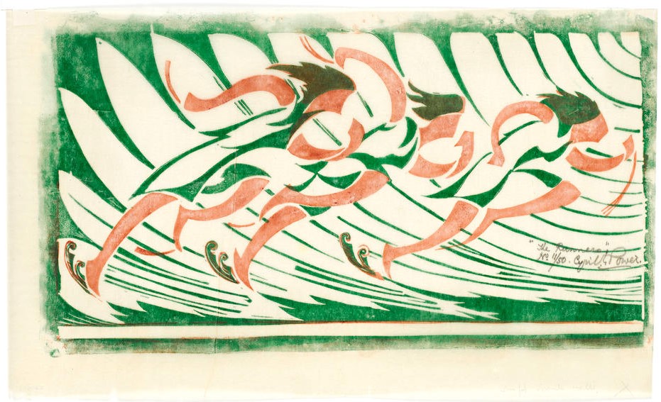
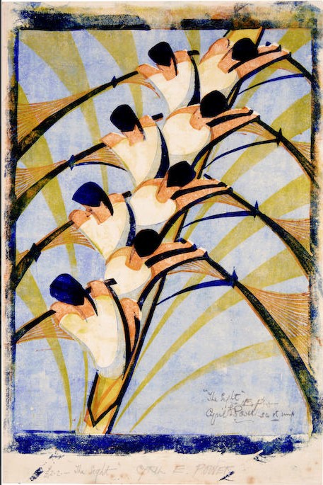
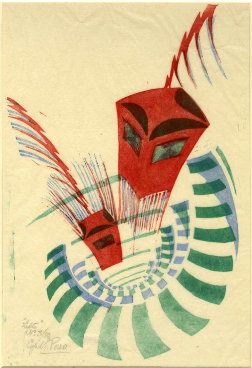
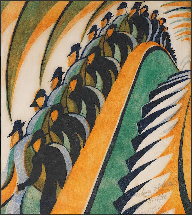
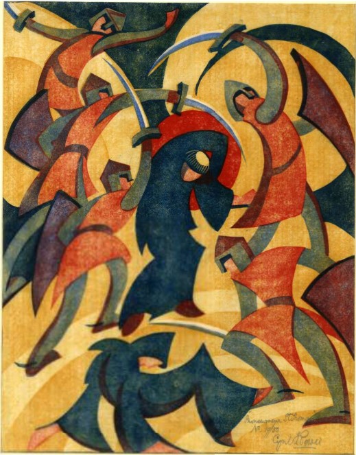
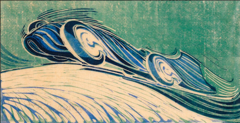
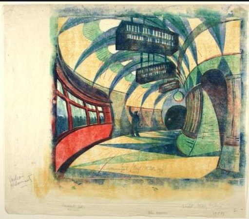
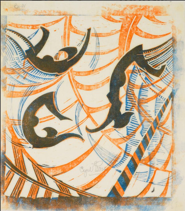
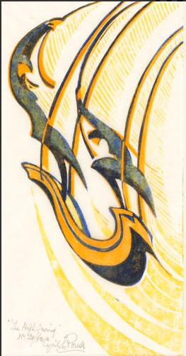
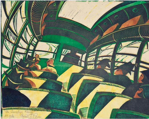
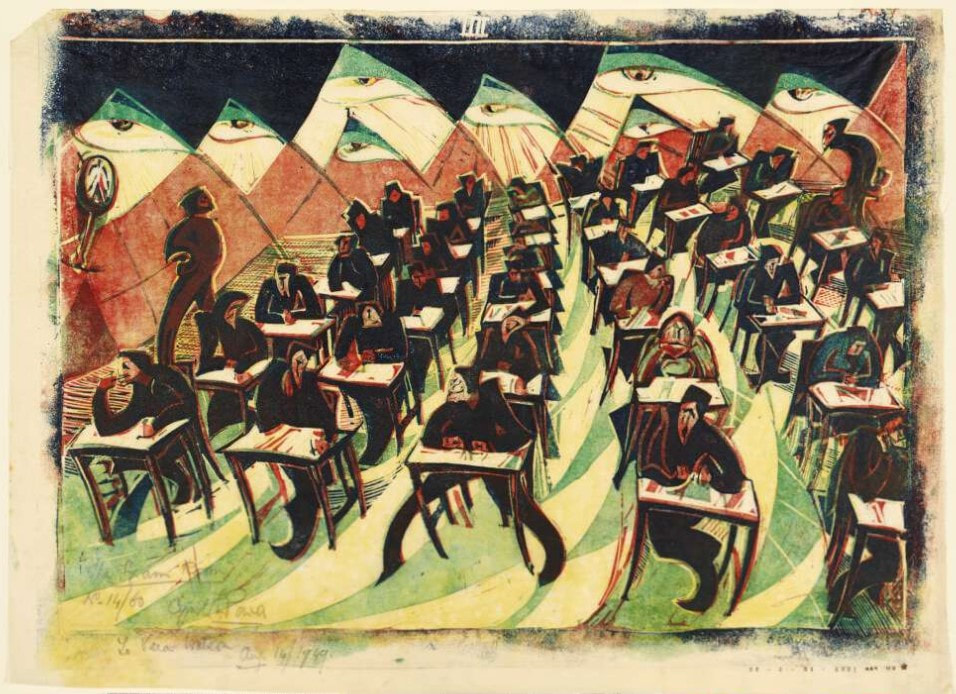
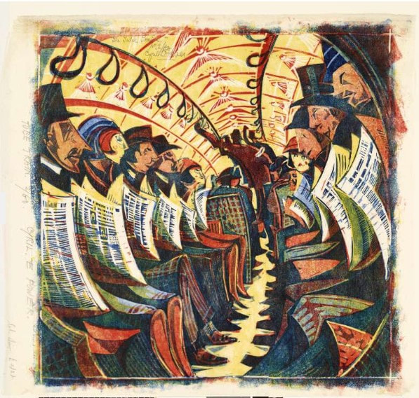
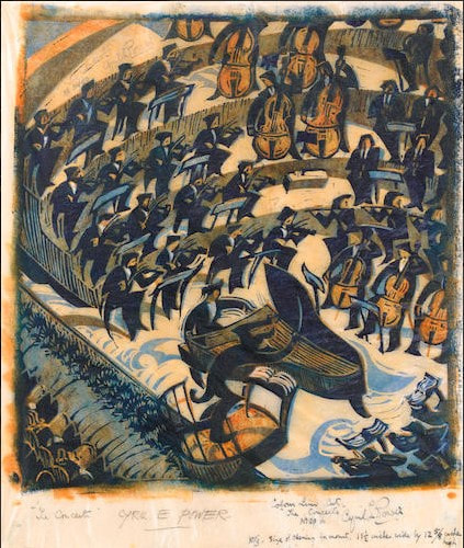
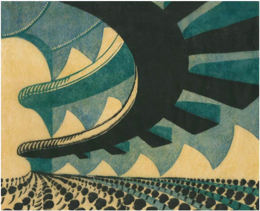
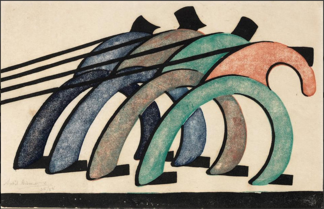
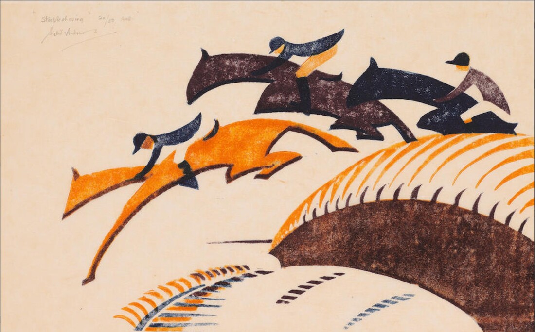
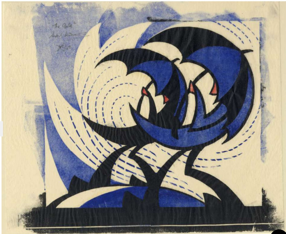
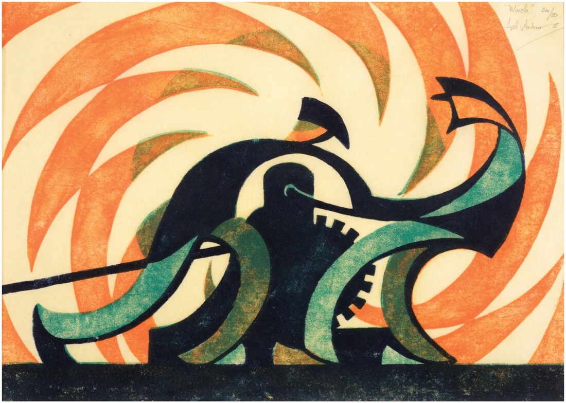
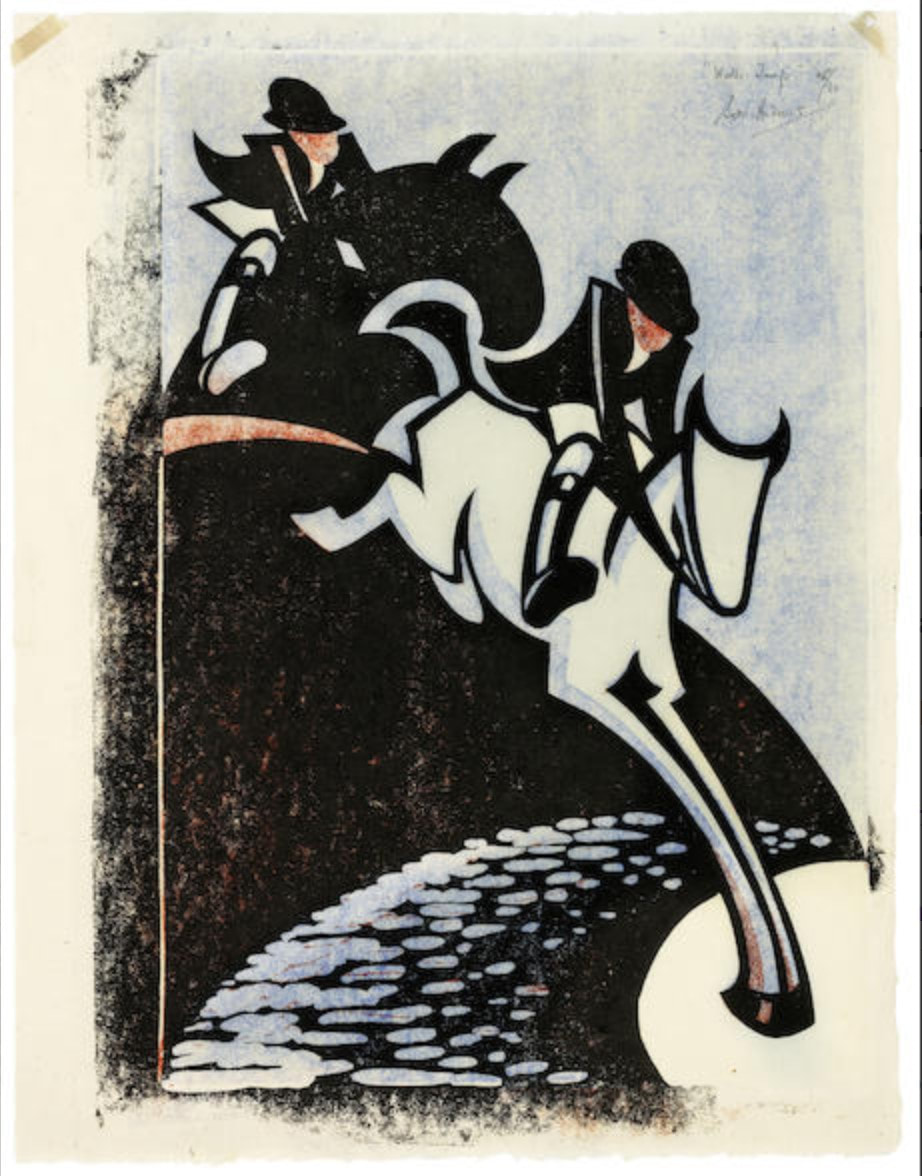
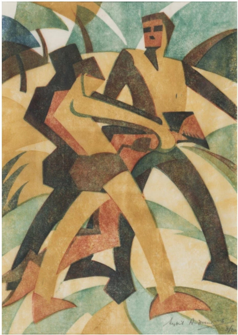
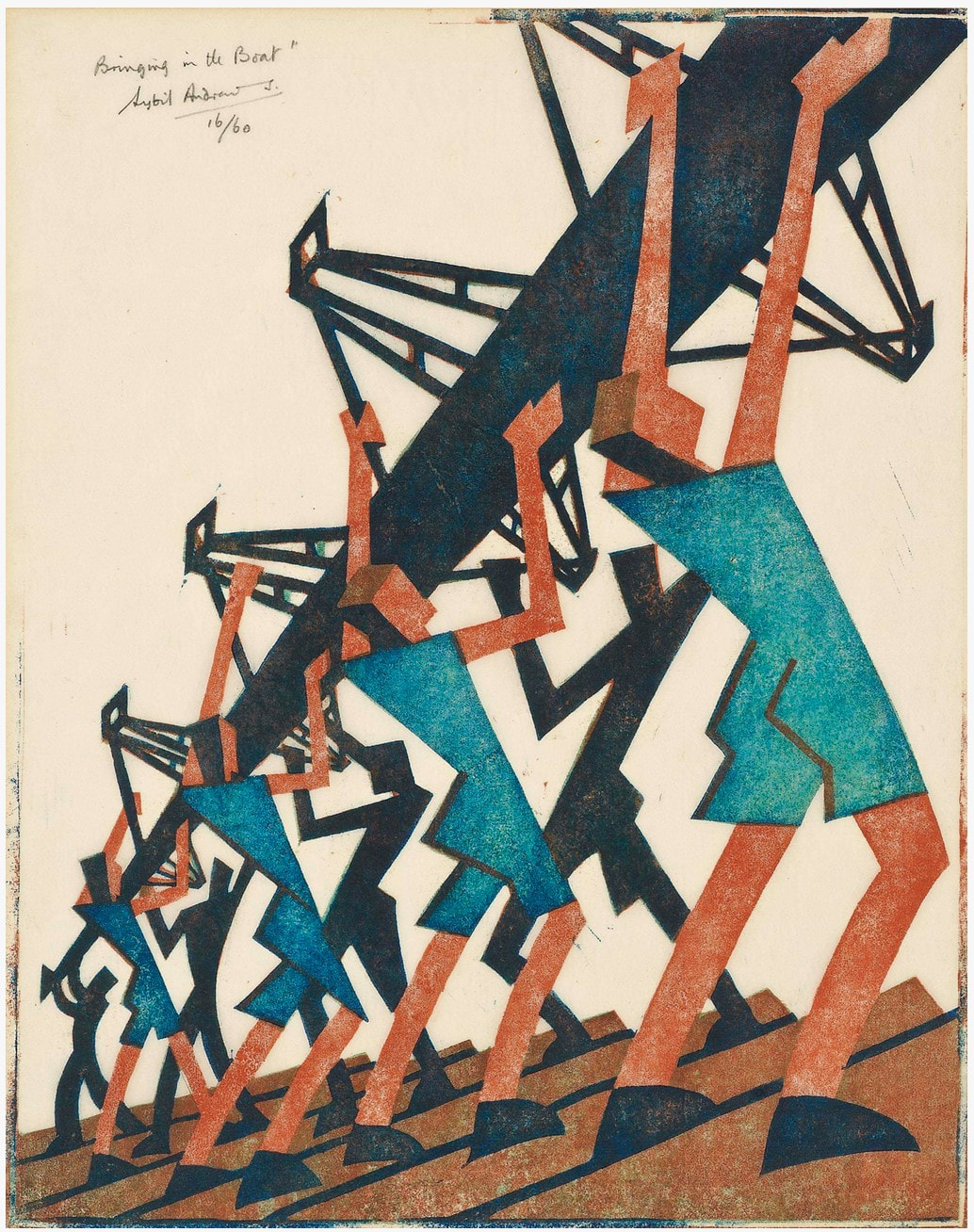
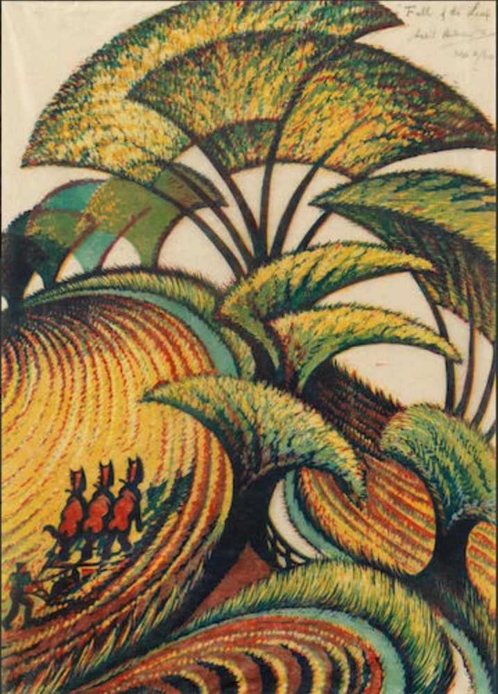
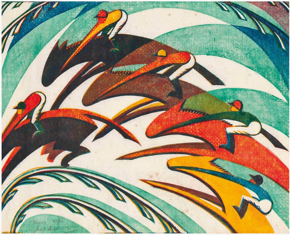
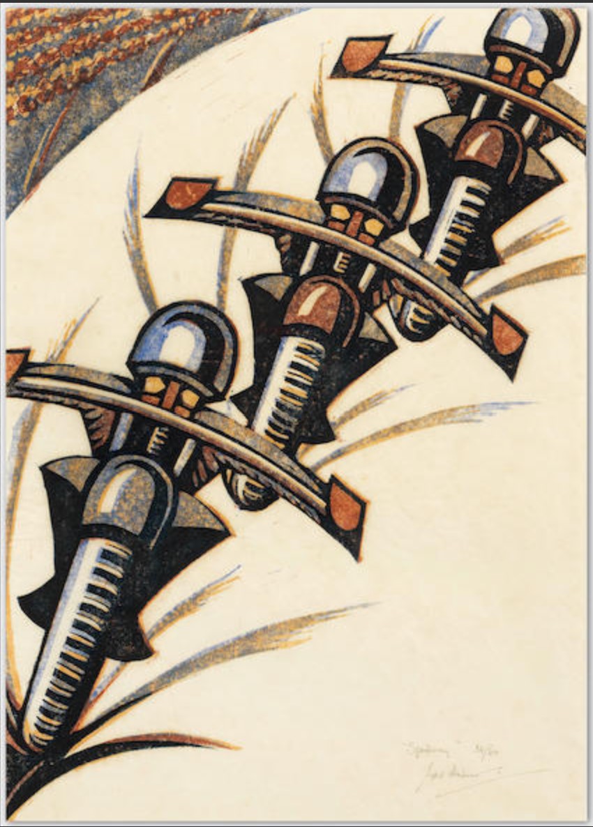
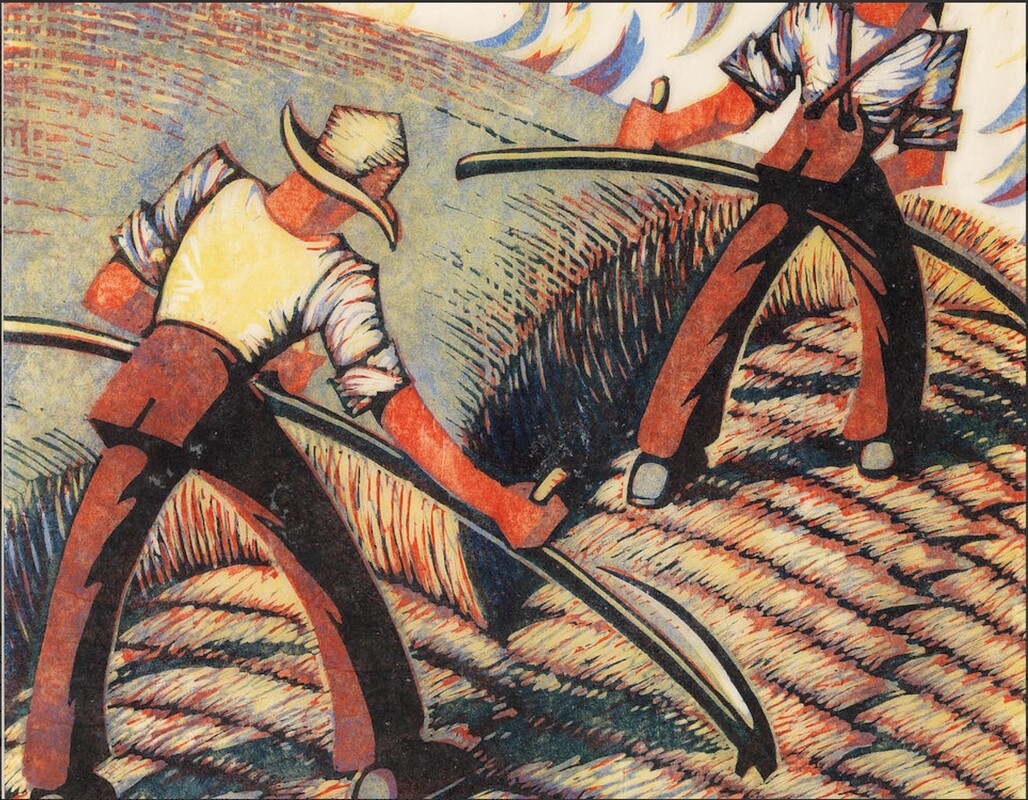
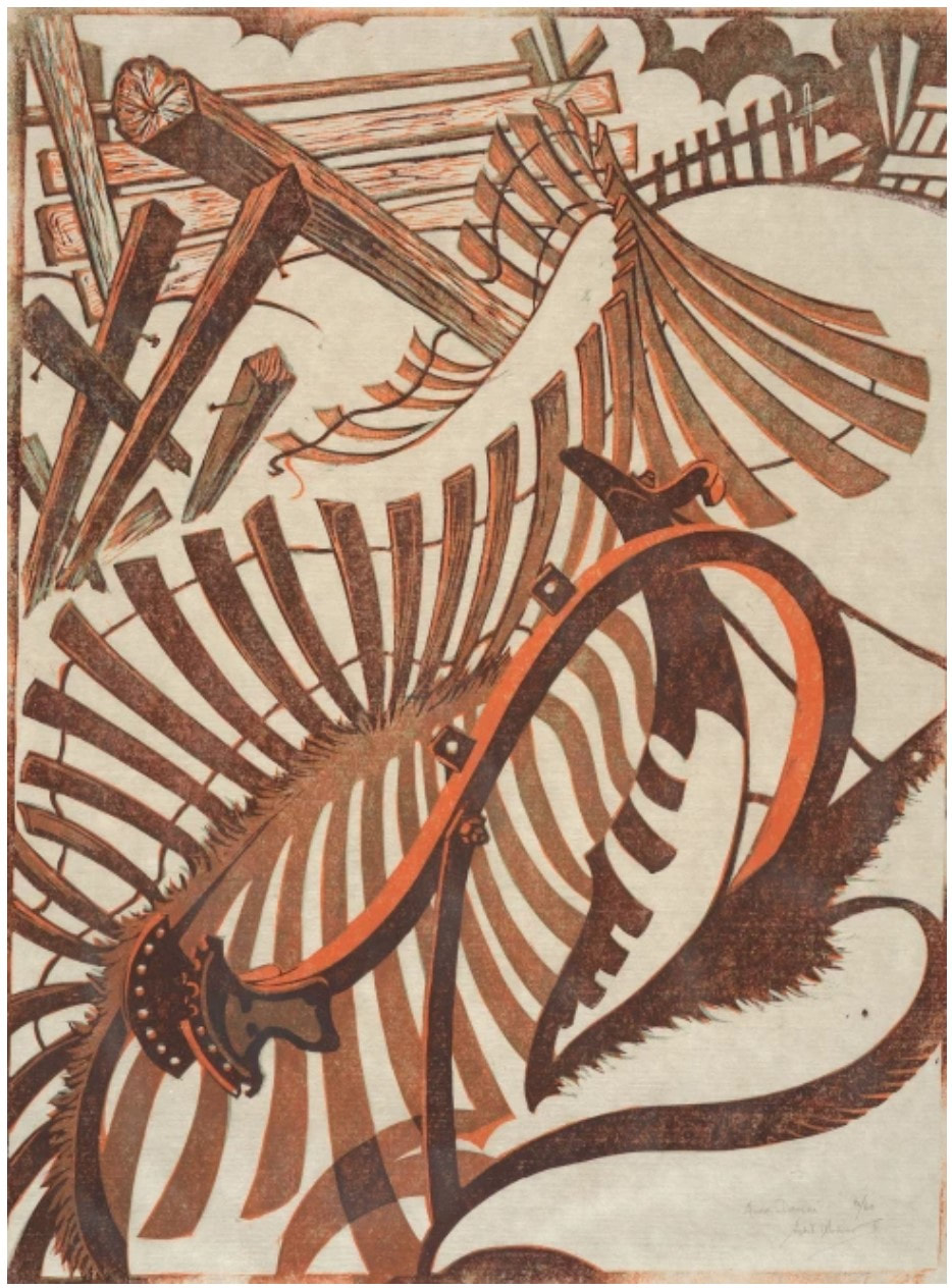
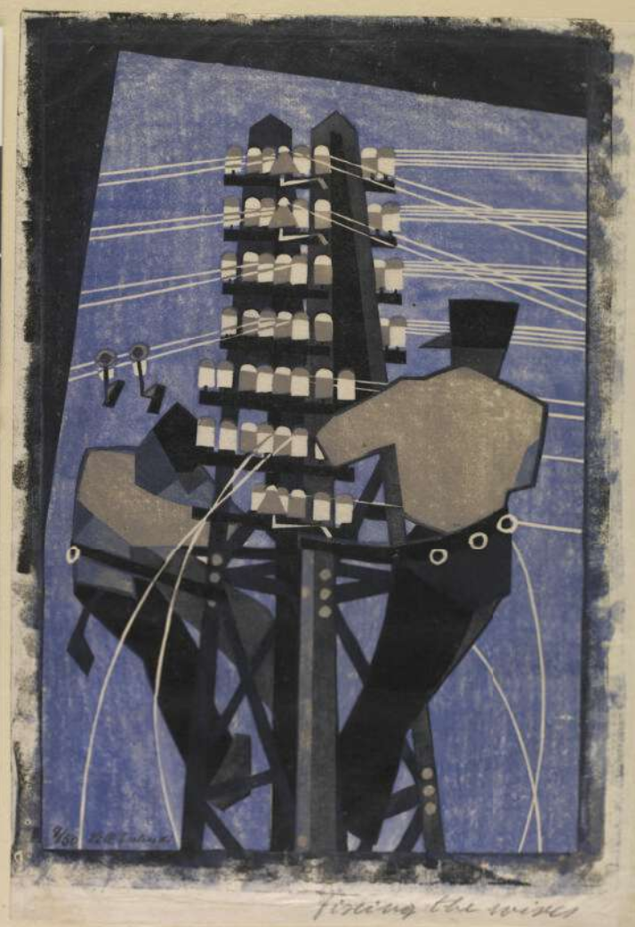
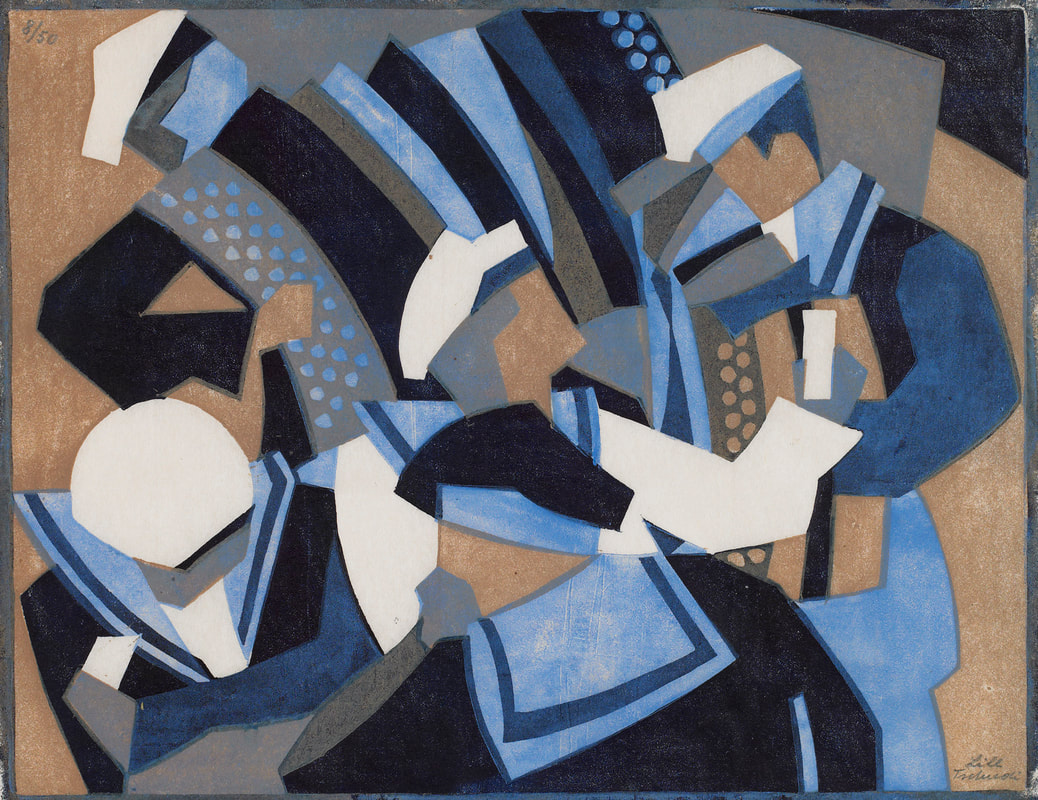
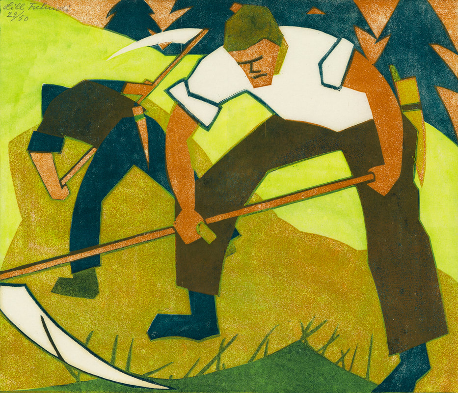
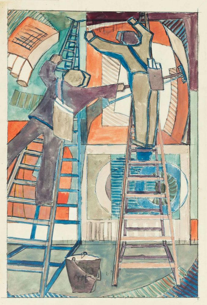
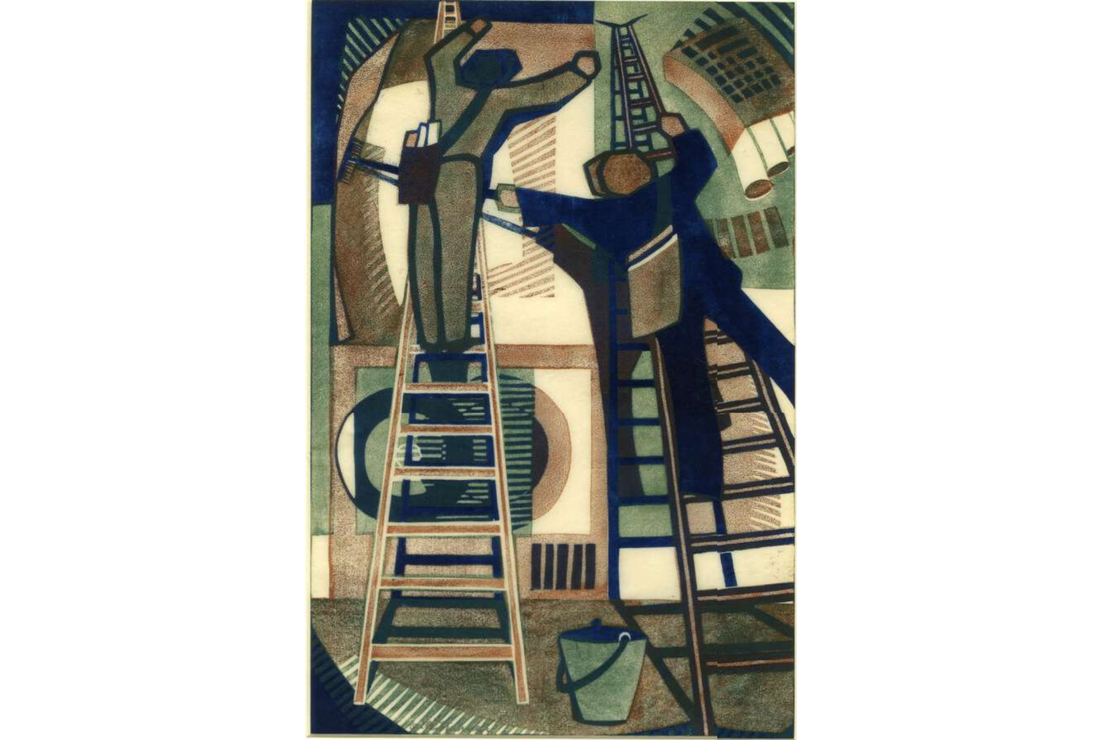
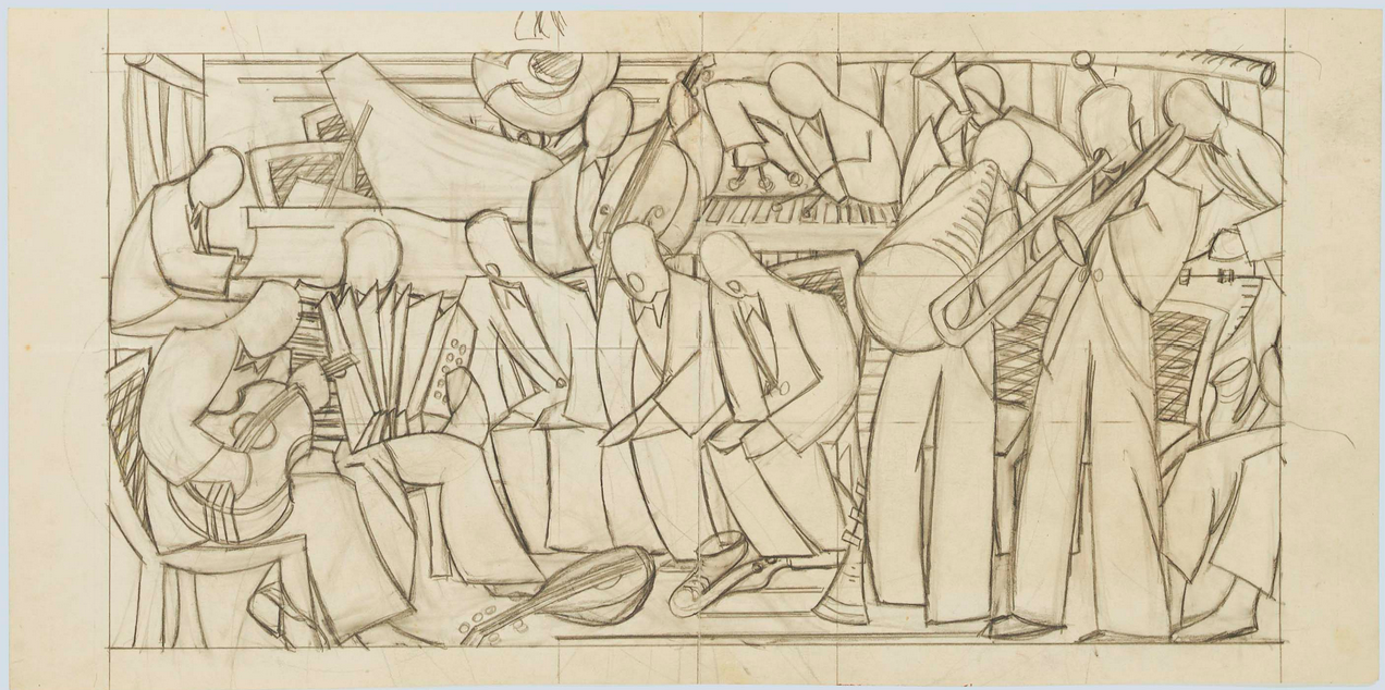
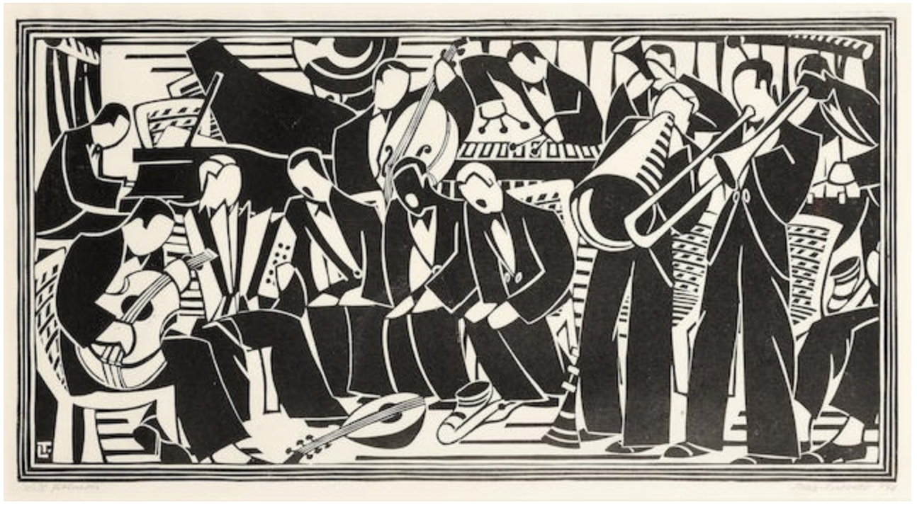
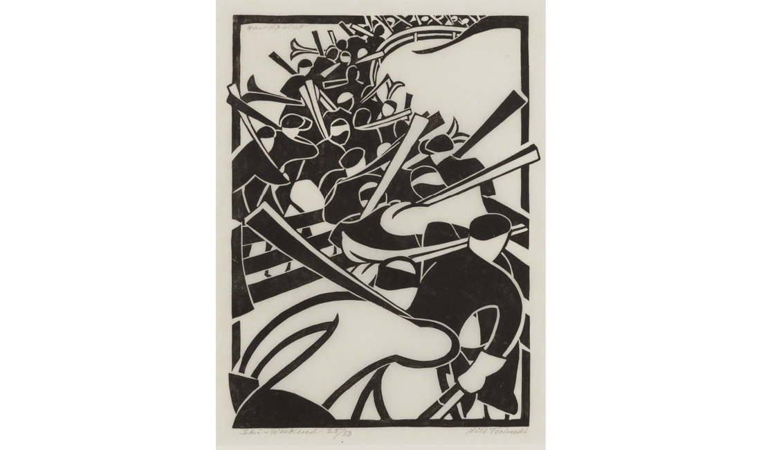
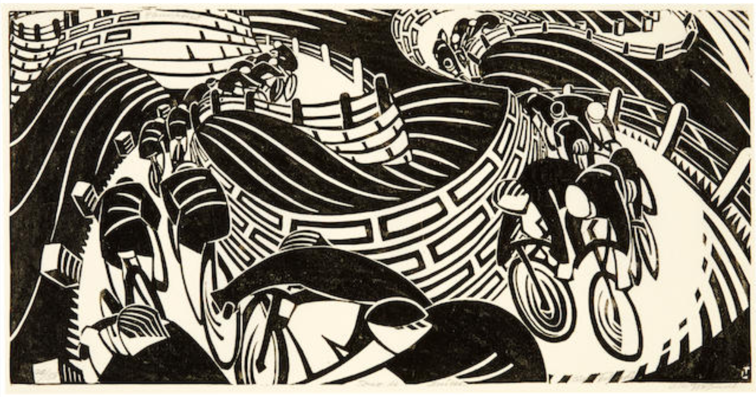
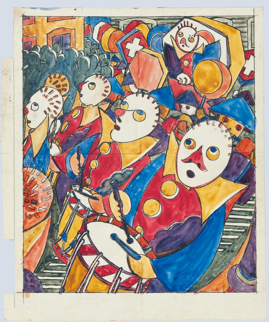
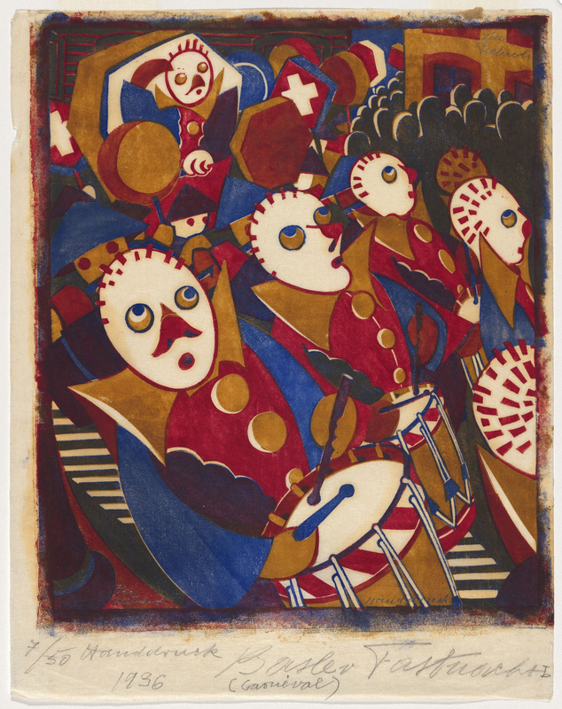
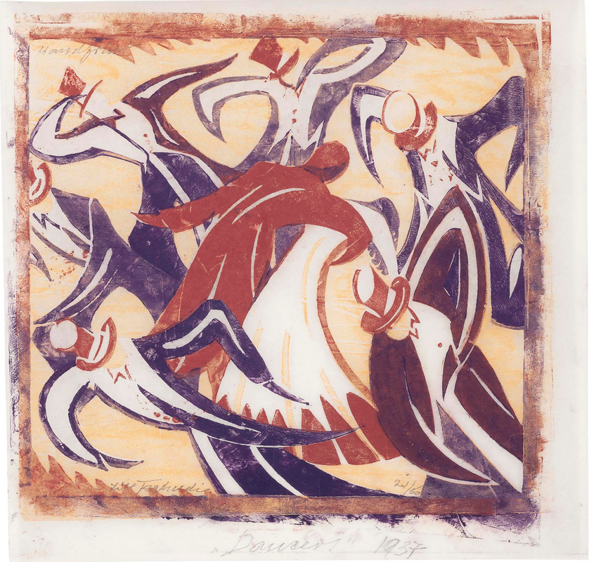
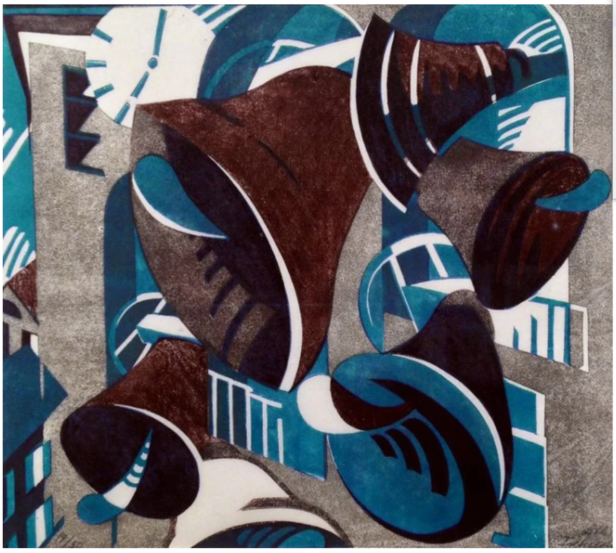
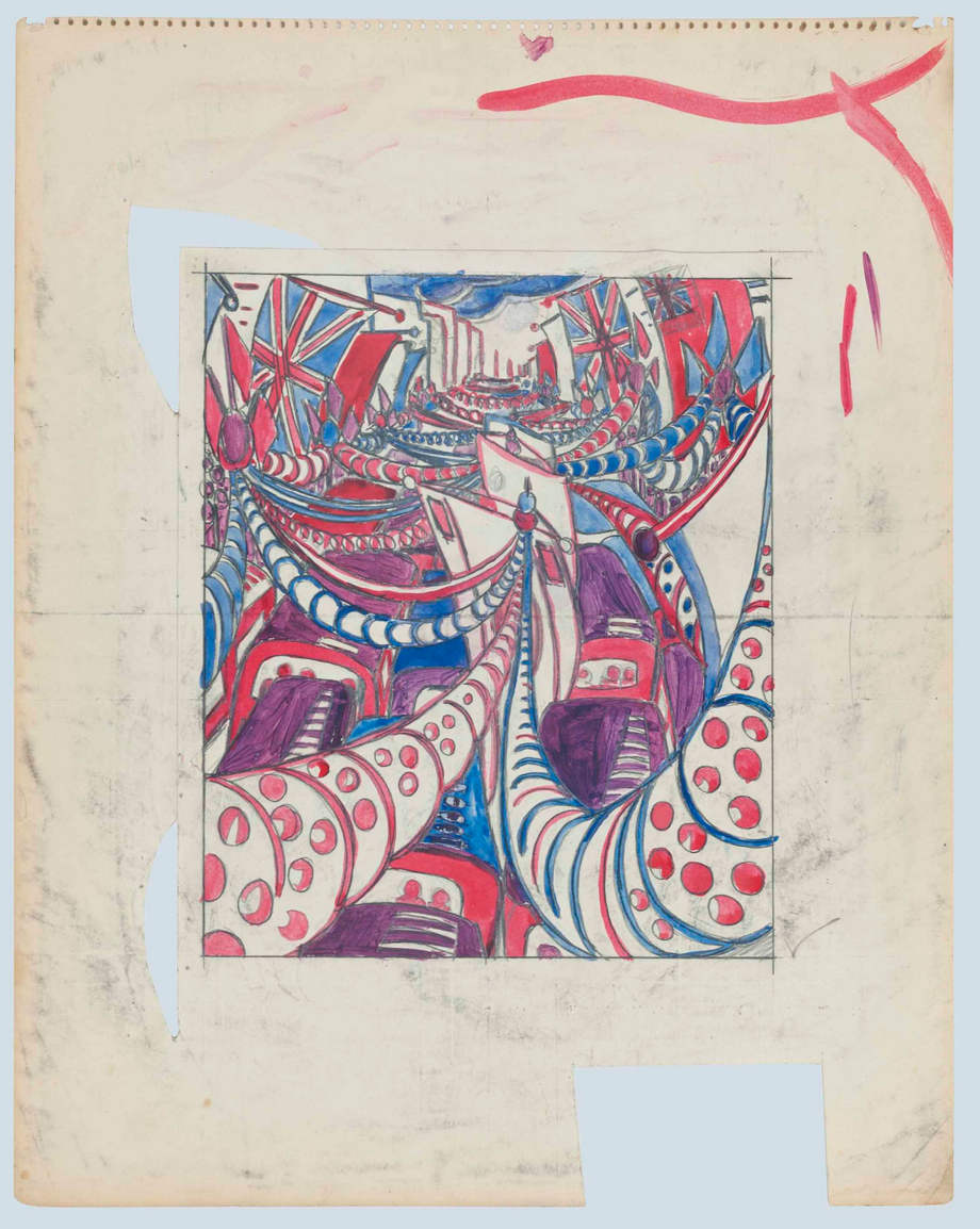
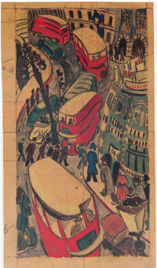
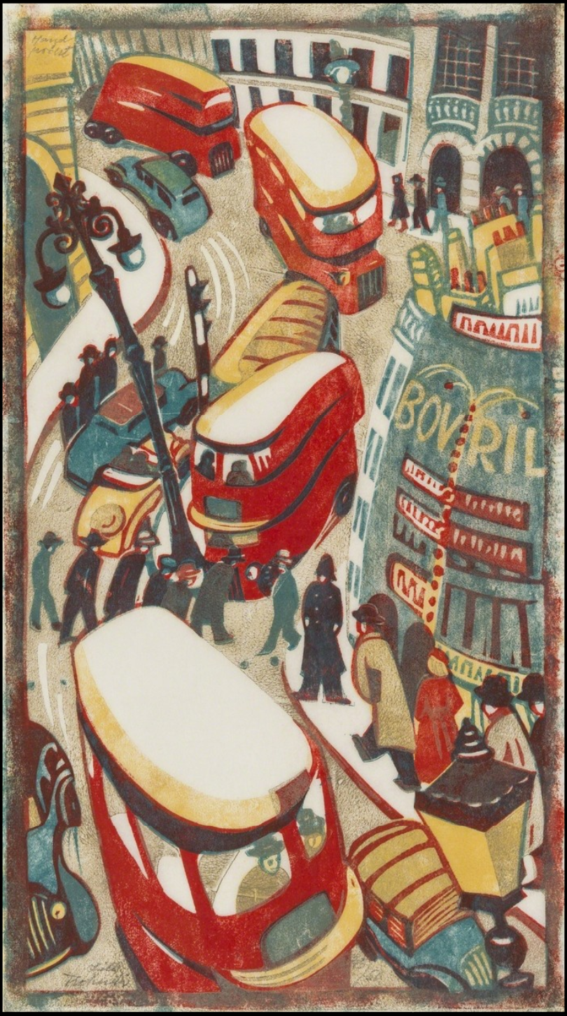
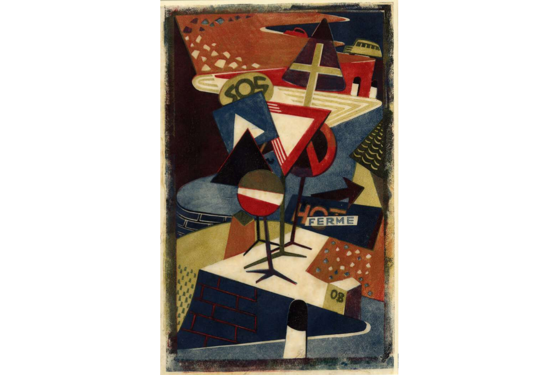
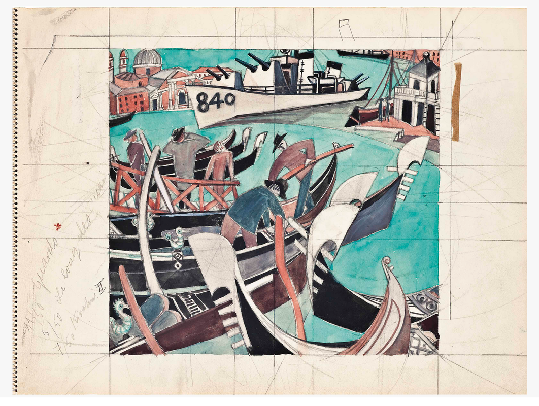
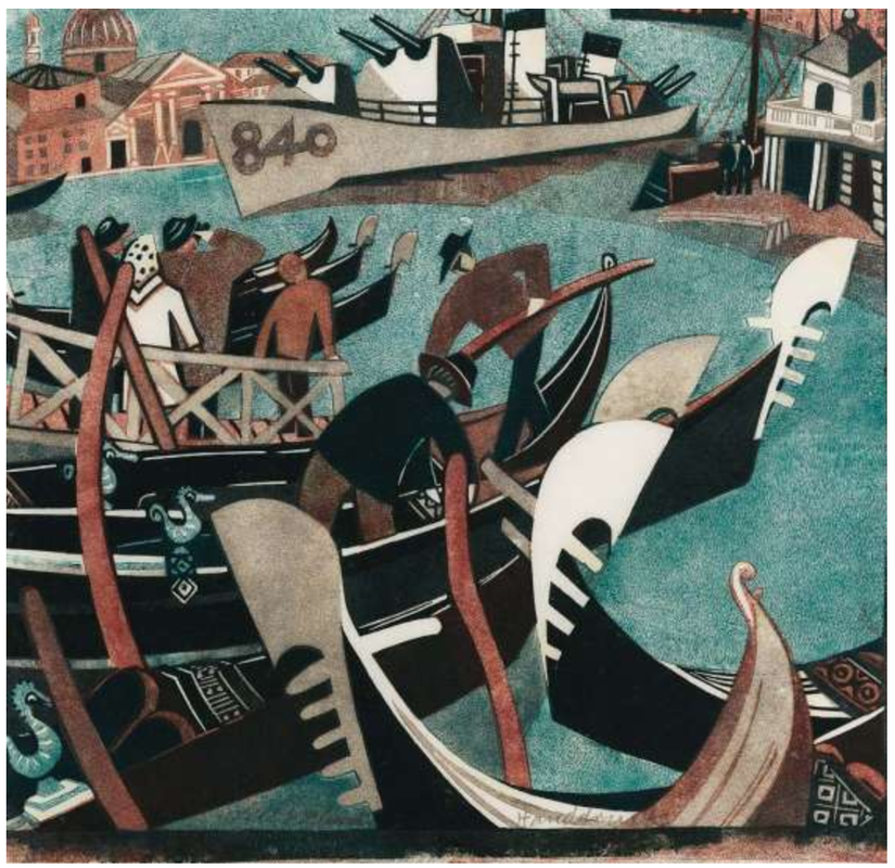
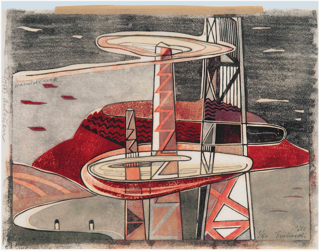
Ann Shafer Recently I shared a post about Sybil Andrews, which seemed to strike a chord if the number of likes and shares is any indication. Her multi-color, multi-block linoleum cuts, like those of her compatriot Grosvenor School artists, celebrated modern life in 1930s England. Today we’re looking at linoleum cuts by Andrews’ close friend and studio mate Cyril Power, who focused mostly on modes transportation, particularly the London Underground. Like Andrews, Power was on the staff at the Grosvenor School when it was founded by Iain Macnab and Claude Flight in 1925. The latter was responsible for the growing interest in multi-color, multi-block linoleum cuts celebrating the speed of modernity. Power himself was a lecturer at the school. He was also a noted scholar of architecture and penned the three-volume A History of English Mediaeval Architecture, which included 424 of his own illustrations and designs. But he’s best known for the linoleum cuts he made alongside Andrews and Flight. Andrews and Power shared a studio for twenty years, giving it up in 1938 (they were both married to other people). Power served at home during the war as a surveyor for a Heavy Rescue Squad (he had also served in World War I), and after the war turned primarily to painting in oils. He died at 78 in 1951. Even when Power’s images are of static, stable things, they feel as if they are in motion. I might even say that he captures motion and potential energy better than Andrews. There’s a reason their compositions are among the best known coming out of the Grosvenor School. They were two of the best. See if you agree. Ann Shafer I love Sybil Andrews’ sensibility. Like Ursula Fookes and Ethel Spowers, who we met recently, Andrews, no surprise, was a part of the Grosvenor School of artists focused on multi-block color linoleum cuts exploring the speed of urban contemporary life primarily during the 1930s in England. I love that she explores speed literally through images of raceways and steeplechases. But she also does something surprising by focusing on rural life and agriculture in that same modernist mode. A bit antithetical. She also created a series of the stations of the cross (I’ll let you look those up on your own). Andrews worked as a secretary at the Grosvenor School beginning in 1925 and soon began making linoleum cuts under the school’s leader, Claude Flight. She became close friends with Cyril Power (I promise, I will cover both Flight and Power soon), sharing a studio until 1938, as well as collaborating under the pseudonym Andrew-Power. During World War II, while working as a welder in a factory, she met her husband Walter Morgan. The couple emigrated to Canada and settled on Vancouver Island in 1947. She continued making color linoleum cuts well into the 1970s. I love that Andrews has such a strong point of view. I love the palette and the colors’ vibrancy. I love the high-design sense and reductiveness of the objects. I love the range of subjects. Well, there is not much about her work I don’t love. Please meet Sybil Andrews. Ann Shafer While I object to designating a single month to paying attention to women--why four weeks per year and why is this really necessary--here we are. I recently (not during the designated month--horrors!) wrote about some early female printmakers: Diana Scultori, Elisabetta Sirani, and Geertruydt Roghman. But, if you’ve been following along, you know my heart is in the twentieth century. So, please meet Lill Tschudi (1911–2004), a Swiss artist best known for her multi-color linoleum cuts of 1930s London. As a teenager Tschudi had already decided she wanted to be a printmaker after seeing an exhibition of prints by Austrian artist Norbertine Bresslern-Roth (she's worth a look). Determined to pursue printmaking, Tschudi spent two years (1929–30) in London beginning at age eighteen, studying with Claude Flight, a key member of the Grosvenor School, a group of printmakers making color linoleum cuts. Other members include Sybil Andrews, Cyril Power, Dorrit Black, and William Greengrass. The artists of the Grosvenor School used multiple blocks of linoleum—one for each color—to create images that celebrate modernity and the machine age in a signature style that exploits rhythmically dynamic patterns. Subjects range from the London underground’s labyrinthine stations and escalators, and horse, car, and bike races, to farmers and other manual laborers, and musicians and other performers. (Linoleum was a fairly new material used in the arts. It had been invented as floor covering in England in 1860 and later was adapted to printmaking.) After two years studying with Flight, Tschudi spent several years in Paris before returning to her native Switzerland. In Paris she studied with cubist artist André Lhote, futurist artist Gino Severini at the Academie Ronson, and Fernand Léger at the Académie Moderne. By 1935 she was back at home in Schwanden, a village in a mountainous region in eastern Switzerland known for its textile industry. In the ensuing years she made more than three hundred linoleum cuts and maintained a business relationship with Flight, who acted as her dealer in England where most of her works sold. So why am I attracted to her prints--well, all of the Grosvenor School, really? I’ve always loved bold graphic images. I love a stripe, a circle, a square, anything geometric; I am much less attracted to paisley or anything fussy. I have often wondered if it goes back to the mid-century modern décor I grew up with in the late sixties and seventies (love me some Marimekko). Cuz, you know, it’s all what you grow up with. I also love it when forms are reduced to their essential elements. And how cool is it that she got motion out of those reductive forms? I just love them. Lucky for us, a large collection of works by Tschudi sold at Christie's in 2012, including a number of preparatory drawings for prints. You'll find some here along with their prints. Ann ShaferI wrote recently about jaw-dropping art history moments. For me, there have only been three: Charles Demuth (the church spire behind his house), Edouard Manet (a still life of lilacs in a glass vase), and Velasquez (Las Meninas). Even more rare is getting goosebumps. Today’s post is about possibly my only goosebumpy moment, which has to do with Charles White. White, an African American artist, was the subject of an exhibition at the Museum of Modern Art in 2018–19. Curated by Esther Adler, the show began its run at the Art Institute of Chicago, and finished it at the Los Angeles County Museum of Art. The BMA has a linoleum cut print by White called Voice of Jericho, 1958. It’s a large print at 39 x 21 inches and shows Harry Belafonte singing. This is a print that I used constantly in the BMA’s studyroom for classes. We would talk about whether the figure was yelling out loud or internally, silently, or if he was singing. And we’d talk and about the portrayal of the sound or silence, which swirls up from the figure to fill more than half the image area. Even if the students were not familiar with Harry Belafonte (he was part of my childhood—one of the first songs I learned on guitar was Jamaica Farewell), the image conveys an immense amount of emotion. And the kids seemed to get it. I made a point of getting to MoMA to see the Charles White exhibition, which was gorgeous. It was during New York Print Week when print curators, dealers, collectors, artists, and publishers descend on the City for four print fairs and a ton of attending programming. As usual, Tru Ludwig was with me. Tru is an artist who also teaches History of Prints at the Maryland Institute College of Art. Voice of Jericho is a staple in that class. I was surprised not to find the BMA print on the walls of the MoMA exhibition—it turned out it had been in Chicago for the first venue, but not included in the second in NY. But the drawing on which it is based was there. (It is owned by Belafonte and his wife.) I had not seen it before and was struck by its gloriousness. But I came away feeling that the print says it better. The drawing includes more of the singer’s figure set on a dark background that lacks the dynamism of the linoleum cut. But in both images Belafonte’s head is cocked back, his mouth open in song, and his neck tensed in the effort. It has always struck me as a posture of potential energy, as if Belafonte is carefully balancing control of performance and his explosive emotions. Here comes the goosebumps part, which were accompanied by welling tears. As part of the MoMA installation, there was a monitor looping video of Harry Belafonte performing the song Bald Headed Woman, which opened his television special, Tonight with Belafonte, in 1959. (It also is on Belafonte’s album Swing Dat Hammer and curiously, was covered by the Kinks and The Who.) A link to the television special is here: https://www.youtube.com/watch?v=otw0FtXjOKc&t=507s. It’s the first song Belafonte performs, but doesn’t begin until the 4:40 mark. As Tru and I stood there watching, suddenly the whole thing came together. Belafonte’s performance is mesmerizing and when he reaches for a high note, his head cocks back exactly as White portrayed him in the drawing and print. Goosebumps and tears. Charles White (American, 1918–1979) Voice of Jericho (Folksinger), 1958 Linoleum cut Sheet: 1003 x 540 mm. (39 1/2 x 21 1/4 in.) Image: 917 x 458 mm. (36 1/8 x 18 1/16 in.) Baltimore Museum of Art: Friends of Art Fund, 1999.84 Charles White (American, 1918–1979) Folksinger (Voice of Jericho: Portrait of Harry Belafonte), 1957 Ink and colored ink with white additions 132 x 865 mm. (52 x 34 in.) Collection Pamela and Harry Belafonte © The Charles White Archives https://www.youtube.com/watch?v=otw0FtXjOKc&t=507s 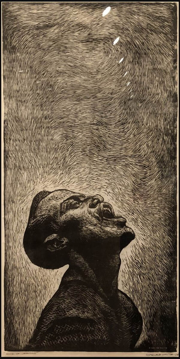 Charles White (American, 1918–1979) Voice of Jericho (Folksinger), 1958 Linoleum cut Sheet: 1003 x 540 mm. (39 1/2 x 21 1/4 in.) Image: 917 x 458 mm. (36 1/8 x 18 1/16 in.) Baltimore Museum of Art: Friends of Art Fund, 1999.84 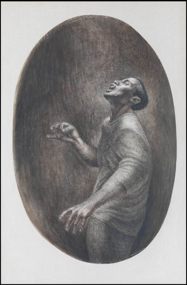 Charles White (American, 1918–1979) Folksinger (Voice of Jericho: Portrait of Harry Belafonte), 1957 Ink and colored ink with white additions 132 x 865 mm. (52 x 34 in.) Collection Pamela and Harry Belafonte © The Charles White Archives |
Ann's art blogA small corner of the interwebs to share thoughts on objects I acquired for the Baltimore Museum of Art's collection, research I've done on Stanley William Hayter and Atelier 17, experiments in intaglio printmaking, and the Baltimore Contemporary Print Fair. Archives
February 2023
Categories
All
|


 RSS Feed