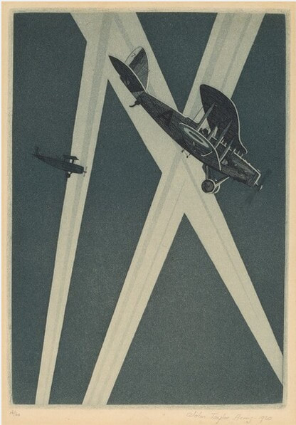
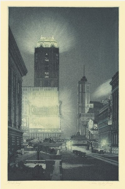
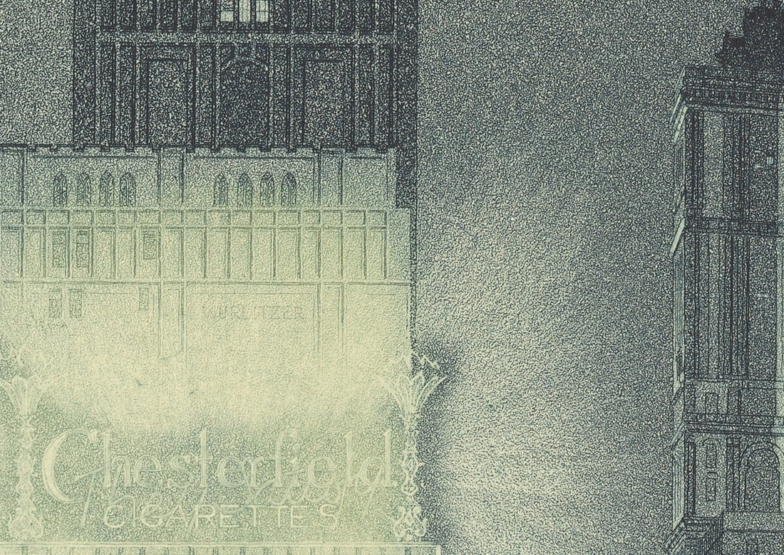
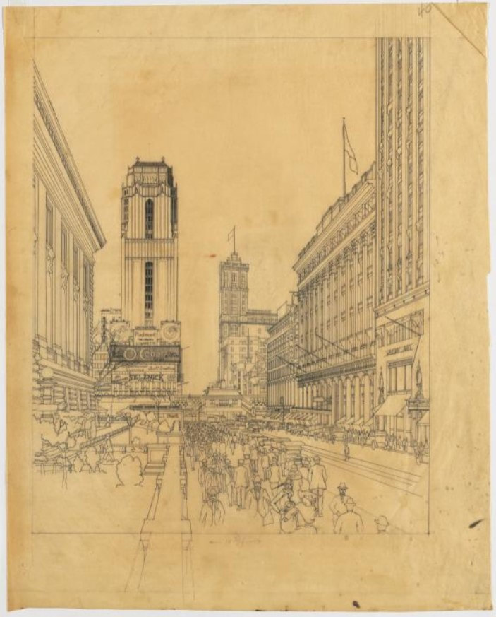
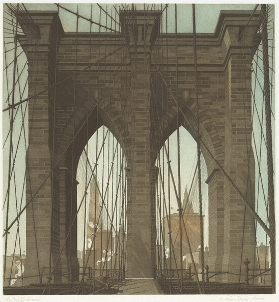
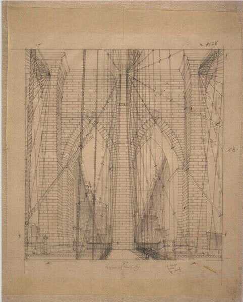
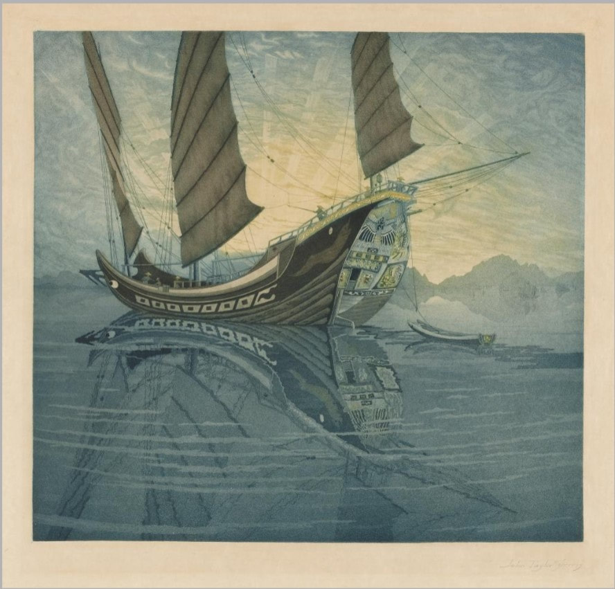
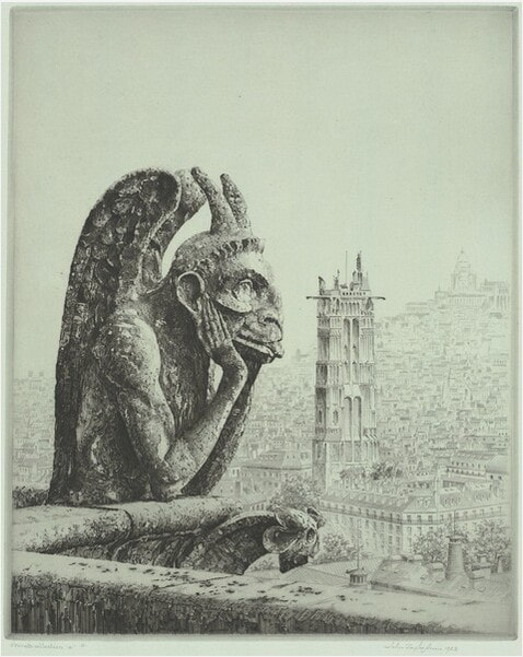
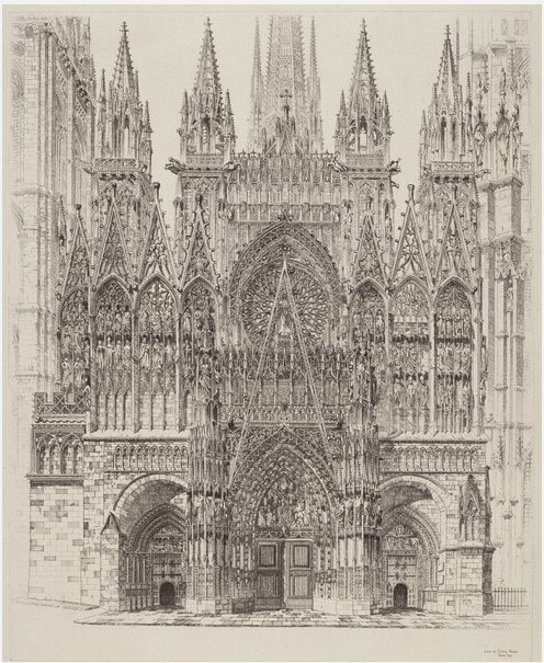
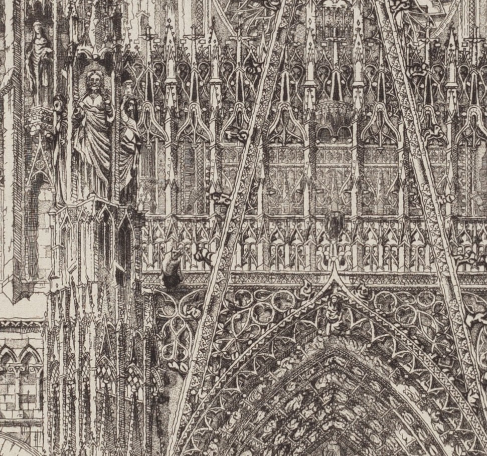
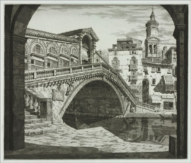
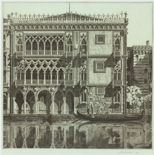
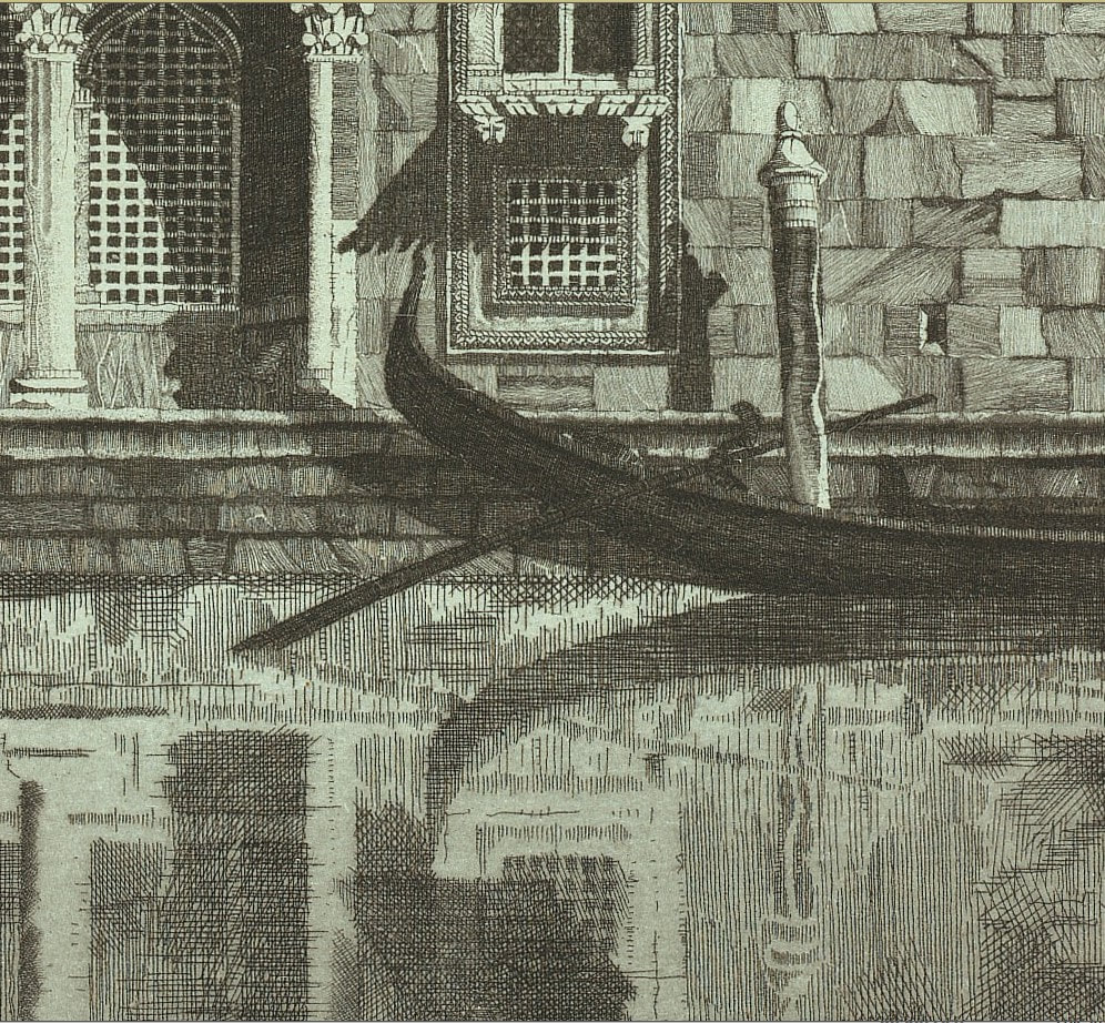
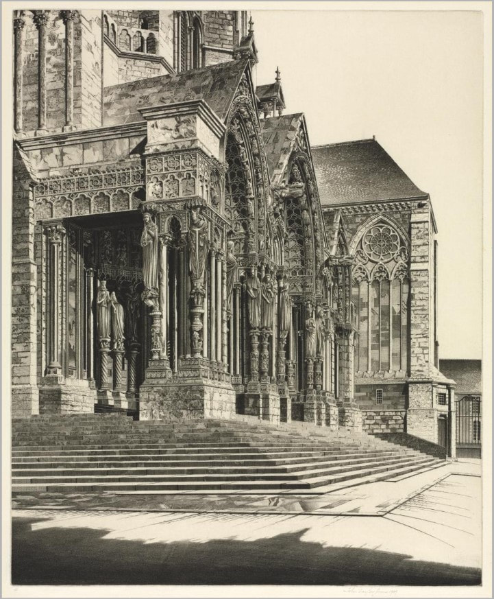
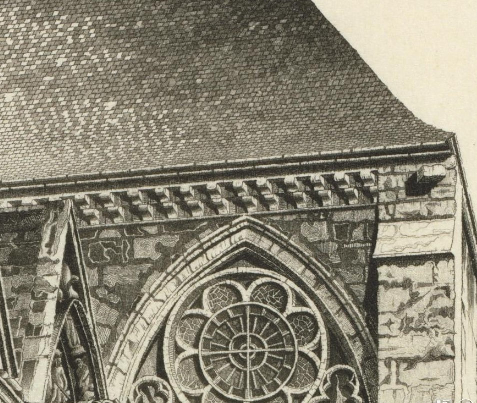
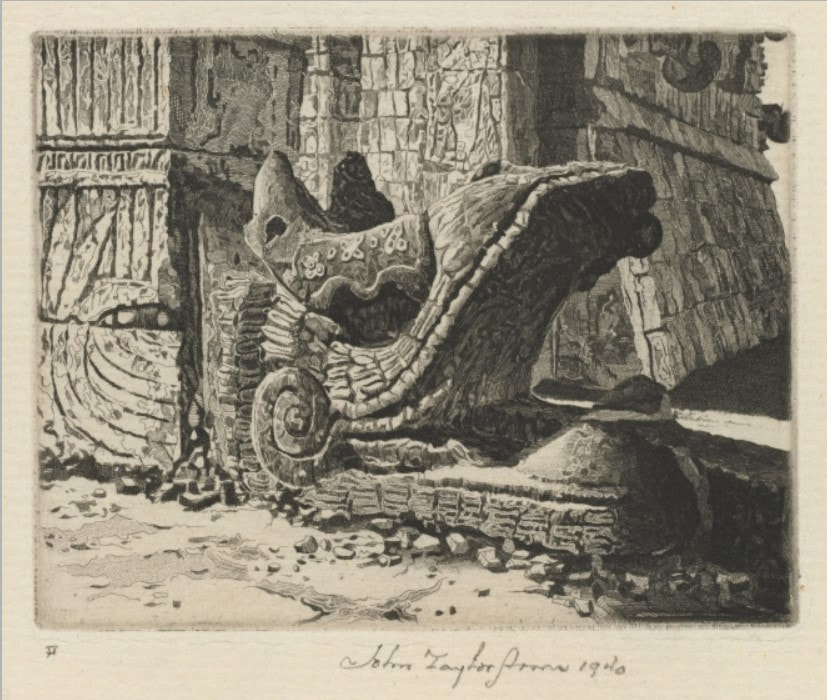
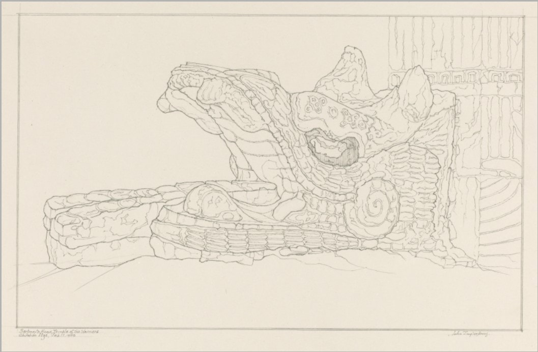
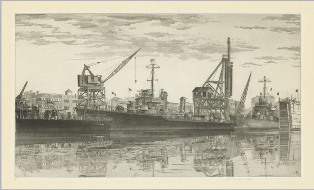
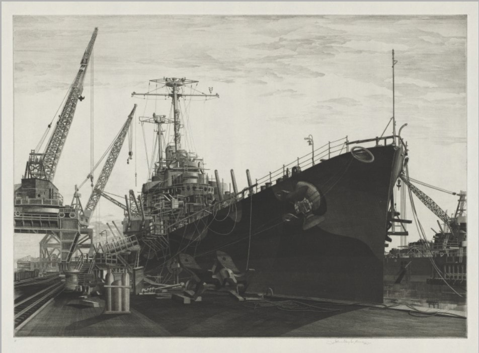
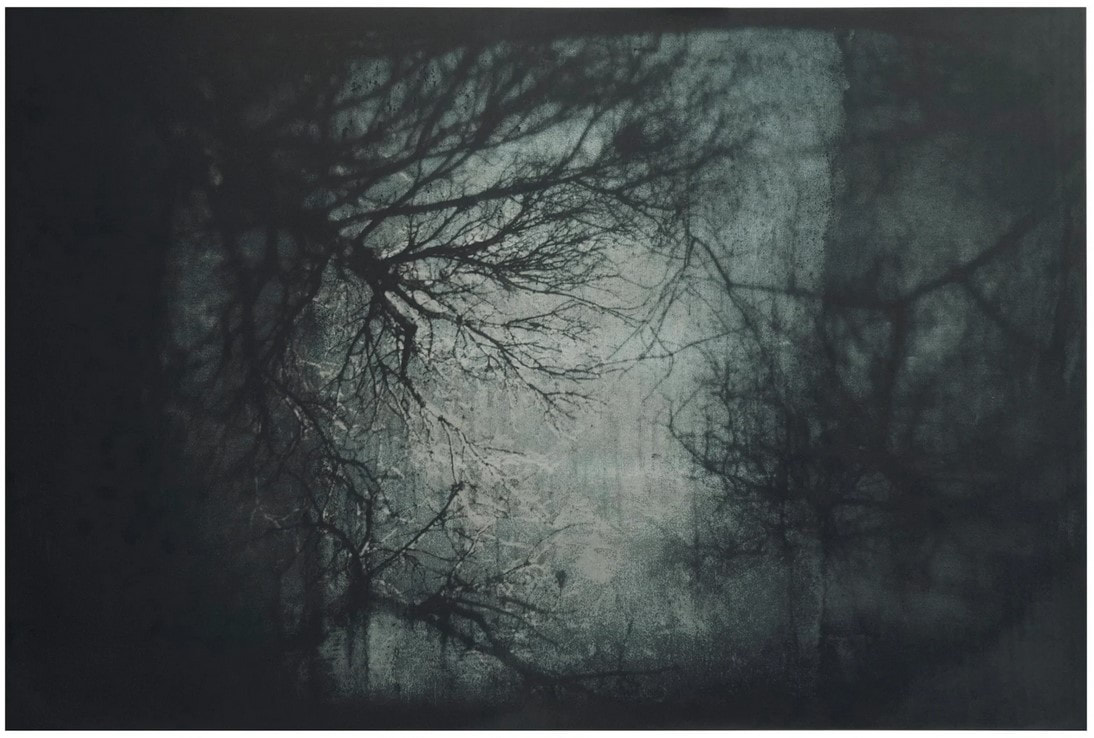
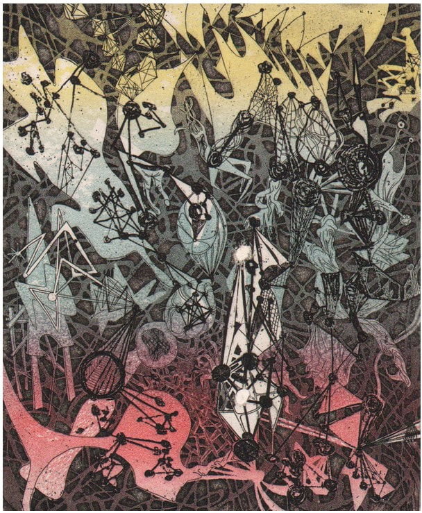
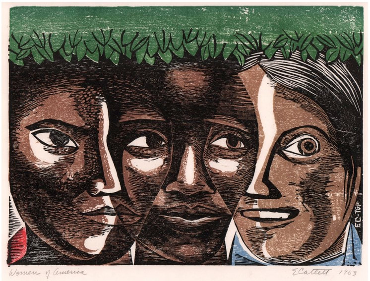
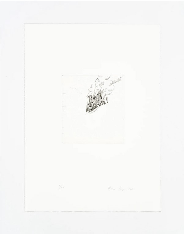
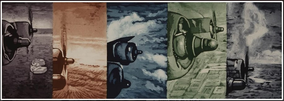
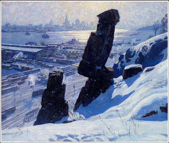
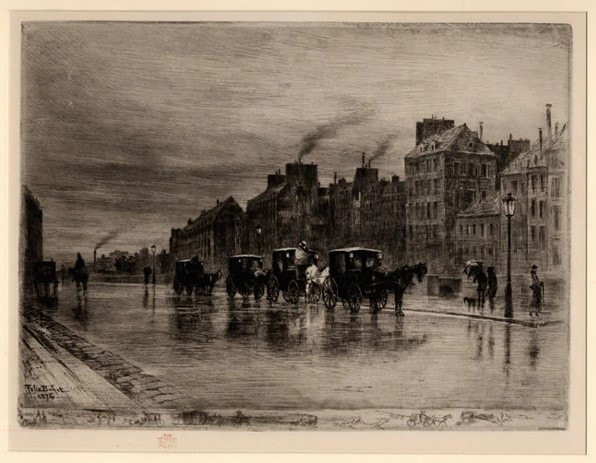
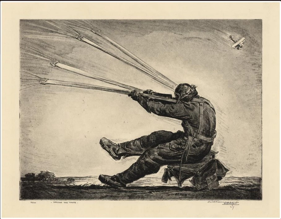
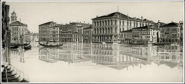
Ann ShaferSelf-taught. Self. Taught. One of the most remarkable etchers of the first half of the twentieth century taught himself how to etch after his wife gave him an “etching kit” for Christmas. What the hell. John Taylor Arms (American, 1887–1953) made stunning etchings of architecture in New York, Europe, and Japan, and Mexico. No doubt his experience as an architect gave him a leg up. In those days, there were no computers with CAD programs to assist with rendering buildings. Back then, architects hand drew every drawing for a project. With that bit of information, Arms’ etchings make more sense. They are, after all, seriously accurate images of architecture. But still. Interestingly, rather than portraying contemporary buildings, Arms more often portrayed Gothic architecture, which he considered “the most significant expression of man’s aspirations.” His early etchings focus on New York’s skyscrapers, but he soon decided “I can admire the skyscrapers of New York, that unbelievable city which is a very gold mine for the architectural etcher, but I do not love them and I cannot etch what I do not love.” Once New York lost its appeal as a subject, Arms traveled extensively making detailed drawings of towns and churches across Europe and Mexico that would be the basis of etchings once he was back home. He made some five hundred etchings during his fifty-year career and was quite successful over the course of his lifetime. Why do I love his etchings? After all, they are hyper-realistic, full of fine details, and are highly representational. They don’t exactly fall into my tight-conceptual-circle model. What gives? Maybe it’s because they take me away to whatever place is represented. And maybe those day-dreamy trips have an extra hold on me during these long winter, quarantine days. Wouldn’t it be nice to be riding a vaporetto along the Grand Canal passing the Ca’ d’Oro? I can almost smell the sea air and every other scent that comes with wandering around Venice. Also, I can’t wrap my head around how he portrays the crumbling stone texture of the gargoyles, the intricacies of Venetian facades, the church porticos, not to mention the reflections, light, and shadows. He apparently used sewing needles and magnifying glasses to make such fine marks. But the image that I really want for myself is Wasp, the image of two planes dive-bombing some target or other, printed in blue ink. I love the flatness of the image, the pattern made by the searchlights, the potential energy of the planes. It sits at the intersection of abstraction and representation and it hits so many notes. Love. It.
0 Comments
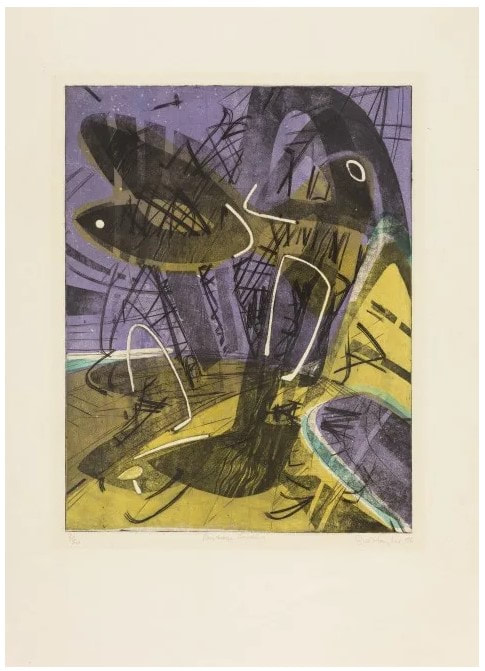
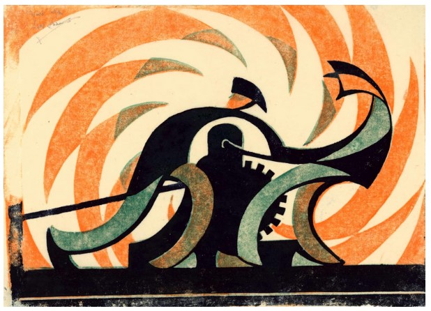
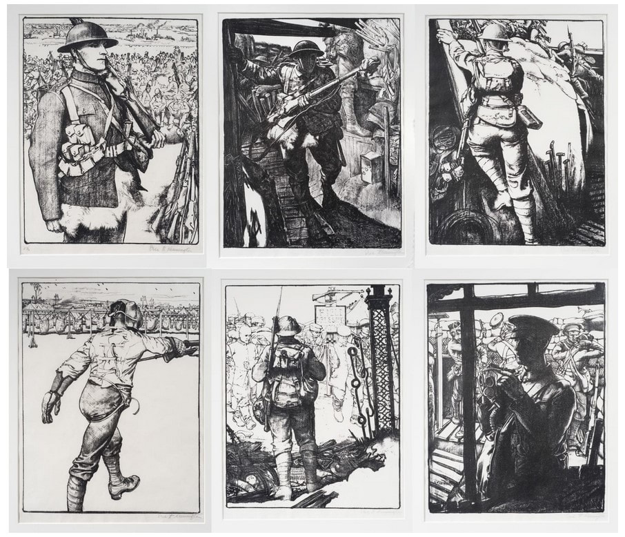
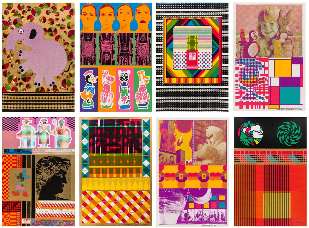
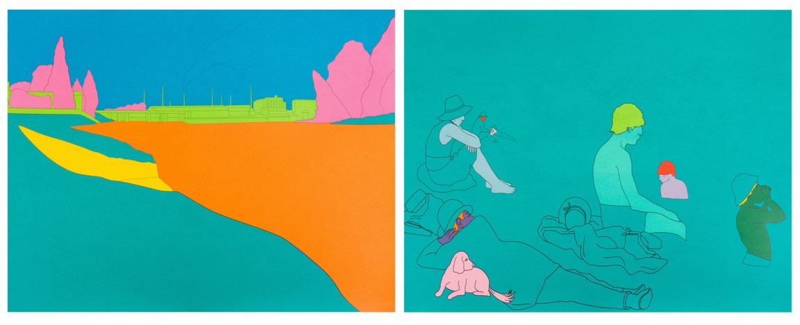
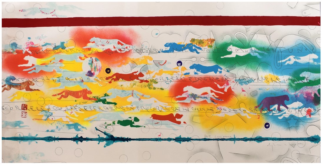
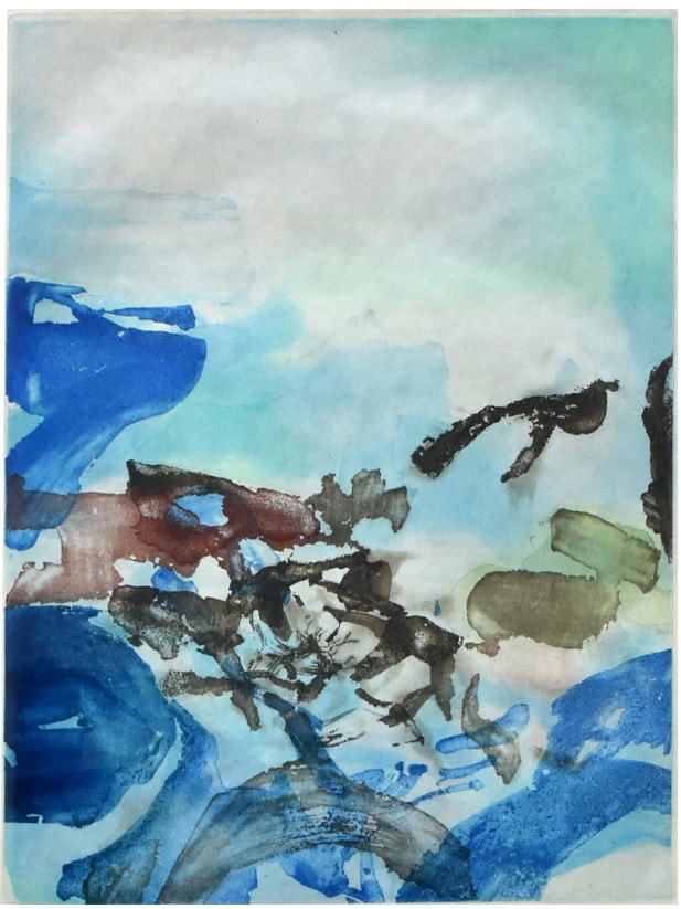
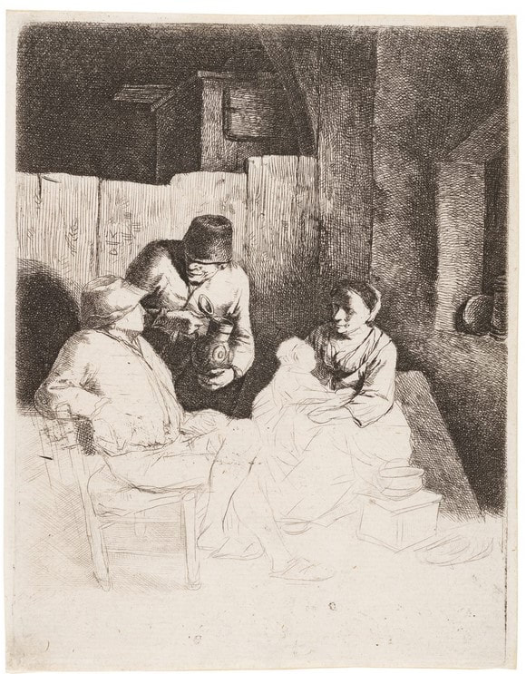
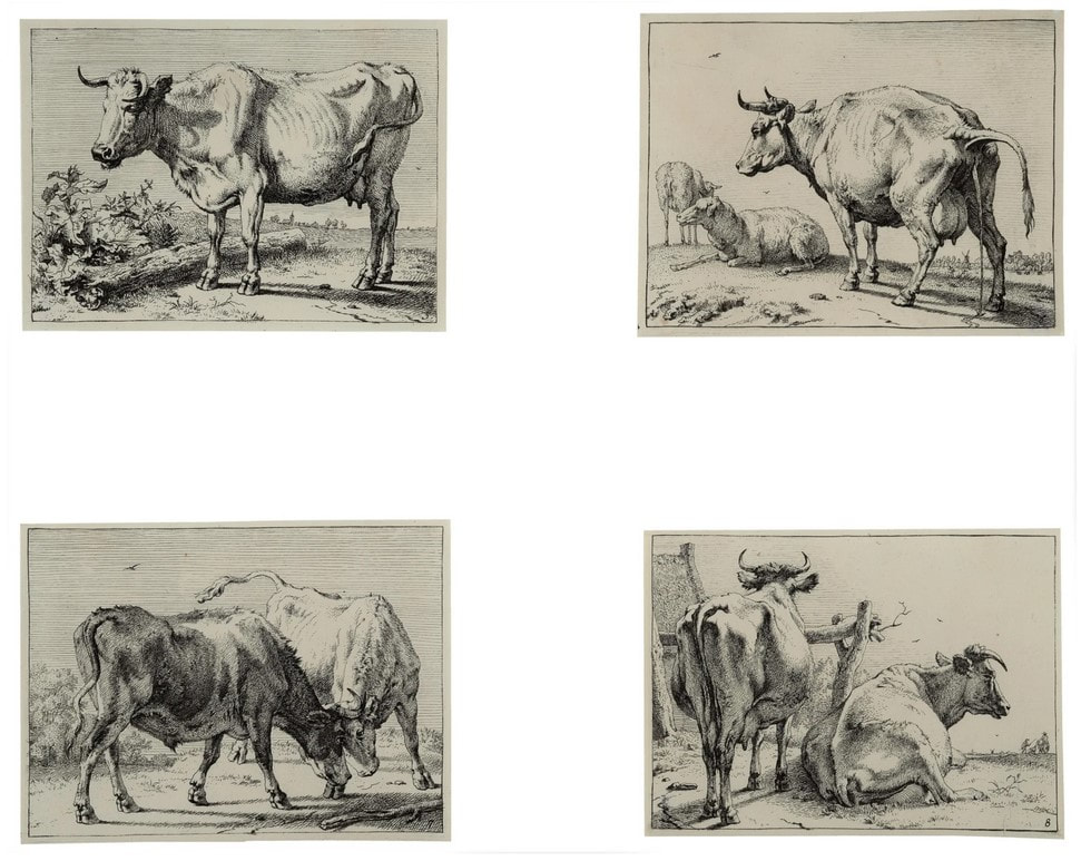
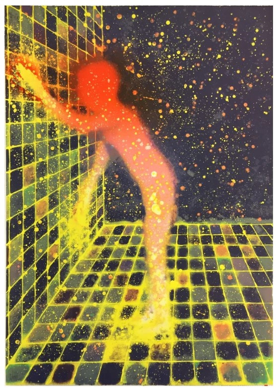
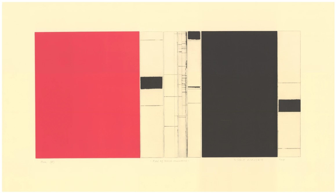
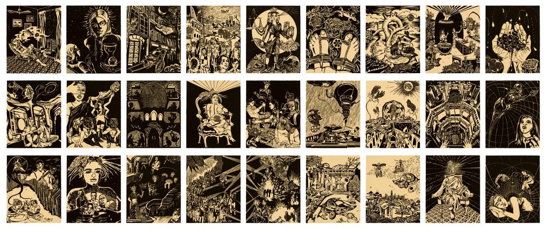
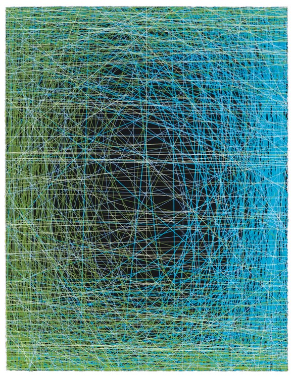
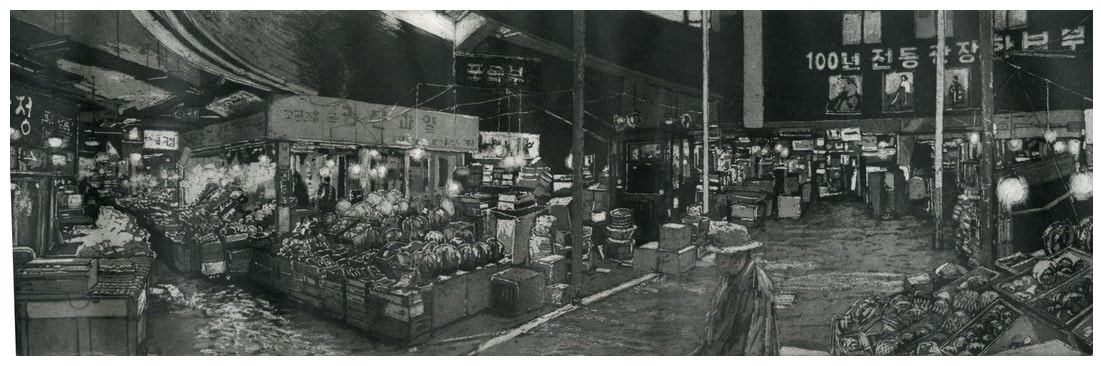
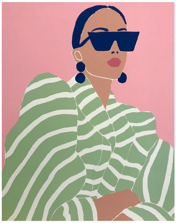
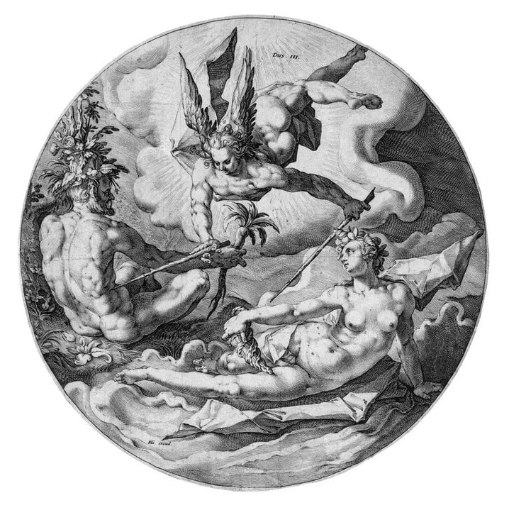
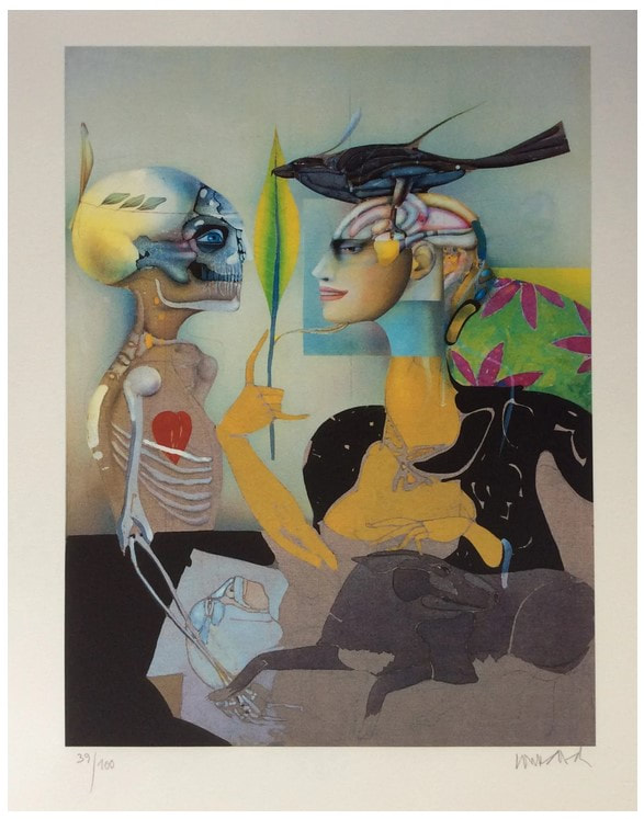
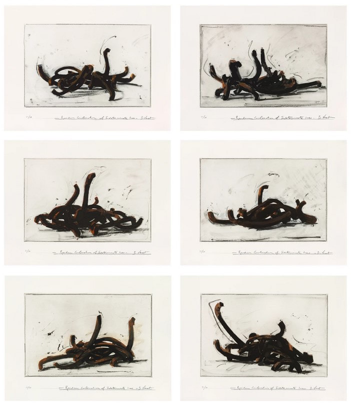
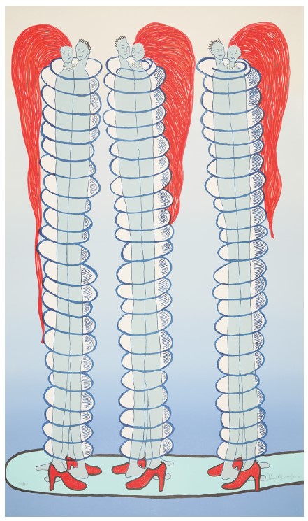
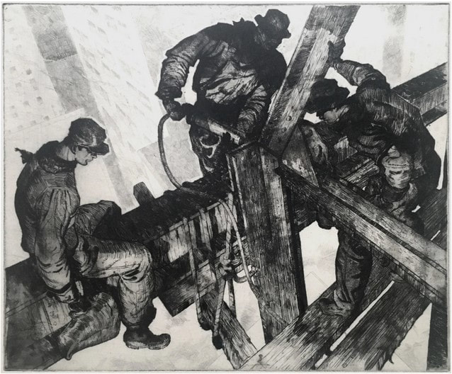
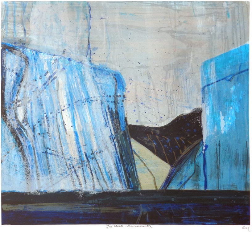
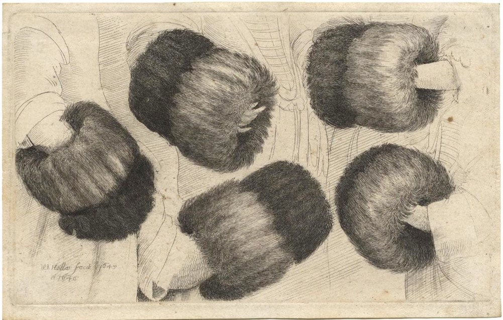
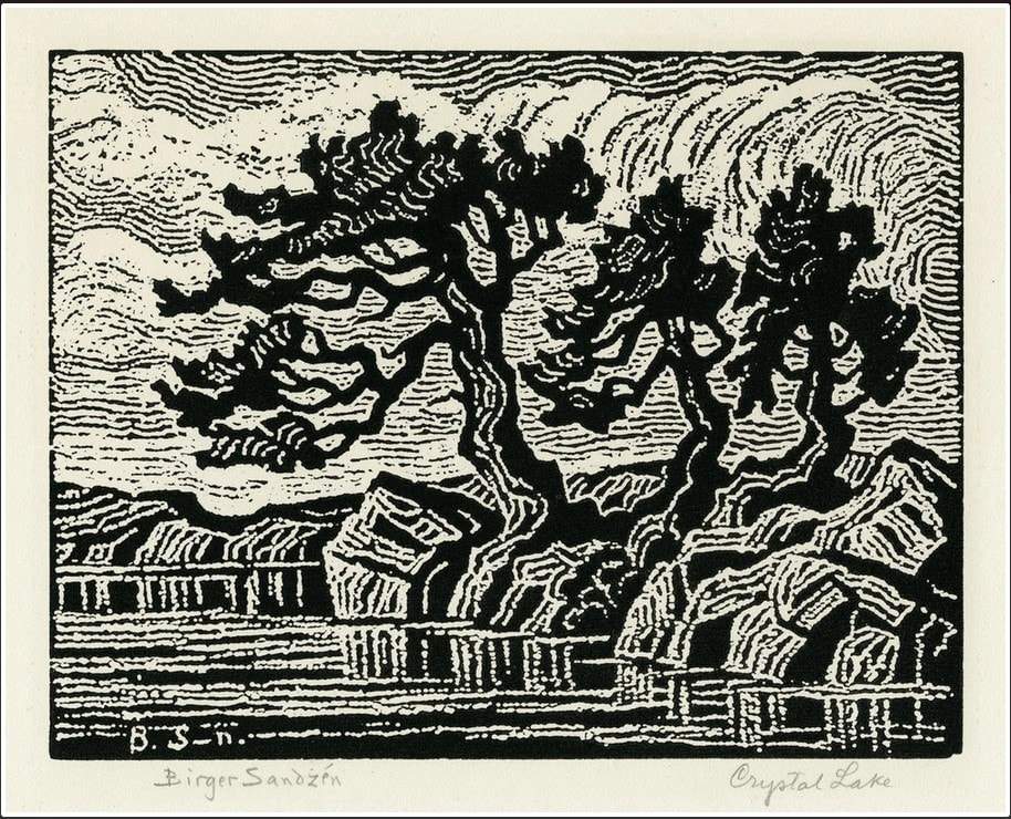
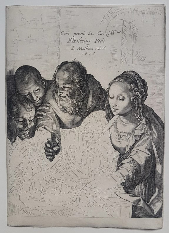
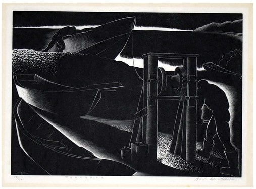
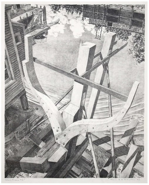
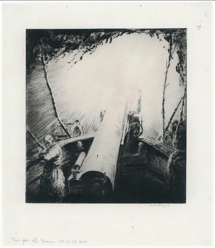
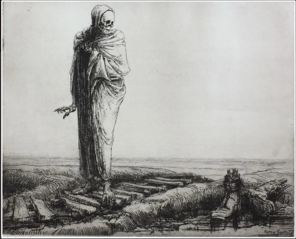
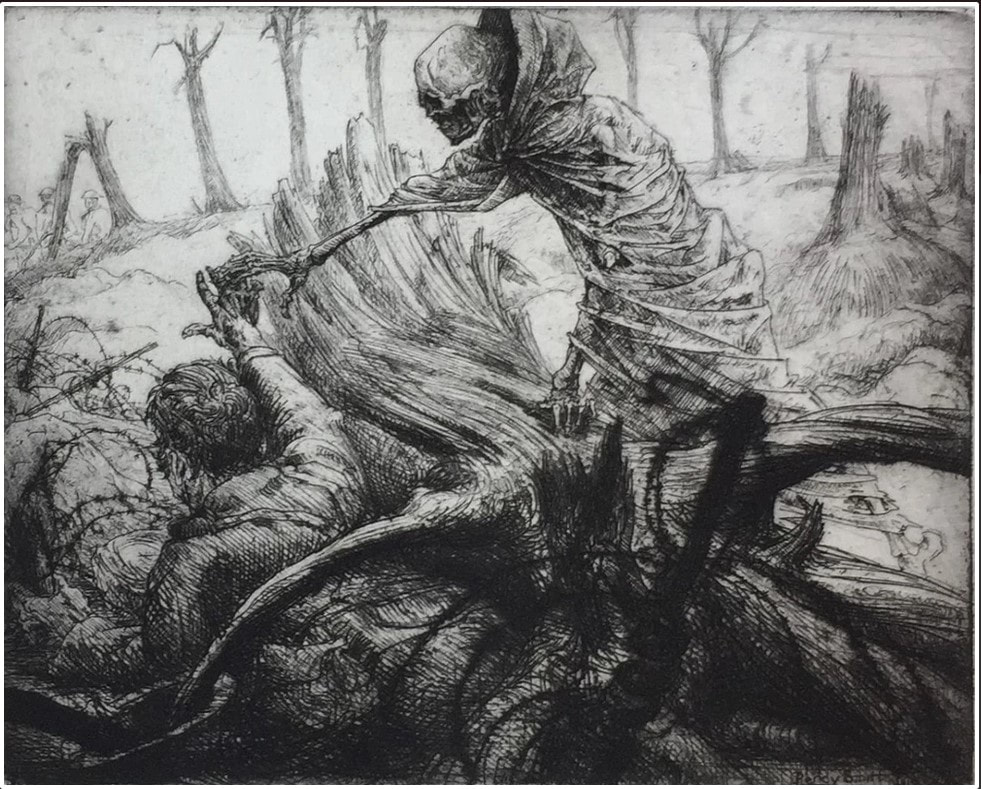
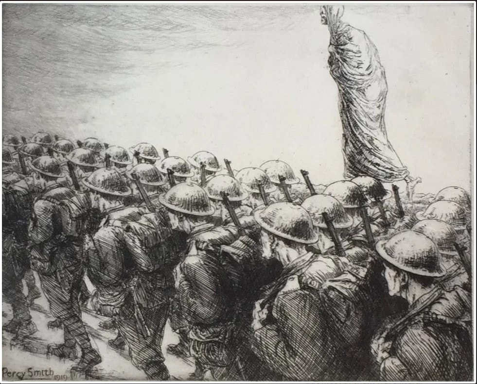
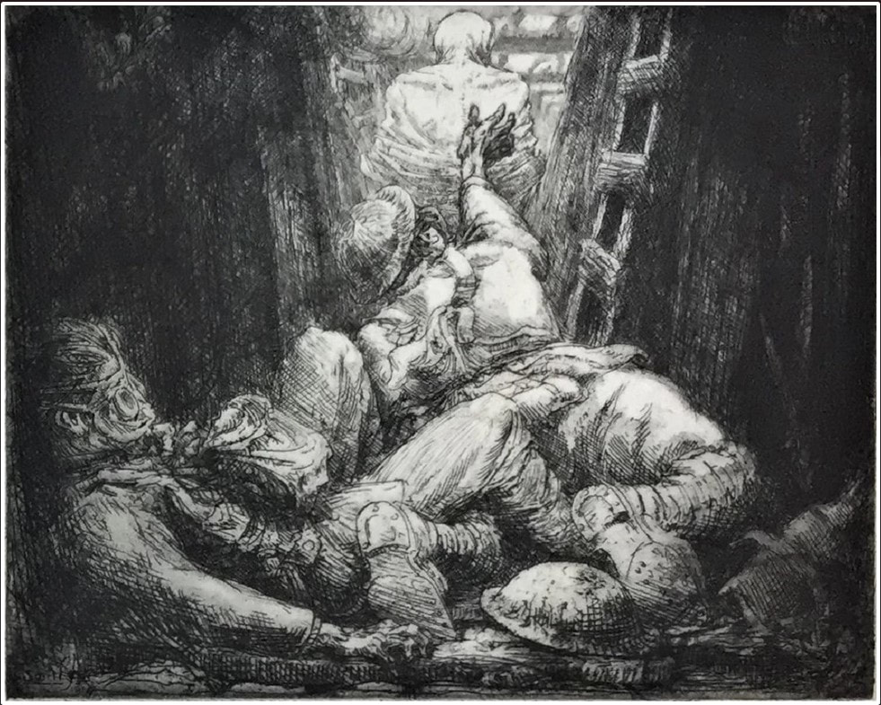
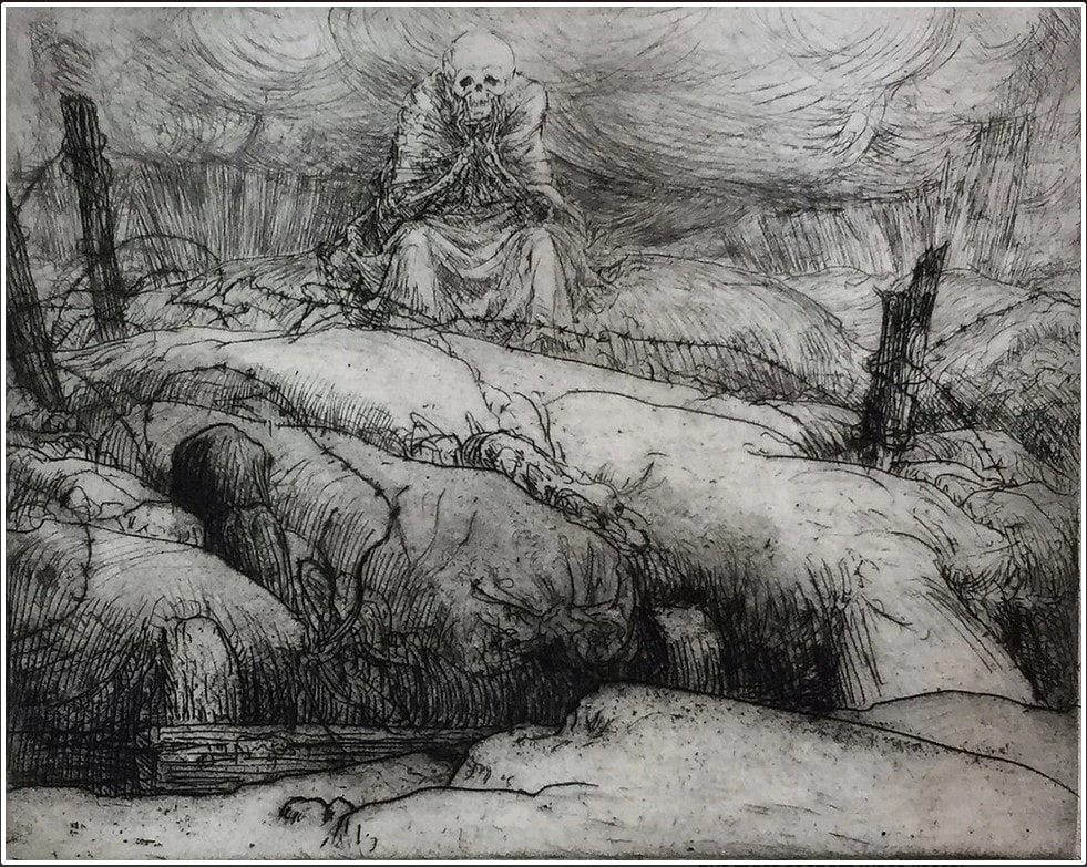
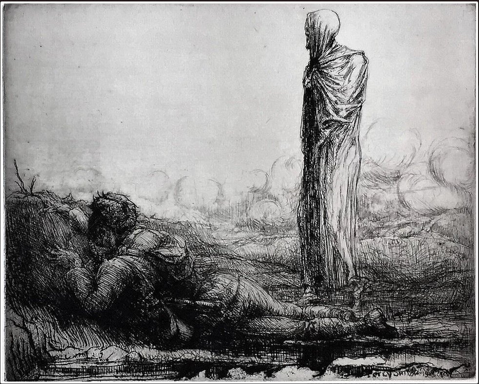
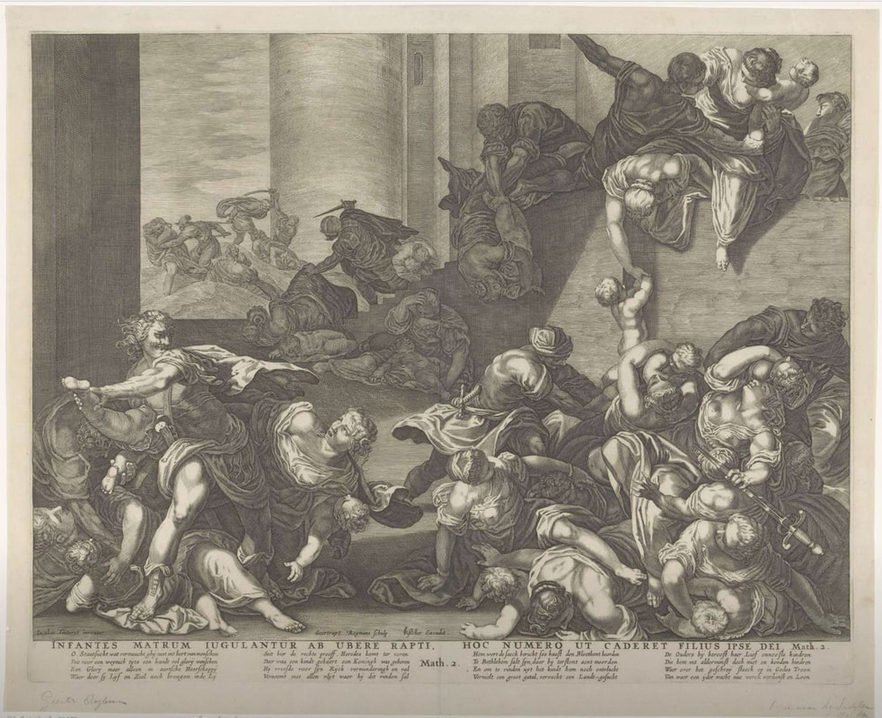
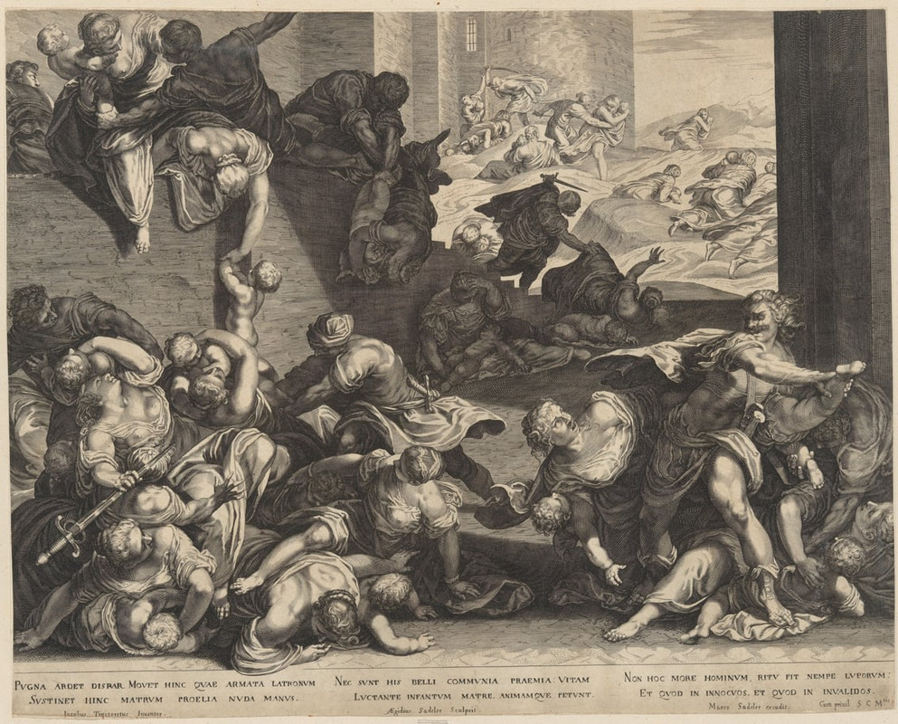
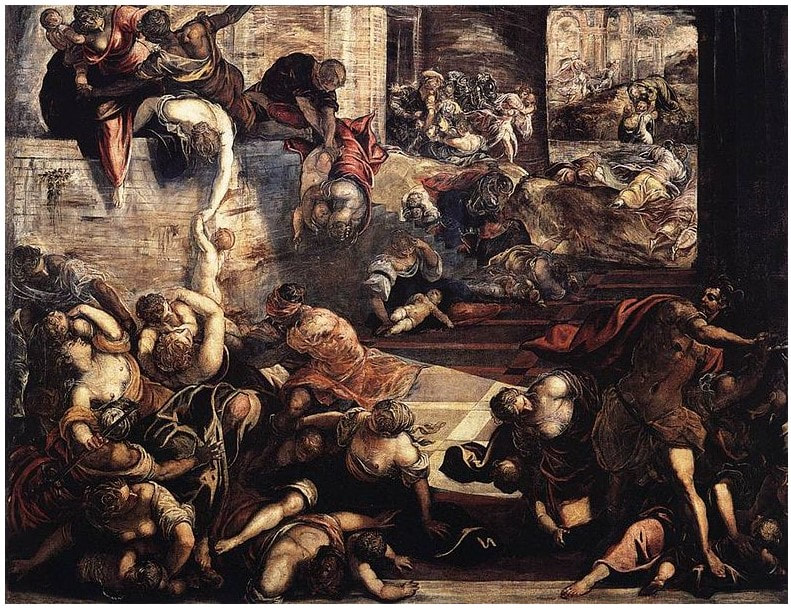
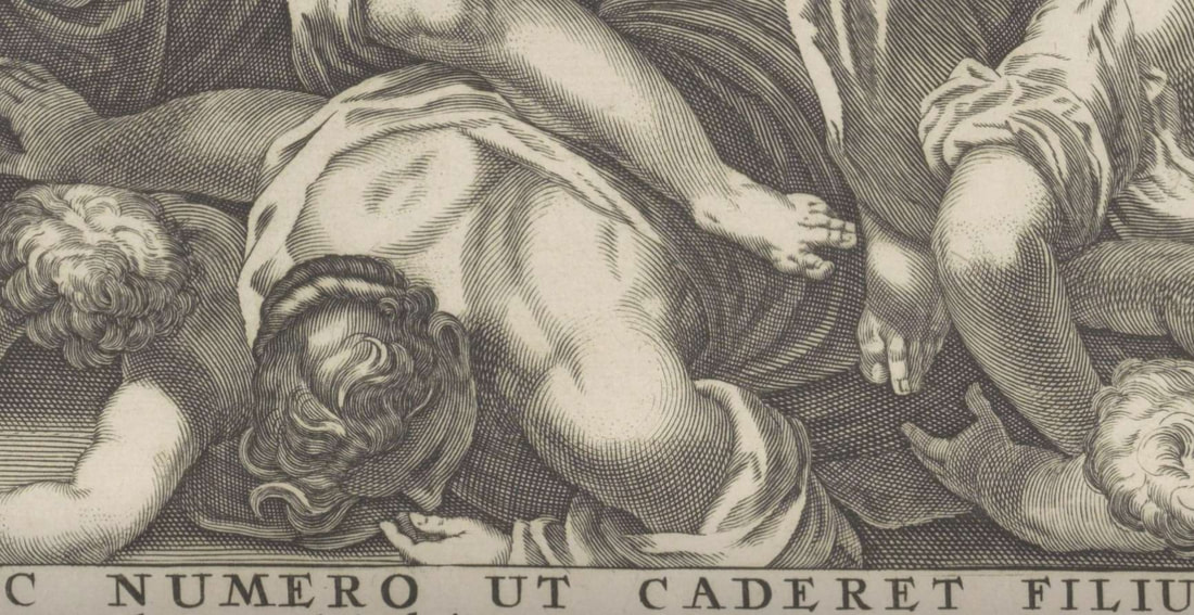
Ann Shafer The end of a fair is always bittersweet. One is exhausted both physically and mentally, and yet, you want it to never end. The adrenaline is followed by such a let-down. If you’ve been following along, you know that I ran the Baltimore Contemporary Print Fair in its final three iterations (2012, 2015, 2017). For the first two of these I worked alongside the indomitable and amazing Ben Levy. He brought his remarkable brain, knowledge, and know-how to the enterprise. For the final iteration, I worked with the indefatigable and fabulous Morgan Dowty. Her quiet strength and constancy amazed me. And the fairs would not have happened without them. Thank you both. Running a fair is not for the faint of heart. But in the same way your love of a newborn baby makes you forget the pain of childbirth, the buzz of the fair long outlasts the exhaustion and sore feet. I always say it was the most fun part of the job. And I still mean it. It was an honor getting to know the dealers, publishers, and artists, just as it was meaningful to walk friends and collectors around and point out things I particularly liked both for me and for the museum’s collection. And that’s the great thing about prints, isn’t it? That one can have the same work of art that is in a museum collection. I love spreading the love. Today is the final day of these Curator’s Choice posts from the #LondonOriginalPrintFair, and while it takes a lot of work to select and gather the images and tombstone information (not to mention writing these mini-blurbs), its conclusion is bittersweet. I hope the cornucopia of images have inspired you to look more, buy something, make something. For that is always my goal: to engage an audience and show them the wonders of prints and printmaking. Until the next fair, this is your friendly print evangelist signing off. Please enjoy day 5/5 of offerings from the #LondonOriginalPrintFair. Today we finish up with R (Rebecca Hossack Art Gallery) through Z (Zuleika Gallery). Here is #LondonOriginalPrintFair Curator's Choice, 5/5. #prints #printmaking #printfair #curatorschoice #contemporaryprintmaking #contemporaryart #woodcut #relief #colorprints #printing #womenartists #collectart #artcollector #supportlivingartists #loveart #masterprinter #art #saga #societyofamericangraphicartists #nonobjectiveart #abstractart #londonoriginalprintfair #royalacademy #ifpda #etching #engraving #monotype #screenprint #lithograph #printevangelist #baltimorecontemporaryprintfair Ann Shafer As a curator, I instinctively judge the evenhandedness of any group of objects and assess how many of the works are by women artists, artists of color/BIPOC (a newish acronym meaning Black, Indigenous, People of Color), and queer artists. This is much more easily done with contemporary works. Old Master prints, as you know, are a whole other thing. The London fair gets fairly high marks for its gender inclusivity, but less so with racial diversity among the artists presented. I find it curious. And I have no answer as to why that might be. I’ll leave that right here for today. Please enjoy day 4/5 of offerings from the #LondonOriginalPrintFair. As always, these are presented alphabetically by dealer meaning the order is random, which I quite enjoy. Today we start with L (Loft 11 Gallery) and go through R (RAW Editions). Here is #LondonOriginalPrintFair Curator's Choice, 4/5. #prints #printmaking #printfair #curatorschoice #contemporaryprintmaking #contemporaryart #woodcut #relief #colorprints #printing #womenartists #collectart #artcollector #supportlivingartists #loveart #masterprinter #art #saga #societyofamericangraphicartists #nonobjectiveart #abstractart #londonoriginalprintfair #royalacademy #ifpda Ann Shafer It’s not that I don’t like lithographs. It’s that their flatness makes them, well, fall flat (see what I did there?). I mean, they are called planographic for a reason, right? Planographic printing means printing from a flat surface, as opposed to a raised surface or incised surface, like you get with intaglio (incised) and woodcut (relief). Maybe it’s because I don’t quite understand the chemical ins and outs of the process. It's magic. If asked, I respond with the oft-stated “it’s based on the principle that oil and water don’t mix.” Hardly a descriptive explanation. But, really, lithographs are totally cool because an artist can draw directly on the stone or aluminum plate (and can transfer a photographic image as well). The ability to produce a print that looks like a drawing is pretty darned awesome. There have been spectacular examples of lithographs since its invention by Alois Senefelder sometime in the 1790s. Great lithographs that pop to mind include Honoré Daumier’s Rue Transnonain, le 15 Avril 1834; Théodore Gericault’s Boxers, 1818; any poster by Alphonse Mucha or Henri de Toulouse-Lautrec; any lithograph by Käthe Kollwitz; New York scenes by George Bellows; regionalist scenes by Thomas Hart Benton and Grant Wood; New England scenes by Stow Wengenroth; any experiments by Robert Blackburn; and of course, Robert Rauschenberg’s Accident, 1963. But back to the cornucopia of prints offered at the London Original Print Fair. Please enjoy day 3/5 of selections from www.londonoriginalprintfair.com. Remember these are presented alphabetically by dealer meaning the prints will appear in a rather random order. Today we start with G (Gilden’s Art Gallery) and go through K (Kunstverket Galleri). Here is #LondonOriginalPrintFair Curator's Choice 3/5. #prints #printmaking #printfair #curatorschoice #contemporaryprintmaking #contemporaryart #woodcut #relief #colorprints #printing #womenartists #collectart #artcollector #supportlivingartists #loveart #masterprinter #art #saga #societyofamericangraphicartists #nonobjectiveart #abstractart #londonoriginalprintfair #royalacademy #ifpda Ann Shafer Recently, my friend Laura Albans challenged me to write about what I think makes a print great. In short, it came down to visual impact and emotional impact. Today, Laura asked me if I would name my favorite technique. If you’ve been following along, you know that I have looked at, researched, written about, and spoken about Stanley William Hayter and Atelier 17 for close to fourteen years. And you’ll know that Atelier 17 was primarily an intaglio studio. So there is your answer. I love a good scrumpy, tactile etching, engraving, drypoint, whathaveyou. I love the platemark mark. I love flipping a print over and seeing the back is just as interesting as the front. I love the objectness of them. I love the amount of planning, patience, and care they require. I love how the ink stands proud on the paper, the depth of the blacks, the variety of marks attainable through aquatint and softground etching. I love that they can be delicate and rough, crisp and feathery, light and dark. I love that in the inking of the plate one can vary the results so widely. Of all the techniques, it seems to me intaglio may well be the most versatile. After intaglio, I would have to go with relief. I love a good Durer apocalyptic woodcut, an expressionist print by Kirchner, Heckel, or Kollwitz, an elegant wood engraving by Asa Cheffetz or Clare Leighton, a linoleum cut by Charles White, or contemporary woodcuts by Chitra Ganesh, Yashua Klos, Tom Huck, or Raj Bunnag. Woodcuts seem so hale and hearty, and I love the strength and patience required in carving. I also love that they can be printed on a press, with a steamroller, or a wooden spoon. Please enjoy day 2/5 of offerings from the www.londonoriginalprintfair.com. Remember these are presented alphabetically by dealer meaning the prints will appear in a rather random order. Today we start with C (Clemens Büntig) and go through G (Gerrish Fine Art). Here is #LondonOriginalPrintFair Curator's Choice 2/5. #prints #printmaking #printfair #curatorschoice #contemporaryprintmaking #contemporaryart #woodcut #relief #colorprints #printing #womenartists #collectart #artcollector #supportlivingartists #loveart #masterprinter #art #saga #societyofamericangraphicartists #nonobjectiveart #abstractart #londonoriginalprintfair #royalacademy #ifpda Ann Shafer Oh my goodness gracious, just as I was finishing up my curator's choice posts from the #WestCoastPrintFair, another fair went live online. The London Original Print Fair offers sixty plus dealers and their inventories of terrific prints. In the face of all those wonderful prints, who am I to not do more posts. This is the first of five posts featuring works from the various dealers at the London fair, which I have never been to. That makes this online version so great. There are so many galleries here that don’t often come to the New York fairs. The dealers range from Old Masters to Contemporary; there is something for everyone. Please enjoy this first group of offerings from the www.londonoriginalprintfair.com. As was the case last week, these are presented alphabetically by dealer meaning the prints will appear in a rather random order. Today we start with A (Advanced Graphics) and go through C (CG Boerner). Here is #LondonOriginalPrintFair Curator's Choice, 1/5. #prints #printmaking #printfair #curatorschoice #contemporaryprintmaking #contemporaryart #woodcut #relief #colorprints #printing #womenartists #collectart #artcollector #supportlivingartists #loveart #masterprinter #art #saga #societyofamericangraphicartists #nonobjectiveart #abstractart #londonoriginalprintfair #royalacademy #ifpda Ann Shafer This post wraps up my picks from the West Coast Print Fair, a new virtual fair that, during the pandemic, compensated for the cancellation of a group of fairs that normally take place in January and February along the West Coast. When I first posted selections from this fair, I promised to articulate what makes a great print. Of course, what makes a great print is in the eye of the beholder. Please know these are my subjective opinions. The best way I can describe what makes a print great (or a work of art in any media) is to take you inside my mind. Yesterday I laid out the two big concepts: visual impact and emotional impact. There’s a lot contained in both categories. This list of questions helps me think through and assess any work of art. It’s important to note, however, that a great print does not need to address each and every one of these questions. In fact, I don’t know that such a print exists (I’ll think on that). Here goes. EMOTIONAL IMPACT: · Does it elicit any feelings (good or bad)? · Is it thoughtful? Does it ask more questions than it answers? · Is it overwrought? Is there unnecessary stuff in it? Could it be said with less? · Does it have a tight conceptual circle—does the idea translate into a work that expresses the idea clearly and well? · Does the choice of technique(s) add to its meaning? · Does it nod to art history in a smart way without being derivative? · Does it nod to meta? Does it understand itself? · Does the work take an idea and transform it into a conversation starter? · Is it by someone other than a white, cis-gender male? VISUAL IMPACT: · Does it have visual impact? This does not mean large and colorful and is a truly subjective gut reaction. · Does it express a great design sensibility? · Does it have a range of lights and darks, wonderful transparencies, interesting patterns? · Does it capture atmosphere, reflections, ephemeral things? · Does it embrace its own delicacy or roughness? · Is it readable/legible/comprehensible, or utter nonsense? · Is it more than merely decorative? · Is it indexical? Is the image of its own making? · Does it cross disciplines in an interesting/meaningful way? · Does it tell a great story? · If I were presenting it to a accessions committee, how much is there to say? Thirty seconds worth or thirty minutes worth? In a weird turnabout, the emotional aspects are quantifiable--identifying whether the technique adds to the meaning is pretty straight forward. But the visual elements are highly subjective--visual impact is totally in the eye of the beholder. Curious. There is so much more, but I think this is a pretty good start. I never wanted to do anything else besides create ways to tell interesting stories through great art. I love works that sit at the intersection of new and old, of abstract representation and representational abstraction, of beauty and toughness, of stark crispness, and pure emotion. Have I set too high a bar? Maybe. And this doesn't address my feeling that a work that is appropriate for an institutional collection is not necessarily one I could live with, and vice versa. There is a place for the decorative, after all. Please enjoy this final group from the westcoastprintfair.com. Remember the randomness derives from the list running alphabetically by dealer. Today we start with Sh (Keith Sheridan) and wrap up with V (The Verne Collection). Here is #WestCoastPrintFair Curator's Choice, 5/5. #prints #printmaking #printfair #curatorschoice #contemporaryprintmaking #contemporaryart #woodcut #relief #colorprints #printing #womenartists #collectart #artcollector #supportlivingartists #loveart #masterprinter #art #saga #societyofamericangraphicartists #nonobjectiveart #abstractart #londonoriginalprintfair #royalacademy #ifpda Ann Shafer When I first shared these curator's choice posts on Facebook, I got a comment from a friend asking me to report on what makes a print great. I had yet to formulate a full answer, so I started with this. For me, it comes down to two things: visual impact and emotional impact. Does the work have visual power? Are its formal qualities like composition, execution, technique, top notch? Does the work have emotional power? Does it elicit a feeling, tell a powerful story, make us laugh? Does it have heart—does it reveal something about its maker? Does the formal reflect the emotional and vice versa? It’s not a science; often it’s a gut feeling. I wrote about it more thoroughly in the fifth of five posts, which you can find on this blog too. Remember the randomness derives from the list running alphabetically by dealer. Today we start with M (Manneken Press) and go through Sc (Scriptum Inc.). Here is #WestCoastPrintFair Curator's Choice, 4/5. #prints #printmaking #printfair #curatorschoice #drawingstoo Ann Shafer Still pondering how to identify what makes a great print (for me, anyway), so stay tuned for that missive. When I initially posted these selections on Facebook, I got a disgruntled comment about the presence of drawings among my selections. Hence my reminder about finding them among the group. Regarding these West Coast Print Fair posts, please know that selections are made from what the dealers are offering. Drawings are on the table, as are paintings. Feel free to visit the fair’s web site: westcoastprintfair.com. And please remember the randomness comes from my ordering the selections alphabetically by dealer. Today we’re starting with G (Roger Genser) and going through L (Josef Lebovic). Here is #WestCoastPrintFair Curator's Choice, 3/5. #prints #printmaking #printfair #curatorschoice #drawingstoo Ann Shafer After yesterday’s post, my friend and colleague Laura Albans challenged me to articulate what I look for in a great print. I’ve said it in drips and drabs throughout these Quarantine posts, but I will attempt to gather my thoughts in one place and post them later this week. I’ve always had a problem remembering that not everyone thinks like I do, and it’s gotten me in trouble more than a few times. My belief in and passion about great printmaking seems so clear and obvious to me as to hardly need explanation. But, prints are tough for the layperson; the many barriers to entry mean one must really want in. I have described myself as a print evangelist numerous times: if I could get a person’s attention long enough to show prints and talk about them I could bring folks into the fold. (Good lord, “I’ll get you, my pretty” just rolled through my head!) I consider this week’s print-fair posts an amuse bouche: something to whet the appetite. While I attempt to articulate more clearly why I love prints and what makes one great, please enjoy day two of my picks from the West Coast Print Fair. (And yes, there are drawings mixed in!) Here is #WestCoastPrintFair Curator's Choice, 2/5. #prints #printmaking #printfair #curatorschoice #contemporaryprintmaking #contemporaryart #woodcut #relief #colorprints #printing #womenartists #collectart #artcollector #supportlivingartists #loveart #masterprinter #art #saga #societyofamericangraphicartists #nonobjectiveart #abstractart #londonoriginalprintfair #royalacademy #ifpda #etching #engraving #monotype #screenprint #lithograph #printevangelist #baltimorecontemporaryprintfair Ann Shafer If you’ve been following along, you know that nothing makes me happier than going to print fairs. Obviously the global pandemic has limited all sorts of things, including a spate of fairs that occur at this time of year from Portland down to San Diego. Instead, a new online fair has been born, which went live last Friday and which will be up until February 8. If you’ve gone to the site, you’ll know it’s a cornucopia of wonderful offerings. Thanks to everyone who pulled it together—no small feat—and a special shout out to my friend and colleague #MaryWeaverChapin, curator at the #PortlandArtMuseum. Nicely done, Mary. As I did with New York Print Week last fall, this week I’ll post some “Curator’s Choice” goodies. I tried to limit myself to two objects per dealer and ended up with one hundred prints, drawings, and a painting. For sanity’s sake, I’ll post them in groups this week, say twenty per day. Please know they are organized alphabetically by dealer, which makes for a super random order. Today’s selections are from galleries starting with the letter A. Know that one portfolio, #PercySmith’s six etchings of World War I imagery, stunned me and I’ve included all six prints. For ease, I've also included the prices, some of which may surprise you. See if anything piques your interest, then reach out to the dealer and make a deal. And now, presenting #WestCoastPrintFair Curator's Choice, 1/5. #prints #printmaking #printfair Ann Shafer One of the super helpful things about reproductive prints is the practice of including the “address” in which the names of the engraver, the artist of the original composition, the publisher, and maybe the benefactor appear along the bottom of the image. This convention has helped every print-room cataloguer, connoisseur, dealer, collector, scholar, and curator make sense of the thousands and thousands of Old Master prints out there in the world. The nomenclature can be a bit confusing and some of the abbreviations mean the same things, but here are some terms frequently used in the address: Cael., caelavit: Engraved by Cum privilegio: Privilege to publish from some authority Del., delt., delin., delineavit: Drawn by Disig., designavit: Designed by Divulg., divulgavit: Published by Eng., engd.: Engraved by Exc., excud., excudit: Printed by or published by F., fac., fec., fect., fecit, faciebat: Made by Imp., Impressit: Printed by Inc,. incidit, incidebat: Incised or engraved by Inv., invenit, inventor: Designed by or originally drawn by Lith., litho., lithog.: Lithographed by Pins., pinxit: Painted by Scrip., scripsit: Text engraved by Sc., sculp., sculpt., sculpsit: Image engraved by In today’s example we have inventor (artist of the original composition), sculpsit (the printmaker/engraver), and excudit (the publisher). Making all these intricacies clear for today’s audiences is challenging. Our convention is to use the term “after” to indicate that X is the artist of the print, which is reproducing (or after) Y’s composition. Label information (we call it the tombstone information) usually omits the publisher, perhaps because it’s confusing enough as it is. In a previous post, we were introduced to Geertruydt Roghman, a printmaker best known for her series of five prints of women engaged in daily tasks. Remember, these were her own compositions. She also made reproductive prints such as The Massacre of the Innocents, which is a great example of the address helping us understand the sequence of works. So, Roghman made an engraving of The Massacre of the Innocents after a print by Aegidius Sadeler. Sadleler’s print reproduced the painting by Jacopo Tintoretto, which is in the Scuola Grande di San Rocco in Venice. So Roghman’s print is after Sadeler’s print, which is after Tintoretto’s painting. Don’t you love a twist and a turn? The subject is the Massacre of the Innocents, the biblical story of Herod who set out to kill every infant boy in Bethlehem knowing one of them would become king of the Jews. The passage is in Matthew (2:16): Then Herod, when he saw that he was mocked of the wise men, was exceeding wroth, and sent forth, and slew all the children that were in Bethlehem, and in all the coasts thereof, from two years old and under, according to the time which he had diligently enquired of the wise men. It's a gruesome story and the image is relentless in its goriness and depravity. To increase the painting’s impact, there is some thought that Tintoretto would have added a plaster forearm to the bottom edge of the canvas where the woman’s arm is cut off—yes, a three-dimensional appendage. Apparently, that was a thing artists would do to enliven their paintings back then. Interestingly, the woman's arm is tucked under her in both of the prints. So how did Sadeler, a Netherlandish artist, make his copy? Did he travel to Venice to draw from the painting at the Scuola or was a drawing of it sent to him? Perhaps Sadeler made his version after yet another print of Tintoretto’s painting. But Sadeler’s version was published after Tintoretto’s death, meaning it couldn’t have been commissioned by Tintoretto to popularize the composition. Curious. We don’t know why Roghman made her version either, which is printed in reverse of both the Sadeler print and the Tintoretto painting. Does that suggest it was an exercise for practice? Was it sold in large numbers? It’s not a great and accurate reproduction if it’s backwards, right? What’s more, why make it so long after both Tintoretto and Sadeler were dead? Intriguing. #printidentification #publishersaddress #sculpsit #oldmasterprints #printsafterprints #Tintoretto #sadeler #roghman #delineavit #excudit |
Ann's art blogA small corner of the interwebs to share thoughts on objects I acquired for the Baltimore Museum of Art's collection, research I've done on Stanley William Hayter and Atelier 17, experiments in intaglio printmaking, and the Baltimore Contemporary Print Fair. Archives
February 2023
Categories
All
|


 RSS Feed