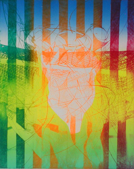
Ann ShaferHere’s a doozy for my simultaneous color printing friends. No surprise, Letterio Calapai worked with our man Hayter at Atelier 17 in New York in the 1940s. While Earthquake is from 1958, it is a glorious summation of techniques he learned among the many inventive artists frequenting Atelier 17. The print is really two prints that form a diptych. I've seen images of the two sides abutting each other, but the BMA would likely present these in a single frame, but with two windows in the mat with a center strip covering the seam. Letterio Calapai followed the path of many other American artists who worked at Hayter’s Atelier 17. After growing up in Boston, he moved to New York in 1928 and supported himself by working in a lithographic shop. He worked for the WPA early on painting a mural in the 101st Signal Battalion at 801 Dean Street in Brooklyn among other projects (see image). By the time Hayter moved Atelier 17 to New York from Paris in 1940 (fleeing German occupation), Calapai was continuing his artistic studies. It wasn’t until 1946 that Calapai worked at Atelier 17; he continued making prints there until 1949. His shift from 1930s realism to 1940s abstraction can be specifically linked to his time there. Like so many other artists who worked at the New York Atelier 17, Calapai went on to found a university printmaking program, in his case, the Graphic Arts Department at the Albright Art School in Buffalo (1949–55). He returned to New York to teach at the New School for Social Research from 1955–65. During his tenure at the New School, he established the Intaglio Workshop for Advanced Printmaking in 1962 (it ran until 1965). In 1965 he moved to Chicago and taught at, and retired from, the University of Illinois at Chicago. So, to the printing. Recently we’ve been pulling apart simultaneous color prints by Hayter. You can assume if Hayter did it, others did too, including Calapai. Earthquake is printed from two plates, which together are some 32 inches wide (big!). Both plates are inked in black (intaglio), where the ink is pushed into the lines and grooves of the plate. Rolled onto the surface (relief) are several colored inks added through screens (similar to a stencil): blue-green gradient, red, and green on the left, and green and red-yellow gradient on the right. The left plate also includes a yellow wood offset rolled through a stencil (similar to Hayter’s Sun Dancer, discussed in another post). For clarity, the description is broken down into bullet points to more easily list each component. Just remember, all of these colored inks are rolled onto each of these plates and are put through the press once. Letterio Calapai (American, 1902–1993) Earthquake, 1958 Diptych of etching, softground etching, open bite etching, and engraving
Sheet (right): 562 x 458 mm. (22 1/8 x 18 1/16 in.; plate (right): 504 x 404 mm. (19 13/16 x 15 7/8 in.) Baltimore Museum of Art: The John Dorsey and Robert W. Armacost Acquisitions Endowment, BMA 2014.13a-b 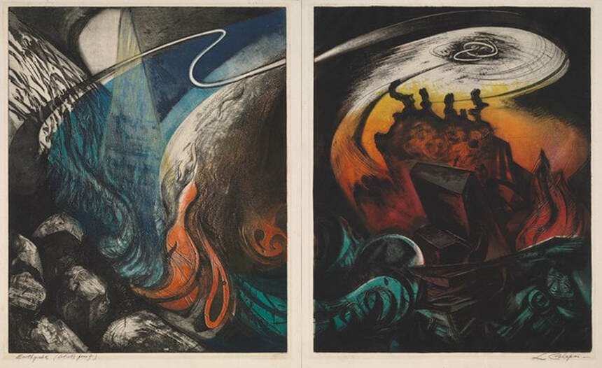 Letterio Calapai (American, 1902–1993), Earthquake, 1958. Diptych of etching, softground etching, open bite etching, and engraving; left plate printed in black (intaglio), blue-green gradient (screen, relief) , red (screen, relief), green (screen, relief), yellow (wood offset, stencil, relief); right plate printed in black (intaglio), green (screen, relief), red-yellow gradient (screen, relief). Sheet (left): 562 x 432 mm. (22 1/8 x 17 in.); plate (left): 505 x 404 mm. (19 7/8 x 15 7/8 in.); sheet (right): 562 x 458 mm. (22 1/8 x 18 1/16 in.); plate (right): 504 x 404 mm. (19 13/16 x 15 7/8 in.). Baltimore Museum of Art: The John Dorsey and Robert W. Armacost Acquisitions Endowment, BMA 2014.13a-b 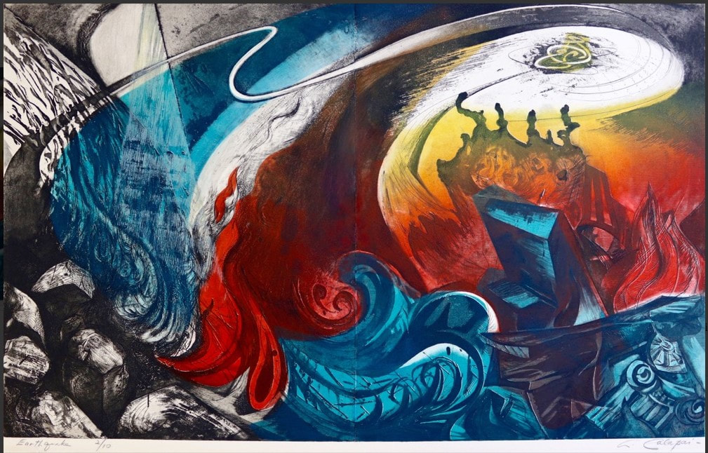 Impression of Calapai's Earthquake from Aaron Galleries. 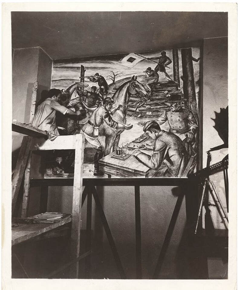 Letterio Calapai painting a WPA mural in the 101st Signal Battalion at 801 Dean Street in Brooklyn. (Photo from Wikipedia.)
0 Comments
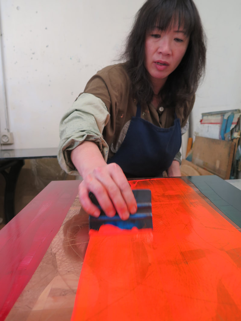
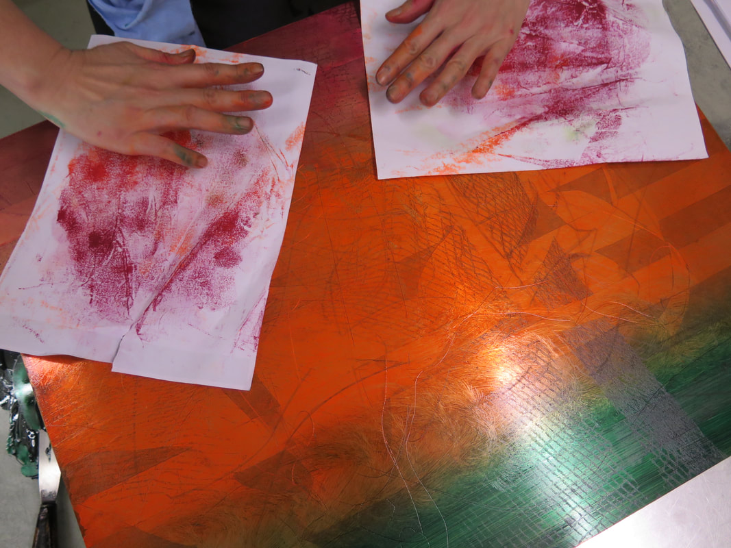
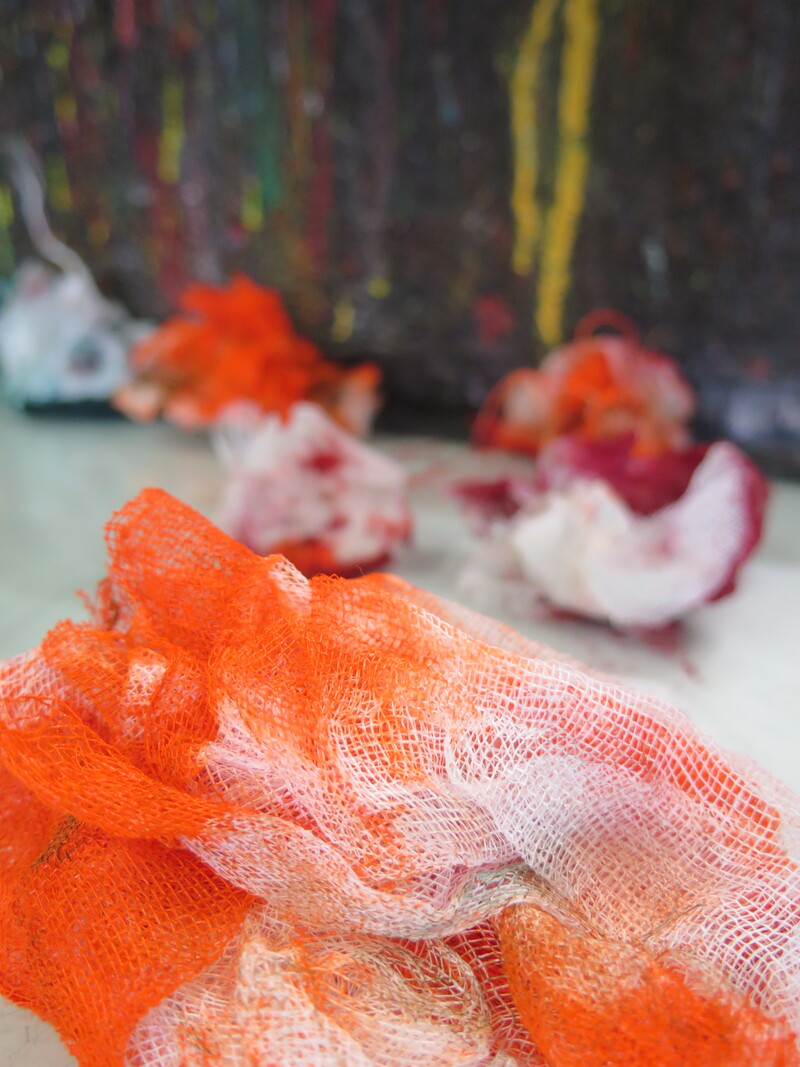
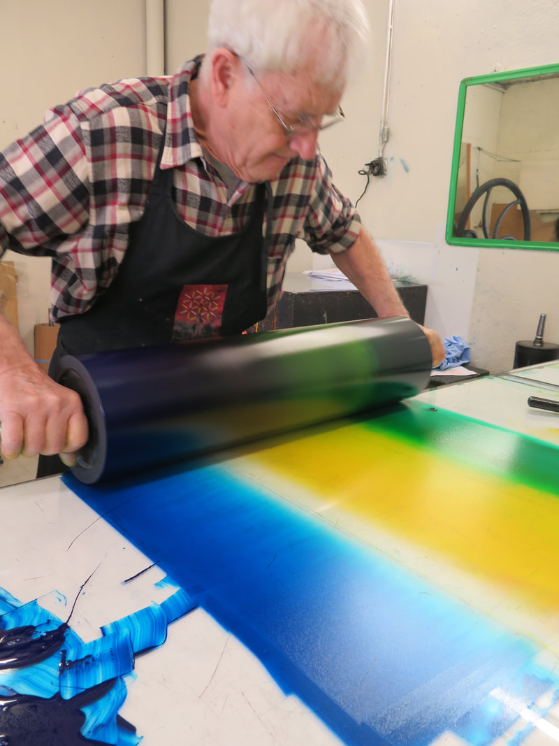
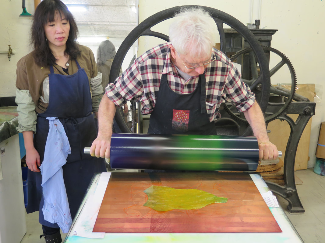
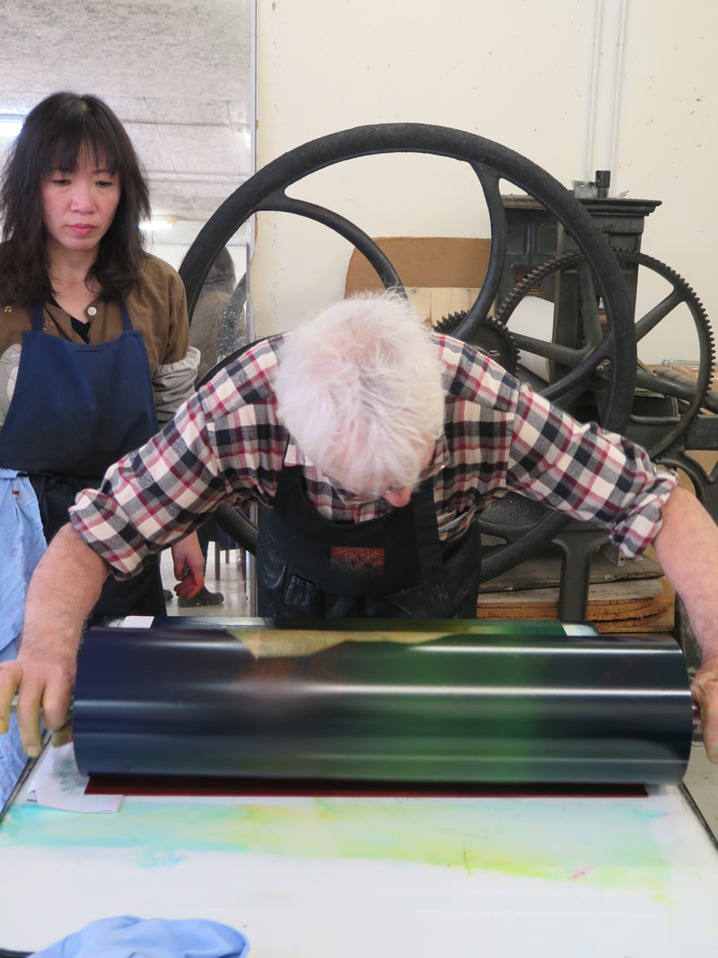
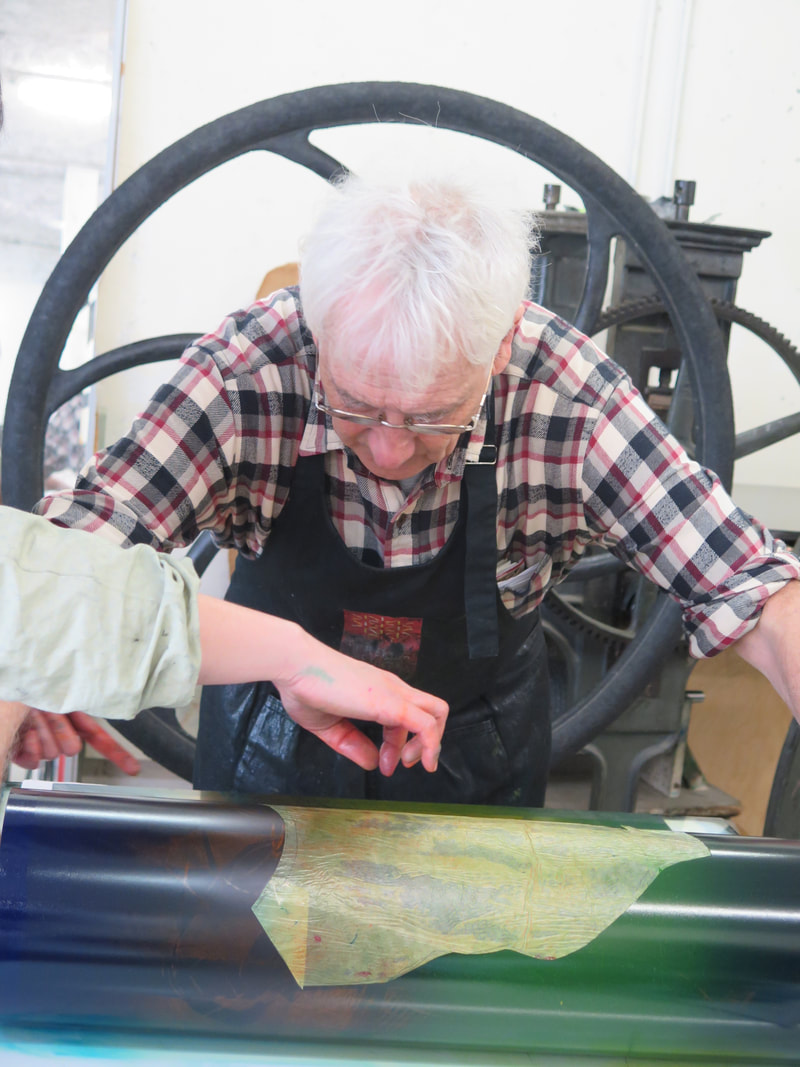
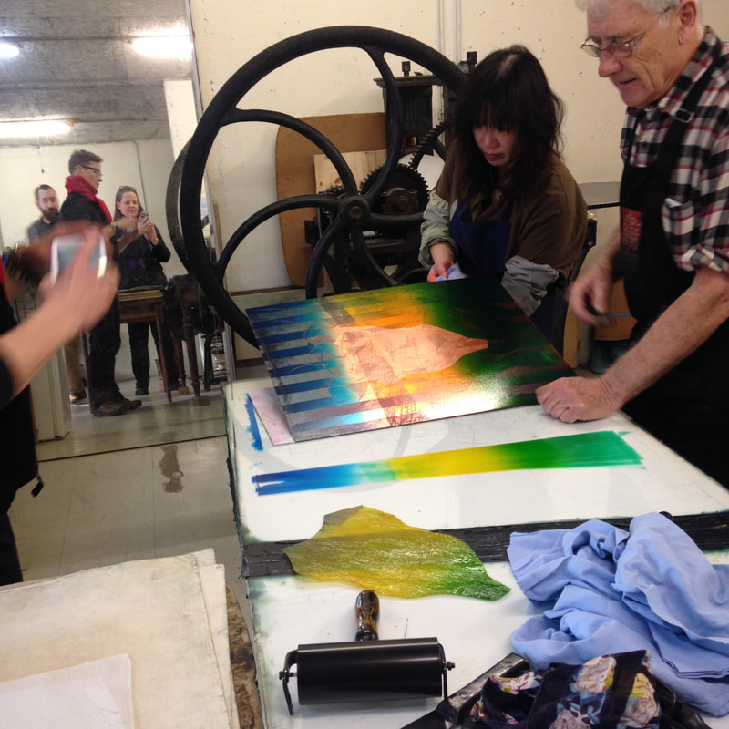
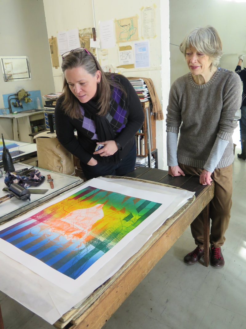
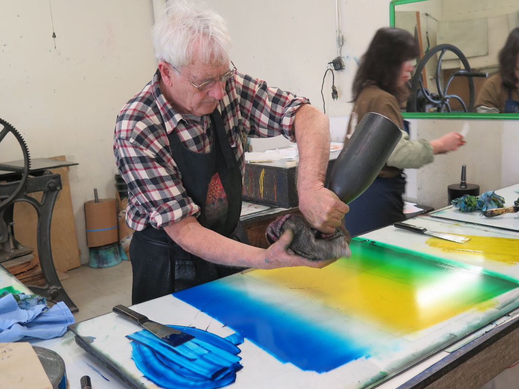
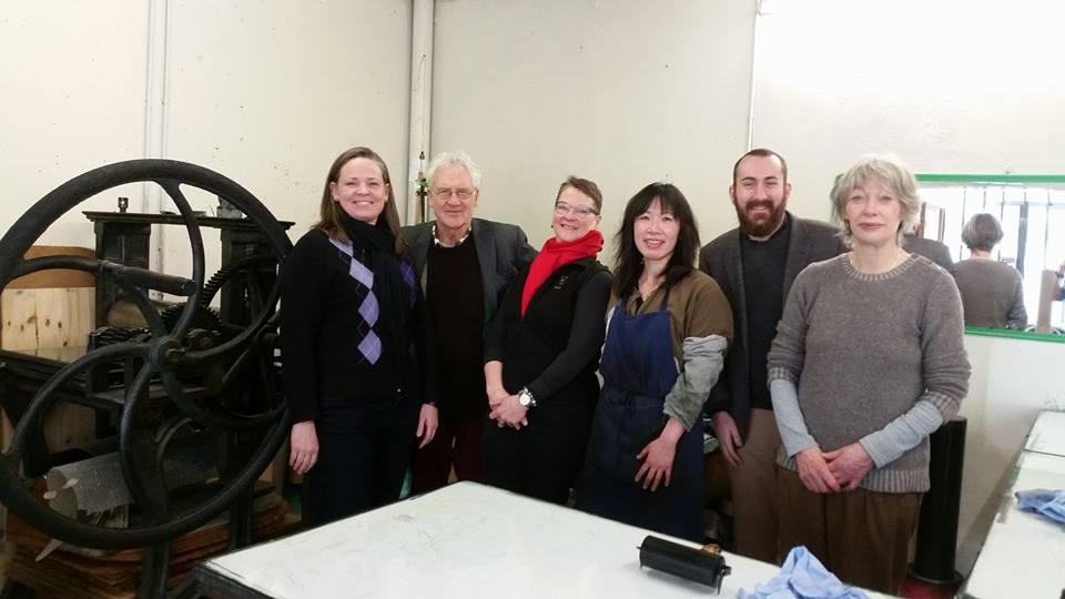
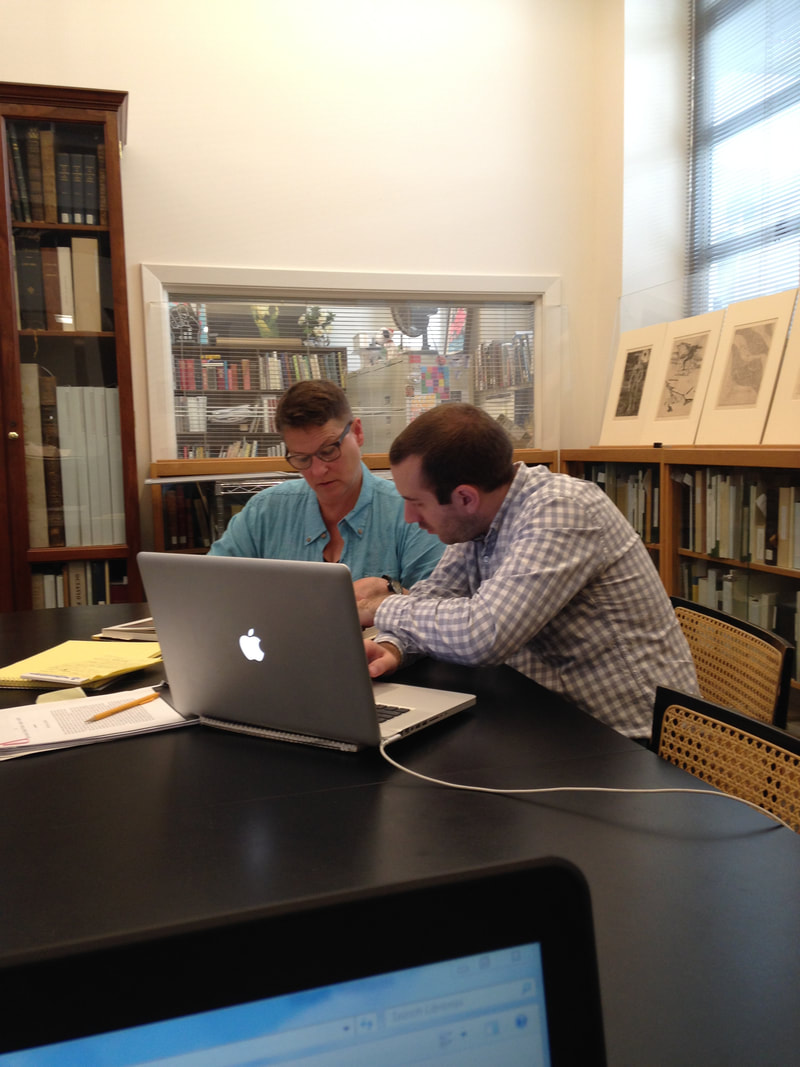
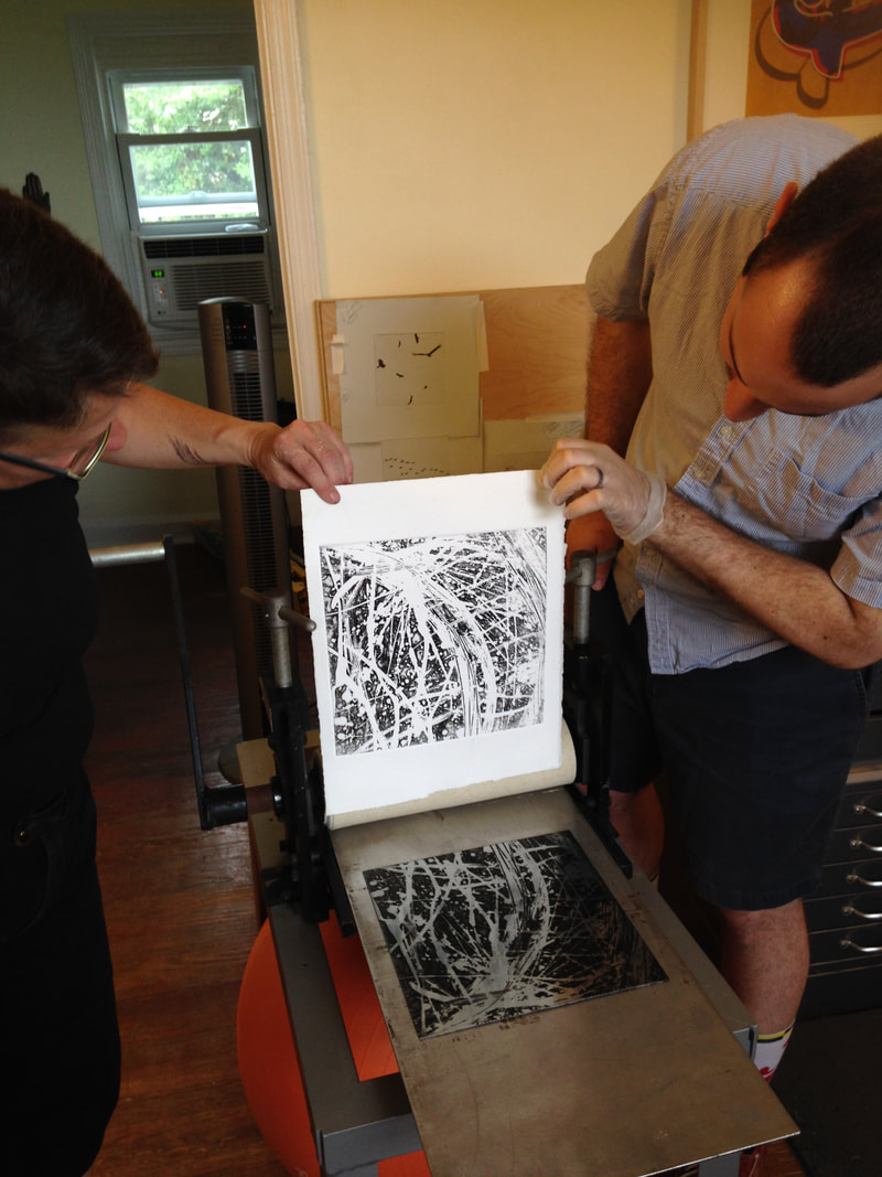
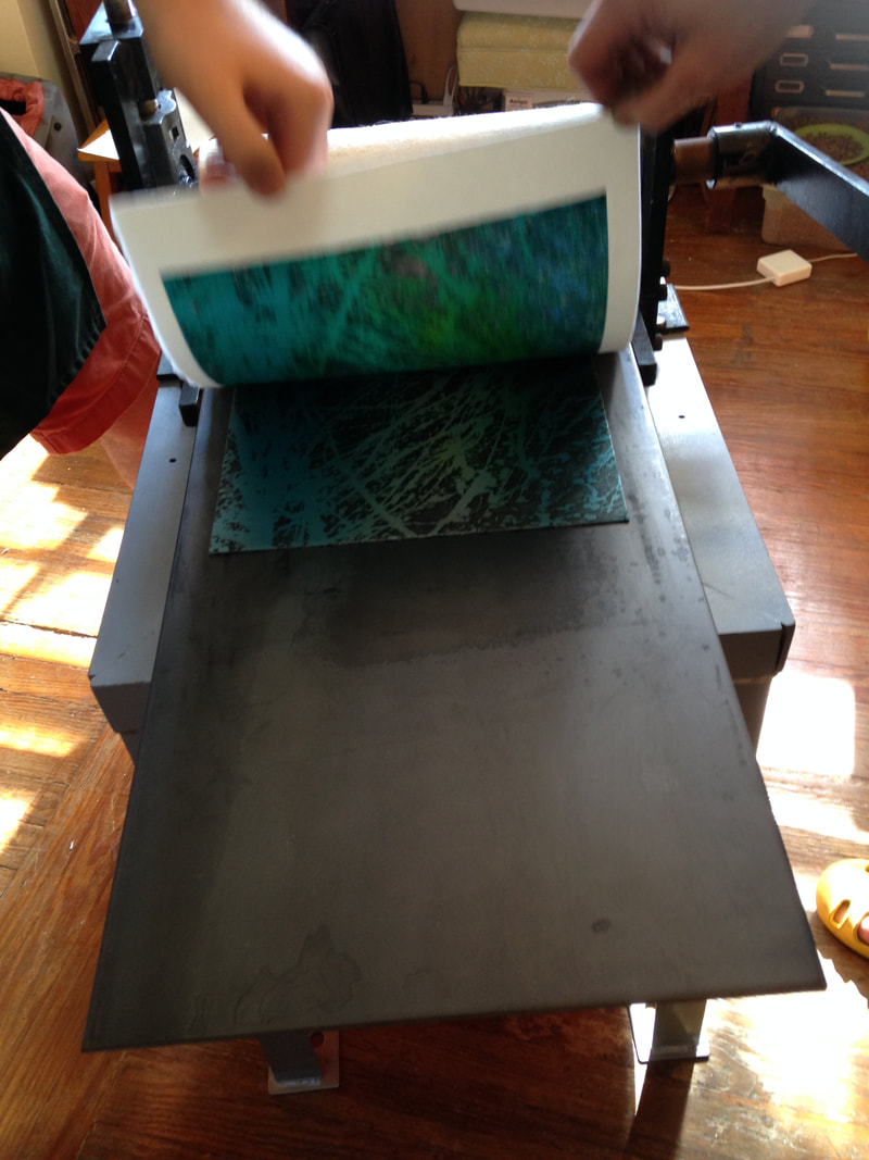
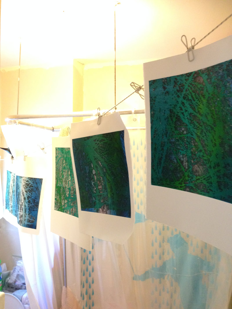
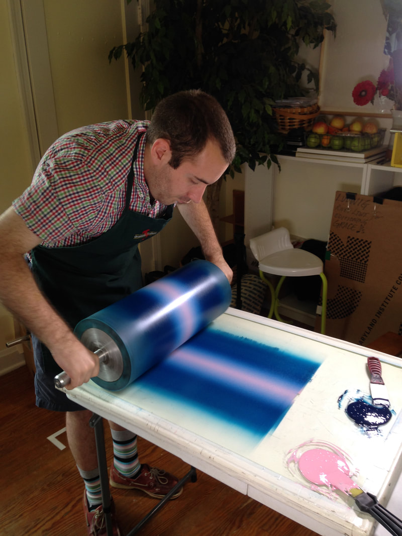
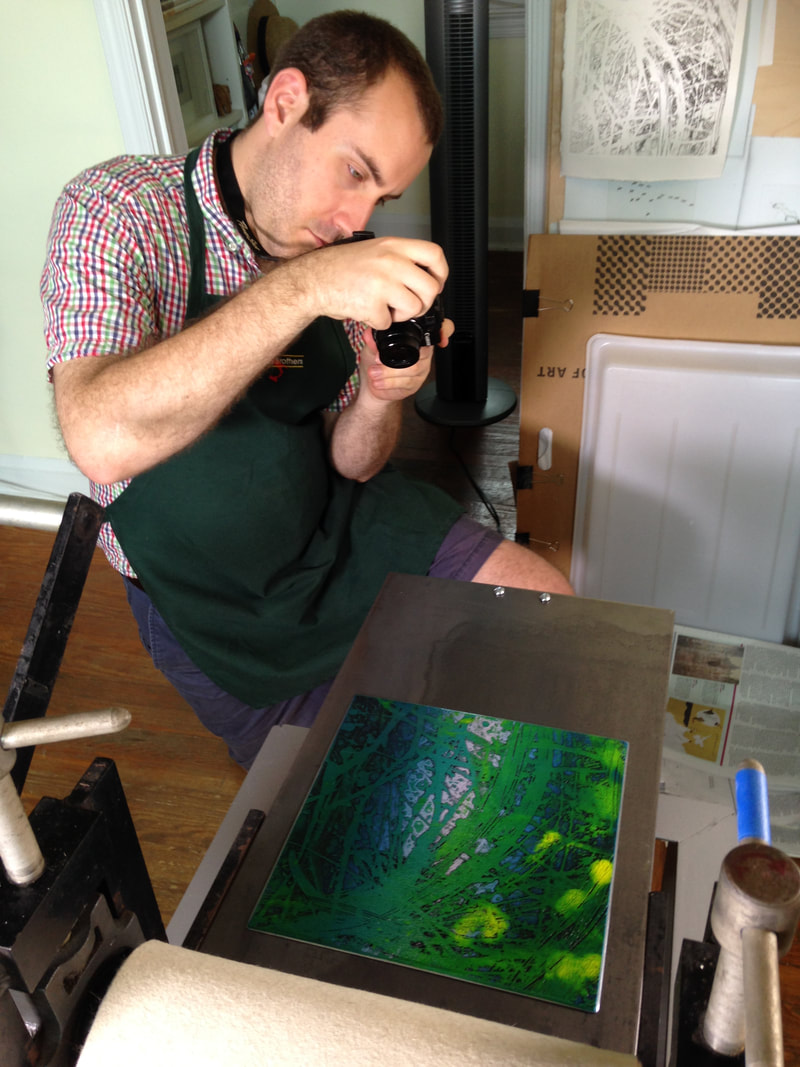
Ann ShaferIn a previous post, we looked at the new system Ben Levy came up with to describe Hayter’s simultaneous color prints. We adopted a two-tiered method: the first line describes what is in the plate (the grooves and textures that carry the image); the subsequent lines describe each layer of inking, which are combined on the single plate and run through the press once. In our discussion we gave a few examples, and one included a wood-offset-stencil-relief roll. Sounds complicated, I know. I’m going to pull it apart for you. Hayter used the wood offset dealio in his 1951 print Danse de soleil (Sun Dancer). Published by Guilde Internationale de la Gravure, there were 200 in the edition (aside from any proofs or early states). Hayter had been experimenting with relief rolling colors of different viscosities onto the plate either through a silkscreen or a stencil for several years—his 1946 print Cinq personnages is considered his most important early use of this new-fangled printing method. By 1951, he’s on a roll (get it?). For Danse du soleil, Hayter used an offset pattern from a plank of wood. To get the texture and pattern of the wood to show up in a gradient of red-orange, he first rolled out the gradient on a glass palette, red on one end and orange on the other. (After a period of rolling, the inks merge in the middle and create a smooth mix of the colors.) Taking the roller with the red-orange ink, Hayter rolled the gradient onto a piece of wood that had just the pattern and texture he wanted. Then he took another, clean roller, one large enough that its circumference was equal to the height of the copper plate carrying the image, and rolled it across the inked-up wood once, picking up the exact image of the wood texture in the red-orange gradient. That roller was rolled across the surface of the already intaglio-inked copper plate once, depositing the image of the red-orange wood on the surface. He did this through a cut paper stencil so that the gradient only appears in certain areas. See the image where I added the purple marks indicating where the stencil allowed the gradient through. He also rolled on a yellow ink through a different stencil, as well as a blue-green gradient through another stencil. Neither of these two stenciled additions used an offset from another texture. Rather, the inks were rolled on a palette and directly rolled onto the plate through stencils. So, our description should now make sense: Engraving, softground etching, and scorper Printed in black (intaglio); red-orange gradient (wood offset, stencil, relief); yellow (stencil, relief); blue-green gradient (stencil, relief) Stanley William Hayter (English, 1901–1988) Danse du soleil (Sun Dancer) [state 1], 1951 Engraving; printed in black (intaglio) Sheet: 503 x 317 mm. (19 13/16 x 12 1/2 in.) Plate: 397 x 233 mm. (15 5/8 x 9 3/16 in.) Baltimore Museum of Art: Gift of Mr. and Mrs. Robert Paul Mann, Towson, Maryland, BMA 1979.362 Stanley William Hayter (English, 1901–1988) Danse du soleil (Sun Dancer), 1951 Engraving, softground etching, and scorper; printed in black (intaglio); red-orange gradient (wood offset, stencil, relief); yellow (stencil, relief); blue-green gradient (stencil, relief) Sheet: 566 x 379 mm. (22 5/16 x 14 15/16 in.) Plate: 394 x 238 mm. (15 1/2 x 9 3/8 in.) Baltimore Museum of Art: Blanche Adler Memorial Fund, BMA 1953.56 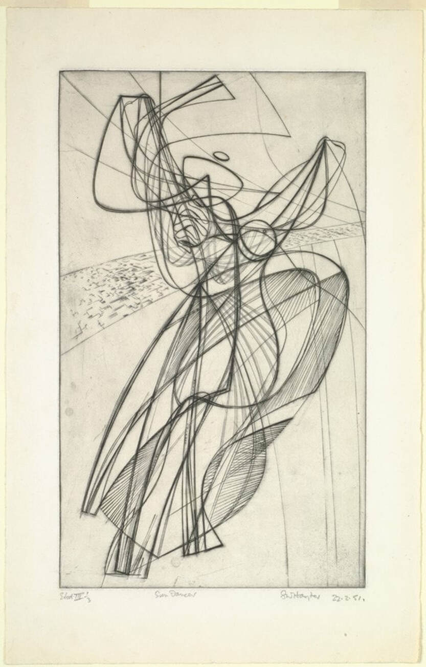 Stanley William Hayter (English, 1901–1988), Danse du soleil (Sun Dancer) [state 1], 1951. Engraving; printed in black (intaglio), sheet: 503 x 317 mm. (19 13/16 x 12 1/2 in.); plate: 397 x 233 mm. (15 5/8 x 9 3/16 in.). Baltimore Museum of Art: Gift of Mr. and Mrs. Robert Paul Mann, Towson, Maryland, BMA 1979.362. 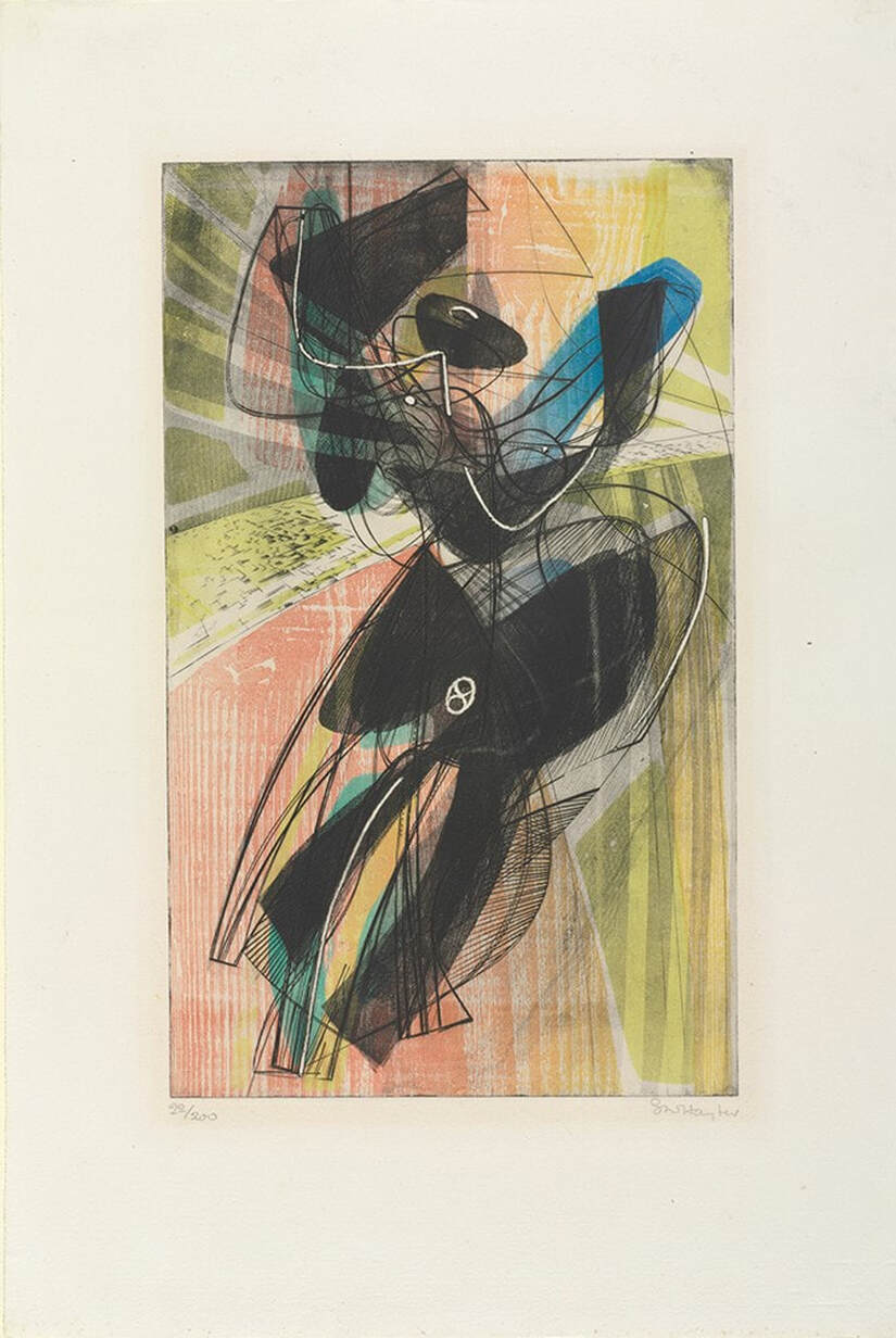 Stanley William Hayter (English, 1901–1988), Danse du soleil (Sun Dancer), 1951. Engraving, softground etching, and scorper; printed in black (intaglio); red-orange gradient (wood offset, stencil, relief); yellow (stencil, relief); blue-green gradient (stencil, relief), sheet: 566 x 379 mm. (22 5/16 x 14 15/16 in.); plate: 394 x 238 mm. (15 1/2 x 9 3/8 in.). Baltimore Museum of Art: Blanche Adler Memorial Fund, BMA 1953.56. 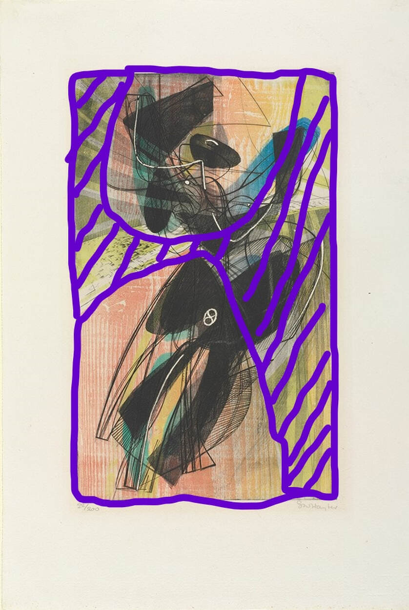 Purple marks where the stencil lets the ink pass through. Stanley William Hayter (English, 1901–1988), Danse du soleil (Sun Dancer), 1951. Engraving, softground etching, and scorper; printed in black (intaglio); red-orange gradient (wood offset, stencil); yellow (stencil); blue-green gradient (stencil), sheet: 566 x 379 mm. (22 5/16 x 14 15/16 in.); plate: 394 x 238 mm. (15 1/2 x 9 3/8 in.). Baltimore Museum of Art: Blanche Adler Memorial Fund, BMA 1953.56. Ann ShaferBack in June 2014, Tru Ludwig, Ben Levy, and I spent hours poring over prints by Hayter and associated artists of Atelier 17 with an eye toward technique. We wanted to change the way people describe these simultaneous-color-printed works so that it was clearer to the layperson how it was done. (They are confusing enough without adding fuzzy descriptions.) Ben devised a method for listing the mediums. We would first describe what techniques were used to make the image in the plate. Then we would follow with a description of how the plate was inked. In our Notes to the Reader (for the unpublished catalogue), we wrote about it this way: The most complicated aspect of the checklist is the media information. Conventionally, print media lines in checklists and on labels are concise, which assumes some knowledge on the part of the viewer. These works demand more explanation. To maintain consistency throughout in describing the techniques and media, we have adopted a two-tiered method of describing each print. For each entry in the checklist, readers will find the first line describes what is in the plate (the grooves and textures that carry the image). The subsequent lines describe each layer of inking, which are combined on the single plate and run through the press once. This second line also includes verbiage referring to the method of inking, which is divided into two categories: intaglio and relief. Intaglio inking means the ink is pushed into the grooves on the plate and the surface of the plate is wiped clean. Relief, in these cases, means that ink is applied to the surface using one of several methods: stencil, screen, various rollers. This last point is critical when discussing simultaneous color printing. Whereas traditional color printing requires a separate plate for each color, Atelier 17 artists discovered a method of printing in multiple colors on a single plate. A description of these terms and how they are used within the context of these complicated works is included below. Conventionally, for black-and-white prints, the media lines are pretty simple: Engraving and etching In this catalogue the same type of work is listed as: Engraving and etching Printed in black (intaglio) It gets more complicated when describing the works with multiple colors: Engraving and open bite etching Printed in black (intaglio), red (relief) Or even more complicated: Engraving, softground etching, and scorper Printed in black (intaglio), red-orange gradient (wood offset, stencil, relief), yellow (stencil, relief), and blue-green gradient (stencil, relief) Each layer of ink is described by the color followed by the method in parentheses. When multiple colors are listed in the same inking run, that means they were applied to the plate at the same time by the same means. Multiple colors connected by hyphens followed by the term gradient indicates several colors rolled and blended on a single glass palette (sometimes called a split fountain or rainbow roll). Multiple colors separated by commas followed by the term unblended indicates several colors that are unblended on the palette (think of mottled colors plopped on the palette). So, take Pillars, 1974. The orange ink is wiped in the intaglio manner, meaning into the lines and open-bit areas. This is followed by two rolls of ink across the surface in the relief manner, with varying amounts of oil so they reject each other. With these two gradient rolls, yellow and blue, Hayter (well, actually Hector Saunier printed this edition) also used a stencil to block the center area from the yellow roll and the blue roll (see the image with the purple shape representing the stencil—roughly). They also used gradient rolls for both the yellow and blue. Meaning, two columns of yellow at the outside portion were rolled with no ink in the center so that the yellow fades as it reached the center. The same was done with the blue. While this may sound like a lot of hogwash, I hope it clarifies a bit about the magical work going on at Atelier 17. In the first image, Ben Levy and Tru Ludwig are parsing Pillars, 1974, in June 2014, at the Baltimore Museum of Art. Stanley William Hayter (English, 1901-1988) Pillars, 1974 Engraving, softground etching, and open bite etching; printed in orange (intaglio); blue-blue gradient (stencil, relief), and yellow-yellow gradient (stencil, relief) Sheet: 746 x 561 mm. (29 3/8 x 22 1/16 in.) Plate: 584 x 430 mm. (23 x 16 15/16 in.) Baltimore Museum of Art: Bequest of Virginia Fox, Palm Beach, Florida, BMA 1988.29 Stanley William Hayter (English, 1901-1988) Pillars, 1974 Engraving, softground etching, and open bite etching; printed in orange (intaglio); blue-blue gradient (stencil, relief), and yellow-yellow gradient (stencil, relief) Plate: 584 x 430 mm. (23 x 16 15/16 in.) Tate Britain: Purchased 1981, P07471 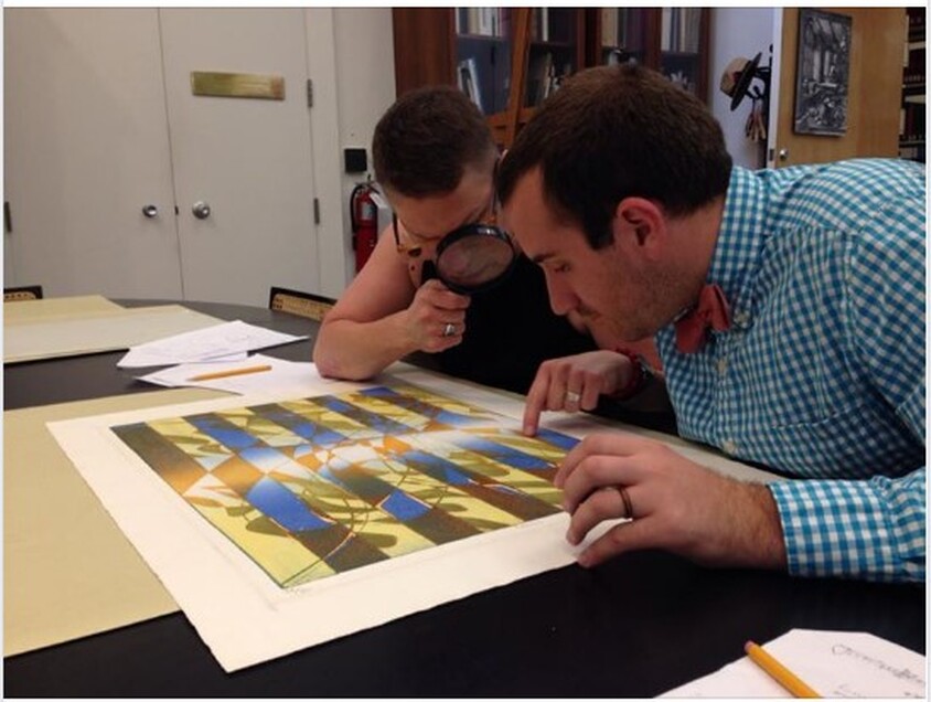 Ben Levy and Tru Ludwig are parsing Pillars, 1974, in June 2014, at the Baltimore Museum of Art. Stanley William Hayter (English, 1901-1988), Pillars, 1974. Engraving, softground etching, and open bite etching; printed in orange (intaglio); blue-blue gradient (stencil, relief), and yellow-yellow gradient (stencil, relief). Sheet: 746 x 561 mm. (29 3/8 x 22 1/16 in.); plate: 584 x 430 mm. (23 x 16 15/16 in.). Baltimore Museum of Art: Bequest of Virginia Fox, Palm Beach, Florida BMA 1988.29. 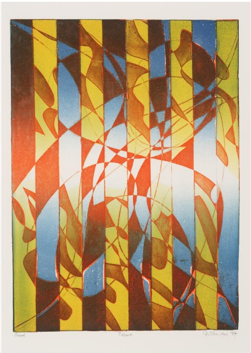 Stanley William Hayter (English, 1901-1988), Pillars, 1974. Engraving, softground etching, and open bite etching; printed in orange (intaglio); blue-blue gradient (stencil, relief), and yellow-yellow gradient (stencil, relief). Plate: 584 x 430 mm. (23 x 16 15/16 in.). Tate Britain: Purchased 1981, P07471. 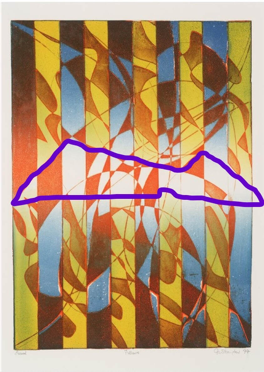 Stencil marked in purple. Stanley William Hayter (English, 1901-1988), Pillars, 1974. Engraving, softground etching, and open bite etching; printed in orange (intaglio); blue-blue gradient (stencil, relief), and yellow-yellow gradient (stencil, relief). Plate: 584 x 430 mm. (23 x 16 15/16 in.). Tate Britain: Purchased 1981, P07471. 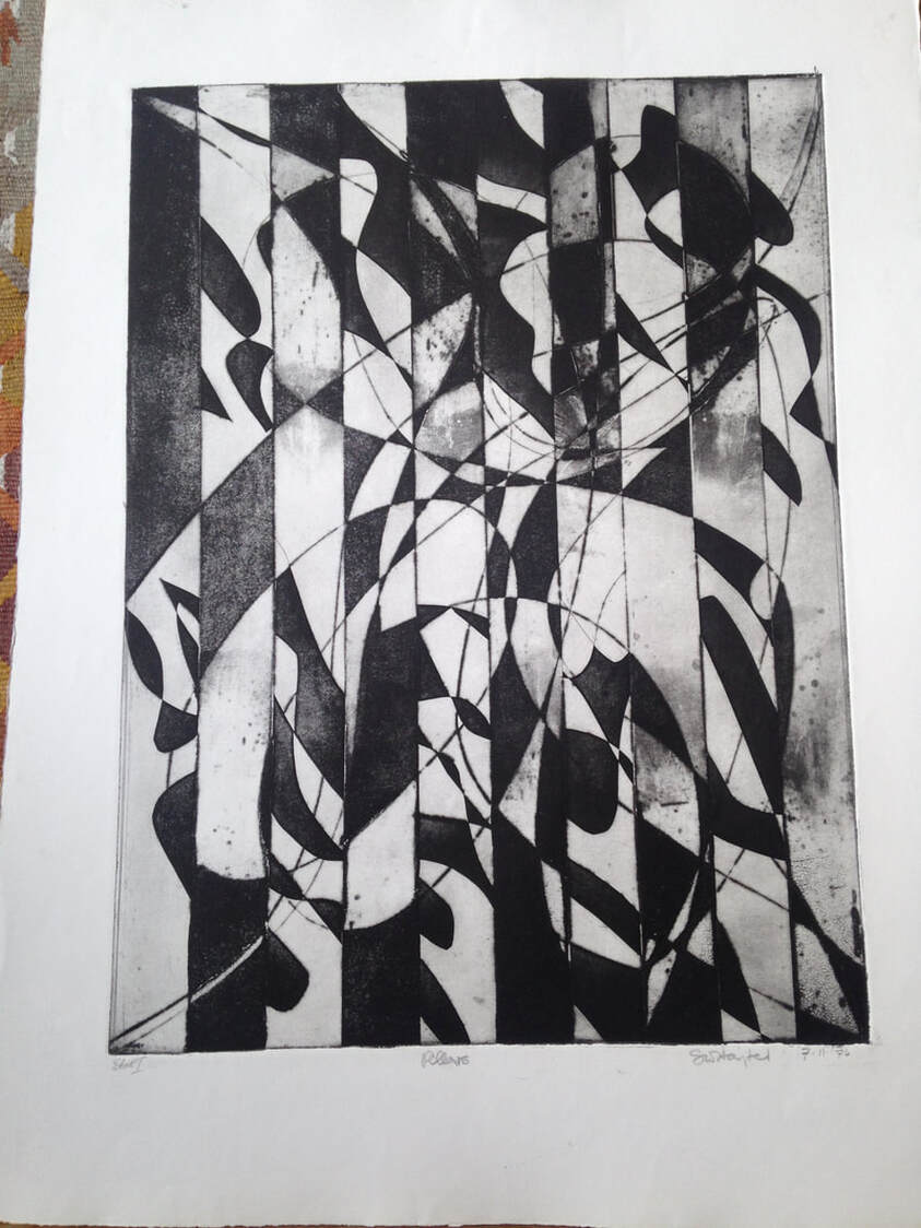 Stanley William Hayter (English, 1901-1988), Pillars [first state], 1974. Engraving, softground etching, and open bite etching; printed in black (intaglio). Plate: 584 x 430 mm. (23 x 16 15/16 in.). Private collection. Ann ShaferYou might be surprised to learn that Hayter's workshop is still operating in Paris at 10, rue Didot. After his death in 1988, the workshop changed its name to Atelier Contrepoint and is run by Hector Saunier, who printed many of Hayter’s late compositions. I was fortunate to be able to visit the Atelier twice, in 2014 and 2015. The first time was to meet Hector and see what the operation looked like. The second time Hayter's widow, Désirée, agreed to bring over one of his plates so Hector could ink and print it for us (there is no one better suited for this particular task). The plan was to create an online feature for the exhibition’s web site, which never happened because the show was cancelled. As usual, Ben Levy and Tru Ludwig were with me, and between the three of us, we shot a lot of video and photographed Hector and Shu-lin Chen printing Hayter’s Torso, 1986. Désirée couldn’t find the plate she was originally thinking of, so she randomly selected Torso, which turned out to be serendipitous because Torso conceptually circles back around to the fist clenching the void discussed in an earlier post. In Torso, Hayter used stripes with inverted color variants, inking the central intaglio composition in green, red, and fluorescent orange, and with a horizontally rolled gradient of blue/yellow/green. The shape of the torso is defined by a mask that was laid down on the inked plate, blocking the rollers from depositing the blue, yellow, and green ink on the paper, producing an area of white across the center. The positive shape of the torso, described by an absence, echoes the conundrum of the untitled plate six from The Apocalypse, in which the negative space of a clenched fist is described by a positive volume. In this late print, the cognitive inquiries and accumulated techniques of four decades have come together. With the copper plate under her arm, we met Désirée on the appointed day at Atelier Contrepoint. After consulting the catalogue raisonné, they got right to work. Shu-lin set about inking the plate (intaglio) in red, fluorescent orange, and dark green in vertical stripes. Hector prepared the rainbow roll of blue, yellow, and green on a glass palette. The mask was still wrapped with the plate, so it was used as well. When Shu-lin was satisfied with her wiping job, the plate was ready for the mask’s placement and the rainbow roll. Hector completed his part and the plate was placed on the bed of the press that had been used for thousands of prints by hundreds of artists over the majority of the twentieth century. After a few unsatisfactory pulls, they printed four impressions, one of which eventually entered the Baltimore Museum of Art’s collection. I remain amazed that I got to experience the printing of one of Hayter’s plates and so appreciative of Désirée, Hector, and Shu-lin’s generosity that day. Even better, Ben Levy and Tru Ludwig were with me to witness the magic. Ann ShaferIn my previous post I talked about Stanley William Hayter's 1959 open bite etching Cascade and promised to dig into its making. It takes many images to describe the process of simultaneous color printing, so I created a PDF slide deck to illustrate how Ben Levy, Tru Ludwig, and I made a group of test prints to figure it all out. You can find the PDF here:
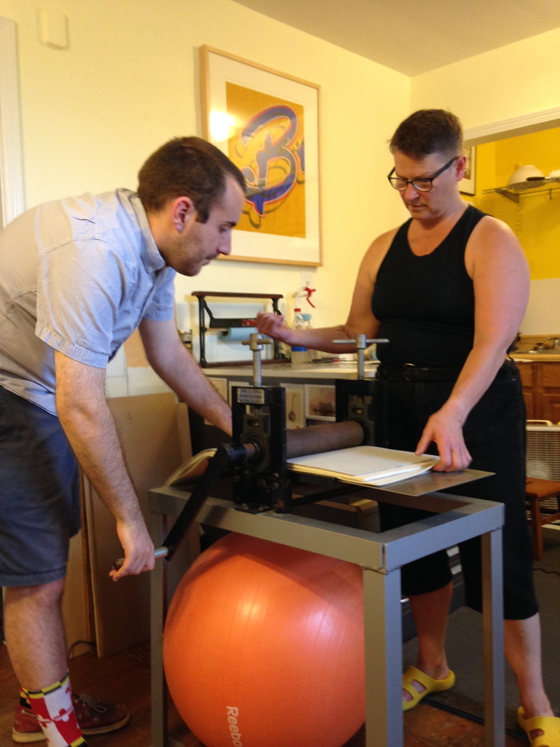
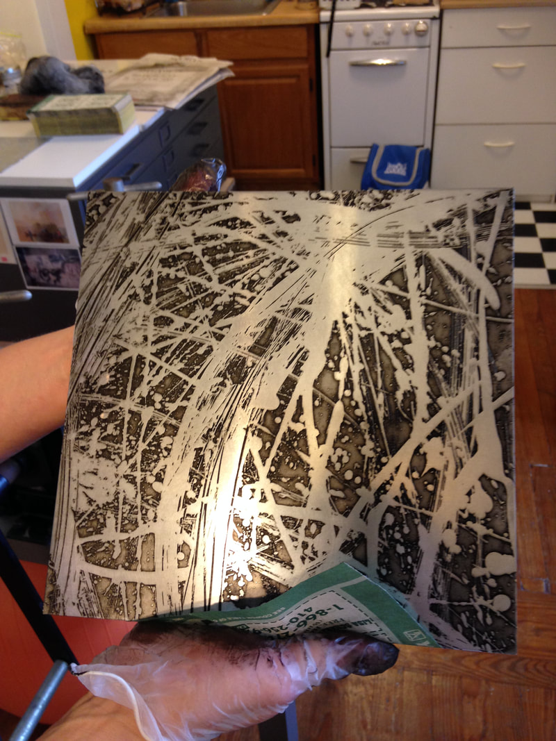
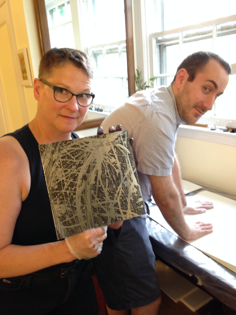
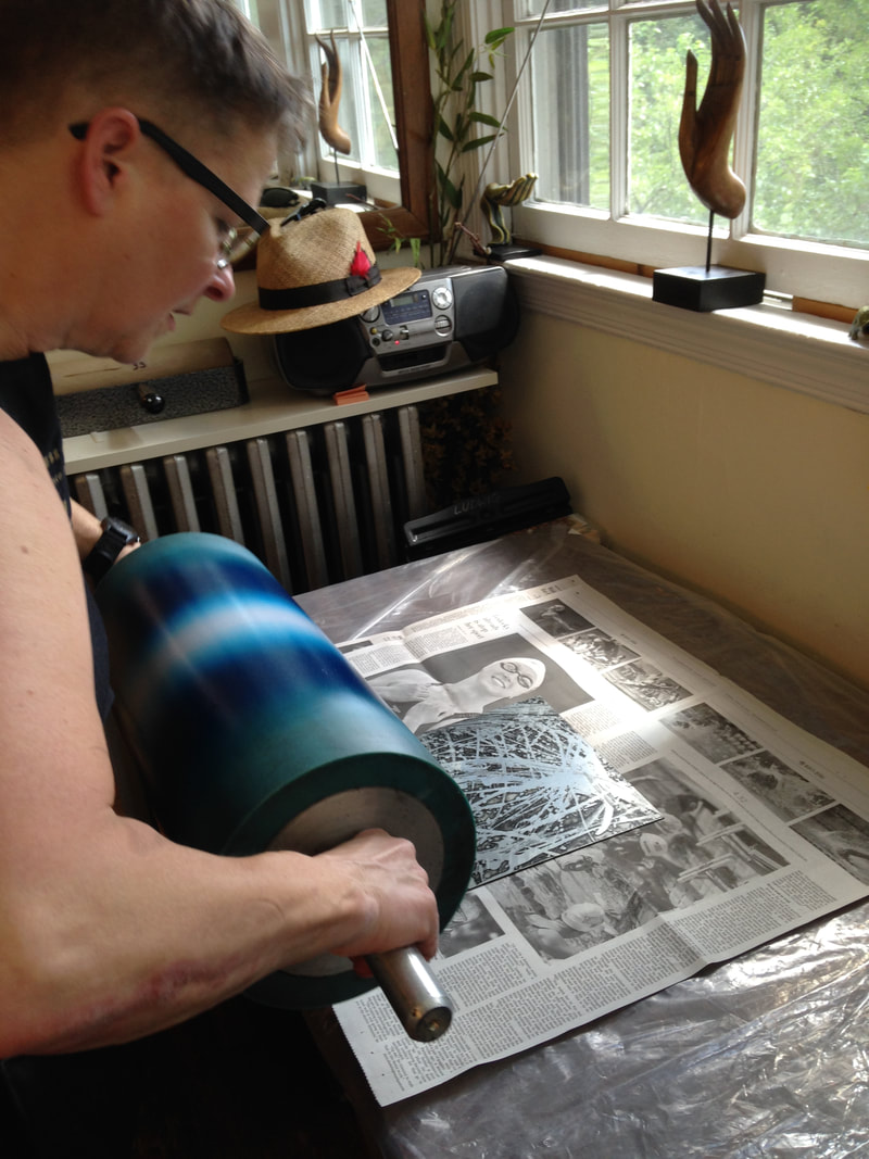
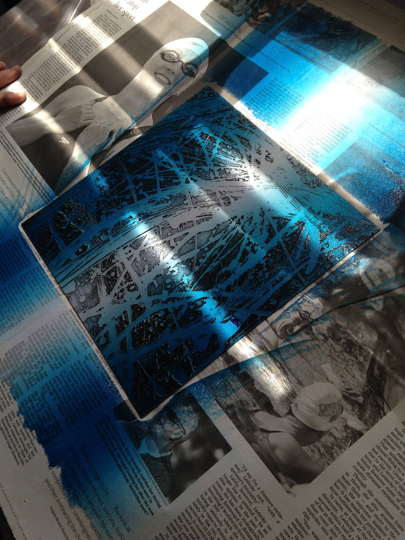
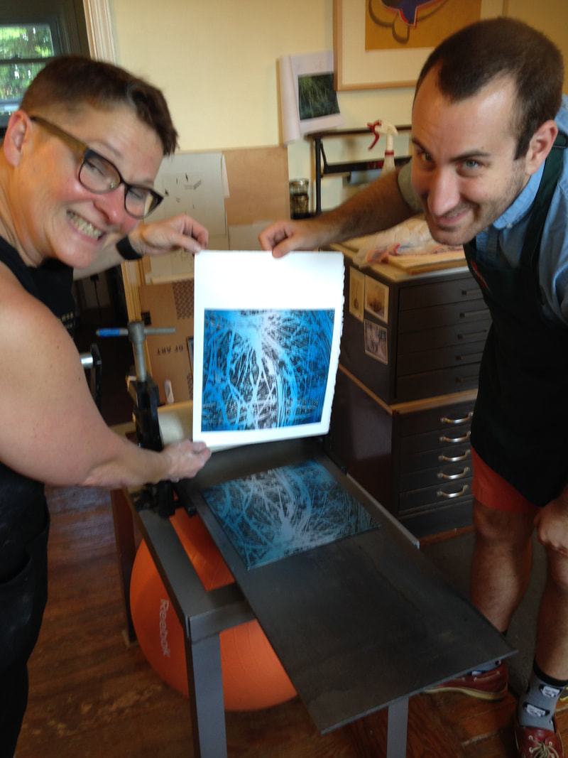
Ann ShaferCascade, 1959, by Stanley William Hayter, is the print I planned to use of the cover of the catalogue. One, because it's gorgeous. Two, because by 1959, Hayter is 58 and had been at it for more than thirty years and Cascade sums up so much of Hayter's thinking. During that time, he's helped Spanish refugees during the Spanish Civil War by hiding them in the studio; he's dropped everything and fled Paris as it went to war with Germany in 1939; he's created something really special in NY during the war and following (he's in NY from 1940-1950); he's watching his 16-year-old son die in 1946; he's helped hundreds of artists find their voices and discover new ways of creating intaglio prints; he, like so many other artists, has grappled with the horrors revealed by the Holocaust and bombing of Hiroshima and Nagasaki; and he's been able to return to France and purchase a vacation home in the south of France. But Hayter was also a man who never stopped thinking, working, creating, loving, living. Three, it's a great place to start talking about one of the Atelier's most important discoveries, that of simultaneous color printing (sometimes called viscosity printing, although Hayter didn't like that term since all inks have a viscosity of some sort). Cascade, 1959, is a colorful print with an all-over composition that appears completely abstract; seemingly random drips and gestures cover the plate. Hayter, however, never accepted pure abstraction as a meaningful subject—even when his subjects defy conventional representation, his titles anchor them in the world of places and things. Cascade is one of many works inspired by the appearance of rushing water in a river near his home in the south of France. The direct autographic drawing that had been essential to Hayter’s work since he began engraving has disappeared, replaced by a variety of devices that could be set in motion by his hand, but whose outcomes were far more open to chance: leaking cans of liquid ground suspended as pendulums, and marker pens that could dribble and spray showers of thin resist. These systems recorded, rather than depicted, the behavior of liquids in motion. Cascade is an indexical print (see prior post about Trisha Brown). Despite all of the scholarly reasons we can cite for Hayter's switch from engraving lines to depict images to indexical splashes of liquid, I've always wondered if his hands were just tired and he was dealing with an onset of arthritis. I have absolutely no proof of this--it's just a thought. What's so intriguing to me about the print is figuring out how in the world a bunch of open-bit swooshes and gestures are inked to produce the colorful image. First, we need to understand that to produce a color print, normally one would create separate copper plates for each color and they would be printed in successive layers on the paper in multiple passes through the press. Instead, Hayter layered the different colors on the same, single plate, and ran it through the press once. The trick is to vary the amount of oil in each color so that they don't run together as they are applied. (This idea was developed at the Atelier by Krishna Reddy and Kaiko Moti--an example of the collaborative nature of the workshop.) Along with the print itself, I'm including an image of the zinc plate (also in Baltimore's collection, a gift from Mrs. Hayter, BMA 2014.40), and an image that shows the cross section of the plate in the order it is inked. I hope this will make some sense; we'll dig in more tomorrow. First, the plate is wiped intaglio in black so that the ink clings to the canyon walls; second, a soft roller carrying the rainbow roll of blue/pink/blue deposits color in the canyons; third, a hard roller deposits an unblended green and yellow across the plateau. This will all be made clearer tomorrow when I share the test plates we created for the exhibition to show each step in this inking process. Because these test plates are the first and only etchings I've ever made, you can imagine I had help. I am deeply, supremely indebted to Tru Ludwig and Ben Levy, who made it all happen. Tomorrow you'll see us in action. Stanley William Hayter (English, 1901-1988) Cascade, 1959 Open bite etching; printed in black (intaglio), blue-pink-blue gradient (relief), yellow, green, and blue, unblended (relief) Sheet: 794 x 584 mm. (31 1/4 x 23 in.) Plate: 489 x 489 mm. (19 1/4 x 19 1/4 in.) The Baltimore Museum of Art: Purchased as the gift of the Print, Drawing & Photograph Society, BMA 2008.112 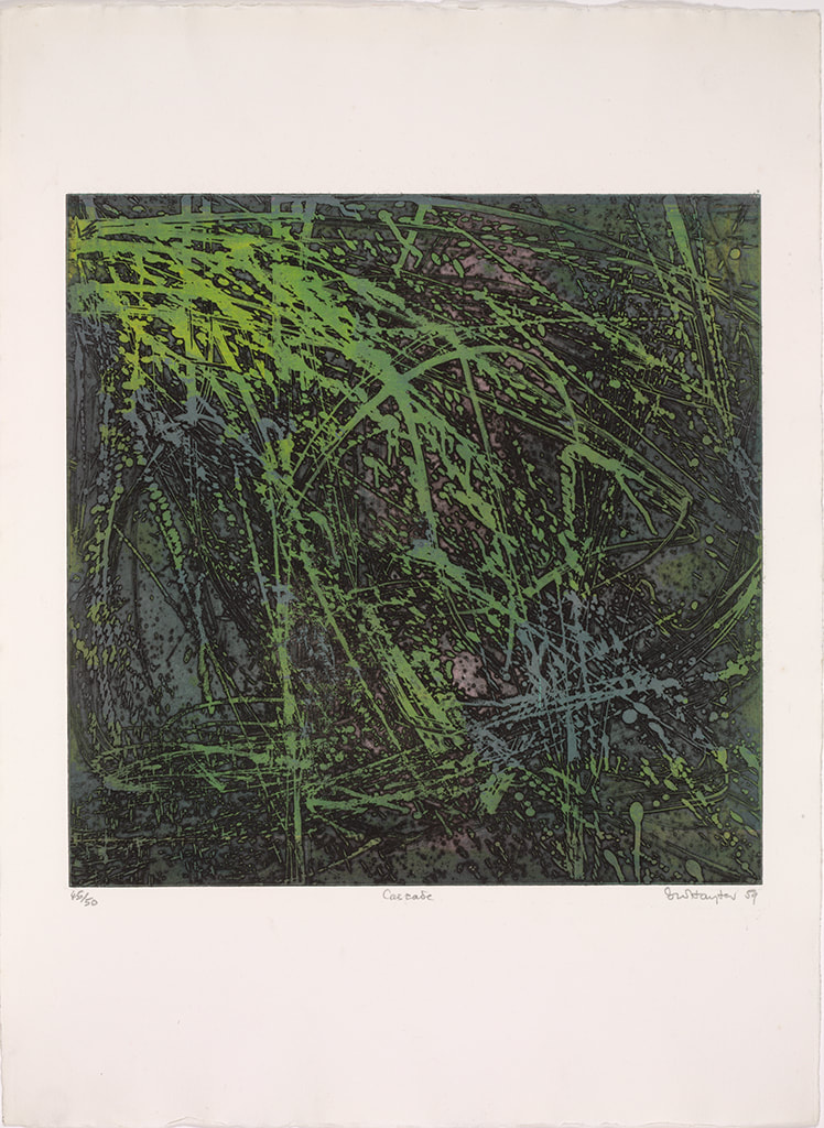 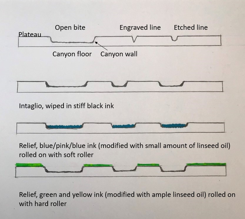 Ann ShaferIn the previous post I shared a video about Stanley William Hayter (known as Bill to his friends), an artist that has interested me for many years. I also shared a link to a PDF catalogue for an exhibition that took place last year in São Paolo, Brazil. I was lucky enough to participate in a conference there in conjunction with that exhibition, Atelier 17 and Modern Printmaking in the Americas. I’m sharing a summary of the conference I wrote for another publication that I hope you find interesting. And, if you or any of your students need a dissertation topic, read through to the end. The conference was held at the Museu de Arte Contemporãnea, which is part of the University of São Paolo and is known as MAC USP. Both the exhibition and conference focused on printmaking and artistic exchange between the United States and South American countries in the mid-twentieth century. The exhibition, catalogue, and conference were born out of the research of USP graduate student Carolina Rossetti de Toledo, who, under the supervision of professor and chief curator Ana Gonçalves Magalhães, focused on several gifts to São Paolo’s new Museum of Modern Art (MAM) in the 1950s of prints from Nelson Rockefeller, Henry Ford, and Lessing Rosenwald (the majority of MAM’s permanent collection was transferred to MAC USP upon its founding in 1963). Nelson Rockefeller made two gifts, one in 1946 of paintings and sculpture and another in 1951 of twenty-five modern prints, to assist in the establishment of a museum of modern art in São Paolo. (He also donated a group of paintings to a museum in Rio de Janeiro in 1952.) Rockefeller’s interest in Brazil began when he travelled there as the director of the Office of the Coordinator of Inter-American Affairs, the purpose of which was to strengthen relations with Latin America during World War II, both politically and culturally. The initial selection of prints for the Rockefeller donation was made by MoMA curator William Lieberman, who chose prints that represented cutting-edge modernism. The majority reflect American printmaking of the time, meaning works by artists associated with Stanley William Hayter’s Atelier 17. Why Rockefeller focused on MAM in São Paolo specifically remains unclear. Whatever the real reason, it was noted as a “gesture of goodwill.” A selection of prints from the 1951 gift were exhibited that year in São Paolo but have rarely been shown in the intervening years. Following Rockefeller’s gesture, Henry Ford donated one print in 1953, and Lessing Rosenwald made a gift of nine modern prints in 1956, which were meant to augment the collection in the area of international modernism. The connection between the three donors and what motivated the Ford and Rosenwald gifts is unclear. But among the prints in these later gifts were yet more examples of international modernism in the form of works by artists associated with Atelier 17. For Brazilian artists, there were three possible points of contact with Atelier 17. The first was through trips abroad. The second was through the publication and circulation of books by Hayter and his associates. The third was through exhibitions such as MoMA’s 1944 Atelier 17 exhibition, which traveled not only around the United States but also throughout Latin America, and through the exhibitions of works by Atelier 17 artists in the São Paolo Biennials and other venues. Hayter had an exhibition in Rio de Janeiro in 1957, which also traveled to Buenos Aires, and his work was included in the British pavilion in the 1959 São Paolo Biennial (MAM purchased several prints from this show). Interestingly, Atelier 17 artist Minna Citron had an extensive one-person show at MAM in São Paolo in 1952, which was by far the biggest exposure of an Atelier 17 artist in Brazil up to that point. Citron was fairly proficient in Portuguese (and many other languages), which may account for how she secured and coordinated this show. Several of the prints in the Rockefeller gift to MAM had been shown in other impressions in the 1944 MoMA exhibition and yet other prints in the gift were seen in Una Johnson’s seminal National Print Annual exhibitions at the Brooklyn Museum. In other words, the gift was of cutting-edge contemporary prints. There are still gaps in the story, however. In her essay for the exhibition catalogue, Rossetti de Toledo notes, rightly, that the connections between modern American and European printmaking and its Latin American counterparts are not well understood or properly documented. The Rockefeller gift is one piece of the puzzle. Rossetti de Toledo’s research into the Rockefeller gift developed into the MAC USP exhibition and bilingual catalogue, both majorly supported by the Terra Foundation. In addition to prints from MAC USP’s collection, the exhibition featured loans from the Terra Foundation’s extensive collection of American prints and works from the Brooklyn Museum and Art Institute of Chicago. The conference began with introductory remarks from Magalhães and Terra Foundation curator Peter John (PJ) Brownlee. Rossetti de Toledo spoke about her research on the Rockefeller gift. I introduced Hayter and the Atelier 17, setting the stage for the discussion. Other speakers included Luiz Claudio Mubarac, who gave an overview of Brazilian printmaking in the twentieth century; Silvia Dolinko, who gave an overview of printmaking in her home country of Argentina; Heloisa Espada, who focused on Brazilian artist Geraldo de Barros (he worked at Atelier 17 in Paris in 1951); and Priscila Sacchettin, who spoke about Livio Abramo (he worked at Atelier 17 in 1951–52 and his work appears in Hayter’s book, About Prints). Christina Weyl closed out the conference with her talk on women at Atelier 17, which was an excellent preview of her important, recently published book. Over the course of two days, it became clear that South American printmaking runs in sometimes intersecting but separate tracks from European and American art. While artists cross pollinated through travel, books, and exhibitions, for those of us who study prints, there’s a whole other world of printmakers to be discovered in South America. It is also clear that research on these printmakers is wide open. Brazil lacks the central repository of artists’ papers and archives like our Archives of American Art. Many of the artists’ families remain in possession of the works and papers of their creative relatives. These artists’ estates have not been formalized or catalogued, nor are they easily accessible. Hardly any estates’ papers have found their way into libraries or universities, meaning there is a lot of room for intrepid scholars to uncover the careers of any number of artists. How’s your Portuguese? Need a dissertation topic? As I noted yesterday, the exhibition catalogue was printed in a small run but a pdf of the book is available here: bit.ly/Atelier17MACUSP. I also include a list of Brazilian and Argentine artists who were mentioned repeatedly. Brazilian artist-printmakers of note: Edith Behring (1916–1996) Maria Bonomi (born 1935, she was married to Abramo) Ibêre Carmargo (1941–1994) Oswaldo Goeldi (1895–1961) Marcelo Grassmann (1925–2013) Evandro Carlos Jardim (born 1935) Renina Katz (born 1925) Anna Letycia (born 1929) Maria Martins (1894–1993) Fayga Ostrower (1920–2001) Carlos Oswald (1882–1971) Mário Pedrosa (1900–1981) Gilvan Samico (1928–2013) Lasar Segall (1891–1957) Regina Silveira (born 1939) Argentine artists-printmakers: Hilda Ainscough (born 1900) Mauricio Lasansky (1914–2012) Julio LeParc (born 1928) Fernando López Anaya (1903–1987) Ana Maria Moncalvo (1921–2009) 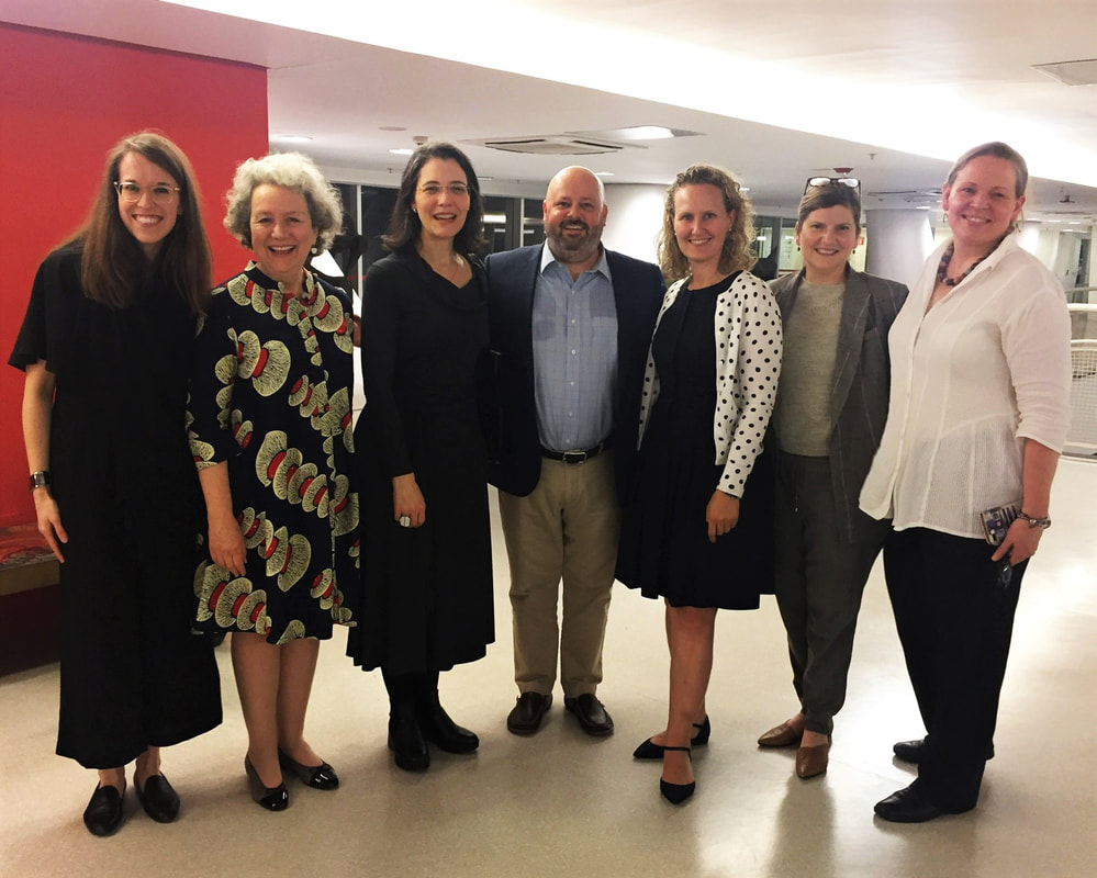 At the exhibition reception: (L-R) Taylor Poulin, Elizabeth Glassman, Ana Gonçalves Magalhães, Peter (PJ) Brownlee, Christina Weyl, Amy Zinck, and Ann Shafer. Photo by MAC USP staff.
|
Ann's art blogA small corner of the interwebs to share thoughts on objects I acquired for the Baltimore Museum of Art's collection, research I've done on Stanley William Hayter and Atelier 17, experiments in intaglio printmaking, and the Baltimore Contemporary Print Fair. Archives
February 2023
Categories
All
|
||


 RSS Feed