Ann ShaferBack in June 2014, Tru Ludwig, Ben Levy, and I spent hours poring over prints by Hayter and associated artists of Atelier 17 with an eye toward technique. We wanted to change the way people describe these simultaneous-color-printed works so that it was clearer to the layperson how it was done. (They are confusing enough without adding fuzzy descriptions.) Ben devised a method for listing the mediums. We would first describe what techniques were used to make the image in the plate. Then we would follow with a description of how the plate was inked. In our Notes to the Reader (for the unpublished catalogue), we wrote about it this way: The most complicated aspect of the checklist is the media information. Conventionally, print media lines in checklists and on labels are concise, which assumes some knowledge on the part of the viewer. These works demand more explanation. To maintain consistency throughout in describing the techniques and media, we have adopted a two-tiered method of describing each print. For each entry in the checklist, readers will find the first line describes what is in the plate (the grooves and textures that carry the image). The subsequent lines describe each layer of inking, which are combined on the single plate and run through the press once. This second line also includes verbiage referring to the method of inking, which is divided into two categories: intaglio and relief. Intaglio inking means the ink is pushed into the grooves on the plate and the surface of the plate is wiped clean. Relief, in these cases, means that ink is applied to the surface using one of several methods: stencil, screen, various rollers. This last point is critical when discussing simultaneous color printing. Whereas traditional color printing requires a separate plate for each color, Atelier 17 artists discovered a method of printing in multiple colors on a single plate. A description of these terms and how they are used within the context of these complicated works is included below. Conventionally, for black-and-white prints, the media lines are pretty simple: Engraving and etching In this catalogue the same type of work is listed as: Engraving and etching Printed in black (intaglio) It gets more complicated when describing the works with multiple colors: Engraving and open bite etching Printed in black (intaglio), red (relief) Or even more complicated: Engraving, softground etching, and scorper Printed in black (intaglio), red-orange gradient (wood offset, stencil, relief), yellow (stencil, relief), and blue-green gradient (stencil, relief) Each layer of ink is described by the color followed by the method in parentheses. When multiple colors are listed in the same inking run, that means they were applied to the plate at the same time by the same means. Multiple colors connected by hyphens followed by the term gradient indicates several colors rolled and blended on a single glass palette (sometimes called a split fountain or rainbow roll). Multiple colors separated by commas followed by the term unblended indicates several colors that are unblended on the palette (think of mottled colors plopped on the palette). So, take Pillars, 1974. The orange ink is wiped in the intaglio manner, meaning into the lines and open-bit areas. This is followed by two rolls of ink across the surface in the relief manner, with varying amounts of oil so they reject each other. With these two gradient rolls, yellow and blue, Hayter (well, actually Hector Saunier printed this edition) also used a stencil to block the center area from the yellow roll and the blue roll (see the image with the purple shape representing the stencil—roughly). They also used gradient rolls for both the yellow and blue. Meaning, two columns of yellow at the outside portion were rolled with no ink in the center so that the yellow fades as it reached the center. The same was done with the blue. While this may sound like a lot of hogwash, I hope it clarifies a bit about the magical work going on at Atelier 17. In the first image, Ben Levy and Tru Ludwig are parsing Pillars, 1974, in June 2014, at the Baltimore Museum of Art. Stanley William Hayter (English, 1901-1988) Pillars, 1974 Engraving, softground etching, and open bite etching; printed in orange (intaglio); blue-blue gradient (stencil, relief), and yellow-yellow gradient (stencil, relief) Sheet: 746 x 561 mm. (29 3/8 x 22 1/16 in.) Plate: 584 x 430 mm. (23 x 16 15/16 in.) Baltimore Museum of Art: Bequest of Virginia Fox, Palm Beach, Florida, BMA 1988.29 Stanley William Hayter (English, 1901-1988) Pillars, 1974 Engraving, softground etching, and open bite etching; printed in orange (intaglio); blue-blue gradient (stencil, relief), and yellow-yellow gradient (stencil, relief) Plate: 584 x 430 mm. (23 x 16 15/16 in.) Tate Britain: Purchased 1981, P07471 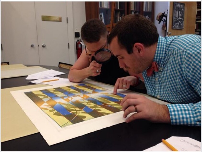 Ben Levy and Tru Ludwig are parsing Pillars, 1974, in June 2014, at the Baltimore Museum of Art. Stanley William Hayter (English, 1901-1988), Pillars, 1974. Engraving, softground etching, and open bite etching; printed in orange (intaglio); blue-blue gradient (stencil, relief), and yellow-yellow gradient (stencil, relief). Sheet: 746 x 561 mm. (29 3/8 x 22 1/16 in.); plate: 584 x 430 mm. (23 x 16 15/16 in.). Baltimore Museum of Art: Bequest of Virginia Fox, Palm Beach, Florida BMA 1988.29. 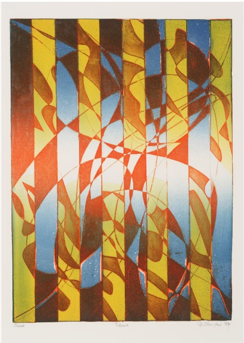 Stanley William Hayter (English, 1901-1988), Pillars, 1974. Engraving, softground etching, and open bite etching; printed in orange (intaglio); blue-blue gradient (stencil, relief), and yellow-yellow gradient (stencil, relief). Plate: 584 x 430 mm. (23 x 16 15/16 in.). Tate Britain: Purchased 1981, P07471. 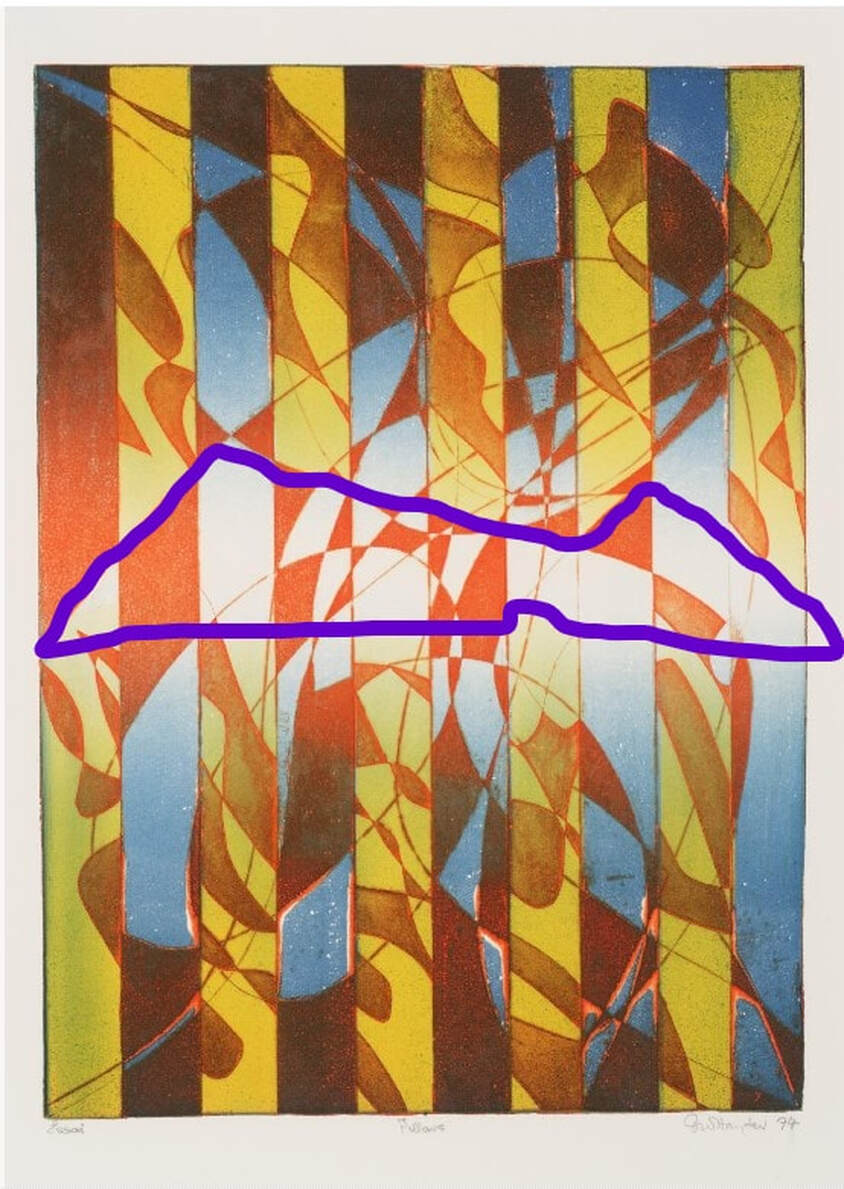 Stencil marked in purple. Stanley William Hayter (English, 1901-1988), Pillars, 1974. Engraving, softground etching, and open bite etching; printed in orange (intaglio); blue-blue gradient (stencil, relief), and yellow-yellow gradient (stencil, relief). Plate: 584 x 430 mm. (23 x 16 15/16 in.). Tate Britain: Purchased 1981, P07471. 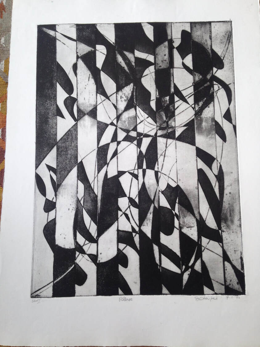 Stanley William Hayter (English, 1901-1988), Pillars [first state], 1974. Engraving, softground etching, and open bite etching; printed in black (intaglio). Plate: 584 x 430 mm. (23 x 16 15/16 in.). Private collection.
1 Comment
5/25/2022 06:48:46 am
This material is fabulous! It's full of incisive information and the points you make are rational and solid. After reading this article i get to know more about ENGRAVING and Etching machine and it's Benefits Leave a Reply. |
Ann's art blogA small corner of the interwebs to share thoughts on objects I acquired for the Baltimore Museum of Art's collection, research I've done on Stanley William Hayter and Atelier 17, experiments in intaglio printmaking, and the Baltimore Contemporary Print Fair. Archives
February 2023
Categories
All
|
 RSS Feed