Ann ShaferRecently I saw a t-shirt that said “Don’t make me repeat myself. –History" There is a lot going on these days. Between the pandemic, politics, and confronting America’s legacy of slavery and systemic racism, I am, as I’m sure you are, anxious. On top of that, as I write this, I’m riding out a hurricane in a cottage overlooking the very turbulent waters of Vineyard Sound. We all know this period is not unique. Humans have made it through more dire times than these. But still, we seem doomed to repeat our mistakes. As I’ve written before, I really appreciate an artist who digs in and expresses the fears and worries of their time in a way that helps viewers process and think. Especially if the images read just as well in our time as in theirs. Gabor Peterdi was a Hungarian artist who worked at Atelier 17 in Paris in the 1930s during the Spanish Civil War and leading up the second World War. Like so many of his compatriots, he created prints that address issues of social justice and crimes against humanity, sometimes using the bull and bull fights or mythical horses and man-animal creatures as stand-ins for humankind. One rarely finds any self-portraits among the prints made at Hayter’s workshop, but Peterdi is notable for a 1938 series of self-portraits in which he holds his head in his hands in despair. It’s hard to get the emotion just right in these kind of images, and I think Peterdi hits the nail on the head. Like so many others, Peterdi made his way to America at the beginning of the war (remember, Europe was in turmoil for years leading up to the official declaration of war in September 1939). He enlisted in the U.S. Army and fought for his new country. No surprise, that experience finds its way into his work. Peterdi went on to have a long career both making prints and teaching printmaking. In addition to establishing the printmaking program at the Brooklyn Museum School, Peterdi taught at Hunter College from 1952–1960, and then at Yale University from 1960–1987. (Among his many students at Yale were Peter Milton and Chuck Close.) In a previous post I wrote about artists making prints reacting to World War II in the years after its conclusion as a demonstration of that conflict’s lasting effect. I also wrote about artists writing about their own work and how I wish more artists would take the time to do the same. Peterdi’s The Vision of Fear, 1953, fits both categories. About the print Peterdi wrote: “My basic idea was to create an oppressive, enervating image haunted by fearful symbols of destruction. I tried to express a composite feeling of flying with deadly birds and watching them from below.” This print is interesting also because of the four additional plates he laid on top of the large plate as it passed through the press. The deep emboss accentuates their addition as does the red ink he used, making the crosses seem to fall from the sky. I’ve included images here that I don’t mention because I think Peterdi deserves more attention and I love his sensibility. But I will note that Still Life in Germany is one that got away. I had been keeping my eye on it for years, waiting for the right time to pitch it. In the end, I ran out of time. By the way, if any of you studied with Peterdi, I’d love to hear your stories. Gabor Peterdi (American, born Hungary, 1915–2001) Despair I, 1938 Etching and engraving Plate: 266 x 197 mm. (10 1/2 × 7 ¾ in.) Sheet: 448 x 315 mm. (17 5/8 × 12 3/8 in.) Museum of Modern Art: Purchase, 146.1944 Gabor Peterdi (American, born Hungary, 1915–2001) Despair II, 1938 Etching and engraving Plate: 245 × 206 mm. (9 5/8 × 8 1/8 in.) Sheet: 304 × 269 mm. (11 15/16 × 10 9/16 in.) Yale University Art Gallery: Gift of James N. Heald II, B.S. 1949, 2011.148.8 Gabor Peterdi (American, born Hungary, 1915–2001) Despair III, 1938 Etching and engraving Plate: 315 x 248 mm. (12 3/8 × 9 ¾ in.) Sheet: 452 x 340 mm. (17 13/16 × 13 3/8 in.) Museum of Modern Art: Gift of the Artist, 103.1955 Gabor Peterdi (American, born Hungary, 1915–2001) Despair IV, 1938 Etching, engraving, and drypoint Plate: 241 × 203 mm. (9 1/2 × 8 in.) Sheet: 453 × 329 mm. (17 13/16 × 12 15/16 in.) Yale University Art Gallery: Gift of James N. Heald II, B.S. 1949, 2011.148.9 Gabor Peterdi (American, born Hungary, 1915–2001) Despair V, 1938 Etching Plate: 247 × 209 mm. (9 3/4 × 8 1/4 in.) Sheet: 453 × 329 mm. (17 13/16 × 12 15/16 in.) Yale University Art Gallery: Gift of James N. Heald II, B.S. 1949, 2011.148.10 Gabor Peterdi (American, born Hungary, 1915–2001) The Vision of Fear, 1953 Etching and engraving Plate: 651 × 933 mm. (25 5/8 × 36 3/4 in.) Sheet: 749 × 105 mm. (29 1/2 × 41 1/4 in.) Mutual Art Gabor Peterdi (American, born Hungary, 1915–2001) Still Life in Germany, 1946 Engraving Plate: 302 x 227 mm. (11 7/8 x 8 15/16 in.) Conrad Graeber Fine Art Gabor Peterdi (American, born Hungary, 1915–2001) Hunter Hunted, 1947 Engraving Plate: 394 x 368 mm. (15 1/2 x 14 ½ in.) Annex Galleries Gabor Peterdi (American, born Hungary, 1915–2001) The Price of Glory, 1947 Engraving Plate: 276 x 454 mm. (10 7/8 x 17 7/8 in.) Sheet: 336 x 514 mm. (13 1/4 x 20 ¼ in.) Dolan/Maxwell 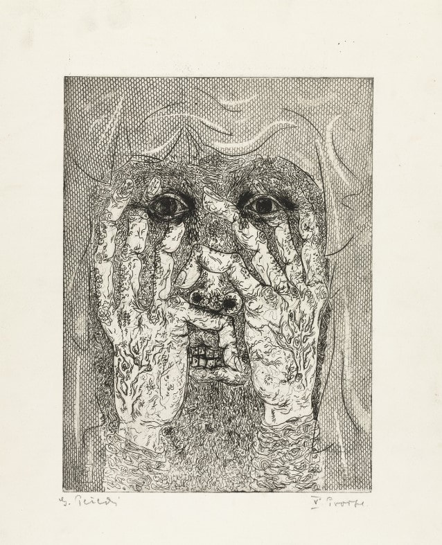 Gabor Peterdi (American, born Hungary, 1915–2001). Despair I, 1938. Etching and engraving. Plate: 266 x 197 mm. (10 1/2 × 7 ¾ in.); sheet: 448 x 315 mm. (17 5/8 × 12 3/8 in.). Museum of Modern Art: Purchase, 146.1944. 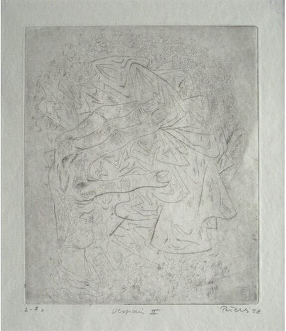 Gabor Peterdi (American, born Hungary, 1915–2001). Despair II, 1938. Etching and engraving. Plate: 245 × 206 mm. (9 5/8 × 8 1/8 in.); sheet: 304 × 269 mm. (11 15/16 × 10 9/16 in.). Yale University Art Gallery: Gift of James N. Heald II, B.S. 1949, 2011.148.8. 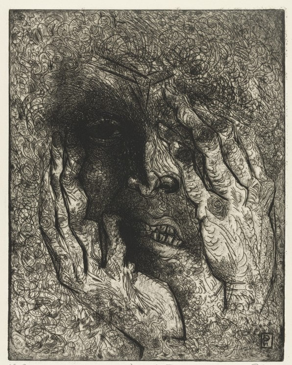 Gabor Peterdi (American, born Hungary, 1915–2001). Despair III, 1938. Etching and engraving. Plate: 315 x 248 mm. (12 3/8 × 9 ¾ in.); sheet: 452 x 340 mm. (17 13/16 × 13 3/8 in.). Museum of Modern Art: Gift of the Artist, 103.1955. 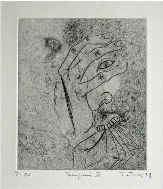 Gabor Peterdi (American, born Hungary, 1915–2001). Despair IV, 1938. Etching, engraving, and drypoint. Plate: 241 × 203 mm. (9 1/2 × 8 in.); sheet: 453 × 329 mm. (17 13/16 × 12 15/16 in.). Yale University Art Gallery: Gift of James N. Heald II, B.S. 1949, 2011.148.9. 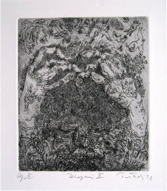 Gabor Peterdi (American, born Hungary, 1915–2001). Despair V, 1938. Etching. Plate: 247 × 209 mm. (9 3/4 × 8 1/4 in.); sheet: 453 × 329 mm. (17 13/16 × 12 15/16 in.). Yale University Art Gallery: Gift of James N. Heald II, B.S. 1949, 2011.148.10. 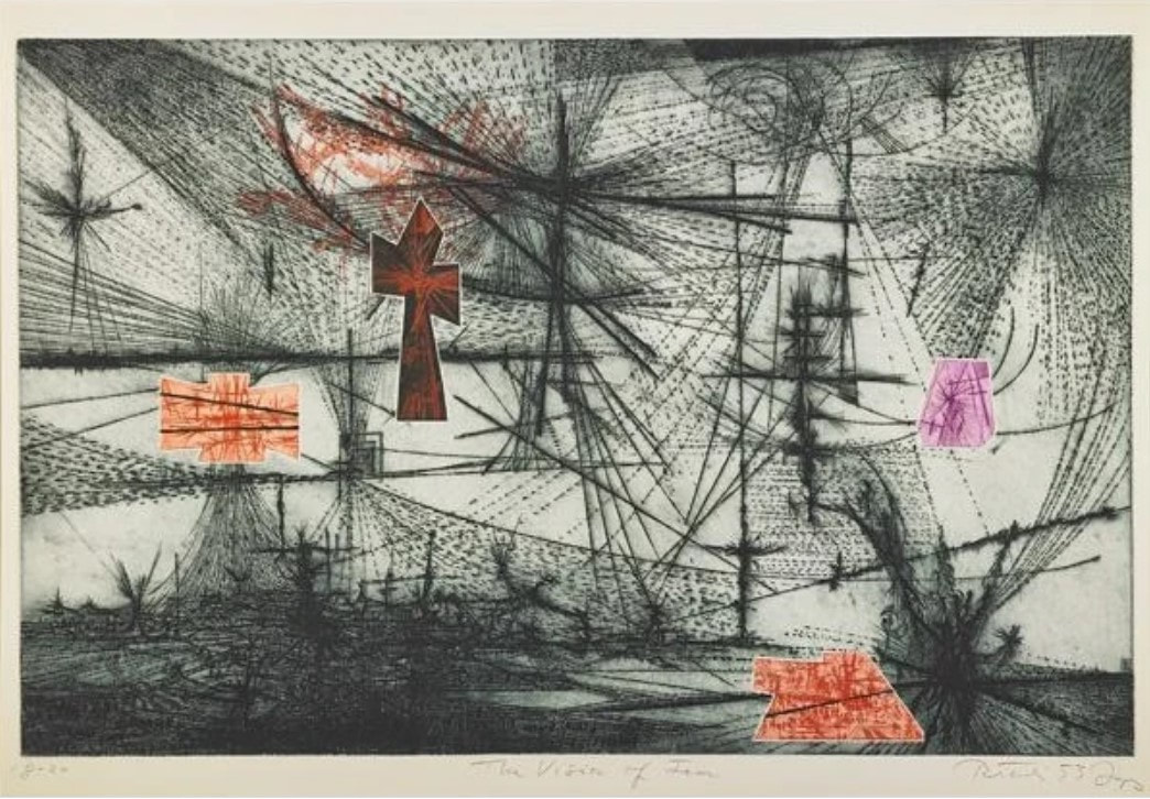 Gabor Peterdi (American, born Hungary, 1915–2001). The Vision of Fear, 1953. Etching and engraving. Plate: 651 × 933 mm. (25 5/8 × 36 3/4 in.); sheet: 749 × 105 mm. (29 1/2 × 41 1/4 in.). Mutual Art. 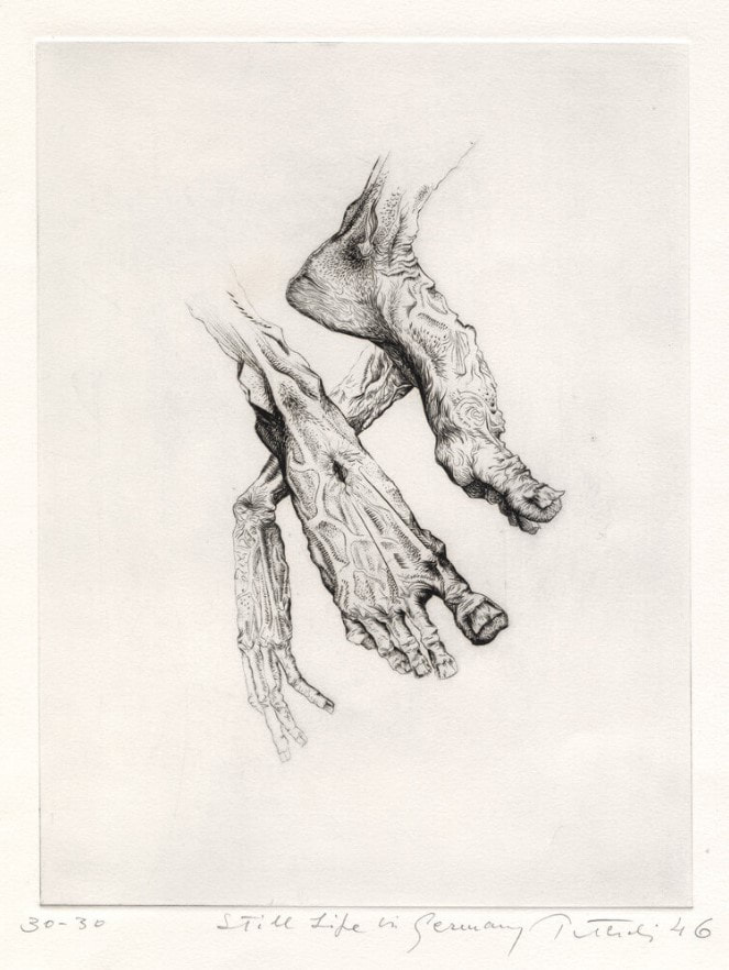 Gabor Peterdi (American, born Hungary, 1915–2001). Still Life in Germany, 1946. Engraving. Plate: 302 x 227 mm. (11 7/8 x 8 15/16 in.). Conrad Graeber Fine Art. 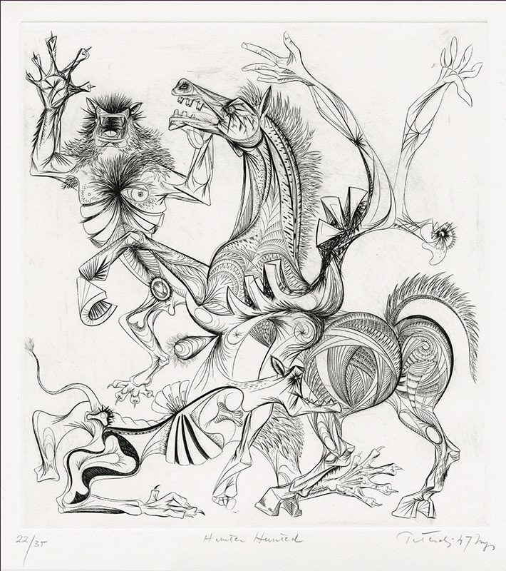 Gabor Peterdi (American, born Hungary, 1915–2001). Hunter Hunted, 1947. Engraving. Plate: 394 x 368 mm. (15 1/2 x 14 ½ in.). Annex Galleries. 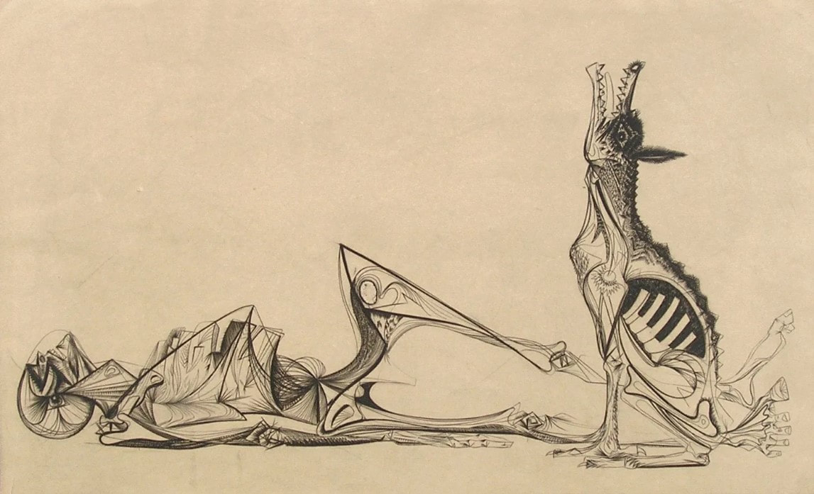 Gabor Peterdi (American, born Hungary, 1915–2001). The Price of Glory, 1947. Engraving. Plate: 276 x 454 mm. (10 7/8 x 17 7/8 in.); sheet: 336 x 514 mm. (13 1/4 x 20 ¼ in.). Dolan/Maxwell.
1 Comment
Ann ShaferWhen I taught young artists in the BMA’s printroom, I always suggested a few things to keep in mind when creating art. First, that they pay attention to materials—the work might turn out well, and you’ll be sorry it’s on crappy paper. Second, that they sign everything—I can’t tell you how many works on paper by unknown artists are in the collection. Third, that they date everything—you always think you’ll remember when you created a work, but unless you have a remarkable mind, you won’t remember. On the latter point, some museums are okay with n.d. as a date (meaning no date), but I was trained to at least assign a range of possible dates, which would help viewers identify a period or century. Sometimes this means a huge range from birth plus twenty to death. For example, if the artist were born in 1900 and died in 1975, and the object had no date, we would write c. 1920–1975. Crazy, right? No one wants that. For me, however, it would be even better if the artist wrote something about their intentions with a work. But my sage friend and artist Ben Levy would say: “I’m an artist and I say things visually. Now you want me to write about it, too? I say it visually because I can’t say it in writing.” And I get it. Artists are a special breed with special brains. They think differently. But it would be lovely to be able to read an artist’s words about a given work anyway. I thank all you artists in advance. It is rare to come across an artist who is eloquent about their own work. While working on my Hayter project, I became intrigued by the hundreds if not thousands of artists who worked at Atelier 17. I was thrilled to find one artist who wrote about his prints, which his granddaughter made available online. Leo Katz was an established printmaker and painter by the time Hayter set up the workshop at the New School for Social Research in New York in 1940. The New York branch remained operational until 1955 under the direction of several people, including Katz. In 2015, his granddaughter, Lisa Katz Wadge, established a useful web site devoted to her grandfather's career that includes one of his essays along with notes on individual prints. For me, Katz’s print Pegasus, 1945, is his most important. It is a direct reaction to World War II. I’m fascinated by prints made during and just following the war, and how artists digested the experience, the fallout, the H bomb, the Holocaust. All these revelations in the late 1940s must have been overwhelming. I’m also interested in how long after the end of the war artists made work reflecting on it. I can think of works done well into the 1950s. Trauma lasts. But to the artist’s own words. Katz writes about Pegasus: "This composition tried to express symbolically, the condition of the creative spirit at the end of World War II. Pegasus the winged horse, the dream symbol of man's creative imagination, tries to get out from under the remains of barbed wires and nets among the concrete tank traps. He makes a feeble attempt to rise on his forelegs. In the distance there are still explosions. The dark mesh, which arches over the horse, has a suggestion of a pelvic form which would indicate that awakening is more like birth. I had a feeling at that time (1945) that the great question of our era is whether this birth, or rebirth, of Pegasus will be a living, lasting success or not. It is not enough to have rockets and bombers flying high in the air while man's creative soul with its dreams is permanently grounded.” If you can, write about your work’s intentions. Or, at the very least, sign and date it. Thank you from future art historians and curators. Leo Katz (American, born Czechoslovakia, 1887–1982) Pegasus (three states), 1945 Engraving and softground etching; printed in black (intaglio) Plate: 251 × 304 mm. (9 7/8 × 11 15/16 in.) Leo Katz Foundation 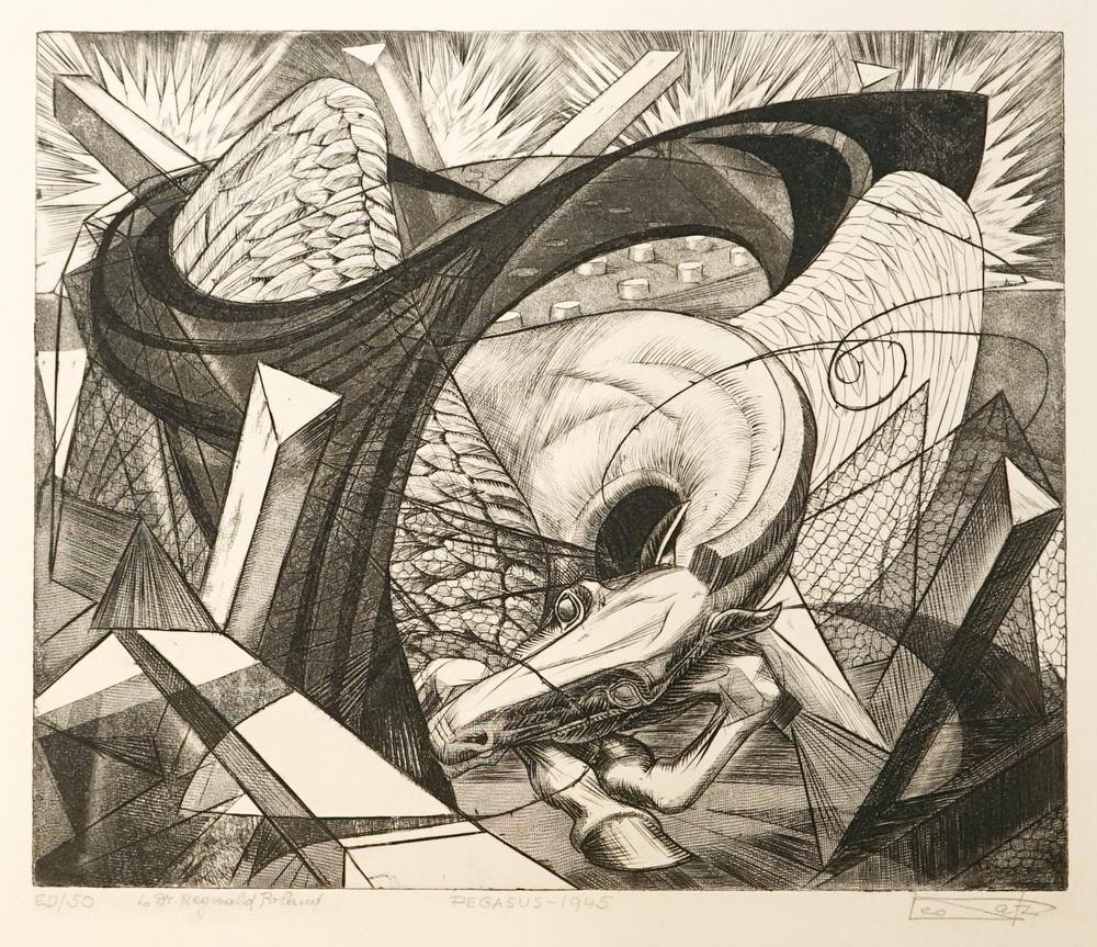 Leo Katz (American, born Czechoslovakia, 1887–1982). Pegasus (final state), 1945. Engraving and softground etching. Plate: 251 × 304 mm. (9 7/8 × 11 15/16 in.). Leo Katz Foundation. 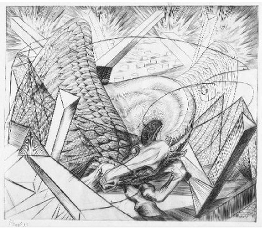 Leo Katz (American, born Czechoslovakia, 1887–1982). Pegasus (second state), 1945. Engraving and softground etching. Plate: 251 × 304 mm. (9 7/8 × 11 15/16 in.). Leo Katz Foundation. 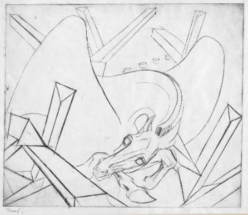 Leo Katz (American, born Czechoslovakia, 1887–1982). Pegasus (first state), 1945. Engraving and softground etching. Plate: 251 × 304 mm. (9 7/8 × 11 15/16 in.). Leo Katz Foundation. Ann ShaferLast week I posted a few images of praying mantes in prints. Fascinating creatures. By the terribly scientific polling apparatus available to me—number of likes, natch—I decided to post more images by the person whose praying mantis print was most admired, Roderick Mead (American, 1900–1971). Mead grew up in New Jersey and attended Yale University, graduating in 1925. Following art school, he moved to New York where he studied at the Art Students’ League under George Luks (and later with him privately) for several years. He also studied watercolor painting with George Pearse Ennis at the Grand Central School of Art. In 1931, Mead moved to Majorca. Three years later he moved his studio to Paris and began studying printmaking at guess where? The experimental studio run by Stanley William Hayter known as Atelier 17. Actually, in 1931, the atelier was only a few years old and had yet to take up the name it would become known by. It wasn’t until 1933 that the studio moved to 17, rue Campagne Première, from which the 17 in its name derives. But you can be sure that Mead absorbed as much as he could there and as a result, the effect on his style is clear. At the Atelier on any given day one might be working at a table next to Joan Miró, Pablo Picasso, Alberto Giacometti, Max Ernst, Yves Tanguy, Jean Hélion, or Wassily Kandinsky. Like most of the artists there, Mead experimented with abstraction and surrealism, and one finds shared ideas, forms, and styles among the prints made there. Like most everyone else, Mead and his wife left Paris in 1939 ahead of the start of World War II and by 1941 was living in Carlsbad, New Mexico. There he was able to devote himself to creating art full time; he continued to paint and make prints until his death in 1971. For me, Mead would have been one in a long list of artists working with Hayter about whom I know not a great deal was it not for my friend Gregg Most, who grew up down the street from the Meads. Gregg and I worked together at the National Gallery in the 1990s, and he has researched and collected Mead for a long time. It is Gregg’s passion for Mead that caused me to pay closer attention. I love Mead’s prints because they are carefully crafted, readable yet totally surreal, and have a high sense of crispness and design that really attracts me. See if you agree. Roderick Mead (American, 1900–1971) The Wrecked Ship, 1936 Engraving Plate: 197 x 251 mm. (7 ¾ x 9 7/8 in.) Smithsonian American Art Museum, Gift of Mrs. Roderick Mead, 1974.122.1 Roderick Mead (American, 1900–1971) Untitled (Matador and Bull), c. 1936 Engraving and softground etching with aquatint Plate: 203 x 203 mm. (8 × 8 in.) Dolan/Maxwell Roderick Mead (American, 1900–1971) Rope Figures, c. 1935–45 Engraving Plate: 160 x 82 mm. (6 1⁄2 x 3 1⁄4 in.) Smithsonian American Art Museum, Gift of Mrs. Roderick Mead, 1976.99.5 Roderick Mead (American, 1900–1971) St. Michael and the Dragon, 1939 Color wood engraving Image: 232 x 203 mm. (9 1/8 x 8 in.) Smithsonian American Art Museum, Gift of Mrs. Roderick Mead, 1974.122.6 Roderick Mead (American, 1900–1971) Creation of Eve, c. 1942 Engraving and softground etching Plate: 200 x 199 mm. (7 7/8 x 7 13/16 in.) Smithsonian American Art Museum, Gift of Mrs. Roderick Mead, 1976.99.1 Roderick Mead (American, 1900–1971) Trojan Horse, c. 1945–50s Color engraving, aquatint, and softground etching Plate: 235 x 298 mm. (9 ¼ x 11 ¾ in.) Smithsonian American Art Museum, Gift of Mrs. Roderick Mead, 1974.122.2 Roderick Mead (American, 1900–1971) Combat #1 (Incident), c. 1942–45 Engraving and softground etching 264 x 186 mm. (10 3/8 x 7 3/8 in.) Smithsonian American Art Museum, Gift of Mrs. Roderick Mead, 1974.122.3 Roderick Mead, (American, 1900–1971) Tauromachia I, 1946 Engraving and aquatint Plate: 114 x 182 mm (4 ½ x 31/4 in.) Fine Arts Museums of San Francisco, Achenbach Foundation, California State Library loan, L543.1966 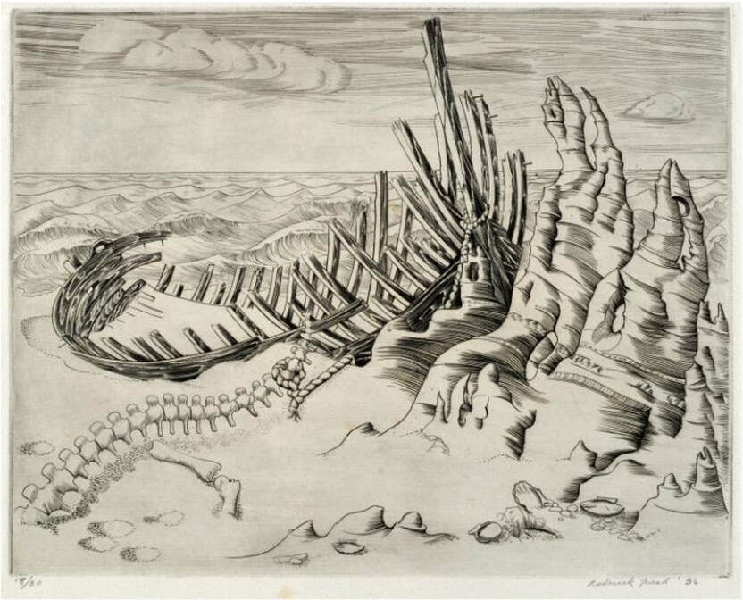 Roderick Mead (American, 1900–1971). The Wrecked Ship,1936. Engraving and aquatint. Plate: 197 x 251 mm. (7 ¾ x 9 7/8 in.). Smithsonian American Art Museum, Gift of Mrs. Roderick Mead, 1974.122.1.  Roderick Mead (American, 1900–1971). Untitled (Matador and Bull), c. 1936. Engraving and softground etching with aquatint. Plate: 203 x 203 mm. (8 × 8 in.). Dolan/Maxwell. 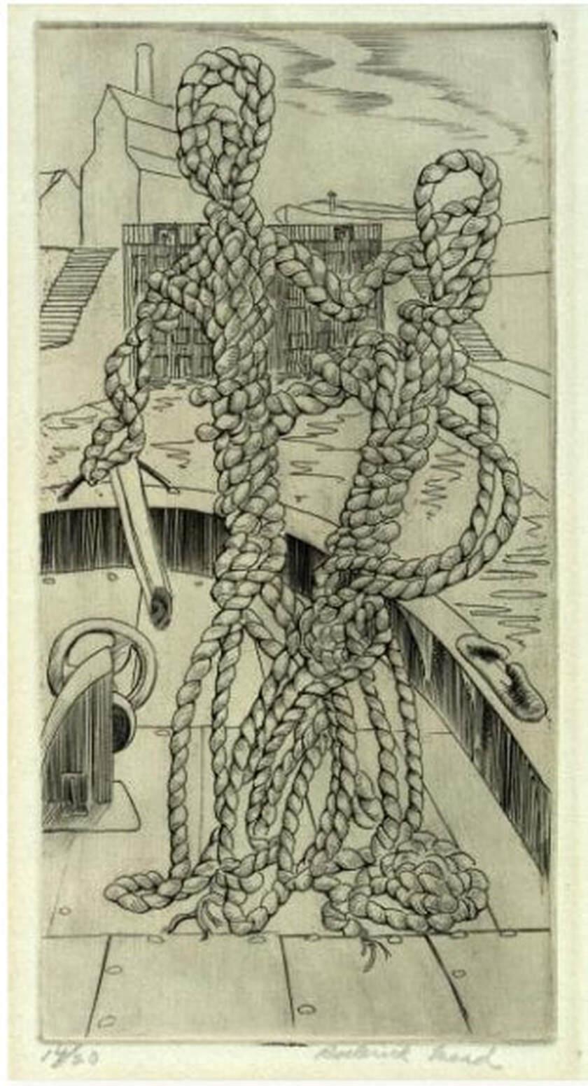 Roderick Mead (American, 1900–1971). Rope Figures, c. 1935–45. Engraving. Plate: 160 x 82 mm. (6 1⁄2 x 3 1⁄4 in.). Smithsonian American Art Museum, Gift of Mrs. Roderick Mead, 1976.99.5. 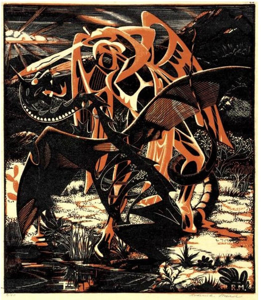 Roderick Mead (American, 1900–1971). St. Michael and the Dragon, 1939. Color wood engraving. Image: 232 x 203 mm. (9 1/8 x 8 in.). Smithsonian American Art Museum, Gift of Mrs. Roderick Mead, 1974.122.6. 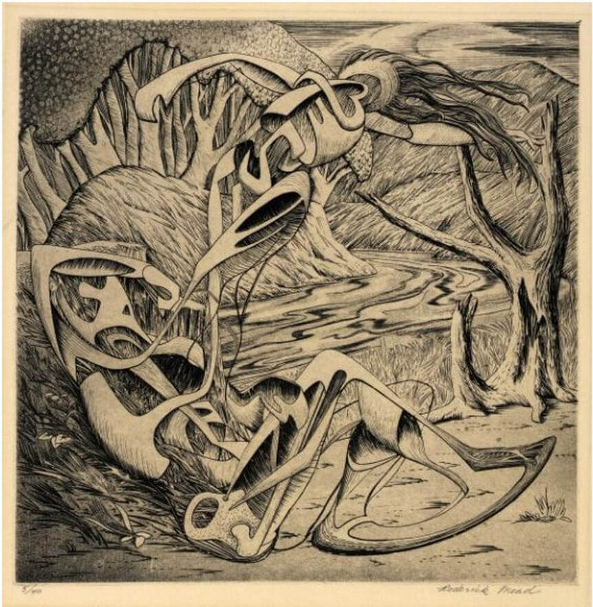 Roderick Mead (American, 1900–1971). Creation of Eve, c. 1942. Engraving and softground etching. Plate: 200 x 199 mm. (7 7/8 x 7 13/16 in.). Smithsonian American Art Museum, Gift of Mrs. Roderick Mead, 1976.99.1. 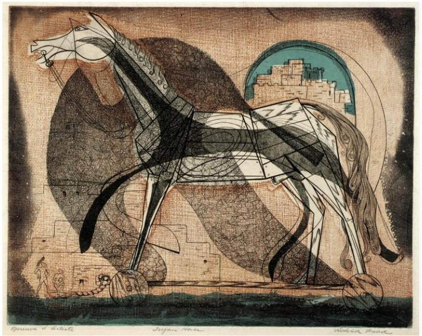 Roderick Mead (American, 1900–1971). Trojan Horse, c. 1945–50s. Color engraving, aquatint, and softground etching. Plate: 235 x 298 mm. (9 ¼ x 11 ¾ in.). Smithsonian American Art Museum, Gift of Mrs. Roderick Mead, 1974.122.2. 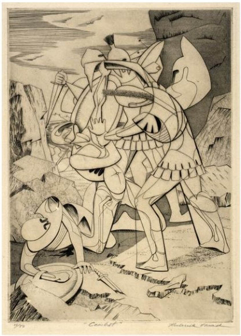 Roderick Mead (American, 1900–1971). Combat #1 (Incident), c. 1942–45. Engraving and softground etching. Plate: 264 x 186 mm. (10 3/8 x 7 3/8 in.). Smithsonian American Art Museum, Gift of Mrs. Roderick Mead, 1974.122.3. 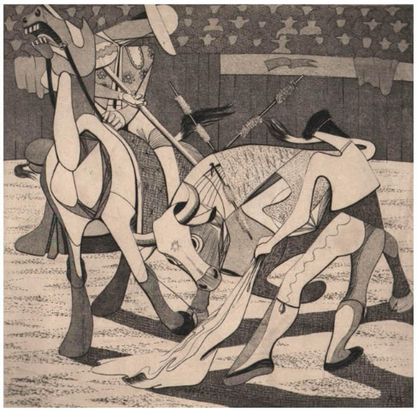 Roderick Mead, (American, 1900–1971). Tauromachia I, 1946. Engraving and aquatint. Plate: 114 x 182 mm (4 ½ x 31/4 in.). Fine Arts Museums of San Francisco, Achenbach Foundation, California State Library loan, L543.1966. Ann ShaferCome with me down a rabbit hole to where the praying mantis lives. We will look at a 1946 print by Fred Becker, who was one of Hayter’s people. He worked as a shop tech and printer at Atelier 17 in the 1940s until he left to found the printmaking program at Washington University in St. Louis. I have been looking at and researching this American artist recently; I have been mulling over Kaleidoscopic Organism, 1946, for longer then I’d like to admit. It has befuddled me. I thought today I would lay out my thinking and take you along for the ride as I pick it apart and attempt to get inside the artist’s mind. Please know this is only my thinking—no guarantee that any of it is right! Kaleidoscopic Organism is an engraving and etching (both hard and softground) and is sizable at 17 5/8 x 14 3/4 (plate size). The image is wacky. An amoeba-like mass occupies the center around which swirl discs that hold open said amoeba to reveal its innards. In the background are radiating lines that create either a halo or a vortex. Within the mass’ interior we find (from the bottom moving upward): a balustrade or railing that is being built or repaired, a casement window handle, a keyhole holding the center of the being but there’s something going through it (a little Dr. Seussian figure, n’est ce pas?), and assorted architectural wire forms surmounted by what I see as a praying mantis. Praying mantis, hmmm. These majestic but aggressive insects were a shared subject among artists making surrealist prints at Atelier 17. I’ve included several prints of mantes by Atelier 17 artists for your viewing pleasure. With angular rear legs, triangular pivoting head, bulging eyes, and large, weirdly human forearms, mantis anatomy translates easily into line and action on the plate and offers interesting stand-ins for humans. But more to the point, the female mantis devours the male mantis after copulation (yikes!). They are also known to attack other insects (delightful). [For a good discussion about the Surrealists’ obsession with praying mantes, see William L. Pressly, “The Praying Mantis in Surrealist Art,” The Art Bulletin 60, no. 4 (December 1973): 600–615. And Ruth Markus. “Surrealism's Praying Mantis and Castrating Woman.” Woman's Art Journal 21, no. 1 (2000), 33–39. So, what about that praying mantis in Becker’s organism? I think we’ve got ourselves a vagina dentata, reflecting myths about fierce lady bits and male castration fears. Becker’s form is not toothed like Hayter’s Ceres, 1947–48 (image below), but its head that is just at the apex of the cavity cannot be overlooked. I will leave it there. Then, we must look at the bulk of the organism itself. At its bottom we find two feet, one with a shoe so worn that a big toe pops out of it. Until this moment, I could still believe we were dealing with a microscopic look at teeming life or a celestial big bang in process, but the feet snap us back to the immediate, visible world. What the heck? Ok, so here are my theories/questions about each element, which often have opposing possibilities. They are many and still swimming around in my brain. I welcome any thoughts that may clarify or further confuse the issues. 1. Is the background radiating to highlight the subject like a halo or is it a vortex we might fall into? 2. Are the discs holding the form open or running around its edges? Are they swirling like wheels or symbolizing something else? I see variously eyes, lemon slices, stained glass windows, military medals of honor, kaleidoscope parts. But could they be railway car wheels or shower heads—you see where I’m heading here, don’t you? 3. The interior elements are structural, manmade, and mechanistic (even the mantis). They are linked together like a Rube Goldbergian contraption. What’s up with the balustrade, the keyhole, and those wire apparatuses? I find it curious that the exterior discs read as organic while the interior elements read as mechanistic. There is something there just out of reach, but it will come to me. 4. The feet read as either comical (a hobo or circus clown), or as deadly serious (a wounded or dead soldier). 5. The title cannot be overlooked: Kaleidoscopic Organism (although I hate it when artists rely on titles to explicate the work—shouldn’t it hold up on its own?). The dictionary tells us that a kaleidoscope can symbolize one’s escape in times of difficulty and self-doubt; that it constantly generates changing symmetrical patterns from small pieces of colored glass and therefore symbolizes anything that changes constantly. Here is where I’ve ended up on meaning in Kaleidoscopic Organism. The title and the aforementioned definition of kaleidoscope bring me to World War II and its aftermath. At first glance, the print (made in 1946, the year after the war ended) looks comical: those gargantuan feet, the toe poking out of the shoe, the whirligigs and deeley boppers. What a smart way to pull us in. But then the praying mantis at its core turns it dark; the radiant, glowing halo turns into a vortex; the feet become those of a dead soldier; the organisms holding open the form reveal man’s mechanistic world symbolizing war, its machines, and their enabling of unbelievable cruelty and death. I suppose that contemporaneous viewers might read this work more quickly, but I believe it is imperative that we know and learn from history. It also serves to remind us that when looking at a work of art, it must be considered in context since artists can never be disassociated from the time in which they are working. Becker’s print is still stewing in my brain. If I come up with a better answer, I’ll let you know. Fred Becker (American, 1913–2004) Kaleidoscopic Organism, 1946 Etching, softground etching, and engraving Plate: 451 x 378 mm. (17 3/4 x 14 7/8 in.) Annex Galleries Stanley William Hayter (British, 1901–1988) Cruelty of Insects, 1942 Engraving and softground etching Sheet: 230 x 288 mm. (9 1/16 x 11 5/16 in.); plate: 202 x 250 mm. (7 15/16 x 9 13/16 in.) Baltimore Museum of Art: Gift of Mr. and Mrs. Robert Paul Mann, Towson, Maryland, BMA 1979.367 Roderick Mead (American, 1900–1972) Praying Mantis, c. 1940s Engraving and softground etching Plate: 394 x 279 mm. (15 ½ x 11 in.) Smithsonian American Art Museum: Gift of Mrs. Roderick Mead, 1974.122.4 Werner Drewes (American, born Germany, 1899–1985) Praying Mantis, 1944, printed 1975 Engraving and softground etching Plate: 200 x 302 mm. (7 7/8 x 11 7/8 in.) Annex Galleries Clinton Blair King (American 1901–1979) Praying Mantis, c. 1945 Etching and aquatint Plate: 277 x 200 mm (10 7/8 x 7 7/8 in.) National Gallery of Art: Reba and Dave Williams Collection, Gift of Reba and Dave Williams, 2008.115.2866 Stanley William Hayter (British, 1901–1988) Ceres, 1947–48 Engraving, softground etching, and scorper Printed in black (intaglio), and yellow (screen, relief) 605 x 390 mm. (23 7/8 x 15 3/8 in.) Museo Nacional de Bellas Artes, Buenos Aires 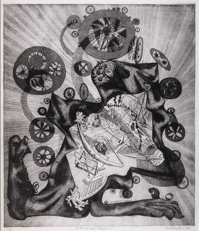 Fred Becker (American, 1913–2004). Kaleidoscopic Organism, 1946. Etching, softground etching, and engraving. Plate: 451 x 378 mm. (17 3/4 x 14 7/8 in.). Annex Galleries. 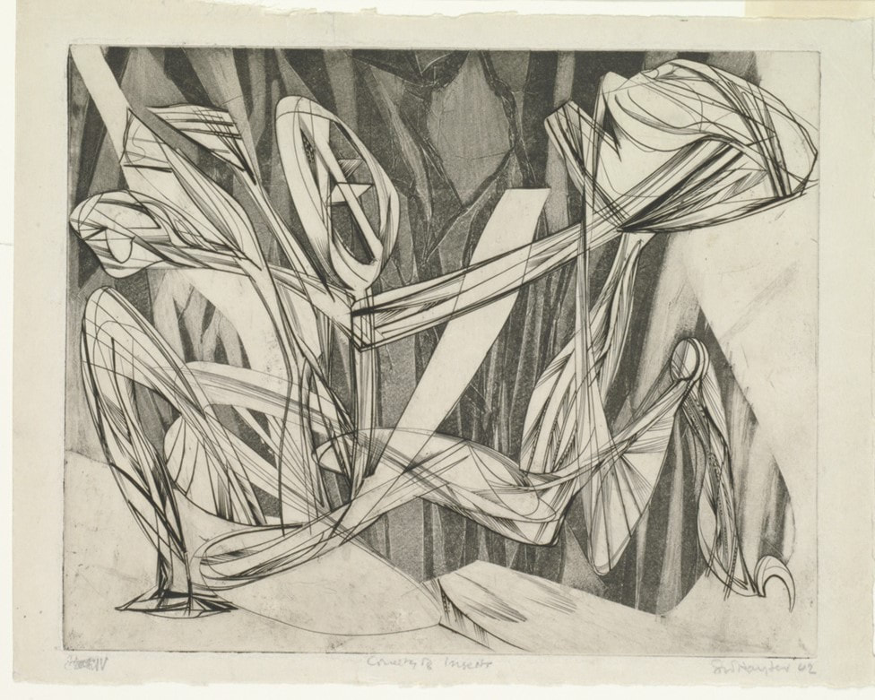 Stanley William Hayter (British, 1901–1988). Cruelty of Insects, 1942. Engraving and softground etching. Sheet: 230 x 288 mm. (9 1/16 x 11 5/16 in.); plate: 202 x 250 mm. (7 15/16 x 9 13/16 in.). Baltimore Museum of Art: Gift of Mr. and Mrs. Robert Paul Mann, Towson, Maryland, BMA 1979.367. 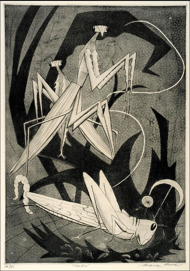 Roderick Mead (American, 1900–1972). Praying Mantis, c. 1940s. Engraving and softground etching. Plate: 394 x 279 mm. (15 ½ x 11 in.) . Smithsonian American Art Museum: Gift of Mrs. Roderick Mead, 1974.122.4.  Werner Drewes (American, born Germany, 1899–1985). Praying Mantis, 1944, printed 1975. Engraving and softground etching. Plate: 200 x 302 mm. (7 7/8 x 11 7/8 in.). Annex Galleries. 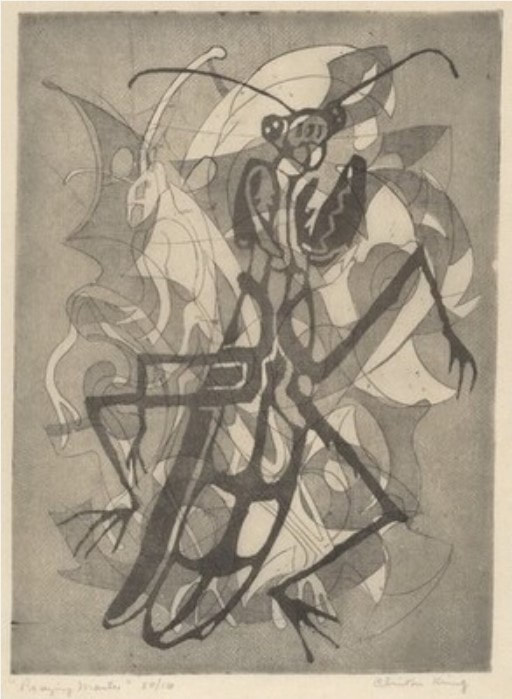 Clinton Blair King (American 1901–1979). Praying Mantis, c. 1945. Etching and aquatint. Plate: 277 x 200 mm (10 7/8 x 7 7/8 in.). National Gallery of Art: Reba and Dave Williams Collection, Gift of Reba and Dave Williams, 2008.115.2866. 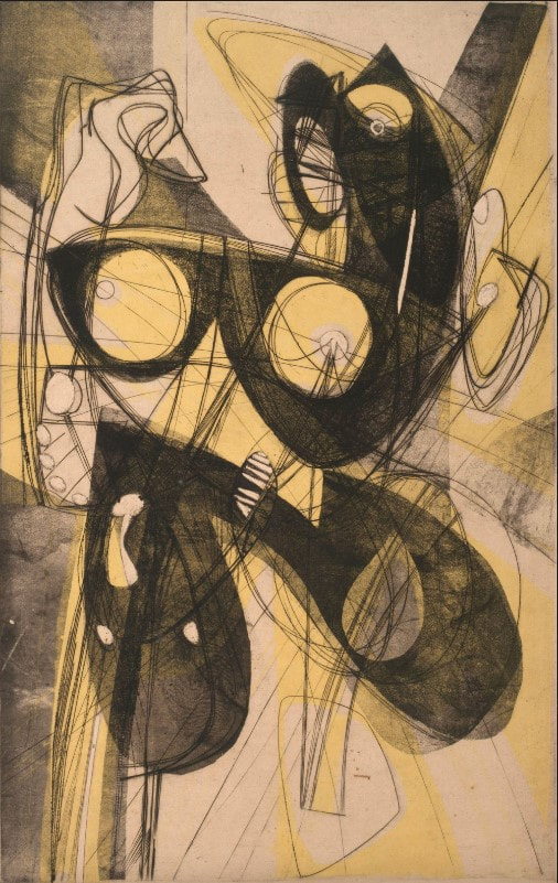 Stanley William Hayter (British, 1901–1988). Ceres, 1947–48. Engraving, softground etching, and scorper; printed in black (intaglio), and yellow (screen, relief). Plate: 605 x 390 mm. (23 7/8 x 15 3/8 in.). Museo Nacional de Bellas Artes, Buenos Aires. Ann ShaferHere’s a doozy for my simultaneous color printing friends. No surprise, Letterio Calapai worked with our man Hayter at Atelier 17 in New York in the 1940s. While Earthquake is from 1958, it is a glorious summation of techniques he learned among the many inventive artists frequenting Atelier 17. The print is really two prints that form a diptych. I've seen images of the two sides abutting each other, but the BMA would likely present these in a single frame, but with two windows in the mat with a center strip covering the seam. Letterio Calapai followed the path of many other American artists who worked at Hayter’s Atelier 17. After growing up in Boston, he moved to New York in 1928 and supported himself by working in a lithographic shop. He worked for the WPA early on painting a mural in the 101st Signal Battalion at 801 Dean Street in Brooklyn among other projects (see image). By the time Hayter moved Atelier 17 to New York from Paris in 1940 (fleeing German occupation), Calapai was continuing his artistic studies. It wasn’t until 1946 that Calapai worked at Atelier 17; he continued making prints there until 1949. His shift from 1930s realism to 1940s abstraction can be specifically linked to his time there. Like so many other artists who worked at the New York Atelier 17, Calapai went on to found a university printmaking program, in his case, the Graphic Arts Department at the Albright Art School in Buffalo (1949–55). He returned to New York to teach at the New School for Social Research from 1955–65. During his tenure at the New School, he established the Intaglio Workshop for Advanced Printmaking in 1962 (it ran until 1965). In 1965 he moved to Chicago and taught at, and retired from, the University of Illinois at Chicago. So, to the printing. Recently we’ve been pulling apart simultaneous color prints by Hayter. You can assume if Hayter did it, others did too, including Calapai. Earthquake is printed from two plates, which together are some 32 inches wide (big!). Both plates are inked in black (intaglio), where the ink is pushed into the lines and grooves of the plate. Rolled onto the surface (relief) are several colored inks added through screens (similar to a stencil): blue-green gradient, red, and green on the left, and green and red-yellow gradient on the right. The left plate also includes a yellow wood offset rolled through a stencil (similar to Hayter’s Sun Dancer, discussed in another post). For clarity, the description is broken down into bullet points to more easily list each component. Just remember, all of these colored inks are rolled onto each of these plates and are put through the press once. Letterio Calapai (American, 1902–1993) Earthquake, 1958 Diptych of etching, softground etching, open bite etching, and engraving
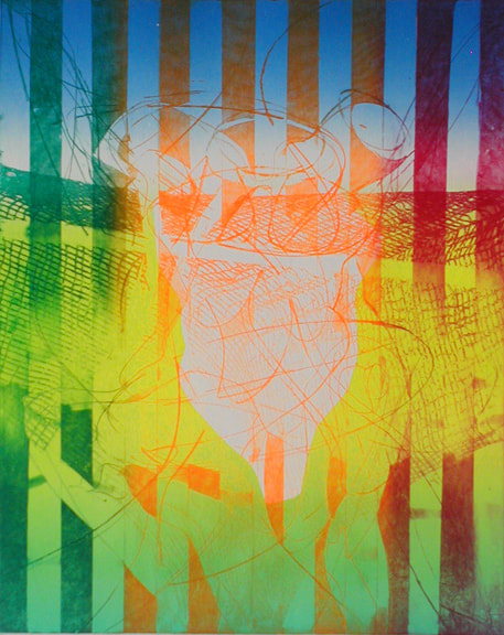
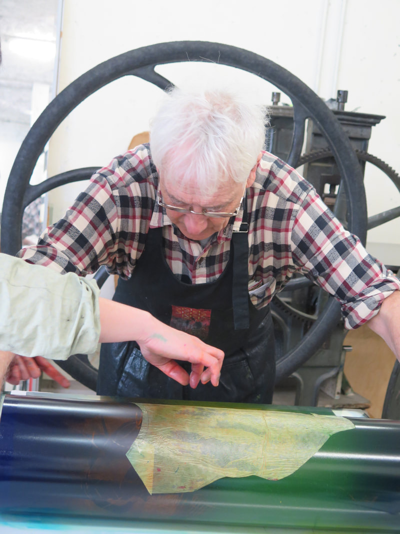
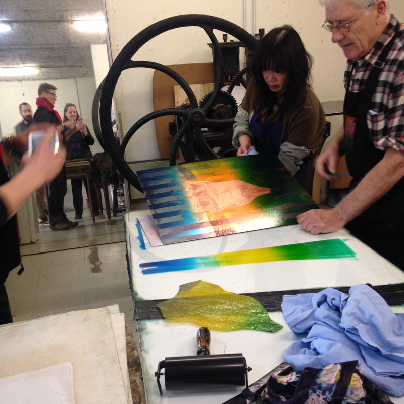
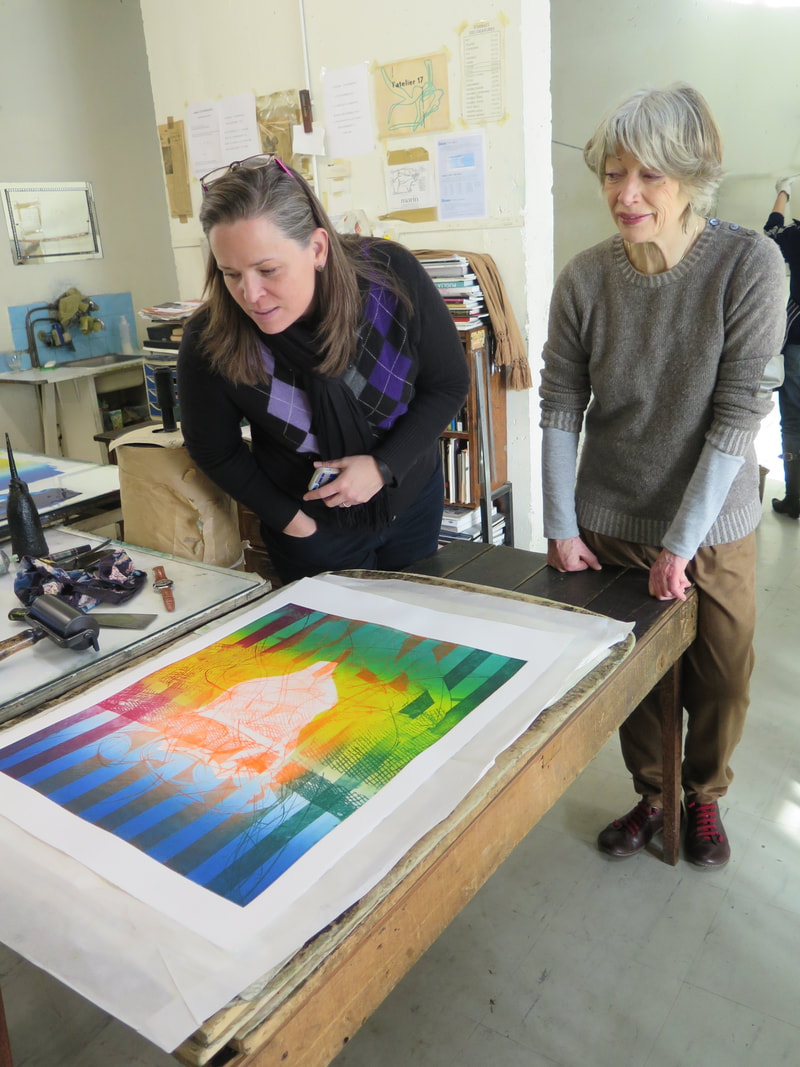
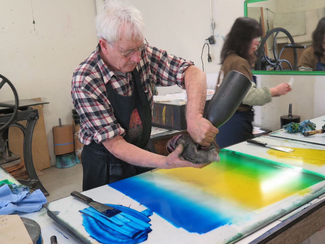
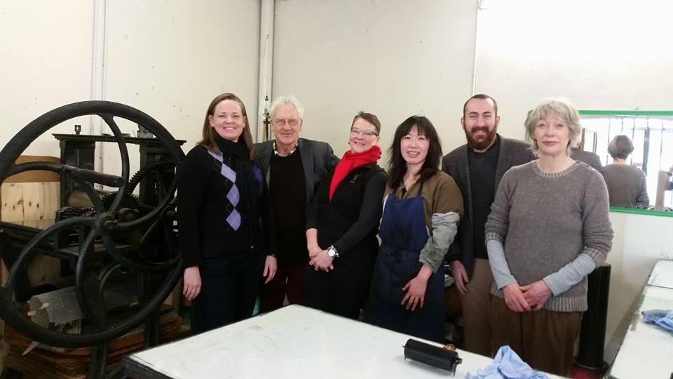
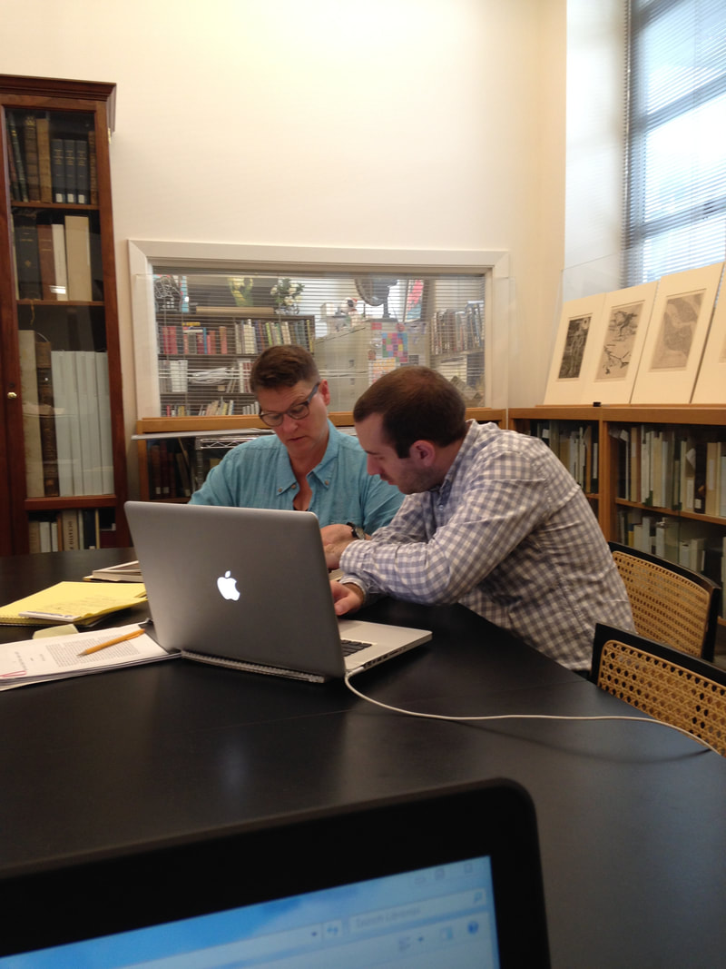
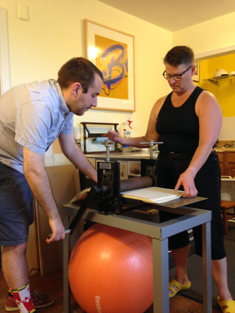
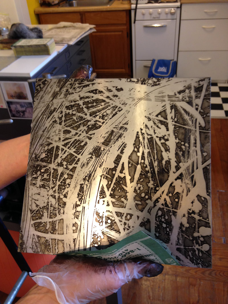
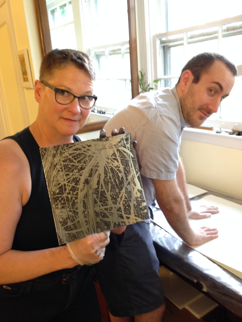
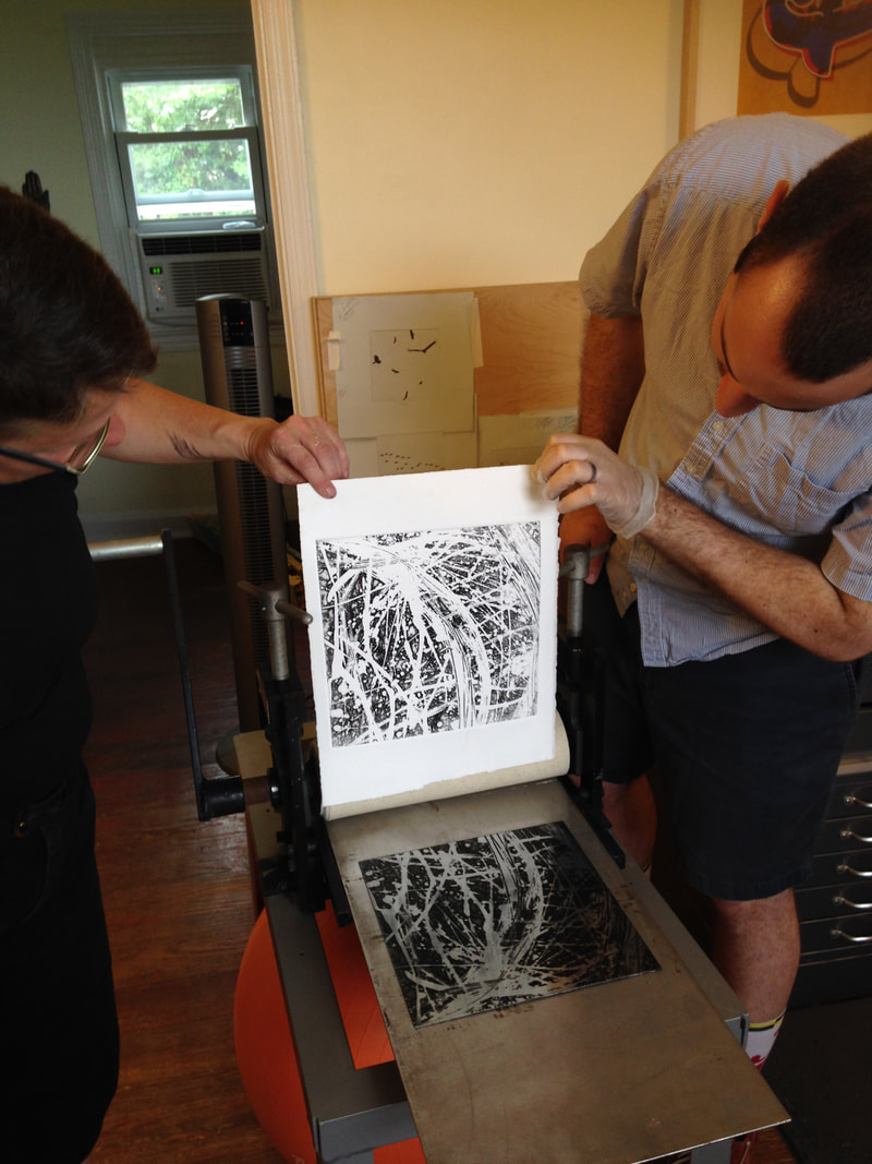
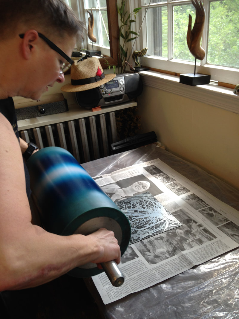
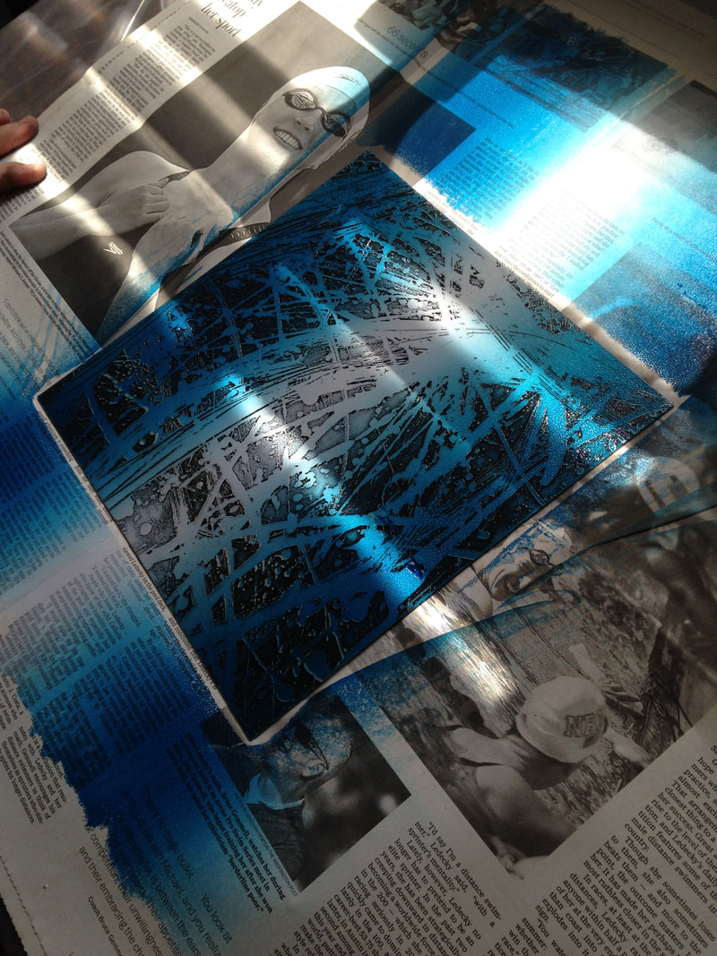
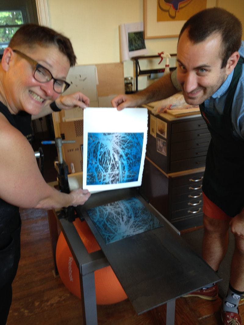
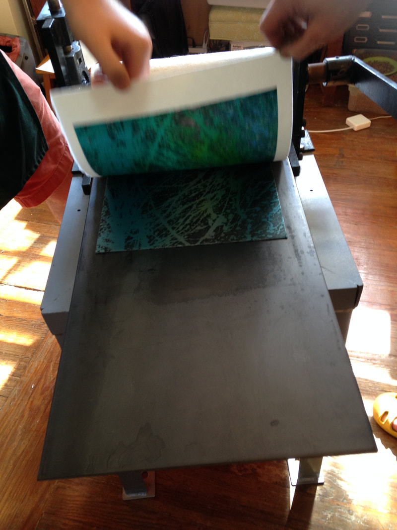
Sheet (right): 562 x 458 mm. (22 1/8 x 18 1/16 in.; plate (right): 504 x 404 mm. (19 13/16 x 15 7/8 in.) Baltimore Museum of Art: The John Dorsey and Robert W. Armacost Acquisitions Endowment, BMA 2014.13a-b 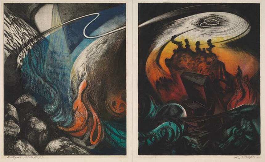 Letterio Calapai (American, 1902–1993), Earthquake, 1958. Diptych of etching, softground etching, open bite etching, and engraving; left plate printed in black (intaglio), blue-green gradient (screen, relief) , red (screen, relief), green (screen, relief), yellow (wood offset, stencil, relief); right plate printed in black (intaglio), green (screen, relief), red-yellow gradient (screen, relief). Sheet (left): 562 x 432 mm. (22 1/8 x 17 in.); plate (left): 505 x 404 mm. (19 7/8 x 15 7/8 in.); sheet (right): 562 x 458 mm. (22 1/8 x 18 1/16 in.); plate (right): 504 x 404 mm. (19 13/16 x 15 7/8 in.). Baltimore Museum of Art: The John Dorsey and Robert W. Armacost Acquisitions Endowment, BMA 2014.13a-b 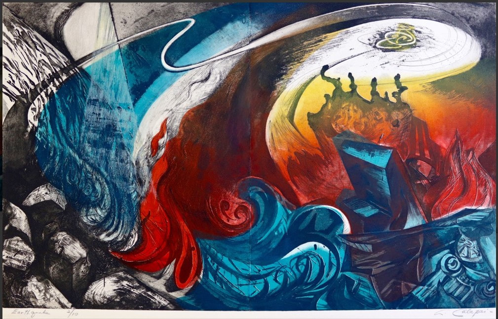 Impression of Calapai's Earthquake from Aaron Galleries. 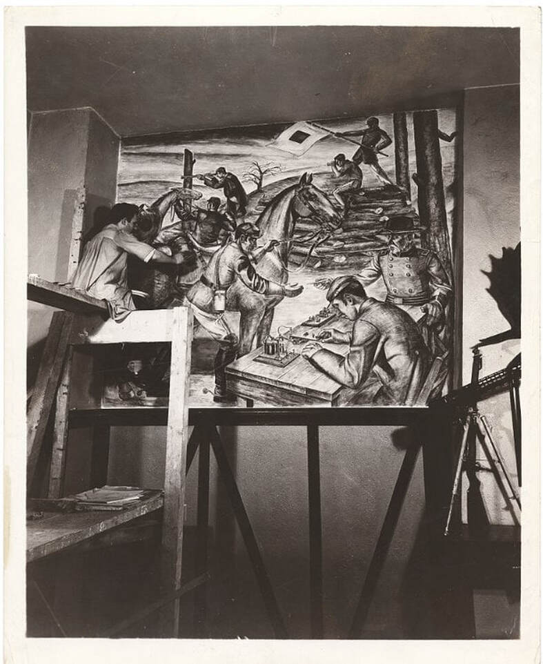 Letterio Calapai painting a WPA mural in the 101st Signal Battalion at 801 Dean Street in Brooklyn. (Photo from Wikipedia.) Ann ShaferIn a previous post, we looked at the new system Ben Levy came up with to describe Hayter’s simultaneous color prints. We adopted a two-tiered method: the first line describes what is in the plate (the grooves and textures that carry the image); the subsequent lines describe each layer of inking, which are combined on the single plate and run through the press once. In our discussion we gave a few examples, and one included a wood-offset-stencil-relief roll. Sounds complicated, I know. I’m going to pull it apart for you. Hayter used the wood offset dealio in his 1951 print Danse de soleil (Sun Dancer). Published by Guilde Internationale de la Gravure, there were 200 in the edition (aside from any proofs or early states). Hayter had been experimenting with relief rolling colors of different viscosities onto the plate either through a silkscreen or a stencil for several years—his 1946 print Cinq personnages is considered his most important early use of this new-fangled printing method. By 1951, he’s on a roll (get it?). For Danse du soleil, Hayter used an offset pattern from a plank of wood. To get the texture and pattern of the wood to show up in a gradient of red-orange, he first rolled out the gradient on a glass palette, red on one end and orange on the other. (After a period of rolling, the inks merge in the middle and create a smooth mix of the colors.) Taking the roller with the red-orange ink, Hayter rolled the gradient onto a piece of wood that had just the pattern and texture he wanted. Then he took another, clean roller, one large enough that its circumference was equal to the height of the copper plate carrying the image, and rolled it across the inked-up wood once, picking up the exact image of the wood texture in the red-orange gradient. That roller was rolled across the surface of the already intaglio-inked copper plate once, depositing the image of the red-orange wood on the surface. He did this through a cut paper stencil so that the gradient only appears in certain areas. See the image where I added the purple marks indicating where the stencil allowed the gradient through. He also rolled on a yellow ink through a different stencil, as well as a blue-green gradient through another stencil. Neither of these two stenciled additions used an offset from another texture. Rather, the inks were rolled on a palette and directly rolled onto the plate through stencils. So, our description should now make sense: Engraving, softground etching, and scorper Printed in black (intaglio); red-orange gradient (wood offset, stencil, relief); yellow (stencil, relief); blue-green gradient (stencil, relief) Stanley William Hayter (English, 1901–1988) Danse du soleil (Sun Dancer) [state 1], 1951 Engraving; printed in black (intaglio) Sheet: 503 x 317 mm. (19 13/16 x 12 1/2 in.) Plate: 397 x 233 mm. (15 5/8 x 9 3/16 in.) Baltimore Museum of Art: Gift of Mr. and Mrs. Robert Paul Mann, Towson, Maryland, BMA 1979.362 Stanley William Hayter (English, 1901–1988) Danse du soleil (Sun Dancer), 1951 Engraving, softground etching, and scorper; printed in black (intaglio); red-orange gradient (wood offset, stencil, relief); yellow (stencil, relief); blue-green gradient (stencil, relief) Sheet: 566 x 379 mm. (22 5/16 x 14 15/16 in.) Plate: 394 x 238 mm. (15 1/2 x 9 3/8 in.) Baltimore Museum of Art: Blanche Adler Memorial Fund, BMA 1953.56 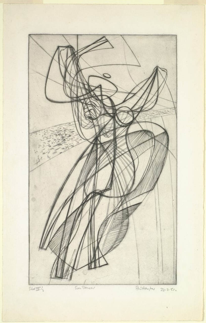 Stanley William Hayter (English, 1901–1988), Danse du soleil (Sun Dancer) [state 1], 1951. Engraving; printed in black (intaglio), sheet: 503 x 317 mm. (19 13/16 x 12 1/2 in.); plate: 397 x 233 mm. (15 5/8 x 9 3/16 in.). Baltimore Museum of Art: Gift of Mr. and Mrs. Robert Paul Mann, Towson, Maryland, BMA 1979.362. 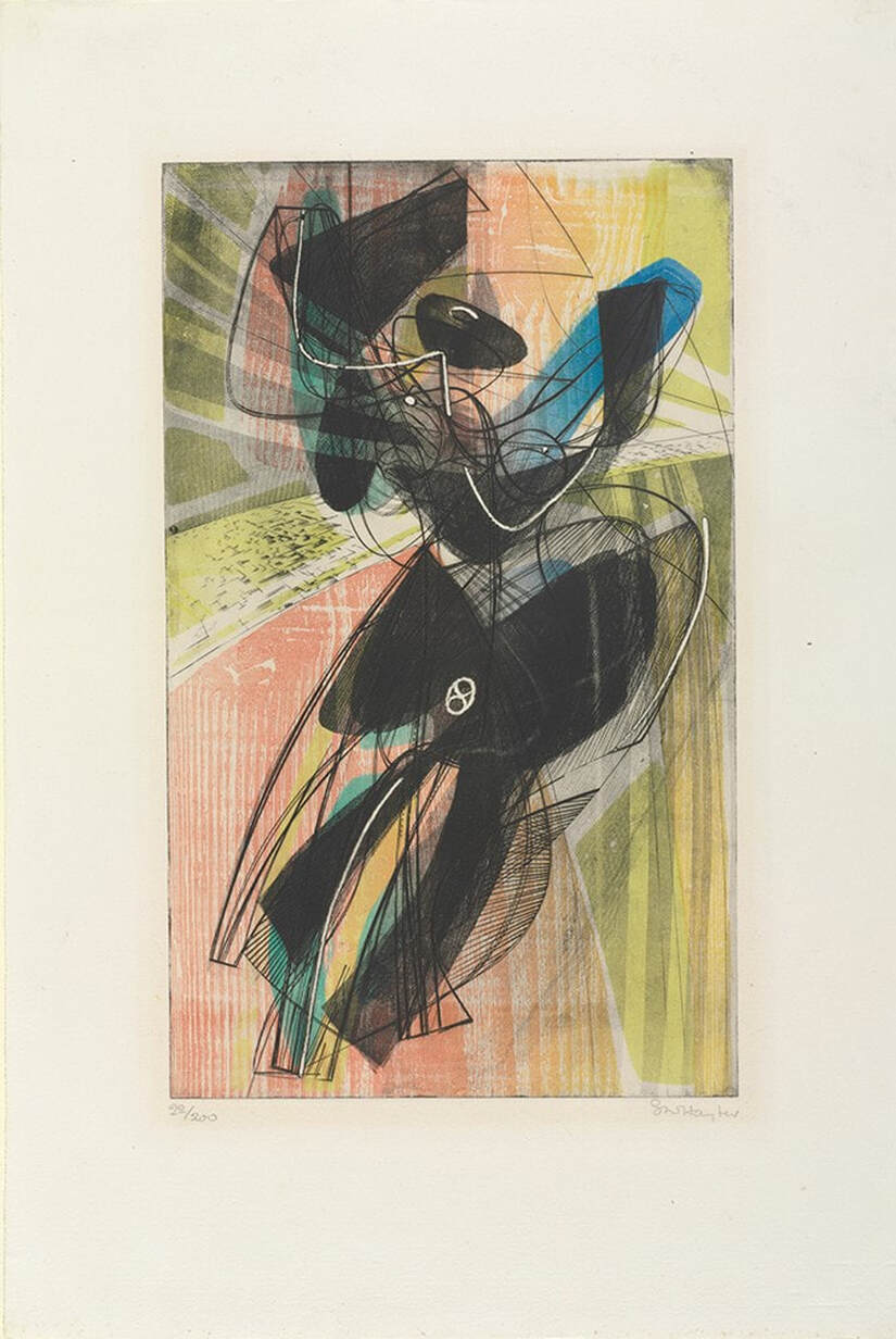 Stanley William Hayter (English, 1901–1988), Danse du soleil (Sun Dancer), 1951. Engraving, softground etching, and scorper; printed in black (intaglio); red-orange gradient (wood offset, stencil, relief); yellow (stencil, relief); blue-green gradient (stencil, relief), sheet: 566 x 379 mm. (22 5/16 x 14 15/16 in.); plate: 394 x 238 mm. (15 1/2 x 9 3/8 in.). Baltimore Museum of Art: Blanche Adler Memorial Fund, BMA 1953.56. 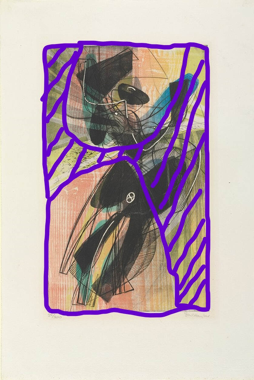 Purple marks where the stencil lets the ink pass through. Stanley William Hayter (English, 1901–1988), Danse du soleil (Sun Dancer), 1951. Engraving, softground etching, and scorper; printed in black (intaglio); red-orange gradient (wood offset, stencil); yellow (stencil); blue-green gradient (stencil), sheet: 566 x 379 mm. (22 5/16 x 14 15/16 in.); plate: 394 x 238 mm. (15 1/2 x 9 3/8 in.). Baltimore Museum of Art: Blanche Adler Memorial Fund, BMA 1953.56. Ann ShaferBack in June 2014, Tru Ludwig, Ben Levy, and I spent hours poring over prints by Hayter and associated artists of Atelier 17 with an eye toward technique. We wanted to change the way people describe these simultaneous-color-printed works so that it was clearer to the layperson how it was done. (They are confusing enough without adding fuzzy descriptions.) Ben devised a method for listing the mediums. We would first describe what techniques were used to make the image in the plate. Then we would follow with a description of how the plate was inked. In our Notes to the Reader (for the unpublished catalogue), we wrote about it this way: The most complicated aspect of the checklist is the media information. Conventionally, print media lines in checklists and on labels are concise, which assumes some knowledge on the part of the viewer. These works demand more explanation. To maintain consistency throughout in describing the techniques and media, we have adopted a two-tiered method of describing each print. For each entry in the checklist, readers will find the first line describes what is in the plate (the grooves and textures that carry the image). The subsequent lines describe each layer of inking, which are combined on the single plate and run through the press once. This second line also includes verbiage referring to the method of inking, which is divided into two categories: intaglio and relief. Intaglio inking means the ink is pushed into the grooves on the plate and the surface of the plate is wiped clean. Relief, in these cases, means that ink is applied to the surface using one of several methods: stencil, screen, various rollers. This last point is critical when discussing simultaneous color printing. Whereas traditional color printing requires a separate plate for each color, Atelier 17 artists discovered a method of printing in multiple colors on a single plate. A description of these terms and how they are used within the context of these complicated works is included below. Conventionally, for black-and-white prints, the media lines are pretty simple: Engraving and etching In this catalogue the same type of work is listed as: Engraving and etching Printed in black (intaglio) It gets more complicated when describing the works with multiple colors: Engraving and open bite etching Printed in black (intaglio), red (relief) Or even more complicated: Engraving, softground etching, and scorper Printed in black (intaglio), red-orange gradient (wood offset, stencil, relief), yellow (stencil, relief), and blue-green gradient (stencil, relief) Each layer of ink is described by the color followed by the method in parentheses. When multiple colors are listed in the same inking run, that means they were applied to the plate at the same time by the same means. Multiple colors connected by hyphens followed by the term gradient indicates several colors rolled and blended on a single glass palette (sometimes called a split fountain or rainbow roll). Multiple colors separated by commas followed by the term unblended indicates several colors that are unblended on the palette (think of mottled colors plopped on the palette). So, take Pillars, 1974. The orange ink is wiped in the intaglio manner, meaning into the lines and open-bit areas. This is followed by two rolls of ink across the surface in the relief manner, with varying amounts of oil so they reject each other. With these two gradient rolls, yellow and blue, Hayter (well, actually Hector Saunier printed this edition) also used a stencil to block the center area from the yellow roll and the blue roll (see the image with the purple shape representing the stencil—roughly). They also used gradient rolls for both the yellow and blue. Meaning, two columns of yellow at the outside portion were rolled with no ink in the center so that the yellow fades as it reached the center. The same was done with the blue. While this may sound like a lot of hogwash, I hope it clarifies a bit about the magical work going on at Atelier 17. In the first image, Ben Levy and Tru Ludwig are parsing Pillars, 1974, in June 2014, at the Baltimore Museum of Art. Stanley William Hayter (English, 1901-1988) Pillars, 1974 Engraving, softground etching, and open bite etching; printed in orange (intaglio); blue-blue gradient (stencil, relief), and yellow-yellow gradient (stencil, relief) Sheet: 746 x 561 mm. (29 3/8 x 22 1/16 in.) Plate: 584 x 430 mm. (23 x 16 15/16 in.) Baltimore Museum of Art: Bequest of Virginia Fox, Palm Beach, Florida, BMA 1988.29 Stanley William Hayter (English, 1901-1988) Pillars, 1974 Engraving, softground etching, and open bite etching; printed in orange (intaglio); blue-blue gradient (stencil, relief), and yellow-yellow gradient (stencil, relief) Plate: 584 x 430 mm. (23 x 16 15/16 in.) Tate Britain: Purchased 1981, P07471 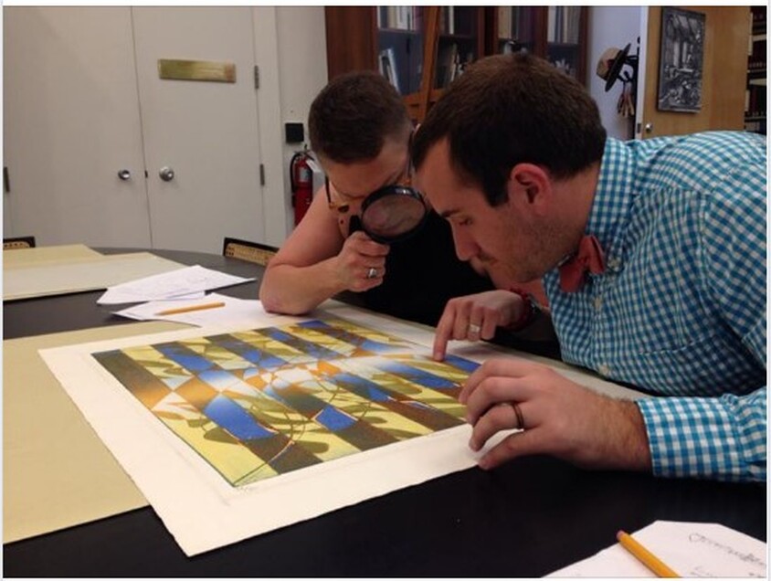 Ben Levy and Tru Ludwig are parsing Pillars, 1974, in June 2014, at the Baltimore Museum of Art. Stanley William Hayter (English, 1901-1988), Pillars, 1974. Engraving, softground etching, and open bite etching; printed in orange (intaglio); blue-blue gradient (stencil, relief), and yellow-yellow gradient (stencil, relief). Sheet: 746 x 561 mm. (29 3/8 x 22 1/16 in.); plate: 584 x 430 mm. (23 x 16 15/16 in.). Baltimore Museum of Art: Bequest of Virginia Fox, Palm Beach, Florida BMA 1988.29. 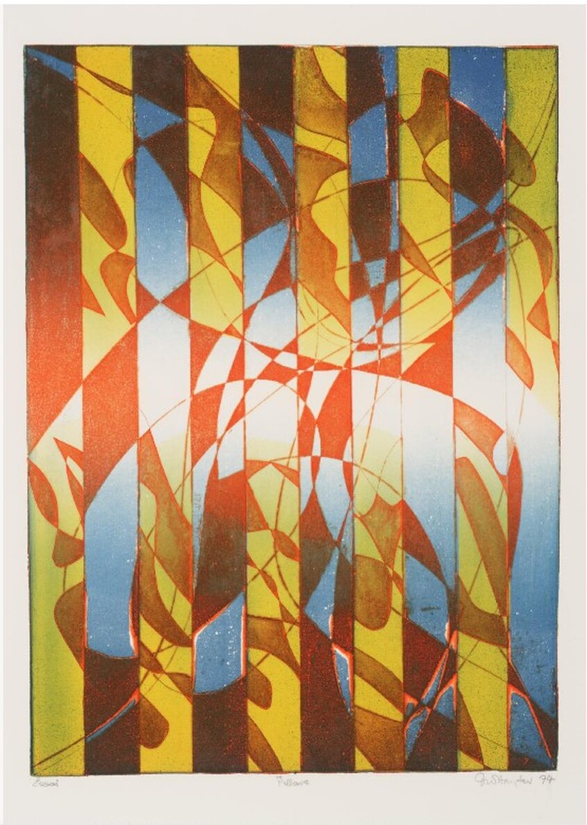 Stanley William Hayter (English, 1901-1988), Pillars, 1974. Engraving, softground etching, and open bite etching; printed in orange (intaglio); blue-blue gradient (stencil, relief), and yellow-yellow gradient (stencil, relief). Plate: 584 x 430 mm. (23 x 16 15/16 in.). Tate Britain: Purchased 1981, P07471. 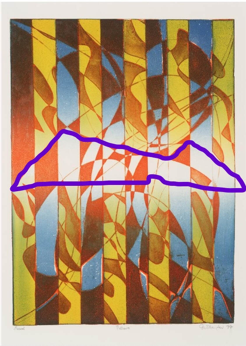 Stencil marked in purple. Stanley William Hayter (English, 1901-1988), Pillars, 1974. Engraving, softground etching, and open bite etching; printed in orange (intaglio); blue-blue gradient (stencil, relief), and yellow-yellow gradient (stencil, relief). Plate: 584 x 430 mm. (23 x 16 15/16 in.). Tate Britain: Purchased 1981, P07471. 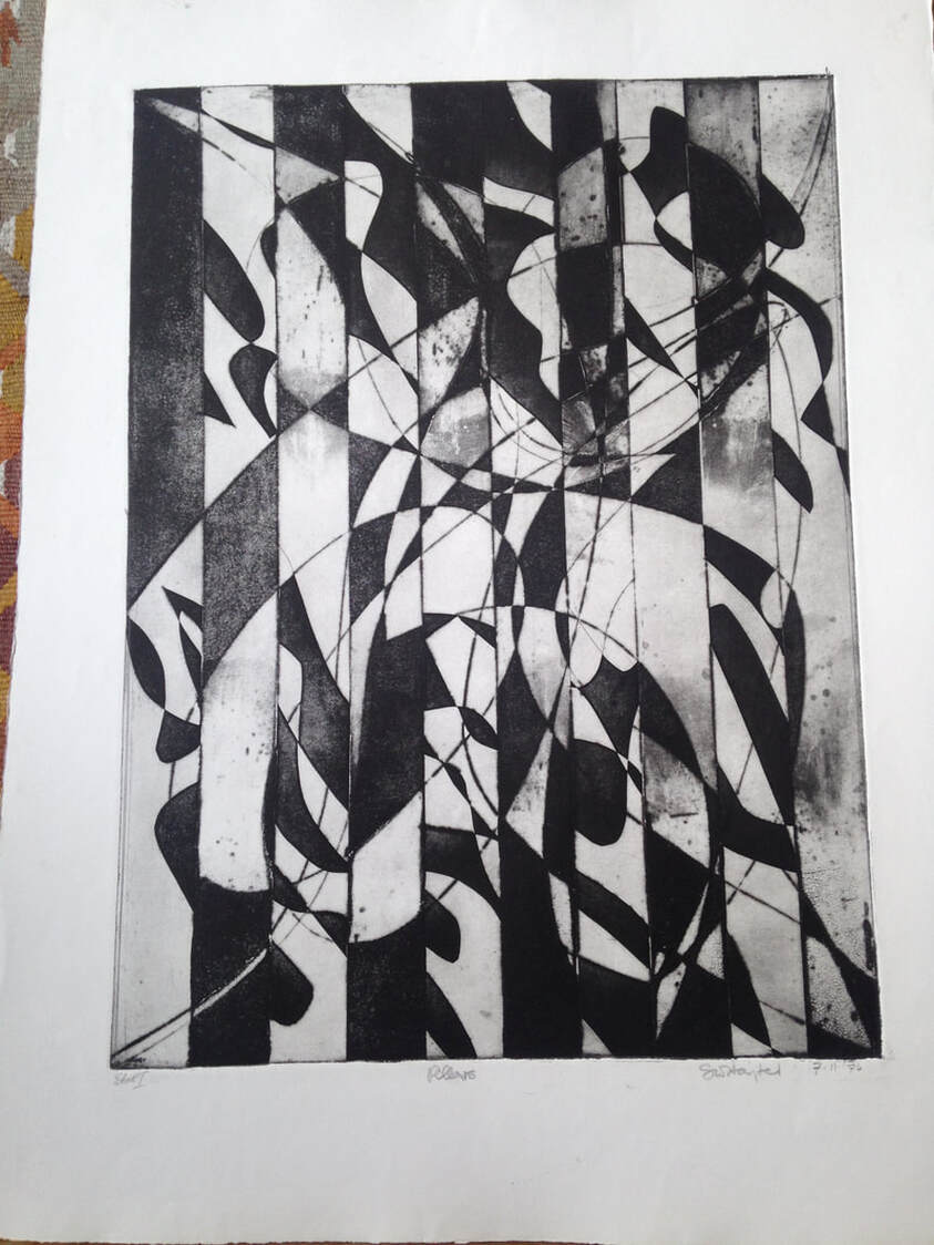 Stanley William Hayter (English, 1901-1988), Pillars [first state], 1974. Engraving, softground etching, and open bite etching; printed in black (intaglio). Plate: 584 x 430 mm. (23 x 16 15/16 in.). Private collection. Ann ShaferA spirit of collaboration and experimentation was at the heart of Atelier 17. Prints by Hayter and his associates are conceptually and passionately full of ideas about the human condition, dreams, mythology, war, and natural phenomena. The exceptional rigor of subject matter in these images was achieved by means of three technical innovations, which changed the course of twentieth century printmaking. First, Hayter revived the art of engraving, which he believed was uniquely suited to address issues of modern art. (Historically engraving had been used to reproduce more famous works for a large market.) Second, members of the studio pioneered the use of textiles, paper, string, wood, and other materials pressed into a softground-coated plate to gain an amazing variety of textures. Third, Hayter and his colleagues (credit to Krishna Reddy and Kaiko Moti) developed several inventive methods of printing in colors from a single plate, eliminating the need to print separate plates for each color. All of these are counterintuitive to admirers of traditions intaglio prints. While looking at the works from this studio, know that often when you think you are seeing etching, it is actually engraving. When you think you are seeing aquatint, it is really softground etching. When you see a color print, it is not the result of each color being printed from separate plates, but of being applied to a single plate. Today’s post zooms in on the second element, softground etching. Not a new technique by any means, the possibilities were greatly expanded by one of the women artists working at Atelier 17, Sue Fuller, who used bits of fabric that went beyond a simple pattern like pantyhose used to create tonal passages mimicking aquatint. Rather, she utilized lace and pieces of string to create the subject of the image itself. Fuller’s print Hen, 1945, is the clearest example of this in its use of a lace collar to form the hen. Fuller’s Cacophony, 1944, features several standing female figures, which are delineated by string. Fortunately for us, Fuller also created collages of some of her compositions, including the one for Cacophony, which is currently “on view” in an online exhibition from Susan Teller Gallery. Seeing the collage of string in the same composition really brings it together and enables viewers to imagine what is meant by softground etching. Teller also is showing the first state and the final, all of which makes clear the composition’s creation. Susan Teller is the go-to person for works by Fuller. Her breadth of knowledge and depth of stock by Fuller and others who worked at the Atelier during its New York years is legendary. The online exhibition is here. For a superb read on Sue Fuller and the many female artists working at Atelier 17, look no further than the recently published book by Christina Weyl, The Women of Atelier 17: Modernist Printmaking in Midcentury New York (Yale University Press, 2019). Christina’s accomplishment with her book is tremendous and it is required reading for students of this era. Yesterday, Joanne B Mulcahy published a review of Christina’s book for Hyperallergic, beautifully summing up its contents. I suspect there may be a run on the book from online sources; I suggest if you are thinking a procuring a copy, act fast. Sue Fuller (American, 1914–2006) Hen, 1945 Engraving and softground etching Sheet: 458 x 364 mm. (18 1/16 x 14 5/16 in.) Plate: 378 x 299 mm. (14 7/8 x 11 3/4 in.) Baltimore Museum of Art: Gift of Adelyn D. Breeskin, BMA 1948.52 Sue Fuller (American, 1914–2006) Cacophony, 1944 Collage 11 x 8 inches Susan Teller Gallery, New York (courtesy the Estate of Sue Fuller and the Susan Teller Gallery, New York) Sue Fuller (American, 1914–2006) Cacophony (first state), 1944 Softground etching, 11 x 8 inches Susan Teller Gallery, New York (courtesy the Estate of Sue Fuller and the Susan Teller Gallery, New York) Sue Fuller (American, 1914–2006) Cacophony (final state), 1944 Etching, softground etching, and aquatint 11 x 8 inches Susan Teller Gallery, New York (courtesy the Estate of Sue Fuller and the Susan Teller Gallery, New York) 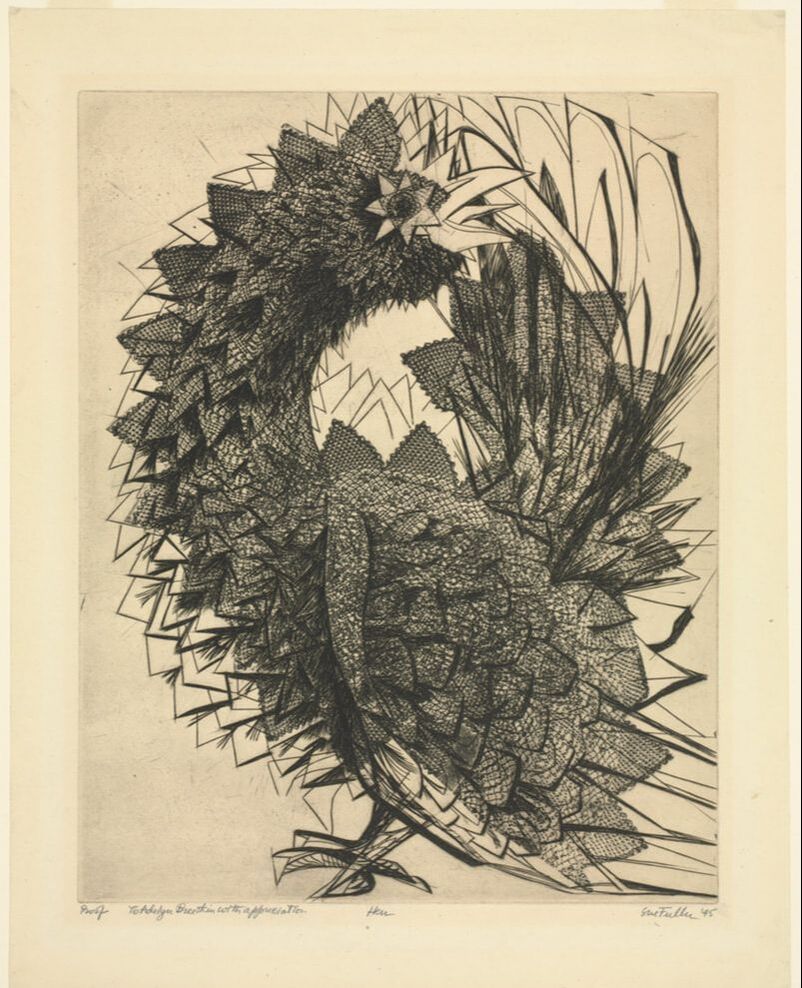 Sue Fuller (American, 1914–2006), Hen, 1945, engraving and softground etching, sheet: 458 x 364 mm. (18 1/16 x 14 5/16 in.), plate: 378 x 299 mm. (14 7/8 x 11 3/4 in.), Baltimore Museum of Art: Gift of Adelyn D. Breeskin, BMA 1948.52 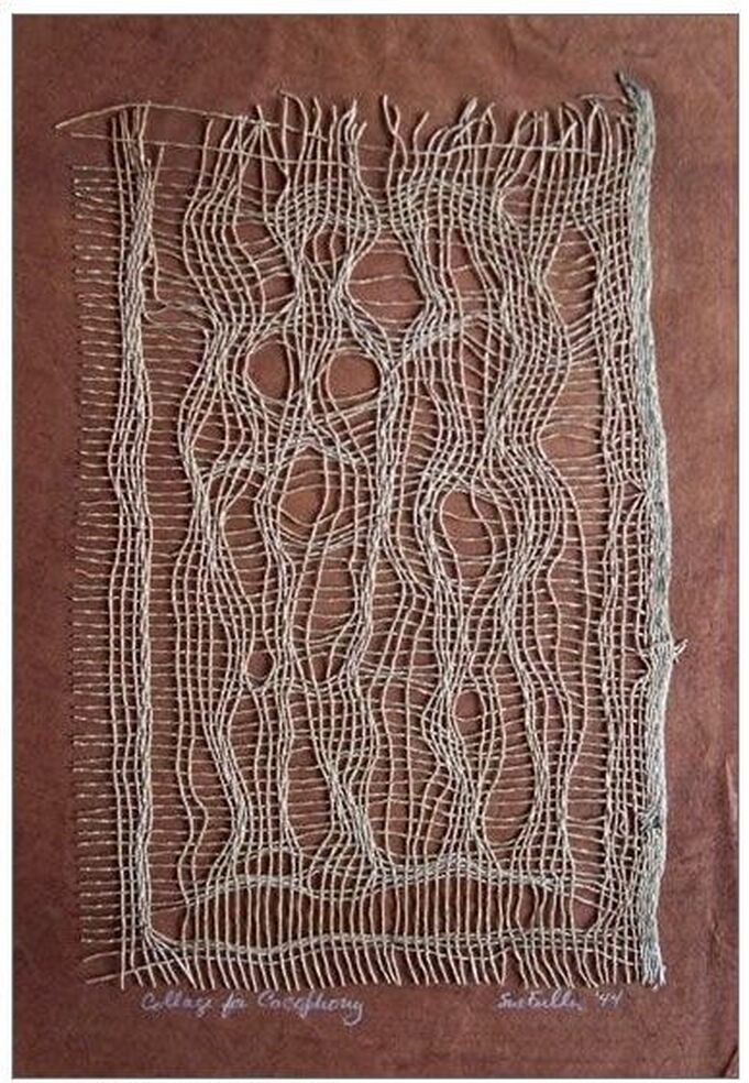 Sue Fuller (American, 1914–2006), Cacophony, 1944, collage, 11 x 8 inches, Susan Teller Gallery, New York (courtesy the Estate of Sue Fuller and the Susan Teller Gallery, New York) 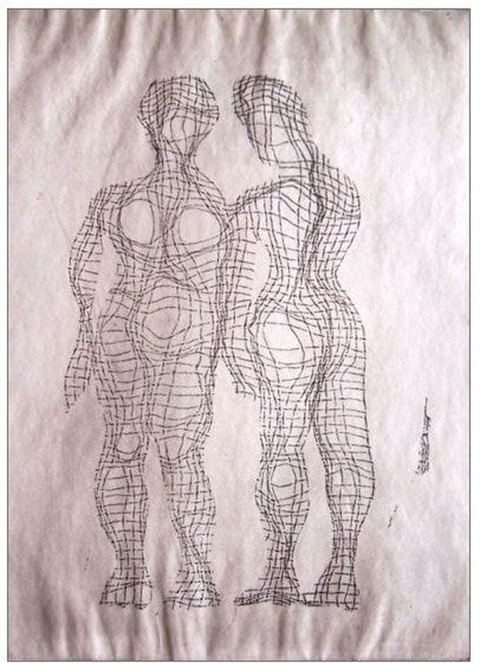 Sue Fuller (American, 1914–2006), Cacophony (first state), 1944, softground etching, 11 x 8 inches, Susan Teller Gallery, New York (courtesy the Estate of Sue Fuller and the Susan Teller Gallery, New York) 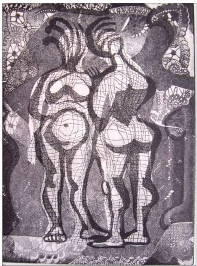 Sue Fuller (American, 1914–2006), Cacophony (final state), 1944, etching, softground etching, and aquatint, 11 x 8 inches, Susan Teller Gallery, New York (courtesy the Estate of Sue Fuller and the Susan Teller Gallery, New York) Ann ShaferOur man Hayter was the spiritual epicenter of Atelier 17, which was an important hub for collaboration and experimentation in printmaking. It was his goal that artists would work together toward new discoveries. He downplayed his role as teacher and mentor, although it is clear the workshop’s success owed a tremendous amount to his personal charisma. When a new artist arrived at the studio Hayter would put them through their paces before allowing them free access to the equipment. One of the first things was to accomplish a plate of burin studies. Given a copper plate, the nouveau was instructed to make marks without regard to a planned image. This was a chance to become familiar with the technique and process. Hayter encouraged students to free their minds of preconceived imagery and just let the burin go where it might until they had become fully comfortable making marks. Because engraving is a difficult means of making an image—one pushes a diamond-shaped tool through the copper or zinc to create divets that will carry ink—it is important that one is at ease with it prior to investing time and energy in a large print. Hayter, himself, engraved several of these sorts of studies over the course of his career, perhaps in order to go back to basics once in a while. These studies really were supposed to be a freeform exercise tapping into one’s subconscious. He even advocated for creating engraved lines by feel rather than by sight. These ideas can be linked to Hayter’s interest in the surrealist practice of automatic drawing, in which one’s subconscious should be accessed thus producing stronger work. Hayter was active at the Atelier until the end of his life in 1988, meaning scores of artists can claim some time with the master. One such artist is the master printer James Stroud, whose print shop, Center Street Studio, operates outside of Boston. In between his BFA and his MFA, Stroud studied with Hayter at the Atelier in Paris from 1980 to 1981. In the progressive states (he stopped and printed the plate periodically as he added more and more to the composition), the plate is filled with swirling lines that intersect over geometric forms in an orderly yet chaotic way. Stroud reported coming across the plate in his studio in 2014, many years after he engraved it. For fun, he printed a handful of impressions and liked the result. Knowing about the BMA’s planned Hayter exhibition, Stroud not only donated a 2014 impression of the final state, but also the set of earlier states he’d kept all these years. Jim is a superb printer (and artist) and his shop is worth checking out: http://www.centerstreetstudio.com/. James Stroud (American, born 1958) Burin Studies (state 1-14 and final), 1980 Engraving Sheet (each): 250 × 205 mm. (9 13/16 × 8 1/16 in.) Plate (each): 184 × 138 mm. (7 1/4 × 5 7/16 in.) Baltimore Museum of Art: Gift of the Artist, 2016.140.1–14 and 2014.100  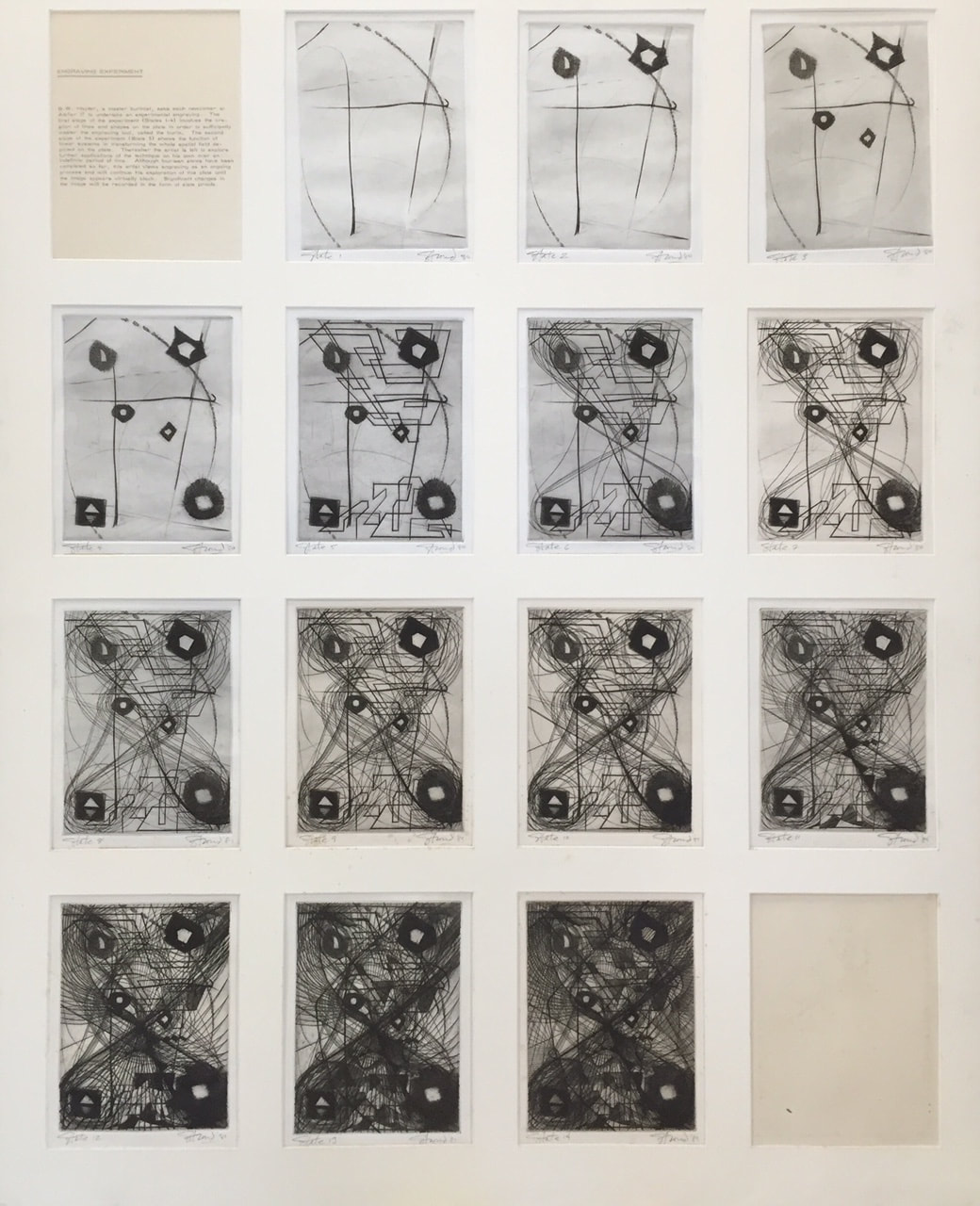 Ann ShaferEngraving was Hayter’s first love. He wanted to reintroduce it as a tool for what he called “original expression,” which basically means for one’s own work and not for reproducing another artists’ design. There aren’t many artists utilizing engraving today, but Evan Lindquist is one of them. No surprise he has ties to Hayter through his graduate studies at the University of Iowa, where Mauricio Lasansky had founded the printmaking department in the late 1940s (Lasansky worked with Hayter at the New York Atelier 17 in the early 1940s). In recent years, Lindquist has created a series of elegantly engraved portraits of art history’s well-known engravers like Martin Schongauer, Albrecht Dürer, Hendrik Goltzius, William Blake, Hayter, and others. (See his website here: https://evanlindquist.com/seeprints/gallery2.html.) In his engraving, SW Hayter Engraves War, Lindquist portrays Hayter as an intense, powerful figure out of whose burin (his engraving tool) come motifs referring to the Spanish Civil War. That Lindquist portrays this titan of printmaking creating a print in support of victims of a crazy war, and not as a teacher, is telling. Hayter and a group of artists created two portfolios, Solidarité (1938) and Fraternity (1939), that were fundraisers for the child victims of the Spanish Civil War. Hayter’s plate for Fraternity, which also contains prints by John Buckland Wright, Dalla Husband, Josef Hecht, Wassily Kandinsky, Roderick Mead, Joan Miró, Dolf Reiser, and Luis Vargas, shows a nude male standing in a doorway while an airplane flies overhead. One can’t help but think of Guernica, the small Spanish village that was bombed in April 1937, killing vast numbers of civilian men, women, and children. Occurrences like Guernica motivated many artists to create work in protest, mostly famously Picasso, and Hayter was no different. He was a passionate humanist who used art to express his profound discomfort with the darkness that befell humanity during the first half of the twentieth century. That the symbols and marks of the war are spitting out vigorously from Hayter’s burin in Lindquist’s portrait is a perfect homage. Stanley William Hayter (English, 1901-1988) Untitled, from the portfolio Fraternity, 1936 Engraving Sheet: 211 x 161 mm. (8 5/16 x 6 5/16 in.) Plate: 124 x 73 mm. (4 7/8 x 2 7/8 in.) Baltimore Museum of Art: Gift of Sidney Hollander, Baltimore, BMA 1996.8.3 Evan Lindquist (American, born 1936) SW Hayter Engraves War, 2015 Engraving Sheet: 388 x 310 mm. (15 1/4 x 12 3/16 in.) Plate: 278 x 207 mm. (10 15/16 x 8 1/8 in.) Baltimore Museum of Art: Purchased as the gift of an Anonymous Donor, BMA 2015.173 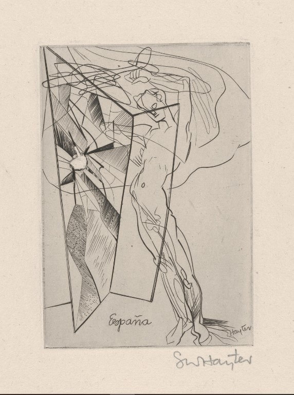 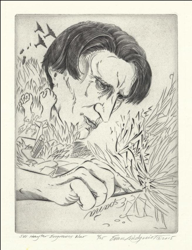 Ann ShaferI’ve been teaching myself Adobe’s video editing software, Premiere Rush. Today is the debut of my first attempt, a very short video on Stanley William Hayter’s Rue des Plantes, 1926. For our epic research trip to Paris in 2015, Ben Levy, Tru Ludwig, and I had a lot on our to-do list related to the Hayter exhibition. First on the list was to photograph and film the printing of Hayter’s Torso, 1986, at Atelier Contrepoint, which I wrote about in another post. Second was to interview Désirée Hayter on video. Third was to find and photograph as many locations of the Atelier as possible (it moved a bunch of times). And fourth was to find, photograph, and videotape the locations that appear in Hayter’s series Paysages urbains, 1930 (more on that in another post). While doing the last, I added finding the site of Rue des Plantes to the list. Rue des Plantes is a lovely early drypoint by Hayter depicting a simple street scene in the 14th arrondissement. In it a lone figure carrying her daily market purchases walks toward a building that oddly is situated in the middle of a cobblestone street. Finding the site wasn’t too hard, but finally laying our eyes on it sparked our adrenaline. Ben set up the video equipment intent on taking some B-roll for an eventual video for the exhibition website. With the camera rolling, suddenly an older woman carrying her market purchases wandered into the frame. The three of us must have looked like lunatics gesturing to each other madly but silently so as not to be recorded on the tape. It couldn’t have been more perfect. Finally, I’ve pulled a short video together showing this golden moment, which thrills me still. Stanley William Hayter (English, 1901–1988) Rue des Plantes, 1926 Drypoint Sheet: 400 x 328 mm. (15 3/4 x 12 15/16 in.) Plate: 267 x 208 mm. (10 1/2 x 8 3/16 in.) Baltimore Museum of Art: Bequest of Ruth Cole Kainen, Chevy Chase, Maryland, BMA 2011.263 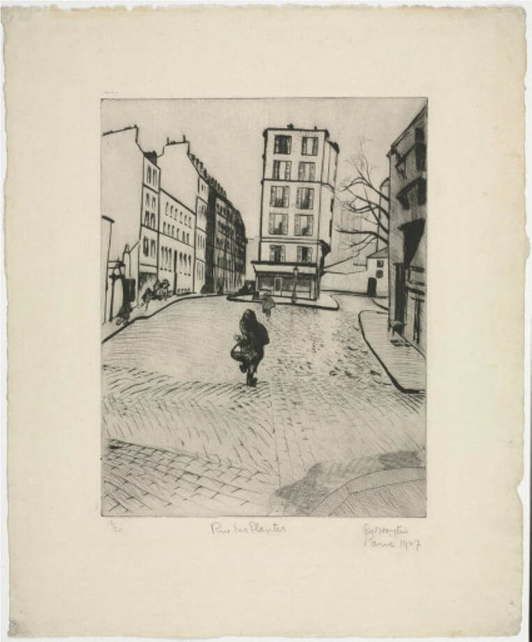 Ann ShaferYou might be surprised to learn that Hayter's workshop is still operating in Paris at 10, rue Didot. After his death in 1988, the workshop changed its name to Atelier Contrepoint and is run by Hector Saunier, who printed many of Hayter’s late compositions. I was fortunate to be able to visit the Atelier twice, in 2014 and 2015. The first time was to meet Hector and see what the operation looked like. The second time Hayter's widow, Désirée, agreed to bring over one of his plates so Hector could ink and print it for us (there is no one better suited for this particular task). The plan was to create an online feature for the exhibition’s web site, which never happened because the show was cancelled. As usual, Ben Levy and Tru Ludwig were with me, and between the three of us, we shot a lot of video and photographed Hector and Shu-lin Chen printing Hayter’s Torso, 1986. Désirée couldn’t find the plate she was originally thinking of, so she randomly selected Torso, which turned out to be serendipitous because Torso conceptually circles back around to the fist clenching the void discussed in an earlier post. In Torso, Hayter used stripes with inverted color variants, inking the central intaglio composition in green, red, and fluorescent orange, and with a horizontally rolled gradient of blue/yellow/green. The shape of the torso is defined by a mask that was laid down on the inked plate, blocking the rollers from depositing the blue, yellow, and green ink on the paper, producing an area of white across the center. The positive shape of the torso, described by an absence, echoes the conundrum of the untitled plate six from The Apocalypse, in which the negative space of a clenched fist is described by a positive volume. In this late print, the cognitive inquiries and accumulated techniques of four decades have come together. With the copper plate under her arm, we met Désirée on the appointed day at Atelier Contrepoint. After consulting the catalogue raisonné, they got right to work. Shu-lin set about inking the plate (intaglio) in red, fluorescent orange, and dark green in vertical stripes. Hector prepared the rainbow roll of blue, yellow, and green on a glass palette. The mask was still wrapped with the plate, so it was used as well. When Shu-lin was satisfied with her wiping job, the plate was ready for the mask’s placement and the rainbow roll. Hector completed his part and the plate was placed on the bed of the press that had been used for thousands of prints by hundreds of artists over the majority of the twentieth century. After a few unsatisfactory pulls, they printed four impressions, one of which eventually entered the Baltimore Museum of Art’s collection. I remain amazed that I got to experience the printing of one of Hayter’s plates and so appreciative of Désirée, Hector, and Shu-lin’s generosity that day. Even better, Ben Levy and Tru Ludwig were with me to witness the magic. Ann ShaferIn my previous post I talked about Stanley William Hayter's 1959 open bite etching Cascade and promised to dig into its making. It takes many images to describe the process of simultaneous color printing, so I created a PDF slide deck to illustrate how Ben Levy, Tru Ludwig, and I made a group of test prints to figure it all out. You can find the PDF here:
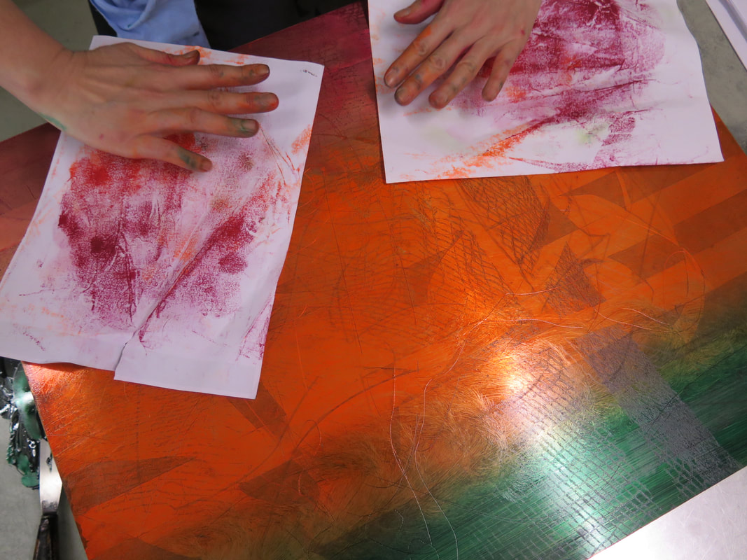
Ann ShaferCascade, 1959, by Stanley William Hayter, is the print I planned to use of the cover of the catalogue. One, because it's gorgeous. Two, because by 1959, Hayter is 58 and had been at it for more than thirty years and Cascade sums up so much of Hayter's thinking. During that time, he's helped Spanish refugees during the Spanish Civil War by hiding them in the studio; he's dropped everything and fled Paris as it went to war with Germany in 1939; he's created something really special in NY during the war and following (he's in NY from 1940-1950); he's watching his 16-year-old son die in 1946; he's helped hundreds of artists find their voices and discover new ways of creating intaglio prints; he, like so many other artists, has grappled with the horrors revealed by the Holocaust and bombing of Hiroshima and Nagasaki; and he's been able to return to France and purchase a vacation home in the south of France. But Hayter was also a man who never stopped thinking, working, creating, loving, living. Three, it's a great place to start talking about one of the Atelier's most important discoveries, that of simultaneous color printing (sometimes called viscosity printing, although Hayter didn't like that term since all inks have a viscosity of some sort). Cascade, 1959, is a colorful print with an all-over composition that appears completely abstract; seemingly random drips and gestures cover the plate. Hayter, however, never accepted pure abstraction as a meaningful subject—even when his subjects defy conventional representation, his titles anchor them in the world of places and things. Cascade is one of many works inspired by the appearance of rushing water in a river near his home in the south of France. The direct autographic drawing that had been essential to Hayter’s work since he began engraving has disappeared, replaced by a variety of devices that could be set in motion by his hand, but whose outcomes were far more open to chance: leaking cans of liquid ground suspended as pendulums, and marker pens that could dribble and spray showers of thin resist. These systems recorded, rather than depicted, the behavior of liquids in motion. Cascade is an indexical print (see prior post about Trisha Brown). Despite all of the scholarly reasons we can cite for Hayter's switch from engraving lines to depict images to indexical splashes of liquid, I've always wondered if his hands were just tired and he was dealing with an onset of arthritis. I have absolutely no proof of this--it's just a thought. What's so intriguing to me about the print is figuring out how in the world a bunch of open-bit swooshes and gestures are inked to produce the colorful image. First, we need to understand that to produce a color print, normally one would create separate copper plates for each color and they would be printed in successive layers on the paper in multiple passes through the press. Instead, Hayter layered the different colors on the same, single plate, and ran it through the press once. The trick is to vary the amount of oil in each color so that they don't run together as they are applied. (This idea was developed at the Atelier by Krishna Reddy and Kaiko Moti--an example of the collaborative nature of the workshop.) Along with the print itself, I'm including an image of the zinc plate (also in Baltimore's collection, a gift from Mrs. Hayter, BMA 2014.40), and an image that shows the cross section of the plate in the order it is inked. I hope this will make some sense; we'll dig in more tomorrow. First, the plate is wiped intaglio in black so that the ink clings to the canyon walls; second, a soft roller carrying the rainbow roll of blue/pink/blue deposits color in the canyons; third, a hard roller deposits an unblended green and yellow across the plateau. This will all be made clearer tomorrow when I share the test plates we created for the exhibition to show each step in this inking process. Because these test plates are the first and only etchings I've ever made, you can imagine I had help. I am deeply, supremely indebted to Tru Ludwig and Ben Levy, who made it all happen. Tomorrow you'll see us in action. Stanley William Hayter (English, 1901-1988) Cascade, 1959 Open bite etching; printed in black (intaglio), blue-pink-blue gradient (relief), yellow, green, and blue, unblended (relief) Sheet: 794 x 584 mm. (31 1/4 x 23 in.) Plate: 489 x 489 mm. (19 1/4 x 19 1/4 in.) The Baltimore Museum of Art: Purchased as the gift of the Print, Drawing & Photograph Society, BMA 2008.112 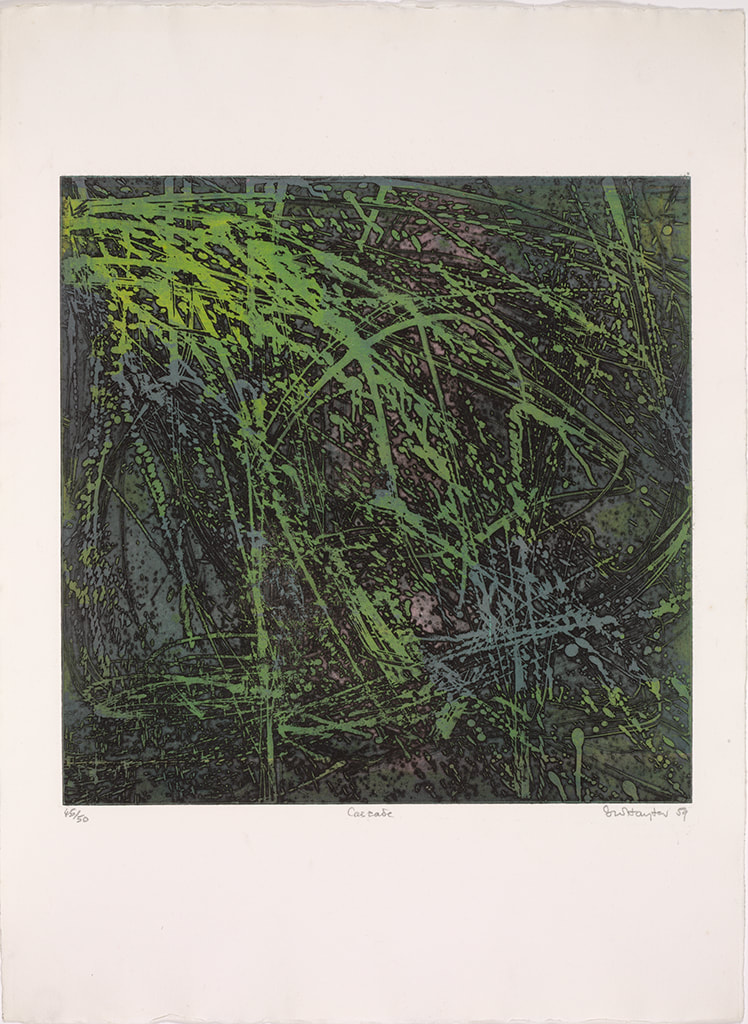 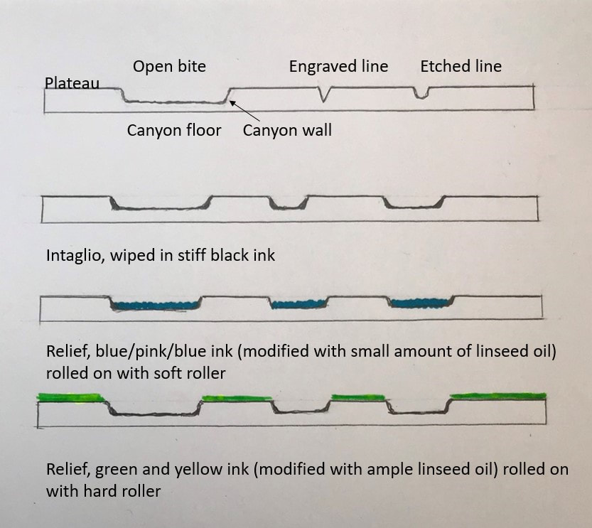 Ann ShaferIn the previous post I shared a video about Stanley William Hayter (known as Bill to his friends), an artist that has interested me for many years. I also shared a link to a PDF catalogue for an exhibition that took place last year in São Paolo, Brazil. I was lucky enough to participate in a conference there in conjunction with that exhibition, Atelier 17 and Modern Printmaking in the Americas. I’m sharing a summary of the conference I wrote for another publication that I hope you find interesting. And, if you or any of your students need a dissertation topic, read through to the end. The conference was held at the Museu de Arte Contemporãnea, which is part of the University of São Paolo and is known as MAC USP. Both the exhibition and conference focused on printmaking and artistic exchange between the United States and South American countries in the mid-twentieth century. The exhibition, catalogue, and conference were born out of the research of USP graduate student Carolina Rossetti de Toledo, who, under the supervision of professor and chief curator Ana Gonçalves Magalhães, focused on several gifts to São Paolo’s new Museum of Modern Art (MAM) in the 1950s of prints from Nelson Rockefeller, Henry Ford, and Lessing Rosenwald (the majority of MAM’s permanent collection was transferred to MAC USP upon its founding in 1963). Nelson Rockefeller made two gifts, one in 1946 of paintings and sculpture and another in 1951 of twenty-five modern prints, to assist in the establishment of a museum of modern art in São Paolo. (He also donated a group of paintings to a museum in Rio de Janeiro in 1952.) Rockefeller’s interest in Brazil began when he travelled there as the director of the Office of the Coordinator of Inter-American Affairs, the purpose of which was to strengthen relations with Latin America during World War II, both politically and culturally. The initial selection of prints for the Rockefeller donation was made by MoMA curator William Lieberman, who chose prints that represented cutting-edge modernism. The majority reflect American printmaking of the time, meaning works by artists associated with Stanley William Hayter’s Atelier 17. Why Rockefeller focused on MAM in São Paolo specifically remains unclear. Whatever the real reason, it was noted as a “gesture of goodwill.” A selection of prints from the 1951 gift were exhibited that year in São Paolo but have rarely been shown in the intervening years. Following Rockefeller’s gesture, Henry Ford donated one print in 1953, and Lessing Rosenwald made a gift of nine modern prints in 1956, which were meant to augment the collection in the area of international modernism. The connection between the three donors and what motivated the Ford and Rosenwald gifts is unclear. But among the prints in these later gifts were yet more examples of international modernism in the form of works by artists associated with Atelier 17. For Brazilian artists, there were three possible points of contact with Atelier 17. The first was through trips abroad. The second was through the publication and circulation of books by Hayter and his associates. The third was through exhibitions such as MoMA’s 1944 Atelier 17 exhibition, which traveled not only around the United States but also throughout Latin America, and through the exhibitions of works by Atelier 17 artists in the São Paolo Biennials and other venues. Hayter had an exhibition in Rio de Janeiro in 1957, which also traveled to Buenos Aires, and his work was included in the British pavilion in the 1959 São Paolo Biennial (MAM purchased several prints from this show). Interestingly, Atelier 17 artist Minna Citron had an extensive one-person show at MAM in São Paolo in 1952, which was by far the biggest exposure of an Atelier 17 artist in Brazil up to that point. Citron was fairly proficient in Portuguese (and many other languages), which may account for how she secured and coordinated this show. Several of the prints in the Rockefeller gift to MAM had been shown in other impressions in the 1944 MoMA exhibition and yet other prints in the gift were seen in Una Johnson’s seminal National Print Annual exhibitions at the Brooklyn Museum. In other words, the gift was of cutting-edge contemporary prints. There are still gaps in the story, however. In her essay for the exhibition catalogue, Rossetti de Toledo notes, rightly, that the connections between modern American and European printmaking and its Latin American counterparts are not well understood or properly documented. The Rockefeller gift is one piece of the puzzle. Rossetti de Toledo’s research into the Rockefeller gift developed into the MAC USP exhibition and bilingual catalogue, both majorly supported by the Terra Foundation. In addition to prints from MAC USP’s collection, the exhibition featured loans from the Terra Foundation’s extensive collection of American prints and works from the Brooklyn Museum and Art Institute of Chicago. The conference began with introductory remarks from Magalhães and Terra Foundation curator Peter John (PJ) Brownlee. Rossetti de Toledo spoke about her research on the Rockefeller gift. I introduced Hayter and the Atelier 17, setting the stage for the discussion. Other speakers included Luiz Claudio Mubarac, who gave an overview of Brazilian printmaking in the twentieth century; Silvia Dolinko, who gave an overview of printmaking in her home country of Argentina; Heloisa Espada, who focused on Brazilian artist Geraldo de Barros (he worked at Atelier 17 in Paris in 1951); and Priscila Sacchettin, who spoke about Livio Abramo (he worked at Atelier 17 in 1951–52 and his work appears in Hayter’s book, About Prints). Christina Weyl closed out the conference with her talk on women at Atelier 17, which was an excellent preview of her important, recently published book. Over the course of two days, it became clear that South American printmaking runs in sometimes intersecting but separate tracks from European and American art. While artists cross pollinated through travel, books, and exhibitions, for those of us who study prints, there’s a whole other world of printmakers to be discovered in South America. It is also clear that research on these printmakers is wide open. Brazil lacks the central repository of artists’ papers and archives like our Archives of American Art. Many of the artists’ families remain in possession of the works and papers of their creative relatives. These artists’ estates have not been formalized or catalogued, nor are they easily accessible. Hardly any estates’ papers have found their way into libraries or universities, meaning there is a lot of room for intrepid scholars to uncover the careers of any number of artists. How’s your Portuguese? Need a dissertation topic? As I noted yesterday, the exhibition catalogue was printed in a small run but a pdf of the book is available here: bit.ly/Atelier17MACUSP. I also include a list of Brazilian and Argentine artists who were mentioned repeatedly. Brazilian artist-printmakers of note: Edith Behring (1916–1996) Maria Bonomi (born 1935, she was married to Abramo) Ibêre Carmargo (1941–1994) Oswaldo Goeldi (1895–1961) Marcelo Grassmann (1925–2013) Evandro Carlos Jardim (born 1935) Renina Katz (born 1925) Anna Letycia (born 1929) Maria Martins (1894–1993) Fayga Ostrower (1920–2001) Carlos Oswald (1882–1971) Mário Pedrosa (1900–1981) Gilvan Samico (1928–2013) Lasar Segall (1891–1957) Regina Silveira (born 1939) Argentine artists-printmakers: Hilda Ainscough (born 1900) Mauricio Lasansky (1914–2012) Julio LeParc (born 1928) Fernando López Anaya (1903–1987) Ana Maria Moncalvo (1921–2009) 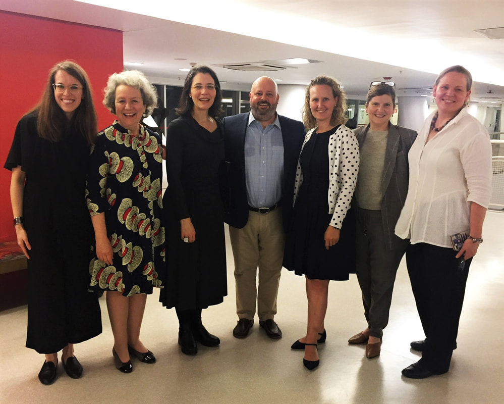 At the exhibition reception: (L-R) Taylor Poulin, Elizabeth Glassman, Ana Gonçalves Magalhães, Peter (PJ) Brownlee, Christina Weyl, Amy Zinck, and Ann Shafer. Photo by MAC USP staff.
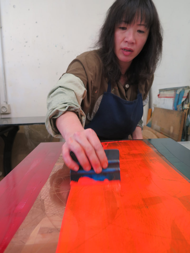
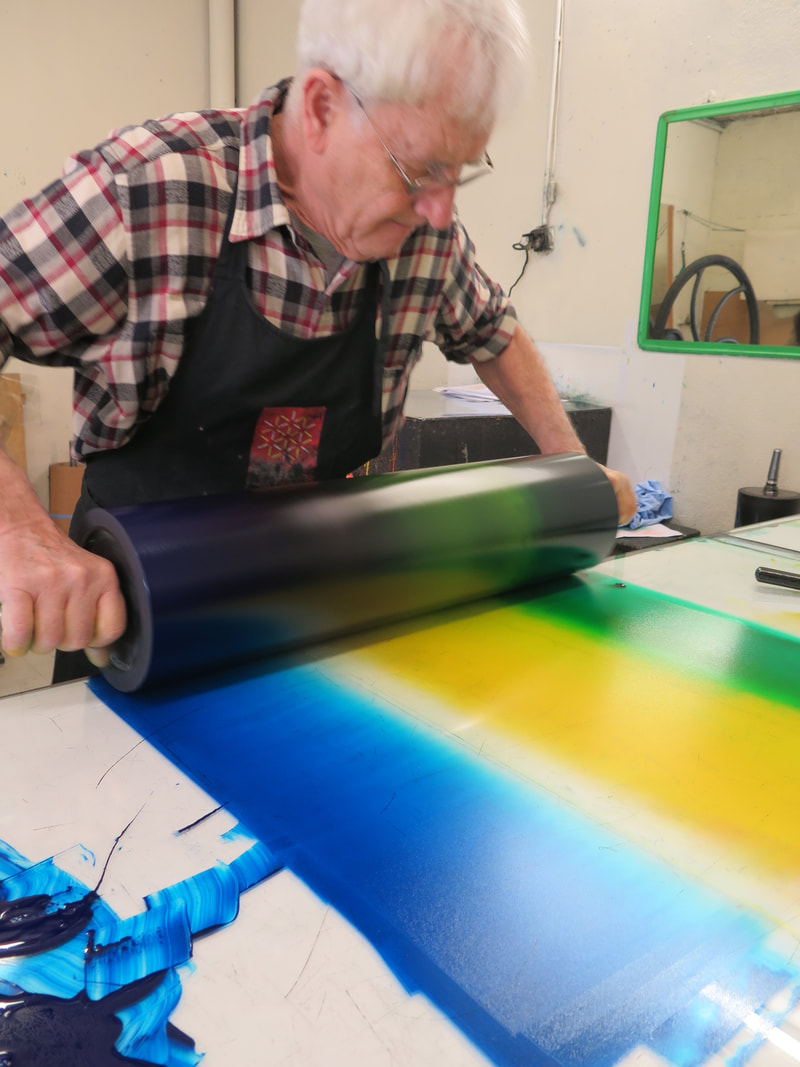
Ann ShaferIf you know me at all, you know I spent a very long time working on a project focused on Stanley William Hayter and Atelier 17. I always talked about him as a lightning rod around whom bazillions of artists swirled. I believe his and the atelier's story is the fastest route to inserting printmaking firmly into the now-ever-changing canon. My attempt to do that in a grand fashion was not to be through circumstances out of my control, but a few smaller projects resulted. Some of the research is published in a catalogue for an exhibition at MAC USP (University of Sao Paolo). The print run was quite small, but the catalogue PDF is available here: bit.ly/Atelier17MACUSP. In addition, I was filmed talking about one of my favorite Hayter prints for the BMA, which is available here: https://www.youtube.com/watch?v=mJ6Z-8Yq9cs. I love this print. I feel like it sums up so much of Hayter's thinking and is among my top candidates for most important print of the 20th century. Stanley William Hayter (English, 1901-1988) Untitled (no. 6 from The Apocalypse), 1931 Engraving and drypoint; printed in black (intaglio) Sheet: 526 x 399 mm. (20 11/16 x 15 11/16 in.) Plate: 324 x 228 mm. (12 3/4 x 9 in.) Baltimore Museum of Art: Gift of Mr. and Mrs. Robert Paul Mann, Towson, Maryland, BMA 1979.377.6  |
Ann's art blogA small corner of the interwebs to share thoughts on objects I acquired for the Baltimore Museum of Art's collection, research I've done on Stanley William Hayter and Atelier 17, experiments in intaglio printmaking, and the Baltimore Contemporary Print Fair. Archives
February 2023
Categories
All
|
||


 RSS Feed