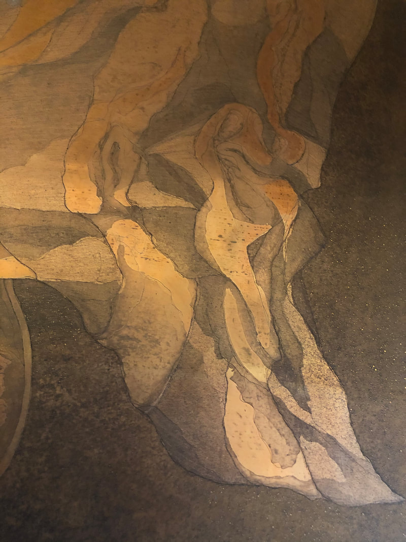
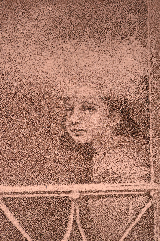
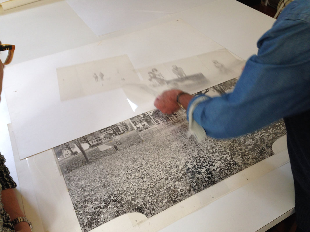
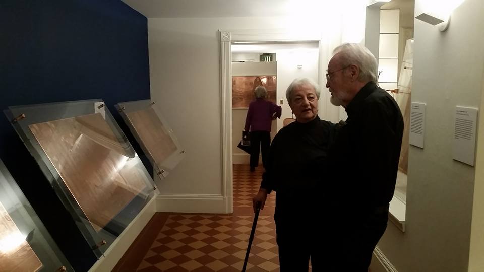
Ann ShaferYou all know about my friend Tru Ludwig. He is one of the rare art historians who is also an artist. That combination is special because those people can not only tell you about the background history of the artist and the subject matter, but also how it was done with such a depth of knowledge it is breathtaking. There were moments in the frantic shuffling of prints and interleaving during History of Prints at the BMA that I would purposefully stop to listen to Tru talk about Rembrandt's Three Crosses, Max Klinger’s Die Handschuh, Kathe Kollwitz’s Battlefield, and Leonard Baskin’s Hydrogen Man. Every time, Tru's oration would get me with goosebumps or tears welling; he is beautifully clear about how art is central to our existence. His magnificence in the classroom is why I asked him to make Platemark's History of Prints series. While we've been making Platemark however, I've been apprenticing at Tru’s print studio, The Purple Crayon Press. Last year we spent two days pulling his magnificent etching called TapHistory (Repeated), 2005, which consists of two large sheets that are joined in the center. Each half is two plates: one in brown and one in red. Learning how to print has been extraordinary. TapHistory is a play on the format of the Bayeux Tapestry, an important embroidered length of fabric that tells the tale of the lead-up to and the Battle of Hastings in 1066, when William, Duke of Normandy defeated the British upstart Harold, Earl of Wessex, following the death of King Edward the Confessor. It is thought that the outcome changed England, its language, architecture, and way of life for the future in massive ways. The tapestry was created only a handful of years after the battle and offers vignettes that tell us about military strategy, armor, cooking conventions, fashion, and all sorts of stuff. It is some 230 feet long and 20 inches tall. The main action takes place along the center, while a top and bottom border carries other figures and stories, which sometimes are fables or cautionary snippets that forecast the future. Tru’s print mimics that format. There is central action and a top and bottom border carrying other supporting information. In the central section is a map of the world, the kind you might find in an old National Geographic. Noted in tiny red stitches (mimicking the tapestry) arrows create paths of conquest by various peoples across time: Goths, Visigoths, Vikings, Mongols, etc. It is also includes art historical quotations. That is Jacques-Louis David’s Oath of the Horatii in the lower center, which depicts three sons and their father issuing an oath that will result in only one son surviving an upcoming land-dispute battle. In the left center is Emmanuel Leutze’s Washington Crossing the Delaware (in reverse). Over in Japan, two mushroom clouds rise above Hiroshima and Nagasaki. And just above Washington are the Twin Towers—one is streaming smoke and the other is about to be hit by an airplane. Tru made this shortly after 9/11, no surprise. To the right of the Oath of the Horatii is Muhammad Borne Aloft by the Buraq, from the Turkish version of The Progress of the Prophet, from the 16th century. The text running across the top of the central panel is “a quest for righteousness can never be repressed,” which is a quotation from Nelson Mandela in 2001. In the triangular space at the left edge are quotations from Niccolò Machiavelli’s The Prince, 1532. Opposite, in the righthand triangular space are excerpts from Baltimore County Public Schools letter sent to families following September 11, 2001 (Tru’s son was in a Baltimore County school at that point). Overlaying the brown map in the central panel is the red outline (a chalk outline, if you will) of the dead toreador figure from Edouard Manet’s painting at the National Gallery of Art. Across the top are partial faces of note: from left to right: Brian Sweeney, one of the pilots who died on Flight 175, which crashed into the south tower on 9/11; the angry eyes of the Statue of Liberty; Mohammed Atta, the alleged pilot of Flight 11, which crashed into the north tower on 9/11; Sharbat Gula in a full burka—she was the young woman with starkly green eyes who was photographed by Stephen McCurry in 1984 and was on the cover of National Geographic the following year; and Ogedei Khan, son of Mongol warlord Genghis Khan. Along the bottom are small packs of warriors heading into battle from various periods of history, along with the Chinese proverb “War does not determine who is right. War determines who is left.” I have often suggested to artists to reduce the number of elements in a work, thinking that if one thing says it well, you do not need five things. When I look at Tru’s print, I see cacophony, but also a deeply felt commitment to making the point: why are we doing this and why do we keep repeating history? The number of elements making the point is many. But then, that is the point, isn’t it? There are innumerable examples of conquest, war, and tragic deaths that have and continue to occur. It is maddening. To Tru I bow in deep respect. 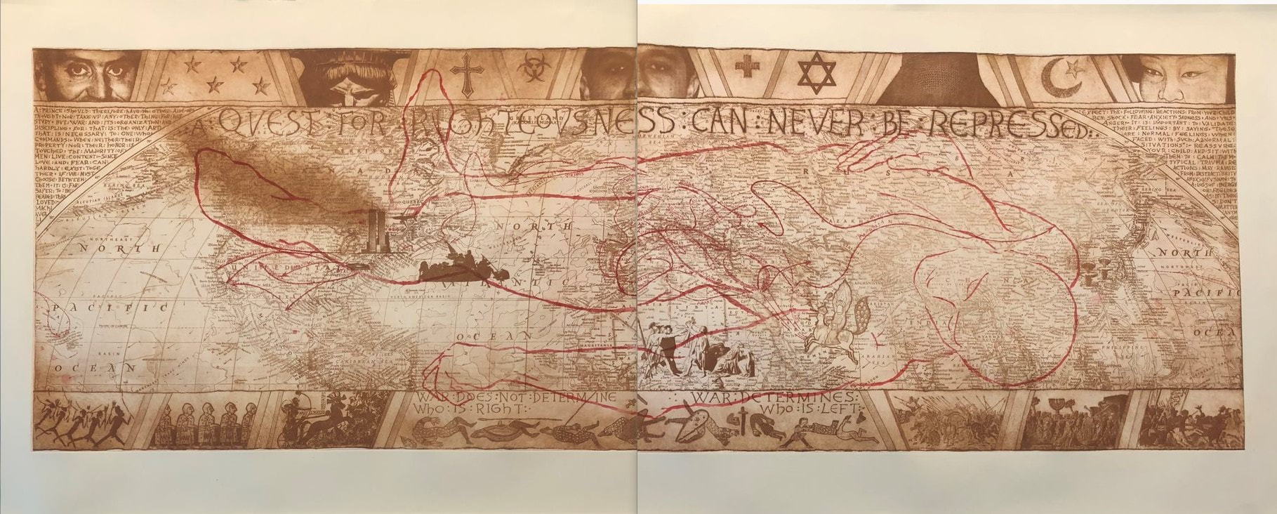 Tru Ludwig (American, born 1959). TapHistory (Repeated), 2005. 4-plate etching. 29 ½ x 76 ½. The Purple Crayon Press, Baltimore.
0 Comments
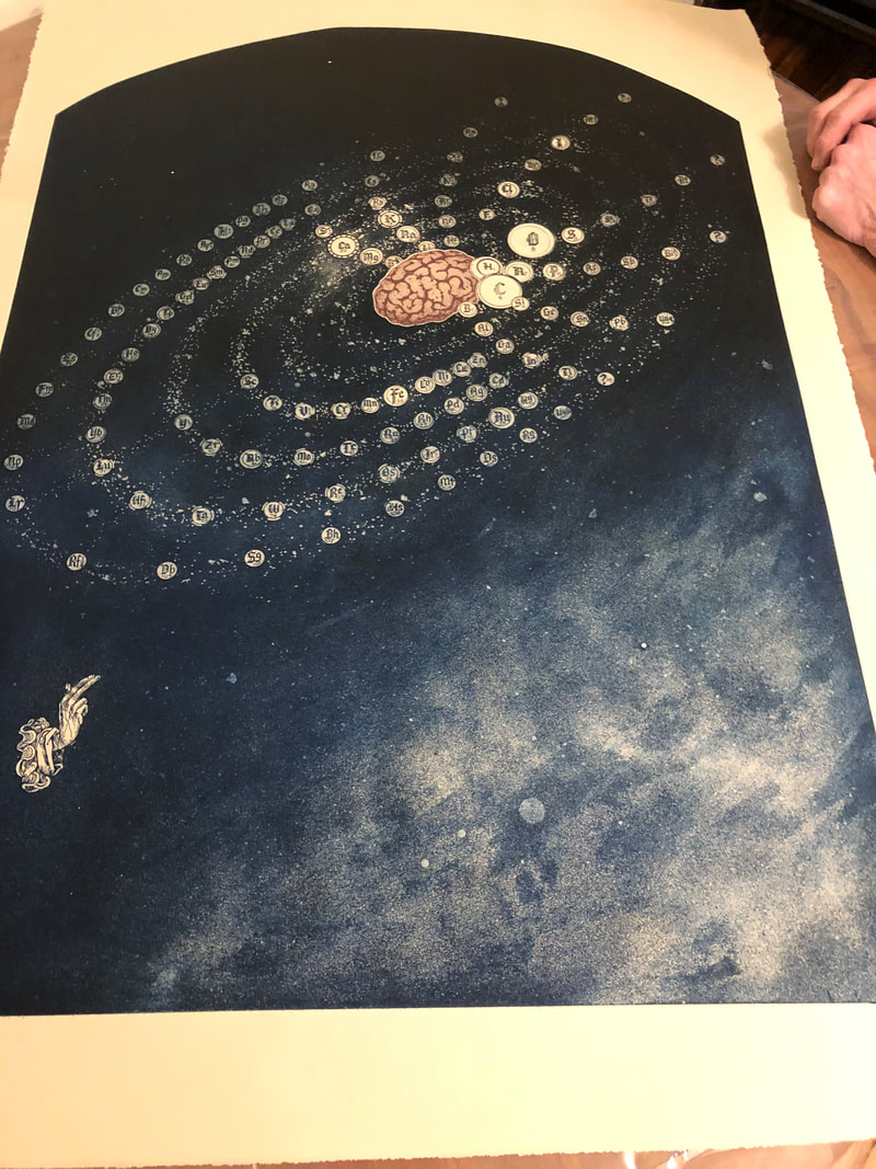
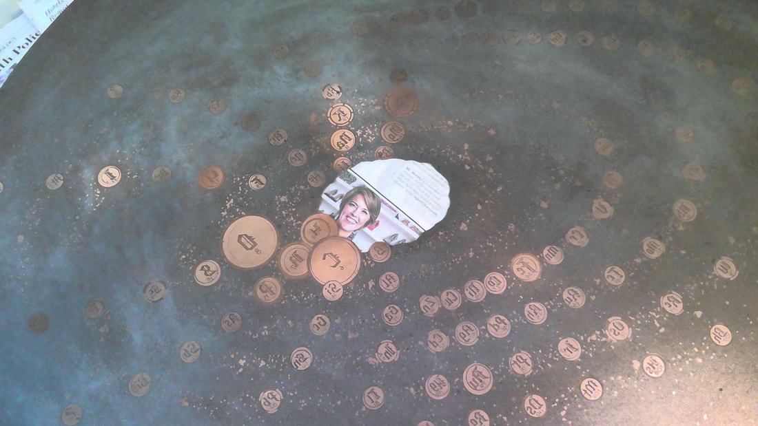
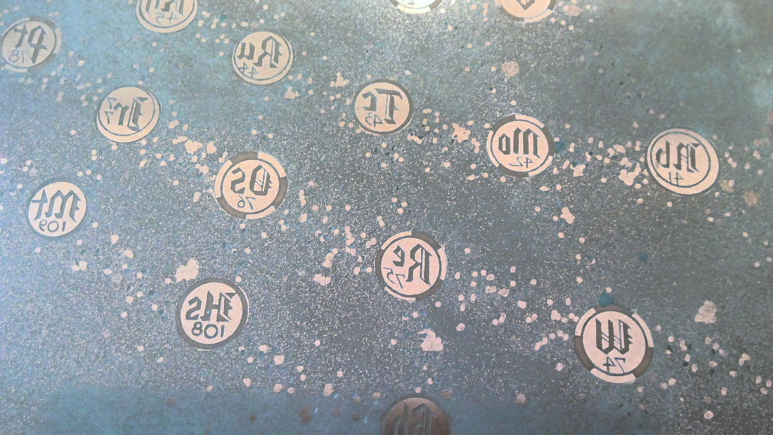
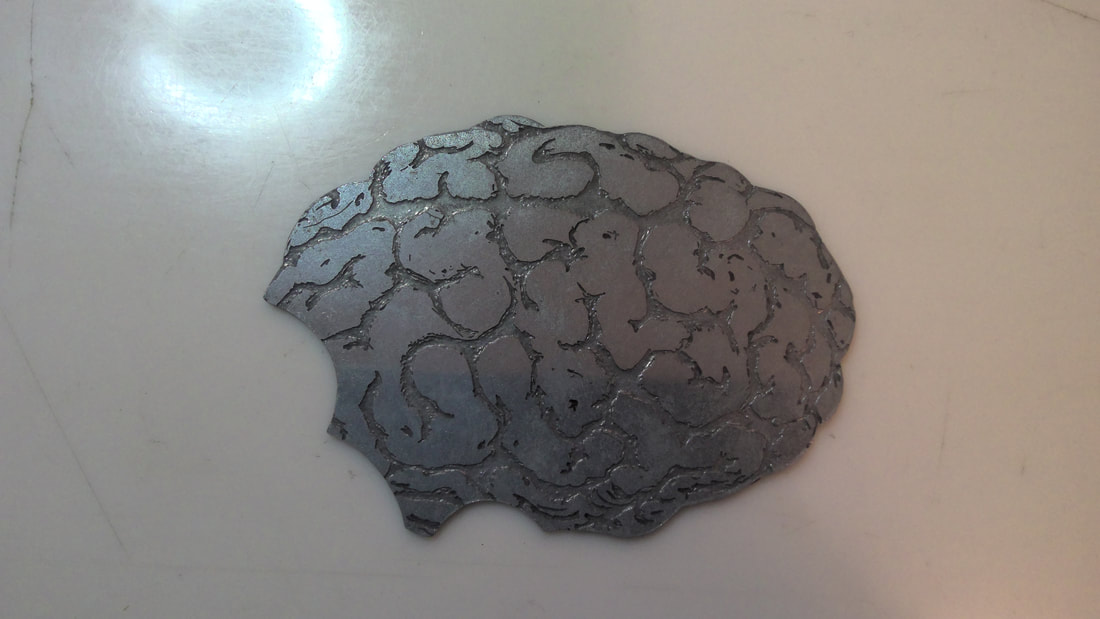
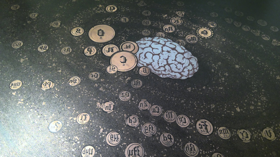
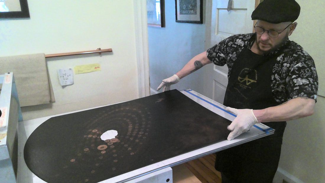
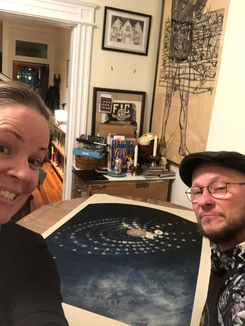
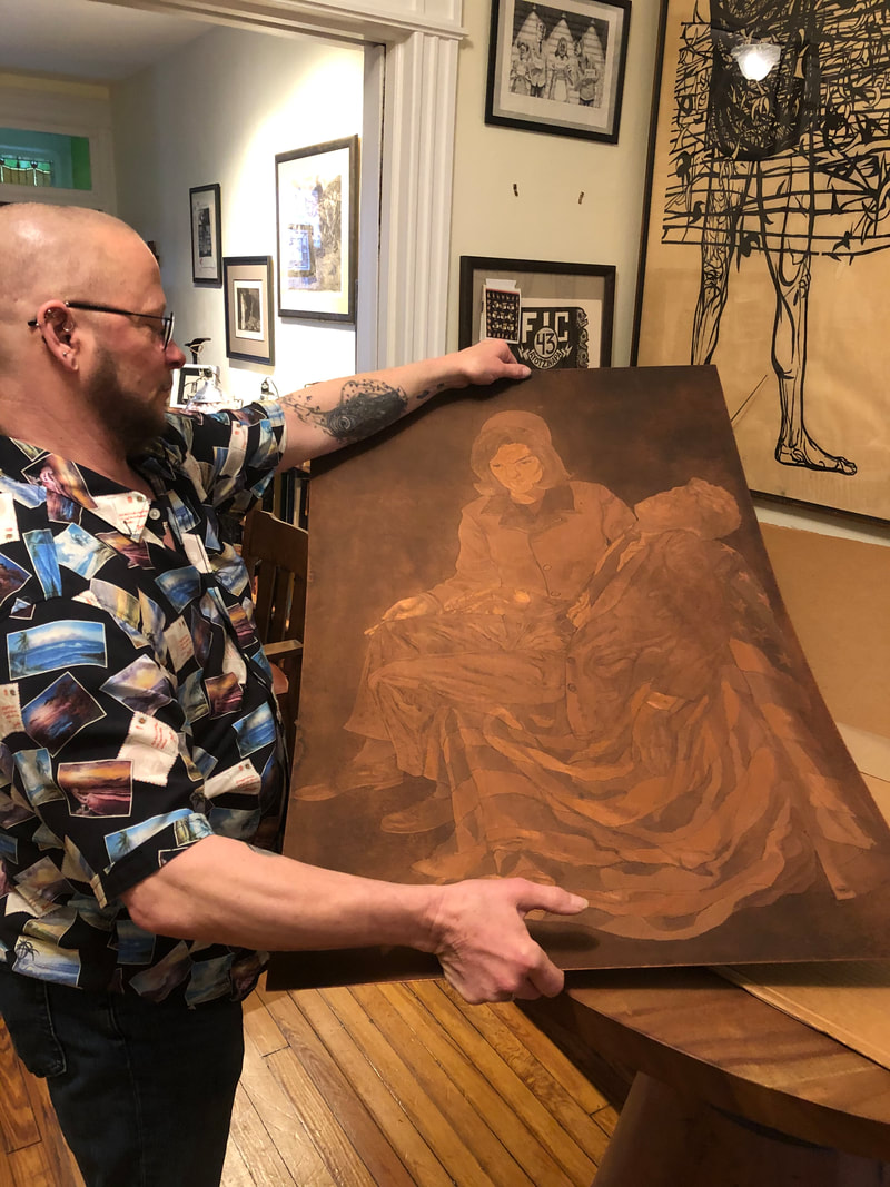
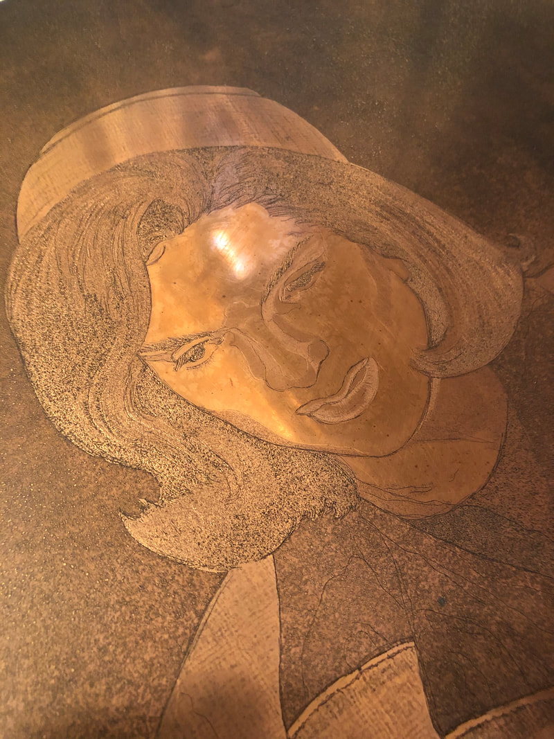
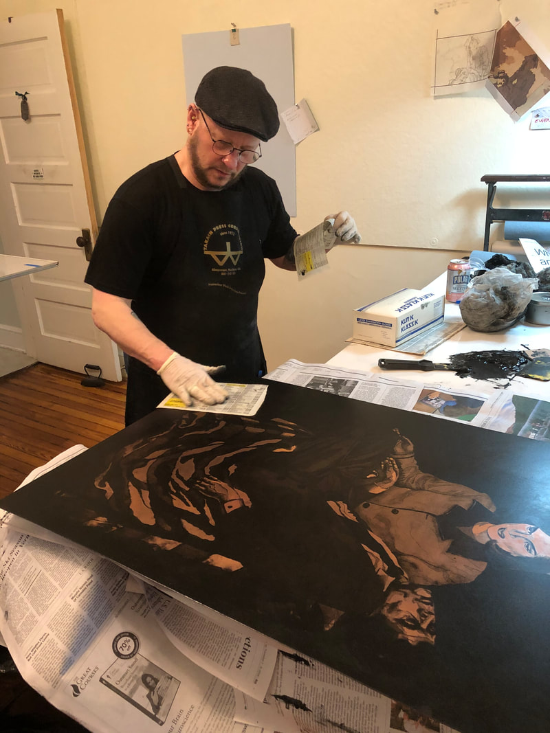
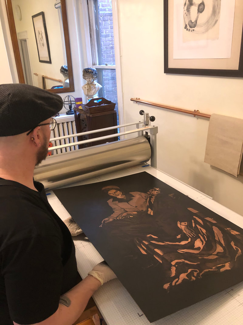
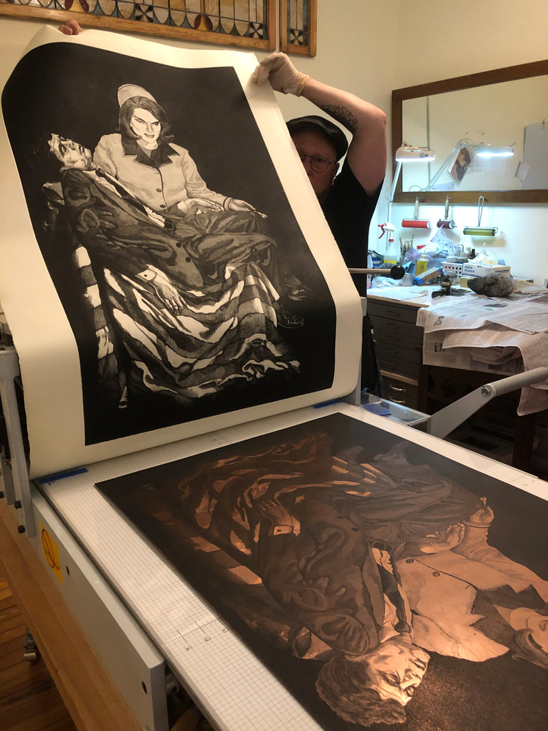
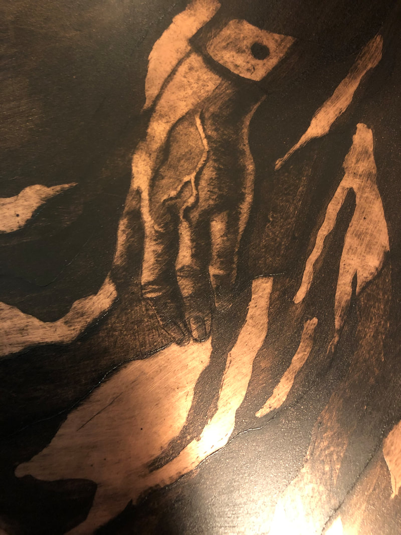
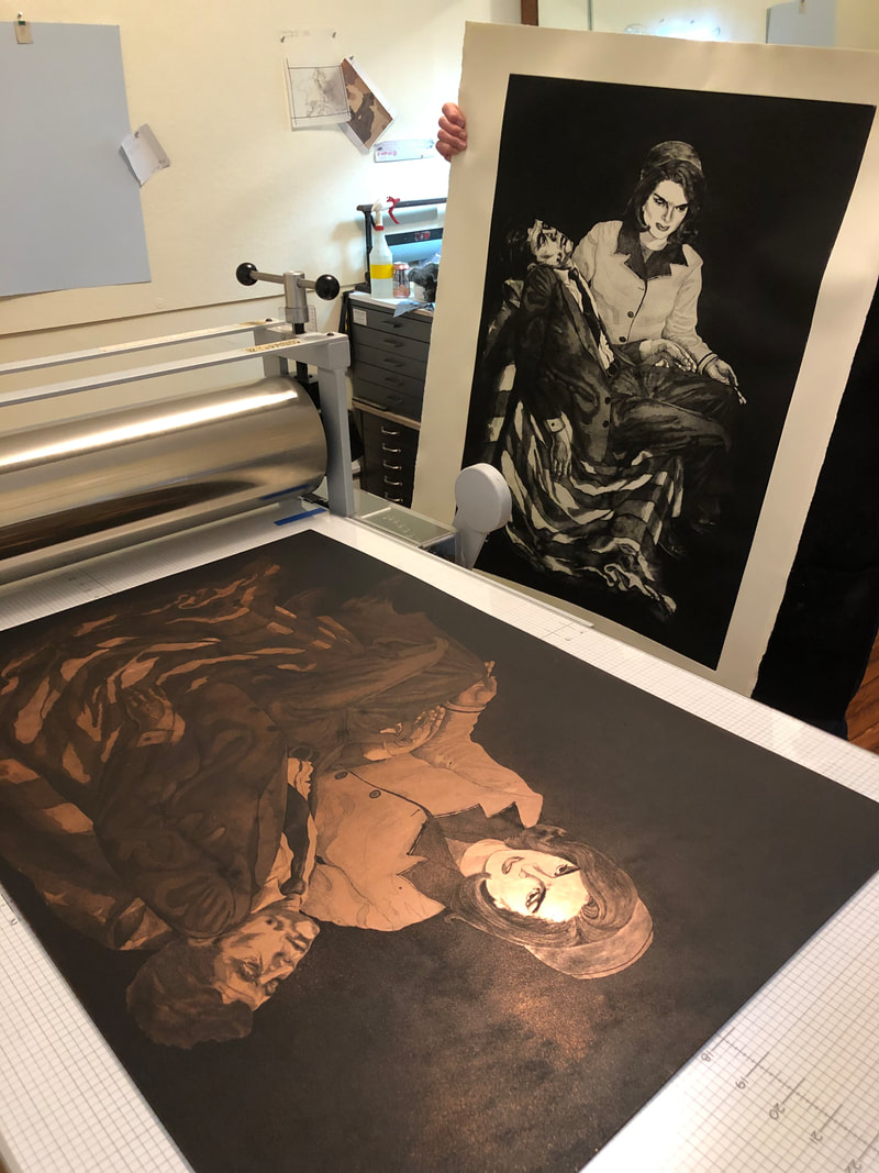
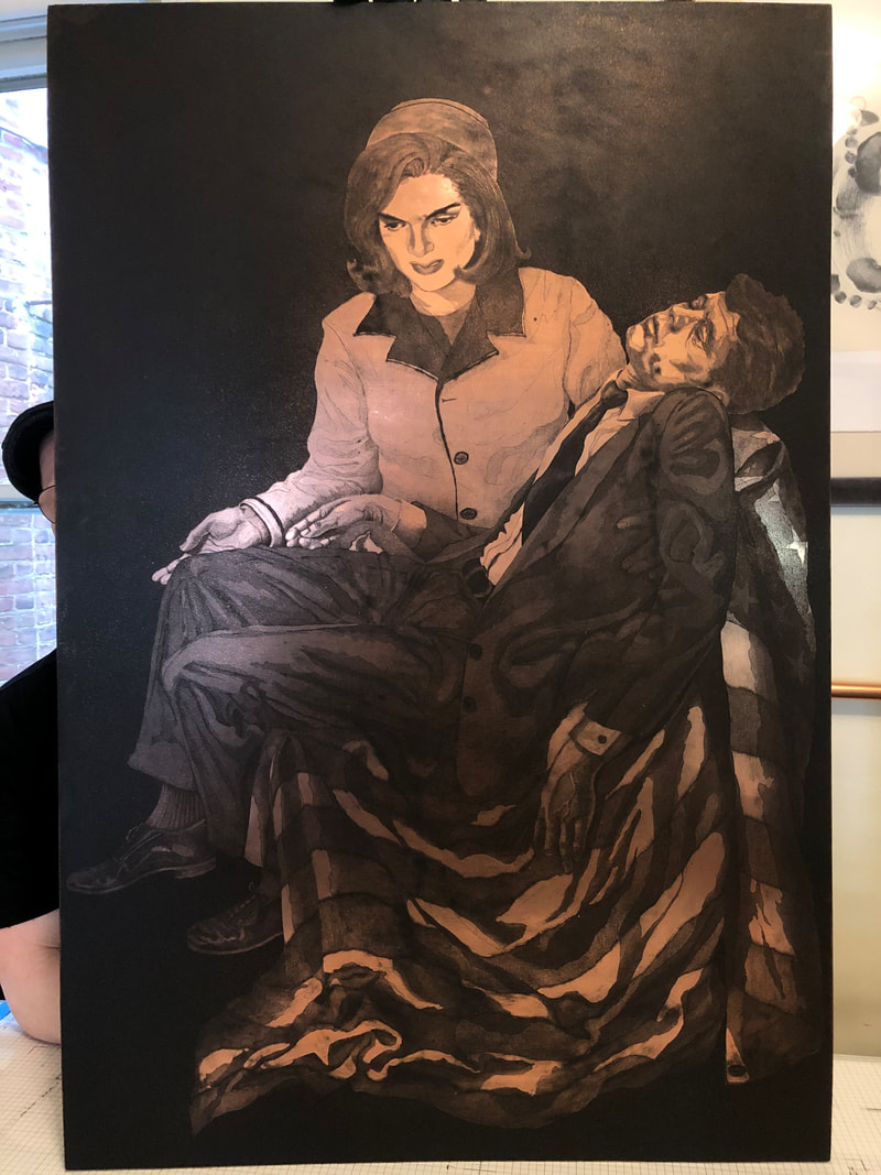
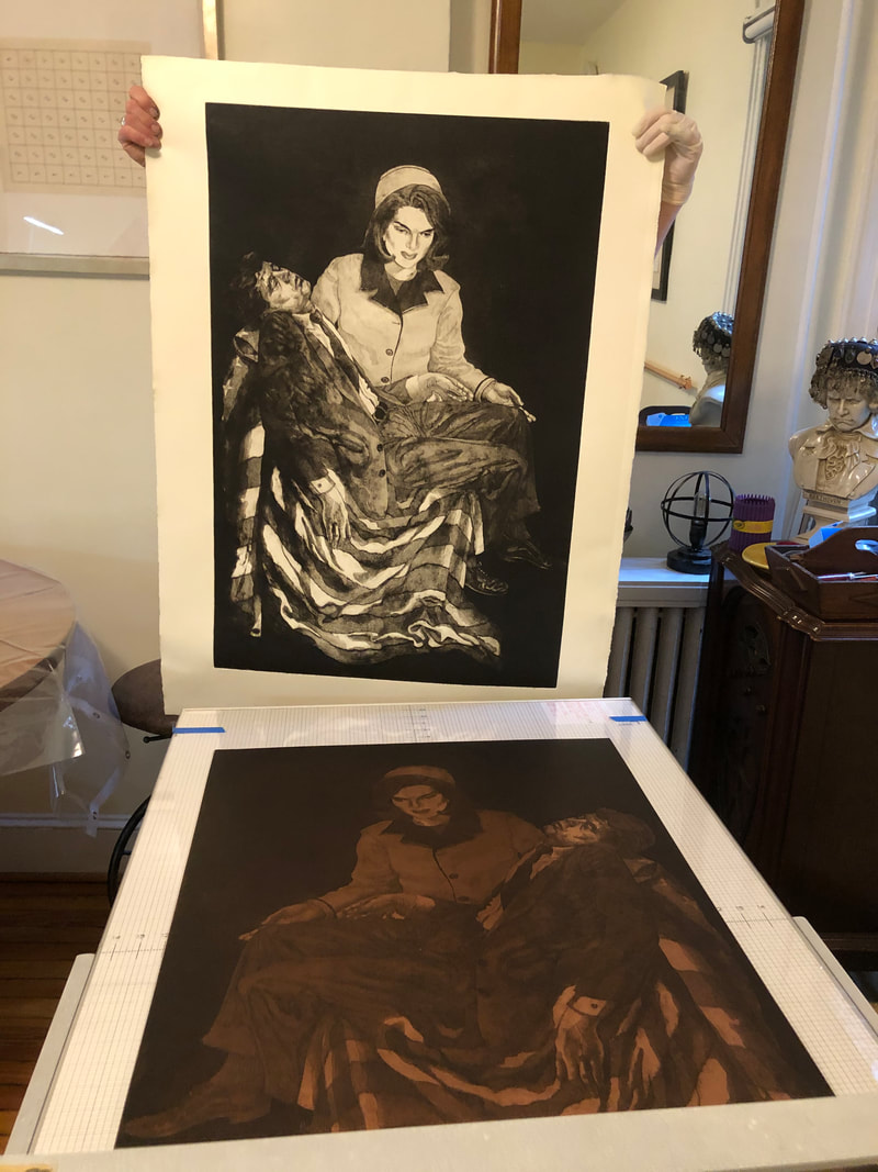
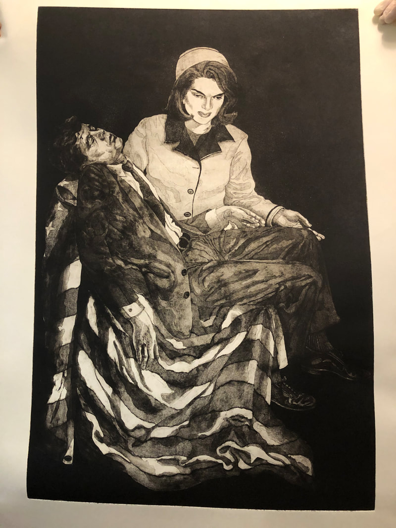
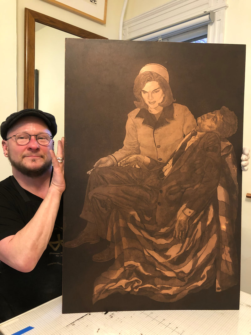
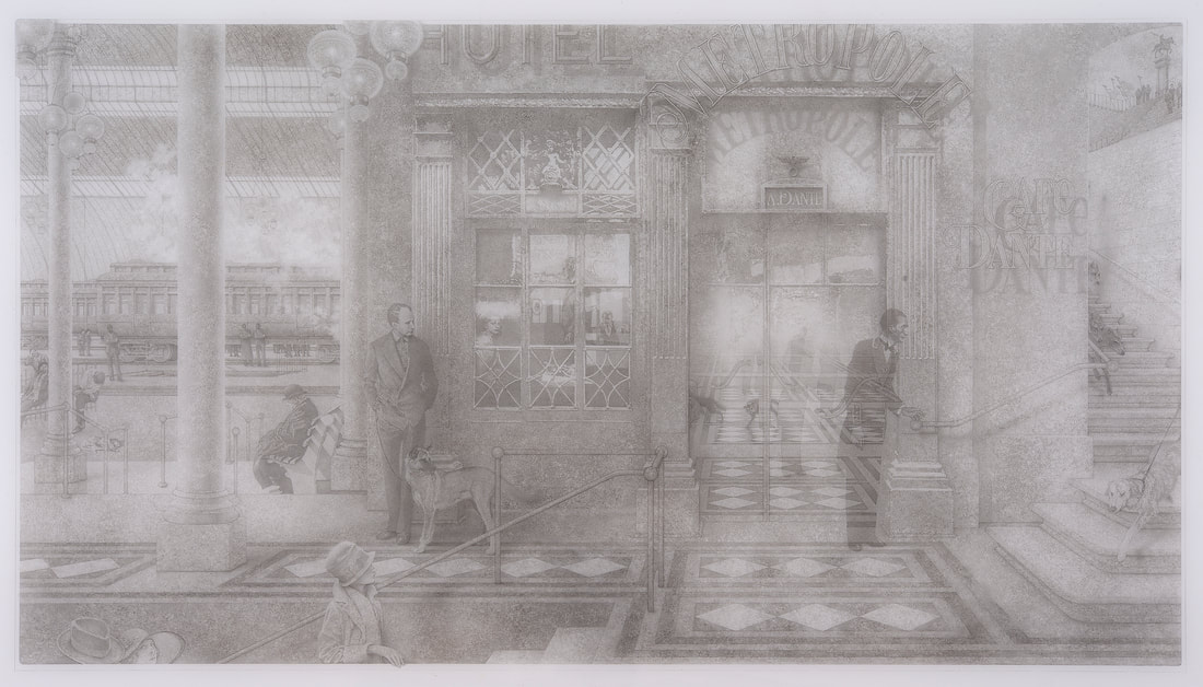
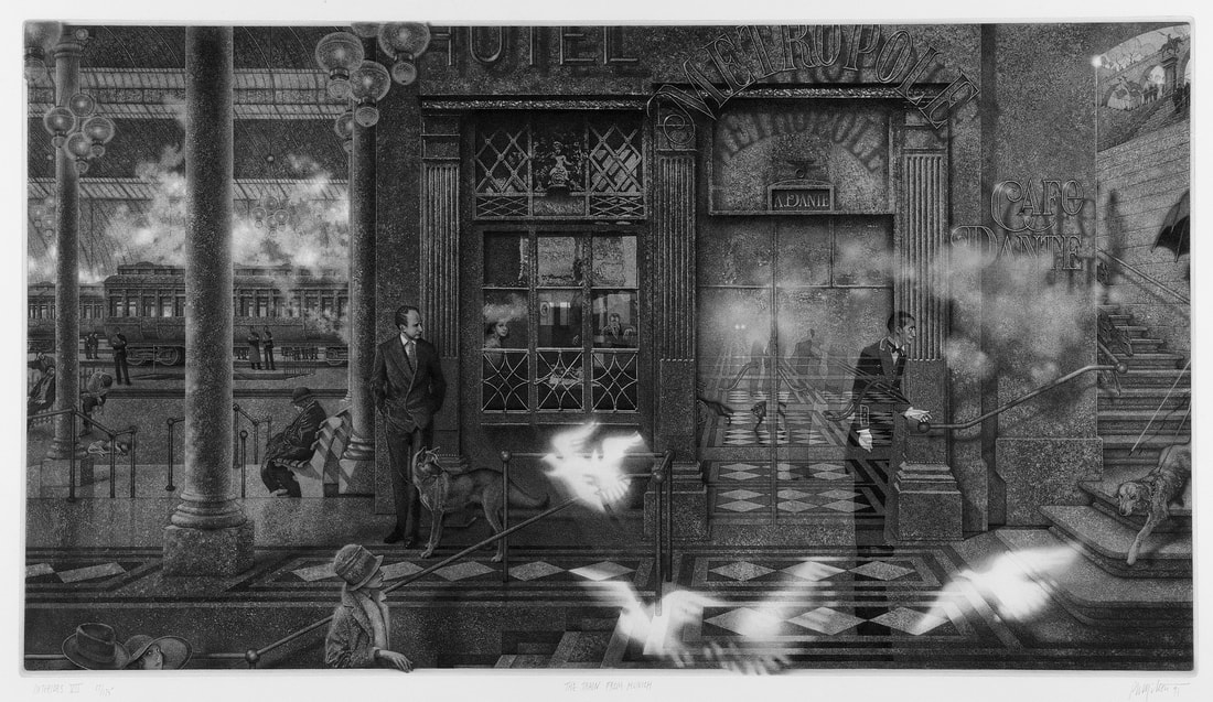
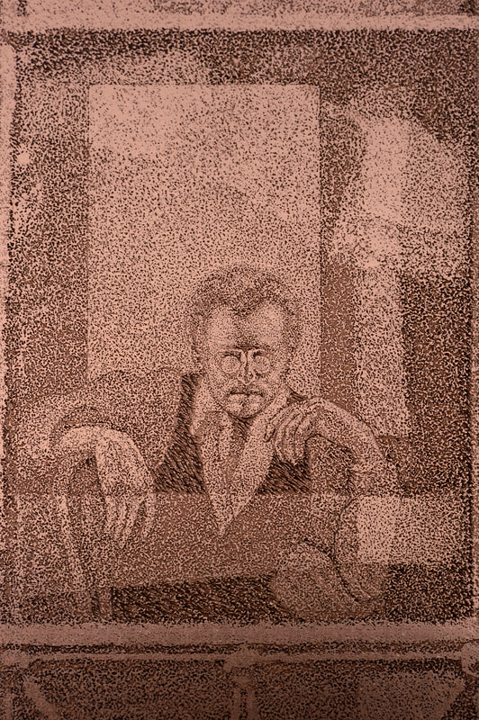
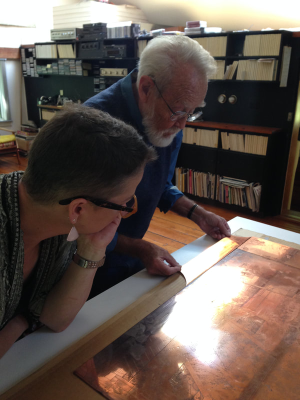
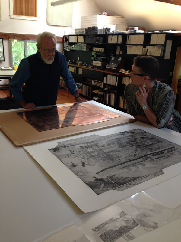
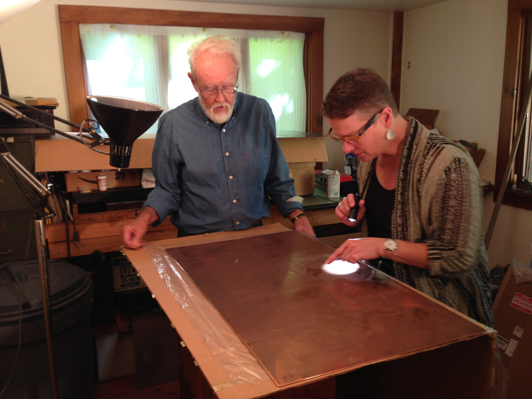
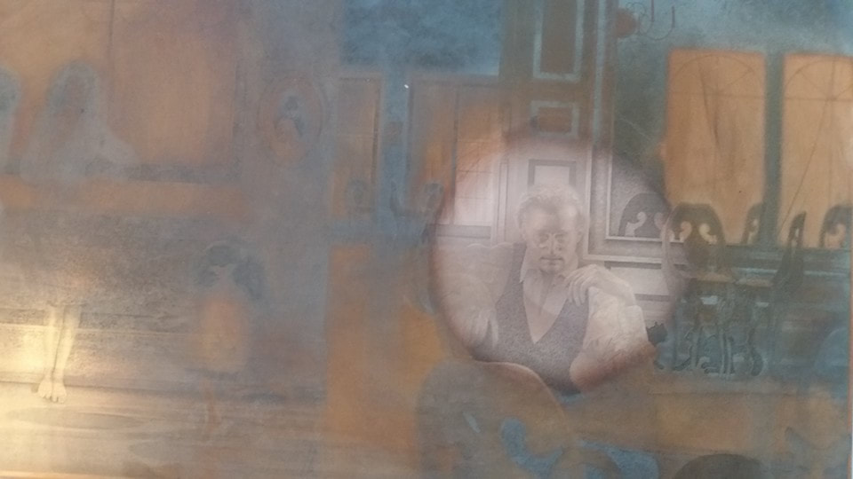
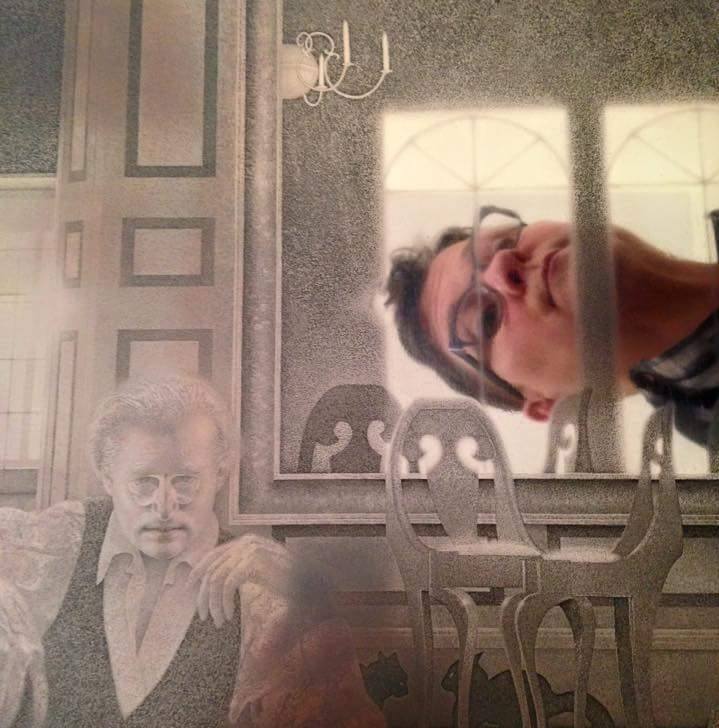
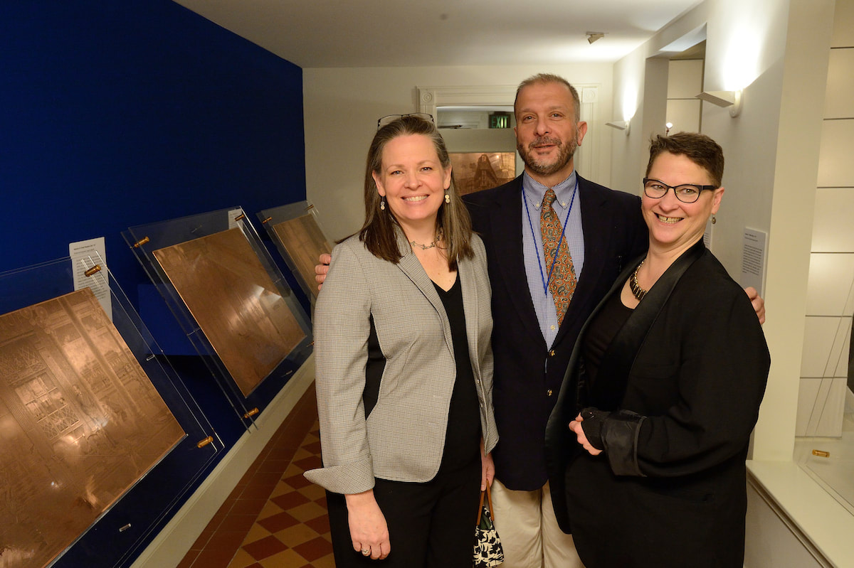
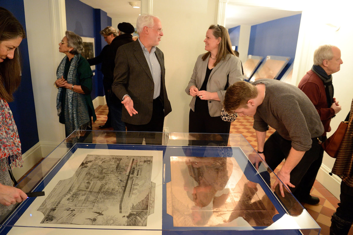
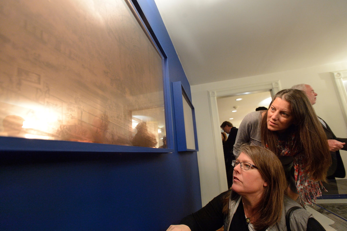
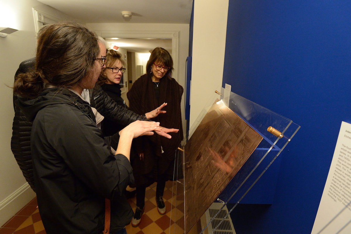
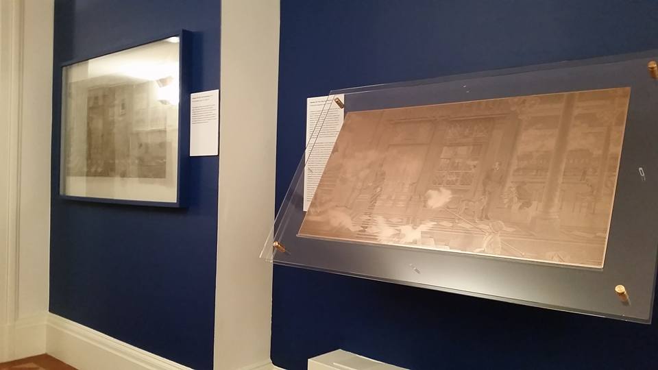
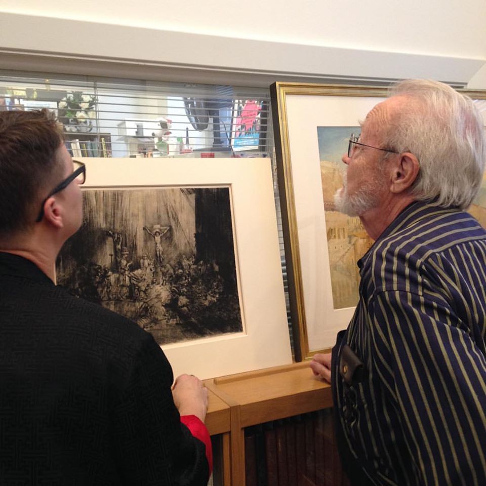
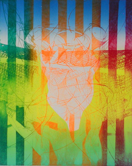
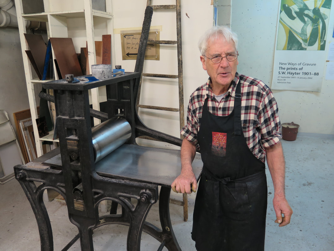
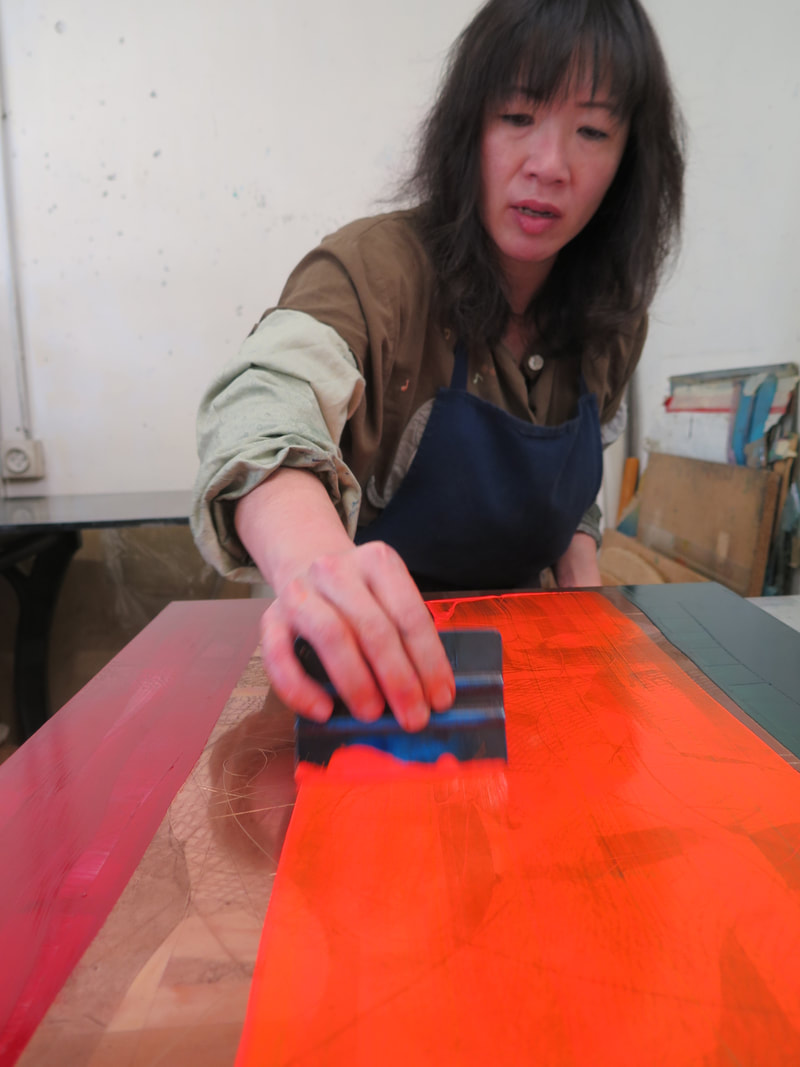
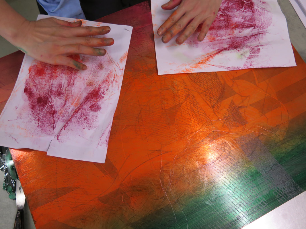
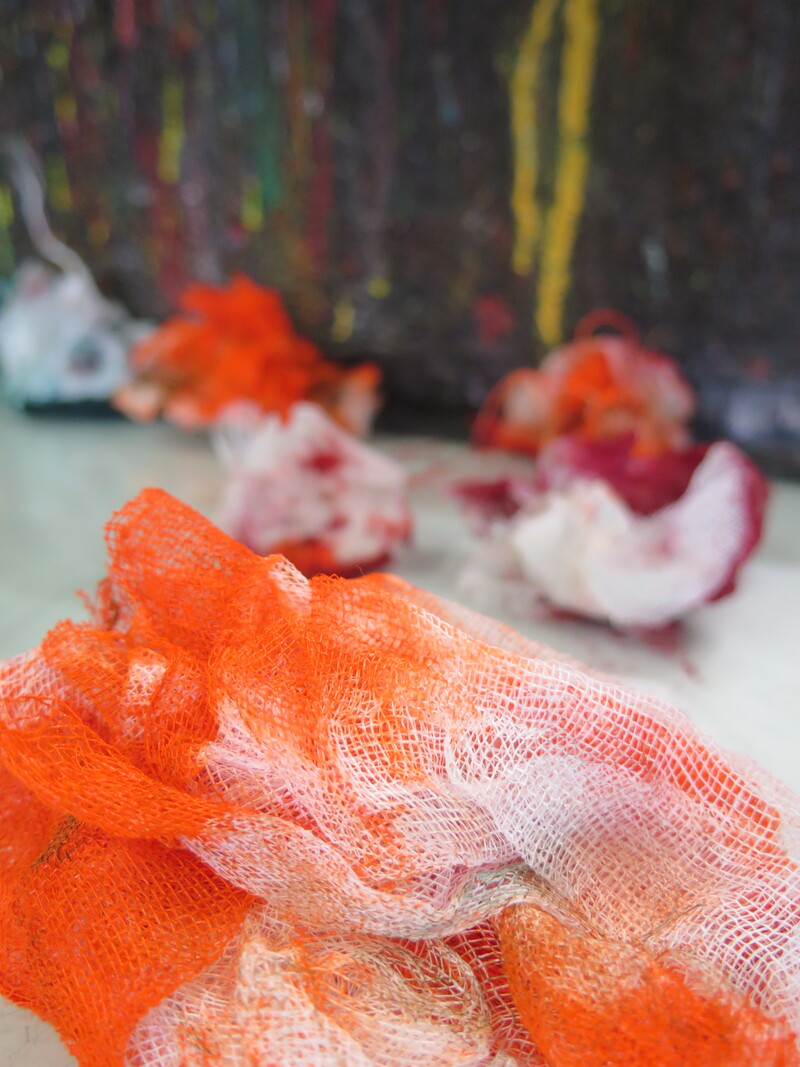
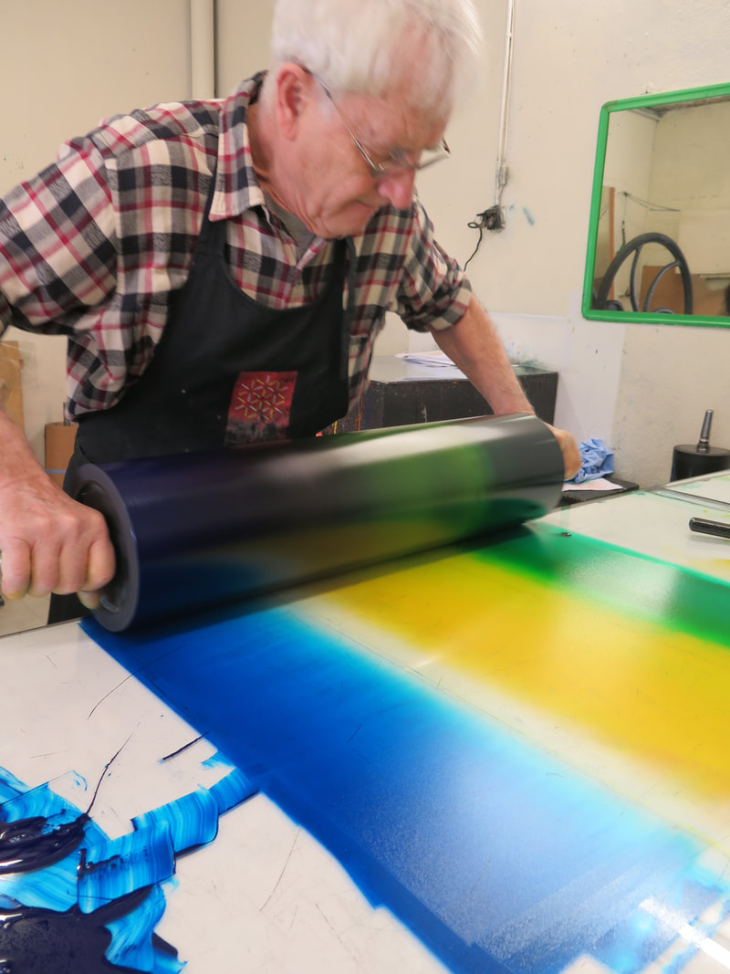
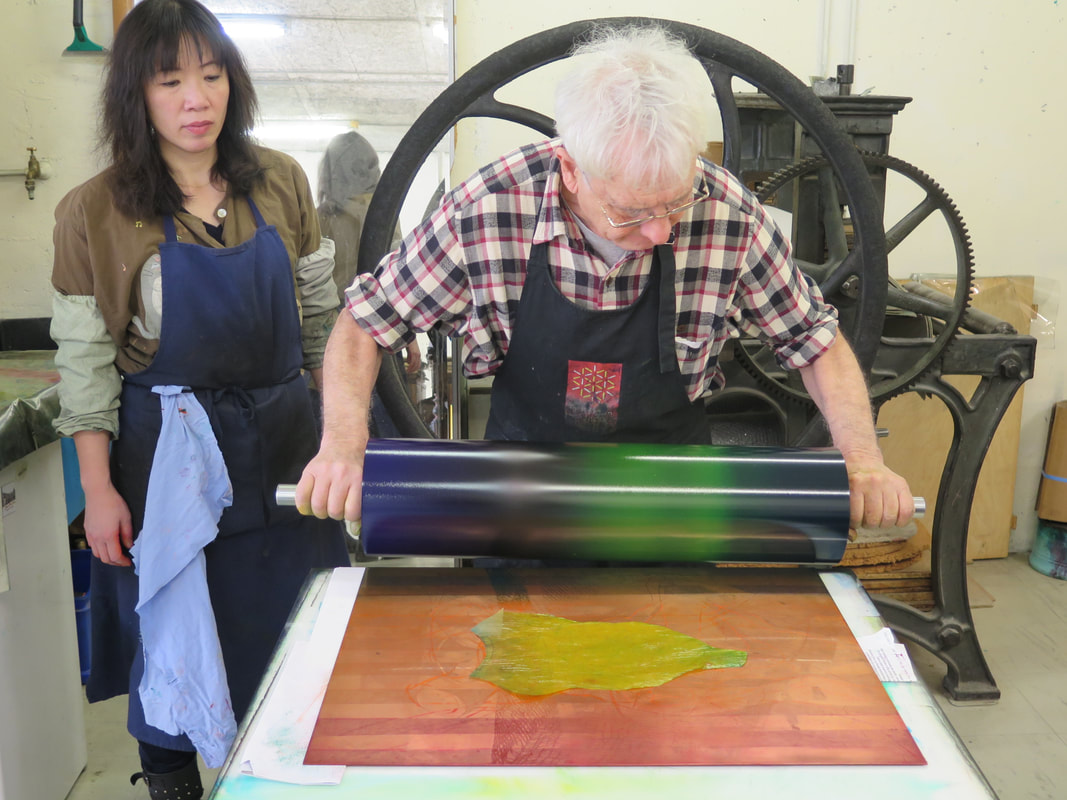
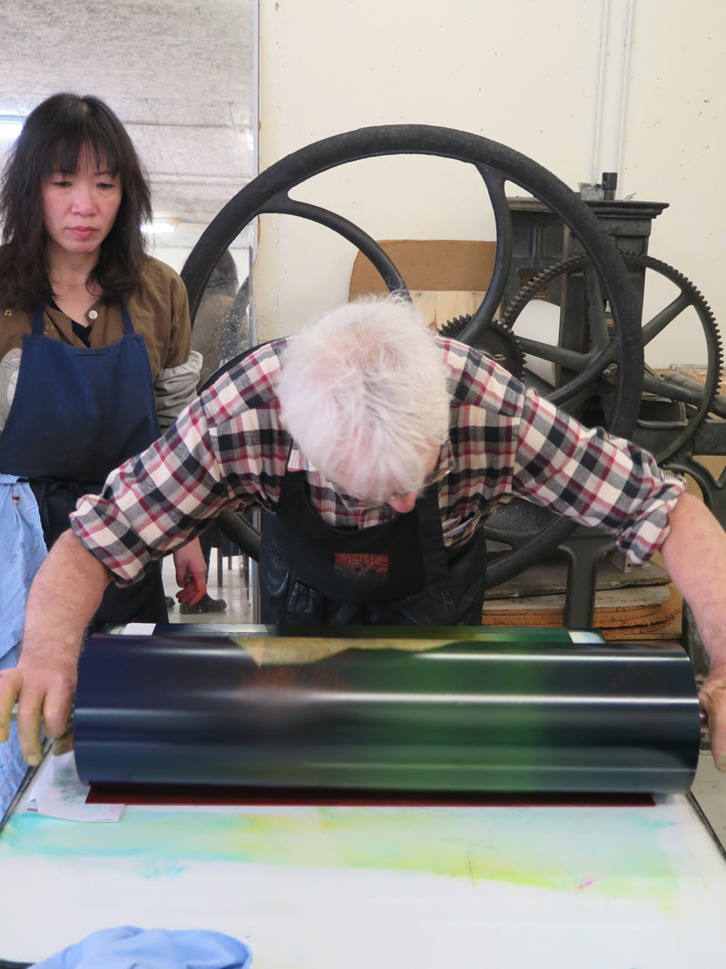
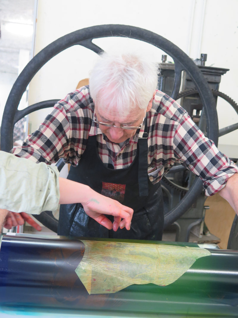
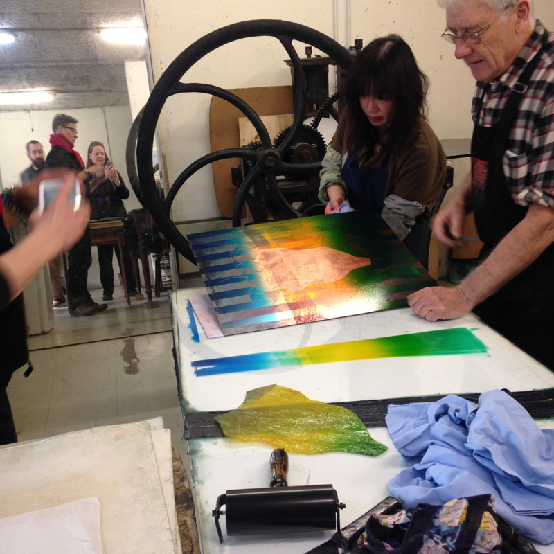
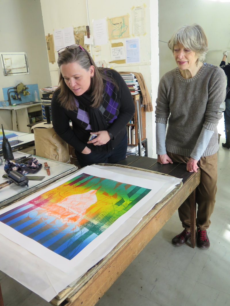
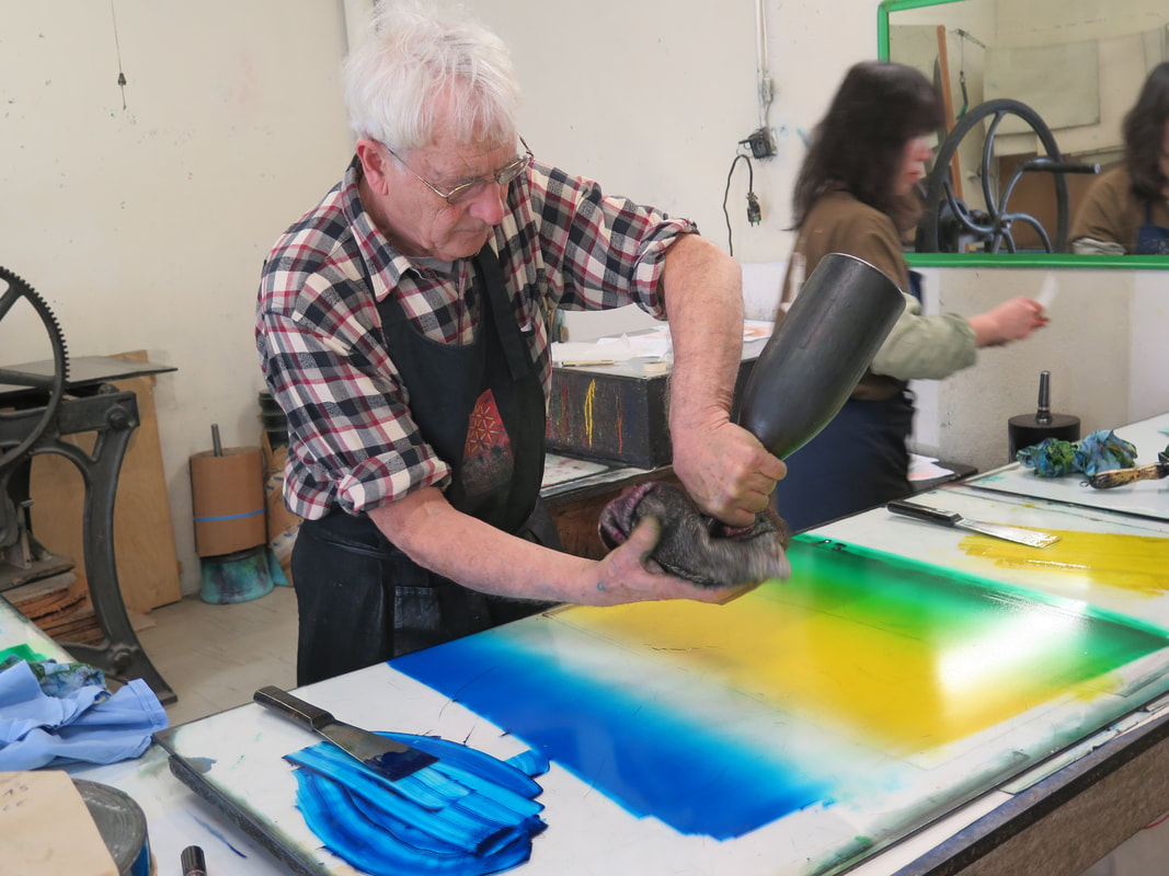
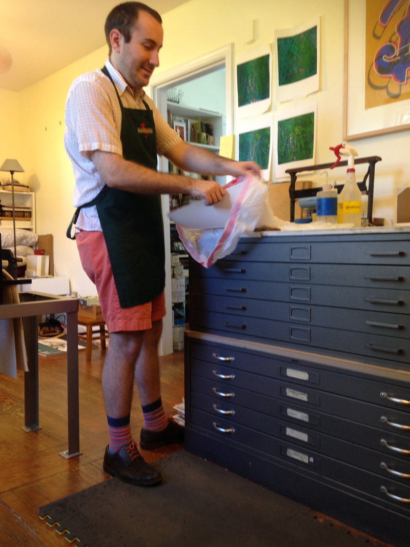
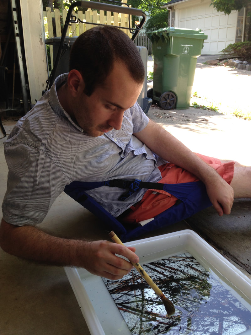
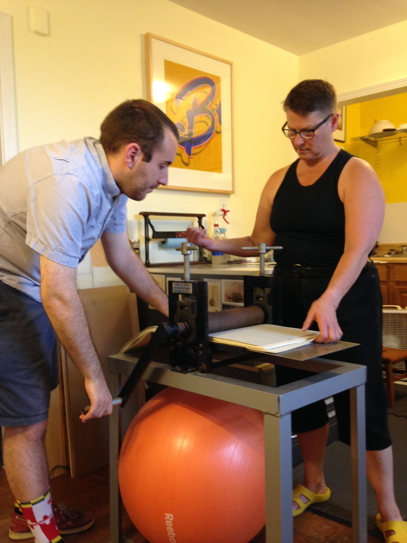
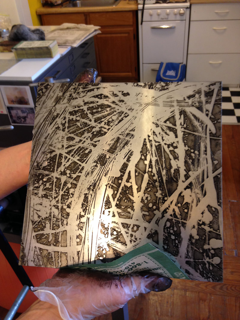
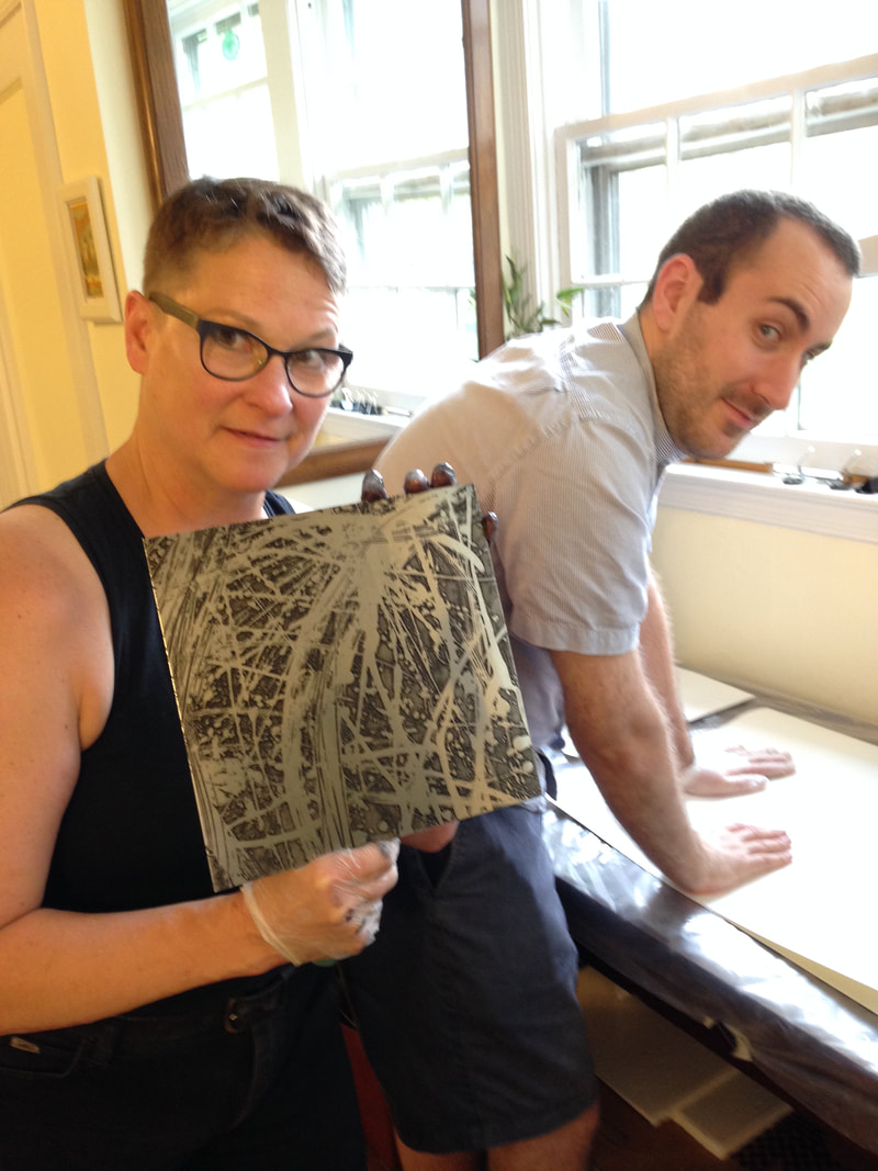
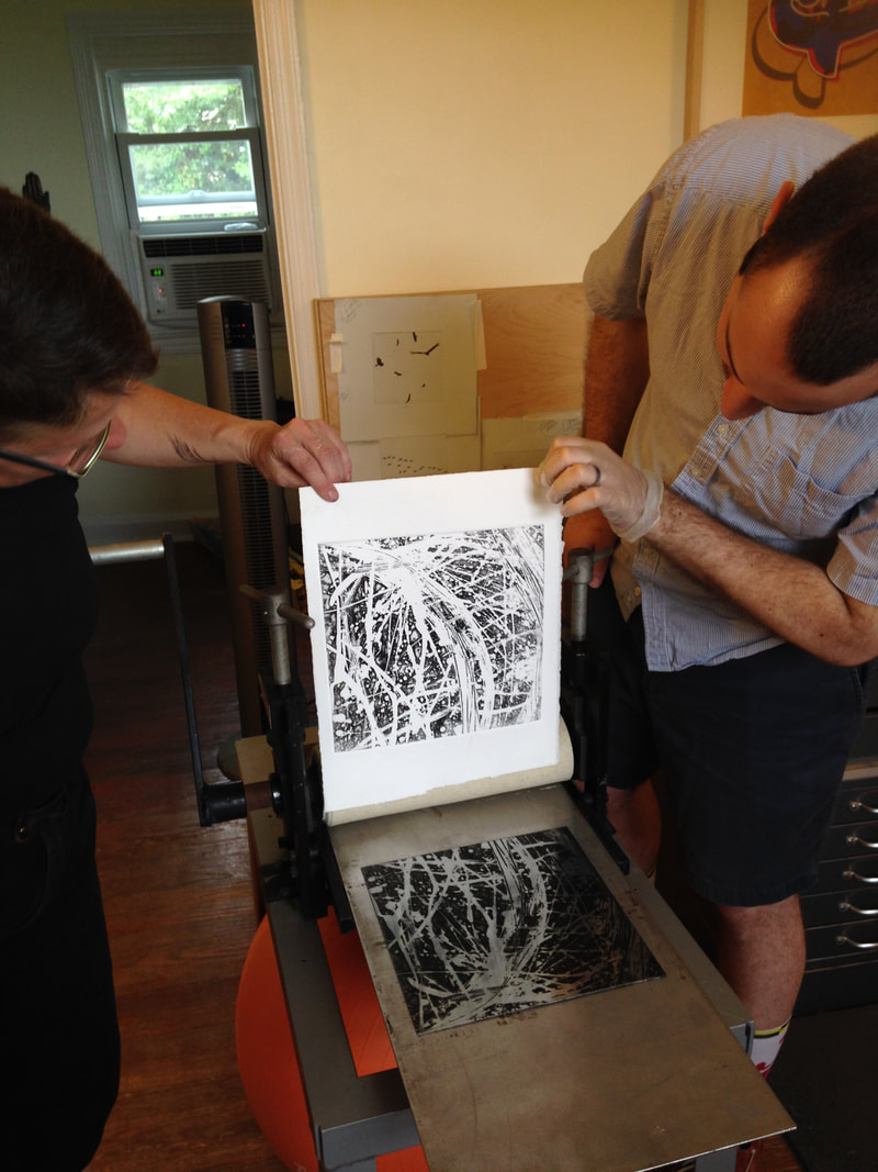
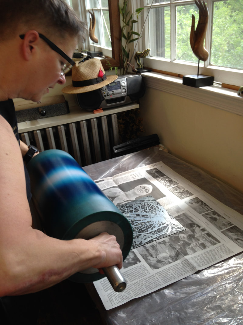
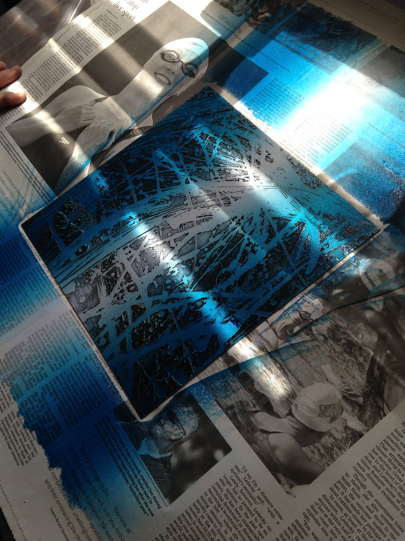
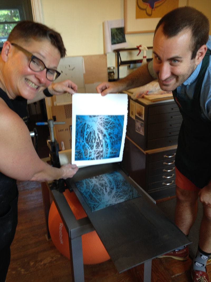
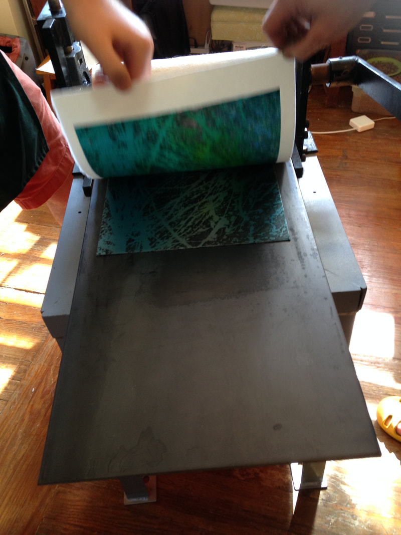
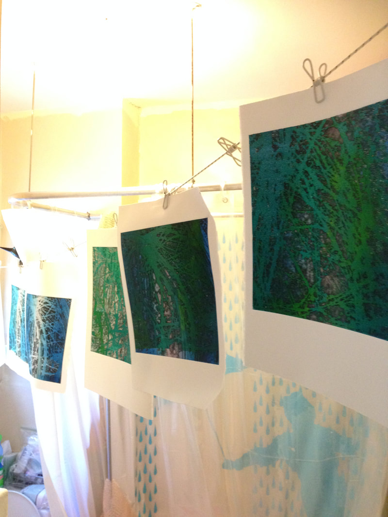
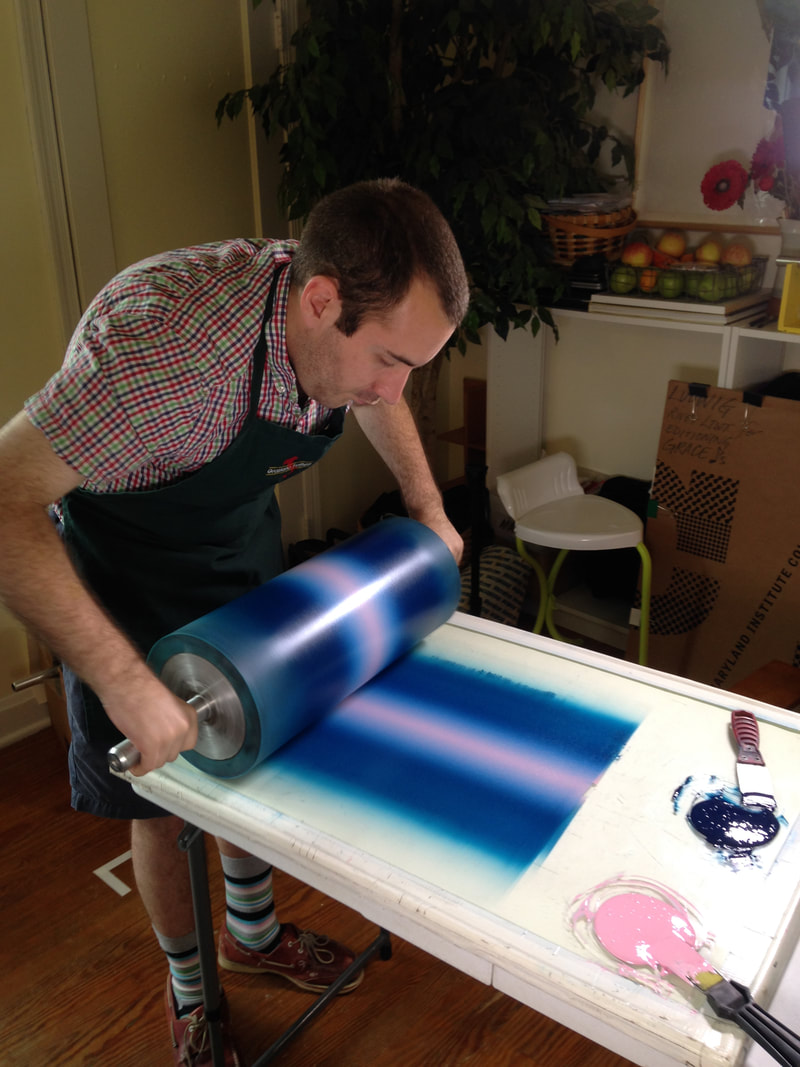
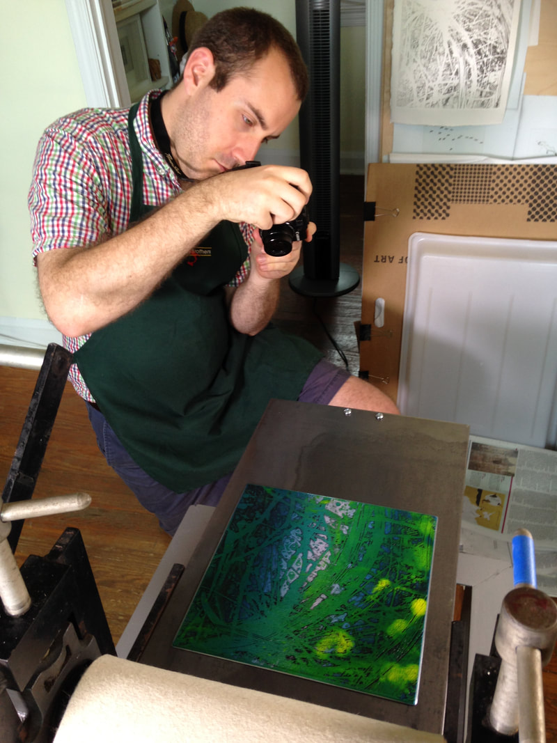
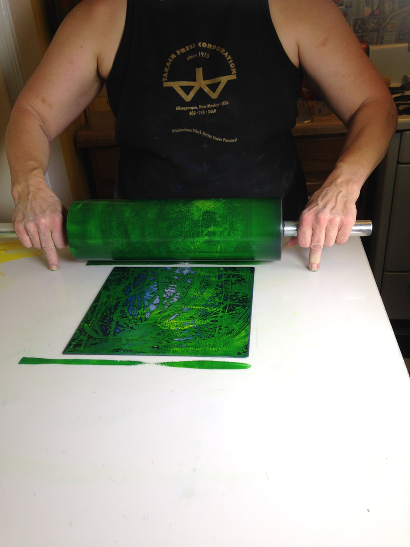
Ann Shafer The Big Bang. How do you express the formation of the planet and its inhabitants, and what kind of craziness had to come together to create the elements that, put together, make humans capable of thought, creativity, love? It’s really all dumb luck, isn’t it? I recently helped Tru Ludwig print a rather large etching tackling this concept, Dumb Luck, 2009. The composition is a ring of periodic table elements swirling around a human brain set against a galaxy of stars. That brain is a zinc plate cut to fit into the center of the copper plate. The image is printed in blue-black (on the copper plate) and deep red (on the zinc plate). Scribing the element symbols took Tru three months to complete. I believe it. They are intricate, delicate discs floating on an aquatinted galaxy of stars and planets. Three bright white, far-off stars are drilled holes in the plate that carry no ink. They are a small yet vital part of the composition. Then there is a set of blessing hands at lower left. So, in addition to pondering the dumb luck that enables our existence, it raises questions about whether a higher power had a hand in our design. I love this print. I’ve always loved looking at pictures of the stars and galaxies and I’ve always been amazed by the Big Bang theory. How could it be that all this was created without some sort of intentionality? I’m not a particularly religious person, but it does make one wonder. That Tru figured out a way to convey this mystery astounds me. You may recall that Tru and I printed another of his prints, Ask Not…, last weekend, during which I was sort of helpful. I think I graduated to really helpful printing Dumb Luck. By the end of the session, I was wiping that little brain without supervision. I was wiping those element discs. I even came up with a method of quickly removing the first layer of ink—I’m pretty proud of that. We fell into the print-shop ballet that will be familiar to anyone who prints. I loved being in the studio and it reignited my long-held desire to open a print shop and publish prints. If only I would win the lottery in order to be able to do so. <sigh> Ann Shafer There’s one part of being a curator that may shock you. There is no requirement that a curator has ever made a work of art in the manner of those objects they study and work with on the job. I mean, they have to know the basics and be able to describe them, but they don’t have to have done it themselves. I’ve watched lots of demos, made a linoleum cut in grade school (still have the scar to prove it), and I’ve been on hand during the printing process, but have always been the extra pair of hands. I’ve never inked, daubed, wiped, and printed a plate. Until recently, that is. If you’ve been following along, you know that Tru Ludwig and I have been friends and colleagues for a good long time. Tru is the MICA professor with whom I taught history of prints for over a decade. I have also told you that Tru and I have traveled together to take in exhibitions and art fairs: New York, Philadelphia, Washington, London, Paris. We’ve shared a lot of hotel rooms, meals, and more than our share of vodka martinis (dirty and really dirty, respectively). But you probably don’t know that Tru is a kickass printmaker. I’ve always admired his woodcuts—there is one in the Baltimore Museum’s collection and I used it frequently for classes in the studyroom. And I’ve seen just about all of his other works. But one had always eluded me, Ask Not...—I’d only seen it in a pretty bad, discolored reproduction. But I knew it was special and that I would give a lot to have an impression. Lucky for me, the plate for Ask Not..., with Jackie and JFK as Pietà, is in fine shape, even after sitting in storage for twenty plus years. After a bit of Weenol, it was ready for its closeup. We managed to pull three impressions on Saturday. Jeepers, it’s a big plate. I was surprised by the amount of ink needed to cover the plate, both less and more than I thought. I was surprised how long it took to wipe the plate. I was surprised by how many variations of wiping went into the enterprise. And it confirmed for me that wiping and printing are just as critical as the making of the plate. It really was an education. And of course, there’s no better teacher than Tru. So, the print, Ask Not.... It’s a mash up of a critical piece of American history portrayed in the manner of an important Renaissance artwork by none other than Michelangelo (love a nod to art history), and turns the focus to not the main character (JFK), but a supporting one (the first lady). Tru’s etching gives us Jackie Kennedy holding the limp, dead body of President Kennedy on her lap in the same way the Virgin Mary holds the dead Christ in Michelangelo’s glorious marble sculpture. (If you’ve never seen the Pietà in St. Peter’s at the Vatican, don’t miss it if you get to Rome. Seriously.) It’s a simple gesture, but so full of meaning, emotion, power. (Remember, less is sometimes more.) Sometimes an image socks you in the gut. Like the Virgin in the Pietà, the image of Jackie holding JFK reminds us of her grace under extraordinary circumstances. Here she is still wearing the pink suit that had been splattered and soaked with the blood of her husband. It is well known that the first lady kept that suit on throughout the long day following the death of the president. She understood the power of images and was heard to say: “let them see what they've done." JFK is being cradled by an American flag, which seems to puddle along with our hope for the future. Tru’s draftsmanship is spot-on. And there’s something about the action of the corrosive acid used to etch the copper plate that lends itself to the subject. It feels like the copper is fighting to be turned into something, in the same way that we are fighting to be seen and heard and acknowledged. That the country’s sorrow should not be in vain. That at this point in our history, we should take a moment to remember what we have all fought for, and what so many have died for. There’s something at once delicate and harsh about the technique and about the subject. A pure confluence of content and method. It all feels more timely than ever. Ann ShaferI’m a super fan of intaglio printmaking—intaglio refers to printmaking techniques in which the image is incised into a surface and the incised line or sunken area holds the ink—and I always wanted to do a series of shows on techniques, starting with, of course, intaglio. (Sorry folks, lithography would be last; well, maybe screenprinting.) Stanley William Hayter was a great practitioner of intaglio printmaking, as were all of the artists who worked with him at Atelier 17. Many of them established or ran university printmaking departments, including Gabor Peterdi, who taught at Yale from 1960 to 1986. One of Peterdi’s students was Peter Milton, who must stand as one of the great intaglio printmakers of the latter part of the 20th century. The BMA has a handful of Milton’s prints. One of the most spectacular, Interiors IV: Hotel Paradise Café (1987), is mindblowing for students in MICA professor Tru Ludwig's History of Prints classes. Upon its unveiling one would hear choruses of “wow!” along with mutters of “it’s so not fair.” Its intricacies have both inspired and depressed young printmakers. Tru and I are both fans and when we had the opportunity to hear Milton speak at Jane Haslem’s Washington, D.C., gallery, we jumped at the chance to meet him. After the talk we approached and he and Tru bonded over everything from techniques to history to all the esoteric details that appear in his prints. It was also there that I spied one of his drawings for his series The Aspern Papers, which I eventually acquired for the BMA—more on that in another post. During their conversation, Peter told Tru that he considered the copper plates to be the most beautiful things he makes. The lightbulb went off and the next thing we knew, Tru and I were working together with James Archer Abbott, then director of Evergreen Museum and Library, to curate an exhibition of Milton’s plates, prints, and preparatory drawings. Several trips were made to Milton’s New Hampshire studio and home, where we were welcomed by Peter and his lovely wife, Edith. There we got to interview him, see where the magic happens, and select the plates and other works to be included in the show. To my mind, Milton’s Interiors series is his most important. We included five of the seven plates from that series including The Train from Munich (1995), which focuses on Edith’s 1939 departure from Germany as one of 10,000 children sent on a Kindertransport train taking unaccompanied Jewish children to the United Kingdom for the duration of the war. [Edith and her sister lived with a British family for seven years and she eventually published an excellent memoir about that time called Tiger in the Attic (a NYT review is here: https://bit.ly/MiltonTigerinAttic).] The Train from Munich graces the cover of the catalogue produced for the Evergreen show and it is written about in depth therein. The link to the PDF catalogue is here: https://bit.ly/MiltonCatalogue. Working on the show, I think Tru had the most fun job. He was the muscle responsible for polishing the copper plates. This is no easy task and takes patience and perseverance. In the end, we both agree with Peter. The copper plates are stunningly beautiful and reveal things, objects, and moments that are easily missed in the printed versions. It was an honor to work with this titan of printmaking. And, we owe one last thank you to Jim Abbott for letting us make a dream come true. Ann ShaferYou might be surprised to learn that Hayter's workshop is still operating in Paris at 10, rue Didot. After his death in 1988, the workshop changed its name to Atelier Contrepoint and is run by Hector Saunier, who printed many of Hayter’s late compositions. I was fortunate to be able to visit the Atelier twice, in 2014 and 2015. The first time was to meet Hector and see what the operation looked like. The second time Hayter's widow, Désirée, agreed to bring over one of his plates so Hector could ink and print it for us (there is no one better suited for this particular task). The plan was to create an online feature for the exhibition’s web site, which never happened because the show was cancelled. As usual, Ben Levy and Tru Ludwig were with me, and between the three of us, we shot a lot of video and photographed Hector and Shu-lin Chen printing Hayter’s Torso, 1986. Désirée couldn’t find the plate she was originally thinking of, so she randomly selected Torso, which turned out to be serendipitous because Torso conceptually circles back around to the fist clenching the void discussed in an earlier post. In Torso, Hayter used stripes with inverted color variants, inking the central intaglio composition in green, red, and fluorescent orange, and with a horizontally rolled gradient of blue/yellow/green. The shape of the torso is defined by a mask that was laid down on the inked plate, blocking the rollers from depositing the blue, yellow, and green ink on the paper, producing an area of white across the center. The positive shape of the torso, described by an absence, echoes the conundrum of the untitled plate six from The Apocalypse, in which the negative space of a clenched fist is described by a positive volume. In this late print, the cognitive inquiries and accumulated techniques of four decades have come together. With the copper plate under her arm, we met Désirée on the appointed day at Atelier Contrepoint. After consulting the catalogue raisonné, they got right to work. Shu-lin set about inking the plate (intaglio) in red, fluorescent orange, and dark green in vertical stripes. Hector prepared the rainbow roll of blue, yellow, and green on a glass palette. The mask was still wrapped with the plate, so it was used as well. When Shu-lin was satisfied with her wiping job, the plate was ready for the mask’s placement and the rainbow roll. Hector completed his part and the plate was placed on the bed of the press that had been used for thousands of prints by hundreds of artists over the majority of the twentieth century. After a few unsatisfactory pulls, they printed four impressions, one of which eventually entered the Baltimore Museum of Art’s collection. I remain amazed that I got to experience the printing of one of Hayter’s plates and so appreciative of Désirée, Hector, and Shu-lin’s generosity that day. Even better, Ben Levy and Tru Ludwig were with me to witness the magic. Ann ShaferIn my previous post I talked about Stanley William Hayter's 1959 open bite etching Cascade and promised to dig into its making. It takes many images to describe the process of simultaneous color printing, so I created a PDF slide deck to illustrate how Ben Levy, Tru Ludwig, and I made a group of test prints to figure it all out. You can find the PDF here:
|
Ann's art blogA small corner of the interwebs to share thoughts on objects I acquired for the Baltimore Museum of Art's collection, research I've done on Stanley William Hayter and Atelier 17, experiments in intaglio printmaking, and the Baltimore Contemporary Print Fair. Archives
February 2023
Categories
All
|
||


 RSS Feed