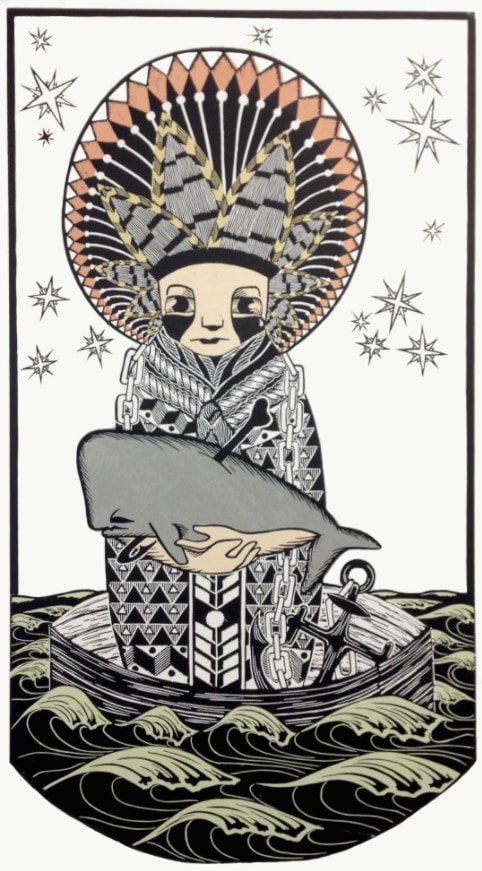
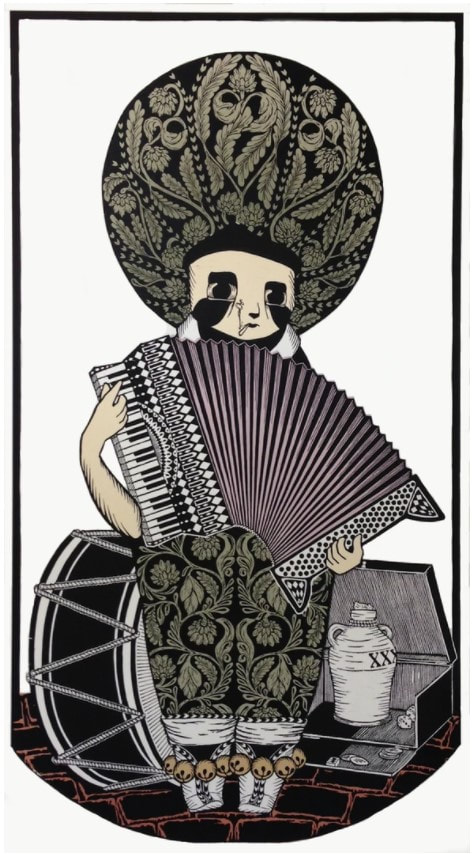
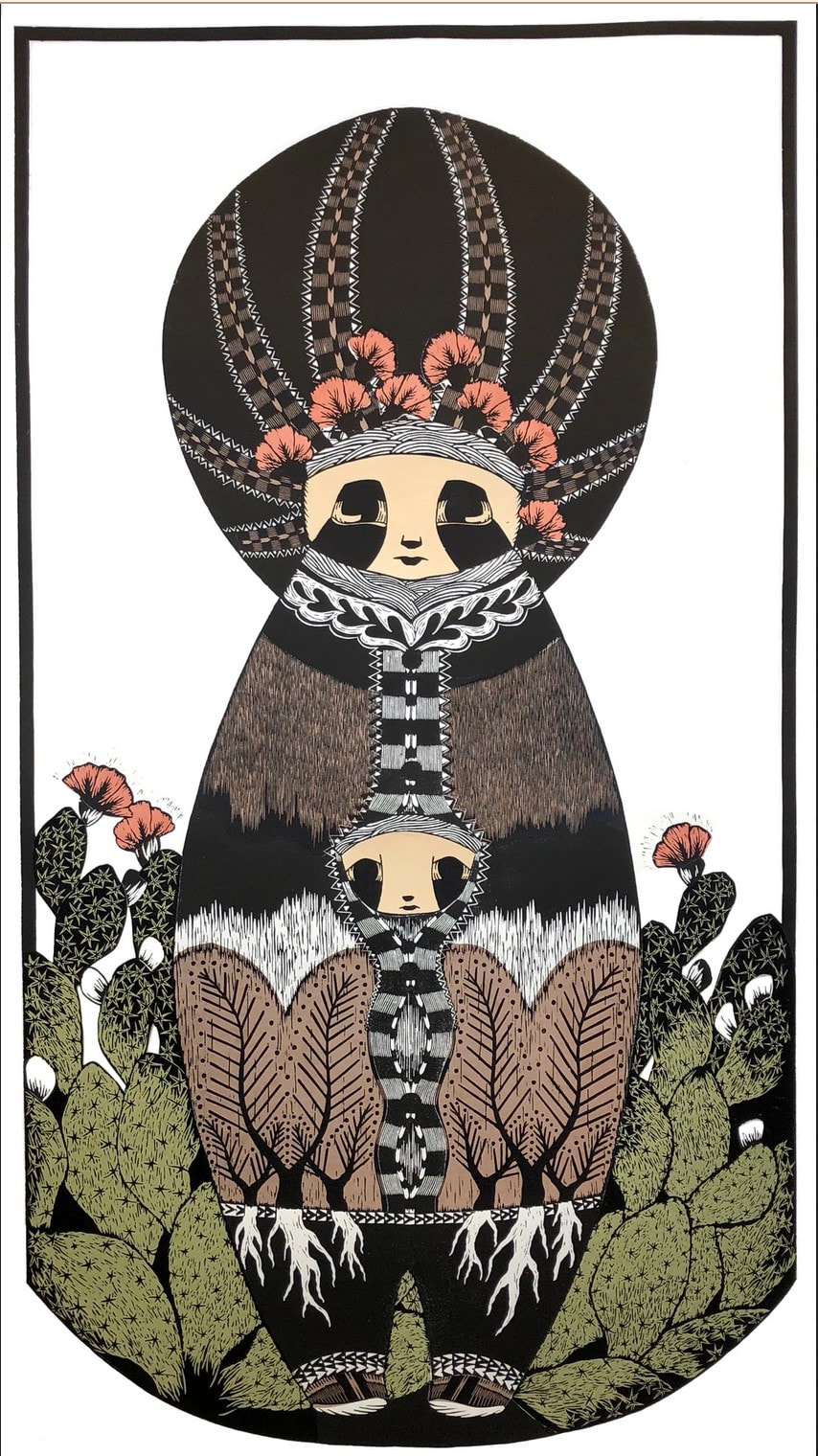
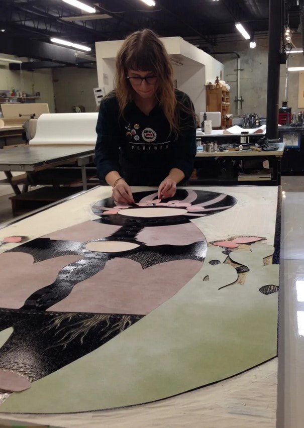
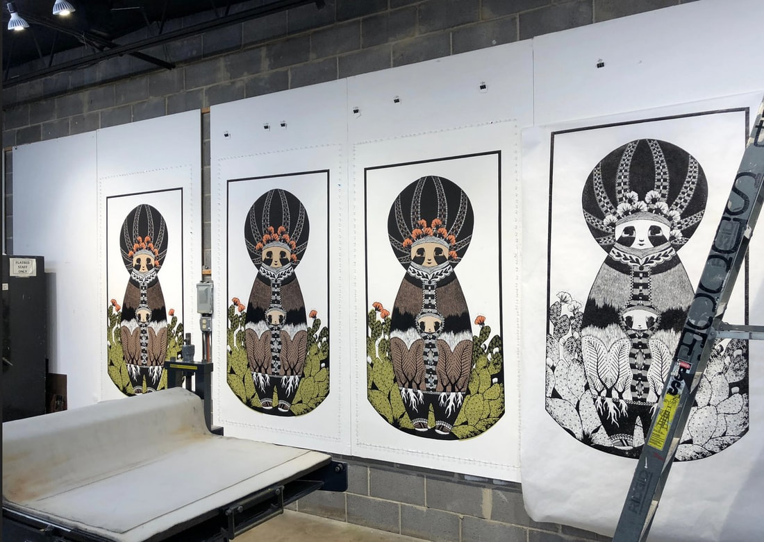
Ann Shafer You’ve heard me say that working on the BMA’s print fair was the most fun part of the job. So many wonderful people came to the museum—joined by a shared love of prints and printmaking—to sell work to an eager and well-informed audience. One of the people I have kept an eye on since I met her in 2017 when she came as part of the Flatbed Press team, is Annalise Gratovitch. Not only was she there as one of Flatbed’s printers (along with founder Katherine Brimberry and Mike Brimberry), but also, Flatbed was showing several of her monumental woodcuts from Carrying Things from Home series. These woodcuts are nearly six feet tall and feature a single character standing fully center, like an icon on a prayer or tarot card. More accurately, they are modeled after matryoshka, those stacking/nesting Russian dolls, an effect that generalizes rather than specifies any one person. But it seems clear that Annalise’s Ukranian heritage is at play. Her grandparents were one of many families to leave their homes with only what they could carry during World War II. Annalise tells of their survival by busking with an accordion and bartering for whatever goods would help keep them fed and clothed. What makes a home? Is it a place or a feeling? How many of us have a migration story in our history? Each of the six figures holds an object and wears clothes that help us understand their role: the mariner cradles a whale, the hunter holds a hare and has a fox on their shoulders and a bear at their feet, the musician plays an accordion, the builder holds a bird (notice the headdress is a bird’s nest), the mother holds a child, and the undertaker carries a tiny, simple coffin. Any areas of color you see are pieces of hand-dyed mulberry paper that have been added by the method of chine collé, which means the colored pieces are laid on the inked block and glued down simultaneously as it goes through the press. By the way, Annalise plans for the series to consist of eight prints—only six have been completed thus far. The final two will be The Healer and The Fool. Can’t wait to see them. When you are compelled to leave your physical home behind, what do you bring with you? What is it that defines your sense of self and purpose? How do you maintain a sense of connection to home? Annalise says of her work: “My work explores themes of displacement, self and cultural identity, intention and accountability, as well as burden and regret.” For me, the two most recent prints, the mother and undertaker characters, point directly at our worldwide refugee problem. There is certainly fear and sorrow in these figures, but also a noble strength and sense of purpose. Life is complicated and family is what you decide it is. I love these prints as straightforward portrayals of strength and fortitude. Honest and direct, their stylized presentation only adds to their accessibility. The images pull you in as wonderfully graphic representations of stalwart and hardworking people, and then their circumstances and lot in life become apparent. Certainly, the scale of the works adds to their power. Sometimes more is more. I’ve been meaning to write about these woodcuts for a while, but now there is a compelling reason to bring them to your attention. Annalise, who works tirelessly on her own work and in various roles within the wider print community, needs our help. She has been battling a rather nasty and debilitating autoimmune disease for the last year and a half. All in the middle of this pandemic when hospitals are overwhelmed with those sick with Covid and turning away patients with other types of illnesses. Annalise has been able to work only intermittently, and the medical costs have been mounting. I am sure asking for help is the last thing she’s like to do, but here we are. A GoFundMe campaign has been organized by a dear friend, Hannah Neal, who reports: “Annalise’s financial burden is massive. She is largely unable to work and has run out of paid leave. Between medical expenses not covered by insurance, studio rental, and lost wages, her total to date is $37,401, and the costs continue to mount every day.” Imagine being a strong, healthy printmaker unable to do the thing you feel compelled to do. Artists must create art; it’s not negotiable. Imagine being unable to work, out of paid leave, and running out of treatment options. Annalise has things to say through her work (including the final two woodcuts from this series yet to be completed) and deserves our every effort to ensure she is back at it as soon as possible. Please consider donating in support of a fellow creative who really needs our help now more than ever. Any amount is a huge help. The GoFundMe page is here. One could also buy a print from her. Just sayin’.
0 Comments
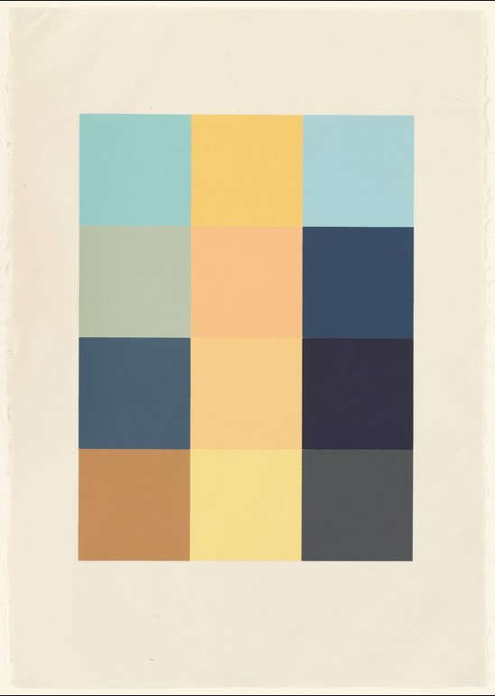
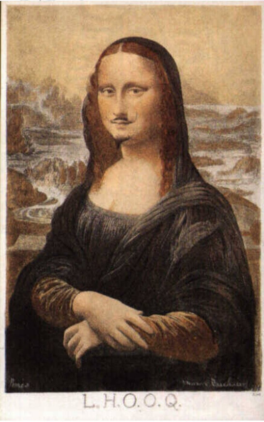
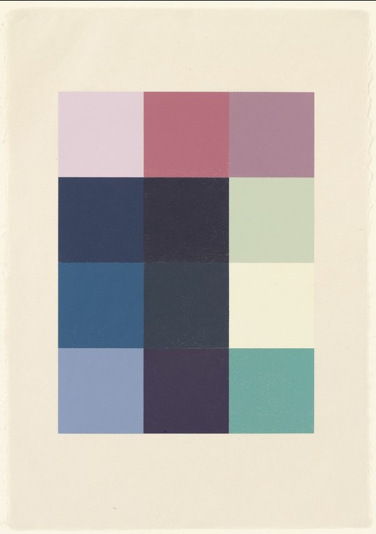
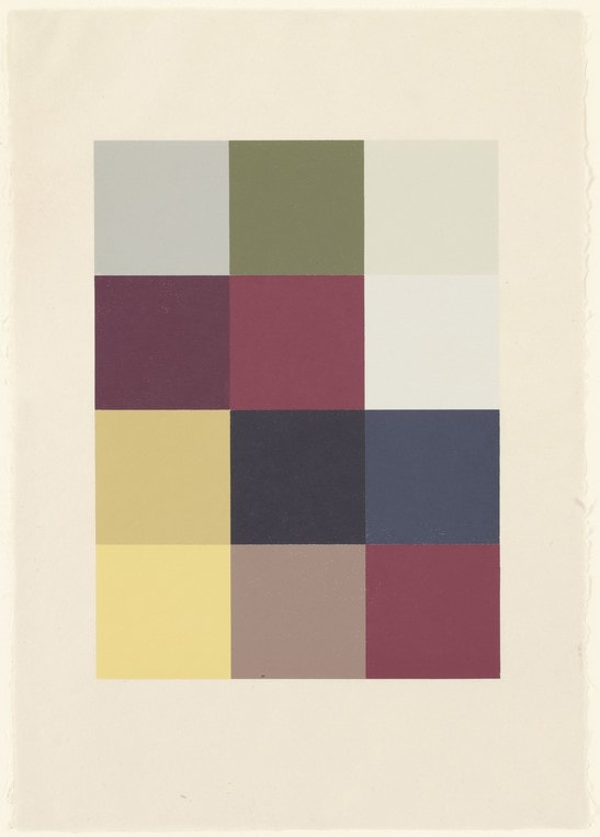
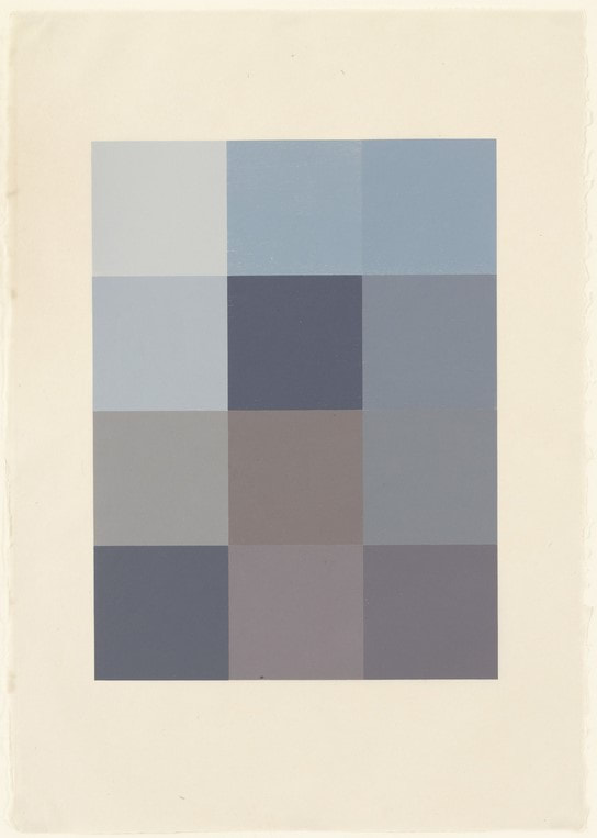
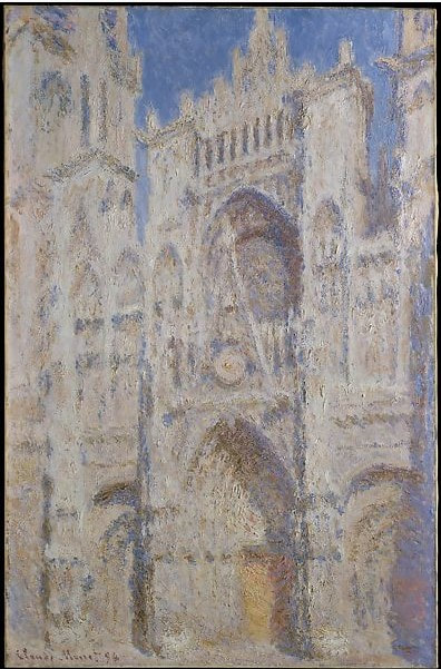
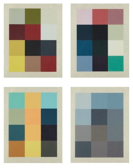
Ann Shafer Ben and I talk about why prints are awesome all the time (especially in episodes 7 and 8 of our podcast Platemark, which will be released later this summer). One key factor: the layers of translation from one step to another in the process. It takes planning and lots of decision-making to think through all the steps, which slows the artist down and makes them consider every aspect of the proposed work. Sherrie Levine’s portfolio Meltdown, 1989, is a perfect example of multiple transitions/translations in the making of the physical object in concert with multiple layers of conceptual ideas. Meltdown is a portfolio of four woodcuts by Levine who is best known for challenging ideas of authenticity and originality. She often uses appropriation, either specifically or generally, as well as art history as a central element. Meltdown combines many of these concerns. The four woodcuts were printed by Maurice Shanchez at Derrière L’Etoile Studios, and the portfolio was published by Peter Blum Editions. Each print consists of twelve squares of color. They are, in my mind, purely beautiful, but they also offer up serious layers and conceptual rigor. In the project’s first step, reproductions of four works of art—paintings by Ernst Ludwig Kirchner, Piet Mondrian, and Claude Monet, plus Marcel Duchamp’s altered postcard of the Mona Lisa—were scanned from art history textbooks and a computer algorithm averaged the colors in each image into twelve pixels. Those twelve colors were approximated (expertly) into various inks and rolled onto square blocks of wood that were jigged together and then printed. So, we have the original artwork, the photograph taken of said artwork, the image as it was reproduced in an art history textbook (or other source), which was scanned to produce yet another derivation of the image. Only then does the human hand and eye of Maurice Sanchez step in to mix the inks. Then, to top it all off, the images that have been pushed through these multiple steps end up as woodcuts, the oldest, least techno form of printmaking. Plus, think about how many actors are in this play. There is the artist of the original painting (Kirchner, Monet, Mondrian—Duchamp is a special case, more on that in a sec, plus Leonardo), the photographer of the original work of art, the person and technology that created the halftone version of the photograph that would appear in a textbook, Levine who scanned the images, the computer program that averaged the colors, Sanchez who approximated those colors, and us, the viewers who bring our own perception to viewing the prints. With the after-Duchamp woodcut, there’s a whole other level of remove from Duchamp’s starting point back to the Mona Lisa. Those are a lot of layers. And let’s not forget that you are seeing a reproduction on your screen that is several steps beyond the original woodcuts. Levine is commenting on the varying nature of reproduction and appropriation of others’ images. How true is any translation of an image in one mode to another? At every stage of the trajectory the colors could have shifted to something else, either wildly or with great subtlety. It all feels extremely random and intentional all at the same time. And the bonus: in the end the prints are just so dang beautiful. Maybe you CAN have it all. Ann ShaferIt is a truth universally acknowledged that performance art is difficult to collect. Just as with dance or music, when the performance is over, there remains nothing solid. Sure, there might be a recording or video, but the thing itself evaporates as soon as it is done. With performance art, often the tangible, collectible thing is some sort of documentation of it—usually photographs. Rarely does one find a work that is a product of the performance—an indexical work, if you will. When Tru Ludwig and I stumbled across Western Exhibitions’ booth at the Editions and Artists Books Fair (E/AB) in 2011, gallery owner Scott Speh had Stan Shellabarger’s book front and center. Stan Shellabarger is known for extended, endurance performances, say walking in a circle for twelve hours, marking the earth and a moment in time. Taking the idea of creating a drawing on the ground further, Shellabarger also walks in shoes outfitted with graphite or sandpaper on the soles and performs an endurance walk on paper or wood. In this way, the artwork is not only the performance itself, but also the drawing created in the process. Like many before him, Shellabarger wanted to be able to create more than one object from a given performance, and, no surprise, he turned to printmaking. The method Shellabarger came up with to record a performance is known as a reductive or suicide woodcut. In this method, a multi-color print is created using a single block by carving away more of the surface in between printing each color. After drawing the outline of the image on the woodblock, first any areas that are to remain the color of the paper are carved away and the first color is printed. It is critical to print more sheets than you think you will need for the planned edition because you will undoubtedly have several mishaps (that’s where the suicide part comes in). After the first color is printed and the block is cleaned, the artist carves away any area that will remain that first color. After printing the second color, the steps are repeated. In the final cutting, usually all that is left is the key or black line, which brings the whole composition together. Shellabarger used the reduction method but in a slightly different way. The woodblock has the various layers of image cut away by the artist walking on it with sandpaper-soled shoes rather than by carving in the conventional manner. For this walking performance piece, there were multiple boards laid out on the floor and walked upon. After each board was printed, after every walking session and every different color printing, the prints pulled from each board were assembled into accordion-fold books. When fully opened and unfolded, the book reaches eighteen feet. Before beginning to walk, Shellabarger took the boards to Spudnik Press, a cooperative printshop in Chicago, printed the first color, the dark red, ending up with a flat red on each sheet. After walking for a period of time (at least four hours), Shellabarger printed the second color, the dark blue. He repeated the process, wearing away more and more of the blocks by sanding them with his shuffle, and printed each successive layer: green, then medium blue, then finishing with light blue. I included Shellabarger’s book in my exhibition at the BMA called On Paper: Spin, Crinkle, Pluck, which was on view April 19–September 20, 2015. Each of the objects in the exhibition was indexical, meaning the image was the product of its own making. The action verbs in the exhibition title refer to three of the works in the show: spin for Trisha Brown’s softground pirouettes in Untitled Set One, 2006 (BMA 2007.336–338, and the subject of an earlier post); crinkle for Tauba Auerbach’s Plate Distortion II, 2011 (BMA 2012.198); and pluck for Ann Hamilton’s warp & weft I, 2007–08 (BMA 2009.128). We lacked enough room in the gallery to install Shellabarger’s book on the floor, which would enable viewers to really grasp how it was made. Instead, we installed it running up the wall, which brought it into a very nice conversation with the Trisha Brown prints on the adjacent wall. The museum made a video about the work for its 100th Anniversary celebration, BMA Voices. Here is the link to that video: https://www.youtube.com/watch?v=OU4pAdE2z2Q. Stan Shellabarger (American, born 1968) Untitled, 2011 Accordion–bound volume of six–color reduction woodblock print Book: 381 x 559 mm. (15 x 22 in.); sheet (unfolded): 381 x 5588 mm. (15 x 220 in.) Baltimore Museum of Art: Print, Drawing & Photograph Society Fund, with proceeds derived from the 2012 Contemporary Print Fair, BMA 2012.190 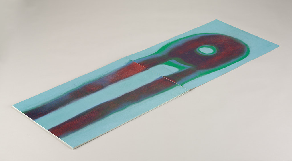 Stan Shellabarger (American, born 1968), Untitled, 2011, accordion–bound volume of six–color reduction woodblock print, book: 381 x 559 mm. (15 x 22 in.); sheet (unfolded): 381 x 5588 mm. (15 x 220 in.), Baltimore Museum of Art: Print, Drawing & Photograph Society Fund, with proceeds derived from the 2012 Contemporary Print Fair, BMA 2012.190 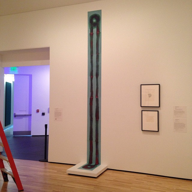 Installation shot at BMA: Stan Shellabarger (American, born 1968), Untitled, 2011, accordion–bound volume of six–color reduction woodblock print, book: 381 x 559 mm. (15 x 22 in.); sheet (unfolded): 381 x 5588 mm. (15 x 220 in.), Baltimore Museum of Art: Print, Drawing & Photograph Society Fund, with proceeds derived from the 2012 Contemporary Print Fair, BMA 2012.190 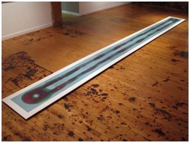 Stan Shellabarger (American, born 1968), Untitled, 2011, accordion–bound volume of six–color reduction woodblock print, book: 381 x 559 mm. (15 x 22 in.); sheet (unfolded): 381 x 5588 mm. (15 x 220 in.), Western Exhibitions, Chicago 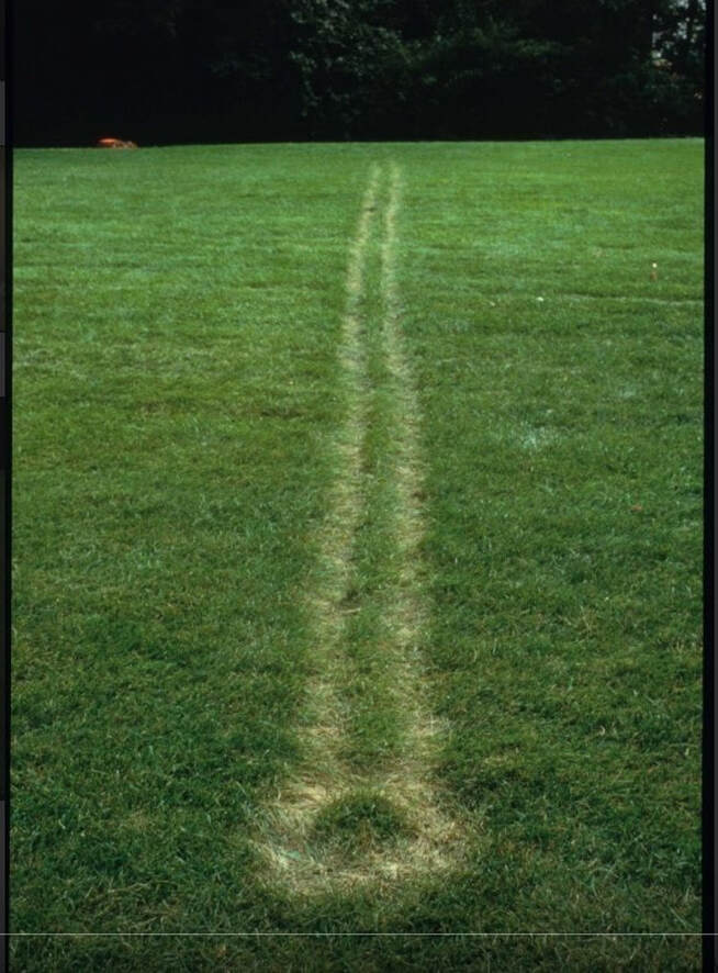 Stan Shellabarger, Untitled Performance (Autumnal Equinox 1994), Madison, WI. On the Autumnal Equinox Shellabarger paced east to west in a straight-line from sunrise to sunset on the lawn of a former astrological observatory. The twelve-hour performance left a narrow path of dead grass on the observatory’s lawn. This mark was visible until the following spring. Photo courtesy of Western Exhibitions. 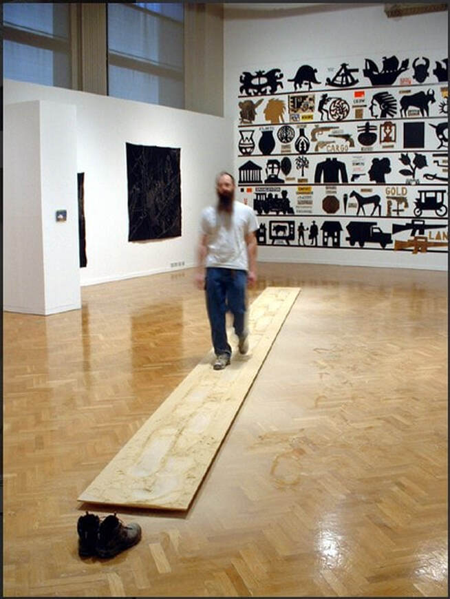 Stan Shellabarger. Untitled Performance (Sanding 2002) Chicago, IL. Shellabarger paced on a wooden walkway thirty feet by two feet for approximately one hundred and twenty hours. The soles of his shoes were covered with sixty grit sandpaper so as he paced he eroded the surface of the walkway. Eventually he wore a depression over an inch deep into the surface of walkway. Photo courtesy of Western Exhibitions. 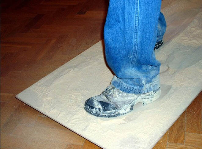 Stan Shellabarger. Untitled Performance (Sanding 2002) Chicago, IL. Shellabarger paced on a wooden walkway thirty feet by two feet for approximately one hundred and twenty hours. The soles of his shoes were covered with sixty grit sandpaper so as he paced he eroded the surface of the walkway. Eventually he wore a depression over an inch deep into the surface of walkway. Photo courtesy of Western Exhibitions. 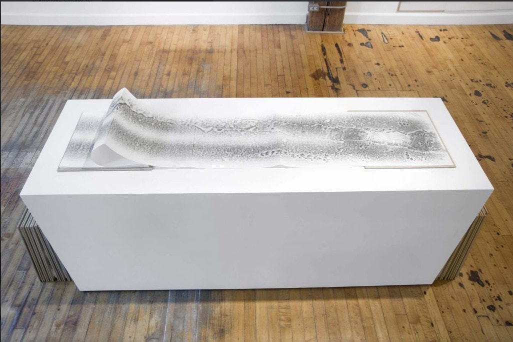 Stan Shellabarger. Untitled (Walking Book 14, 2201 S. Union, 3rd Floor, Chicago, IL) 2008, graphite on archival paper, waxed MDF covers, 15 x 15 inches closed, 15 x 337 in. open. Photo courtesy of Western Exhibitions. |
Ann's art blogA small corner of the interwebs to share thoughts on objects I acquired for the Baltimore Museum of Art's collection, research I've done on Stanley William Hayter and Atelier 17, experiments in intaglio printmaking, and the Baltimore Contemporary Print Fair. Archives
February 2023
Categories
All
|


 RSS Feed