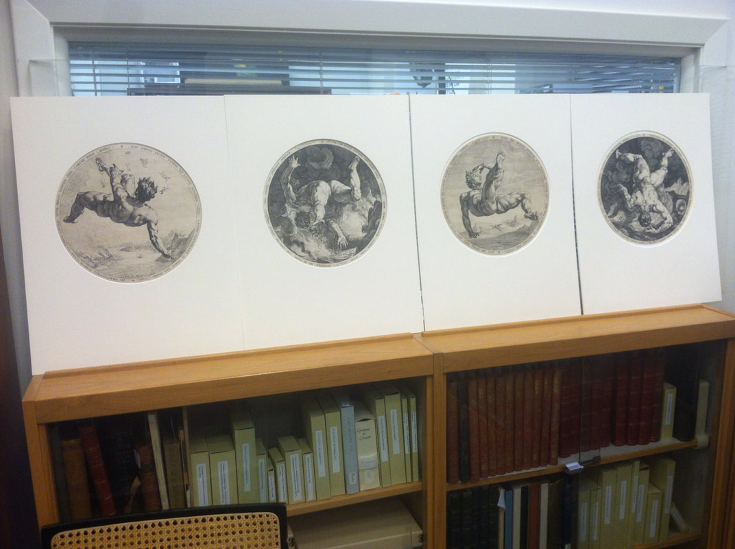
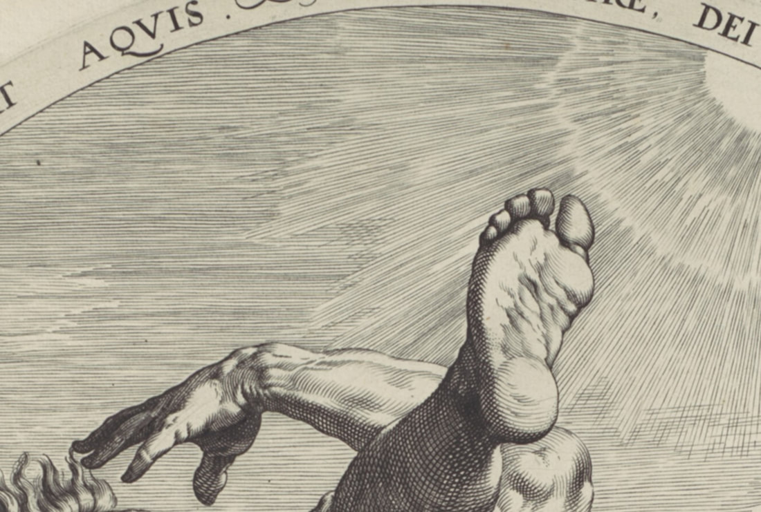
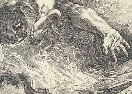
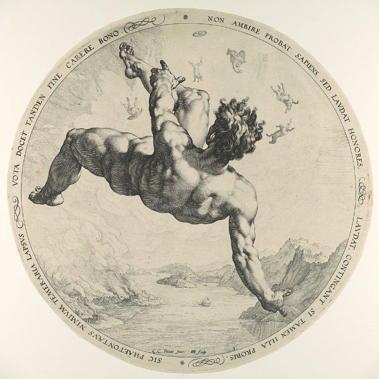
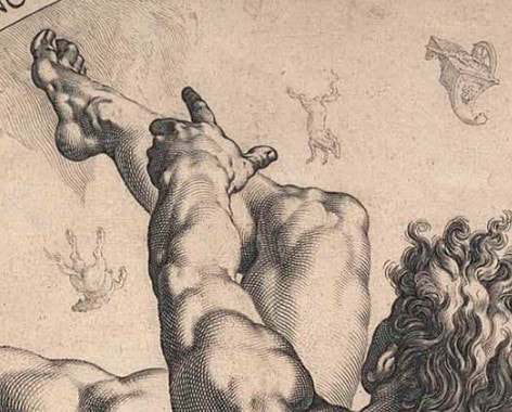
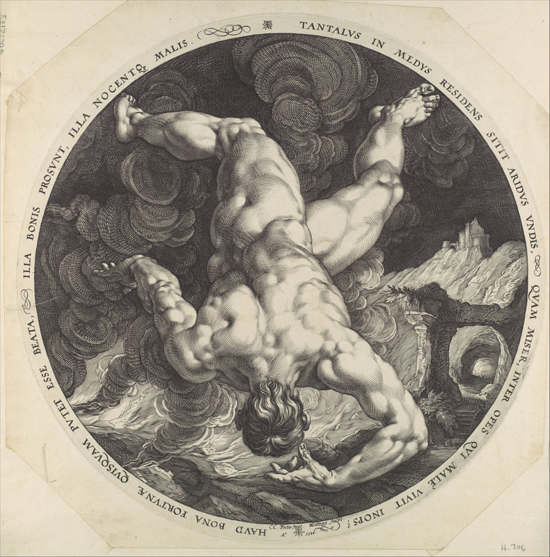
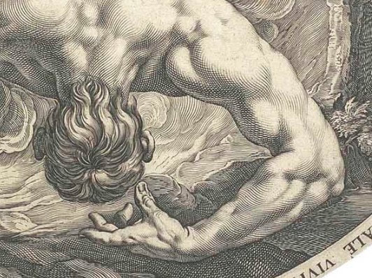
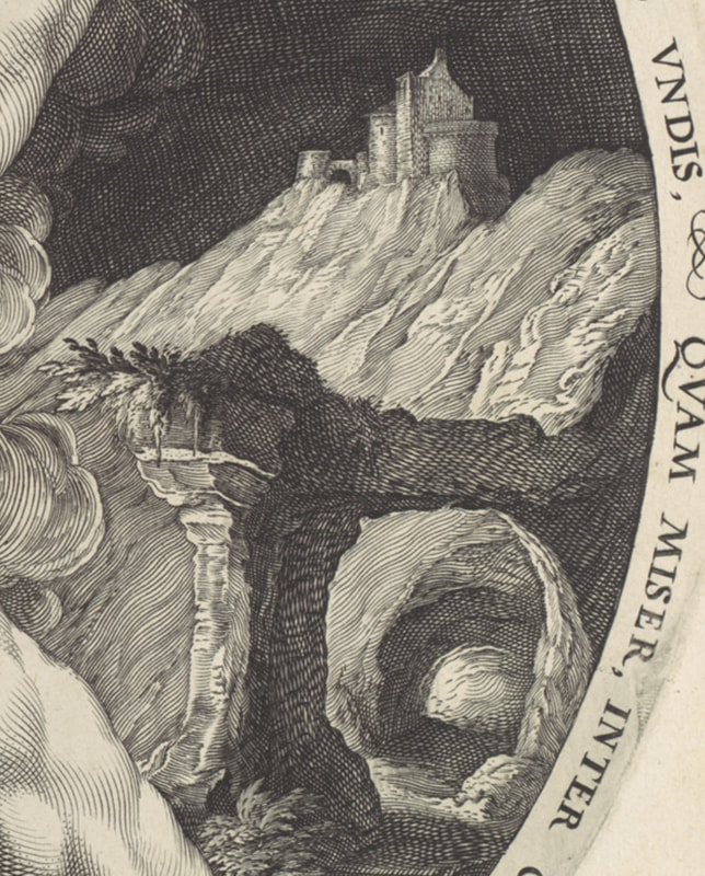
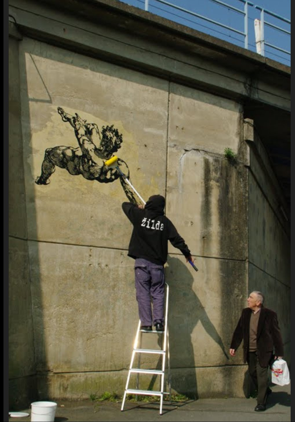
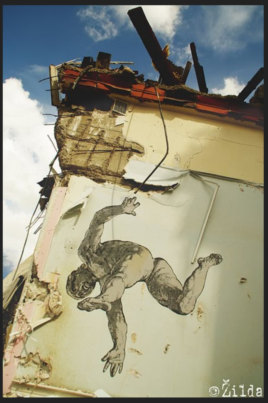
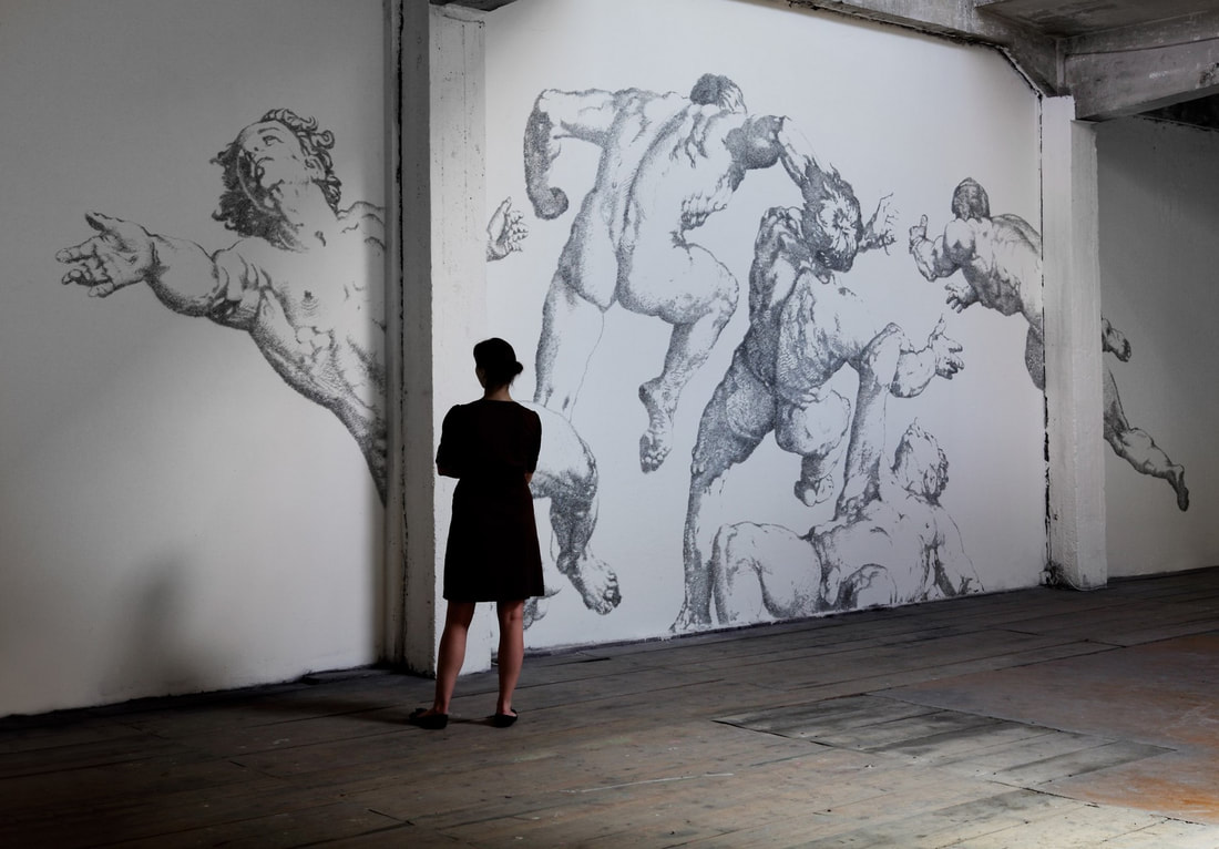
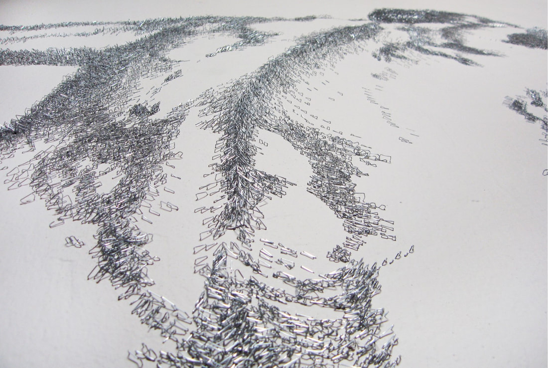
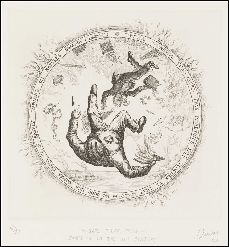
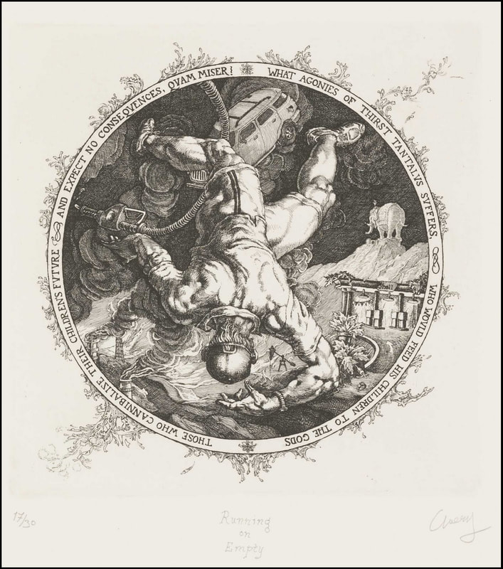
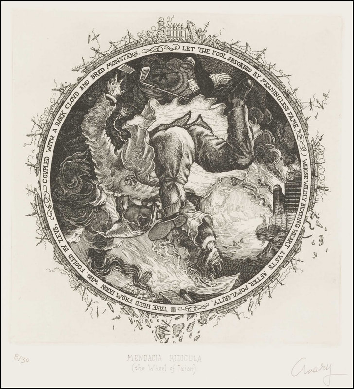
Ann Shafer While teaching young artists about prints, it’s easy to think they won’t respond to works made before 1960, but they can and do. There is a quartet of engravings from 1588 called The Disgracers that were always a highlight in Tru Ludwig’s History of Prints class. They are by Hendrick Goltzius and portray four male nude figures falling. Each engraving offers a muscular male in different views of nearly the identical pose. The four men are Icarus, Ixion, Phaethon, and Tantalus. Each of them had tried to enter the realm of the gods and were sentenced to eternal torture for their hubris. Kinda like the ancient Greek version of the fall of man. I’m guessing the students reacted to the same things I do in the prints: the artist’s audacity in portraying figures with such weird and difficult foreshortening; describing textures and patterns with surprisingly regimented engraved marks; giving a convincing sense of falling; portraying gentlemen-bits, as it were. (I can’t recall another example of such views of male nudes. Let me know if you can.) I also respond to them as a captured moment that tells the whole story of each flawed character without much context or narrative. I love the tondo shape (why aren’t they referred to simply as round?), and the text that runs around the circumference. It’s almost like we are looking through a telescope at them falling through the sky. The perspective and compositions are so startling after looking at standing figure after standing figure, they always elicited oohs and ahhs from the students. One might think the set of four would come to the museum together, having been originally collected as a group. But when I arrived at the museum there were only three of the four already in the collection and they all were, oddly, from different gifts. The missing print was Phaethon. I’m sure I wasn’t the only curator ever to work in the collection who kept an eye out to acquire the fourth print, but it took seven years to find one. It was like finding the long-lost last piece of the puzzle, and it still makes me expel a long sigh to think of them all together. There is just something wonderful about being able to show all four to students and visitors in the study room. The Disgracers are so well known to scholars of Western printmaking, you don’t even need to mention the artist’s name. Subsequent artists have been inspired by their compositions and messages and have borrowed from them to create their own take on them. For instance, there is a street artist in France named Žilda whose 2010 Liber Casus features wheat-pasted paintings of falling figures installed on buildings and bridges in Paris, Rennes, and Belgrade. And there is another artist, Baptiste Debombourg, who in 2012 created a mural based on Phaethon from The Disgracers using many thousands of staples. Yes, staples. Lawrence Goedde sums up their use of the falling figure well: “For both, the artifice of Goltzius’s series clearly provokes, intrigues, and challenges as they adapt his imagery to new purposes. Žilda sees the falling figures pasted high above passersby in urban settings as destabilizing the familiar world of the streets, provoking reflection on falling as a metaphor for the necessity of risk-taking amid the general indifference and banality of ordinary life. Debombourg finds in the heroic scale of Mannerist male nudes a metaphor for societal, and especially male, violence as seen in popular super-heroes, an aggression and familiarity that he sees as echoed in the way staples are driven into board and their utter ubiquity.” (https://apps.carleton.edu/kettering/goedde/) While Žilda and Debombourg’s Goltzius-inspired works are not prints, a third artist, David Avery, created a set of four etchings that stays closer to Goltzius’ scale and compositions in their inclusion of the text around the circumference of each. But Avery has changed the characters in order to comment about issues facing us today. Safe, Clean, Cheap: Phaeton in the 21st Century, 2011, highlights issues of the environment and its imminent destruction at our hands. Too Close to the Sun, 2013, points at human’s problematic fascination with phones and screens. Running on Empty, 2016, critiques America’s dependence on big oil. And the last in the set, Mendacia Ridicula, 2018 (Latin for ridiculous lying), satirizes politicians and the divisiveness that has come from all that lying. I appreciate it when artists look to historical examples. It reinforces the idea that they know upon whose shoulders they stand. Wouldn’t it be cool to pull together a group of contemporary works with Goltzius’ engravings for an exhibition about inspiration and artistic heroes? I’m sure there are more examples of artists looking at The Disgracers. Let me know who comes to mind. There is deep richness to be found in the history of prints. Lucky for us, there are plenty of places to see prints like these and many curators and scholars who are happy to talk about them.
1 Comment
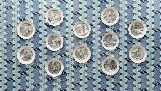
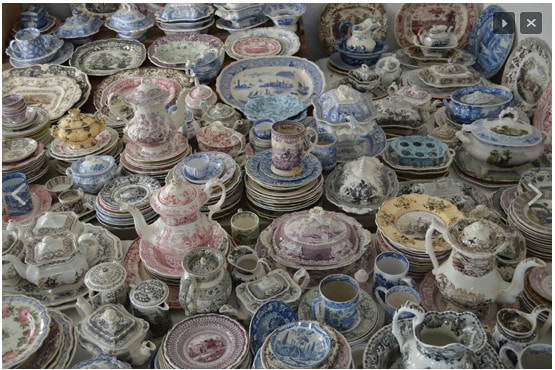
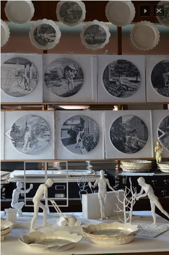
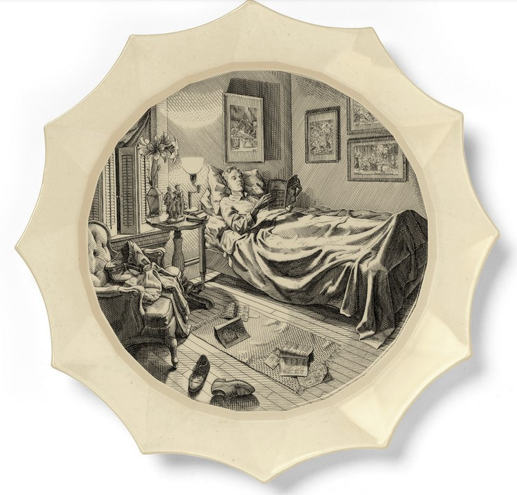
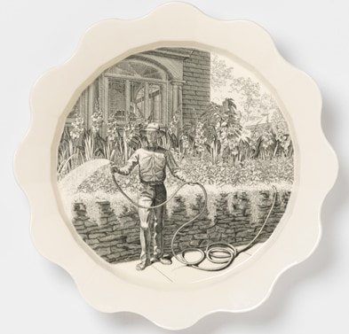
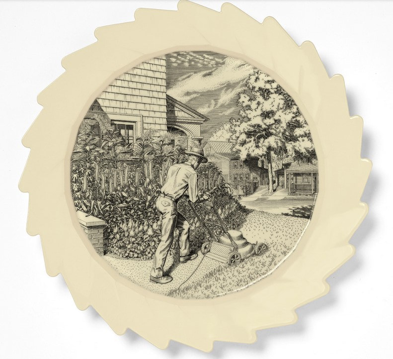
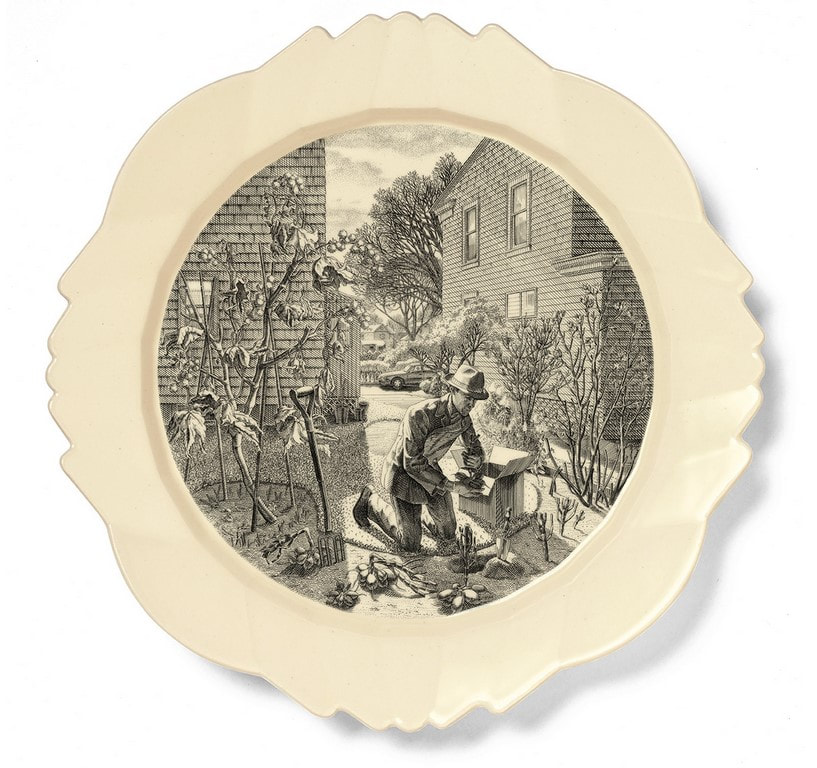
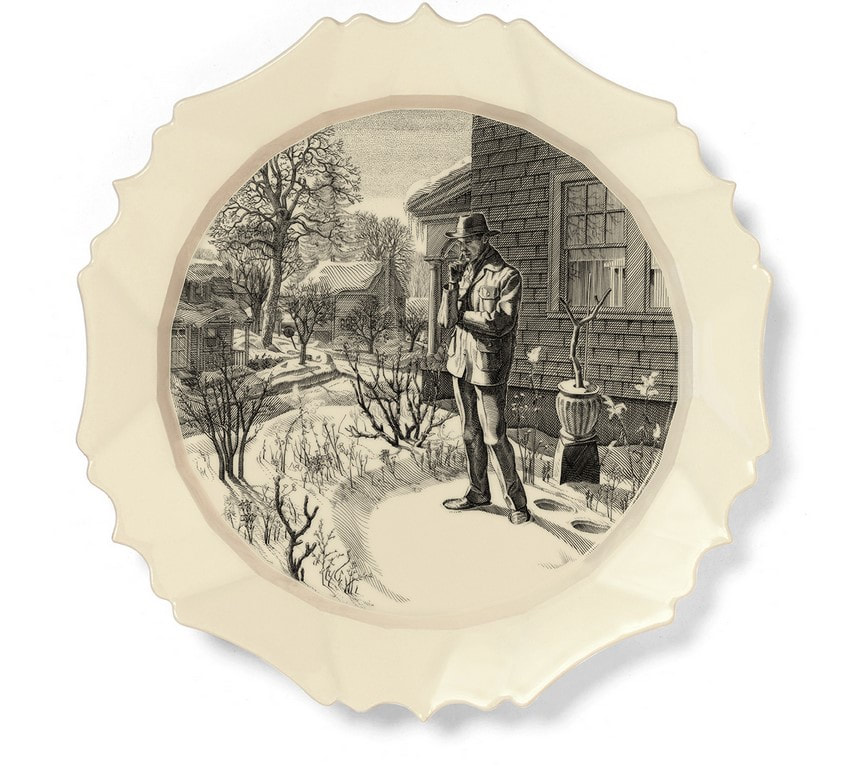
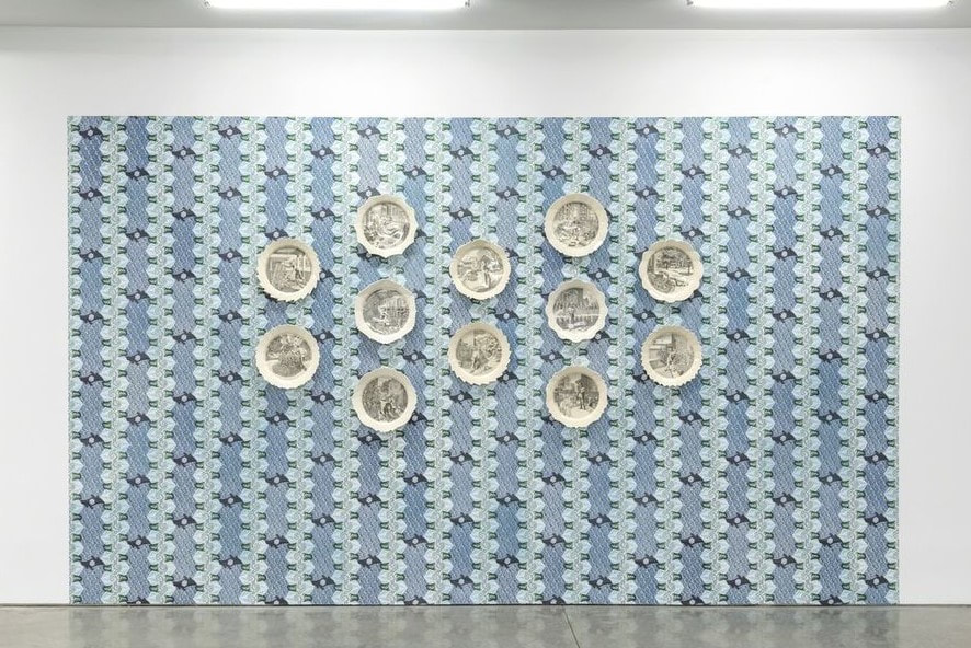
Ann Shafer Prints pop up everywhere. But did you ever expect to eat on them? Engravings of bucolic scenes, flora, and fauna have been transferred to ceramics since the technique was developed in England in the 1750s. Highly decorated dinnerware was previously hand painted, costly, and meant for the aristocracy. As a way of getting decorative serving sets to the growing middle classes, the transfer process was developed and has been used ever since. You probably have some in your cupboard even now. Andrew Raftery, one of very few contemporary engravers, has collected transferware for a long time as he contemplated creating a set of dinner plates of his own design. Eight years in the making, Autobiography of a Garden on Twelve Engraved Plates was finally released in 2016 (the set was published by Mary Ryan Gallery). The set of twelve plates represent the twelve months of the year, each showing Raftery engaged in thinking about, planning, and working in his garden. Raftery’s process is extensive. Scale models of each scene were made, studies and grisaille drawings were executed, and each plate’s shape was designed by the artist (each shape is unique). And that’s before he began engraving the copper plates, a laborious process in itself. No wonder it took eight years to complete the project. Oh, and he designed wallpaper that the plates may be hung upon. It’s quite an accomplishment. The set was among the final objects I acquired for the museum. Glad to have accomplished that last purchase. Ann Shafer Lately, Carrie Mae Weems’ Untitled (Listening Devices), a photogravure I acquired for the museum in 2015, has been rolling through my mind. It consists of a grid of images of devices that are posed as if having their portraits taken. The image at lower right is a simple megaphone, while next to it is the classic two cans connected by a string. Other squares are occupied by old fashioned telephones. Missing, of course, are references to smart phones of any kind. Might this be a nod to a simpler time? Or is it a nod to that old game of Telephone in which a sentence is whispered person to person resulting in a statement that bears no resemblance to the original. Does it point to ideas about failures to communicate? For me, it reflects both a plea for the simple act of listening and of being tired of talking. Last summer I listened to the podcast from Serial, Nice White Parents, and was mortified to think of my own patterns of behavior, unintentional or not. It was an important eye opener about my own position of privilege. And recently (thanks to Ben Levy for the recommendation), I listened to a talk by Dr. Meranda Roberts, who spoke about the significance of land acknowledgments in colonial spaces like museums. Learning how to de-center oneself is difficult. It all feels overwhelming, but it is crucial. The reason Weems’ photogravure keeps popping into my brain relates to this distinction noted by Roberts: • White savior: thinks it’s her job to give black women a voice. • White ally: knows it’s her responsibility to listen to the black voices that are already speaking. It’s not up to others to educate us, but it is on us to actively listen when they speak. It is we who need to do our own work. When I pitched this photogravure to my colleagues, I think they thought it wasn’t as representative of Weems’ work as they might want. But I persisted in my conviction that its universal message of listening with intention was equally powerful. I don’t think the museum has had a chance to exhibit the work yet—although I don’t know since I have only returned to the building once since I left. There is so much learning and unlearning that must be done personally and collectively in the art world and museums regarding racism, sexism, pay equity, decolonization, land acknowledgements, and so many other things. And I need to start with me and recognize that it is not about me at all. Carrie Mae Weems (American, born 1953) Untitled (Listening Devices), 2014 Printer/Publisher: Segura Arts Studio Photogravure Sheet: 1308 x 1079 mm. (51 1/2 x 42 1/2 in.) Baltimore Museum of Art: Print, Drawing & Photograph Society Fund, with proceeds derived from the 2015 Contemporary Print Fair, 2015.161 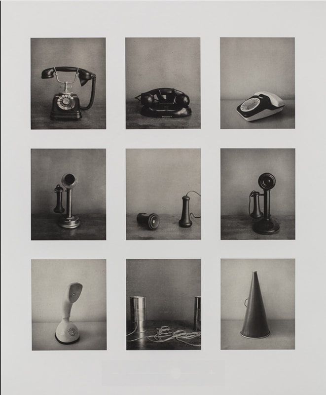 |
Ann's art blogA small corner of the interwebs to share thoughts on objects I acquired for the Baltimore Museum of Art's collection, research I've done on Stanley William Hayter and Atelier 17, experiments in intaglio printmaking, and the Baltimore Contemporary Print Fair. Archives
February 2023
Categories
All
|


 RSS Feed