Ann ShaferLast week I posted a few images of praying mantes in prints. Fascinating creatures. By the terribly scientific polling apparatus available to me—number of likes, natch—I decided to post more images by the person whose praying mantis print was most admired, Roderick Mead (American, 1900–1971). Mead grew up in New Jersey and attended Yale University, graduating in 1925. Following art school, he moved to New York where he studied at the Art Students’ League under George Luks (and later with him privately) for several years. He also studied watercolor painting with George Pearse Ennis at the Grand Central School of Art. In 1931, Mead moved to Majorca. Three years later he moved his studio to Paris and began studying printmaking at guess where? The experimental studio run by Stanley William Hayter known as Atelier 17. Actually, in 1931, the atelier was only a few years old and had yet to take up the name it would become known by. It wasn’t until 1933 that the studio moved to 17, rue Campagne Première, from which the 17 in its name derives. But you can be sure that Mead absorbed as much as he could there and as a result, the effect on his style is clear. At the Atelier on any given day one might be working at a table next to Joan Miró, Pablo Picasso, Alberto Giacometti, Max Ernst, Yves Tanguy, Jean Hélion, or Wassily Kandinsky. Like most of the artists there, Mead experimented with abstraction and surrealism, and one finds shared ideas, forms, and styles among the prints made there. Like most everyone else, Mead and his wife left Paris in 1939 ahead of the start of World War II and by 1941 was living in Carlsbad, New Mexico. There he was able to devote himself to creating art full time; he continued to paint and make prints until his death in 1971. For me, Mead would have been one in a long list of artists working with Hayter about whom I know not a great deal was it not for my friend Gregg Most, who grew up down the street from the Meads. Gregg and I worked together at the National Gallery in the 1990s, and he has researched and collected Mead for a long time. It is Gregg’s passion for Mead that caused me to pay closer attention. I love Mead’s prints because they are carefully crafted, readable yet totally surreal, and have a high sense of crispness and design that really attracts me. See if you agree. Roderick Mead (American, 1900–1971) The Wrecked Ship, 1936 Engraving Plate: 197 x 251 mm. (7 ¾ x 9 7/8 in.) Smithsonian American Art Museum, Gift of Mrs. Roderick Mead, 1974.122.1 Roderick Mead (American, 1900–1971) Untitled (Matador and Bull), c. 1936 Engraving and softground etching with aquatint Plate: 203 x 203 mm. (8 × 8 in.) Dolan/Maxwell Roderick Mead (American, 1900–1971) Rope Figures, c. 1935–45 Engraving Plate: 160 x 82 mm. (6 1⁄2 x 3 1⁄4 in.) Smithsonian American Art Museum, Gift of Mrs. Roderick Mead, 1976.99.5 Roderick Mead (American, 1900–1971) St. Michael and the Dragon, 1939 Color wood engraving Image: 232 x 203 mm. (9 1/8 x 8 in.) Smithsonian American Art Museum, Gift of Mrs. Roderick Mead, 1974.122.6 Roderick Mead (American, 1900–1971) Creation of Eve, c. 1942 Engraving and softground etching Plate: 200 x 199 mm. (7 7/8 x 7 13/16 in.) Smithsonian American Art Museum, Gift of Mrs. Roderick Mead, 1976.99.1 Roderick Mead (American, 1900–1971) Trojan Horse, c. 1945–50s Color engraving, aquatint, and softground etching Plate: 235 x 298 mm. (9 ¼ x 11 ¾ in.) Smithsonian American Art Museum, Gift of Mrs. Roderick Mead, 1974.122.2 Roderick Mead (American, 1900–1971) Combat #1 (Incident), c. 1942–45 Engraving and softground etching 264 x 186 mm. (10 3/8 x 7 3/8 in.) Smithsonian American Art Museum, Gift of Mrs. Roderick Mead, 1974.122.3 Roderick Mead, (American, 1900–1971) Tauromachia I, 1946 Engraving and aquatint Plate: 114 x 182 mm (4 ½ x 31/4 in.) Fine Arts Museums of San Francisco, Achenbach Foundation, California State Library loan, L543.1966 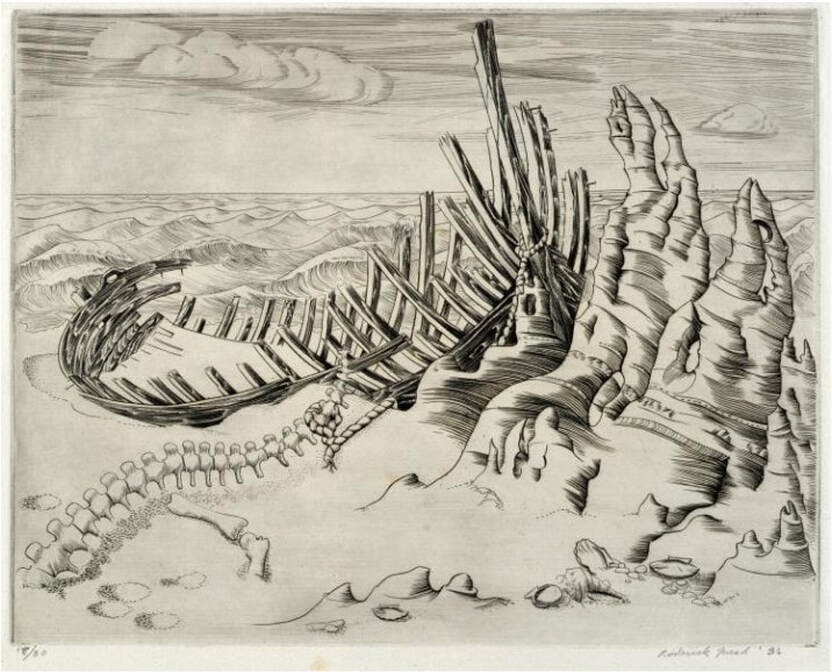 Roderick Mead (American, 1900–1971). The Wrecked Ship,1936. Engraving and aquatint. Plate: 197 x 251 mm. (7 ¾ x 9 7/8 in.). Smithsonian American Art Museum, Gift of Mrs. Roderick Mead, 1974.122.1.  Roderick Mead (American, 1900–1971). Untitled (Matador and Bull), c. 1936. Engraving and softground etching with aquatint. Plate: 203 x 203 mm. (8 × 8 in.). Dolan/Maxwell. 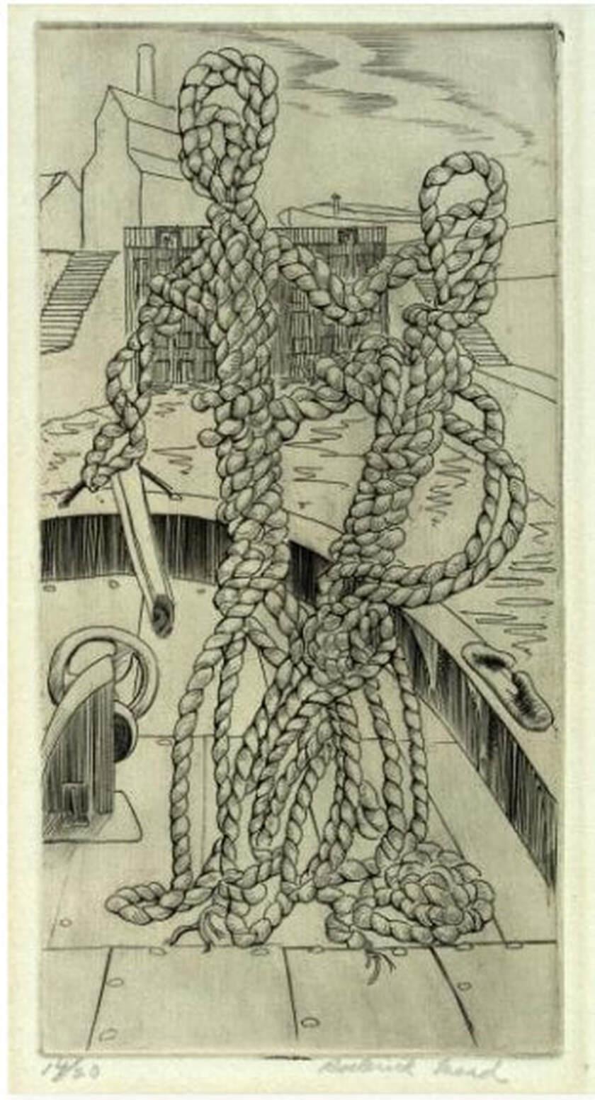 Roderick Mead (American, 1900–1971). Rope Figures, c. 1935–45. Engraving. Plate: 160 x 82 mm. (6 1⁄2 x 3 1⁄4 in.). Smithsonian American Art Museum, Gift of Mrs. Roderick Mead, 1976.99.5. 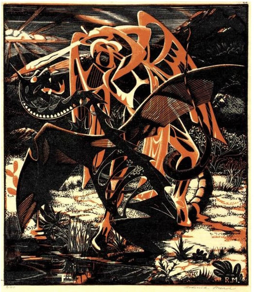 Roderick Mead (American, 1900–1971). St. Michael and the Dragon, 1939. Color wood engraving. Image: 232 x 203 mm. (9 1/8 x 8 in.). Smithsonian American Art Museum, Gift of Mrs. Roderick Mead, 1974.122.6. 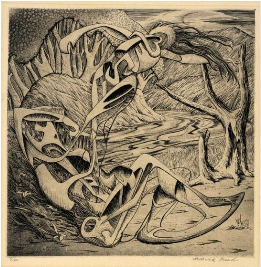 Roderick Mead (American, 1900–1971). Creation of Eve, c. 1942. Engraving and softground etching. Plate: 200 x 199 mm. (7 7/8 x 7 13/16 in.). Smithsonian American Art Museum, Gift of Mrs. Roderick Mead, 1976.99.1. 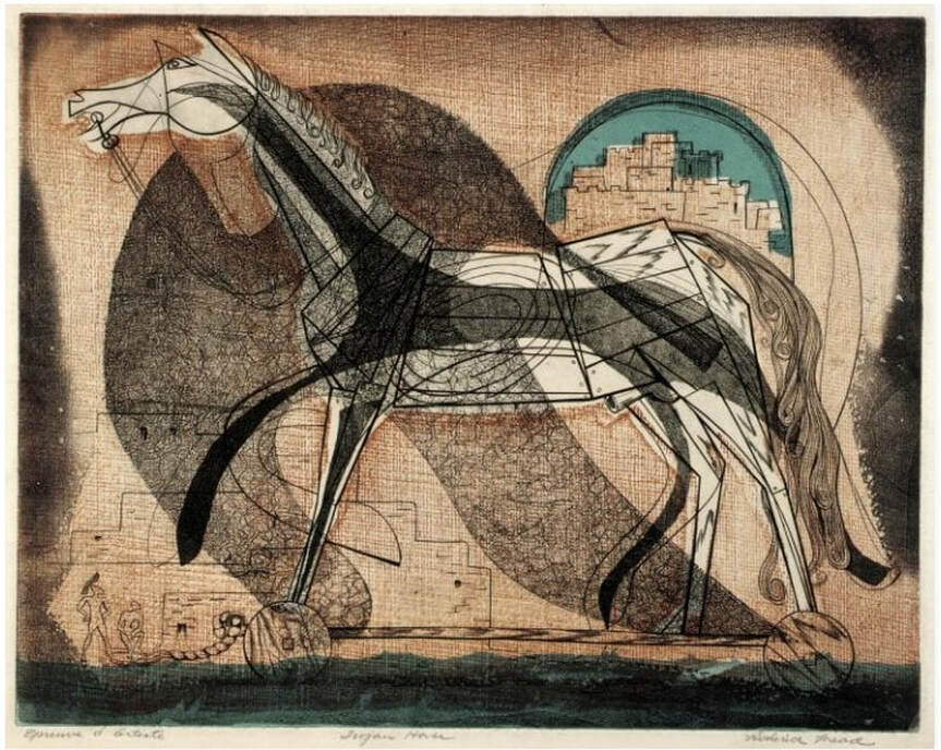 Roderick Mead (American, 1900–1971). Trojan Horse, c. 1945–50s. Color engraving, aquatint, and softground etching. Plate: 235 x 298 mm. (9 ¼ x 11 ¾ in.). Smithsonian American Art Museum, Gift of Mrs. Roderick Mead, 1974.122.2. 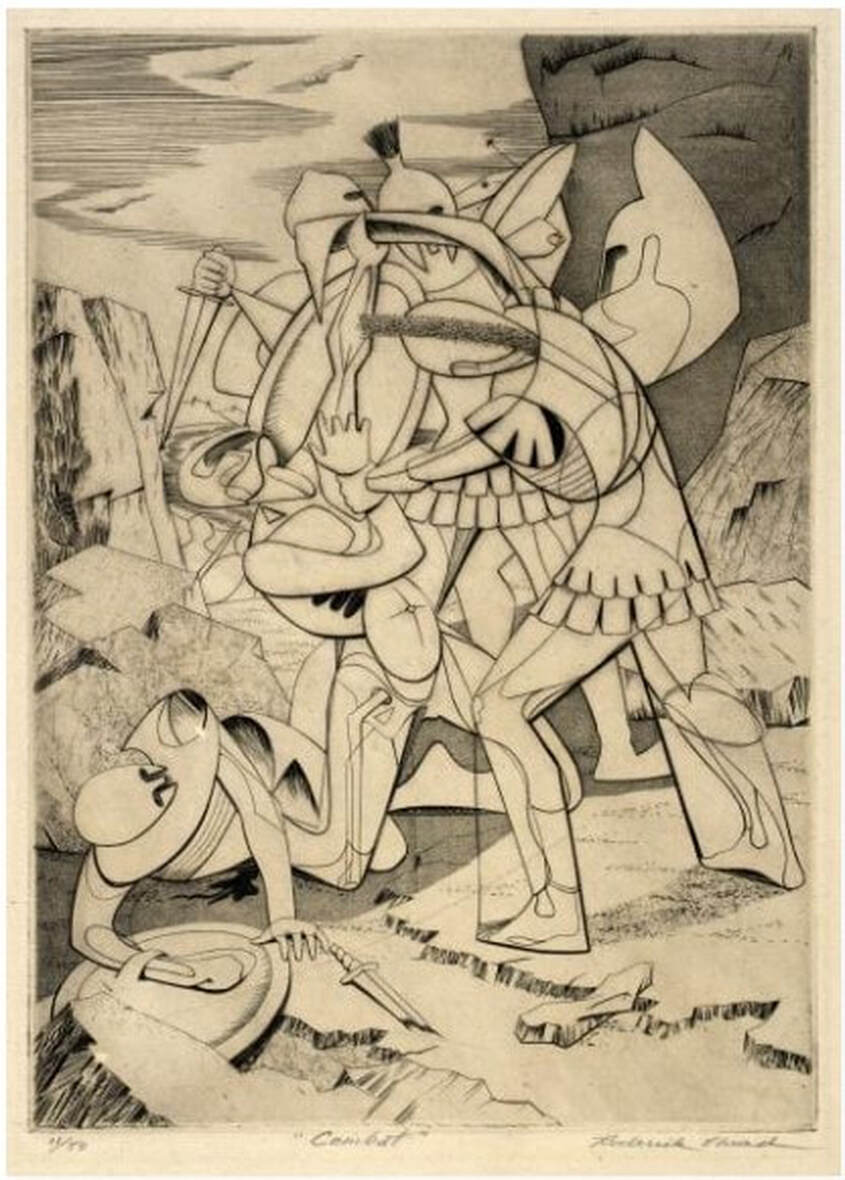 Roderick Mead (American, 1900–1971). Combat #1 (Incident), c. 1942–45. Engraving and softground etching. Plate: 264 x 186 mm. (10 3/8 x 7 3/8 in.). Smithsonian American Art Museum, Gift of Mrs. Roderick Mead, 1974.122.3. 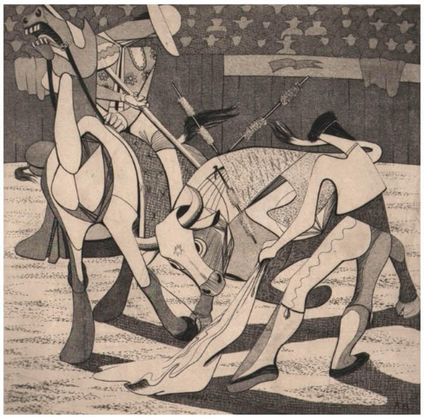 Roderick Mead, (American, 1900–1971). Tauromachia I, 1946. Engraving and aquatint. Plate: 114 x 182 mm (4 ½ x 31/4 in.). Fine Arts Museums of San Francisco, Achenbach Foundation, California State Library loan, L543.1966.
1 Comment
Ann ShaferI always wanted to do an exhibition about the audience. Portraying not the main attraction—the action on stage—but the people who are watching seems ripe for capturing a slice of life. The lookers being looked at flips convention. Voyeurism is a funny thing, alternately creepy and, what’s the opposite of creepy? Oh, pleasant. There are some great prints from the late nineteenth and early twentieth centuries that would fit in this proposed exhibition nicely like Mary Cassatt’s In the Opera Box, 1879, Reginald Marsh’s Box at the Metropolitan, 1934, Joseph Hirsch’s Hecklers, 1943. Of course, there are plenty of paintings portraying audiences, too. My favorite is Tissot’s Women of Paris: The Circus Lover, 1885. Though these images may seem quirky and quaint now, it is possible for an image of this type to cross over into social justice and to capture the zeitgeist. For me, one of the most searing group of images of an audience is Paul Fusco’s series taken in 1968 from the train carrying the body of Robert F. Kennedy from New York to Washington, D.C., for burial at Arlington National Cemetery. The photographs capture an emotionally naked populace witnessing the end of optimism in the country. RFK’s assassination followed that of his brother, President Kennedy on November 22, 1963; Malcolm X on February 21, 1965; and Martin Luther King, Jr., on April 4, 1968. RFK was shot just two months after Dr. King’s death, on June 5, 1968. By then, the country had seen more than its share of sorrow and senseless killing. The photographer, Paul Fusco, died last week, and it reminded me of how powerful the images are still. I marvel at how much emotion is conveyed across decades; they give me chills to this day. It may not surprise you to know that one of the photographs, a shot up North Broadway, just before the train dips underground on its approach into Penn Station in Baltimore, is one that got away. I pitched this photograph some years ago and got enough pushback to return it to the dealer. Part of the issue was that my colleagues weren’t convinced it was Baltimore in the photograph (of course it is), and the other had to do with vintage prints versus later reprints. Many curators seek and prefer to collect vintage prints, meaning the photographs were printed at the time they were shot. The photograph in question was a later printing, and thus was less desirable. I am certain Fusco wasn’t thinking in terms of museum collections in 1968. In fact, as a member of Magnum Photos, an international cooperative agency, he was on assignment for Look magazine, which published two of the photographs in black and white. The series was unknown until Aperture published it in 2008. Hence the later printings. In an earlier post I said I have never forgotten those that got away, and it’s true. To this day, when I see one of these works on the wall in some exhibition, I think “yes, I was right.” A few years after my failed pitch, I saw an exhibition of Fusco’s RFK train pictures at SFMoMA, and there was the North Broadway shot, front and center. Vindication. Paul Fusco (American, 1930–2020) Untitled (North Broadway, Baltimore), from the series RFK Funeral Train, 1968, printed later Danziger Gallery Paul Fusco (American, 1930–2020) Untitled (Family), from the series RFK Funeral Train, 1968, printed later Danziger Gallery Paul Fusco (American, 1930–2020) Untitled (Western Maryland Railroad), from the series RFK Funeral Train, 1968, printed later Danziger Gallery Mary Cassatt (American, 1844–1926) In the Opera Box (No. 3), c. 1880 Etching, softground etching, and aquatint Sheet: 357 x 269 mm. (14 1/16 x 10 9/16 in.) Plate: 197 x 178 mm. (7 3/4 x 7 in.) Metropolitan Museum of Art: Gift of Mrs. Imrie de Vegh, 1949, 49.127.1 Reginald Marsh American (1898–1954) Box at the Metropolitan, 1934 Etching and engraving Sheet: 250 x 202 mm. (9 13/16 x 7 15/16 in.) Plate 322 x 252 mm. (12 11/16 x 9 15/16 in.) Metropolitan Museum of Art: Gift of The Honorable William Benton, 1959, 59.609.15 Joseph Hirsch (American, 1910–1981) The Hecklers, 1943–1944, published 1948 Lithograph Sheet 312 421 mm. (12 5/16 x 16 9/16 in.) Image: 251 x 388 mm. (9 7/8 x 15 ¼ in.) National Gallery of Art: Reba and Dave Williams Collection, Gift of Reba and Dave Williams, 2008.115.2503 James Tissot (1836–1902) Women of Paris: The Circus Lover, 1885 Oil on canvas 147.3 x 101.6 cm. (58 x 40 in.) Museum of Fine Arts, Boston: Juliana Cheney Edwards Collection, 58.45 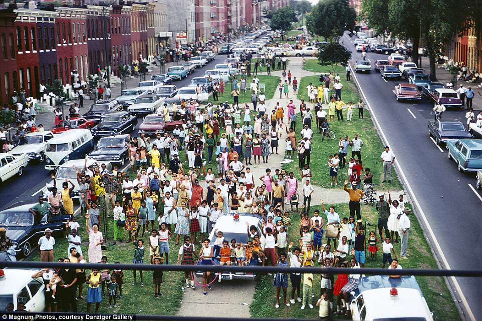 Paul Fusco (American, 1930–2020). Untitled (North Broadway, Baltimore), from the series RFK Funeral Train, 1968, printed later. Danziger Gallery. 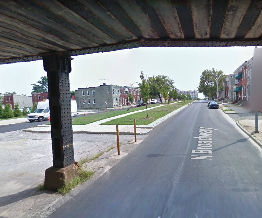 Google Maps shot of the median on North Broadway, Baltimore, from under the train tracks. 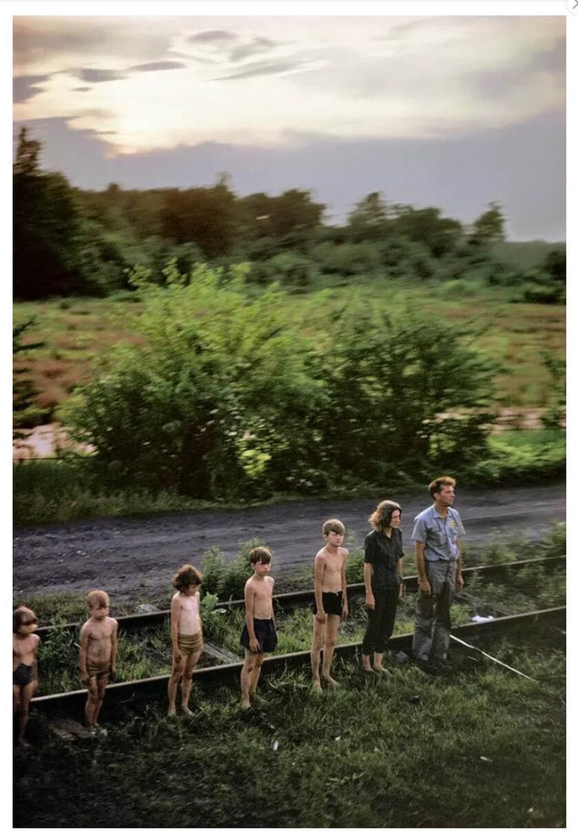 Paul Fusco (American, 1930–2020). Untitled (Family), from the series RFK Funeral Train, 1968, printed later. Danziger Gallery. 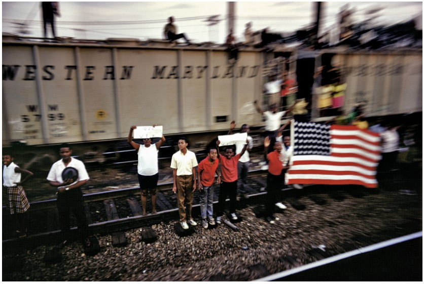 Paul Fusco (American, 1930–2020). Untitled (Western Maryland Railroad), from the series RFK Funeral Train, 1968, printed later. Danziger Gallery. 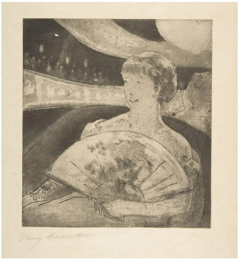 Mary Cassatt (American, 1844–1926). In the Opera Box (No. 3), c. 1880. Etching, softground etching, and aquatint. Sheet: 357 x 269 mm. (14 1/16 x 10 9/16 in.); plate: 197 x 178 mm. (7 3/4 x 7 in.). Metropolitan Museum of Art: Gift of Mrs. Imrie de Vegh, 1949, 49.127.1. 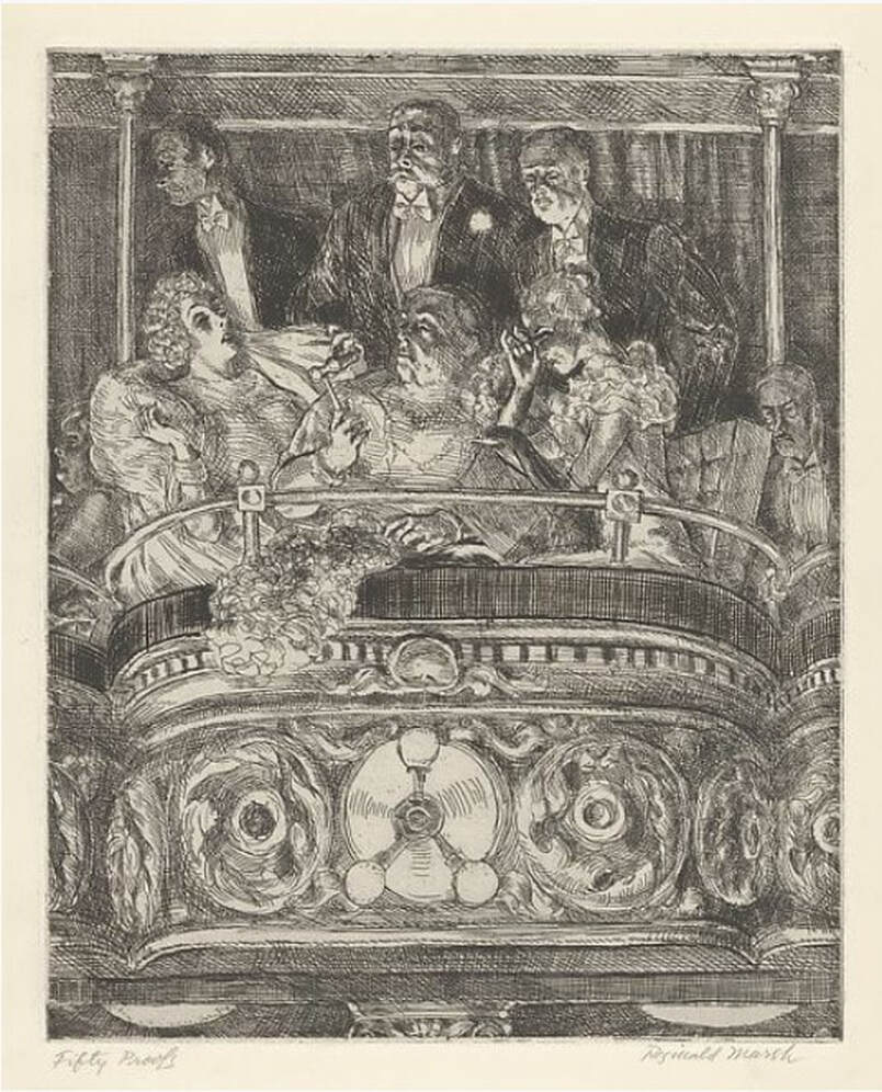 Reginald Marsh American (1898–1954). Box at the Metropolitan, 1934. Etching and engraving. Sheet: 250 x 202 mm. (9 13/16 x 7 15/16 in.); plate 322 x 252 mm. (12 11/16 x 9 15/16 in.). Metropolitan Museum of Art: Gift of The Honorable William Benton, 1959, 59.609.15. 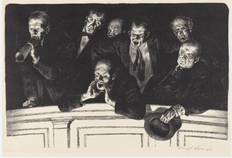 Joseph Hirsch (American, 1910–1981). The Hecklers, 1943–1944, published 1948. Lithograph. Sheet 312 421 mm. (12 5/16 x 16 9/16 in.); image: 251 x 388 mm. (9 7/8 x 15 ¼ in.). National Gallery of Art: Reba and Dave Williams Collection, Gift of Reba and Dave Williams, 2008.115.2503. 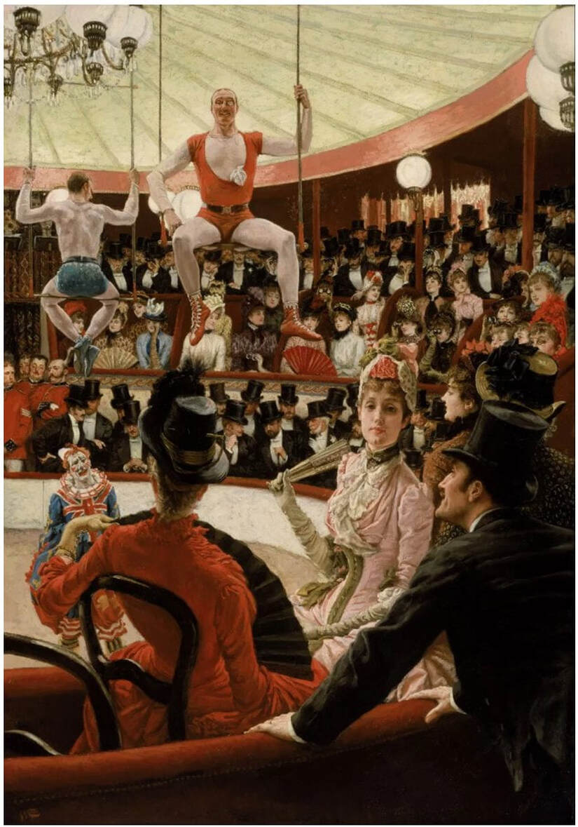 James Tissot (1836–1902). Women of Paris: The Circus Lover, 1885. Oil on canvas. 147.3 x 101.6 cm. (58 x 40 in.). Museum of Fine Arts, Boston: Juliana Cheney Edwards Collection, 58.45. Ann ShaferCome with me down a rabbit hole to where the praying mantis lives. We will look at a 1946 print by Fred Becker, who was one of Hayter’s people. He worked as a shop tech and printer at Atelier 17 in the 1940s until he left to found the printmaking program at Washington University in St. Louis. I have been looking at and researching this American artist recently; I have been mulling over Kaleidoscopic Organism, 1946, for longer then I’d like to admit. It has befuddled me. I thought today I would lay out my thinking and take you along for the ride as I pick it apart and attempt to get inside the artist’s mind. Please know this is only my thinking—no guarantee that any of it is right! Kaleidoscopic Organism is an engraving and etching (both hard and softground) and is sizable at 17 5/8 x 14 3/4 (plate size). The image is wacky. An amoeba-like mass occupies the center around which swirl discs that hold open said amoeba to reveal its innards. In the background are radiating lines that create either a halo or a vortex. Within the mass’ interior we find (from the bottom moving upward): a balustrade or railing that is being built or repaired, a casement window handle, a keyhole holding the center of the being but there’s something going through it (a little Dr. Seussian figure, n’est ce pas?), and assorted architectural wire forms surmounted by what I see as a praying mantis. Praying mantis, hmmm. These majestic but aggressive insects were a shared subject among artists making surrealist prints at Atelier 17. I’ve included several prints of mantes by Atelier 17 artists for your viewing pleasure. With angular rear legs, triangular pivoting head, bulging eyes, and large, weirdly human forearms, mantis anatomy translates easily into line and action on the plate and offers interesting stand-ins for humans. But more to the point, the female mantis devours the male mantis after copulation (yikes!). They are also known to attack other insects (delightful). [For a good discussion about the Surrealists’ obsession with praying mantes, see William L. Pressly, “The Praying Mantis in Surrealist Art,” The Art Bulletin 60, no. 4 (December 1973): 600–615. And Ruth Markus. “Surrealism's Praying Mantis and Castrating Woman.” Woman's Art Journal 21, no. 1 (2000), 33–39. So, what about that praying mantis in Becker’s organism? I think we’ve got ourselves a vagina dentata, reflecting myths about fierce lady bits and male castration fears. Becker’s form is not toothed like Hayter’s Ceres, 1947–48 (image below), but its head that is just at the apex of the cavity cannot be overlooked. I will leave it there. Then, we must look at the bulk of the organism itself. At its bottom we find two feet, one with a shoe so worn that a big toe pops out of it. Until this moment, I could still believe we were dealing with a microscopic look at teeming life or a celestial big bang in process, but the feet snap us back to the immediate, visible world. What the heck? Ok, so here are my theories/questions about each element, which often have opposing possibilities. They are many and still swimming around in my brain. I welcome any thoughts that may clarify or further confuse the issues. 1. Is the background radiating to highlight the subject like a halo or is it a vortex we might fall into? 2. Are the discs holding the form open or running around its edges? Are they swirling like wheels or symbolizing something else? I see variously eyes, lemon slices, stained glass windows, military medals of honor, kaleidoscope parts. But could they be railway car wheels or shower heads—you see where I’m heading here, don’t you? 3. The interior elements are structural, manmade, and mechanistic (even the mantis). They are linked together like a Rube Goldbergian contraption. What’s up with the balustrade, the keyhole, and those wire apparatuses? I find it curious that the exterior discs read as organic while the interior elements read as mechanistic. There is something there just out of reach, but it will come to me. 4. The feet read as either comical (a hobo or circus clown), or as deadly serious (a wounded or dead soldier). 5. The title cannot be overlooked: Kaleidoscopic Organism (although I hate it when artists rely on titles to explicate the work—shouldn’t it hold up on its own?). The dictionary tells us that a kaleidoscope can symbolize one’s escape in times of difficulty and self-doubt; that it constantly generates changing symmetrical patterns from small pieces of colored glass and therefore symbolizes anything that changes constantly. Here is where I’ve ended up on meaning in Kaleidoscopic Organism. The title and the aforementioned definition of kaleidoscope bring me to World War II and its aftermath. At first glance, the print (made in 1946, the year after the war ended) looks comical: those gargantuan feet, the toe poking out of the shoe, the whirligigs and deeley boppers. What a smart way to pull us in. But then the praying mantis at its core turns it dark; the radiant, glowing halo turns into a vortex; the feet become those of a dead soldier; the organisms holding open the form reveal man’s mechanistic world symbolizing war, its machines, and their enabling of unbelievable cruelty and death. I suppose that contemporaneous viewers might read this work more quickly, but I believe it is imperative that we know and learn from history. It also serves to remind us that when looking at a work of art, it must be considered in context since artists can never be disassociated from the time in which they are working. Becker’s print is still stewing in my brain. If I come up with a better answer, I’ll let you know. Fred Becker (American, 1913–2004) Kaleidoscopic Organism, 1946 Etching, softground etching, and engraving Plate: 451 x 378 mm. (17 3/4 x 14 7/8 in.) Annex Galleries Stanley William Hayter (British, 1901–1988) Cruelty of Insects, 1942 Engraving and softground etching Sheet: 230 x 288 mm. (9 1/16 x 11 5/16 in.); plate: 202 x 250 mm. (7 15/16 x 9 13/16 in.) Baltimore Museum of Art: Gift of Mr. and Mrs. Robert Paul Mann, Towson, Maryland, BMA 1979.367 Roderick Mead (American, 1900–1972) Praying Mantis, c. 1940s Engraving and softground etching Plate: 394 x 279 mm. (15 ½ x 11 in.) Smithsonian American Art Museum: Gift of Mrs. Roderick Mead, 1974.122.4 Werner Drewes (American, born Germany, 1899–1985) Praying Mantis, 1944, printed 1975 Engraving and softground etching Plate: 200 x 302 mm. (7 7/8 x 11 7/8 in.) Annex Galleries Clinton Blair King (American 1901–1979) Praying Mantis, c. 1945 Etching and aquatint Plate: 277 x 200 mm (10 7/8 x 7 7/8 in.) National Gallery of Art: Reba and Dave Williams Collection, Gift of Reba and Dave Williams, 2008.115.2866 Stanley William Hayter (British, 1901–1988) Ceres, 1947–48 Engraving, softground etching, and scorper Printed in black (intaglio), and yellow (screen, relief) 605 x 390 mm. (23 7/8 x 15 3/8 in.) Museo Nacional de Bellas Artes, Buenos Aires  Fred Becker (American, 1913–2004). Kaleidoscopic Organism, 1946. Etching, softground etching, and engraving. Plate: 451 x 378 mm. (17 3/4 x 14 7/8 in.). Annex Galleries. 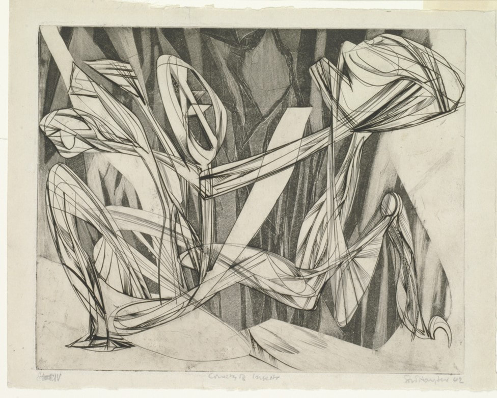 Stanley William Hayter (British, 1901–1988). Cruelty of Insects, 1942. Engraving and softground etching. Sheet: 230 x 288 mm. (9 1/16 x 11 5/16 in.); plate: 202 x 250 mm. (7 15/16 x 9 13/16 in.). Baltimore Museum of Art: Gift of Mr. and Mrs. Robert Paul Mann, Towson, Maryland, BMA 1979.367. 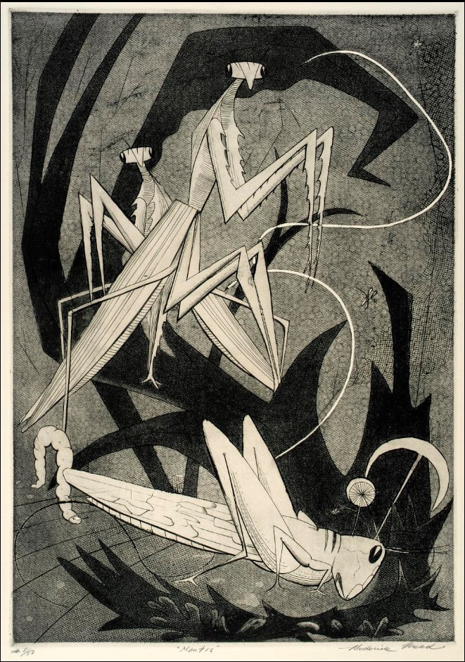 Roderick Mead (American, 1900–1972). Praying Mantis, c. 1940s. Engraving and softground etching. Plate: 394 x 279 mm. (15 ½ x 11 in.) . Smithsonian American Art Museum: Gift of Mrs. Roderick Mead, 1974.122.4.  Werner Drewes (American, born Germany, 1899–1985). Praying Mantis, 1944, printed 1975. Engraving and softground etching. Plate: 200 x 302 mm. (7 7/8 x 11 7/8 in.). Annex Galleries. 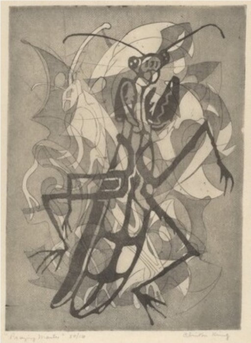 Clinton Blair King (American 1901–1979). Praying Mantis, c. 1945. Etching and aquatint. Plate: 277 x 200 mm (10 7/8 x 7 7/8 in.). National Gallery of Art: Reba and Dave Williams Collection, Gift of Reba and Dave Williams, 2008.115.2866. 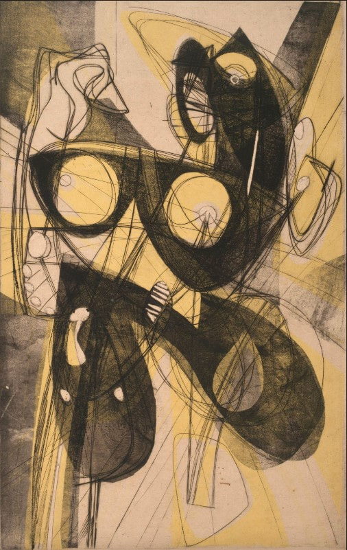 Stanley William Hayter (British, 1901–1988). Ceres, 1947–48. Engraving, softground etching, and scorper; printed in black (intaglio), and yellow (screen, relief). Plate: 605 x 390 mm. (23 7/8 x 15 3/8 in.). Museo Nacional de Bellas Artes, Buenos Aires. Ann ShaferHere’s another one that got away. And at my very last opportunity before leaving the museum, too. Rashaad Newsome’s 2016 set of lithographs were front and center in Tamarind’s booth at the 2017 Baltimore Contemporary Print Fair. The five lithographs are part of a larger project that begins with a performance of five dancers voguing, which was captured by an Xbox Kinect the artist reprogrammed. Five classic voguing dance forms were performed. The energetic swirls of their movements were captured digitally and subsequently translated into both sculptures and prints. Check out this video of Tornado Revlon. In the performance, each dancer—all of whom are well known in the voguing world—performs a different move: a catwalk is performed by Star Revlon; rapid hand movements are performed by Tornado Revlon; duck walking is performed by Justin Monster Labeija; spin dips are performed by Davon Amazon; and floor work is performed by Jamel Prodigy. For the Tamarind lithographs, the digitally tracked movements are printed in different colors, and a tiny plastic body part that indicates which part was tracked is collaged onto each print. They are 29 ¾ x 42 inches each. I knew they would both have wall power and draw people in. Newsome’s work looks at agency and privilege, asking who gets it, when, and why. Vogue balls, events that became widely known through the 1990 film Paris is Burning, is currently the subject of an FX series called Pose, which is streaming on Netflix, Amazon Prime, and elsewhere. I imagine that people in the voguing world have mixed feelings about being put under a microscope and portrayed by actors, particularly since vogue balls have always been recognized as safe spaces for Black and queer people. But that moniker “safe space” implies outsiders aren’t welcome. What do you do when Hollywood comes calling? Newsome’s performance regains agency for the performers themselves (Newsome is a part of the community) and brings it to the fine art world. Just as balls are safe spaces, I would postulate that artmaking is a safe space, too. In their need to investigate themes, problems, and ideas deeply, artists must have their own safe spaces where ideas are put through the conceptual sausage grinder and are transformed into something that starts conversations and spurs thinking and feeling. I like the parallels. You may recall I love the idea of taking dance/movement to the walls of a gallery (see my post about Trisha Brown). Works that cross disciplines have always interested me. But also because performance art is difficult to collect because of its ephemerality, I appreciate creative ways of capturing it. Just as Stan Shellabarger’s walking book (see earlier post) was the product of its own creation, Newsome’s prints capture performance through digital tracking technology. I am not particularly interested in performance art through documentary photographs. Newsome’s tracked movements translated into a jumble of frenetic energy are more evocative of the performance than any photograph could ever be. I thought it would be a great fit for the collection. Truthfully, I can’t recall which straw man quashed the acquisition. While I got used to disappointments over the years, I can still conjure the feeling of frustration. I used to always say: “I should have been a collector.” Oh well, guess I’ll just keep writing about it. Rashaad Newsome (American, born 1979) Published by Tamarind Institute FIVE SFMOMA, 2016 Five multi-color lithographs with 3D-printed and collage elements; and silver-leaf or pearlescent dusting Sheet (each): 29 3/4 x 42 inches Rashaad Newsome (American, born 1979) Published by Tamarind Institute Catwalk (Star Revlon), from the portfolio FIVE SFMOMA, 2016 Color lithograph with 3D-printed and collage elements; and silver-leaf or pearlescent dusting Sheet: 29 3/4 x 42 inches Rashaad Newsome (American, born 1979) Published by Tamarind Institute Hands (Tornado Revlon), from the portfolio FIVE SFMOMA, 2016 Color lithograph with 3D-printed and collage elements; and silver-leaf or pearlescent dusting Sheet: 29 3/4 x 42 inches Rashaad Newsome (American, born 1979) Published by Tamarind Institute Duck Walking (Juston Monster Labeija), from the portfolio FIVE SFMOMA, 2016 Color lithograph with 3D-printed and collage elements; and silver-leaf or pearlescent dusting Sheet: 29 3/4 x 42 inches Rashaad Newsome (American, born 1979) Published by Tamarind Institute Spin Dips (Davon Amazon), from the portfolio FIVE SFMOMA, 2016 Color lithograph with 3D-printed and collage elements; and silver-leaf or pearlescent dusting Sheet: 29 3/4 x 42 inches Rashaad Newsome (American, born 1979) Published by Tamarind Institute Floor Performance (Jamel Prodigy), from the portfolio FIVE SFMOMA, 2016 Color lithograph with 3D-printed and collage elements; and silver-leaf or pearlescent dusting Sheet: 29 3/4 x 42 inches  Rashaad Newsome (American, born 1979). Published by Tamarind Institute. FIVE SFMOMA, 2016. Five multi-color lithographs with 3D-printed and collage elements; and silver-leaf or pearlescent dusting. Sheet (each): 29 3/4 x 42 inches.  Rashaad Newsome (American, born 1979). Published by Tamarind Institute. Catwalk (Star Revlon), from the portfolio FIVE SFMOMA, 2016 . Color lithograph with 3D-printed and collage elements; and silver-leaf or pearlescent dusting. Sheet: 29 3/4 x 42 inches.  Rashaad Newsome (American, born 1979). Published by Tamarind Institute. Hands (Tornado Revlon), from the portfolio FIVE SFMOMA, 2016 . Color lithograph with 3D-printed and collage elements; and silver-leaf or pearlescent dusting. Sheet: 29 3/4 x 42 inches.  Rashaad Newsome (American, born 1979). Published by Tamarind Institute. Duck Walking (Juston Monster Labeija), from the portfolio FIVE SFMOMA, 2016. Color lithograph with 3D-printed and collage elements; and silver-leaf or pearlescent dusting. Sheet: 29 3/4 x 42 inches.  Rashaad Newsome (American, born 1979). Published by Tamarind Institute. Spin Dips (Davon Amazon), from the portfolio FIVE SFMOMA, 2016 . Color lithograph with 3D-printed and collage elements; and silver-leaf or pearlescent dusting. Sheet: 29 3/4 x 42 inches.  Rashaad Newsome (American, born 1979). Published by Tamarind Institute. Floor Performance (Jamel Prodigy), from the portfolio FIVE SFMOMA, 2016. Color lithograph with 3D-printed and collage elements; and silver-leaf or pearlescent dusting. Sheet: 29 3/4 x 42 inches. Ann ShaferRecently I was google-alerted to an ARTNews article about the Baltimore Museum of Art’s recent round of contemporary acquisitions, which, during its “year of the woman,” are all by women, mostly of color. Most of the artists are likely unfamiliar to you—they were to me. Let me be clear: I applaud the effort; it’s all good. But it made me think back to all the acquisitions meetings during which I proposed works of art only to be turned down because the artists were unknown to my colleagues. That reason to say no, “I’ve never heard of them,” made me mentally design a pie chart. There is a narrow slice of pie that represents contemporary artists my colleagues were interested in, and then there is the rest of the pie filled with artists making meaningful work. They just aren’t represented by Hauser & Wirth, Gagosian, or David Zwirner. I once was told: “There is a difference between contemporary art and art made today.” I always felt this was seriously shortsighted. This points to the beauty of prints and other works on paper since they are considerably more affordable than paintings, sculpture, installations, video art, and such. The price point of paintings, etc., is often a stretch for all but the best endowed museums, and the ability to acquire these kind of objects is limited. Whereas the curators in these areas must choose VERY carefully, curators of works on paper have it easier in collecting outside the sliver of pie that the contemporary curators are held to. The print curator is always thinking about the content and usefulness of a particular object rather than whether it’s by a superstar artist (at least I am). Over the years, there have been quite a few works I failed to get into the collection. I have never forgotten them. One of the ones that got away was close enough that we brought it into the museum for consideration. (Usually if it was a no, the no came long before we brought works in.) It was a portfolio of prints by Damon Davis called All Hands on Deck, 2015. Here’s the backstory. Davis is a native of East St. Louis. Following the death of Michael Brown in Ferguson, Missouri, on August 9, 2014, and events that followed—peaceful protests that turned ugly—Davis took photographs of the hands of a variety of protesters up, in a turnabout of gesture. Rather than hands up as surrender, they are hands up in protest. The photographs were printed out on large sheets and wheat pasted onto the boarded-up storefronts along West Florissant Avenue (with the permission of the store owners), which had become ground zero of the protests. Subsequently, Davis worked with Wildwood Press’ Maryanne Simmons to create a fine art edition of seven pairs of hands. The moment I saw the announcement of its publication, I fired off an inquiry about the portfolio. It seemed like a no-brainer for the Baltimore Museum given the city’s unrest following the death of Freddie Gray in April 2015, less than a year after Michael Brown’s death. Talk about parallels. (Susan Tallman wrote an excellent article on Davis’ portfolio in Art in Print, which you can find here.) When the prints arrived, my colleagues took issue with the quality of the images. Davis had retained the pixilation and choppiness of the edges from the wheat paste posters. I explained that Davis had photoshopped the images quickly in an effort to get them up on storefronts and had decided to retain that same look in the fine art edition. I had absolutely no doubt that they would look fantastic on the wall—in curator parlance we would say they have wall power. Even better, they are both specific to Ferguson and universal. They stand as a monument to protests against police brutality across the country and they are as powerful today as they were in 2015. I regret my failure for the collection. And even worse: we had full funding for the portfolio from a donor. Damon Davis (American, born 1985) Published by Wildwood Press All Hands on Deck, 2015 Portfolio of seven lithographs Sheet (each): 813 x 1232 (32 x 48 ½ in.)  Damon Davis (American, born 1985), published by Wildwood Press. All Hands on Deck, 2015. Portfolio of seven lithographs. Sheet (each): 813 x 1232 (32 x 48 ½ in.). 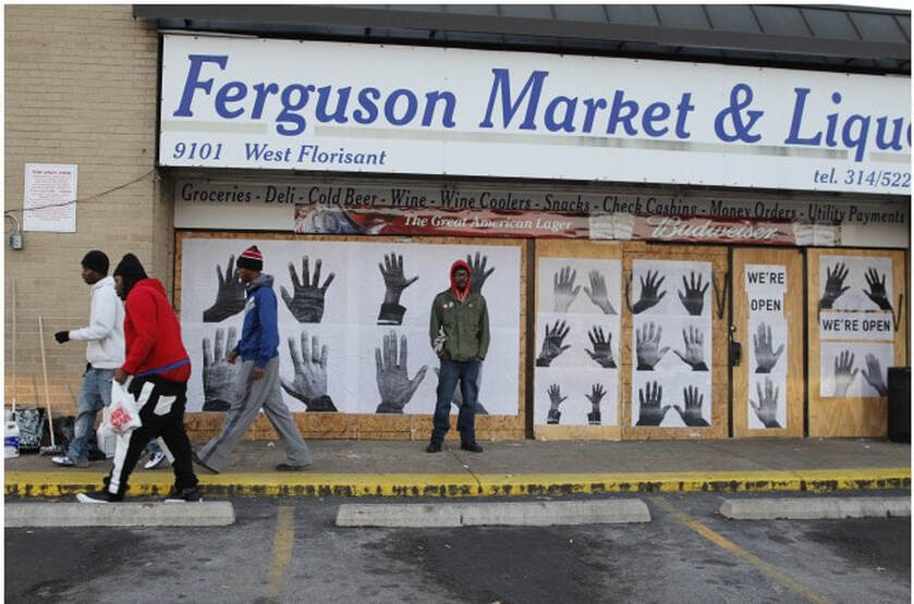 Damon Davis in Ferguson, MO, with wheat-pasted posters. 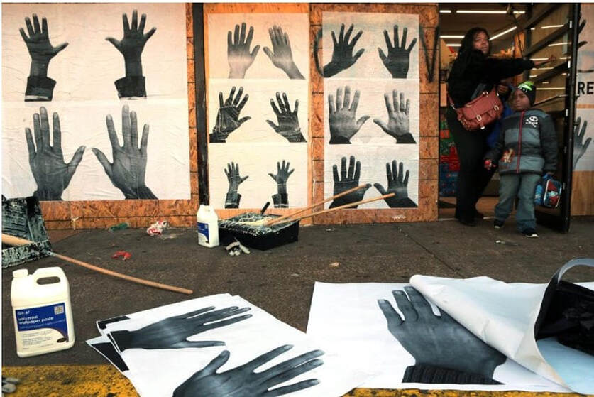 Damon Davis' wheat-pasted posters in Ferguson, MO, 2014. 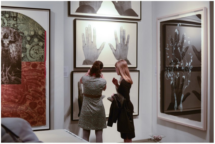 Wildwood Press' booth at the Seattle Art Fair. 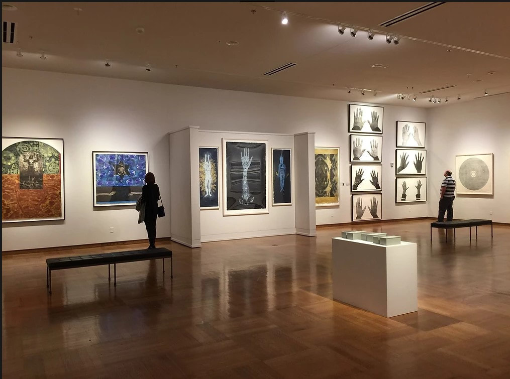 Damon Davis' portfolio on view at the Mitchell Museum at Cedarhurst, 2016. Ann ShaferIt was a “I’ve been plucked from the chorus line” moment. Back in 2008, I went on a tastemaker’s tour of Brazil with a small group of curators from various American museums. It was at the invitation of the Brazilian government—they had been running these sorts of trips periodically (our guide told us he had recently hosted a group of Japanese architects). It was meant to expose us to some of their museums, galleries, foundations, and artists in hopes of future collaborations between the two countries. We were escorted on the tour by a government representative, a super nice man named Carlos. We started out in Rio de Janeiro, flew to Salvador, then ended up in São Paolo. It was an amazing trip and we saw great art. Along the way, I was introduced to a bunch of artists with whom I was unfamiliar. Some of my favorites are: Daniel Senise, Lina Kim, Alejandro Chaskielberg, Marcius Galan, Gerda Steiner & Jörg Lenzlinger, Marcello Grassmann, Oscar Niemeyer, Lygia Clark, Mira Schendel, Carlito Carvalhosa, Christian Cravo, Fayga Ostrower, Tarsila do Amaral, Nicola Costantino, Michael Wesley, Livio Abramo, Ernesto Neto, Lina Bo Bardi. When I returned to the BMA, I gave a presentation on all that we saw, which led to the only connection I was able to make. One of my colleagues, Karen Millbourne, fell in love with the work of Henrique Oliveira and included him in a show at her next museum of employment, the National Museum of African Art. He makes fantastical sculptures out of discarded plywood from urban construction sites (boards used in the fencing that blocks the view from the street) that take over spaces. São Paolo is a gigantic city that spreads out over 587 square miles. When you fly in, you see nothing but city as far as the eye can see. It just goes on and on. When we visited Galerie Vermelho, one of our last stops, I fell in love with an artist’s book by Kátia Fiera. It’s unique (there is only one of them--it is composed of drawings), and small, horizontally shaped and is filled with translucent sheets. Delicate line drawings in black marker of power lines, television antennas, and kites fill the textless pages. That you can see through each page to the subsequent pages, and that the power lines just keep going, beautifully captures the endlessness of the city, as well as its problems with pollution. While I didn’t know anything about Fiera at the time, I couldn’t pass up a perfect memento of a fabulous trip. Kátia Fiera (Brazilian, born 1976) De Passegem, 2007 Artist’s book Private collection Henrique Oliveira (Brazilian, born 1973) Desnatureza, 2011 Found plywood Galerie Vallois installation shot  Kátia Fiera (Brazilian, born 1976). De Passegem, 2007. Artist’s book. Private collection.  Kátia Fiera (Brazilian, born 1976). De Passegem, 2007. Artist’s book. Private collection.  Kátia Fiera (Brazilian, born 1976). De Passegem, 2007. Artist’s book. Private collection.  Kátia Fiera (Brazilian, born 1976). De Passegem, 2007. Artist’s book. Private collection.  Kátia Fiera (Brazilian, born 1976). De Passegem, 2007. Artist’s book. Private collection.  Henrique Oliveira (Brazilian, born 1973). Desnatureza, 2011. Found plywood. Galerie Vallois installation shot. Ann ShaferHere’s a doozy for my simultaneous color printing friends. No surprise, Letterio Calapai worked with our man Hayter at Atelier 17 in New York in the 1940s. While Earthquake is from 1958, it is a glorious summation of techniques he learned among the many inventive artists frequenting Atelier 17. The print is really two prints that form a diptych. I've seen images of the two sides abutting each other, but the BMA would likely present these in a single frame, but with two windows in the mat with a center strip covering the seam. Letterio Calapai followed the path of many other American artists who worked at Hayter’s Atelier 17. After growing up in Boston, he moved to New York in 1928 and supported himself by working in a lithographic shop. He worked for the WPA early on painting a mural in the 101st Signal Battalion at 801 Dean Street in Brooklyn among other projects (see image). By the time Hayter moved Atelier 17 to New York from Paris in 1940 (fleeing German occupation), Calapai was continuing his artistic studies. It wasn’t until 1946 that Calapai worked at Atelier 17; he continued making prints there until 1949. His shift from 1930s realism to 1940s abstraction can be specifically linked to his time there. Like so many other artists who worked at the New York Atelier 17, Calapai went on to found a university printmaking program, in his case, the Graphic Arts Department at the Albright Art School in Buffalo (1949–55). He returned to New York to teach at the New School for Social Research from 1955–65. During his tenure at the New School, he established the Intaglio Workshop for Advanced Printmaking in 1962 (it ran until 1965). In 1965 he moved to Chicago and taught at, and retired from, the University of Illinois at Chicago. So, to the printing. Recently we’ve been pulling apart simultaneous color prints by Hayter. You can assume if Hayter did it, others did too, including Calapai. Earthquake is printed from two plates, which together are some 32 inches wide (big!). Both plates are inked in black (intaglio), where the ink is pushed into the lines and grooves of the plate. Rolled onto the surface (relief) are several colored inks added through screens (similar to a stencil): blue-green gradient, red, and green on the left, and green and red-yellow gradient on the right. The left plate also includes a yellow wood offset rolled through a stencil (similar to Hayter’s Sun Dancer, discussed in another post). For clarity, the description is broken down into bullet points to more easily list each component. Just remember, all of these colored inks are rolled onto each of these plates and are put through the press once. Letterio Calapai (American, 1902–1993) Earthquake, 1958 Diptych of etching, softground etching, open bite etching, and engraving
Sheet (right): 562 x 458 mm. (22 1/8 x 18 1/16 in.; plate (right): 504 x 404 mm. (19 13/16 x 15 7/8 in.) Baltimore Museum of Art: The John Dorsey and Robert W. Armacost Acquisitions Endowment, BMA 2014.13a-b 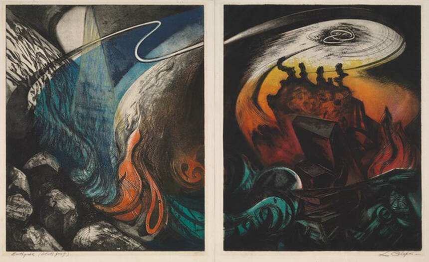 Letterio Calapai (American, 1902–1993), Earthquake, 1958. Diptych of etching, softground etching, open bite etching, and engraving; left plate printed in black (intaglio), blue-green gradient (screen, relief) , red (screen, relief), green (screen, relief), yellow (wood offset, stencil, relief); right plate printed in black (intaglio), green (screen, relief), red-yellow gradient (screen, relief). Sheet (left): 562 x 432 mm. (22 1/8 x 17 in.); plate (left): 505 x 404 mm. (19 7/8 x 15 7/8 in.); sheet (right): 562 x 458 mm. (22 1/8 x 18 1/16 in.); plate (right): 504 x 404 mm. (19 13/16 x 15 7/8 in.). Baltimore Museum of Art: The John Dorsey and Robert W. Armacost Acquisitions Endowment, BMA 2014.13a-b 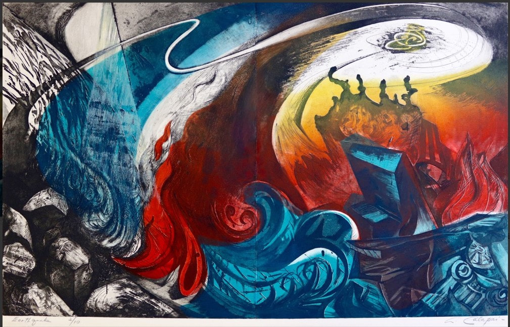 Impression of Calapai's Earthquake from Aaron Galleries. 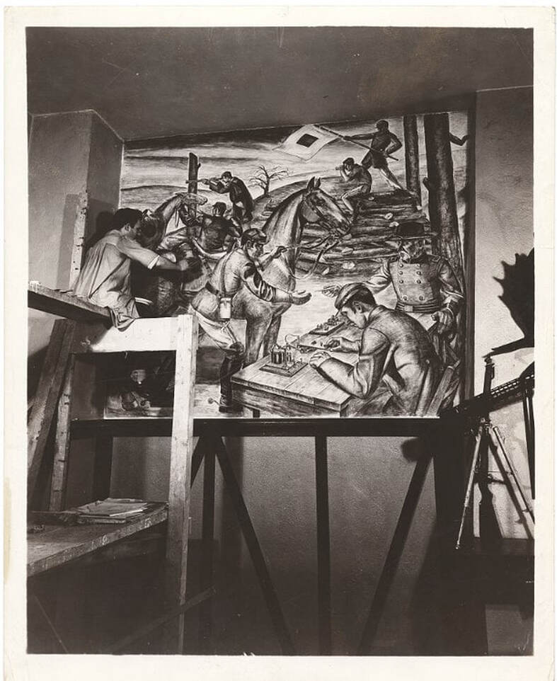 Letterio Calapai painting a WPA mural in the 101st Signal Battalion at 801 Dean Street in Brooklyn. (Photo from Wikipedia.) Ann ShaferIn a previous post, we looked at the new system Ben Levy came up with to describe Hayter’s simultaneous color prints. We adopted a two-tiered method: the first line describes what is in the plate (the grooves and textures that carry the image); the subsequent lines describe each layer of inking, which are combined on the single plate and run through the press once. In our discussion we gave a few examples, and one included a wood-offset-stencil-relief roll. Sounds complicated, I know. I’m going to pull it apart for you. Hayter used the wood offset dealio in his 1951 print Danse de soleil (Sun Dancer). Published by Guilde Internationale de la Gravure, there were 200 in the edition (aside from any proofs or early states). Hayter had been experimenting with relief rolling colors of different viscosities onto the plate either through a silkscreen or a stencil for several years—his 1946 print Cinq personnages is considered his most important early use of this new-fangled printing method. By 1951, he’s on a roll (get it?). For Danse du soleil, Hayter used an offset pattern from a plank of wood. To get the texture and pattern of the wood to show up in a gradient of red-orange, he first rolled out the gradient on a glass palette, red on one end and orange on the other. (After a period of rolling, the inks merge in the middle and create a smooth mix of the colors.) Taking the roller with the red-orange ink, Hayter rolled the gradient onto a piece of wood that had just the pattern and texture he wanted. Then he took another, clean roller, one large enough that its circumference was equal to the height of the copper plate carrying the image, and rolled it across the inked-up wood once, picking up the exact image of the wood texture in the red-orange gradient. That roller was rolled across the surface of the already intaglio-inked copper plate once, depositing the image of the red-orange wood on the surface. He did this through a cut paper stencil so that the gradient only appears in certain areas. See the image where I added the purple marks indicating where the stencil allowed the gradient through. He also rolled on a yellow ink through a different stencil, as well as a blue-green gradient through another stencil. Neither of these two stenciled additions used an offset from another texture. Rather, the inks were rolled on a palette and directly rolled onto the plate through stencils. So, our description should now make sense: Engraving, softground etching, and scorper Printed in black (intaglio); red-orange gradient (wood offset, stencil, relief); yellow (stencil, relief); blue-green gradient (stencil, relief) Stanley William Hayter (English, 1901–1988) Danse du soleil (Sun Dancer) [state 1], 1951 Engraving; printed in black (intaglio) Sheet: 503 x 317 mm. (19 13/16 x 12 1/2 in.) Plate: 397 x 233 mm. (15 5/8 x 9 3/16 in.) Baltimore Museum of Art: Gift of Mr. and Mrs. Robert Paul Mann, Towson, Maryland, BMA 1979.362 Stanley William Hayter (English, 1901–1988) Danse du soleil (Sun Dancer), 1951 Engraving, softground etching, and scorper; printed in black (intaglio); red-orange gradient (wood offset, stencil, relief); yellow (stencil, relief); blue-green gradient (stencil, relief) Sheet: 566 x 379 mm. (22 5/16 x 14 15/16 in.) Plate: 394 x 238 mm. (15 1/2 x 9 3/8 in.) Baltimore Museum of Art: Blanche Adler Memorial Fund, BMA 1953.56 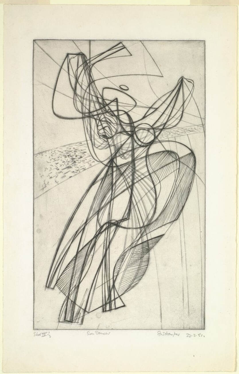 Stanley William Hayter (English, 1901–1988), Danse du soleil (Sun Dancer) [state 1], 1951. Engraving; printed in black (intaglio), sheet: 503 x 317 mm. (19 13/16 x 12 1/2 in.); plate: 397 x 233 mm. (15 5/8 x 9 3/16 in.). Baltimore Museum of Art: Gift of Mr. and Mrs. Robert Paul Mann, Towson, Maryland, BMA 1979.362. 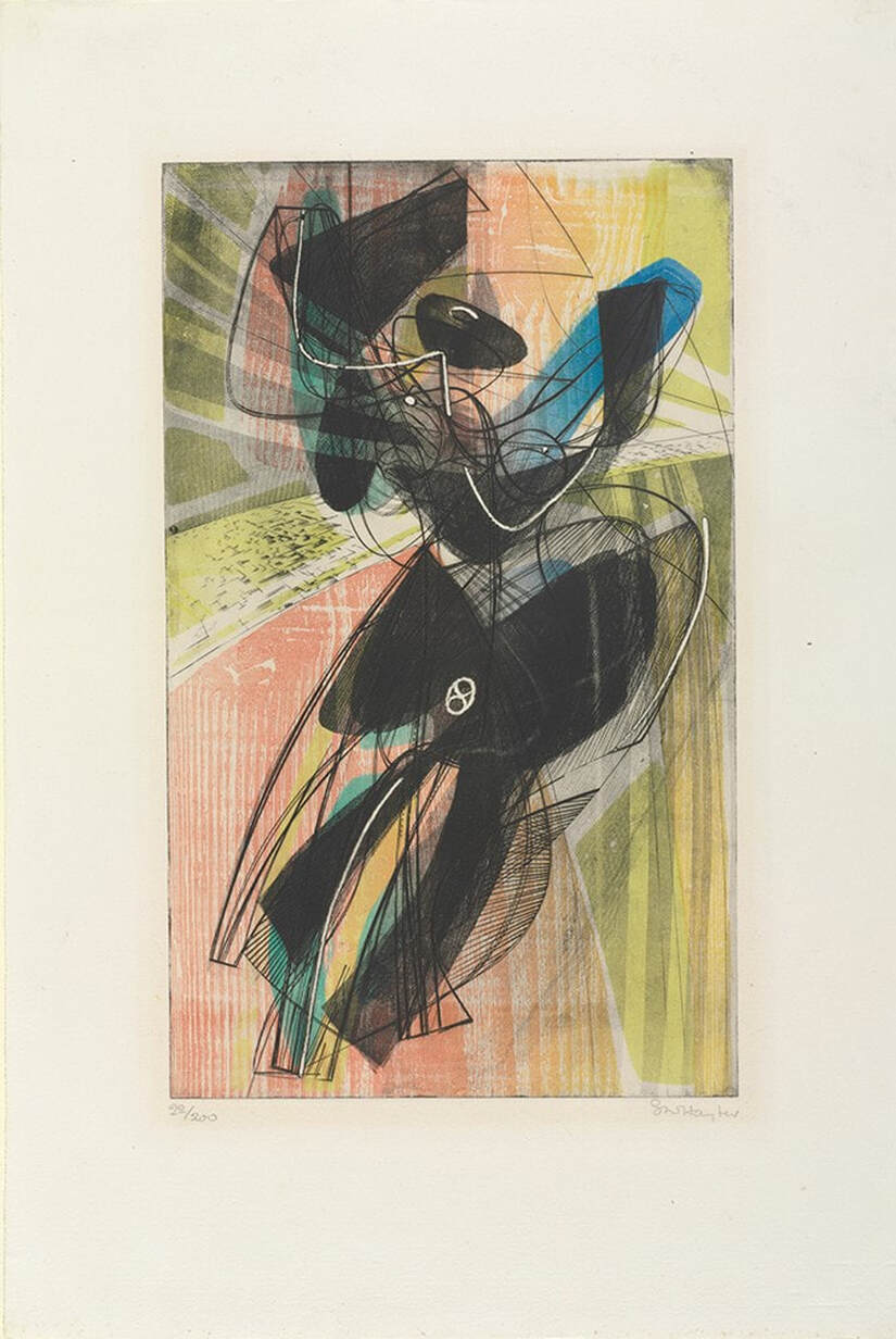 Stanley William Hayter (English, 1901–1988), Danse du soleil (Sun Dancer), 1951. Engraving, softground etching, and scorper; printed in black (intaglio); red-orange gradient (wood offset, stencil, relief); yellow (stencil, relief); blue-green gradient (stencil, relief), sheet: 566 x 379 mm. (22 5/16 x 14 15/16 in.); plate: 394 x 238 mm. (15 1/2 x 9 3/8 in.). Baltimore Museum of Art: Blanche Adler Memorial Fund, BMA 1953.56. 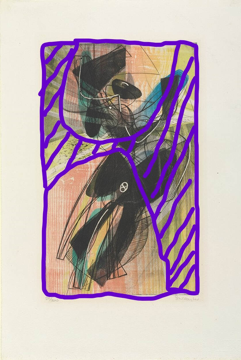 Purple marks where the stencil lets the ink pass through. Stanley William Hayter (English, 1901–1988), Danse du soleil (Sun Dancer), 1951. Engraving, softground etching, and scorper; printed in black (intaglio); red-orange gradient (wood offset, stencil); yellow (stencil); blue-green gradient (stencil), sheet: 566 x 379 mm. (22 5/16 x 14 15/16 in.); plate: 394 x 238 mm. (15 1/2 x 9 3/8 in.). Baltimore Museum of Art: Blanche Adler Memorial Fund, BMA 1953.56. Ann ShaferBack in June 2014, Tru Ludwig, Ben Levy, and I spent hours poring over prints by Hayter and associated artists of Atelier 17 with an eye toward technique. We wanted to change the way people describe these simultaneous-color-printed works so that it was clearer to the layperson how it was done. (They are confusing enough without adding fuzzy descriptions.) Ben devised a method for listing the mediums. We would first describe what techniques were used to make the image in the plate. Then we would follow with a description of how the plate was inked. In our Notes to the Reader (for the unpublished catalogue), we wrote about it this way: The most complicated aspect of the checklist is the media information. Conventionally, print media lines in checklists and on labels are concise, which assumes some knowledge on the part of the viewer. These works demand more explanation. To maintain consistency throughout in describing the techniques and media, we have adopted a two-tiered method of describing each print. For each entry in the checklist, readers will find the first line describes what is in the plate (the grooves and textures that carry the image). The subsequent lines describe each layer of inking, which are combined on the single plate and run through the press once. This second line also includes verbiage referring to the method of inking, which is divided into two categories: intaglio and relief. Intaglio inking means the ink is pushed into the grooves on the plate and the surface of the plate is wiped clean. Relief, in these cases, means that ink is applied to the surface using one of several methods: stencil, screen, various rollers. This last point is critical when discussing simultaneous color printing. Whereas traditional color printing requires a separate plate for each color, Atelier 17 artists discovered a method of printing in multiple colors on a single plate. A description of these terms and how they are used within the context of these complicated works is included below. Conventionally, for black-and-white prints, the media lines are pretty simple: Engraving and etching In this catalogue the same type of work is listed as: Engraving and etching Printed in black (intaglio) It gets more complicated when describing the works with multiple colors: Engraving and open bite etching Printed in black (intaglio), red (relief) Or even more complicated: Engraving, softground etching, and scorper Printed in black (intaglio), red-orange gradient (wood offset, stencil, relief), yellow (stencil, relief), and blue-green gradient (stencil, relief) Each layer of ink is described by the color followed by the method in parentheses. When multiple colors are listed in the same inking run, that means they were applied to the plate at the same time by the same means. Multiple colors connected by hyphens followed by the term gradient indicates several colors rolled and blended on a single glass palette (sometimes called a split fountain or rainbow roll). Multiple colors separated by commas followed by the term unblended indicates several colors that are unblended on the palette (think of mottled colors plopped on the palette). So, take Pillars, 1974. The orange ink is wiped in the intaglio manner, meaning into the lines and open-bit areas. This is followed by two rolls of ink across the surface in the relief manner, with varying amounts of oil so they reject each other. With these two gradient rolls, yellow and blue, Hayter (well, actually Hector Saunier printed this edition) also used a stencil to block the center area from the yellow roll and the blue roll (see the image with the purple shape representing the stencil—roughly). They also used gradient rolls for both the yellow and blue. Meaning, two columns of yellow at the outside portion were rolled with no ink in the center so that the yellow fades as it reached the center. The same was done with the blue. While this may sound like a lot of hogwash, I hope it clarifies a bit about the magical work going on at Atelier 17. In the first image, Ben Levy and Tru Ludwig are parsing Pillars, 1974, in June 2014, at the Baltimore Museum of Art. Stanley William Hayter (English, 1901-1988) Pillars, 1974 Engraving, softground etching, and open bite etching; printed in orange (intaglio); blue-blue gradient (stencil, relief), and yellow-yellow gradient (stencil, relief) Sheet: 746 x 561 mm. (29 3/8 x 22 1/16 in.) Plate: 584 x 430 mm. (23 x 16 15/16 in.) Baltimore Museum of Art: Bequest of Virginia Fox, Palm Beach, Florida, BMA 1988.29 Stanley William Hayter (English, 1901-1988) Pillars, 1974 Engraving, softground etching, and open bite etching; printed in orange (intaglio); blue-blue gradient (stencil, relief), and yellow-yellow gradient (stencil, relief) Plate: 584 x 430 mm. (23 x 16 15/16 in.) Tate Britain: Purchased 1981, P07471 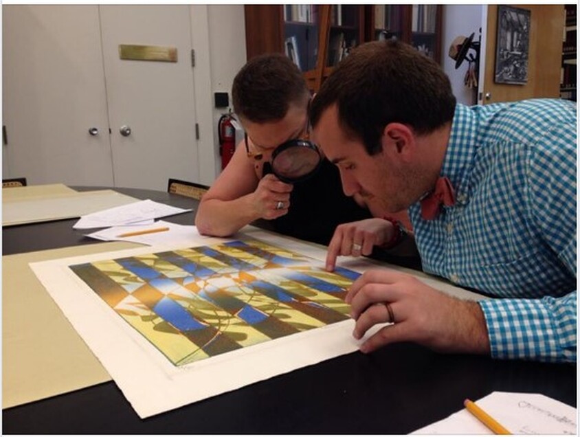 Ben Levy and Tru Ludwig are parsing Pillars, 1974, in June 2014, at the Baltimore Museum of Art. Stanley William Hayter (English, 1901-1988), Pillars, 1974. Engraving, softground etching, and open bite etching; printed in orange (intaglio); blue-blue gradient (stencil, relief), and yellow-yellow gradient (stencil, relief). Sheet: 746 x 561 mm. (29 3/8 x 22 1/16 in.); plate: 584 x 430 mm. (23 x 16 15/16 in.). Baltimore Museum of Art: Bequest of Virginia Fox, Palm Beach, Florida BMA 1988.29. 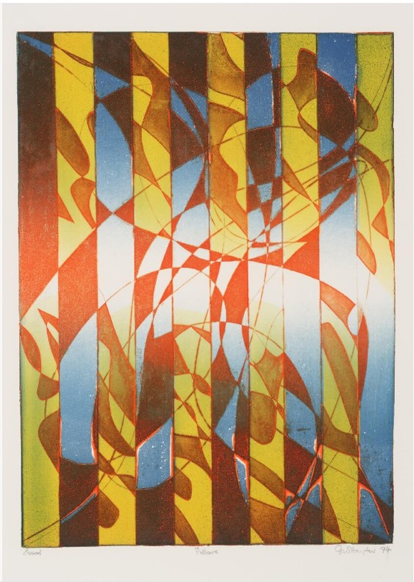 Stanley William Hayter (English, 1901-1988), Pillars, 1974. Engraving, softground etching, and open bite etching; printed in orange (intaglio); blue-blue gradient (stencil, relief), and yellow-yellow gradient (stencil, relief). Plate: 584 x 430 mm. (23 x 16 15/16 in.). Tate Britain: Purchased 1981, P07471. 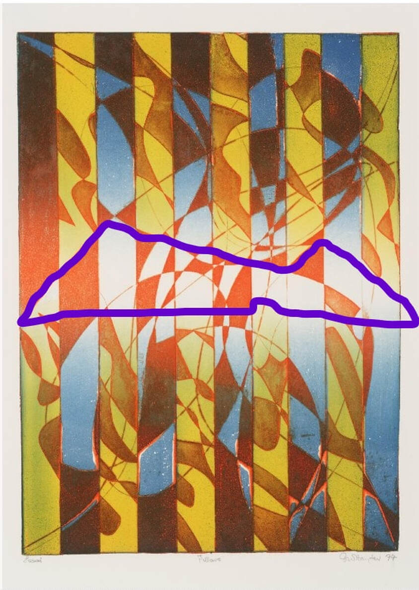 Stencil marked in purple. Stanley William Hayter (English, 1901-1988), Pillars, 1974. Engraving, softground etching, and open bite etching; printed in orange (intaglio); blue-blue gradient (stencil, relief), and yellow-yellow gradient (stencil, relief). Plate: 584 x 430 mm. (23 x 16 15/16 in.). Tate Britain: Purchased 1981, P07471. 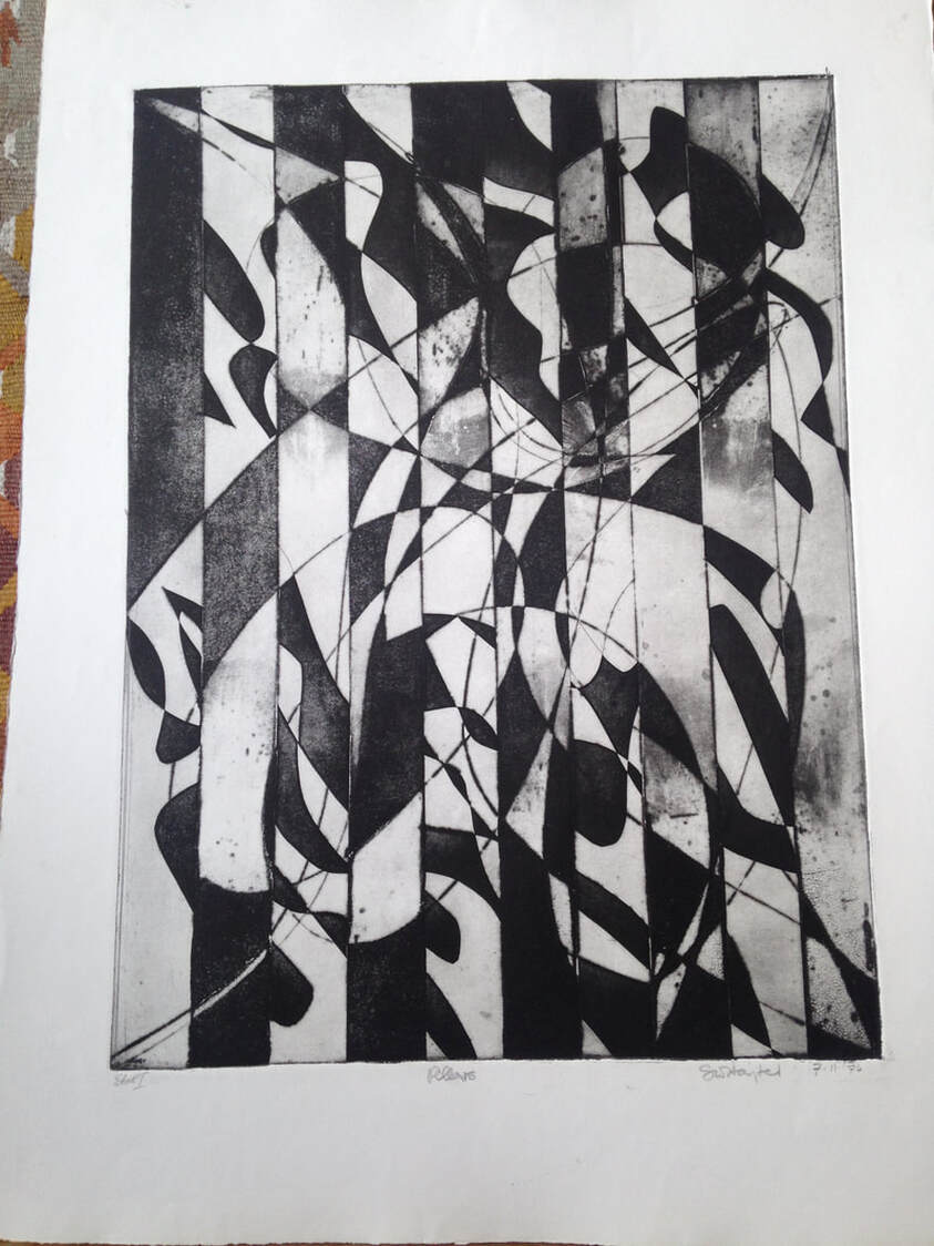 Stanley William Hayter (English, 1901-1988), Pillars [first state], 1974. Engraving, softground etching, and open bite etching; printed in black (intaglio). Plate: 584 x 430 mm. (23 x 16 15/16 in.). Private collection. Ann ShaferOne of the reasons I love Stanley William Hayter so much is that I adore the quality of line he gets with engraving. In this method the artist uses a burin, a handheld tool with a diamond-shaped tip, to cut into the copper; they push the tool forward to incise a line in the copper into which the ink will lay. It takes a lot of strength and control, but it rewards the hard work. I love the swell and taper, the strength, the crispness. Hayter used engraving in a totally new way beginning in the 1930s. Prior to that the technique was used to reproduce the compositions of other artists. This type of print is known as a reproductive print. By these prints, the artist of the original composition could spread his designs far and wide, and the engraver could make a living. They were created by very talented engravers who devised a series of patterns of marks meant to mimic brushstrokes, fabric, hair, feathers, all the while in black and white. You can imagine that the advent of photography in the late 1830s killed this entire industry and engraving along with it. One hundred years later, Hayter revitalized the technique, but in a wholly new way. Reproductive prints are the bastard stepchild of the already bastard stepchild of prints, making them the bottom of the barrel. They don't get a lot of respect, but there has been a growing interest in them in the last few decades. Maybe they will soon have their day in the spotlight. I used to skim past these kinds of prints when going through solander boxes in the storeroom. They tended to be portrait after portrait of persons I didn't recognize or care about. They seemed trite, fussy, controlled, old fashioned, and are markedly different from the modernist prints of Hayter and the associated artists at Atelier 17. But as happens with prints, the more you slow down your looking, the more you see. As we used to say in the print room: "these reward scrutiny." I had a chance today to paw through Tru Ludwig's copy of Anthony Griffith's monumental book, The Print Before Photography (EDIT: not Prints and Printmaking: An Introduction to the History and Techniques, as first reported). The book is impressive, and the images are drawn solely from the collection of the British Museum. Its endpapers are a detail of a reproductive engraving by Antoine Masson of a portrait of Henri de Lorraine, Count of Harcourt, by Nicolas Mignard from 1667. In the first few pages are more details plus the entire image. As you look through these details, check out how many different patterns are used and what they describe. This is when reproductive engravings get interesting for me: imagining an artist looking at a painting, or, more likely, a drawing of the painting, and attempting to render the flesh of the sitter's hand with black lines and dashes. Or the curling hair of his mustache. Or the shine of his satin sleeves. The list goes on. It truly boggles the mind. Antoine Masson (French, 1636–1700), after Nicolas Mignard (French, 1606–1668) Henri de Lorraine, Count of Harcourt, 1667 Engraving Plate (trimmed within platemark) 544 x 390 (20 1/2 x 16 in.) British Museum: Bequest of Clayton Mordaunt Cracherode, R,6.209  Antoine Masson (French, 1636–1700), after Nicolas Mignard (French, 1606–1668). Henri de Lorraine, Count of Harcourt, 1667. Engraving, plate (trimmed within platemark) 544 x 390 (20 1/2 x 16 in.). British Museum: Bequest of Clayton Mordaunt Cracherode, R,6.209 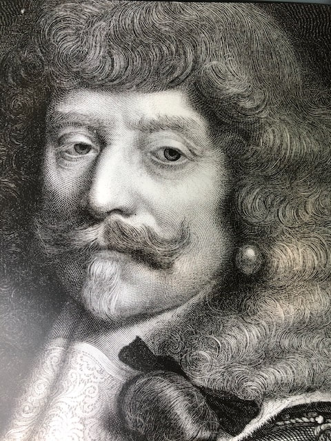 DETAIL: Antoine Masson (French, 1636–1700), after Nicolas Mignard (French, 1606–1668) Henri de Lorraine, Count of Harcourt, 1667 Engraving Plate (trimmed within platemark) 544 x 390 (20 1/2 x 16 in.) British Museum: Bequest of Clayton Mordaunt Cracherode, R,6.209 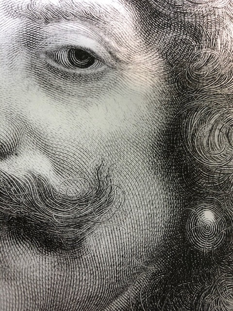 DETAIL: Antoine Masson (French, 1636–1700), after Nicolas Mignard (French, 1606–1668) Henri de Lorraine, Count of Harcourt, 1667 Engraving Plate (trimmed within platemark) 544 x 390 (20 1/2 x 16 in.) British Museum: Bequest of Clayton Mordaunt Cracherode, R,6.209 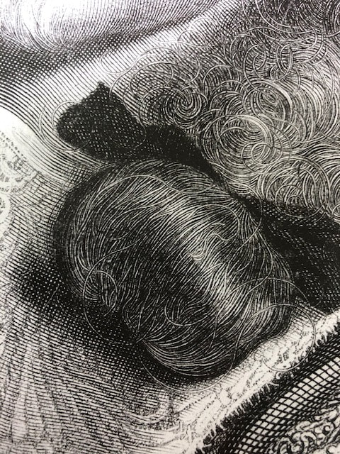 DETAIL: Antoine Masson (French, 1636–1700), after Nicolas Mignard (French, 1606–1668) Henri de Lorraine, Count of Harcourt, 1667 Engraving Plate (trimmed within platemark) 544 x 390 (20 1/2 x 16 in.) British Museum: Bequest of Clayton Mordaunt Cracherode, R,6.209 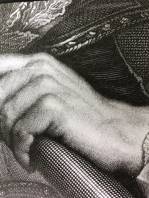 DETAIL: Antoine Masson (French, 1636–1700), after Nicolas Mignard (French, 1606–1668) Henri de Lorraine, Count of Harcourt, 1667 Engraving Plate (trimmed within platemark) 544 x 390 (20 1/2 x 16 in.) British Museum: Bequest of Clayton Mordaunt Cracherode, R,6.209 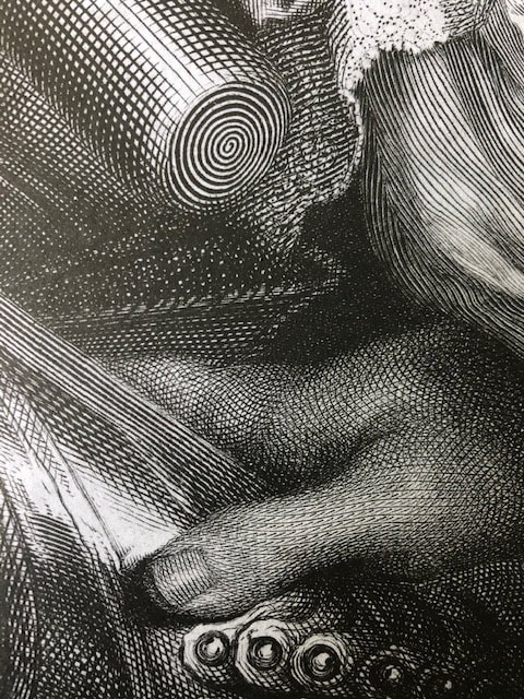 DETAIL: Antoine Masson (French, 1636–1700), after Nicolas Mignard (French, 1606–1668) Henri de Lorraine, Count of Harcourt, 1667 Engraving Plate (trimmed within platemark) 544 x 390 (20 1/2 x 16 in.) British Museum: Bequest of Clayton Mordaunt Cracherode, R,6.209  DETAIL: Antoine Masson (French, 1636–1700), after Nicolas Mignard (French, 1606–1668) Henri de Lorraine, Count of Harcourt, 1667 Engraving Plate (trimmed within platemark) 544 x 390 (20 1/2 x 16 in.) British Museum: Bequest of Clayton Mordaunt Cracherode, R,6.209  DETAIL: Antoine Masson (French, 1636–1700), after Nicolas Mignard (French, 1606–1668) Henri de Lorraine, Count of Harcourt, 1667 Engraving Plate (trimmed within platemark) 544 x 390 (20 1/2 x 16 in.) British Museum: Bequest of Clayton Mordaunt Cracherode, R,6.209  DETAIL: Antoine Masson (French, 1636–1700), after Nicolas Mignard (French, 1606–1668) Henri de Lorraine, Count of Harcourt, 1667 Engraving Plate (trimmed within platemark) 544 x 390 (20 1/2 x 16 in.) British Museum: Bequest of Clayton Mordaunt Cracherode, R,6.209  DETAIL: Antoine Masson (French, 1636–1700), after Nicolas Mignard (French, 1606–1668) Henri de Lorraine, Count of Harcourt, 1667 Engraving Plate (trimmed within platemark) 544 x 390 (20 1/2 x 16 in.) British Museum: Bequest of Clayton Mordaunt Cracherode, R,6.209 Ann ShaferIf I am doing my job correctly, I rarely come across someone or something I’ve not seen before that I know is right for the collection immediately. Even better is when the work is a powerful statement protesting the justice system. Being in New York for Print Week means reserving enough time to scoot down to the galleries in Chelsea to see what’s up. We always go to the International Print Center New York to see what magic Judy Hecker has up. Then we wander down the halls at 526 West 26th Street to see Old Master dealer C.G. Boerner’s contemporary offerings as well as the projects on view in David Krut’s gallery. Back in 2010, Ben Levy and I made the rounds and discovered the superb work of South African artist Diane Victor at David Krut’s project space. The longest wall was salon-hung with Victor’s delicate and beautiful smoke drawings of black African men and children in which disembodied heads float on a white ground. You can’t help but be drawn in to investigate them more closely. We came to learn the drawings of adult males reflected men who were in prison awaiting trial, in other words, stuck in limbo. The children depicted were faces of those who were missing (Americans of a certain vintage will remember the missing children notices on our milk cartons). In both cases, they are people lost in the system. Victor draws with smoke emanating from a lit candle. (A short video of this process is here: https://youtu.be/-6E-BilDHkg.) Not only are the wispy marks ephemeral in a symbolic sense—these men and children have disappeared into the system—but also, they are literally ephemeral. The slightest touch to the surface will mar it irreparably. This delicacy reflects the precariousness of the situations these people find themselves in. The drawings are a great example of technique and meaning running in a tight conceptual circle. Even the titles, in which neither the man nor the child are named, adds to the sense of their loss—they are just numbers in the system. Standing in David Krut’s space, several things became clear very quickly. The first being that Diane Victor is a very generous person. The drawings were very reasonable, meaning they were entirely accessible to institutions and young collectors. This indicated, to me anyway, that the artist felt these conversation starters needed to be spread far and wide. Second, as a result, red dots were being placed next to drawings as we stood there. They were selling fast. Now, acquisition choices are not arrived at in a vacuum; I needed the okay to place a drawing on reserve. The problem was the person who needed to see these powerful drawings and agree with me couldn’t come until the following day. I was truly worried they would all be gone. It all worked out in the end—we were able to acquire two drawings—but there were some tense moments there. The website for The Artists’ Press (artprintsa.com) offers this description of the artist: “Diane Victor is somewhat like a spring, tightly coiled, tiny, and capable of great power…. She prefers imagery to words and the strength of her visual eloquence hits one in the gut and takes one's breath away.” The use of the term tightly coiled spring makes me smile because that is exactly how the writer Anaïs Nin described Stanley William Hayter: “a stretched bow or a coiled spring every minute, witty, swift, ebullient, sarcastic.” It seems both these high-energy artists are passionate about their message, craft, and sharing their talent with the world. My kind of artist. Like Hayter, Victor is also a prolific printmaker, working mainly in etching. I truly regret not acquiring several prints for the museum, but alas, it was not meant to be. I am, however, always keeping an eye out for what she does next. Instagram, on which one can follow so many artists and printshops directly, reveals that Victor has been at Island Press, part of the Sam Fox School of Design & Visual Arts at Washington University in St. Louis, working on a gorgeous, large-scale etching called Beware the Lap of Luxury. Island Press posted several images of Victor working on the plate that will thrill fans of printmaking and which I include in this post (thank you, Lisa Bulawsky, Director of Island Press, for the images). It’s a beauty and I can’t wait to see it in person, although when that might be remains a mystery since the fall New York print fairs have been cancelled. So many of us are crushed to not be able to see everyone in person, from galleries and publishers to artists and museum colleagues. It truly is a printmaking Shangri-La, which will be all the more special when it returns. Diane Victor (South African, born 1964) Smoke Screen 7 (Frailty and Failing), 2010 Smoke carbon from candle over graphite Sheet: 660 x 508 mm. (26 x 20 in.) Baltimore Museum of Art: Purchased in Honor of Rosalind Kronthal's Seventieth Birthday with funds contributed by her Family and Friends, BMA 2011.34 Diane Victor (South African, born 1964) Smoke Screen 9 (Frailty and Failing), 2010 Smoke carbon from candle over graphite Sheet: 660 x 508 mm. (26 x 20 in.) Baltimore Museum of Art: Purchased as the gift of Dr. Peyton Eggleston, Baltimore, BMA 2011.35  Salon-hung wall of Diane Victor's smoke drawings.  Diane Victor (South African, born 1964), Smoke Screen 7 (Frailty and Failing), 2010, smoke carbon from candle over graphite, 660 x 508 mm. (26 x 20 in.), Baltimore Museum of Art: Purchased in Honor of Rosalind Kronthal's Seventieth Birthday with funds contributed by her Family and Friends, BMA 2011.34  Diane Victor (South African, born 1964), Smoke Screen 9 (Frailty and Failing), 2010, smoke carbon from candle over graphite, 660 x 508 mm. (26 x 20 in.), Baltimore Museum of Art: Purchased as the gift of Dr. Peyton Eggleston, Baltimore, BMA 2011.35 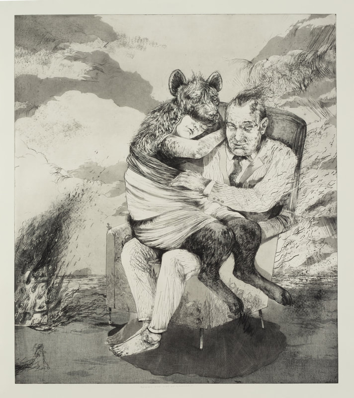 Diane Victor (South African, born 1964). Beware the Lap of Luxury, 2020. Etching (hardground and softground), drypoint, and aquatint from steel plate on Hannemuhle Copperplate paper. More specifically, line etch with three stopouts, softground with lift transfers, and softground with drawing transfer, drypoint, and three aquatint bites. Sheet: 1016 x 1168 mm. (40 x 46 in.); plate: 914 x 1067 mm. (36 x 42 in.) Edition of 18. Island Press, Sam Fox School of Design & Visual Arts at Washington University. Photo courtesy of Island Press, Sam Fox School of Design & Visual Arts at Washington University. Photo courtesy of Island Press. 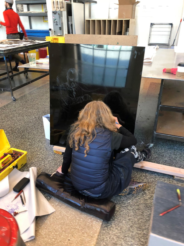 Diane Victor working on Beware the Lap of Luxury, 2020 at Island Press. Etching (hardground and softground), drypoint, and aquatint from steel plate on Hannemuhle Copperplate paper. More specifically, line etch with three stopouts, softground with lift transfers, and softground with drawing transfer, drypoint, and three aquatint bites. Sheet: 1016 x 1168 mm. (40 x 46 in.); plate: 914 x 1067 mm. (36 x 42 in.). Edition of 18. Island Press, Sam Fox School of Design & Visual Arts at Washington University. Photo courtesy of Island Press, Sam Fox School of Design & Visual Arts at Washington University. Photo courtesy of Island Press. 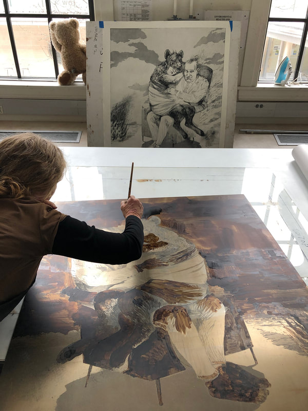 Diane Victor working on Beware the Lap of Luxury, 2020 at Island Press. Etching (hardground and softground), drypoint, and aquatint from steel plate on Hannemuhle Copperplate paper. More specifically, line etch with three stopouts, softground with lift transfers, and softground with drawing transfer, drypoint, and three aquatint bites. Sheet: 1016 x 1168 mm. (40 x 46 in.); plate: 914 x 1067 mm. (36 x 42 in.). Edition of 18. Island Press, Sam Fox School of Design & Visual Arts at Washington University. Photo courtesy of Island Press, Sam Fox School of Design & Visual Arts at Washington University. Photo courtesy of Island Press. 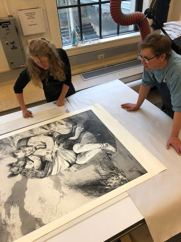 Diane Victor and Master Printer Tom Reed working on Beware the Lap of Luxury, 2020 at Island Press. Etching (hardground and softground), drypoint, and aquatint from steel plate on Hannemuhle Copperplate paper. More specifically, line etch with three stopouts, softground with lift transfers, and softground with drawing transfer, drypoint, and three aquatint bites. Sheet: 1016 x 1168 mm. (40 x 46 in.); plate: 914 x 1067 mm. (36 x 42 in.). Edition of 18. Island Press, Sam Fox School of Design & Visual Arts at Washington University. Photo courtesy of Island Press, Sam Fox School of Design & Visual Arts at Washington University. Photo courtesy of Island Press. Ann ShaferWhen I’m hunting for new acquisitions, on the macro level I ask myself several questions. How does it fit into the larger collection? Is it continuing an established collecting area, or is it a wholly new avenue? Does it have friends already in the collection, and will they play well together in an interesting exhibition? And, will it be useful with students in the print room? On the micro level, other questions arise. When you find a work that is political in tone, for instance, I always ask myself, is it too specific to a certain moment that will be lost on future viewers, or is the message universal enough to be both specific and universal? Ben Levy and I invited Joseph Carroll to be a vendor at the 2012 Baltimore Contemporary Print Fair, and he brought with him Ambreen Butt's set of five prints, Daughter of the East, 2008. I loved them then and pitched them, but the proceeds from the fair went to other acquisitions. I always regretted it, so when the same set of prints showed up at the 2017 print fair with Wingate Studio, I gave a little jump for joy. (Butt’s prints were printed and published by Wingate’s Peter Pettengill, a lovely person and a great printer, and are among the last things I acquired for the BMA.) The set of five prints are delicate and strong at the same time and reflect Butt’s early training as a miniature painter (she grew up in Pakistan and studied traditional Indian and Persian miniature painting at the National College of Arts in Lahore). In 1993, Butt moved to Boston to get an MFA from Massachusetts College of Art and Design. She now lives in Dallas. Daughter of the East, 2008, consists of five multi-plate etchings, some with chine collé, that are a reaction to the Siege of Lal Masjid, or Red Mosque, in Islamabad, which occurred July 3–11, 2007. During the siege, the Pakistani government raided the Red Mosque complex, whose students (men and women) and mosque leaders challenged the Pakistani government. They practiced radical, conservative religious teachings, and have since been linked to Al Qaeda. When negotiations with the mosque leaders failed, the complex was stormed by the Pakistani Army’s Special Services Group, resulting in 248 people injured, over one hundred dead, and fifty captured. While at least thirty women and children were able to escape unharmed, many were reported to have been used as shields by their male allies. Subsequent reporting indicates that no women were killed, although that has long been part of the narrative. In the end, it doesn’t matter. Butt’s prints put forth the idea of women as fierce and vulnerable at the same time, of strength in numbers, and the power of the individual. In them there is both sorrow and pride, fear and purpose, belief and faith. Behind the figures, Butt takes stylistic elements of traditional Persian miniatures but creates them as aggregations of surprising objects: pistols, headwraps, helmets, ladybugs. In the first print, women, like ladybugs, gain power in numbers, even if only armed with bamboo sticks. In the second print, the figure’s burqa morphs into a dragon, which I choose to read as her power realized. In the third print, the female figure, who is specific and universal at the same time, dissolves into a splattering of ladybugs and flowers. In her ability to be one woman and all women, Butt may be referring to Indic and Buddhist philosophies in which the one and the infinite exist simultaneously. In the fourth print, the figure has dissolved into a thousand ladybugs and has assembled her power in the figure holding the rifle, ready to defend her beliefs. The final print depicts a woman with her face revealed (the artist herself), a solitary figure whose weapon is being destroyed by a woodpecker. In terms of asking those questions about political prints—does it hold up even if you don’t know to which events the prints are referring—I believe these fit the bill. For me, they portray a full range of emotions on what it is to be a woman. Although we each bring our own gifts and individuality, we need each other and are stronger together. That seems like a solid message to send out into the world as this week of protest marches and public fury at the authoritarian steps being taken by those in power comes to an end. May Butt’s images and ideas help sustain us as we stand together for what is right. And may we come out the other end with systemic change at all levels of society. Ambreen Butt (American, born Pakistan, 1969) Printed and published by Wingate Studio Daughter of the East, 2008 Portfolio of five color etchings with aquatint, spit bite aquatint, and drypoint on chine collé Sheet (each): 634 × 481 mm. (24 15/16 × 18 15/16 in.); plate (each): 455 × 327 mm. (17 15/16 × 12 7/8 in.) Baltimore Museum of Art: Print, Drawing & Photograph Society Fund, with proceeds derived from the 2017 Contemporary Print Fair, BMA 2017.68.1–5 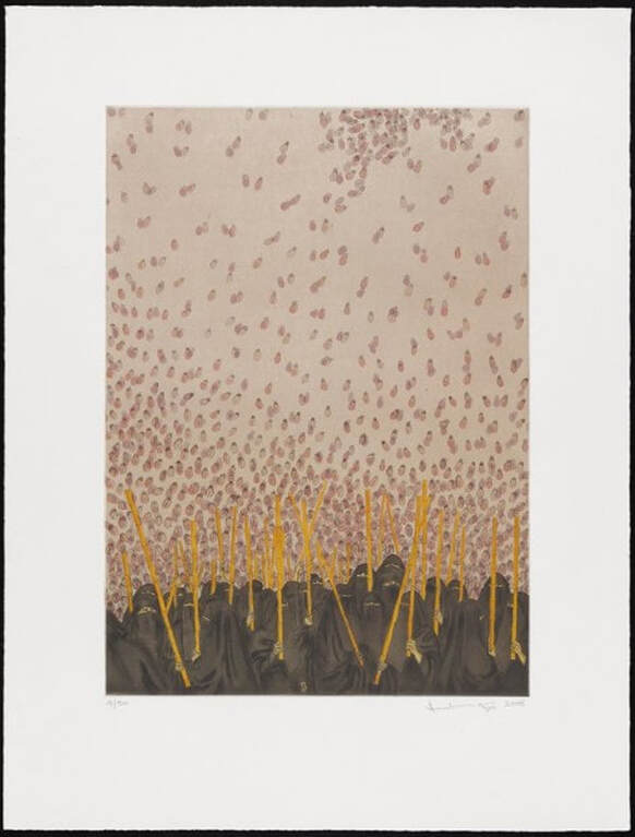 Ambreen Butt (American, born Pakistan, 1969), Plate 1 from Daughter of the East, 2008, color etching with aquatint, spit bite aquatint, and drypoint on chine collé, sheet: 634 × 481 mm. (24 15/16 × 18 15/16 in.); plate: 455 × 327 mm. (17 15/16 × 12 7/8 in.), Baltimore Museum of Art: Print, Drawing & Photograph Society Fund, with proceeds derived from the 2017 Contemporary Print Fair, BMA 2017.68.1 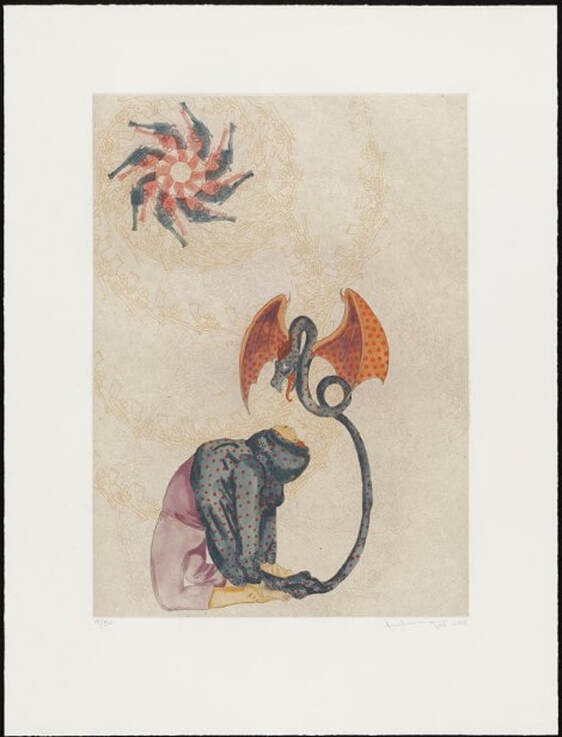 Ambreen Butt (American, born Pakistan, 1969), Plate 2 from Daughter of the East, 2008, color etching with aquatint, spit bite aquatint, and drypoint on chine collé, sheet: 634 × 481 mm. (24 15/16 × 18 15/16 in.); plate: 455 × 327 mm. (17 15/16 × 12 7/8 in.), Baltimore Museum of Art: Print, Drawing & Photograph Society Fund, with proceeds derived from the 2017 Contemporary Print Fair, BMA 2017.68.2 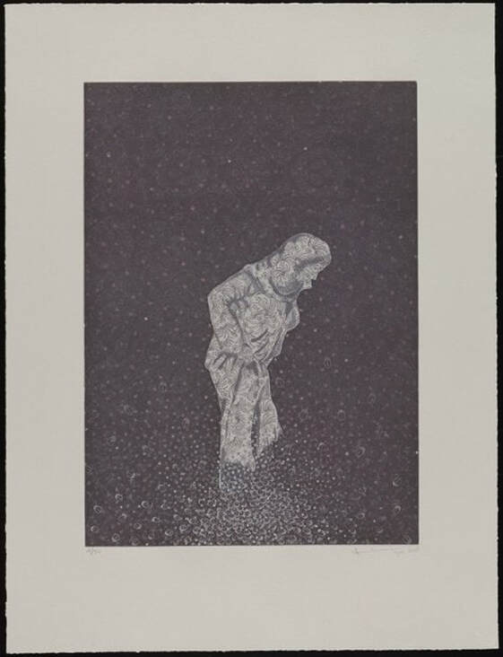 Ambreen Butt (American, born Pakistan, 1969), Plate 3 from Daughter of the East, 2008, color etching with aquatint, spit bite aquatint, and drypoint on chine collé, sheet: 634 × 481 mm. (24 15/16 × 18 15/16 in.); plate: 455 × 327 mm. (17 15/16 × 12 7/8 in.), Baltimore Museum of Art: Print, Drawing & Photograph Society Fund, with proceeds derived from the 2017 Contemporary Print Fair, BMA 2017.68.3 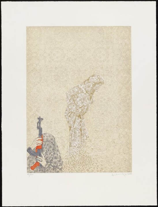 Ambreen Butt (American, born Pakistan, 1969), Plate 4 from Daughter of the East, 2008, color etching with aquatint, spit bite aquatint, and drypoint on chine collé, sheet: 634 × 481 mm. (24 15/16 × 18 15/16 in.); plate: 455 × 327 mm. (17 15/16 × 12 7/8 in.), Baltimore Museum of Art: Print, Drawing & Photograph Society Fund, with proceeds derived from the 2017 Contemporary Print Fair, BMA 2017.68.4 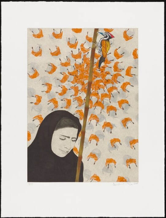 Ambreen Butt (American, born Pakistan, 1969), Plate 5 from Daughter of the East, 2008, color etching with aquatint, spit bite aquatint, and drypoint on chine collé, sheet: 634 × 481 mm. (24 15/16 × 18 15/16 in.); plate: 455 × 327 mm. (17 15/16 × 12 7/8 in.), Baltimore Museum of Art: Print, Drawing & Photograph Society Fund, with proceeds derived from the 2017 Contemporary Print Fair, BMA 2017.68.5  B.K. BANGASH/AP PHOTO. See https://www.newyorker.com/magazine/2007/07/23/days-of-rage Ann ShaferOne of the best things about teaching art students is that they move on and you get to watch as they continue to blossom. I’m not in touch with all of the students who wandered through my print room, but there are a special few with whom I keep in touch and follow on the interwebs. Once such artist is Terron Sorrells, who was in Tru Ludwig’s History of Prints class in 2014, during his junior year at MICA. Tru brought classes to the BMA six times over the semester and we looked at eighty to one hundred prints per visit from Master E.S. to yesterday. (There’s just no substitute for seeing prints in person.) Tru and I taught those classes thirteen times from fall 2005 to spring 2017. During the fall 2014 class, Terron was always as close to the prints as possible with a magnifying glass in hand, clearly soaking in their history, intricacies, and beauty. The final project in History of Prints was the creation of a work using two or three prints the students had seen during the semester as jumping-off points. Sometimes non-printmaking students would produce a project in a different medium but mostly they produced prints. We saw a tapestry, a handful of drawings, a video work using Kathe Kollwitz’s Raped as its influence, and a website playing with the notion of the limited edition (when you set the number in the edition, after viewing the webpage that number of times, it would no longer load). We saw some really great prints and a whole lot of meh prints. I always noted to myself which work was that class’s winner. Terron’s print, Handouts, was the winner in the fall 2014 class. Terron’s prints from his years at MICA seem particularly relevant today as we’ve just come off a weekend full of demonstrations, some peaceful and some violent, protesting the murder of George Floyd at the hands of the Minneapolis police. There is a through-line that winds its way from slavery through Reconstruction-era inmate leasing, Jim Crow laws of segregation, racial terror lynchings, mass incarceration, and today’s police killings. The terms may have changed, but the effect remains. Visual acts of protest in prints can be indelible markers of those moments in history, and some can remain eerily relevant even years later. Terron had his first one-person exhibition in 2019 at Strathmore Hall in Bethesda, Maryland, and it was beautiful. It was great to see Terron’s more recent paintings hanging alongside the prints from his school years. Many of the works on view had red dots marking them as sold, and additional impressions of some of the prints were available in Strathmore’s shop, because, ya know, prints are multiples. While many people take issue with that multiplicity, printmakers have long been drawn to making images in numbers that enable images to be spread far and wide. Sometimes prints are made to extend an artist’s fame or a particular composition; sometimes prints are made to make a very pointed statement about society. Prescient political prints have been produced by the likes of Jacques Callot, Francisco de Goya, Edouard Manet, Honoré Daumier, Otto Dix, Pablo Picasso, Leonard Baskin, Sue Coe, Sandow Birk, and countless others. To this list we can add Terron Sorrells. Terron’s prints often turn history on its ear. In Triumph over Kasualties, African Americans wearing whiteface swoop into a Klan rally on horseback upending the narrative. This is the most active act of resistance in this group of prints. The rest highlight somewhat quieter but no less impactful moments. In Colored Only the split frame reveals that life only exists in color on the colored side. In After That, Do This, Then This, Then That, a multi-appendaged domestic worker is keeping the household running as the white woman boops her on the nose. The shadow of her head is reminiscent of a figure in Pablo Picasso's monumental and monumentally important painting, Guernica. In Handouts, Cooper has crossed out the identifying label “negro” to remind viewers that there are individuals behind labels. These prints are pointed, beautifully executed, and quiet, but they pack a wallop. While I really like Terron’s new paintings, I hope that someday he will return to printmaking, for his is a strong voice that is needed now more than ever. Terron Sorrells (American, born 1994) Handouts, 2014 Etching 279 x 356 mm. (11 x 14 in.) Terron Sorrells (American, born 1994) Gumptious Stroll Through Stagville Estate, 2014 Etching 279 x 330 mm. (11 x 13 in.) Terron Sorrells (American, born 1994) Triumph over Kasualties, 2015 Etching 356 x 508 mm. (14 x 20 in.) Terron Sorrells (American, born 1994) Press Forward, 2015 Etching with chine collé 127 x 178 mm. (5 x 7 in.) Terron Sorrells (American, born 1994) Picket, 2015 Etching with chine collé 279 x 381 mm. (11 X 15 in.) Terron Sorrells (American, born 1994) Colored Only, 2016 Lithograph with chine collé 381 x 533 mm. (15 x 21 in.) Terron Sorrells (American, born 1994) After That, Do This, Then This, Then That, 2016 Lithograph 381 x 533 mm. (15 x 21 in.) Terron Sorrells (American, born 1994) Black Lives Matter, 2016 Monotype 444 x 508 mm. (17 ½ x 20 in.) 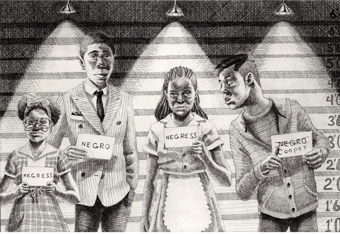 Terron Sorrells (American, born 1994), Handouts, 2014, etching, 279 x 356 mm. (11 x 14 in.) 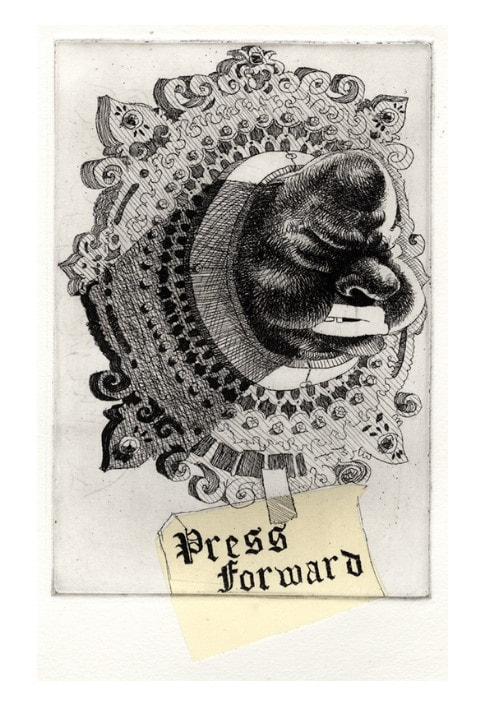 Terron Sorrells (American, born 1994), Press Forward, 2015, etching with chine collé, 127 x 178 mm. (5 x 7 in.) 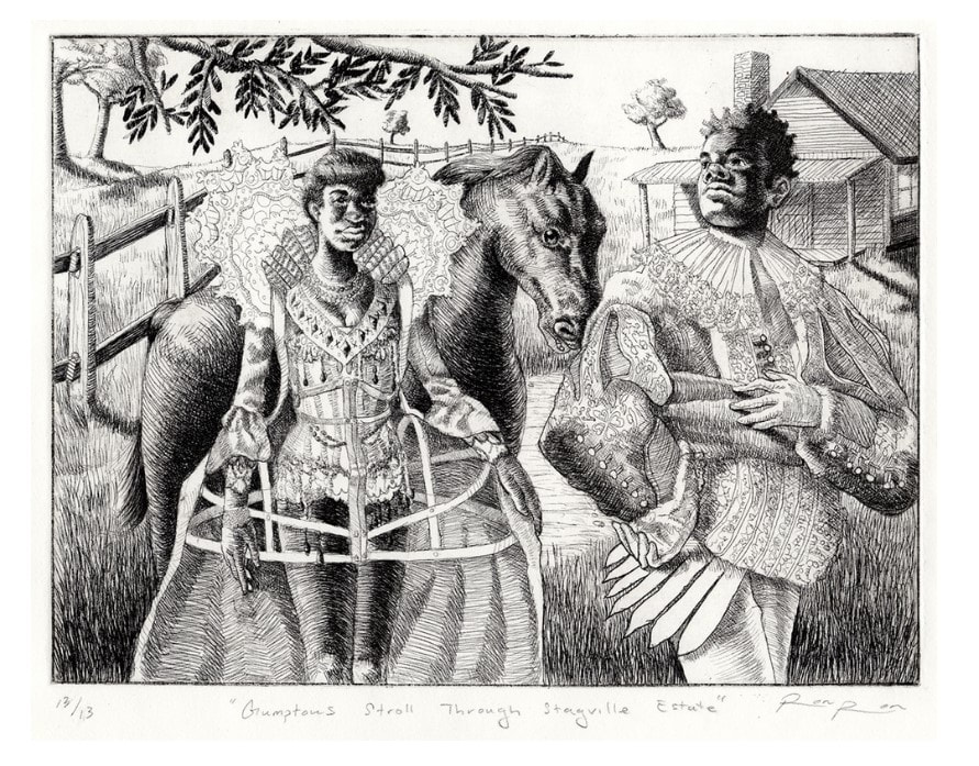 Terron Sorrells (American, born 1994), Gumptious Stroll Through Stagville Estate, 2014, etching, 279 x 330 mm. (11 x 13 in.) 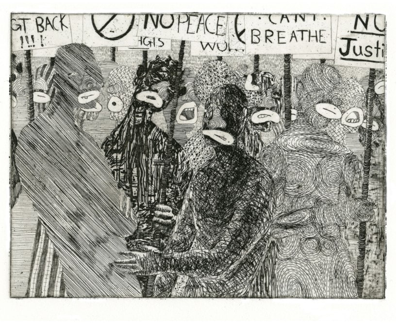 Terron Sorrells (American, born 1994), Picket, 2015, etching with chine collé, 279 x 381 mm. (11 X 15 in.) 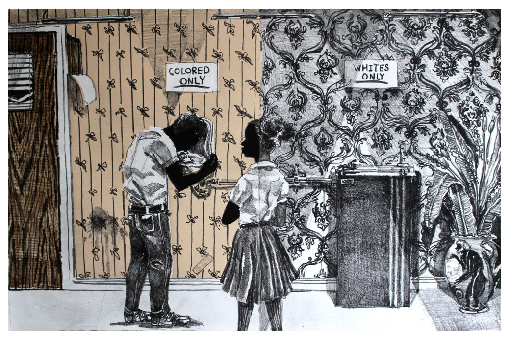 Terron Sorrells (American, born 1994), Colored Only, 2016, lithograph with chine collé, 381 x 533 mm. (15 x 21 in.) 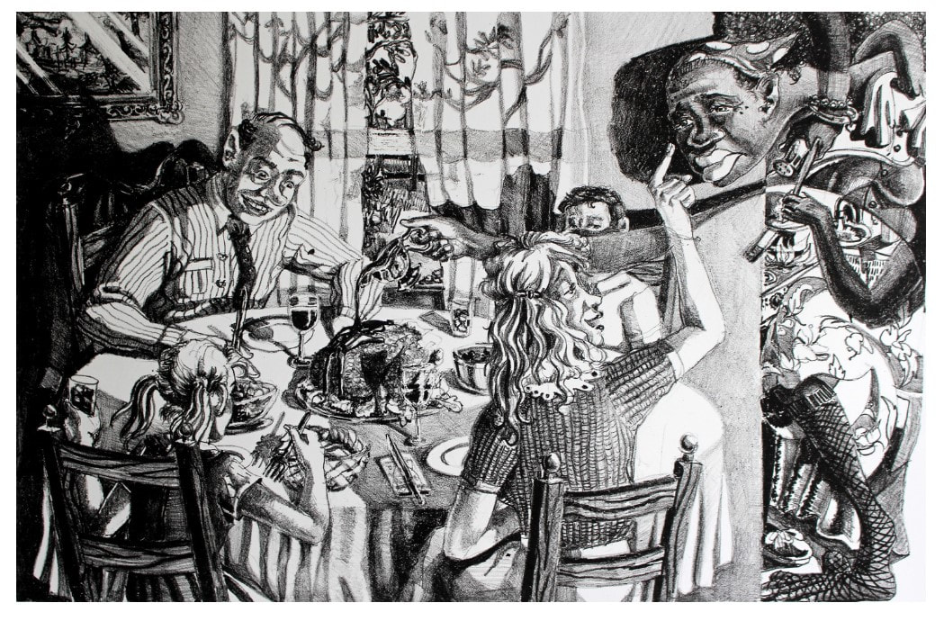 Terron Sorrells (American, born 1994), After That, Do This, Then This, Then That, 2016, lithograph, 381 x 533 mm. (15 x 21 in.) 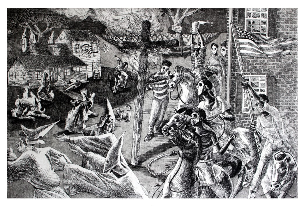 Terron Sorrells (American, born 1994), Triumph over Kasualties, 2015, etching, 356 x 508 mm. (14 x 20 in.) 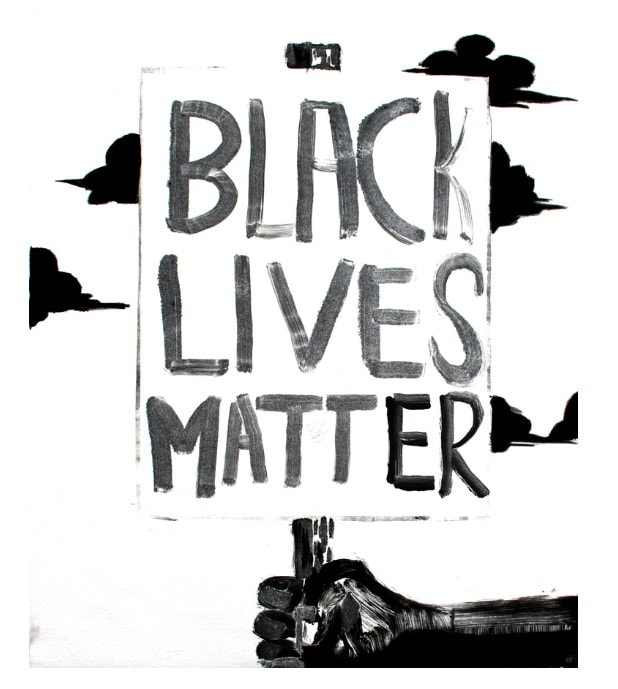 Terron Sorrells (American, born 1994), Black Lives Matter, 2016, monotype, 444 x 508 mm. (17 ½ x 20 in.) Ann ShaferI’ve been thinking a lot about why I feel compelled to write posts about art. Since I am no longer at a museum, and because of these crazy and scary times—we just hit that unfathomable milestone of 100K dead—I wanted to get some stuff down for the record. A blog seem like a good method to share some thoughts. This pandemic has brought into the light so many cracks in our society. How we come through the other side remains to be seen. There are many things that I hope will change, and many institutions that I hope will survive. I think writing about art takes me away to somewhere beautiful, thoughtful, hopeful. It all takes me back to why I was drawn to art history in the first place. It is a truth that understanding history is critical for humankind’s survival; it’s crucial to understand where we’ve been in order to move forward with hindsight's wisdom. When I was in school, history classes consisted of a straight-up recounting of politics, governments, and wars. While important, those things felt pretty far away, and I confess to feeling a combination of boredom and depression. (Acknowledging privilege here.) It always felt like there had to be more. More information about hopeful aspects of human life. More information about society and how culture is key and revelatory. More about things that closely impact our individual and personal lives. In art history I found a recounting of human history through the perspective of art and culture. Rather than the contentious and divisive world of politics and warfare, culture and art offer hopeful, uplifting perspectives and still convey our history. Aha! And yet, throughout thirty years in the art business, I periodically had a crisis of faith. It sometimes seemed like art was an unnecessary and frivolous aspect of society, the proverbial icing on the cake. Nice to have, but not essential. But I have come to believe that art is a critical component in our lives. (Let’s not forget to mention the economics of this robust sector. It may not be the best paying of careers, but there are many, many people engaged in this important work.) Further, I believe that creativity is the best part of being human. I believe that artists are uniquely suited to create art that not only pleases the eye but also challenges the mind. It is a higher-order type of thinking and is unique to humans. It would be sad indeed if we were to squander this amazing ability, but embracing it fully gives me hope for our future. The possibilities for impacting lives are endless. For me, it is an honor to help people understand art a bit better. And I hope that my passion for it is infectious. Image: Ann Shafer giving a talk to the Print, Drawing & Photograph Society of the Baltimore Museum of Art in March 2013. Photo credit: Ben Levy 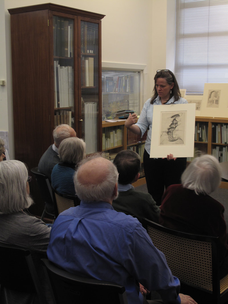 Ann Shafer giving a talk to the Print, Drawing & Photograph Society of the Baltimore Museum of Art in March 2013. Photo credit: Ben Levy Ann ShaferIt is a truth universally acknowledged that performance art is difficult to collect. Just as with dance or music, when the performance is over, there remains nothing solid. Sure, there might be a recording or video, but the thing itself evaporates as soon as it is done. With performance art, often the tangible, collectible thing is some sort of documentation of it—usually photographs. Rarely does one find a work that is a product of the performance—an indexical work, if you will. When Tru Ludwig and I stumbled across Western Exhibitions’ booth at the Editions and Artists Books Fair (E/AB) in 2011, gallery owner Scott Speh had Stan Shellabarger’s book front and center. Stan Shellabarger is known for extended, endurance performances, say walking in a circle for twelve hours, marking the earth and a moment in time. Taking the idea of creating a drawing on the ground further, Shellabarger also walks in shoes outfitted with graphite or sandpaper on the soles and performs an endurance walk on paper or wood. In this way, the artwork is not only the performance itself, but also the drawing created in the process. Like many before him, Shellabarger wanted to be able to create more than one object from a given performance, and, no surprise, he turned to printmaking. The method Shellabarger came up with to record a performance is known as a reductive or suicide woodcut. In this method, a multi-color print is created using a single block by carving away more of the surface in between printing each color. After drawing the outline of the image on the woodblock, first any areas that are to remain the color of the paper are carved away and the first color is printed. It is critical to print more sheets than you think you will need for the planned edition because you will undoubtedly have several mishaps (that’s where the suicide part comes in). After the first color is printed and the block is cleaned, the artist carves away any area that will remain that first color. After printing the second color, the steps are repeated. In the final cutting, usually all that is left is the key or black line, which brings the whole composition together. Shellabarger used the reduction method but in a slightly different way. The woodblock has the various layers of image cut away by the artist walking on it with sandpaper-soled shoes rather than by carving in the conventional manner. For this walking performance piece, there were multiple boards laid out on the floor and walked upon. After each board was printed, after every walking session and every different color printing, the prints pulled from each board were assembled into accordion-fold books. When fully opened and unfolded, the book reaches eighteen feet. Before beginning to walk, Shellabarger took the boards to Spudnik Press, a cooperative printshop in Chicago, printed the first color, the dark red, ending up with a flat red on each sheet. After walking for a period of time (at least four hours), Shellabarger printed the second color, the dark blue. He repeated the process, wearing away more and more of the blocks by sanding them with his shuffle, and printed each successive layer: green, then medium blue, then finishing with light blue. I included Shellabarger’s book in my exhibition at the BMA called On Paper: Spin, Crinkle, Pluck, which was on view April 19–September 20, 2015. Each of the objects in the exhibition was indexical, meaning the image was the product of its own making. The action verbs in the exhibition title refer to three of the works in the show: spin for Trisha Brown’s softground pirouettes in Untitled Set One, 2006 (BMA 2007.336–338, and the subject of an earlier post); crinkle for Tauba Auerbach’s Plate Distortion II, 2011 (BMA 2012.198); and pluck for Ann Hamilton’s warp & weft I, 2007–08 (BMA 2009.128). We lacked enough room in the gallery to install Shellabarger’s book on the floor, which would enable viewers to really grasp how it was made. Instead, we installed it running up the wall, which brought it into a very nice conversation with the Trisha Brown prints on the adjacent wall. The museum made a video about the work for its 100th Anniversary celebration, BMA Voices. Here is the link to that video: https://www.youtube.com/watch?v=OU4pAdE2z2Q. Stan Shellabarger (American, born 1968) Untitled, 2011 Accordion–bound volume of six–color reduction woodblock print Book: 381 x 559 mm. (15 x 22 in.); sheet (unfolded): 381 x 5588 mm. (15 x 220 in.) Baltimore Museum of Art: Print, Drawing & Photograph Society Fund, with proceeds derived from the 2012 Contemporary Print Fair, BMA 2012.190 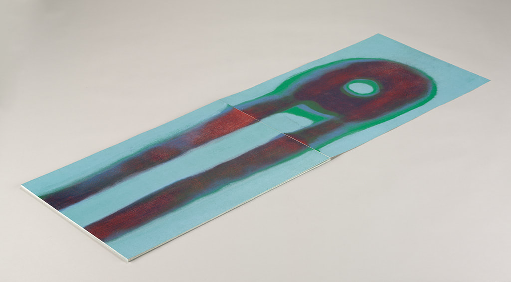 Stan Shellabarger (American, born 1968), Untitled, 2011, accordion–bound volume of six–color reduction woodblock print, book: 381 x 559 mm. (15 x 22 in.); sheet (unfolded): 381 x 5588 mm. (15 x 220 in.), Baltimore Museum of Art: Print, Drawing & Photograph Society Fund, with proceeds derived from the 2012 Contemporary Print Fair, BMA 2012.190 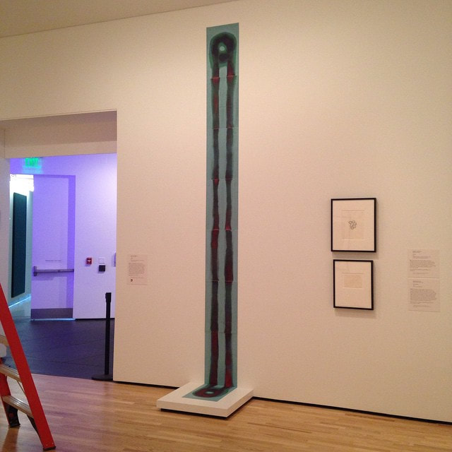 Installation shot at BMA: Stan Shellabarger (American, born 1968), Untitled, 2011, accordion–bound volume of six–color reduction woodblock print, book: 381 x 559 mm. (15 x 22 in.); sheet (unfolded): 381 x 5588 mm. (15 x 220 in.), Baltimore Museum of Art: Print, Drawing & Photograph Society Fund, with proceeds derived from the 2012 Contemporary Print Fair, BMA 2012.190 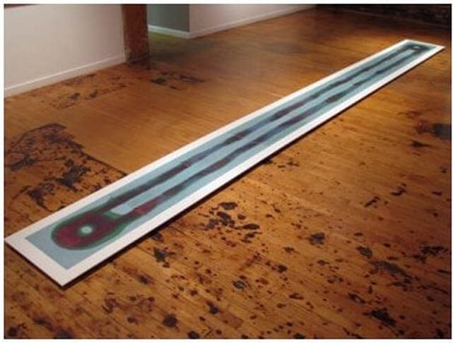 Stan Shellabarger (American, born 1968), Untitled, 2011, accordion–bound volume of six–color reduction woodblock print, book: 381 x 559 mm. (15 x 22 in.); sheet (unfolded): 381 x 5588 mm. (15 x 220 in.), Western Exhibitions, Chicago 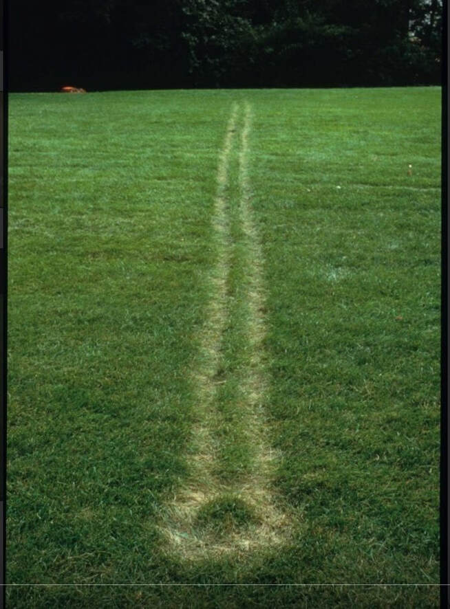 Stan Shellabarger, Untitled Performance (Autumnal Equinox 1994), Madison, WI. On the Autumnal Equinox Shellabarger paced east to west in a straight-line from sunrise to sunset on the lawn of a former astrological observatory. The twelve-hour performance left a narrow path of dead grass on the observatory’s lawn. This mark was visible until the following spring. Photo courtesy of Western Exhibitions. 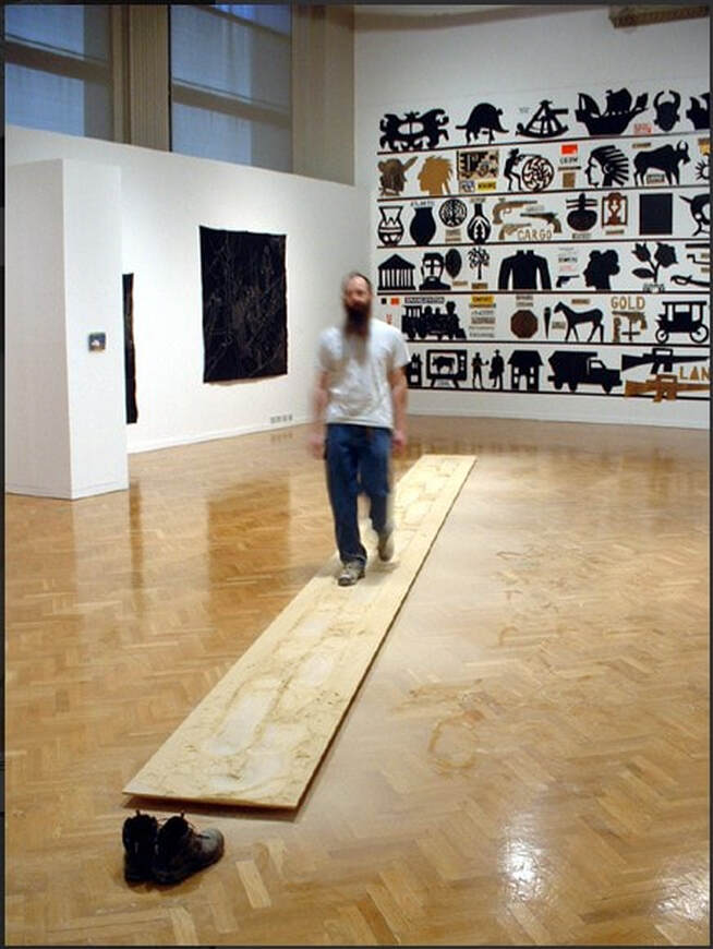 Stan Shellabarger. Untitled Performance (Sanding 2002) Chicago, IL. Shellabarger paced on a wooden walkway thirty feet by two feet for approximately one hundred and twenty hours. The soles of his shoes were covered with sixty grit sandpaper so as he paced he eroded the surface of the walkway. Eventually he wore a depression over an inch deep into the surface of walkway. Photo courtesy of Western Exhibitions. 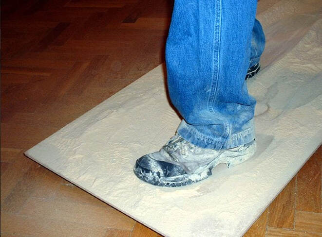 Stan Shellabarger. Untitled Performance (Sanding 2002) Chicago, IL. Shellabarger paced on a wooden walkway thirty feet by two feet for approximately one hundred and twenty hours. The soles of his shoes were covered with sixty grit sandpaper so as he paced he eroded the surface of the walkway. Eventually he wore a depression over an inch deep into the surface of walkway. Photo courtesy of Western Exhibitions. 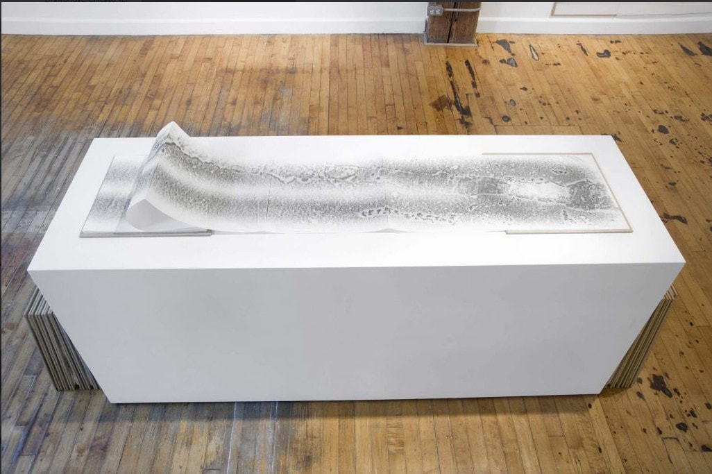 Stan Shellabarger. Untitled (Walking Book 14, 2201 S. Union, 3rd Floor, Chicago, IL) 2008, graphite on archival paper, waxed MDF covers, 15 x 15 inches closed, 15 x 337 in. open. Photo courtesy of Western Exhibitions. Ann ShaferDavid St. Hubbins: It's such a fine line between stupid, and uh... Nigel Tufnel: Clever. David St. Hubbins: Yeah, and clever. (From the movie, This is Spinal Tap) As a curator, I like work that is thoughtful, has a tight conceptual circle, and says a lot using minimal means. I appreciate it if the artist uses techniques that align with the meaning of the work. And I really appreciate it if there is a sly nod to some earlier piece of art history. This latter part is divisive among my colleagues. Is it clever or stupid? Is it derivative or smart in accessing its forebears? I spent many years hosting visitors and classes in the print room and offering critiques in the studios of artists. Occasionally I came across someone who said they didn’t want to learn about artists who came before them because it would influence their thinking and creativity. The sentiment “they have nothing to teach me,” always strikes me as foolhardy. Imagine exhibiting your work and getting comments like, “Oh, so-and-so did work like this in the 1980s.” I always tried to impress upon these non-believers that being ignorant of the work of artists “upon whose shoulders you stand,” to quote Tru Ludwig, is foolish and makes them look stupid rather than clever, in Spinal Tap parlance. Whenever I converse with artists about their work, I think about what other artists they should look at, or specific objects they need to see in the museum’s collection. I always reinforce the idea of visiting print rooms in any museum, which are there for the study of works on paper not on view in the galleries. Normally, 99.9% of the collection of works on paper is only accessible by making an appointment to look at them under supervision in a print room. And most museums, no matter where you are, have such a thing. I believe print rooms are one of the front doors of the museum. As the first contact point for print room visitors, I think it is important to give them access to objects, resources, and me (or whoever is there). Not that I know everything—far from it—but that I could at least offer a suggestion of where to turn next if I didn’t have the answers. Honestly, this was just about the most fun part of the job: watching artists looking at objects you know will spark something in their brains, inevitably leading to better work. Does this mean a work is derivative, a copy, a nod, an appropriation because of ideas formed looking at other objects? Personally, I don’t think so. (There are shades all along the spectrum on this.) I would rather the artist know that someone else thought of it first and that they took the time to think through that aspect and morph it into their own vision of the same idea. I also love that often there is more than one object that speaks to a particular work. Hang on, we’re going down a rabbit hole. Years ago, the museum purchased a drawing by Rachel Perry that is made up of cut slivers of fruit stickers forming loops. That work, S.O.O.O. Good, 2008, is not included in the online database (many, many things aren’t), but it looks a lot like Peach Party, 2012. I always loved the drawing and used it often in classes. That one could take something as mundane as a bunch of fruit stickers and create such a lyrical drawing always struck me as brilliant. While Perry was collecting the fruit stickers for these drawings, she also produced a series of photographs called Lost in my Life that feature the artist obscured and overwhelmed by an overabundance of an everyday object like price tags, twist ties, bread tabs, take-out containers, and, of course, fruit stickers. They are perfect statements about consumerism and waste. When the photograph series was first shown at Yancey Richardson Gallery, I was excited to pitch the photo with the fruit stickers to the museum for acquisition thinking it was a beautiful pendant to the drawing we’d already acquired. My pitch was unsuccessful. But the smallest version of the photograph (Perry published it in three sizes) hangs in my living room. In Lost in my Life (fruit stickers), Perry holds in front of her a patchwork of squares of wax paper upon which she has been storing the fruit stickers she harvested from her family kitchen. The top of her head is visible, as are her bare feet. Through the translucent wax paper, it appears that she is naked, as if she has just emerged from the shower. Behind her, the wallpaper is images of fruit stickers, created by the artist. I was entranced by the photograph anyway, but when my art-partner-travel-companion Tru Ludwig made the connection to Raphaelle Peale’s painting, Venus Rising from the Sea—A Deception, c. 1822, I was sold. Peale’s painting is complex and fascinating and warrants further reading. A short description from the Nelson-Atkins Museum (which owns it), is here: https://art.nelson-atkins.org/objects/30797/venus-rising-from-the-seaa-deception. A rather in-depth look at it both historically and physically is found here: Lauren Lessing and Mary Schafer. “Unveiling Raphaelle Peale’s Venus Rising from the Sea—a Deception.” Winterthur Portfolio 43, no. 2/3 (summer/autumn 2009), pp. 229–59. Suffice it to say that painting a trompe l’oeil kerchief obscuring a nude woman was rather scandalous in 1820s America. The kerchief, a length of fabric worn around a woman’s neck and tucked into her bodice, would have been seen as if not erotic then at least alluring. That it is hiding a nude woman emerging from her bath would have been titillating in puritanical America. Sure, the Europeans had been portraying nudes forever, but not so in this country. It’s an amazing painting and is worth the trip to Kansas City to see. But back to the idea of copying, appropriating, whatever you want to call it. The figure behind the draped kerchief is a direct quotation from a c. 1722 painting by James Barry. I doubt Peale would have seen the Irishman’s painting in person, but no surprise, there was a reproductive print made of the composition to spread Barry’s reputation and imagery. The mezzotint, by Valentine Green, would have likely found its way into a collection in Philadelphia or Baltimore, where Peale would have seen it. The idea of painting drapery in this fashion probably derives from a work by the Spaniard Francisco de Zubarán, whose The Veil of Saint Veronica, 1630s, shows the sudarium with the visage of Jesus Christ, which was imprinted on the veil when Veronica wiped Christ’s face as he carried the cross. Close in composition is Philippe de Champaigne’s etching and engraving after the painting by Nicolas de Plattemontagne—another example of prints as a way of disseminating imagery. They were that time’s Instagram. And of course, one must mention the incredible engraving of the sudarium by Claude Mellan, whose single line starts at the nose and works its way outward. Yes, you read that right, one line. That’s a lot of layers to get back to Rachel Perry’s photograph about contemporary life and consumerism. This through-line deserves a more thorough analysis to be sure, but I thought I would suck you in with this teaser. Rachel Perry (American, born 1962) Peach Party, 2012 Fruit stickers and archival adhesive 279 x 279 mm. (11 x 11 inches) Private Collection Rachel Perry (American, born 1962) Lost in my Life (fruit stickers), 2010 Pigment print 762 x 508 mm. (30 x 20 in.) Private Collection Raphaelle Peale (American, 1774–1825) Venus Rising from the Sea—A Deception, c. 1822 Oil on canvas 740 x 613 cm. (29 1/8 x 24 1/8 in.) The Nelson-Atkins Museum of Art: William Rockhill Nelson Trust, 34-147 James Barry (Irish, 1741–1806) The Birth of Venus, c. 1772 Oil on canvas 260.3 x 170.2 cm. (102 ½ x 67 in.) Dublin City Gallery, the Hugh Lane Valentine Green (British, 1739–1812) after James Barry (Irish, 1741–1806) The Birth of Venus, 1772 Mezzotint Plate: 612 x 391 mm. (24 1/8 x 15 3/8 in.) Ackland Art Museum, University of North Carolina at Chapel Hill: William A. Whitaker Foundation Art Fund Francisco de Zubarán (Spanish, 1558–1664) The Veil of Saint Veronica, 1630s Oil on canvas 101.6 x 832 cm. (42 ½ x 31 ¼ in.) Sarah Campbell Blaffer Foundation, Houston Nicolas de Plattemontagne (French, 1631–1706) after Philippe de Champaigne (French, 1602–1674) The Veil of Saint Veronica, 1654 Etching and engraving Sheet (trimmed within platemark): 554 x 353 mm. (17 15/16 x 13 7/8 in.) National Gallery of Art: Ailsa Mellon Bruce Fund, 1998.34.2 Claude Mellan (French 1598–1688) The Sudarium of Saint Veronica, 1649 Engraving Plate: 430 x 318 mm. (16 15/16 x 12 ½ in.) Sheet: 517 x 395 mm. (20 3/8 x 15 9/16 in.) National Gallery of Art: Rosenwald Collection, 1943.3.6144  Rachel Perry (American, born 1962), Peach Party, 2012, fruit stickers and archival adhesive, 279 x 279 mm. (11 x 11 inches), Private Collection 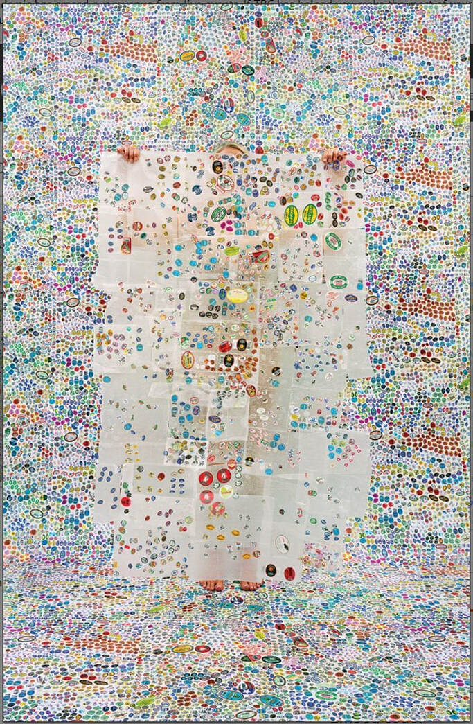 Rachel Perry (American, born 1962), Lost in my Life (fruit stickers), 2010, pigment print, 762 x 508 mm. (30 x 20 in.), Private Collection  Raphaelle Peale (American, 1774–1825), Venus Rising from the Sea—A Deception, c. 1822, oil on canvas, 740 x 613 cm. (29 1/8 x 24 1/8 in.), The Nelson-Atkins Museum of Art: William Rockhill Nelson Trust, 34-147 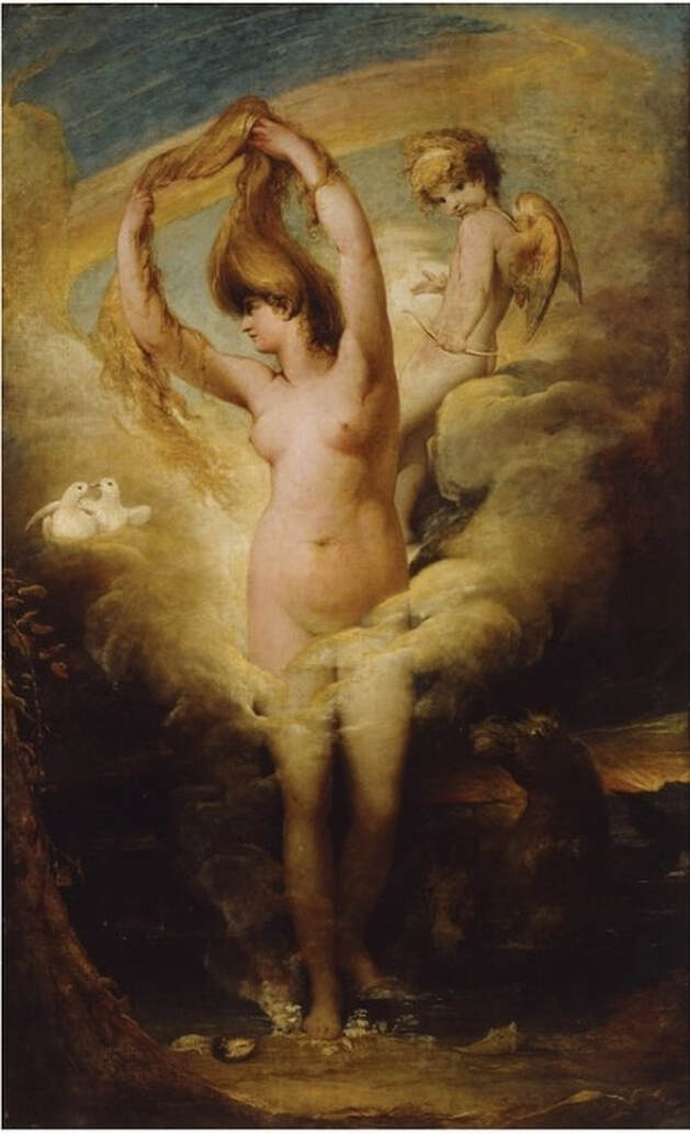 James Barry (Irish, 1741–1806), The Birth of Venus, c. 1772, oil on canvas, 260.3 x 170.2 cm. (102 ½ x 67 in.), Dublin City Gallery, the Hugh Lane 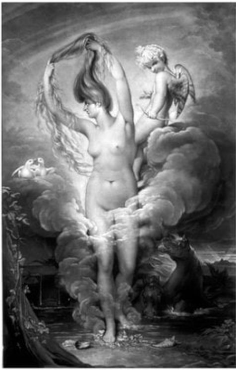 Valentine Green (British, 1739–1812), after James Barry (Irish, 1741–1806), The Birth of Venus, 1772, mezzotint Plate: 612 x 391 mm. (24 1/8 x 15 3/8 in.), Ackland Art Museum, University of North Carolina at Chapel Hill: William A. Whitaker Foundation Art Fund 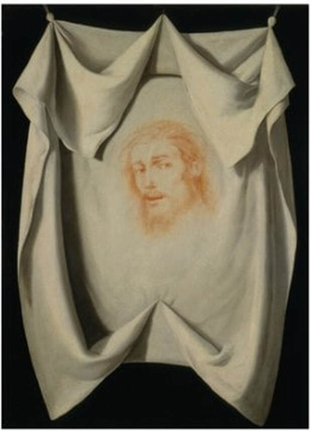 Francisco de Zubarán (Spanish, 1558–1664), The Veil of Saint Veronica, 1630s, oil on canvas, 101.6 x 832 cm. (42 ½ x 31 ¼ in.), Sarah Campbell Blaffer Foundation, Houston 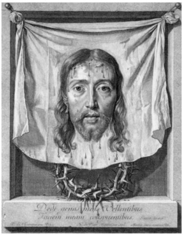 Nicolas de Plattemontagne (French, 1631–1706), after Philippe de Champaigne (French, 1602–1674), The Veil of Saint Veronica, 1654, etching and engraving, sheet (trimmed within platemark): 554 x 353 mm. (17 15/16 x 13 7/8 in.), National Gallery of Art: Ailsa Mellon Bruce Fund, 1998.34.2 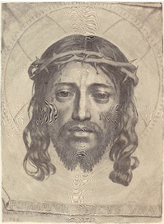 Claude Mellan (French 1598–1688), The Sudarium of Saint Veronica, 1649, engraving, plate: 430 x 318 mm. (16 15/16 x 12 ½ in.), sheet: 517 x 395 mm. (20 3/8 x 15 9/16 in.), National Gallery of Art: Rosenwald Collection, 1943.3.6144 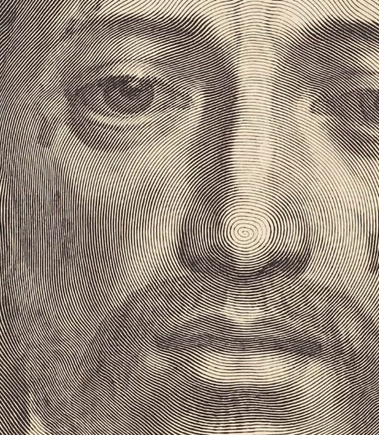 DETAIL: Claude Mellan (French 1598–1688), The Sudarium of Saint Veronica, 1649, engraving, plate: 430 x 318 mm. (16 15/16 x 12 ½ in.), sheet: 517 x 395 mm. (20 3/8 x 15 9/16 in.), National Gallery of Art: Rosenwald Collection, 1943.3.6144 Ann ShaferOnce I got through Art History 101 (what a whirlwind), at the beginning of my second year at the College of Wooster I took a class in nineteenth century art (read: French) with the professor that turned me into an art history nut. Arn Lewis was a quiet and intense man whose passion for his subject viscerally came through. I don’t think I ever expected to be excited about any subject that wasn’t studio art or music (oboe, alto). And I remember thinking: finally, something I can sink my teeth into. I was a copious note-taker. Not only did it help me stay awake in the dark classroom, but also it was clear to me that note-taking made the test-taking a whole lot easier. (Actually, I am rather nerdishly proud that I have never fallen asleep in an art history lecture.) We were exploring the oeuvre of French artist Edouard Manet one day and I was busily jotting something down when I looked up to see Bouquet of Lilacs (c. 1882) on the screen. This was my first jaw-dropping art history moment, which I have referred to several times in earlier posts. Edouard Manet, who some think of as the father of Modernism, painted some magnificent paintings. (Please note I claim zero expertise in Manet.) In the fall of 1983, there was a blockbuster exhibition at the Metropolitan Museum of Art, which was my “home” museum having grown up in the NY suburbs. All the biggies were there. The Balcony (1868–69) was the mascot, if you will. It was on the cover of the catalogue and was made into a poster that I had in my dorm room throughout college and graduate school. I honestly can't recall, and don't have the catalogue handy, to know if other key works were also in the exhibition. But some of his most important paintings include: Olympia (1863), Le déjeuner sur l’herbe (1863), The Railway (1872–73), and A Bar at the Folies Bergère (1882). It was my first blockbuster show, and at the time I had no idea museums and curating exhibitions were going to be my career (I’ll save the story of when that lightbulb went off for another post). Manet died at fifty-one, a year after painting A Bar at the Folies Bergère. He had contracted syphilis in his forties and was in considerable pain in his final years. He suffered from jerky, uncontrolled body movements and had his left foot amputated eleven days before he died. In that last year, Manet painted Bouquet of Lilacs and other flowers and fruit as symbols of transience, a kind of vanitas. Apparently one of his close friends, Méry Laurent, brought him flowers every day, and Manet painted them against a plain background. One assumes it was to better focus on the fragile beauty of the blooms. What made my jaw drop in that classroom in Ohio? Part of it, I’m sure, was the scale. It was really big up on that screen--it's 21 x 16 inches in reality. Part of it was because the flowers are set against a dark background in the painting, and in that dark classroom those white blossoms really popped. But I think what really got me was the way he captured the stems in the water and the glass. How did he paint the water? We’re sure the water level is halfway up, but the way he paints the stems in and out of the water are exactly the same but not. What the heck! As a would-be artist, all I could think was: no fair, you bastard! Edouard Manet (1832–1883) Bouquet of Lilacs, c. 1882 Oil on canvas 54 x 42 cm. (21 ¼ x 16 ½ in.) Nationalgalerie | Alte Nationalgalerie, Berlin © Photo: Nationalgalerie der Staatlichen Museen zu Berlin - Preußischer Kulturbesitz Edouard Manet (1832-1883) The Balcony, 1868–69 Oil on canvas 170 x 124.5 cm. (67 x 49 in.) Musée d'Orsay: Gustave Caillebotte Bequest, 1894 © Musée d'Orsay, dist. RMN-Grand Palais / Patrice Schmidt  Edouard Manet (1832–1883), Bouquet of Lilacs, c. 1882, oil on canvas, 54 x 42 cm. (21 ¼ x 16 ½ in.), Nationalgalerie | Alte Nationalgalerie, Berlin, © Photo: Nationalgalerie der Staatlichen Museen zu Berlin - Preußischer Kulturbesitz 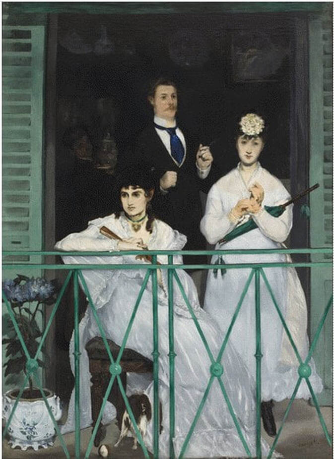 Edouard Manet (1832-1883), The Balcony, 1868–69, oil on canvas, 170 x 124.5 cm. (67 x 49 in.), Musée d'Orsay: Gustave Caillebotte Bequest, 1894, © Musée d'Orsay, dist. RMN-Grand Palais / Patrice Schmidt Ann ShaferMothers’ Day is not a big deal in our house. The husband does not believe we should let Hallmark dictate when to say, “I love you,” since we tell each other that every day. I don’t disagree, but sometimes these holidays sneak up on you and leave an impression. This year, I’m guessing due to this crazy quarantine/deadly virus issue, I’m missing my mom more than usual. Ellen Medart MacNary was a graduate of Wash U’s art school and continued to paint throughout her life. I don’t know if she had any formal training in watercolors (I doubt it), but she seemed to pick it up effortlessly. I would watch her and sometimes try to copy what she was doing, without a tremendous amount of luck. Good thing I dropped my studio art aspirations for art history, which gave my father much relief since he felt he had watched Mom “suffer” as an artist to gain recognition. He veritably begged me not to major in studio art at the College of Wooster. During our summer vacations, either sailing in Maine and Nova Scotia, or camping in any number of places with our trusty VW bus (the regular one, not the camper one) and two tents, Mom brought watercolors with her. She carried a small tackle box full of brushes and tubes, along with a small palette, and a block of watercolor paper. When we anchored for the night, or set up camp somewhere, she would pull out her paints and jot off something like it was nothing. In one of the watercolors you can see a little girl sitting at a picnic table. Mom and I were driving to Nova Scotia to collect the rest of the family as they disembarked from a trip sailing my grandfather’s Concordia Yawl, Westray, from Maine to Nova Scotia (another family would take her from there). I think that drive, and the several nights we camped along the way, was the only time I ever traveled with Mom by myself. Boy, was that a treat. There are a good number of Mom’s watercolors out there in the world and are prized possessions. At my house, most of them are resting in the dark at the moment (watercolor is highly susceptible to light damage), so when I pulled them out to photograph them, it was lovely to see the group together. I especially love the one of me sitting at that picnic table.  Ellen MacNary, Guysborough, Nova Scotia, 1975, watercolor over graphite, Private Collection  Ellen MacNary, Goose Cove, Maine, 1976, watercolor over graphite, Private Collection  Ellen MacNary, The Hollow, East Hampton, Connecticut, 1975, watercolor over graphite, Private Collection  Ellen MacNary, Rand's Canal, North Falmouth, Massachusetts, 1975, watercolor over graphite, Private Collection  Ellen MacNary, Barbara Dawn, Yarmouth, Nova Scotia, 1975, watercolor over graphite, Private Collection Ann ShaferVarious print dealers made annual visits to the BMA’s print department, during which we were able to look through several boxes and portfolio carriers they brought. More often than not, we retained one or more works for possible acquisition. One day in 2011, a particular dealer came who always had great stuff to offer. Out of one of the medium-sized boxes came an etching by Horst Janssen. It caught my eye immediately for several reasons. One, it’s totally cool. Two, the subject is Edgar Allan Poe, who Baltimore claims as one of its own because he died here. Three, Poe’s poem The Raven is the reason Baltimore’s NFL team is called the Ravens. Four, Horst Janssen was unrepresented in the collection. Five, museum director Doreen Bolger was working on an exhibition about Poe and it seemed a great addition. Six, we had been searching for an appropriate work to bring into the collection in memory of Doreen’s mother, who had recently passed away (back then it was customary for museum members to send in some money to be put toward an acquisition for a particular person’s retirement or death). In other words, it was a no brainer. Horst Janssen was an amazingly prolific printmaker in nearly every technique (everything but screenprinting). He completed landscapes, portraits of notable people including Edgar Allan Poe, erotica, as well as a huge number of self-portraits. A glance at a sequence of the self-portraits shows every bit of his hard life, which was challenging: he never knew his father, his mother died when he was fourteen, he had multiple marriages and children, he was an alcoholic, and probably had a host of other issues. As for Poe, Janssen portrays him as a bit of a kook, or at least as a tortured soul like the artist himself. Poe’s nose seems to have broken down, his eyes are unfocused, the bags under his eyes rival his eyebrows, his hair is a fright, a bug crawls up the right-hand side of the composition, and his tie seems to be made of a crustacean of some sort. This is a portrait of a tortured artist/creative, raising all sorts of questions about artistic genius and whether one must be a bit crazy to access that kind of creativity. But that’s a debate for another day. Horst Janssen (German, 1929–1995) Portrait of Edgar Allan Poe, 1988 Color etching Sheet: 686 x 483 mm. (27 x 19 in.) Plate: 559 x 381 mm. (22 x 15 in.) Baltimore Museum of Art: Purchased in Memory of Alice Bolger with funds contributed by her Friends, Staff and Board of Trustees of The Baltimore Museum of Art, BMA 2011.70 © Horst Janssen / Artists Rights Society (ARS), New York / VG Bild-Kunst, Bonn 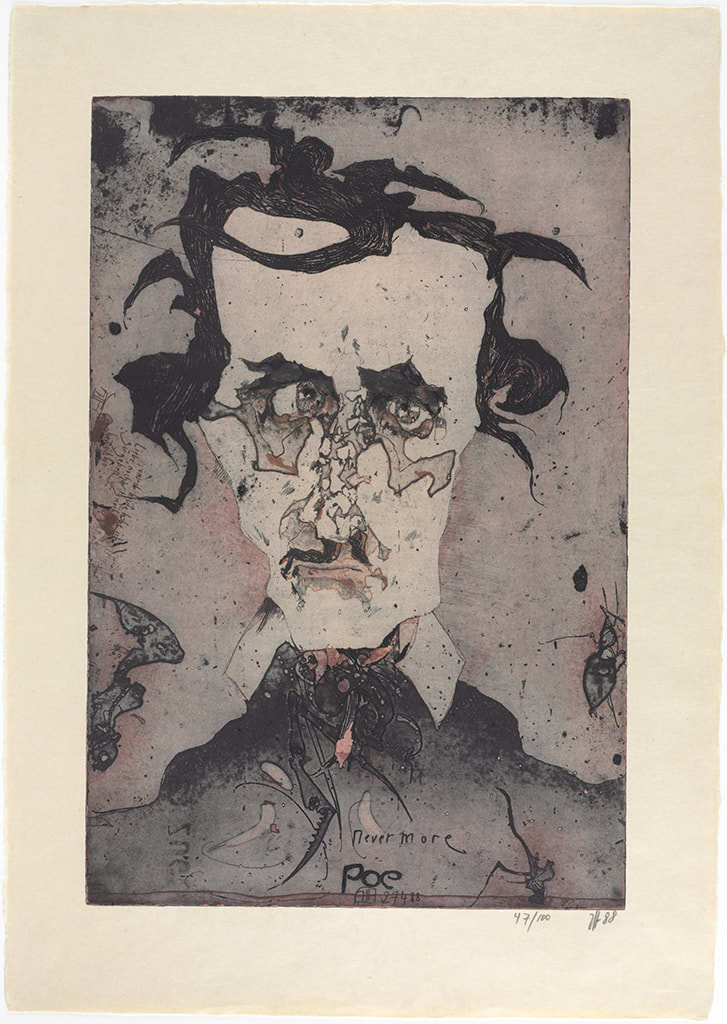 Horst Janssen (German, 1929–1995), Portrait of Edgar Allan Poe, 1988, color etching, sheet: 686 x 483 mm. (27 x 19 in.); plate: 559 x 381 mm. (22 x 15 in.), Baltimore Museum of Art: Purchased in Memory of Alice Bolger with funds contributed by her Friends, Staff and Board of Trustees of The Baltimore Museum of Art, BMA 2011.70 © Horst Janssen / Artists Rights Society (ARS), New York / VG Bild-Kunst, Bonn Ann ShaferA spirit of collaboration and experimentation was at the heart of Atelier 17. Prints by Hayter and his associates are conceptually and passionately full of ideas about the human condition, dreams, mythology, war, and natural phenomena. The exceptional rigor of subject matter in these images was achieved by means of three technical innovations, which changed the course of twentieth century printmaking. First, Hayter revived the art of engraving, which he believed was uniquely suited to address issues of modern art. (Historically engraving had been used to reproduce more famous works for a large market.) Second, members of the studio pioneered the use of textiles, paper, string, wood, and other materials pressed into a softground-coated plate to gain an amazing variety of textures. Third, Hayter and his colleagues (credit to Krishna Reddy and Kaiko Moti) developed several inventive methods of printing in colors from a single plate, eliminating the need to print separate plates for each color. All of these are counterintuitive to admirers of traditions intaglio prints. While looking at the works from this studio, know that often when you think you are seeing etching, it is actually engraving. When you think you are seeing aquatint, it is really softground etching. When you see a color print, it is not the result of each color being printed from separate plates, but of being applied to a single plate. Today’s post zooms in on the second element, softground etching. Not a new technique by any means, the possibilities were greatly expanded by one of the women artists working at Atelier 17, Sue Fuller, who used bits of fabric that went beyond a simple pattern like pantyhose used to create tonal passages mimicking aquatint. Rather, she utilized lace and pieces of string to create the subject of the image itself. Fuller’s print Hen, 1945, is the clearest example of this in its use of a lace collar to form the hen. Fuller’s Cacophony, 1944, features several standing female figures, which are delineated by string. Fortunately for us, Fuller also created collages of some of her compositions, including the one for Cacophony, which is currently “on view” in an online exhibition from Susan Teller Gallery. Seeing the collage of string in the same composition really brings it together and enables viewers to imagine what is meant by softground etching. Teller also is showing the first state and the final, all of which makes clear the composition’s creation. Susan Teller is the go-to person for works by Fuller. Her breadth of knowledge and depth of stock by Fuller and others who worked at the Atelier during its New York years is legendary. The online exhibition is here. For a superb read on Sue Fuller and the many female artists working at Atelier 17, look no further than the recently published book by Christina Weyl, The Women of Atelier 17: Modernist Printmaking in Midcentury New York (Yale University Press, 2019). Christina’s accomplishment with her book is tremendous and it is required reading for students of this era. Yesterday, Joanne B Mulcahy published a review of Christina’s book for Hyperallergic, beautifully summing up its contents. I suspect there may be a run on the book from online sources; I suggest if you are thinking a procuring a copy, act fast. Sue Fuller (American, 1914–2006) Hen, 1945 Engraving and softground etching Sheet: 458 x 364 mm. (18 1/16 x 14 5/16 in.) Plate: 378 x 299 mm. (14 7/8 x 11 3/4 in.) Baltimore Museum of Art: Gift of Adelyn D. Breeskin, BMA 1948.52 Sue Fuller (American, 1914–2006) Cacophony, 1944 Collage 11 x 8 inches Susan Teller Gallery, New York (courtesy the Estate of Sue Fuller and the Susan Teller Gallery, New York) Sue Fuller (American, 1914–2006) Cacophony (first state), 1944 Softground etching, 11 x 8 inches Susan Teller Gallery, New York (courtesy the Estate of Sue Fuller and the Susan Teller Gallery, New York) Sue Fuller (American, 1914–2006) Cacophony (final state), 1944 Etching, softground etching, and aquatint 11 x 8 inches Susan Teller Gallery, New York (courtesy the Estate of Sue Fuller and the Susan Teller Gallery, New York)  Sue Fuller (American, 1914–2006), Hen, 1945, engraving and softground etching, sheet: 458 x 364 mm. (18 1/16 x 14 5/16 in.), plate: 378 x 299 mm. (14 7/8 x 11 3/4 in.), Baltimore Museum of Art: Gift of Adelyn D. Breeskin, BMA 1948.52  Sue Fuller (American, 1914–2006), Cacophony, 1944, collage, 11 x 8 inches, Susan Teller Gallery, New York (courtesy the Estate of Sue Fuller and the Susan Teller Gallery, New York)  Sue Fuller (American, 1914–2006), Cacophony (first state), 1944, softground etching, 11 x 8 inches, Susan Teller Gallery, New York (courtesy the Estate of Sue Fuller and the Susan Teller Gallery, New York)  Sue Fuller (American, 1914–2006), Cacophony (final state), 1944, etching, softground etching, and aquatint, 11 x 8 inches, Susan Teller Gallery, New York (courtesy the Estate of Sue Fuller and the Susan Teller Gallery, New York) |
Ann's art blogA small corner of the interwebs to share thoughts on objects I acquired for the Baltimore Museum of Art's collection, research I've done on Stanley William Hayter and Atelier 17, experiments in intaglio printmaking, and the Baltimore Contemporary Print Fair. Archives
February 2023
Categories
All
|
 RSS Feed