Ann ShaferMothers’ Day is not a big deal in our house. The husband does not believe we should let Hallmark dictate when to say, “I love you,” since we tell each other that every day. I don’t disagree, but sometimes these holidays sneak up on you and leave an impression. This year, I’m guessing due to this crazy quarantine/deadly virus issue, I’m missing my mom more than usual. Ellen Medart MacNary was a graduate of Wash U’s art school and continued to paint throughout her life. I don’t know if she had any formal training in watercolors (I doubt it), but she seemed to pick it up effortlessly. I would watch her and sometimes try to copy what she was doing, without a tremendous amount of luck. Good thing I dropped my studio art aspirations for art history, which gave my father much relief since he felt he had watched Mom “suffer” as an artist to gain recognition. He veritably begged me not to major in studio art at the College of Wooster. During our summer vacations, either sailing in Maine and Nova Scotia, or camping in any number of places with our trusty VW bus (the regular one, not the camper one) and two tents, Mom brought watercolors with her. She carried a small tackle box full of brushes and tubes, along with a small palette, and a block of watercolor paper. When we anchored for the night, or set up camp somewhere, she would pull out her paints and jot off something like it was nothing. In one of the watercolors you can see a little girl sitting at a picnic table. Mom and I were driving to Nova Scotia to collect the rest of the family as they disembarked from a trip sailing my grandfather’s Concordia Yawl, Westray, from Maine to Nova Scotia (another family would take her from there). I think that drive, and the several nights we camped along the way, was the only time I ever traveled with Mom by myself. Boy, was that a treat. There are a good number of Mom’s watercolors out there in the world and are prized possessions. At my house, most of them are resting in the dark at the moment (watercolor is highly susceptible to light damage), so when I pulled them out to photograph them, it was lovely to see the group together. I especially love the one of me sitting at that picnic table. 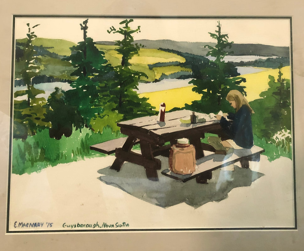 Ellen MacNary, Guysborough, Nova Scotia, 1975, watercolor over graphite, Private Collection 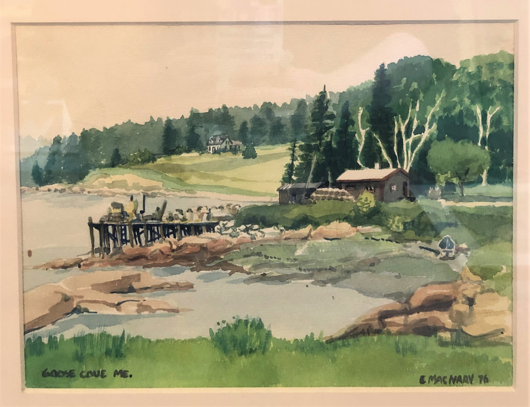 Ellen MacNary, Goose Cove, Maine, 1976, watercolor over graphite, Private Collection 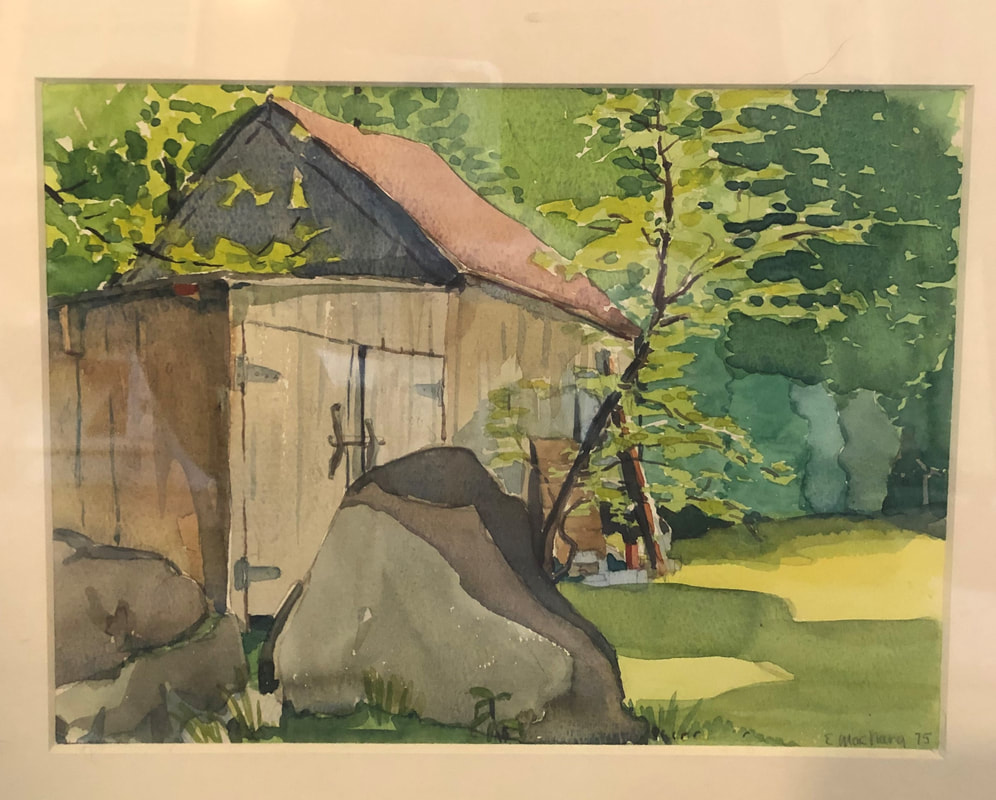 Ellen MacNary, The Hollow, East Hampton, Connecticut, 1975, watercolor over graphite, Private Collection 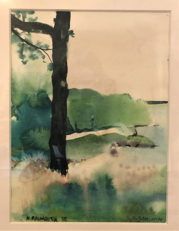 Ellen MacNary, Rand's Canal, North Falmouth, Massachusetts, 1975, watercolor over graphite, Private Collection 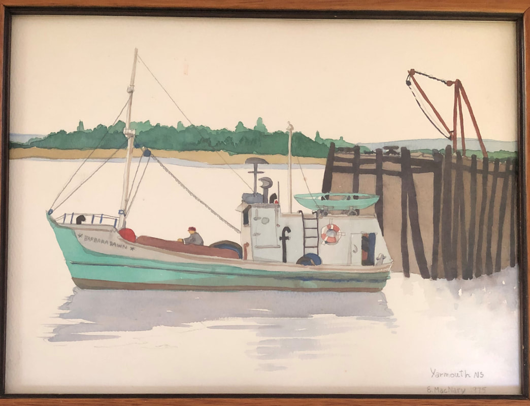 Ellen MacNary, Barbara Dawn, Yarmouth, Nova Scotia, 1975, watercolor over graphite, Private Collection
1 Comment
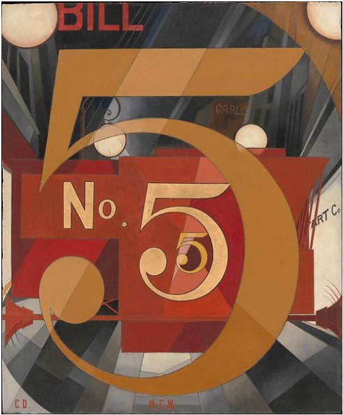
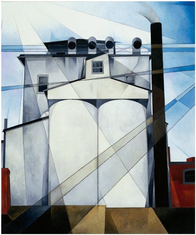
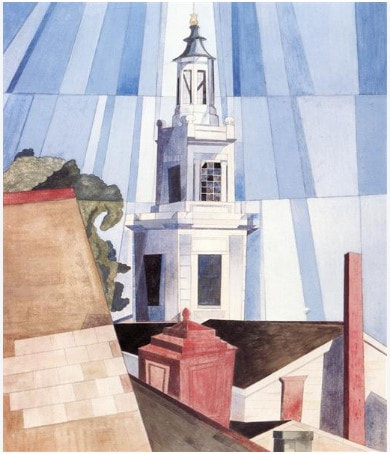
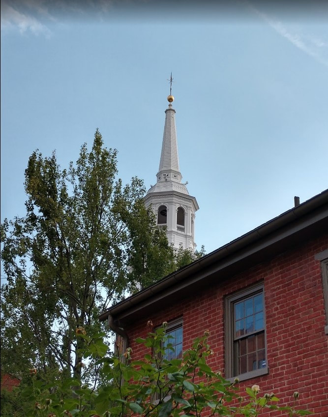
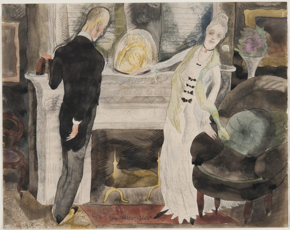
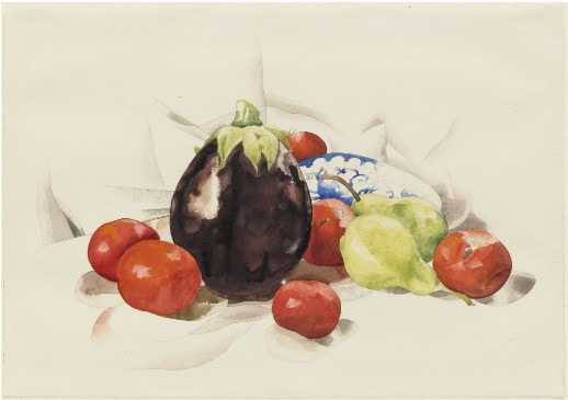
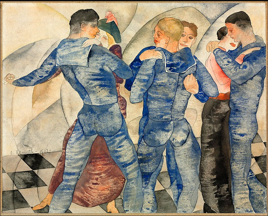
Ann ShaferI wrote my senior thesis on my second and more abiding love, Charles Demuth (DEE-muth, not deMOOTH). I focused on several groups of his watercolors featuring figures: circus and vaudeville acts, literary illustrations for Henry James and the like, and erotic-ish scenes including sailors dancing, lolling on the beach, jazz clubs, and Turkish baths. I don’t think I have my copy of that paper anymore, which is just as well. Not that the watercolors aren’t great, they are, but that my writing about them was surely riddled with holes. Demuth remains a favorite because not only are the figural watercolors awesome, his still lifes in watercolor are breathtaking and his output in painting is stunning. Two of my favorite paintings are I Saw the Figure 5 in Gold, 1928, and My Egypt, 1927, which I saw nearly every day when I worked at the Whitney right out of college. I Saw the Figure 5 in Gold is one of Demuth’s eight portraits painted in tribute to various American writers, artists, and performers. None are physical likenesses, but rather they show imagery that evokes the person and their work. This one is a tribute to William Carlos Williams who was a friend, poet, and his physician. (Demuth died at age 51 due to complications from diabetes. He was one of the earliest patients to give himself insulin shots—a brand new treatment.) The title of Demuth’s painting is taken from Williams’ poem that describes the sights and sounds of a firetruck speeding down a New York City Avenue: Among the rain and lights I saw the figure 5 in gold on a red firetruck moving tense unheeded to gong clangs siren howls and wheels rumbling through the dark city It always makes me smile when I happen upon I Saw the Figure 5 in Gold at the Metropolitan Museum of Art. I was more fortunate to be able to look at My Egypt every day for two plus years at the Whitney Museum of American Art (back when it was in the Breuer building at Madison and 75th Street). Its title gives a pretty substantial hint as to what it’s about: our grain elevators, water towers, and factories stand as monuments to America’s achievements in industry in much the same way the pyramids glorify the pharaohs in ancient Egypt. One could also guess that Demuth is likening the dehumanizing of the labor force in big industry of the 1920s to the slaves that built the pyramids. In addition to factories and grain elevators, Demuth painted church spires, which often loom up over the viewer. Sometimes it appears that an artist’s imagination has run away with them, that the scene portrayed couldn’t possibly exist in real life, and I frequently wonder how they conceived of such a view. For instance, Thomas Moran’s paintings of Yellowstone National Park look like confections in yellow and pink, but parts of the park really are those same colors. Demuth’s point of view became very clear to me on a visit to the Demuth Museum in Lancaster, Pennsylvania. The museum includes the family home and the tobacco shop next door, which are in the middle of downtown. I made a pilgrimage there one January only to discover the museum is shuttered in the winter (should have checked the internet). Disappointed but not daunted, I knew there was a garden behind the building where Demuth had spent much of his young life painting the flowers his mother grew due to his frailty (severe diabetes). I made my way down the tiny passthrough between the buildings and emerged into a lovely, small, brick-lined garden. Then I looked up and my jaw dropped. Looming over the garden courtyard is the giant church steeple of Holy Trinity Lutheran Church, which is directly behind the house. It was as if one of his paintings, like The Tower, 1920, came to life, after which his style and acute angles made so much sense. That was one of only three times that my jaw has dropped for art: the first was in a nineteenth-century art class in college when a slide (yes, slide) of a Manet painting of lilacs in a glass vase popped up, the second was while standing in front of Velasquez’s Las Meninas at the Prado. While Demuth’s paintings are amazing, I have, no surprise, a soft spot for his watercolors. The still lifes are worth checking out. He has such a delicate and deft touch, he’s unafraid of leaving white space, and I love his use of salt and small squares of blotter paper to gain that mottled texture and those sharp edges. I could look at the fruit and flower watercolors all day long. The figural watercolors are less easy to love, but they are an interesting facet of his work. The illustrations for various works of literature—he seemed particularly keen on Henry James—weren’t commissioned to illustrate published works, rather, they were personal, just for him. The circus performers and vaudeville acts are quirky and fun. And his scenes of sailors partially nude on the beach or in dance halls, where two men dancing with women gaze longingly at each other, or a self-portrait at the Lafayette bathhouse reveal he was an openly gay man partaking in the burgeoning underground gay subculture in post-World War I New York. These erotic works were not for public consumption, but in subsequent years they have offered inspiration to artists working with similar themes. Only Hayter has eclipsed my deep and abiding love for Demuth. No, actually, I find Demuth’s work more beautiful and personally satisfying. There is just so much more to discover with Hayter. Charles Demuth (American, 1883–1935) I Saw the Figure 5 in Gold, 1928 Oil, graphite, ink, gold leaf on paperboard (Upson board) 35 1/2 x 30 in. (90.2 x 76.2 cm) The Metropolitan Museum of Art: Alfred Stieglitz Collection, 1949, 49.59.1 Charles Demuth (American, 1883–1935) My Egypt, 1927 Oil, fabricated chalk, and graphite on composition board 35 15/16 x 30 in. (91.3 x 76.2 cm.) Whitney Museum of American Art: Purchase, with funds from Gertrude Vanderbilt Whitney, 31.172 Charles Demuth (American, 1883–1935) The Tower, 1920 Tempera on pasteboard 23 1/4 x 19 1/2 in. (591 x 495 cm.) The Columbus Museum of Art: Gift of Ferdinand Howald, 1931.146 Charles Demuth (American, 1883–1935) The Revelation Comes to May Bartram in Her Dressing Room, 1919 Illustration for the short story "The Beast in the Jungle," by Henry James Watercolor over graphite Sheet: 203 x 257 mm. (8 x 10 1/8 in.) Philadelphia Museum of Art: Gift of Frank and Alice Osborn, 1966, 1966-68-6 Charles Demuth (American, 1883–1935) Eggplant and Tomatoes, 1926 Watercolor over graphite Sheet: 358 x 509 mm. (14 1/8 x 20 in.) Museum of Modern Art: The Philip L. Goodwin Collection, 99.1958 Charles Demuth (American, 1883–1935) Dancing Sailors, 1918 Watercolor over graphite Sheet: 204 x 257 mm. (8 1/16 x 10 1/8 in.) Cleveland Museum of Art: Mr. and Mrs. William H. Marlatt Fund, 1980.9 Ann ShaferEdward Hopper, the original social distancer. Seems like the perfect time to write about the first artist I studied in depth. Back in college, I was aiming at American paintings, mainly of the first half of the twentieth century. That I ended up a print person surprises me still since I backed into their study unintentionally. I wrote my junior thesis on Edward Hopper and his depiction of women in paintings. (Tip of the hat to my brother Ren MacNary, who helped me type it--on a typewriter.) I think I tried to approach it with a feminist lens but really, I was writing from my gut. I haven’t looked back at it in years; I don’t even know if I still have a copy, which is just as well. New York Movie, 1939, is one of my favorite Hopper paintings featuring a lone figure. I’m fascinated by artists’ depictions of the audience and the loneliness that can be felt in a room full of people. Hopper’s woman is a great example of the theme of alone in a crowd. Like so many artists, Hopper also made work in other media as a regular part of his practice. I have a soft spot in my heart for good watercolors (I dabble, and my mother was pretty darn good at them) and Hopper painted some real beauties like The Mansard Roof, 1923. I love that he portrays Victorian domestic architecture (considered out of fashion at the time) rather than the picturesque harbor of the fishing village of Gloucester, Massachusetts, which was the focus of other artists working there in the twenties. Painted on an angle and from below, the house’s billowing yellow awnings dominate. While this is an accurate representation of the house, really it is an exercise in light and shadow. When he painted this house in 1923, Hopper was spending the first of six summers in Gloucester, was trying out watercolor for the first time, and had just met his soon-to-be-wife, Josephine Nivinson. In addition, after not selling any work for the prior ten years, this watercolor was included in an exhibition at, and subsequently purchased for the collection of, the Brooklyn Museum. Not bad for a first stab at the notoriously difficult medium of watercolor. His facility with the brush reminds me of another watercolorist who seemed to be able to whip off a gorgeous work in no time, John Singer Sargent. Because of my own experience and love of watercolors, landing a first job as a curator in a works on paper department represented a shift, but a good one. It wasn’t until much later that I made the final shift to loving prints, which are a tough sell to the public. The barriers to entry are many: the technical information is challenging and complicated, the concept of multiples is confusing, and what does “original” mean anyway. But, once we get people past a certain point, they’re in. Hence my self-identification as a print evangelist. My transition to the dark side was completed under the expert eye of Tru Ludwig. We’ve looked at thousands of prints together and he is my rock. Prior to painting in watercolor in Gloucester, Hopper began making etchings in 1915. He is said to have taught himself, but there is some thought that he learned some of the technical ins and outs from Martin Lewis (more on him in a future post). Of his seventy-some etchings (only 28 were published), my favorite is American Landscape, 1920. Formally, it is such an odd composition with its horizontality and the main subjects—a group of cows trundling over railroad tracks—occupying the lower half of the composition. Only the top of the house rises into the sky. Perhaps we could read into it that Hopper’s prevailing theme of loneliness is personified in the house that is cut off from society by the railroad tracks. Perhaps the cows are the farmer’s only link to the outside world. Who knows? But I do know that to our twenty-first century eyes, the composition looks like a film still: dramatic angle, stark lighting, mundane action portending the future. It all seems apropos in these times of pandemics, quarantines, and social distancing. Edward Hopper (American, 1882–1967) New York Movie, 1939 Oil on canvas 81.9 x 101.9 cm (32 1/4 x 40 1/8 in.) Museum of Modern Art, 396.1941 Edward Hopper (American, 1882-1967) The Mansard Roof, 1923. Watercolor over graphite 352 x 508 mm. (13 7/8 x 20 in.) Brooklyn Museum: Museum Collection Fund, 23.100 Edward Hopper (American, 1882–1967) American Landscape, 1920 Etching Sheet: 326 x 442 mm. (12 13/16 x 17 3/8 in.) Plate: 185 x 313 mm. (7 5/16 x 12 5/16 in.) National Gallery of Art: Rosenwald Collection, 1949.5.70 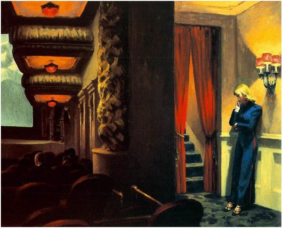 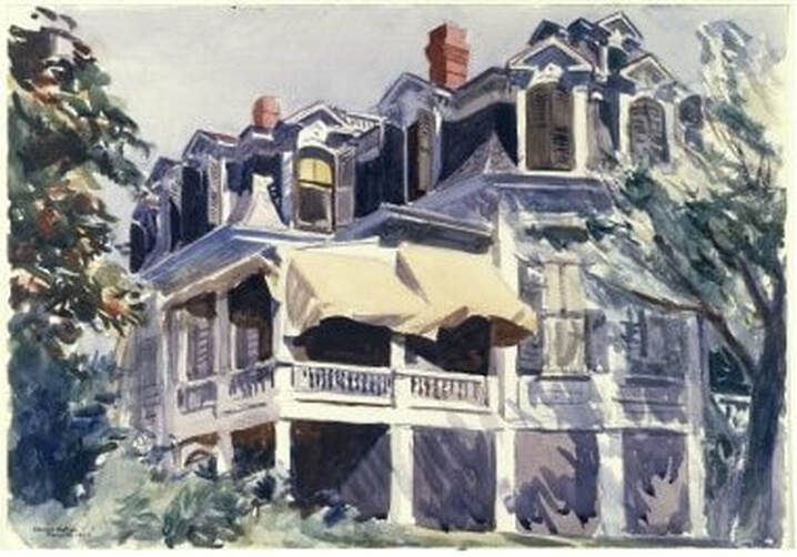 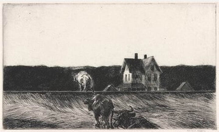 Ann ShaferIf ever I turned my attention to making art instead of writing about it, I would pull out my watercolors and brushes and head outdoors. It’s hard to imagine a world when that wasn’t possible—but it wasn’t so long ago that the first paints in tubes became commercially available. The first premixed watercolors were introduced to the market in England in the 1760s, but it wasn’t until the 1840s that those little tubes we know today were invented. The proliferation of watercolor landscapes in England in the late-eighteenth and nineteenth centuries was due in no small part to the introduction of those premixed watercolor paints. Artists began to experiment with the medium and test the boundaries of what could be accomplished. Soon these works found their way into the annual exhibitions of the English Royal Academy, but they were so marginalized that a group of artists split from the Academy in 1804 to establish the Society of Painters in Water-Colours. The goal of this new Society was to place watercolors on an equal footing with oil paintings, and artists responded by creating large-scale, highly finished watercolors displayed in elaborate gold frames. The Baltimore Museum of Art is fortunate to have an example of one of these presentation watercolors by Britain’s favorite son, Joseph Mallord William Turner. In contrast to the highly finished exhibition watercolors, many artists created more intimate works in the same medium. Artists went outdoors with sketchbooks and paints to test their skills at portraying the landscape. One such work from a sketchbook (notice the crease down the center) is a favorite acquisition. The artist is John White Abbott, a country surgeon and apothecary from Exeter, who as an amateur artist painted for his own enjoyment (the term amateur indicates only that the artist did not earn money making art, but is no indication of a lack of talent). After inheriting an estate from his uncle, he was able to devote himself full time to painting. Abbott probably drew A Path through the Woods first in graphite pencil on the spot, and then returned to his studio to finish the work with gray washes and pen and brown ink. I continue to be amazed at the quality of light through the dappled foliage painted with just gray and brown. In fact, the execution is so masterful that I see this monochromatic scene in full color. In addition, the peacefulness of the scene always transports me to somewhere else. For me, this work is a figurative and literal breath of fresh air. John White Abbott (English, 1763‑1851) A Path through the Woods, c. 1785‑1795. Pen and brown and gray ink with brush and gray ink over graphite Sheet: 256 x 335 mm. (10 1/16 x 13 3/16 in.) Baltimore Museum of Art: Purchased as the gift of Rhoda Oakley, Baltimore, BMA 2008.9 Joseph Mallord William Turner (English, 1775‑1851) Grenoble Bridge, c. 1824. Transparent and opaque watercolor with scraping over traces of graphite Sheet: 530 x 718 mm. (20 7/8 x 28 1/4 in.) Baltimore Museum of Art: Purchased with exchange funds from Nelson and Juanita Greif Gutman Collection, BMA 1968.28 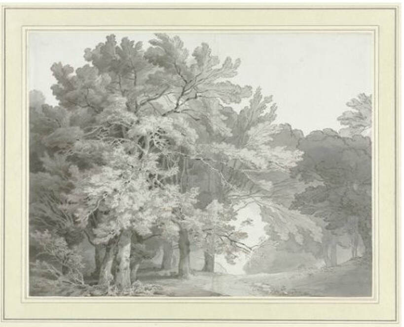 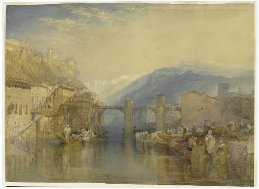 Ann ShaferYou may not know that I have a secret passion for British watercolors of the 18th and early 19th centuries. The BMA has a glorious Turner presentation watercolor of Grenoble Bridge, but few companions. In 2008 I put together a small show featuring the Turner and was able to acquire this watercolor to augment the show and the collection. It's by Robert Hills, an artist best known as an animalier--one who specialized in painting animals. In this watercolor he captured the curve in the country road with the broken-down fence at left and singular tree at right. It's a crisp, lovely sheet--the whites are white and the colors strong--and it has all the features one wants in such a composition: a path leading the eye back in space, a framing tree and shadow, that broken down fence as a bit of nostalgia in industrializing Britain, the sense that it was painted on the spot (it likely was), and its uncontrolled picturesqueness. I think this was my first purchase for the collection. I love it still. Robert Hills (English, 1769–1844) Nook End, Ambleside, c. 1807 Watercolor over graphite Sheet: 357 x 270 mm. (14 1/16 x 10 5/8 in.) The Baltimore Museum of Art: Purchase with exchange funds from Bequest of Saidie A. May, BMA 2006.93 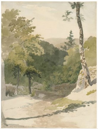 |
Ann's art blogA small corner of the interwebs to share thoughts on objects I acquired for the Baltimore Museum of Art's collection, research I've done on Stanley William Hayter and Atelier 17, experiments in intaglio printmaking, and the Baltimore Contemporary Print Fair. Archives
February 2023
Categories
All
|
 RSS Feed