|
I'm one lucky person. I love what I do—the curatorial part. But I also have a love for the doing of art. I loved art class in school, loved teaching third and forth graders about artists and doing a related project at my sons’ school, I loved and still love doing stuff with my hands. These days that is mostly writing. But listeners of Platemark will already know that there was a fateful moment in college when I decided between studio art and art history. Really it came down to the fact that while I love doing and being around creatives, I do not have that drive to create something every day. And that was the watermark for me. Dabbling in graphic design has fulfilled that low-level need to create in adulthood. But I have long wanted to start a print shop and print publishing studio. Need to win the lottery to enact that plan, so it is on the way back burner.
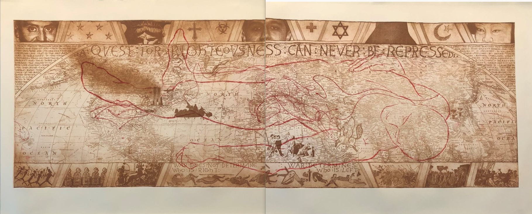
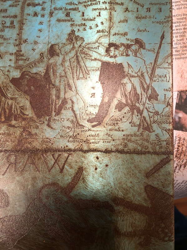
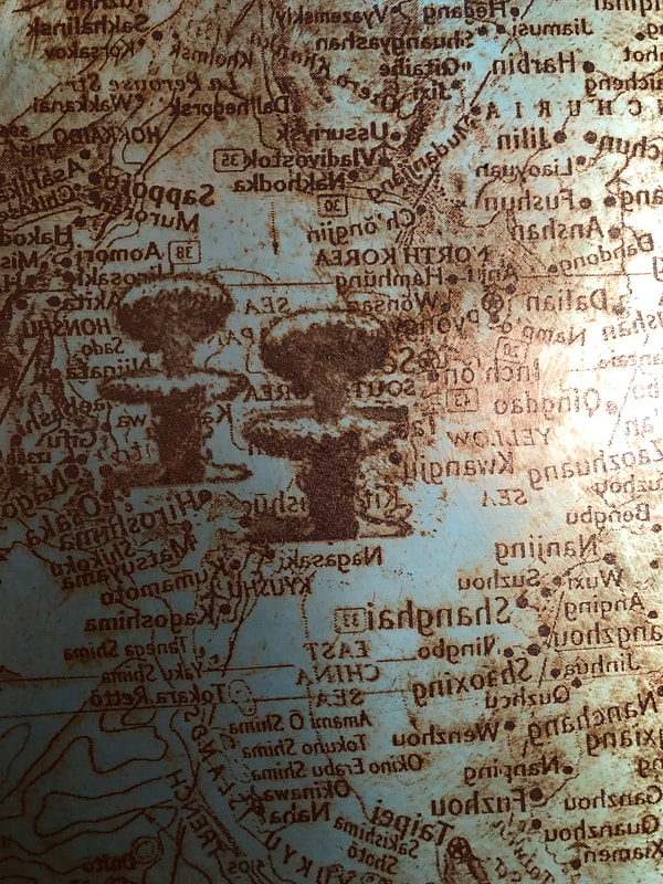
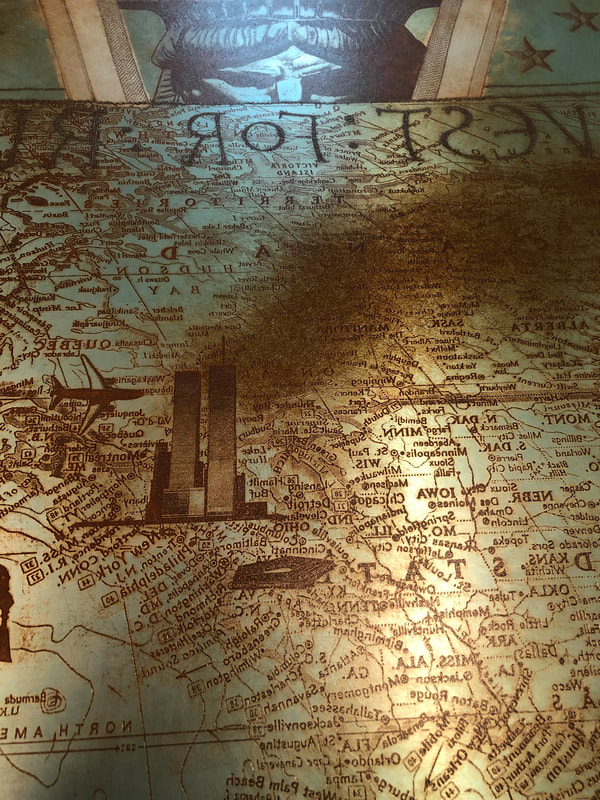
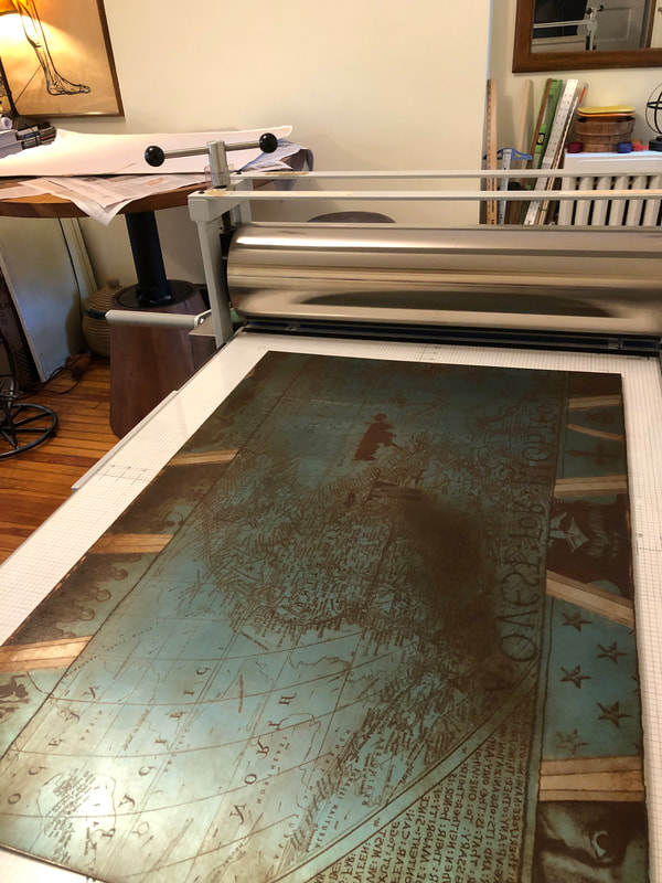
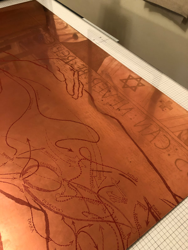
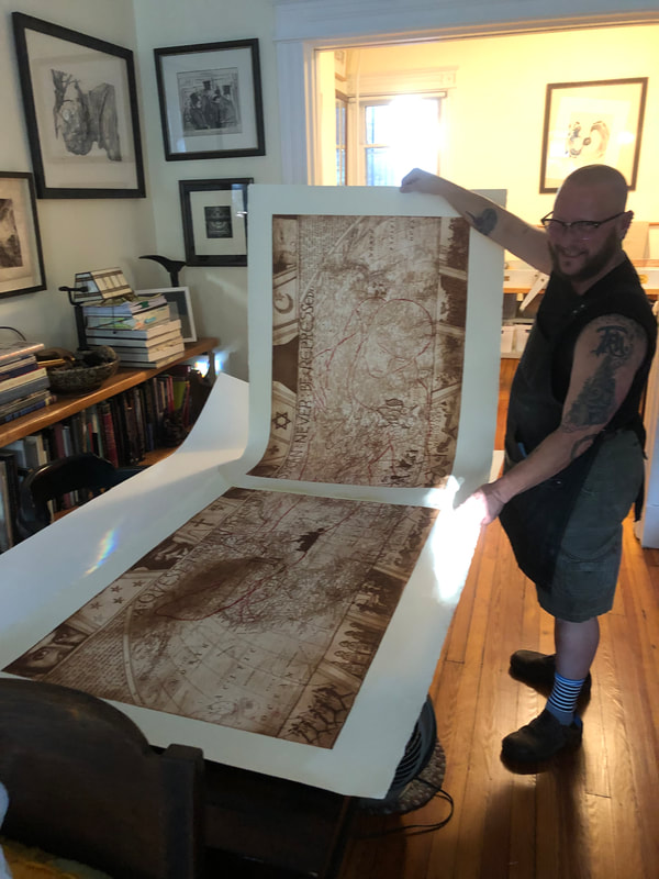
When I started in the print department at the BMA, I was the person who hosted classes. There are many wonderful professors who I have met this way, and it was always a joy to see students’ eyes light up in front of a Rembrandt etching or a Hayter engraving. I never expected to become close friends with any of them, until I met Tru Ludwig, who is one of the rare art historians who is also an artist. That combination is special because those people can not only tell you about the background history of the artist and the subject matter, but also how it was done with such a depth of knowledge it is breathtaking. Back in 2005, Tru was teaching History of Prints at the Maryland Institute College of Art, the renowned art school in Baltimore, MD. Tru brought these art students to the BMA to teach the history of prints from the objects themselves. At first, they came for just a few sessions, but by the time we were in full swing, they came to the BMA’s print room six times and looked at hundreds of prints from Durer to yesterday. It was a lot of work, pulling and putting away that many prints, but it was always worth it. Tru is a gifted orator who infuses his speech with sound effects and colloquialisms. Just enough to keep any sleepy college art student engaged. There were always moments in the frantic shuffling of prints and interleaving that I just stopped to listen to Tru go on about Rembrandt's Three Crosses, Max Klinger’s Die Handschuh, Kathe Kollwitz’s Battlefield, Leonard Baskin’s Hydrogen Man, and Peter Milton’s Hotel Paradise Café. Every time through the class, some 18 times, Tru would get me with goosebumps or tears welling at the tale he wove about how art is central to our existence. Since I am no longer at the BMA, and Tru is no longer teaching History of Prints, I convinced him to join me in creating a podcast of the history of prints class. Platemark series two is underway—we have just gotten through Durer. It may seem counterintuitive to talk about visual art in an audio format, but the images are available in each episode’s show notes. I encourage you to check it out. Meanwhile, I have been apprenticing at Tru’s print studio, The Purple Crayon Press. Earlier this year I helped wipe and print two large etchings, Ask Not and Dumb Luck, for the first time. I mean I have watched the process many times, but this time I was aproned up and had gloves on and got dirty. What you may not know if that if you are a curator of prints, you do not ever have had to make any. It is not a requirement. But I can say, it certainly helps to understand just how finicky the process can be. Recently I spent two days helping Tru pull a magnificent etching, one whose edition had never been completed. I can surely see why. We accomplished printing three impressions over two days. It is a large print called TapHistory, 2005, and consists of two large sheets that are joined in the center. Each half is two plates. One in brown and one in red. So, that basically means we printed six two-plate etchings, or the equivalent of twelve one-plate prints. It’s a lot. And so rewarding when it all comes together, and you get the quality of impression that you are after. TapHistory is a play on the format of the Bayeux Tapestry, a really important embroidered length of fabric that tells the tale of the lead-up to and the Battle of Hastings in 1066, when William, Duke of Normandy defeated the British upstart Harold, Earl of Wessex, following the death of King Edward the Confessor. It is thought that the outcome changed England, its language, architecture, and way of life for the future in massive ways. The tapestry was created only a handful of years after the battle and offers vignettes that tell us about military strategy, armor, cooking conventions, fashion, and all sorts of stuff. It is some 230 feet long and 20 feet tall. The main action takes place along the center, while a top and bottom border carries other figures and stories, which sometimes are fables or cautionary snippets that forecast the future. Tru’s print mimics that format. There is central action and a top and bottom border carrying other supporting information. In the central section is a map of the world, the kind you might find from National Geographic. Noted in tiny red stitches (mimicking the tapestry) forming arrows are paths of conquest by various peoples across time: Goths, Visigoths, Vikings, Mongols, etc. It is also includes art historical quotations. That is Jacques-Louis David’s Oath of the Horatii in the lower center, which depicts three sons and their father issuing an oath that will result in only one son surviving an upcoming land-dispute battle. In the left center is Emmanuel Leutze’s Washington Crossing the Delaware (in reverse). Over in Japan, two mushroom clouds rise about Hiroshima and Nagasaki. And just above Washington are the Twin Towers—one is streaming smoke and the other is about to be hit with an airplane. Remember, Tru made this shortly after 9/11. To the right of the Oath of the Horatii is Muhammad Borne Aloft by the Buraq, from a Turkish version of The Progress of the Prophet, 16 century. The text running across the top of the central panel is “a quest for righteousness can never be repressed,” which is a quotation from Nelson Mandela, 2001. In that triangular space at the left edge are quotations from Niccolò Machiavelli’s The Prince, 1532. Opposite, in the right-hand triangular space are excerpts from Baltimore County Public Schools letter sent to families following September 11, 2001 (Tru’s son was in a Baltimore County school at that point). Overlaying the brown map in the central panel is the red outline (a chalk outline if you will) of the dead toreador figure from Edouard Manet’s painting at the National Gallery of Art. Across the top are partial faces of note: from left to right: Brian Sweeney, one of the pilots who died on Flight 175, which crashed into the south tower on 9/11; the angry eyes of the Statue of Liberty; Mohammed Atta, the alleged pilot of Flight 11, which crashed into the north tower on 9/11; Sharbat Gula in a full burka—she was the young woman with starkly green eyes who was photographed by Stephen McCurry in 1984 and on the cover of National Geographic the following year; Ogedei Khan, son of Mongol warlord Genghis Khan. Along the bottom are small packs of warriors heading into battle from various periods of history, along with the Chinese proverb “War does not determine who is right. War determines who is left.” I have often suggested to artists to reduce the number of elements in a work, thinking that if one thing says it well, you do not need five things. When I look at Tru’s print, I see cacophony, but also a deeply felt commitment to making the point: why are we doing this and why do we keep repeating history? The number of elements that all point at that point is many. But then that is the point, isn’t it? There are so many examples of conquest, war, and tragic deaths that have and continue to occur. It is maddening. I continue to be deeply impressed by Tru and his work. Well, more than impressed. Astonished. Listen to the episode by clicking the player below. Or, head over to YouTube to watch the video version. Images © Ann Shafer and Tru Ludwig Music: Michael Diamond
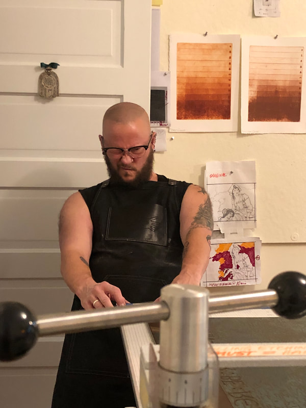
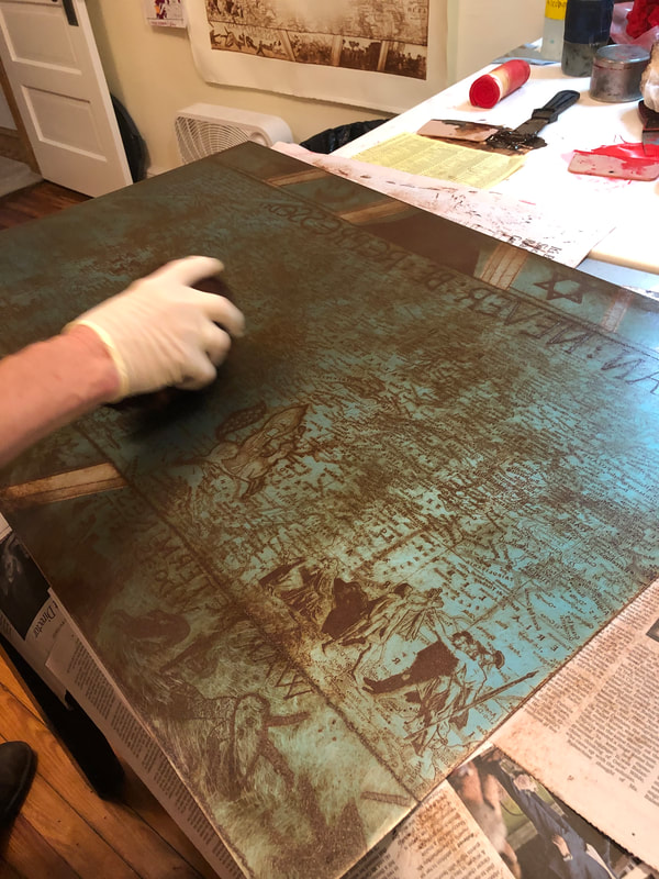
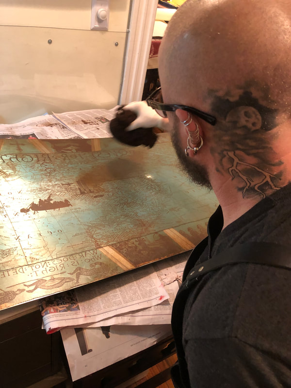
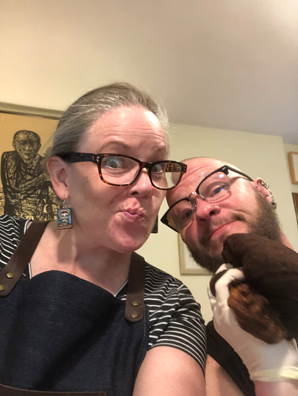
Some process shots from our printing sessions, October 18-19, 2021, Purple Crayon Press, Baltimore, Maryland.
0 Comments
Leave a Reply. |
Ann ShaferHost and resident curator Archives
January 2022
Categories
All
|
 RSS Feed