Ann Shafer The Big Bang. How do you express the formation of the planet and its inhabitants, and what kind of craziness had to come together to create the elements that, put together, make humans capable of thought, creativity, love? It’s really all dumb luck, isn’t it?
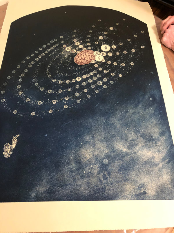
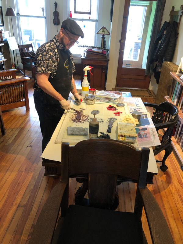
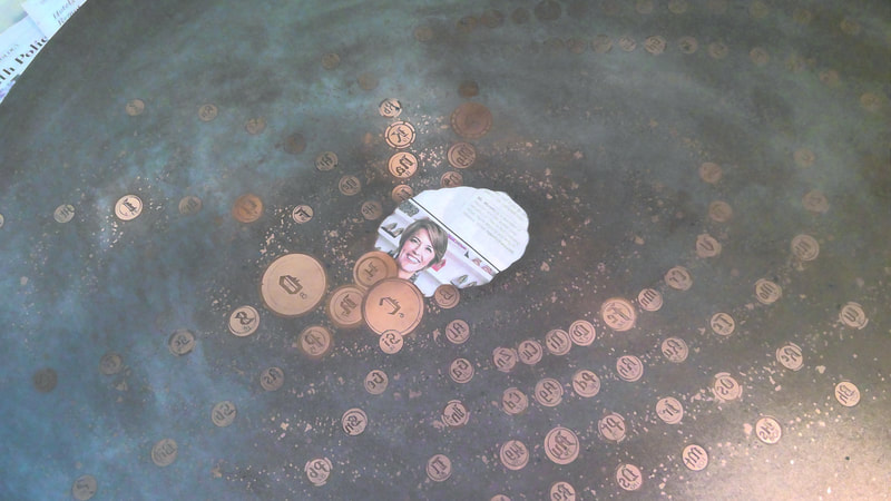
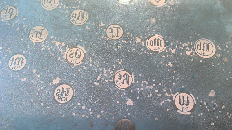
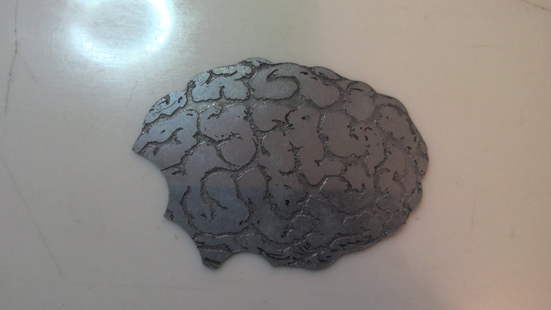
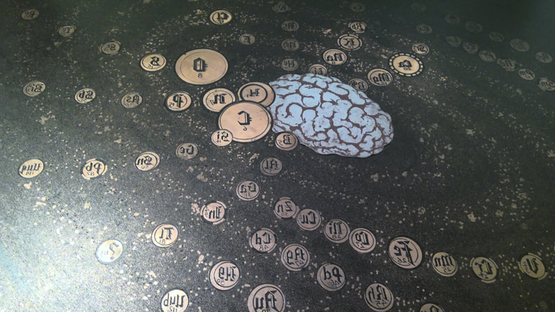
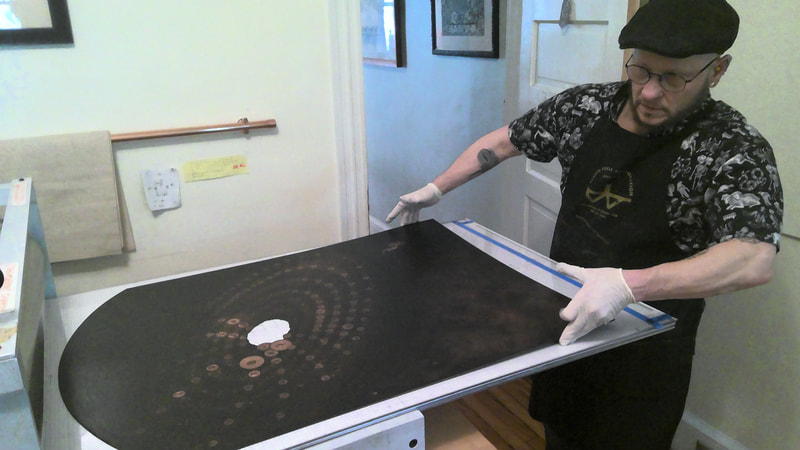
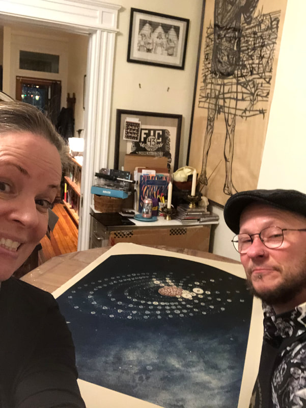
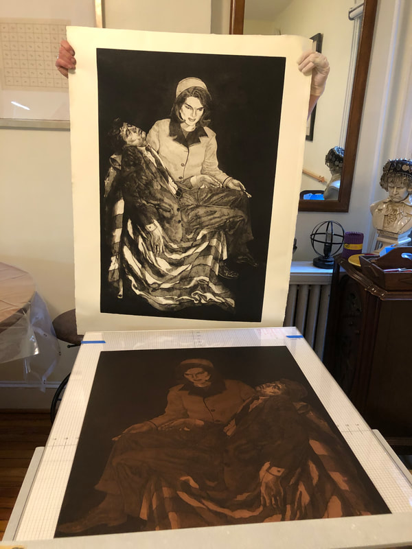
I recently helped Tru Ludwig print a rather large etching tackling this concept, Dumb Luck, 2009. The composition is a ring of periodic table elements swirling around a human brain set against a galaxy of stars. That brain is a zinc plate cut to fit into the center of the copper plate. The image is printed in blue-black (on the copper plate) and deep red (on the zinc plate). Scribing the element symbols took Tru three months to complete. I believe it. They are intricate, delicate discs floating on an aquatinted galaxy of stars and planets. Three bright white, far-off stars are drilled holes in the plate that carry no ink. They are a small yet vital part of the composition. Then there is a set of blessing hands at lower left. So, in addition to pondering the dumb luck that enables our existence, it raises questions about whether a higher power had a hand in our design. I love this print. I’ve always loved looking at pictures of the stars and galaxies and I’ve always been amazed by the Big Bang theory. How could it be that all this was created without some sort of intentionality? I’m not a particularly religious person, but it does make one wonder. That Tru figured out a way to convey this mystery astounds me. You may recall that Tru and I printed another of his prints, Ask Not…, last weekend, during which I was sort of helpful. I think I graduated to really helpful printing Dumb Luck. By the end of the session, I was wiping that little brain without supervision. I was wiping those element discs. I even came up with a method of quickly removing the first layer of ink—I’m pretty proud of that. We fell into the print-shop ballet that will be familiar to anyone who prints. I loved being in the studio and it reignited my long-held desire to open a print shop and publish prints. If only I would win the lottery in order to be able to do so. <sigh>
0 Comments
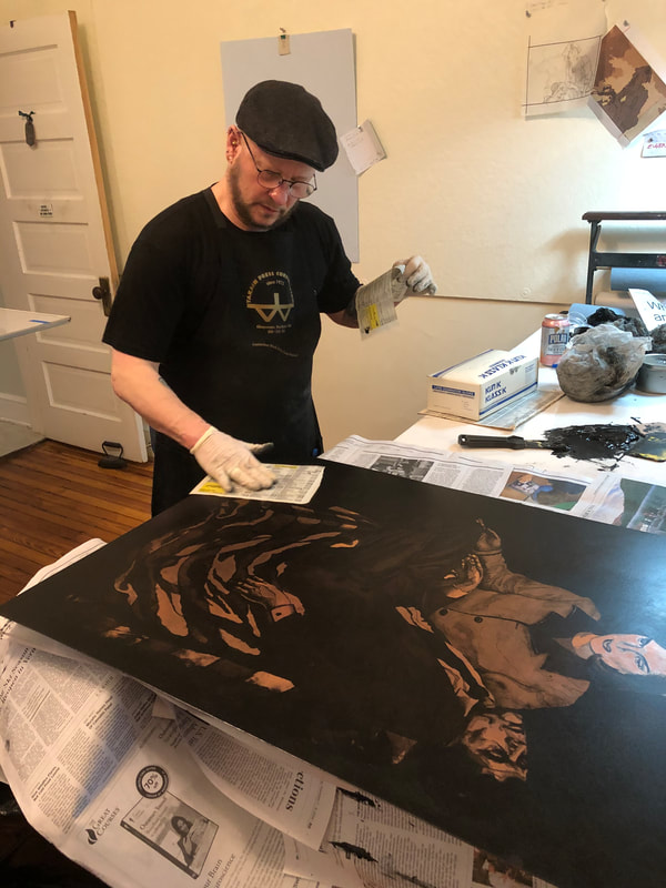
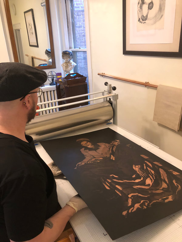
Ann Shafer There’s one part of being a curator that may shock you. There is no requirement that a curator has ever made a work of art in the manner of those objects they study and work with on the job. I mean, they have to know the basics and be able to describe them, but they don’t have to have done it themselves. I’ve watched lots of demos, made a linoleum cut in grade school (still have the scar to prove it), and I’ve been on hand during the printing process, but have always been the extra pair of hands. I’ve never inked, daubed, wiped, and printed a plate. Until recently, that is.
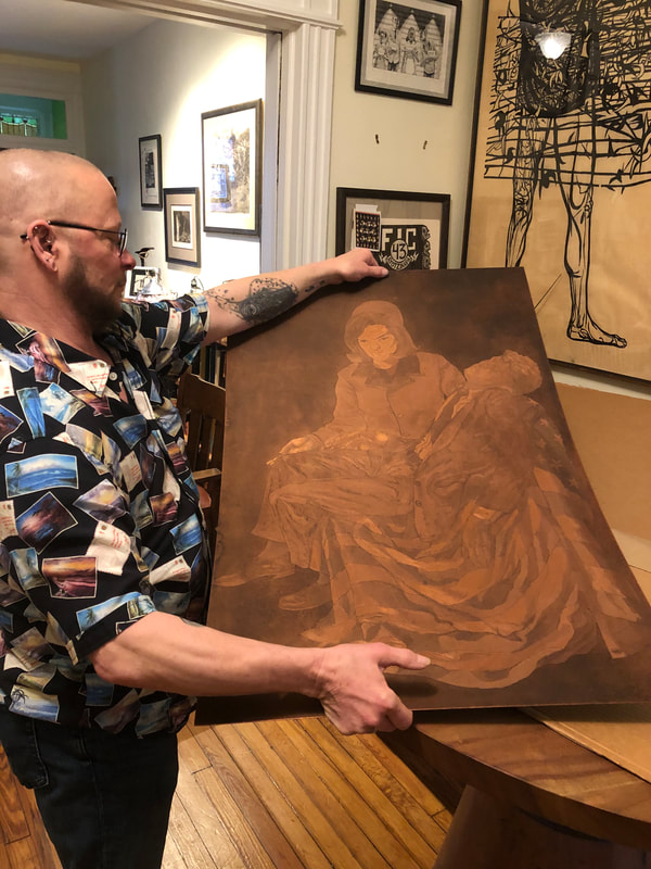
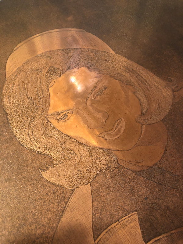
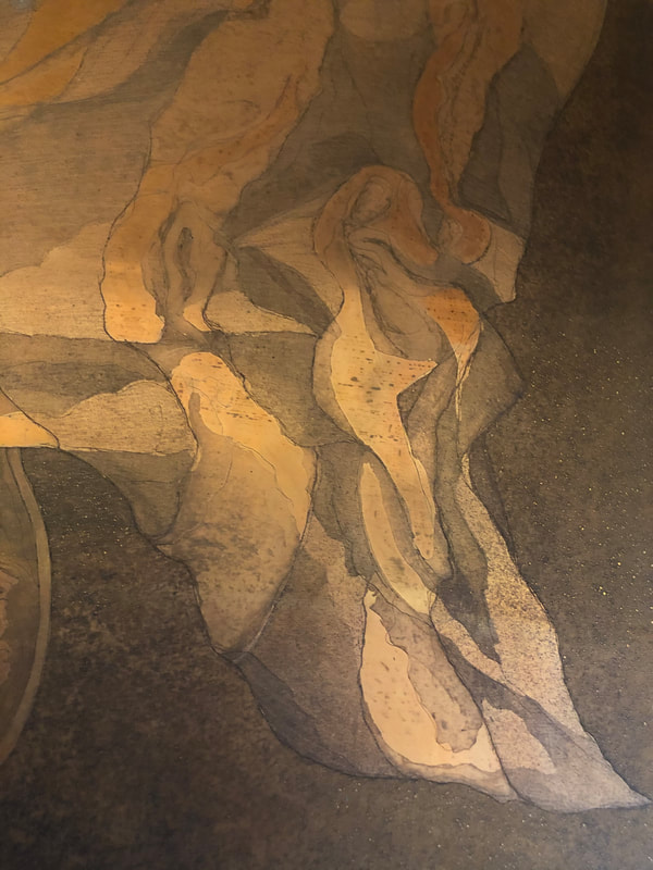
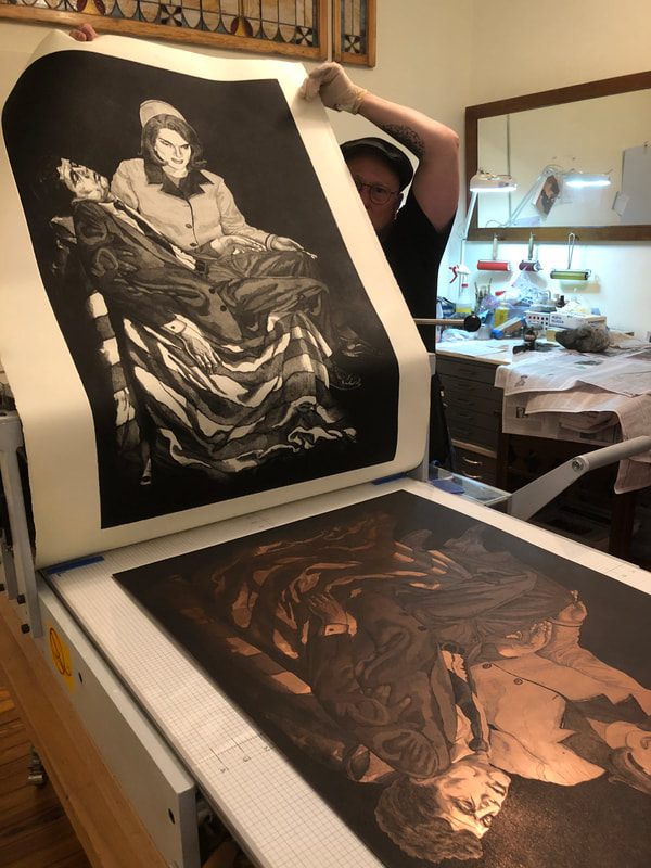
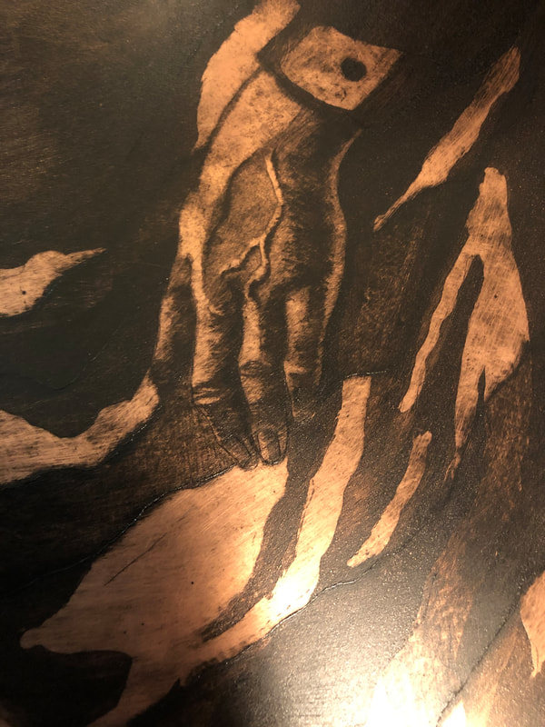
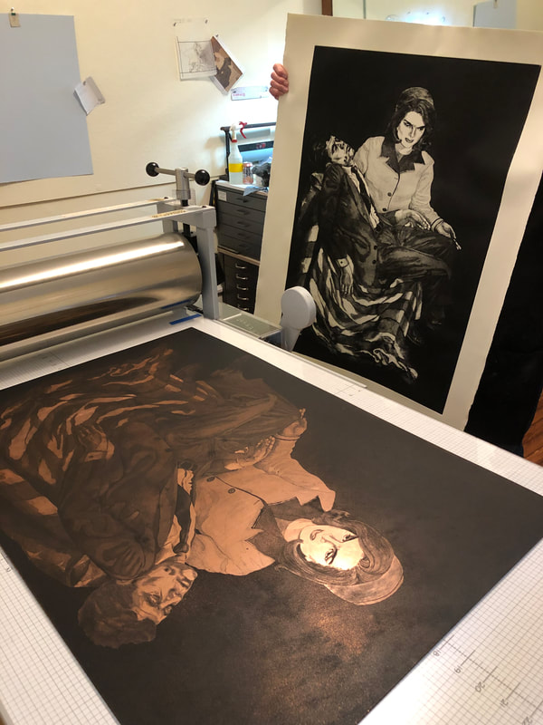
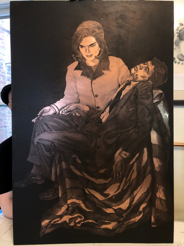
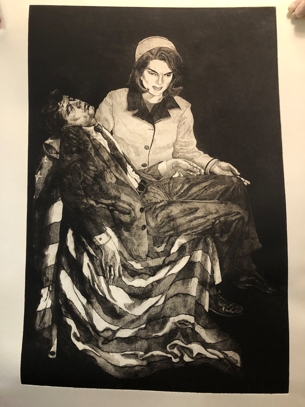
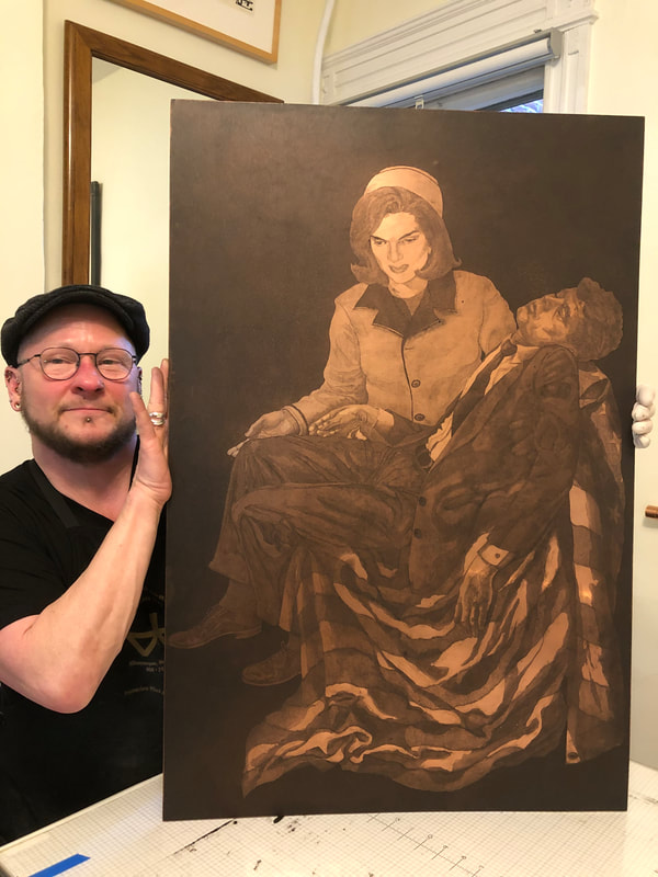
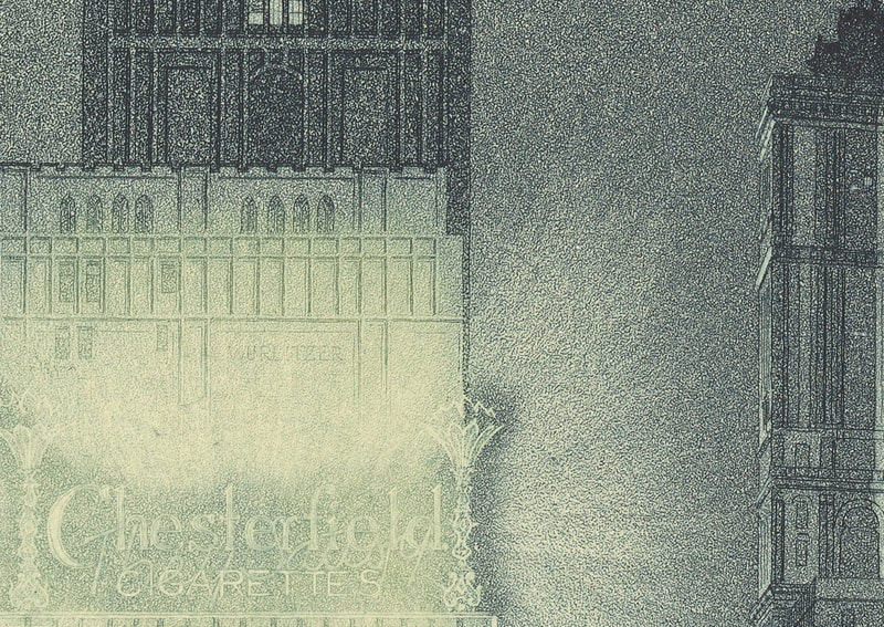
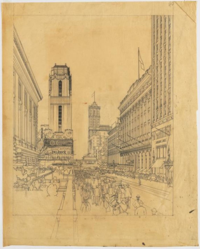
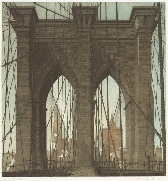
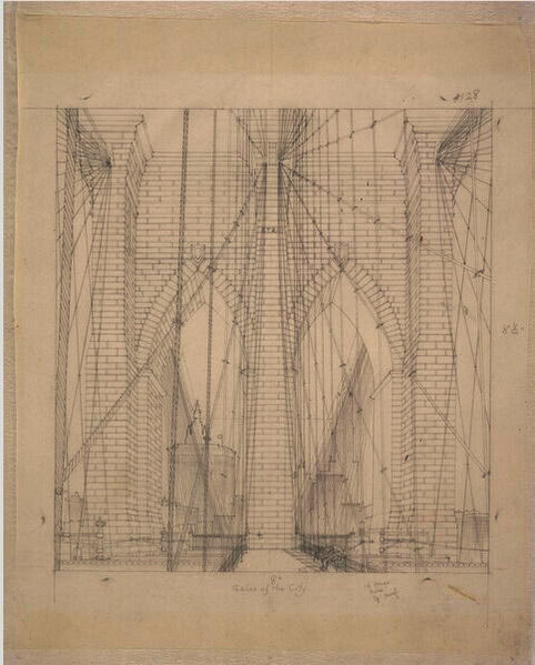
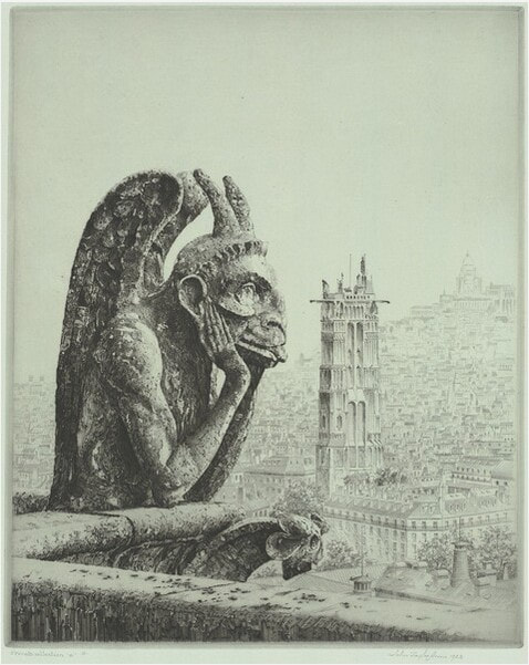
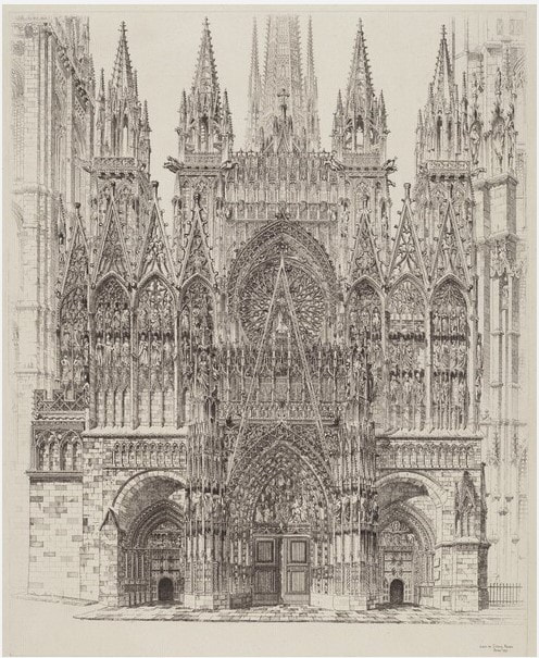
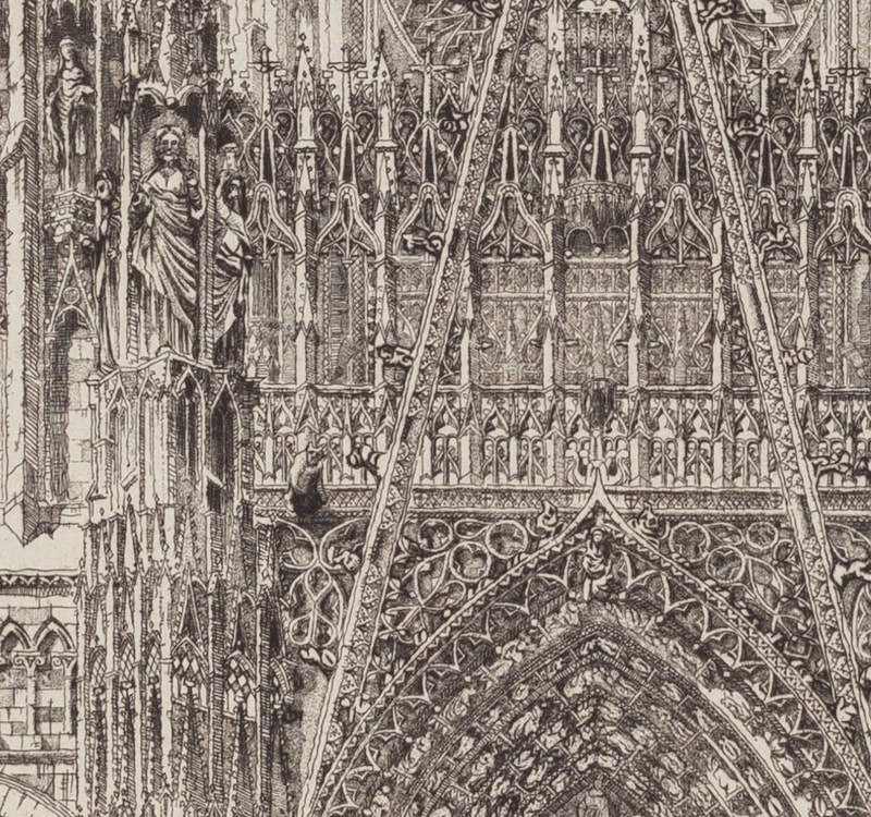
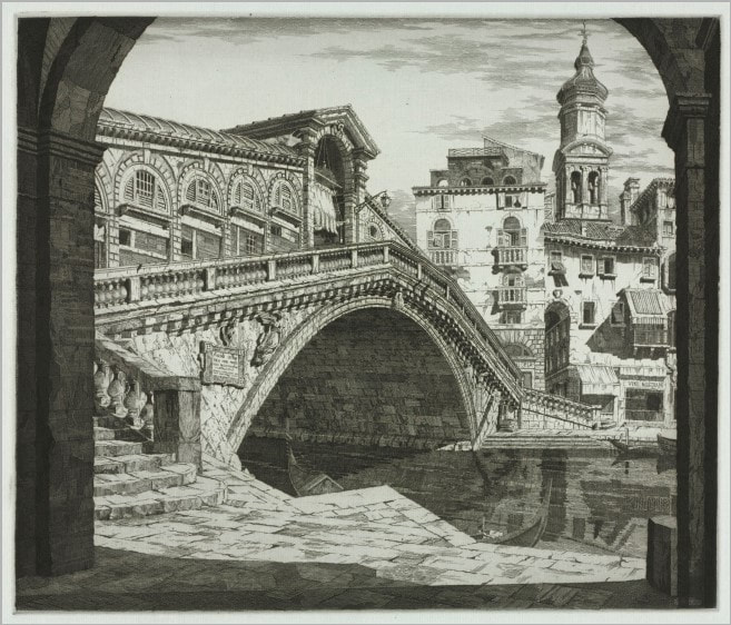
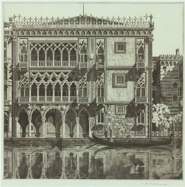
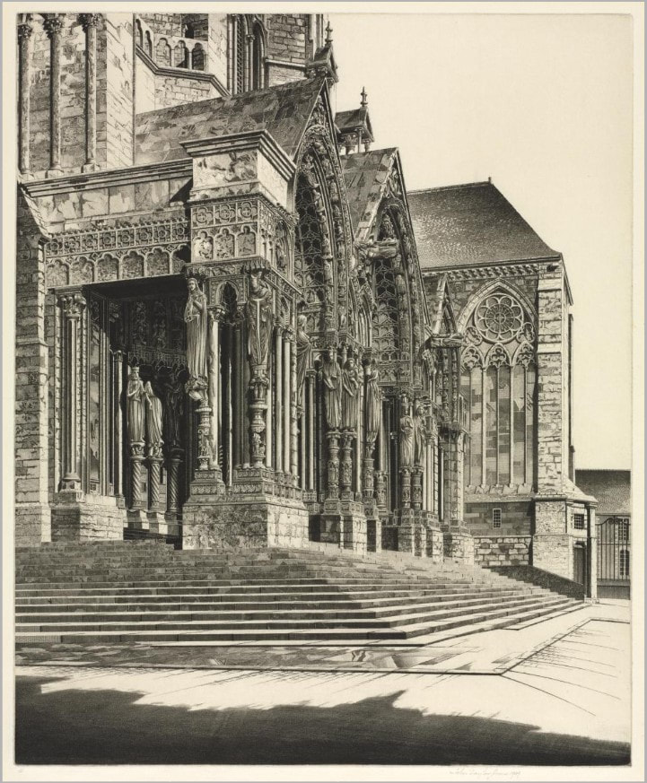
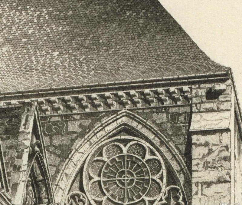
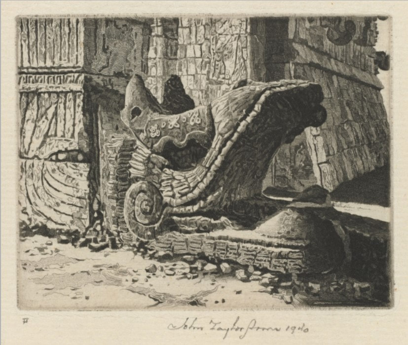
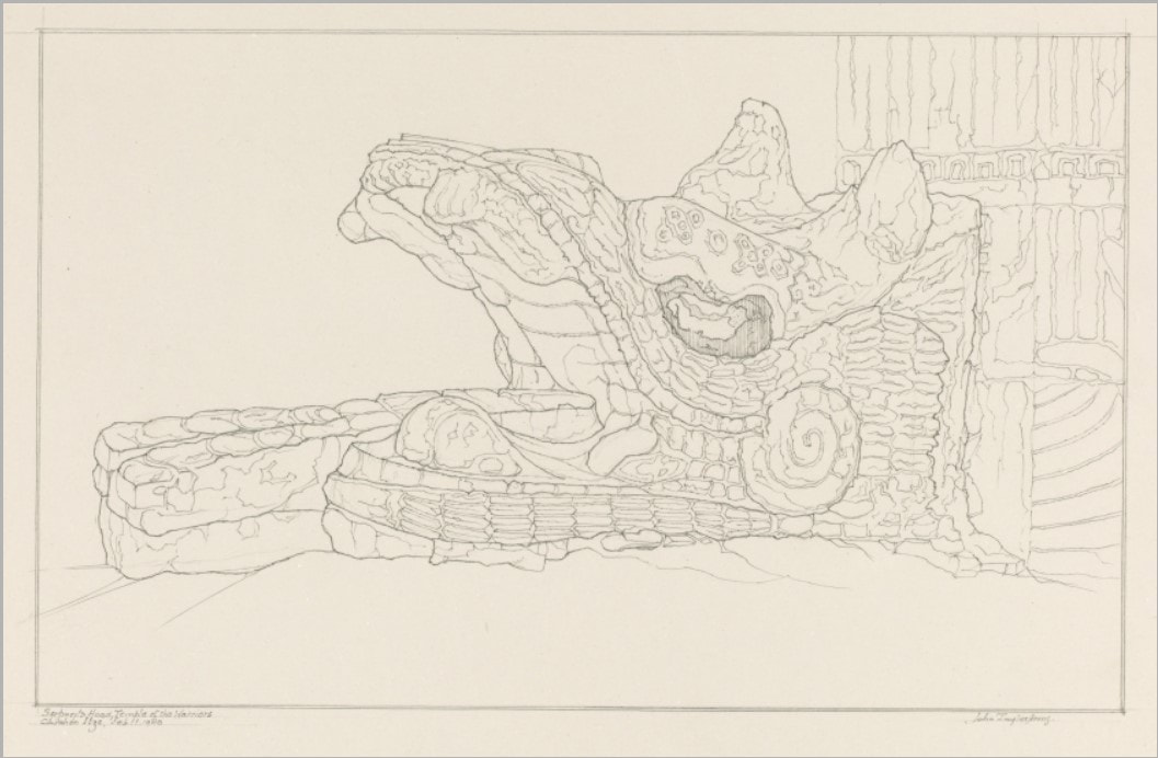
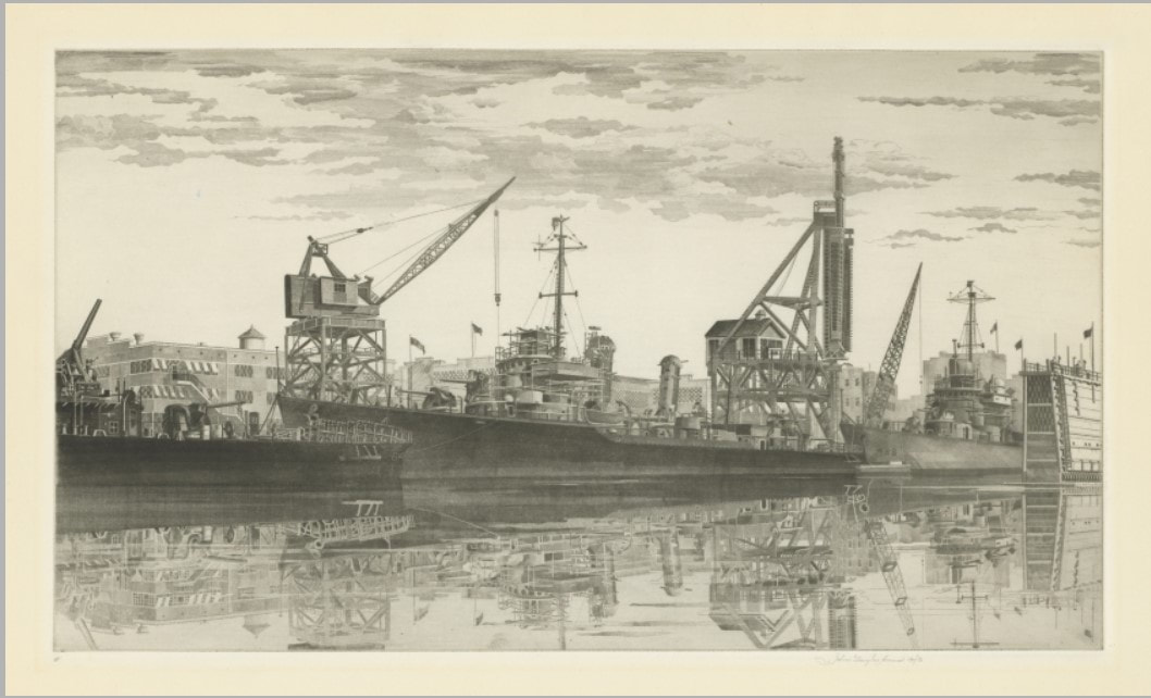
If you’ve been following along, you know that Tru Ludwig and I have been friends and colleagues for a good long time. Tru is the MICA professor with whom I taught history of prints for over a decade. I have also told you that Tru and I have traveled together to take in exhibitions and art fairs: New York, Philadelphia, Washington, London, Paris. We’ve shared a lot of hotel rooms, meals, and more than our share of vodka martinis (dirty and really dirty, respectively). But you probably don’t know that Tru is a kickass printmaker. I’ve always admired his woodcuts—there is one in the Baltimore Museum’s collection and I used it frequently for classes in the studyroom. And I’ve seen just about all of his other works. But one had always eluded me, Ask Not...—I’d only seen it in a pretty bad, discolored reproduction. But I knew it was special and that I would give a lot to have an impression. Lucky for me, the plate for Ask Not..., with Jackie and JFK as Pietà, is in fine shape, even after sitting in storage for twenty plus years. After a bit of Weenol, it was ready for its closeup. We managed to pull three impressions on Saturday. Jeepers, it’s a big plate. I was surprised by the amount of ink needed to cover the plate, both less and more than I thought. I was surprised how long it took to wipe the plate. I was surprised by how many variations of wiping went into the enterprise. And it confirmed for me that wiping and printing are just as critical as the making of the plate. It really was an education. And of course, there’s no better teacher than Tru. So, the print, Ask Not.... It’s a mash up of a critical piece of American history portrayed in the manner of an important Renaissance artwork by none other than Michelangelo (love a nod to art history), and turns the focus to not the main character (JFK), but a supporting one (the first lady). Tru’s etching gives us Jackie Kennedy holding the limp, dead body of President Kennedy on her lap in the same way the Virgin Mary holds the dead Christ in Michelangelo’s glorious marble sculpture. (If you’ve never seen the Pietà in St. Peter’s at the Vatican, don’t miss it if you get to Rome. Seriously.) It’s a simple gesture, but so full of meaning, emotion, power. (Remember, less is sometimes more.) Sometimes an image socks you in the gut. Like the Virgin in the Pietà, the image of Jackie holding JFK reminds us of her grace under extraordinary circumstances. Here she is still wearing the pink suit that had been splattered and soaked with the blood of her husband. It is well known that the first lady kept that suit on throughout the long day following the death of the president. She understood the power of images and was heard to say: “let them see what they've done." JFK is being cradled by an American flag, which seems to puddle along with our hope for the future. Tru’s draftsmanship is spot-on. And there’s something about the action of the corrosive acid used to etch the copper plate that lends itself to the subject. It feels like the copper is fighting to be turned into something, in the same way that we are fighting to be seen and heard and acknowledged. That the country’s sorrow should not be in vain. That at this point in our history, we should take a moment to remember what we have all fought for, and what so many have died for. There’s something at once delicate and harsh about the technique and about the subject. A pure confluence of content and method. It all feels more timely than ever. Ann Shafer I gave a talk to the Lewes (Delaware) Historical Society last week. With the option to talk about anything, I focused on American prints from 1900-1950. Fair warning: it runs nearly an hour. Ann ShaferSelf-taught. Self. Taught. One of the most remarkable etchers of the first half of the twentieth century taught himself how to etch after his wife gave him an “etching kit” for Christmas. What the hell. John Taylor Arms (American, 1887–1953) made stunning etchings of architecture in New York, Europe, and Japan, and Mexico. No doubt his experience as an architect gave him a leg up. In those days, there were no computers with CAD programs to assist with rendering buildings. Back then, architects hand drew every drawing for a project. With that bit of information, Arms’ etchings make more sense. They are, after all, seriously accurate images of architecture. But still.
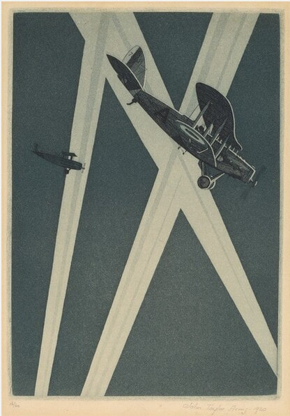
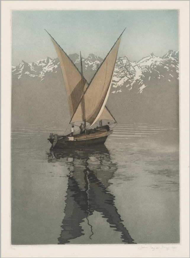
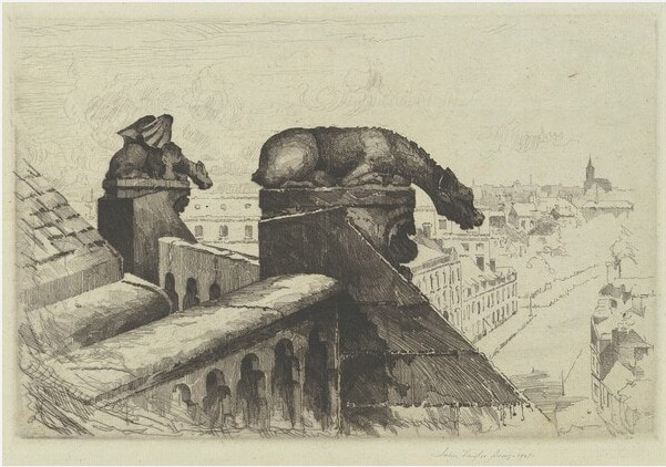
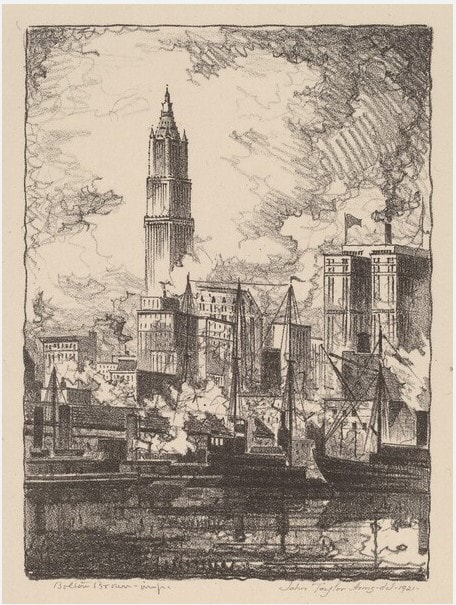
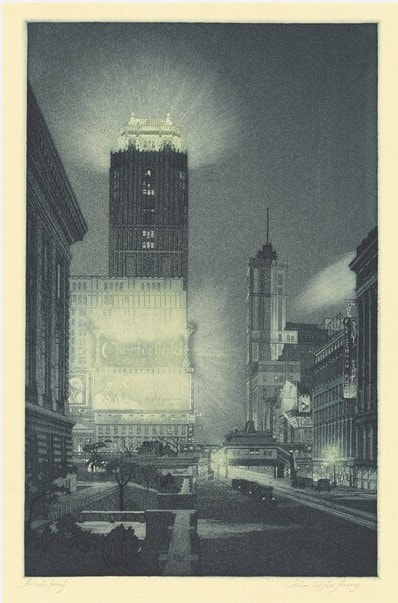
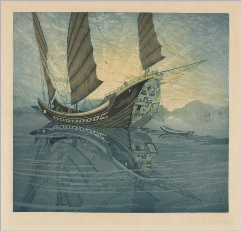
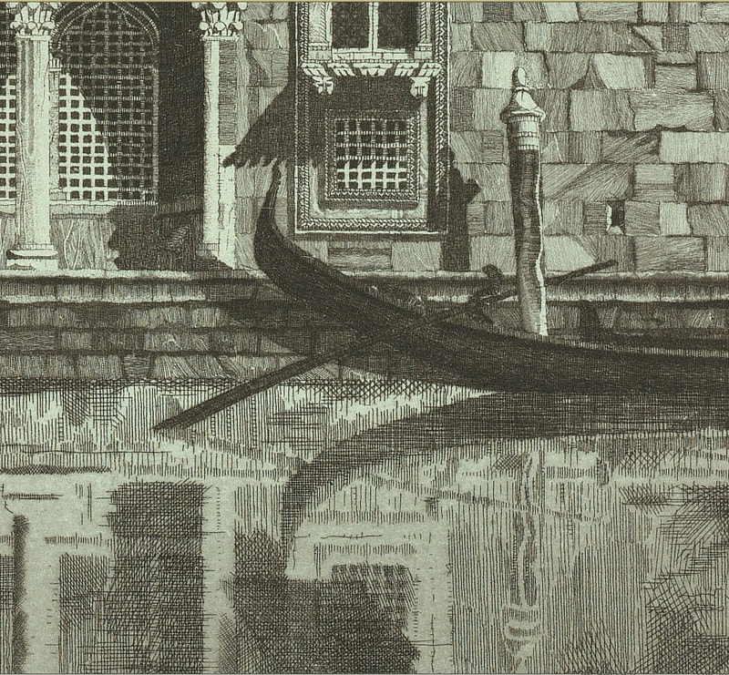
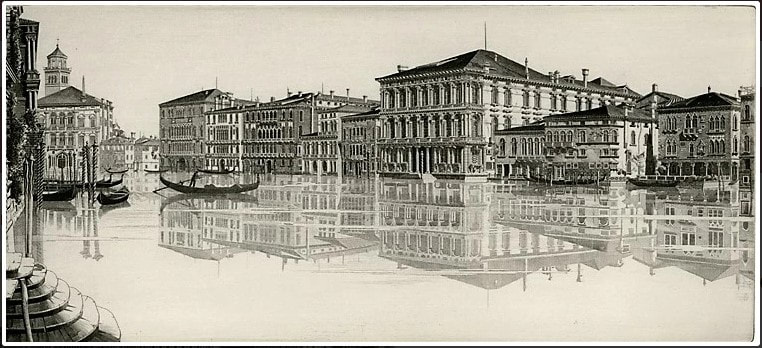
Interestingly, rather than portraying contemporary buildings, Arms more often portrayed Gothic architecture, which he considered “the most significant expression of man’s aspirations.” His early etchings focus on New York’s skyscrapers, but he soon decided “I can admire the skyscrapers of New York, that unbelievable city which is a very gold mine for the architectural etcher, but I do not love them and I cannot etch what I do not love.” Once New York lost its appeal as a subject, Arms traveled extensively making detailed drawings of towns and churches across Europe and Mexico that would be the basis of etchings once he was back home. He made some five hundred etchings during his fifty-year career and was quite successful over the course of his lifetime. Why do I love his etchings? After all, they are hyper-realistic, full of fine details, and are highly representational. They don’t exactly fall into my tight-conceptual-circle model. What gives? Maybe it’s because they take me away to whatever place is represented. And maybe those day-dreamy trips have an extra hold on me during these long winter, quarantine days. Wouldn’t it be nice to be riding a vaporetto along the Grand Canal passing the Ca’ d’Oro? I can almost smell the sea air and every other scent that comes with wandering around Venice. Also, I can’t wrap my head around how he portrays the crumbling stone texture of the gargoyles, the intricacies of Venetian facades, the church porticos, not to mention the reflections, light, and shadows. He apparently used sewing needles and magnifying glasses to make such fine marks. But the image that I really want for myself is Wasp, the image of two planes dive-bombing some target or other, printed in blue ink. I love the flatness of the image, the pattern made by the searchlights, the potential energy of the planes. It sits at the intersection of abstraction and representation and it hits so many notes. Love. It. Ann Shafer The end of a fair is always bittersweet. One is exhausted both physically and mentally, and yet, you want it to never end. The adrenaline is followed by such a let-down. If you’ve been following along, you know that I ran the Baltimore Contemporary Print Fair in its final three iterations (2012, 2015, 2017). For the first two of these I worked alongside the indomitable and amazing Ben Levy. He brought his remarkable brain, knowledge, and know-how to the enterprise. For the final iteration, I worked with the indefatigable and fabulous Morgan Dowty. Her quiet strength and constancy amazed me. And the fairs would not have happened without them. Thank you both.
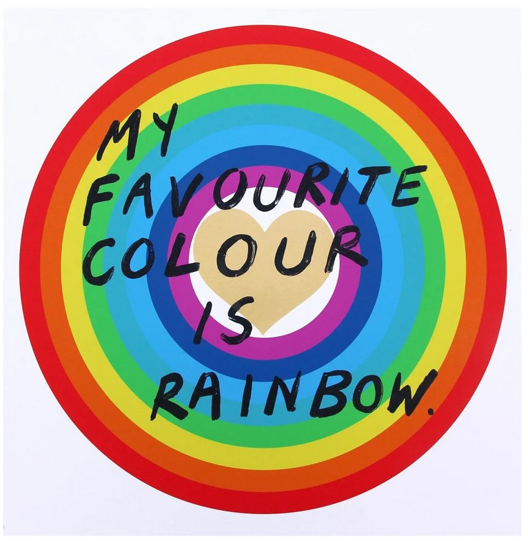
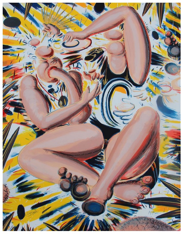
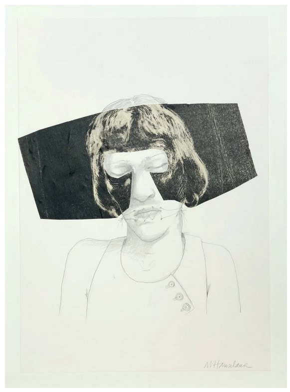
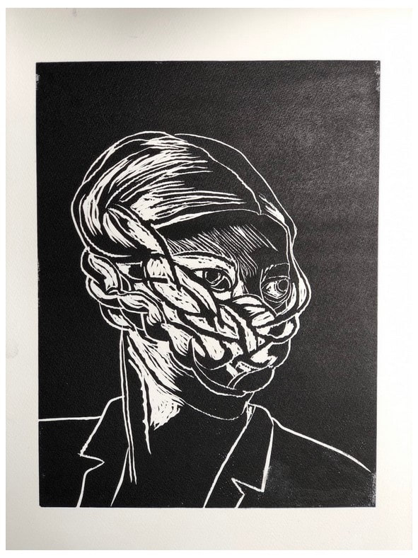
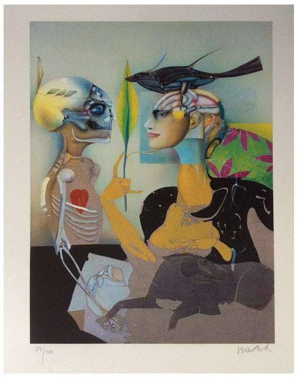
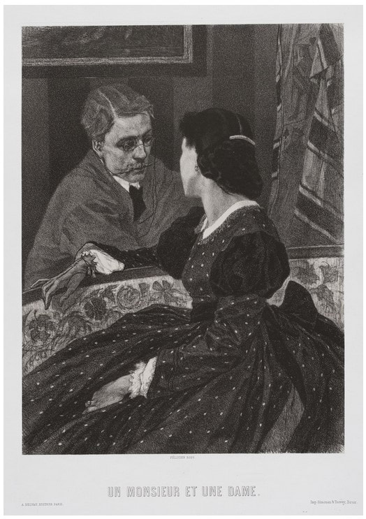
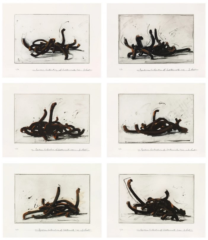
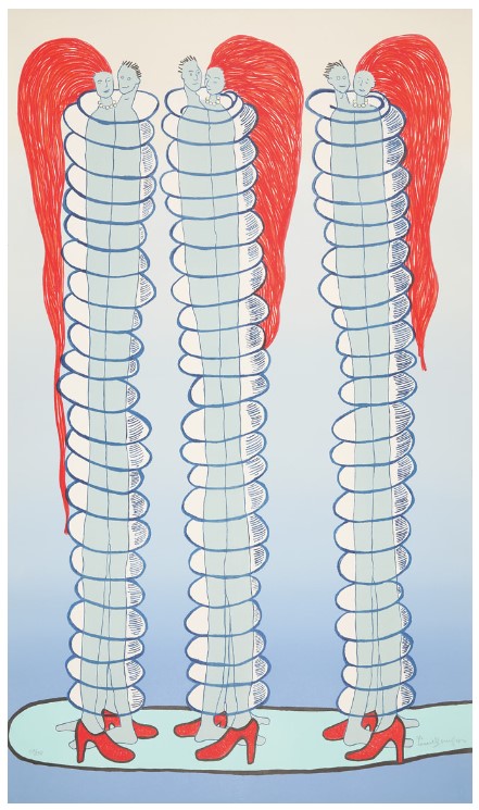
Running a fair is not for the faint of heart. But in the same way your love of a newborn baby makes you forget the pain of childbirth, the buzz of the fair long outlasts the exhaustion and sore feet. I always say it was the most fun part of the job. And I still mean it. It was an honor getting to know the dealers, publishers, and artists, just as it was meaningful to walk friends and collectors around and point out things I particularly liked both for me and for the museum’s collection. And that’s the great thing about prints, isn’t it? That one can have the same work of art that is in a museum collection. I love spreading the love. Today is the final day of these Curator’s Choice posts from the #LondonOriginalPrintFair, and while it takes a lot of work to select and gather the images and tombstone information (not to mention writing these mini-blurbs), its conclusion is bittersweet. I hope the cornucopia of images have inspired you to look more, buy something, make something. For that is always my goal: to engage an audience and show them the wonders of prints and printmaking. Until the next fair, this is your friendly print evangelist signing off. Please enjoy day 5/5 of offerings from the #LondonOriginalPrintFair. Today we finish up with R (Rebecca Hossack Art Gallery) through Z (Zuleika Gallery). Here is #LondonOriginalPrintFair Curator's Choice, 5/5. #prints #printmaking #printfair #curatorschoice #contemporaryprintmaking #contemporaryart #woodcut #relief #colorprints #printing #womenartists #collectart #artcollector #supportlivingartists #loveart #masterprinter #art #saga #societyofamericangraphicartists #nonobjectiveart #abstractart #londonoriginalprintfair #royalacademy #ifpda #etching #engraving #monotype #screenprint #lithograph #printevangelist #baltimorecontemporaryprintfair Ann Shafer As a curator, I instinctively judge the evenhandedness of any group of objects and assess how many of the works are by women artists, artists of color/BIPOC (a newish acronym meaning Black, Indigenous, People of Color), and queer artists. This is much more easily done with contemporary works. Old Master prints, as you know, are a whole other thing. The London fair gets fairly high marks for its gender inclusivity, but less so with racial diversity among the artists presented. I find it curious. And I have no answer as to why that might be.
I’ll leave that right here for today. Please enjoy day 4/5 of offerings from the #LondonOriginalPrintFair. As always, these are presented alphabetically by dealer meaning the order is random, which I quite enjoy. Today we start with L (Loft 11 Gallery) and go through R (RAW Editions). Here is #LondonOriginalPrintFair Curator's Choice, 4/5. #prints #printmaking #printfair #curatorschoice #contemporaryprintmaking #contemporaryart #woodcut #relief #colorprints #printing #womenartists #collectart #artcollector #supportlivingartists #loveart #masterprinter #art #saga #societyofamericangraphicartists #nonobjectiveart #abstractart #londonoriginalprintfair #royalacademy #ifpda Ann Shafer It’s not that I don’t like lithographs. It’s that their flatness makes them, well, fall flat (see what I did there?). I mean, they are called planographic for a reason, right? Planographic printing means printing from a flat surface, as opposed to a raised surface or incised surface, like you get with intaglio (incised) and woodcut (relief). Maybe it’s because I don’t quite understand the chemical ins and outs of the process. It's magic. If asked, I respond with the oft-stated “it’s based on the principle that oil and water don’t mix.” Hardly a descriptive explanation.
But, really, lithographs are totally cool because an artist can draw directly on the stone or aluminum plate (and can transfer a photographic image as well). The ability to produce a print that looks like a drawing is pretty darned awesome. There have been spectacular examples of lithographs since its invention by Alois Senefelder sometime in the 1790s. Great lithographs that pop to mind include Honoré Daumier’s Rue Transnonain, le 15 Avril 1834; Théodore Gericault’s Boxers, 1818; any poster by Alphonse Mucha or Henri de Toulouse-Lautrec; any lithograph by Käthe Kollwitz; New York scenes by George Bellows; regionalist scenes by Thomas Hart Benton and Grant Wood; New England scenes by Stow Wengenroth; any experiments by Robert Blackburn; and of course, Robert Rauschenberg’s Accident, 1963. But back to the cornucopia of prints offered at the London Original Print Fair. Please enjoy day 3/5 of selections from www.londonoriginalprintfair.com. Remember these are presented alphabetically by dealer meaning the prints will appear in a rather random order. Today we start with G (Gilden’s Art Gallery) and go through K (Kunstverket Galleri). Here is #LondonOriginalPrintFair Curator's Choice 3/5. #prints #printmaking #printfair #curatorschoice #contemporaryprintmaking #contemporaryart #woodcut #relief #colorprints #printing #womenartists #collectart #artcollector #supportlivingartists #loveart #masterprinter #art #saga #societyofamericangraphicartists #nonobjectiveart #abstractart #londonoriginalprintfair #royalacademy #ifpda Ann Shafer Recently, my friend Laura Albans challenged me to write about what I think makes a print great. In short, it came down to visual impact and emotional impact. Today, Laura asked me if I would name my favorite technique. If you’ve been following along, you know that I have looked at, researched, written about, and spoken about Stanley William Hayter and Atelier 17 for close to fourteen years. And you’ll know that Atelier 17 was primarily an intaglio studio. So there is your answer.
I love a good scrumpy, tactile etching, engraving, drypoint, whathaveyou. I love the platemark mark. I love flipping a print over and seeing the back is just as interesting as the front. I love the objectness of them. I love the amount of planning, patience, and care they require. I love how the ink stands proud on the paper, the depth of the blacks, the variety of marks attainable through aquatint and softground etching. I love that they can be delicate and rough, crisp and feathery, light and dark. I love that in the inking of the plate one can vary the results so widely. Of all the techniques, it seems to me intaglio may well be the most versatile. After intaglio, I would have to go with relief. I love a good Durer apocalyptic woodcut, an expressionist print by Kirchner, Heckel, or Kollwitz, an elegant wood engraving by Asa Cheffetz or Clare Leighton, a linoleum cut by Charles White, or contemporary woodcuts by Chitra Ganesh, Yashua Klos, Tom Huck, or Raj Bunnag. Woodcuts seem so hale and hearty, and I love the strength and patience required in carving. I also love that they can be printed on a press, with a steamroller, or a wooden spoon. Please enjoy day 2/5 of offerings from the www.londonoriginalprintfair.com. Remember these are presented alphabetically by dealer meaning the prints will appear in a rather random order. Today we start with C (Clemens Büntig) and go through G (Gerrish Fine Art). Here is #LondonOriginalPrintFair Curator's Choice 2/5. #prints #printmaking #printfair #curatorschoice #contemporaryprintmaking #contemporaryart #woodcut #relief #colorprints #printing #womenartists #collectart #artcollector #supportlivingartists #loveart #masterprinter #art #saga #societyofamericangraphicartists #nonobjectiveart #abstractart #londonoriginalprintfair #royalacademy #ifpda Ann Shafer Oh my goodness gracious, just as I was finishing up my curator's choice posts from the #WestCoastPrintFair, another fair went live online. The London Original Print Fair offers sixty plus dealers and their inventories of terrific prints. In the face of all those wonderful prints, who am I to not do more posts. This is the first of five posts featuring works from the various dealers at the London fair, which I have never been to. That makes this online version so great. There are so many galleries here that don’t often come to the New York fairs. The dealers range from Old Masters to Contemporary; there is something for everyone.
Please enjoy this first group of offerings from the www.londonoriginalprintfair.com. As was the case last week, these are presented alphabetically by dealer meaning the prints will appear in a rather random order. Today we start with A (Advanced Graphics) and go through C (CG Boerner). Here is #LondonOriginalPrintFair Curator's Choice, 1/5. #prints #printmaking #printfair #curatorschoice #contemporaryprintmaking #contemporaryart #woodcut #relief #colorprints #printing #womenartists #collectart #artcollector #supportlivingartists #loveart #masterprinter #art #saga #societyofamericangraphicartists #nonobjectiveart #abstractart #londonoriginalprintfair #royalacademy #ifpda Ann Shafer This post wraps up my picks from the West Coast Print Fair, a new virtual fair that, during the pandemic, compensated for the cancellation of a group of fairs that normally take place in January and February along the West Coast. When I first posted selections from this fair, I promised to articulate what makes a great print. Of course, what makes a great print is in the eye of the beholder. Please know these are my subjective opinions.
The best way I can describe what makes a print great (or a work of art in any media) is to take you inside my mind. Yesterday I laid out the two big concepts: visual impact and emotional impact. There’s a lot contained in both categories. This list of questions helps me think through and assess any work of art. It’s important to note, however, that a great print does not need to address each and every one of these questions. In fact, I don’t know that such a print exists (I’ll think on that). Here goes. EMOTIONAL IMPACT: · Does it elicit any feelings (good or bad)? · Is it thoughtful? Does it ask more questions than it answers? · Is it overwrought? Is there unnecessary stuff in it? Could it be said with less? · Does it have a tight conceptual circle—does the idea translate into a work that expresses the idea clearly and well? · Does the choice of technique(s) add to its meaning? · Does it nod to art history in a smart way without being derivative? · Does it nod to meta? Does it understand itself? · Does the work take an idea and transform it into a conversation starter? · Is it by someone other than a white, cis-gender male? VISUAL IMPACT: · Does it have visual impact? This does not mean large and colorful and is a truly subjective gut reaction. · Does it express a great design sensibility? · Does it have a range of lights and darks, wonderful transparencies, interesting patterns? · Does it capture atmosphere, reflections, ephemeral things? · Does it embrace its own delicacy or roughness? · Is it readable/legible/comprehensible, or utter nonsense? · Is it more than merely decorative? · Is it indexical? Is the image of its own making? · Does it cross disciplines in an interesting/meaningful way? · Does it tell a great story? · If I were presenting it to a accessions committee, how much is there to say? Thirty seconds worth or thirty minutes worth? In a weird turnabout, the emotional aspects are quantifiable--identifying whether the technique adds to the meaning is pretty straight forward. But the visual elements are highly subjective--visual impact is totally in the eye of the beholder. Curious. There is so much more, but I think this is a pretty good start. I never wanted to do anything else besides create ways to tell interesting stories through great art. I love works that sit at the intersection of new and old, of abstract representation and representational abstraction, of beauty and toughness, of stark crispness, and pure emotion. Have I set too high a bar? Maybe. And this doesn't address my feeling that a work that is appropriate for an institutional collection is not necessarily one I could live with, and vice versa. There is a place for the decorative, after all. Please enjoy this final group from the westcoastprintfair.com. Remember the randomness derives from the list running alphabetically by dealer. Today we start with Sh (Keith Sheridan) and wrap up with V (The Verne Collection). Here is #WestCoastPrintFair Curator's Choice, 5/5. #prints #printmaking #printfair #curatorschoice #contemporaryprintmaking #contemporaryart #woodcut #relief #colorprints #printing #womenartists #collectart #artcollector #supportlivingartists #loveart #masterprinter #art #saga #societyofamericangraphicartists #nonobjectiveart #abstractart #londonoriginalprintfair #royalacademy #ifpda Ann Shafer When I first shared these curator's choice posts on Facebook, I got a comment from a friend asking me to report on what makes a print great. I had yet to formulate a full answer, so I started with this. For me, it comes down to two things: visual impact and emotional impact. Does the work have visual power? Are its formal qualities like composition, execution, technique, top notch? Does the work have emotional power? Does it elicit a feeling, tell a powerful story, make us laugh? Does it have heart—does it reveal something about its maker? Does the formal reflect the emotional and vice versa?
It’s not a science; often it’s a gut feeling. I wrote about it more thoroughly in the fifth of five posts, which you can find on this blog too. Remember the randomness derives from the list running alphabetically by dealer. Today we start with M (Manneken Press) and go through Sc (Scriptum Inc.). Here is #WestCoastPrintFair Curator's Choice, 4/5. #prints #printmaking #printfair #curatorschoice #drawingstoo Ann Shafer Still pondering how to identify what makes a great print (for me, anyway), so stay tuned for that missive.
When I initially posted these selections on Facebook, I got a disgruntled comment about the presence of drawings among my selections. Hence my reminder about finding them among the group. Regarding these West Coast Print Fair posts, please know that selections are made from what the dealers are offering. Drawings are on the table, as are paintings. Feel free to visit the fair’s web site: westcoastprintfair.com. And please remember the randomness comes from my ordering the selections alphabetically by dealer. Today we’re starting with G (Roger Genser) and going through L (Josef Lebovic). Here is #WestCoastPrintFair Curator's Choice, 3/5. #prints #printmaking #printfair #curatorschoice #drawingstoo Ann Shafer After yesterday’s post, my friend and colleague Laura Albans challenged me to articulate what I look for in a great print. I’ve said it in drips and drabs throughout these Quarantine posts, but I will attempt to gather my thoughts in one place and post them later this week.
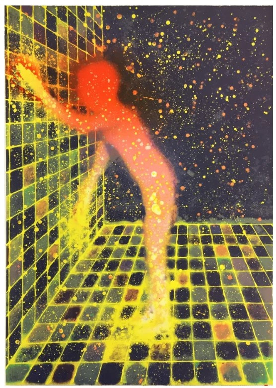
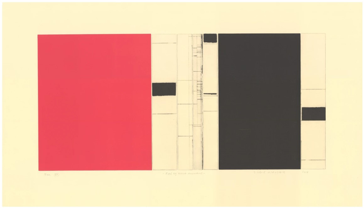
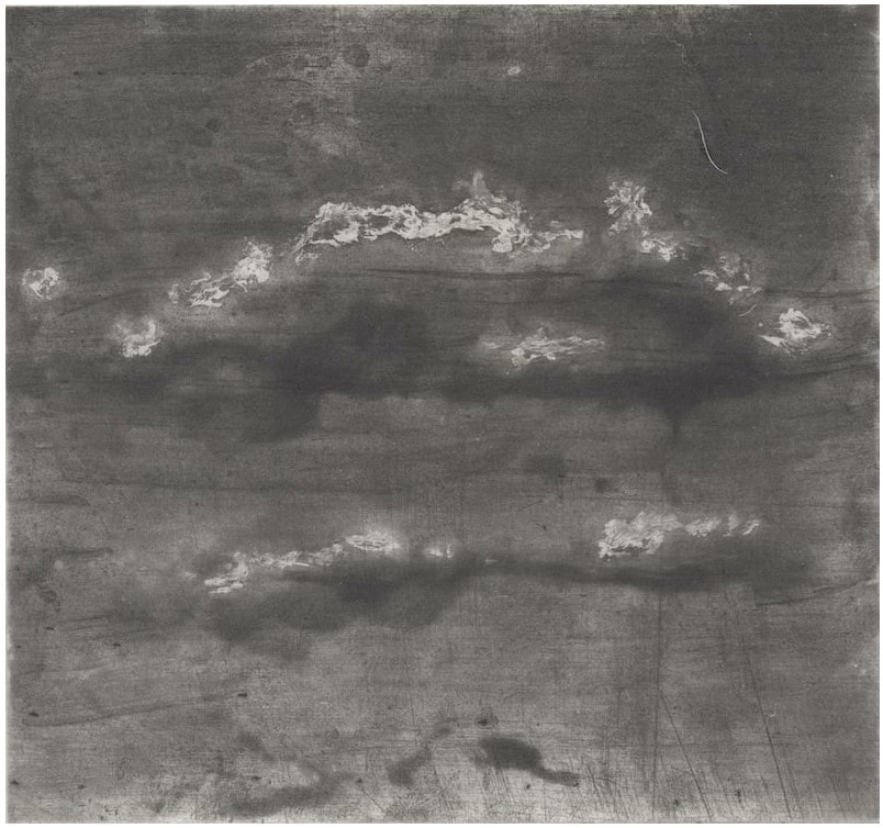
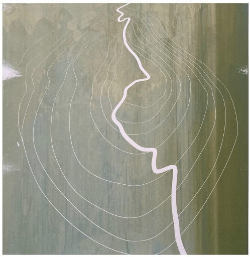
I’ve always had a problem remembering that not everyone thinks like I do, and it’s gotten me in trouble more than a few times. My belief in and passion about great printmaking seems so clear and obvious to me as to hardly need explanation. But, prints are tough for the layperson; the many barriers to entry mean one must really want in. I have described myself as a print evangelist numerous times: if I could get a person’s attention long enough to show prints and talk about them I could bring folks into the fold. (Good lord, “I’ll get you, my pretty” just rolled through my head!) I consider this week’s print-fair posts an amuse bouche: something to whet the appetite. While I attempt to articulate more clearly why I love prints and what makes one great, please enjoy day two of my picks from the West Coast Print Fair. (And yes, there are drawings mixed in!) Here is #WestCoastPrintFair Curator's Choice, 2/5. #prints #printmaking #printfair #curatorschoice #contemporaryprintmaking #contemporaryart #woodcut #relief #colorprints #printing #womenartists #collectart #artcollector #supportlivingartists #loveart #masterprinter #art #saga #societyofamericangraphicartists #nonobjectiveart #abstractart #londonoriginalprintfair #royalacademy #ifpda #etching #engraving #monotype #screenprint #lithograph #printevangelist #baltimorecontemporaryprintfair Ann Shafer If you’ve been following along, you know that nothing makes me happier than going to print fairs. Obviously the global pandemic has limited all sorts of things, including a spate of fairs that occur at this time of year from Portland down to San Diego. Instead, a new online fair has been born, which went live last Friday and which will be up until February 8. If you’ve gone to the site, you’ll know it’s a cornucopia of wonderful offerings. Thanks to everyone who pulled it together—no small feat—and a special shout out to my friend and colleague #MaryWeaverChapin, curator at the #PortlandArtMuseum. Nicely done, Mary.
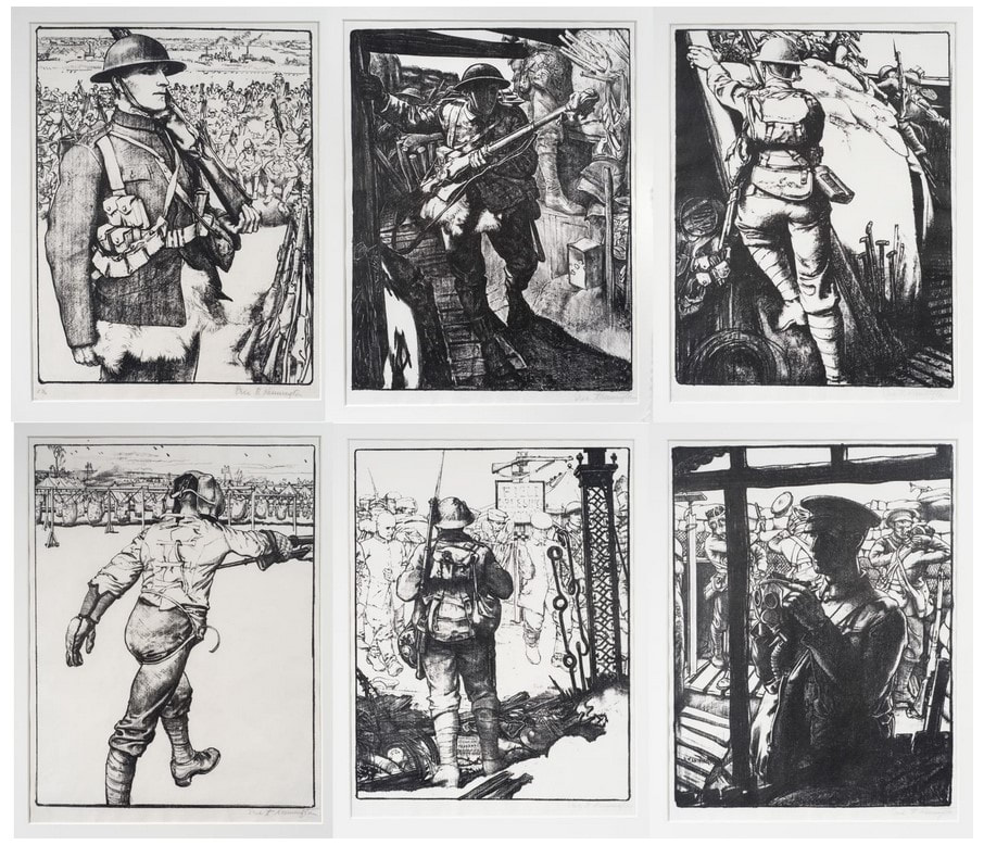
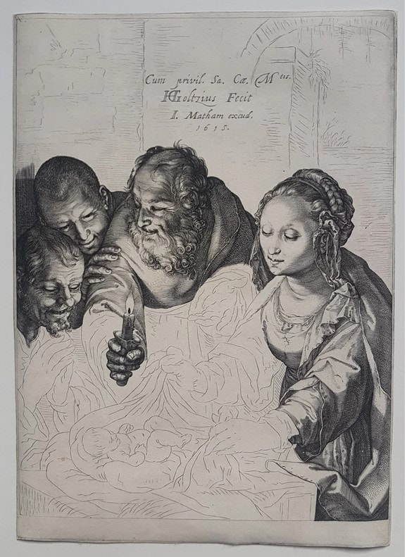
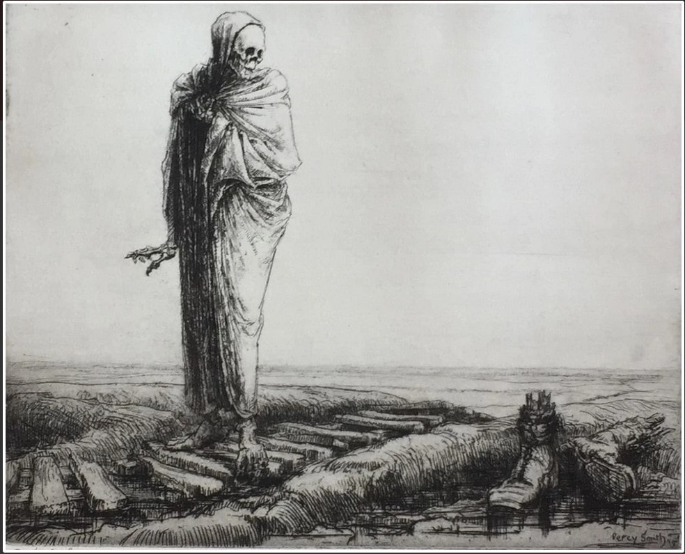
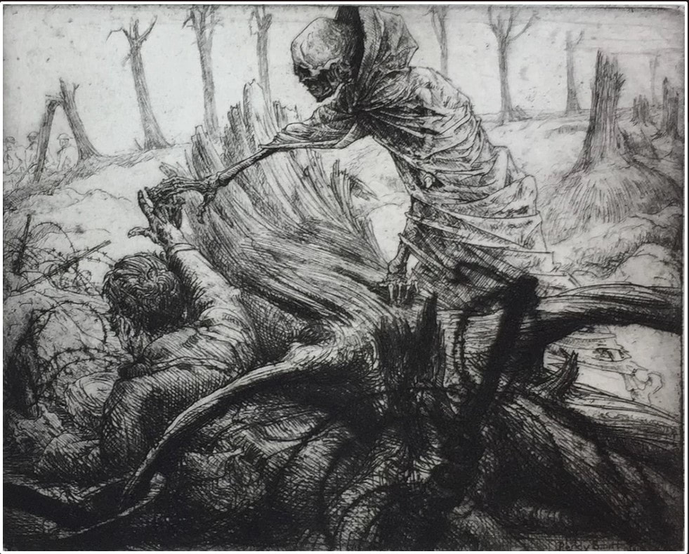
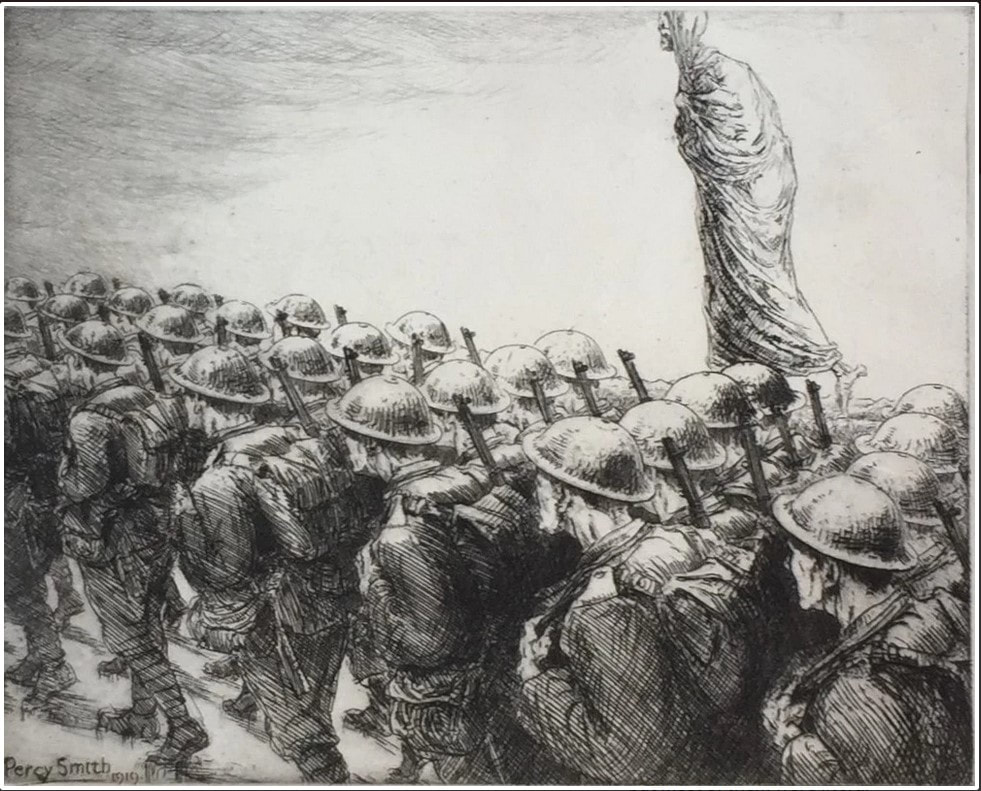
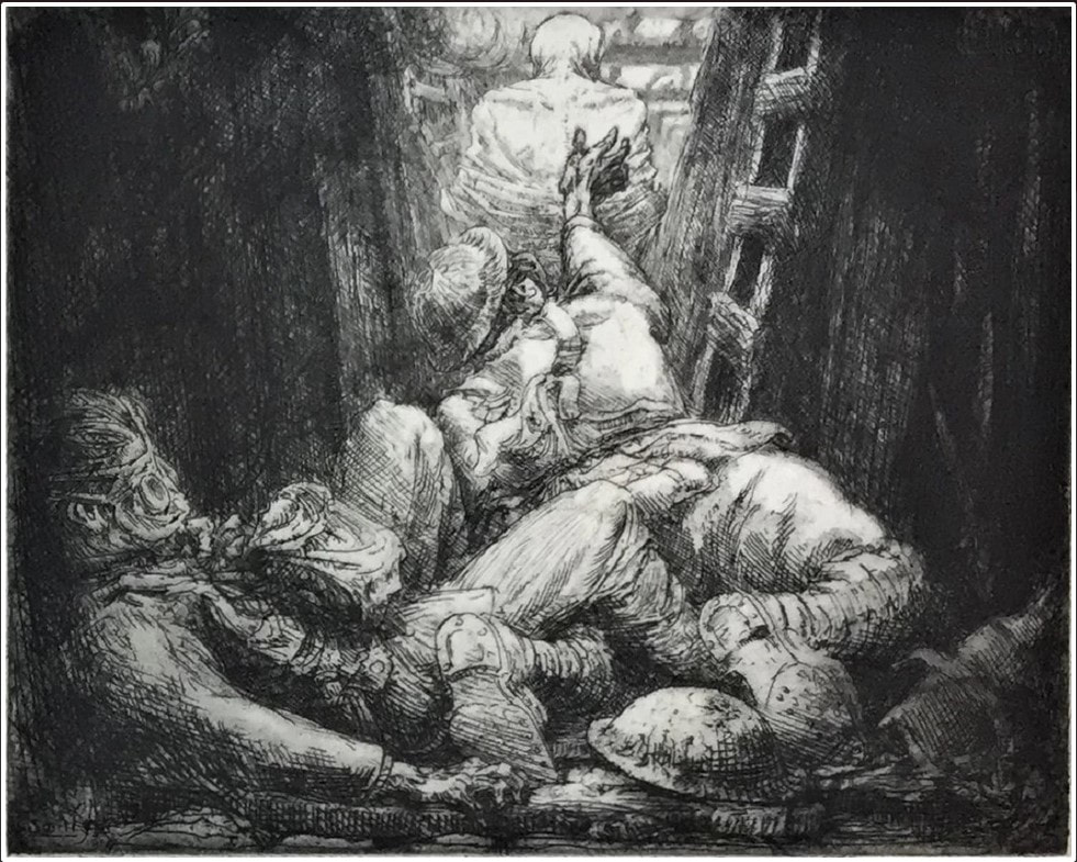
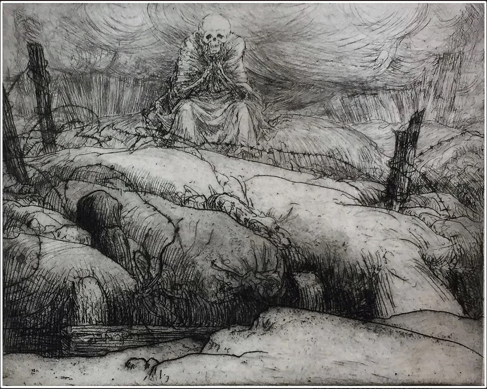
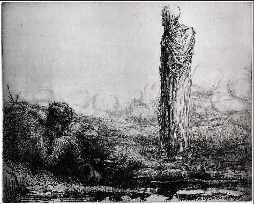
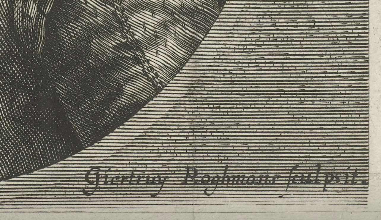
As I did with New York Print Week last fall, this week I’ll post some “Curator’s Choice” goodies. I tried to limit myself to two objects per dealer and ended up with one hundred prints, drawings, and a painting. For sanity’s sake, I’ll post them in groups this week, say twenty per day. Please know they are organized alphabetically by dealer, which makes for a super random order. Today’s selections are from galleries starting with the letter A. Know that one portfolio, #PercySmith’s six etchings of World War I imagery, stunned me and I’ve included all six prints. For ease, I've also included the prices, some of which may surprise you. See if anything piques your interest, then reach out to the dealer and make a deal. And now, presenting #WestCoastPrintFair Curator's Choice, 1/5. #prints #printmaking #printfair Ann Shafer One of the super helpful things about reproductive prints is the practice of including the “address” in which the names of the engraver, the artist of the original composition, the publisher, and maybe the benefactor appear along the bottom of the image. This convention has helped every print-room cataloguer, connoisseur, dealer, collector, scholar, and curator make sense of the thousands and thousands of Old Master prints out there in the world.
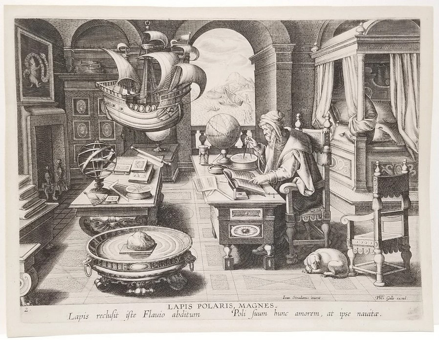
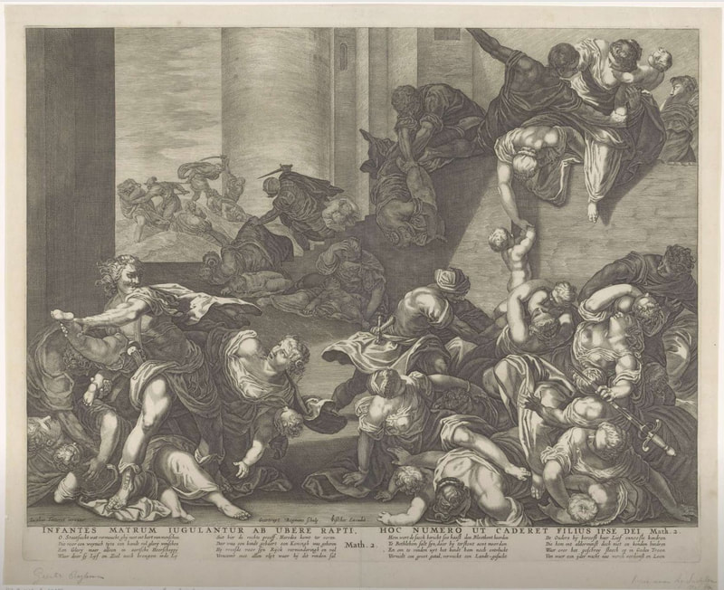
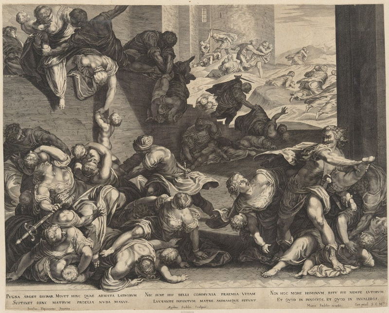
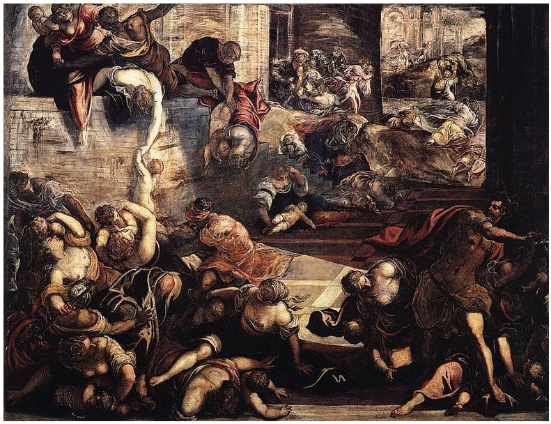
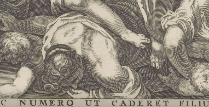
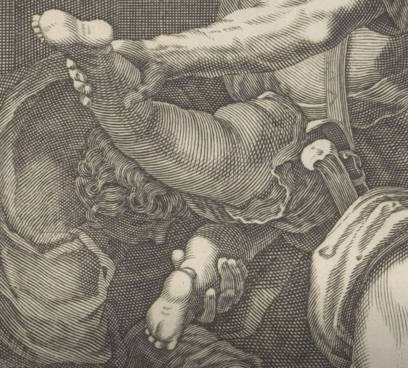
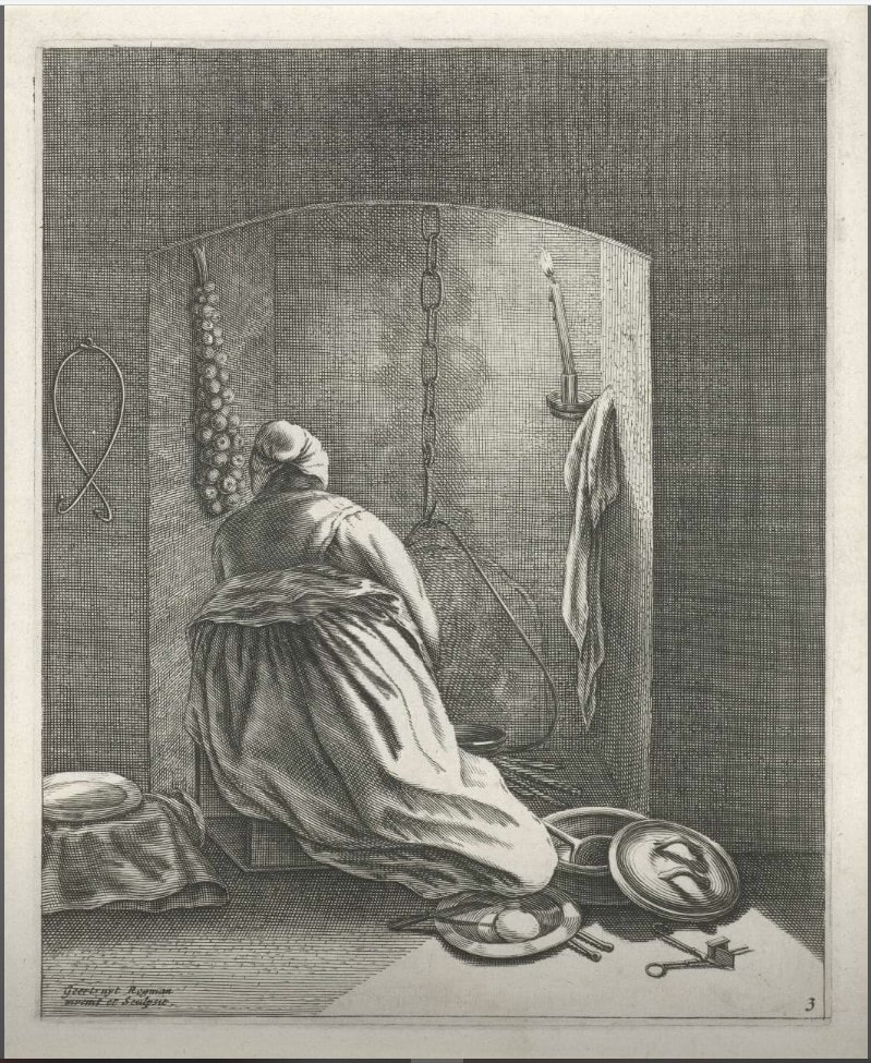
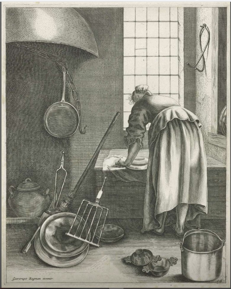
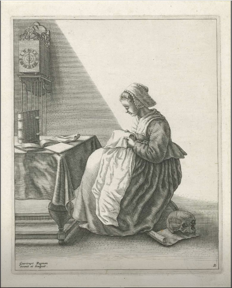
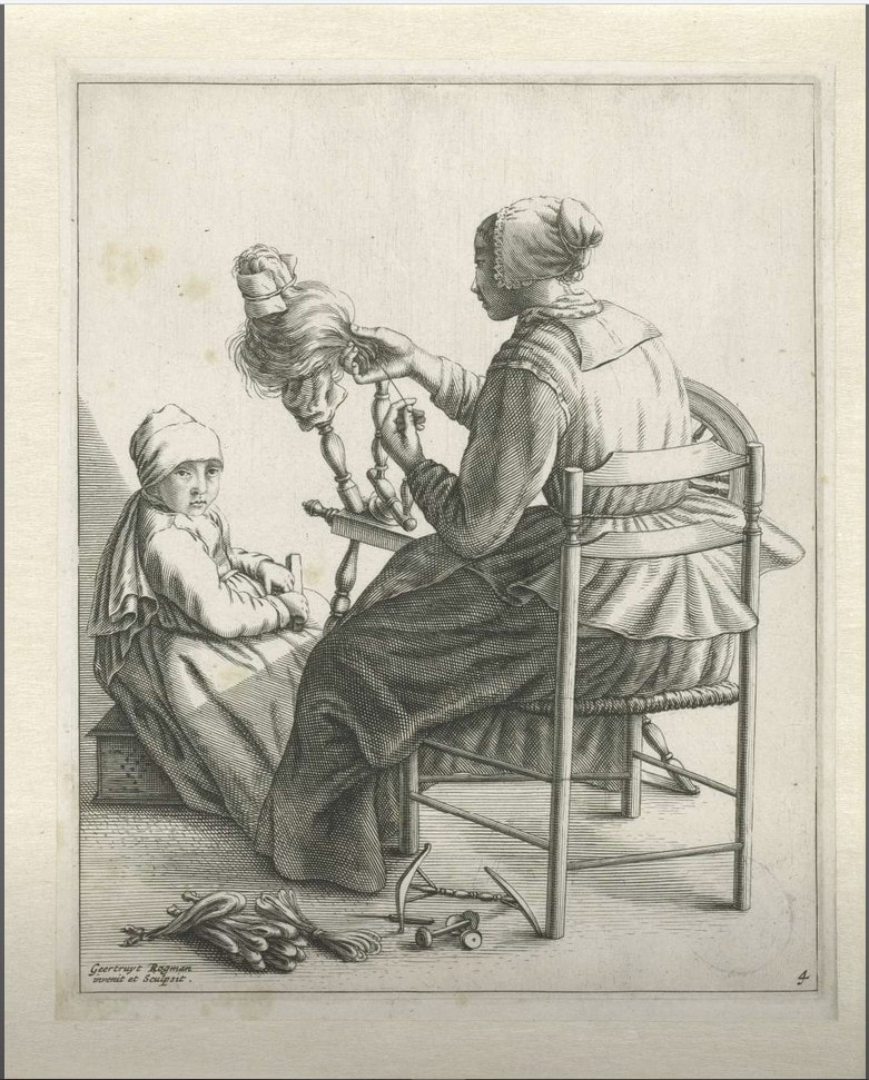
The nomenclature can be a bit confusing and some of the abbreviations mean the same things, but here are some terms frequently used in the address: Cael., caelavit: Engraved by Cum privilegio: Privilege to publish from some authority Del., delt., delin., delineavit: Drawn by Disig., designavit: Designed by Divulg., divulgavit: Published by Eng., engd.: Engraved by Exc., excud., excudit: Printed by or published by F., fac., fec., fect., fecit, faciebat: Made by Imp., Impressit: Printed by Inc,. incidit, incidebat: Incised or engraved by Inv., invenit, inventor: Designed by or originally drawn by Lith., litho., lithog.: Lithographed by Pins., pinxit: Painted by Scrip., scripsit: Text engraved by Sc., sculp., sculpt., sculpsit: Image engraved by In today’s example we have inventor (artist of the original composition), sculpsit (the printmaker/engraver), and excudit (the publisher). Making all these intricacies clear for today’s audiences is challenging. Our convention is to use the term “after” to indicate that X is the artist of the print, which is reproducing (or after) Y’s composition. Label information (we call it the tombstone information) usually omits the publisher, perhaps because it’s confusing enough as it is. In a previous post, we were introduced to Geertruydt Roghman, a printmaker best known for her series of five prints of women engaged in daily tasks. Remember, these were her own compositions. She also made reproductive prints such as The Massacre of the Innocents, which is a great example of the address helping us understand the sequence of works. So, Roghman made an engraving of The Massacre of the Innocents after a print by Aegidius Sadeler. Sadleler’s print reproduced the painting by Jacopo Tintoretto, which is in the Scuola Grande di San Rocco in Venice. So Roghman’s print is after Sadeler’s print, which is after Tintoretto’s painting. Don’t you love a twist and a turn? The subject is the Massacre of the Innocents, the biblical story of Herod who set out to kill every infant boy in Bethlehem knowing one of them would become king of the Jews. The passage is in Matthew (2:16): Then Herod, when he saw that he was mocked of the wise men, was exceeding wroth, and sent forth, and slew all the children that were in Bethlehem, and in all the coasts thereof, from two years old and under, according to the time which he had diligently enquired of the wise men. It's a gruesome story and the image is relentless in its goriness and depravity. To increase the painting’s impact, there is some thought that Tintoretto would have added a plaster forearm to the bottom edge of the canvas where the woman’s arm is cut off—yes, a three-dimensional appendage. Apparently, that was a thing artists would do to enliven their paintings back then. Interestingly, the woman's arm is tucked under her in both of the prints. So how did Sadeler, a Netherlandish artist, make his copy? Did he travel to Venice to draw from the painting at the Scuola or was a drawing of it sent to him? Perhaps Sadeler made his version after yet another print of Tintoretto’s painting. But Sadeler’s version was published after Tintoretto’s death, meaning it couldn’t have been commissioned by Tintoretto to popularize the composition. Curious. We don’t know why Roghman made her version either, which is printed in reverse of both the Sadeler print and the Tintoretto painting. Does that suggest it was an exercise for practice? Was it sold in large numbers? It’s not a great and accurate reproduction if it’s backwards, right? What’s more, why make it so long after both Tintoretto and Sadeler were dead? Intriguing. #printidentification #publishersaddress #sculpsit #oldmasterprints #printsafterprints #Tintoretto #sadeler #roghman #delineavit #excudit Ann Shafer During History of Prints class, it’s impossible to show everything. After each class, Tru Ludwig and I would reassess our lists and see where we could make cuts in the early periods to make room for the contemporary works at the end that the museum had recently acquired. For a while we had early Italian female printmaker Diana Scultori as the first woman to appear on the chronological list, but she got bumped off at some point (sorry Diana). If I recall correctly, the BMA’s prints by her were not great representations of her work. So, the first woman on the list became Geertruydt Roghman (Dutch, 1625–1657), an artist from an extensive artist family in Amsterdam.
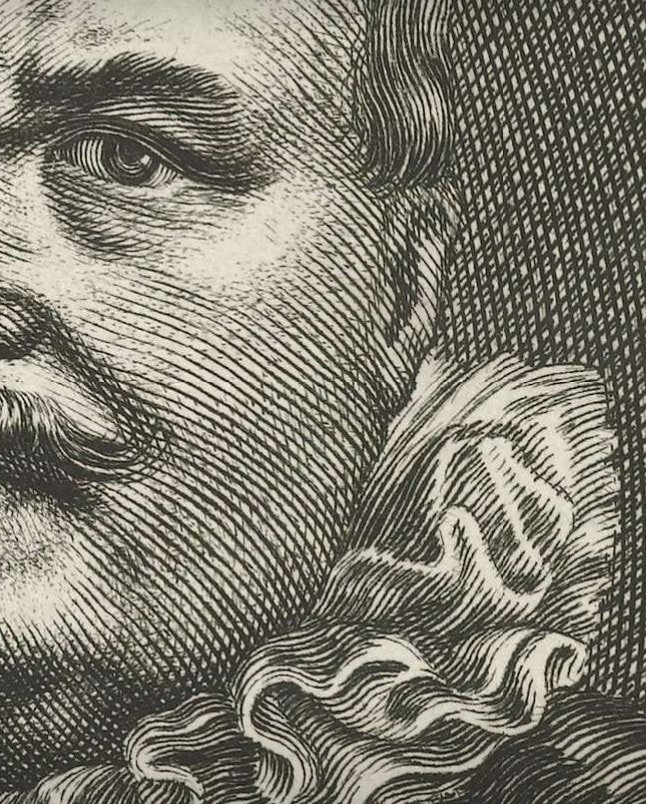
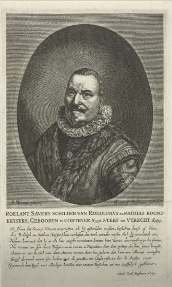
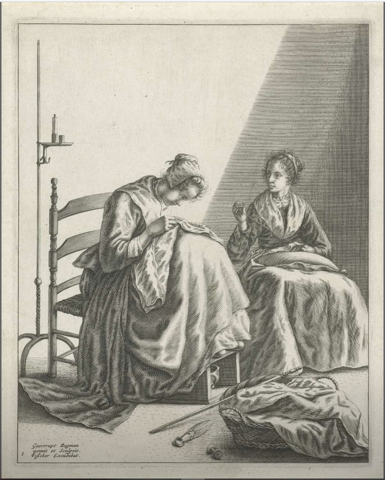
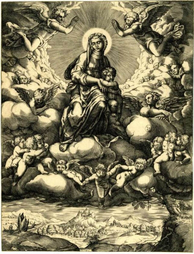
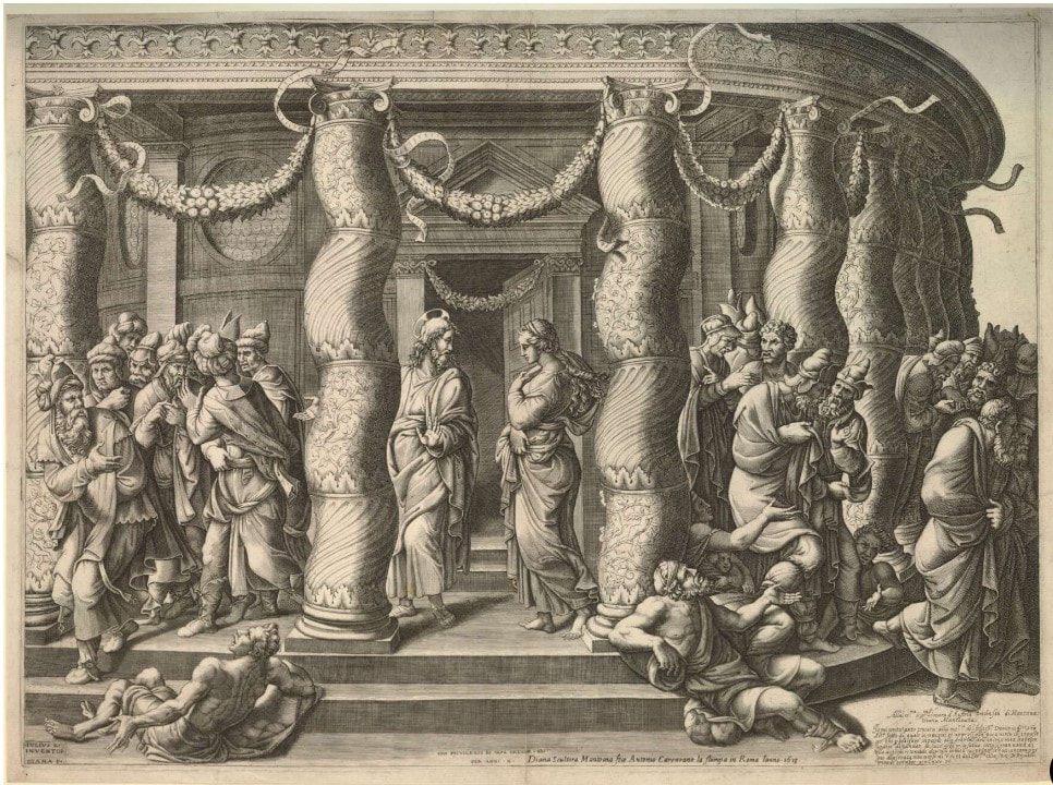
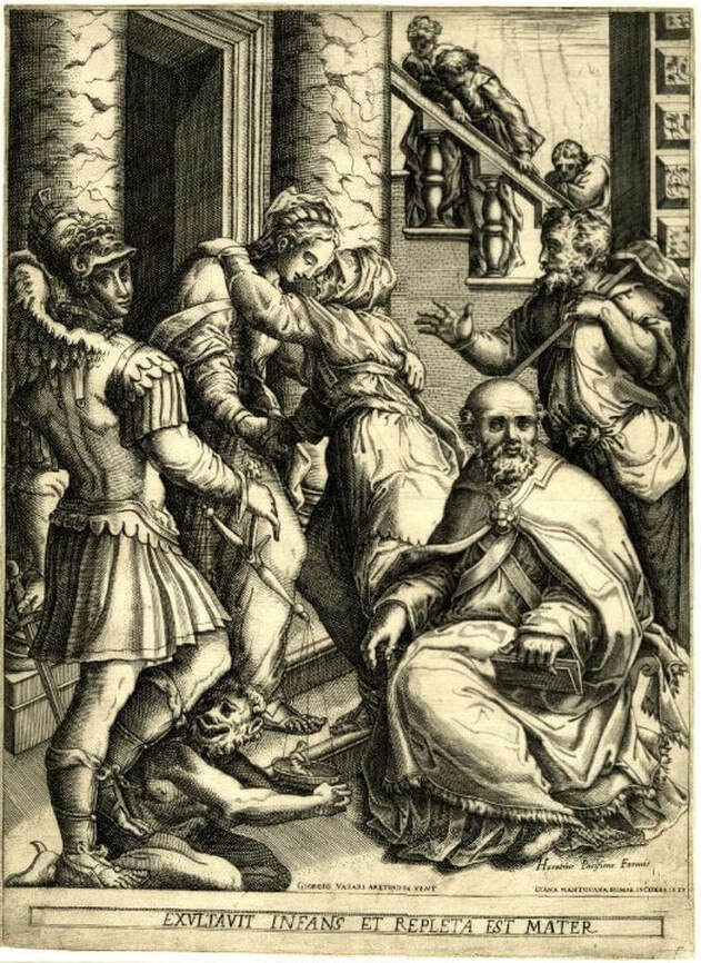
Geertruydt’s father, Hendrik Lambertsz. Roghman (1602–before 1657), was an engraver. Her mother Maritje’s father was Jacob Savery II (1593–c. 1627), a painter and etcher. Her great uncle was the Flemish painter and printmaker Roelant Savery (1576–1639), whose patron was Rudolf II, the Holy Roman Emperor (1552–1612). Geertruydt’s brother Roelant (1627–1692) and sister Magdalena (1637–after 1669) were also artists and the three siblings worked with their father. As we’ve seen in our discussions of Diana Scultori and Elisabetta Sirani (see recent posts), women printmakers were frequently members of a larger artist family. Otherwise, it must have been difficult to access the world of print publishing. Roghman mostly made reproductive prints—meaning prints reproducing the compositions of other works, which can be paintings or even other prints. Her earliest known work is a portrait engraving of her great uncle Roelant, after a painting by Paulus Moreelse (1571–1638). With her brother Roelant, she made fourteen landscape etchings after his drawings. They were in their early twenties when they made these. But, Roghman is best known and celebrated for a set of five prints that are her own designs (not after some other artist’s paintings or prints) that show women engaged in daily household tasks. They are remarkable in their originality and banality. In four of them an anonymous woman is going about her day: ruffling some fabric, spinning yarn, cooking, cleaning cookware. In the fifth print, two women are sewing. Interestingly, in two of the prints, lone figures have their backs turned to the viewer. So why images of daily life rather than moralizing or religious lessons, you ask? The simple answer is that in Northern Europe (Germany, Holland, Flanders), an anti-Catholic movement was born in the sixteenth century. The Protestant movement (protest—get it?) prescribed that people did not need the Church as intercessor but they should instead form a more direct and personal relationship with God. This meant no images in churches, no religious paintings, no religious prints. (It’s more complicated than that, but you get the picture.) This anti-religious-imagery trend marked the rise of other subjects in art: portraits, still lifes, landscapes, scenes of daily life. With Roghman’s series of women doing daily tasks, we get even more of a sense of the reality of women’s daily lives. She was one of the few seventeenth-century Dutch artists to focus on ordinary women. As the Metropolitan Museum’s web site points out: “In comparing Roghman's images of household servants with those of [Gerrit] Dou and [Johannes] Vermeer, it is tempting to distinguish male and female points of view (as some critics have rather emphatically). Whatever the interpretation, it is important to bear in mind that Roghman's prints were intended for a broad art market, whereas Dou's famously expensive paintings (as opposed to the later prints after them) and The Milkmaid by Vermeer were made with individual collectors in mind.” Roghman’s prints were an abrupt departure from the religious imagery we had been covering in class up to that point. The figures are so ordinary that their meaning and importance was lost on the students. Only with context did they come to life. Of course, Tru was there to guide us every step of the way. Ann Shafer “Why are there no great women artists?” was the main question tackled by Linda Nochlin in a 1971 essay that changed art history forever. In it, Nochlin didn’t dive into the lives of specific women, rather, she critiqued the systems, schools, and other institutions that were designed to discriminate against women. It was the beginning of a conversation that endures. Yes, there are few female printmakers recorded in the early history of Western printmaking. But does it follow that there aren’t any or is it that we just don’t know who they are? Today, please meet Elisabetta Sirani (Italian, 1638–1665), who produced an astonishing two hundred paintings and fifteen etchings before she died at the young age of twenty-seven. Born in Bologna, Sirani was the daughter of Giovanni Andrea Sirani, who was principal assistant to the painter Guido Reni. When her father became ill, Sirani ran the print publishing business supporting the whole family. Luckily for future historians, she was mentored by one Carlo Malvasia, who became her biographer. She was painting professionally by the age of seventeen and she completed commissions for private patrons (usually small-scale devotional paintings) as well as for aristocratic patrons like Grand Duke Cosimo III de' Medici (these were large-scale religious and historical works). Sirani’s reputation for rapidly painting beautiful canvases drew skepticism as patrons believed her father must be helping her with production. Sirani countered these rumors by opening her studio to visitors to show that she alone was completing the paintings. (One can imagine a society’s shock that such a young artist could be so prolific, especially a female one. And yet, I’m rolling my eyes at their disbelief.) Apparently, Sirani taught more than a dozen young women who went on to become professional artists themselves (aside from her two sisters, I haven’t found a comprehensive list so far). All before age twenty-seven—impressive, indeed. Her touch reminds me of the prints of father and son Giovanni Battista Tiepolo and Giovanni Domenico Tiepolo. Interestingly, G.B. was born in 1696, thirty years after Sirani died. Wonder if he knew her work somehow? All these prints are in the British Museum, which has an astonishingly deep collection of prints and drawings. (Check out each print’s accession number and note the year of acquisition, 1799. American collections were not even a spark in a collector’s eye). These works were acquired as part of the bequest of Clayton Mordaunt Cracherode (British, 1730–1799), a collector of books, drawings, prints, shells, and minerals (a classic eighteenth-century student of the Enlightenment). He was a trustee of the British Museum beginning in 1784, and upon his death in April 1799, his holdings entered the museum’s collection. The Cracherode bequest included forty-five hundred books, many of which are important examples of early printing, and the portfolios of prints included magnificent engravings by Dürer and etchings by Rembrandt and form the basis of the museum’s print collection. By the way, the British Museum’s works on paper collection includes 50,000 drawings and more than two million prints. And I thought 65,000 pieces of paper was a lot to wrangle. Ann Shafer In recognition of the one hundredth anniversary of the ratification of the nineteenth amendment granting women the right to vote, the BMA has just concluded its year of the woman during which it exhibited and acquired only work by female artists. I applaud the effort and am happy to see they have shown some terrific artists during 2020. It is pretty easy in contemporary art to find excellent female artists. Despite the fact that women still account for less than 50% of exhibitions across US museums, the problem is at least recognized. It is much harder to find huge numbers of women working in the early centuries of Western art—say, fourteenth through eighteenth centuries. In the early history of prints, when women artists are noted, most are members of a print and publishing family or are amateur artists. Remember, women were barred from art schools and institutions and there was a serious barrier to entry on multiple fronts. More research is emerging about these should-be-better-known artists. But it takes time and a lot of work. In the next few posts I want to introduce you to a few early female printmakers. Today, please meet Diana Scultori (Italian, 1536–1588). Part of the reason we know about Scultori’s work at all is that she signed her prints, which she did from her earliest known composition, The Continence of Scipio, 1542, to her last. The existence of this first dated print has thrown into question her birth date, which is usually noted as 1536. A birth date in the late 1520s is more likely given the math--most of us would agree that accomplishing an engraving at age six is unlikely, no matter how good she was. Scultori was one of four children of Giovanni Battista Scultori, who lived and operated a print workshop in Mantua. She learned printmaking in her father’s studio and executed a number of prints reproducing the compositions of several artists including Giulio Romano, who was a friend and neighbor. Romano was a pupil of Raphael and was the official artist of Duke Federico Gonzaga of Mantua. Scultori's prints helped spread Romano's renown far and wide. Scultori received her first public recognition as an engraver in Giorgio Vasari's second edition of Le vite de' più eccellenti pittori, scultori, e architettori (The Lives of the Most Excellent Painters, Sculptors, and Architects) in 1568, an early codification of Italian art history. In it Vasari talks about meeting the artist and her father on a trip to Mantua: "To Giovanbattista Mantovano, an engraver of prints and an excellent sculptor, whom we have spoken of, in the Vita of Giulio Romano and that of Marcantonio Bolognese, two sons were born, who engrave prints on copper divinely; and what is more wondrous, a daughter named Diana, who also engraves very well, which is a wondrous thing: and I who saw her, a very young and gracious young girl, and her works which are very beautiful, was astounded." This is a huge deal. Scultori engraved some sixty-two prints (that we know of), mainly of religious and mythological subjects. With her architect husband, Francesco Capriani da Volterra, she moved to Rome in 1575, where she received a Papal Privilege to make and market her own work. From the middle of the sixteenth century print publishers applied for privileges for specific prints or for all of their publications, which gave a legal base for prosecution in case of breach of the privilege. It must have been remarkable for the Pope to give Scultori the privilege on all her prints, which she signed “Diana” or “Diana Mantuana” (indicating she hailed from Mantua). Later, she married another architect, Giulio Pelosi, after her first husband died in 1594. She herself died in 1612. I imagine we would know absolutely nothing about her if she had not insisted on signing her works. Did she understand that any unsigned work would be assumed to be by a man? I am guessing she did, and that that confidence was encouraged by her father and brothers in the family printshop. I would love to have been a fly on the wall in that workshop. Don’t miss how she articulate those clouds in the last detail: stylized and hilarious, in the best way. 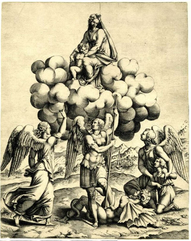 Diana Scultori (Italian, 1536–1588), after Giulio Romano (Italian, c. 1499–1546). The archangels Michael, Gabriel and Raphael adoring the Virgin and Child who occur above seated on a cloud, 1547–1612. Engraving. Sheet (trimmed to platemark): 340 x 270 mm. British Museum: Bequest of Sir Hans Sloane, 1799, V,8.12. 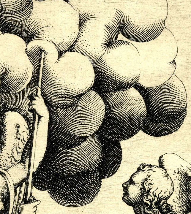 [DETAIL] Diana Scultori (Italian, 1536–1588), after Giulio Romano (Italian, c. 1499–1546). The archangels Michael, Gabriel and Raphael adoring the Virgin and Child who occur above seated on a cloud, 1547–1612. Engraving. Sheet (trimmed to platemark): 340 x 270 mm. British Museum: Bequest of Sir Hans Sloane, 1799, V,8.12. Ann Shafer When I started in the print department in fall 2005, I got a request to host a Maryland Institute College of Art History of Prints (HoP) class for multiple visits. The professor had taught the class before and had an already established lists of objects. Even being new to the task, I was surprised to realize the breadth of the plan. For each of six visits we pulled out between eighty and one hundred prints starting with Master ES and ending with yesterday. While those classes were a lot of work, they were so rewarding. The immense impact of HoP on hundreds of young artists is due solely to professor Tru Ludwig who is not only a gifted art historian, but also is a practicing printmaker with some badass technical chops. We clicked from the start and taught HoP together fifteen times between 2005 and 2017. In my time in the print room, no other teachers made as powerful a use of the collection.
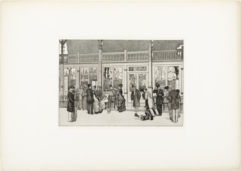
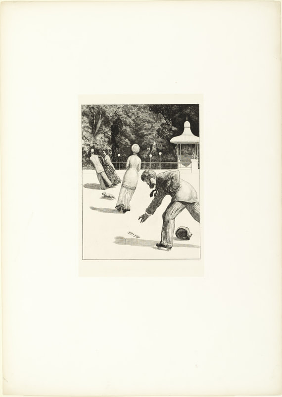
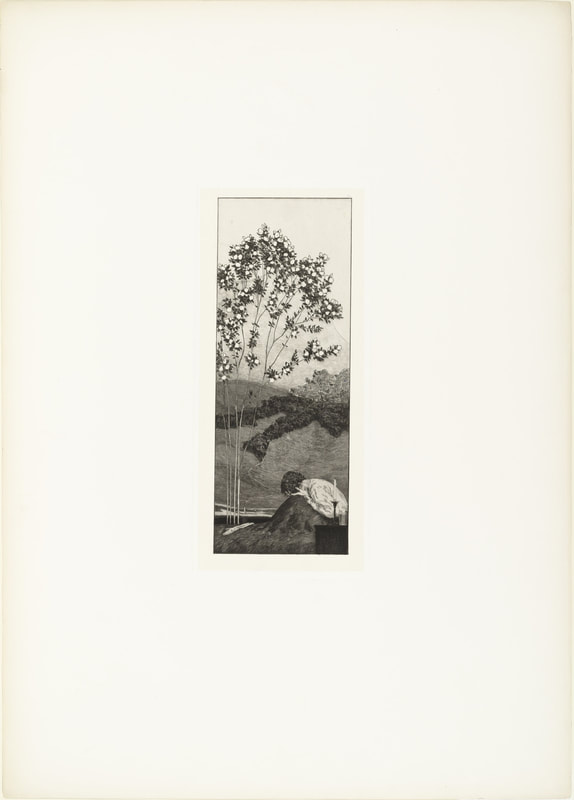
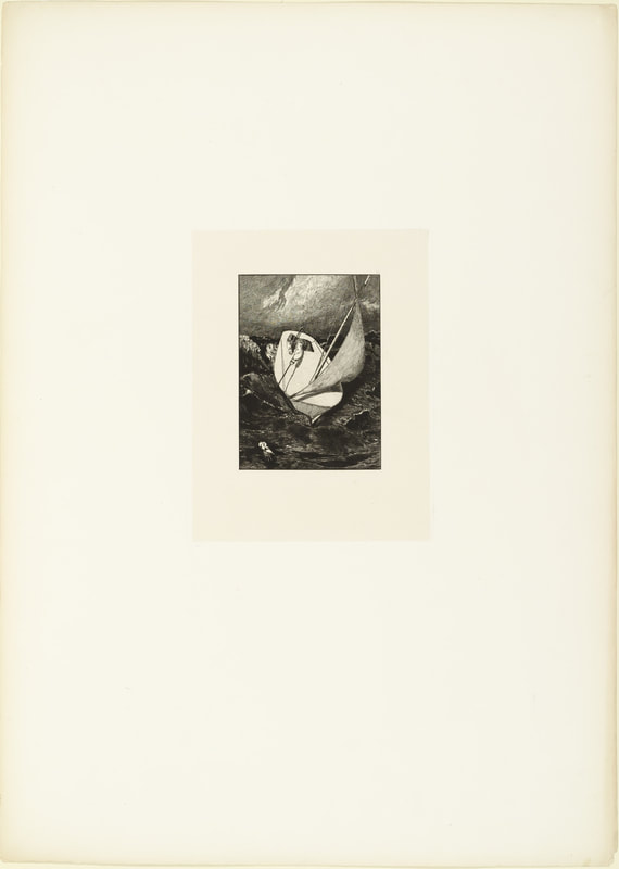
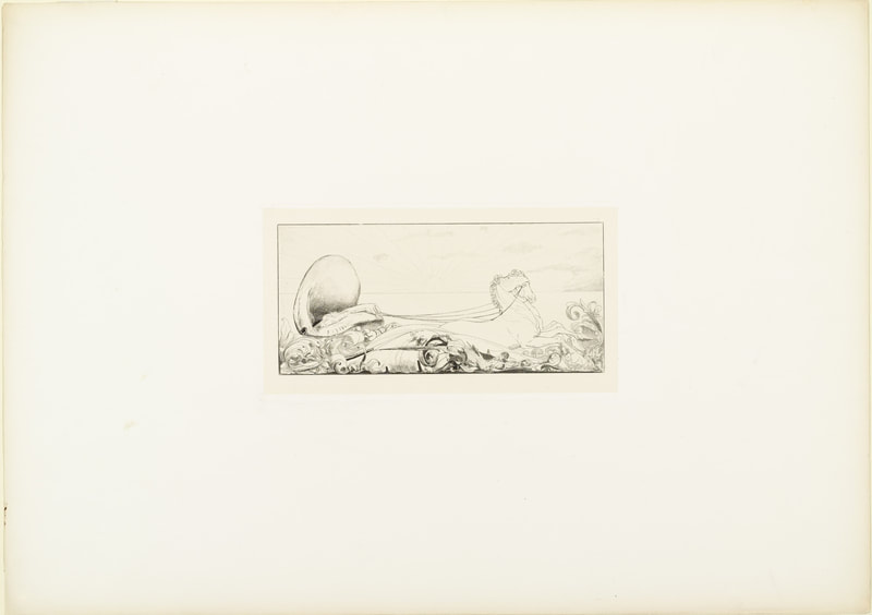
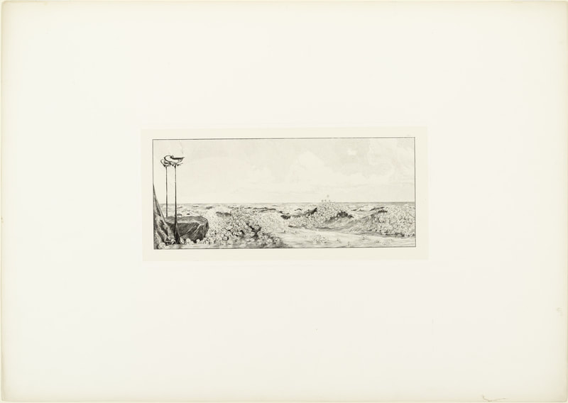
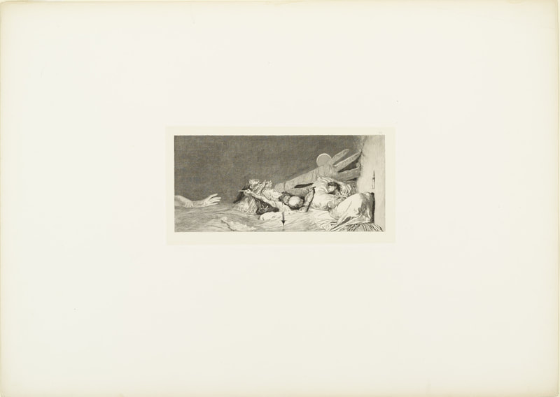
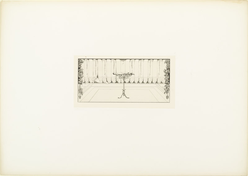
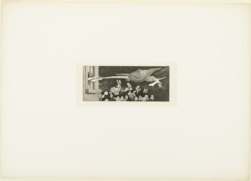
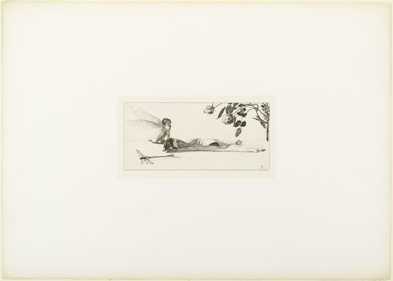
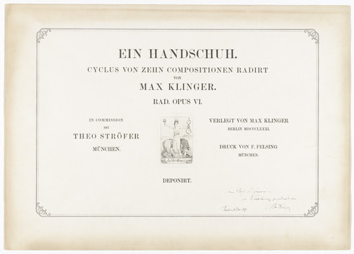
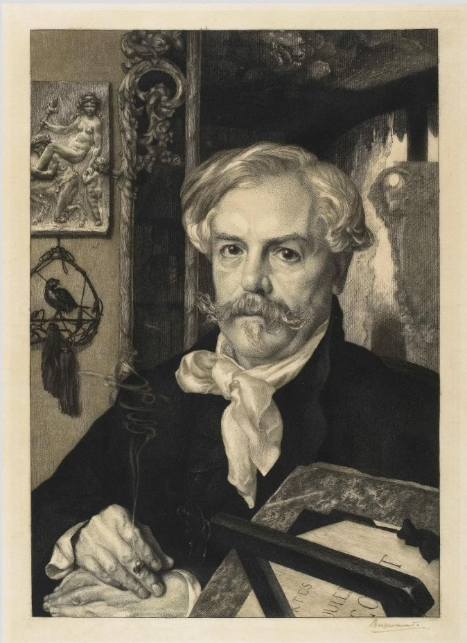
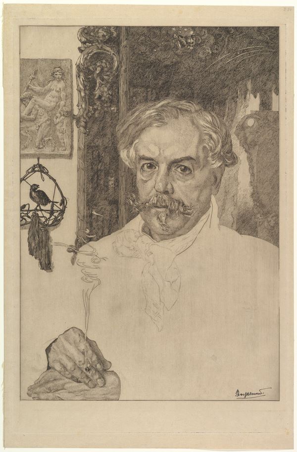
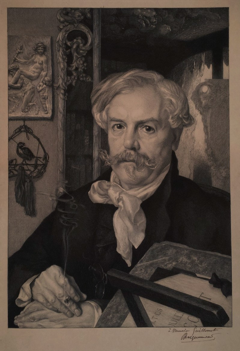
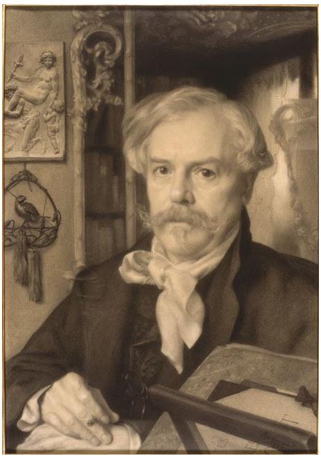
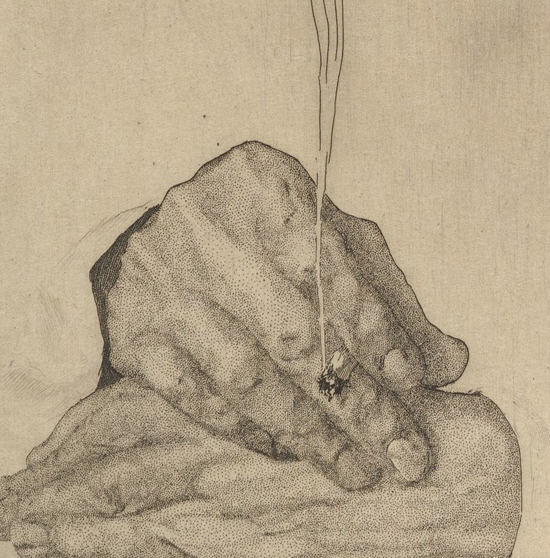
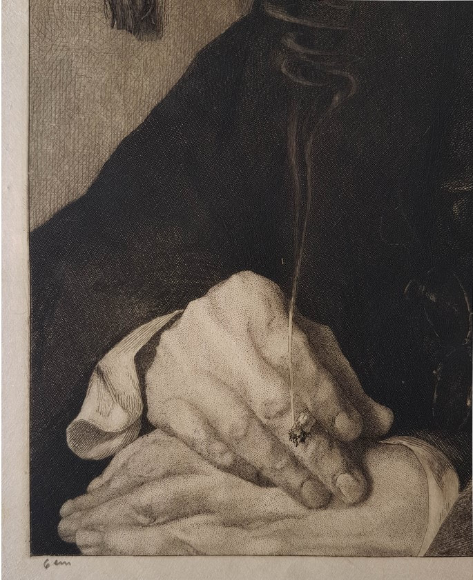
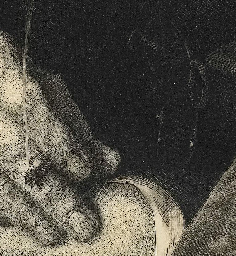
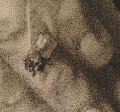
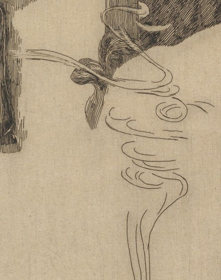
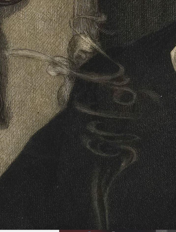
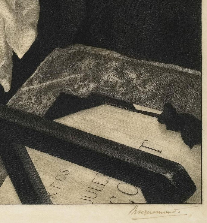
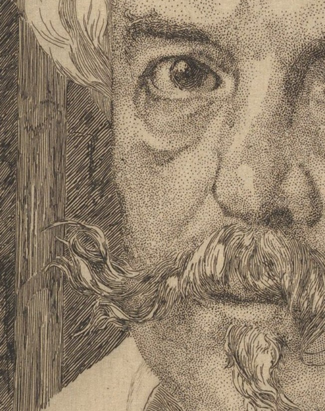
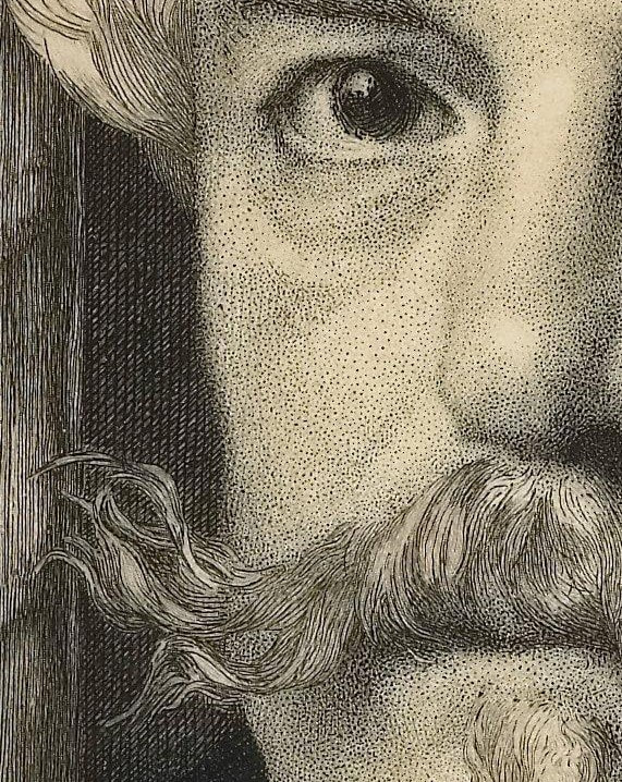
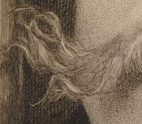
I had never taken a history of prints class (exactly how many colleges offer one?), and with Tru, I had a front row seat to the best teaching I’d ever seen. What does it take to engage twenty-five art students, some of whom think they don’t need to learn anything? It takes a person whose passion is contagious and whose performance is energetic, full of prime historical and technical information, and who encourages students to get up close and personal with the prints themselves. Print nerds know that looking at prints out of their frames is really the only way to get close enough to see what is going on in line quality, tiny details, and textures. The combination of excellent teaching and in-person contact with actual objects is just the best. Tru shines when he starts talking about a time period, movement, or particular artist and gets on a roll. Every semester there was at least one spiel that gave me goosebumps or got me teary-eyed, and more than one that made everyone laugh. After Dürer, Rembrandt, Goya, and everyone in between, and having seen hundreds of prints, we’d finally get to the late-nineteenth century. Most of the material from this period is focused on France, but a sudden detour to Germany introduced Max Klinger and his 1881 portfolio, A Glove (Ein Handschuh), to the class. Klinger (1857–1920) was a bit of an outsider. He created visions from his mind’s eye that presaged twentieth-century thinking about the subconscious and dreams before it was a thing. His work influenced surrealist artists like Salvador Dalí and Giorgio de Chirico, as well as Käthe Kollwitz and Edvard Munch. Of the thirteen portfolios Klinger published during his lifetime, his first is a favorite. It is based on a set of drawings, Fantasies on a Found Glove (Phantasien über einen gefundenen Handschuh), which was exhibited in 1878 at the Berlin Royal Academy of the Arts' annual exhibition. (He was twenty-one years old.) Encouraged by art dealer and engraver Hermann Sagert, Klinger published the set of etchings as a portfolio two years later in 1881. A Glove, Opus VI (Ein Handschuh, Opus VI) features ten etchings and a title page that follows a dream/nightmare sequence of a lost ladies’ glove. First picked up at a skating rink, it becomes an obsession for the central character (Klinger himself) and haunts his waking and sleeping moments. The sexual connotations of such an object are obvious, and Tru’s description had all of us tittering with laughter. The portfolio was always a hit with the class. MoMA’s Heather Hess sums up the portfolio’s narrative nicely: “Klinger meticulously depicts the real and the imaginary with hallucinatory clarity, casting himself as protagonist. At a skating rink in Berlin, Klinger is seen eyeing a beautiful young woman; he swoops down to retrieve her dropped glove. This intimate and potently sexualized object triggers a series of elaborate visions of longing and loss, conveyed through dreamlike distortions of scale and jarring juxtapositions. As desire threatens to engulf Klinger, the fetishized glove takes on a life of its own. It assumes the attributes of Venus, born of sea foam and driving a shell chariot. An outsize version torments him in his sleep, recalling Francisco de Goya's prints. Klinger's grasp on the glove remains elusive, and a fantastic creature finally spirits the object away.” (https://www.moma.org/s/ge/collection_ge/object/object_objid-64063.html) The portfolio’s popularity is clear; after the first publication, it was issued in several subsequent editions, including one posthumously (meaning after Klinger’s death). This is the publication sequence: the first edition was published in 1881 in an edition of twenty-five; a second edition was published a year later as Paraphrase über den Fund eines Handschuhs in an unknown quantity; both a third (1883) and fourth (1892) edition were published in an unknown quantity; the fifth edition was posthumously published in 1924, as Paraphrase über den Fund eines Handschuhs by Verlag von Gertrud Hartmann-Klinger in an edition of approximately one hundred. Knowing all this becomes important when it comes to value and marketability. Obviously, it is preferable to have the earliest set. But would I buy a posthumous set for myself if I came across one? Hell yes. It's such an odd, fantastical sequence, and is all the more remarkable because it dates to the early 1880s, comes out of Germany, and is executed by a twenty-something artist. It makes me wonder about the exact nature of creativity and imagination. I mean, from whence do these kinds of visions come? And who is bold enough to make them into a multiple, collectible set of gorgeous etchings? Tru’s presentation of Ein Handschuh was a highlight every semester. I’d wager that former students (we call them HoPsters) would agree that it was indeed memorable. Any HoPster alums want to chime in? Ann Shafer The museum is fortunate to have two impressions of Félix Bracquemond’s gorgeous portrait of Edmond de Goncourt (one first state and one eighth/final state), and the pair was a permanent fixture on lists for classes studying prints or drawings. Why did I pull the two out constantly? For one thing, it is a kitchen sink etching full of a variety of mark making. Two, having an early state means you can see how and where he started and compare it to the final state. Three, it is a remarkably beautiful and sensitive portrayal of the artist's friend.
For me, however, the easy sell is the smoke emanating from the cigarette Goncourt holds. I mean, have you ever? In fact it was the smoke in this print that made me start a subject list of all sorts of images. Whenever I was box surfing, I would note works that featured any number of objects or themes: clouds, eyeglasses, monkeys, night scenes, games, sports, city, country, four seasons, seven deadly sins, you get the picture. Trying to draw smoke seems to me to be almost as difficult as portraying water in a vase (see my earlier post about Manet’s Lilacs in a Vase). Bracquemond’s elegant spiral of smoke wafts up from the butt with such elegance. (Please don’t mistake this for an advertisement for smoking—it isn’t.) Bracquemond enjoyed notoriety and success as a printmaker by the time he started work on the etched portrait of Edmond de Goncourt. He had had prints in multiple Salon exhibitions in Paris and his work was included in the first Impressionist show in 1874. He also created designs for dinnerware, was fascinated by Japonisme, and taught etching to many artists including Jean-Baptiste-Camille Corot, Gustave Courbet, Théodore Rousseau, Edgar Degas, and Henri Fantin-Latour. Bracquemond was a key figure in the etching revival of the 1850s and 1860s in France. Along with the publisher Alfred Cadart and the printer Auguste Delâtre, he founded La Société des Aquafortistes in 1862. The Société published a monthly portfolio of prints over its five-year existence, including work by the most progressive artists of the time: Edouard Manet, Fantin-Latour, Charles Meryon, James McNeil Whistler, and Bracquemond himself. To say he was in the mix would be an understatement. He made over 900 prints during his lifetime, two favorites of which are worth looking up: Le haut d’un battant de porte (Birds Nailed to a Barn Door), 1852; and The Large Rabbit, 1891. But for me, his Portrait of Edmond de Goncourt, 1881–82, is the pinnacle of his oeuvre. In the portrait, Goncourt is shown surrounded by objects that tell us about him. The most meaningful, perhaps, is the portfolio of prints by his younger brother, Jules de Goncourt, seen at lower right. Jules was an amateur printmaker, but more importantly, together the brothers produced a literary journal that is revered today. It is at once a chronicle of an era, an intimate glimpse into their lives, and the purest expression of a burgeoning modern sensibility preoccupied with sex, art, celebrity, and self-exposure. The Goncourts were known to visit everything from slums and brothels to balls and imperial receptions; they argued about art and politics and were merciless gossips discussing news with and about writers Victor Hugo, Charles Baudelaire, and Emile Zola, as well as artists Edgar Degas, Auguste Rodin, and many others. When Jules (who was ten years younger) suffered a painful and slow death at age thirty-nine from syphilis in 1871, Edmond was at his side. The portfolio in the portrait is a nod to Jules as a beloved brother and close collaborator. Other objects include, at upper left, a relief by the French sculptor Clodion of a frolicking nymph and satyr (mythical woodland creatures) recalling eighteenth-century French art, about which Goncourt was passionate. Below the relief is a bronze ornament with a bird and tassels, which represents Goncourt’s collection of fifteen hundred Japanese objects. On the right is a large vase reflected in a mirror. Apparently, Goncourt’s writing about art often evoked physical sensations such as touch and smell, which Bracquemond suggests with objects, rich fabrics, and that burning cigarette. Bracquemond and Goncourt were friends, which I believe is apparent in the portrait’s attention to detail. It is also one of the largest plates Bracquemond ever worked on, adding to its significance. As an artist paying attention to the new conception of the limited edition, with special proofs, papers, etc., Bracquemond took full advantage. As far as we know, there are probably twenty impressions of state I, six impressions of states II–VII, and 175 impressions of state VIII (twenty-five on vellum and 150 on Japan paper). The images below are of several different impressions of the print, including details of a first state impression from the collection of the Metropolitan Museum, a final state impression from the Minneapolis Institute of Arts, along with the drawing of the same subject in the collection of the Louvre. Other details come from a variety of collections. Please know these choices are based on the resolution of the online images. (The online images of the Baltimore Museum of Art's impressions are not high enough resolution to reproduce here.) As always, collections are noted in the captions. |
Ann's art blogA small corner of the interwebs to share thoughts on objects I acquired for the Baltimore Museum of Art's collection, research I've done on Stanley William Hayter and Atelier 17, experiments in intaglio printmaking, and the Baltimore Contemporary Print Fair. Archives
February 2023
Categories
All
|



 RSS Feed